10,000 search results (0.034 seconds)
  1. Comaro - Personal use only
  2. Marbold - Personal use only
  3. ATROX - Unknown license
  4. Inscruta - Personal use only
  5. Gael - Personal use only
  6. Pisan - Personal use only
  7. AddLoops - Unknown license
  8. Romanche - Personal use only
  9. RikyTiky - Personal use only
  10. Fettash - Personal use only
  11. BeesWax - Personal use only
  12. Balloons - Personal use only
  13. HVD Edding 780 - Unknown license
  14. TeknikohlRemix01 - Unknown license
  15. Starcraft - Unknown license
  16. Skeksis - Unknown license
  17. Turok - Unknown license
  18. Thalia - Unknown license
  19. Dalelands - Unknown license
  20. Emulator - Unknown license
  21. Chinyen - Unknown license
  22. Transmetals - Unknown license
  23. Nightwarrior - Unknown license
  24. Gutcruncher - Unknown license
  25. Sands of Fire - Unknown license
  26. Adventure - Unknown license
  27. Warlords - Unknown license
  28. Sutro Shaded by Parkinson, $25.00
    My affection for Slab Serifs began in the early 1960s in Kansas City when Rob Roy Kelly was at the Kansas City Art Institute, teaching and writing his book on American Wood Type. I got to know him just well enough to gain access to his fabulous collection of wood type and wood type catalogs. Later, in the1970s, I tried to re-create a Nebiolo Egiziano for Roger Black at New West magazine. And again for Roger, in the 1980s, I designed a Slab Serif logo for Newsweek Magazine. Finally, in 2003, designed the Sutro Family. There were things I didn't like about it, so, over time, I’ve been adding some things and dressing it up a little. Sutro Shaded has existed for a few years as a one color, outlined, drop-shadowed display font. It seemed like it was just dying for a little color. I added five more fonts: Fill, Gradient, Hatching, Rules and HiLite. These fonts can be used in different combinations to achieve various effects. There is a downloadable SUTRO SHADED USER MANUAL PDF in the Gallery section for this family.
  29. Neon Goo by Hanoded, $16.00
    I’m a bit of a sucker for neon lights, especially in big cities. My favourite city is Tokyo, with its brightly coloured billboards and its back alleys full of neon-lit eateries. At first sight, Neon Goo is a slightly warped font, with some funny looking glyphs and a generous spacing. When you start using it, you’ll find out that the glyphs do complement each other! Neon Goo comes with all diacritics and a set of alternates for the lower case letters.
  30. Jefferson Pilot NF by Nick's Fonts, $10.00
    One in the series of fonts called Whiz-Bang Wood Type, intended to be set large and tight. Jefferson Pilot’s unusual letter treatment isn't for every project, but for projects that need a great "old-timey" look, it’s perfect. Named for a city in East Texas that was a port city on the late 1800s, but today is landlocked. Both versions of this font contain the Unicode 1252 Latin and Unicode 1250 Central European character sets, with localization for Romanian and Moldovan.
  31. Utusi Star - Unknown license
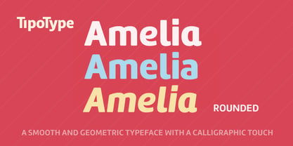
  32. Amelia Rounded by TipoType, $19.00
    Amelia Rounded is a geometric sans that keeps the softness of humanistic strokes. The combination of contrasting styles makes Amelia Rounded an ideal choice for both body and display text. The different styles included in the Amelia Rounded family offer flexibility and variation for your projects, either for a formal or a relaxed look, thanks to the Up version.
  33. Opa-locka JNL by Jeff Levine, $29.00
    Opa-locka JNL is named for a city in Miami-Dade County, Florida and is based on an Art Nouveau-era bit of hand lettering found on vintage sheet music. Legendary aviation pioneer Glenn Curtiss (who successfully developed the city of Miami Springs and the city of Hialeah with James Bright) began the development of Opa-locka around 1925 as a planned community with a "1001 Arabian Nights" theme. Plans for this exclusive community included a country club and a small private airfield, but the hurricane of 1926 derailed Curtiss' original vision of the city. Opa-locka gradually took shape as a residential area for middle-class families, but the closing of a long-established Marine base, changing demographics and a reputation for being a hot-spot for crime, drug abuse and corruption tarnished this once-grand community (which boasts the largest collection of Moorish Revival architecture in the Western hemisphere). Old-time Miamians bristle when the city's name (an abbreviation of a Seminole place name, spelled Opa-tisha-wocka-locka) is mis-spelled as "Opa-Locka", "Opa Locka" or "Opalocka". The correct name is hyphenated, and the second part is in lower case.
  34. the american flag - Unknown license
  35. Pokemon - Unknown license
  36. Jedi - Unknown license
  37. Tsa - Unknown license
  38. Ysgarth - Unknown license
  39. Minnesota Plaid by Breauhare, $35.00
    Minnesota Plaid is the baddest plaid ever! It may not be the choice pattern for golfers' slacks or bagpipers' kilts, but it has a City-like flavor with its own twist, a stylish ruggedness & toughness that could even be described as a sort of formal graffiti, thanks to the art deco swash of many of its strokes. It’s the kind of look that would be perfectly at home with hip hop or rap music, football and other sports, cars and trucks, power tools, and other manly, masculine usages. Of course, women are just as capable of having the aforementioned interests, too. Minnesota Plaid is the kind of font that can get stuck on you! Digitized by John Bomparte.
  40. webster - Unknown license
Looking for more fonts? Check out our New, Sans, Script, Handwriting fonts or Categories
abstract fontscontact usprivacy policyweb font generator
Processing