2,271 search results
(0.008 seconds)
- The Smell After Rain by Tlatous Type,
$19.00
- Hebrew Alter Rebbe of Liadi by Samtype,
$385.00
- city burn night after night and we spraypaint the walls - Unknown license

- AfterYear - Personal use only

- y.n.w.u.a.y - Unknown license

- Dream Lover by TypeArt Foundry,
$45.00
- Dramaminex by Emboss,
$12.40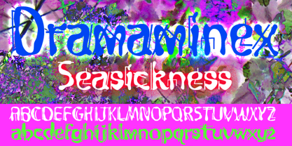
- Steelyard by TypeArt Foundry,
$45.00
- Babalon by Emboss,
$24.95
- Simple by Winnie Tan,
$69.00
- FaxFont by Emboss,
$19.95 - Afterbutler by WNGSTD,
$15.00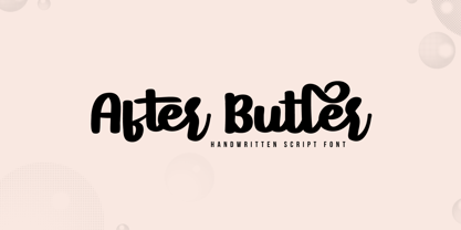
- Tobago by Emboss,
$24.95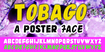
- Annabelle JF by Jukebox Collection,
$32.99
- Mitropaschrift by RMU,
$-
- LD Chaver by Illustration Ink,
$3.00 - Mainstream by Mans Greback,
$59.00
- Squiddles by Thomas Käding,
$2.00
- Bombay Blue by Hanoded,
$15.00
- Straker by Device,
$29.00
- Glamour Absolute by Nicky Laatz,
$42.00
- BattleLines - Personal use only

- KG Like A Skyscraper by Kimberly Geswein,
$5.00
- Eternal Life by PizzaDude.dk,
$20.00 - PL Torino by Monotype,
$29.99 - Radium J - Unknown license

- MGN Burro by Morgana Studio,
$17.50
- Jimi by Canada Type,
$24.95 - pf.animals - Unknown license

- Precision by Gerald Gallo,
$20.00
- Slender by Gerald Gallo,
$20.00
- KG Primary Penmanship by Kimberly Geswein,
$5.00
- Retro Voice by BlessedPrint,
$20.00
- Kaldi by Hemphill Type,
$18.99
- LD Soccer Mom by Illustration Ink,
$3.00 - Breuckelen by Glyphobet,
$14.99
- New Boston NF by Nick's Fonts,
$10.00 - Plonker by Tour De Force,
$25.00
- Extension by Red Rooster Collection,
$45.00 - Presentation JNL by Jeff Levine,
$29.00


