10,000 search results
(0.052 seconds)
- The DorovarFLF-Carolus font, crafted by Altsys Metamorphosis, is a tribute to the elegance and historical depth of early manuscript and inscription lettering, harmoniously blending tradition with the...
- Jerash Demo by David F. Nalle is a distinctive font that immerses users into the depths of artistic expression and historical resonance. Crafted with an acute attention to detail, this typeface bridg...
- Apres RE by Font Bureau,
$40.00 Apres is a clear and comfortable typeface from David Berlow, originally designed for the Palm Pre smart phone. This humanist geometric design projects a friendly and forthright familiarity, without being static or mechanical. This version of the family is part of the Reading Edge series of fonts specifically designed for small text onscreen, having been adjusted to provide more generous proportions and roomier spacing, and having been hinted in TrueType for optimal rendering in low resolution environments.
 - Bokar by Pelavin Fonts,
$25.00 I am inspired by imagery that technology has rendered obsolete. I treasure anachronistic packaging and design which has somehow evaded obliteration by focus groups.I especially admire the packaging for A&P coffee brands Eight O'Clock, Red Circle and Bokar whose eccentric yet elegant typography harkens back to an earlier, less complicated era. The font Bokar is my nod of appreciation to those robust and full-bodied blends spared from the bland, tasteless scourge of corporate branding.
 - Speedwriter - Personal use only

- Salernomi J - Unknown license

- OldeChicago - Unknown license

- Kimora by Scoothtype,
$9.00 Kimora is a versatile, modern unique and elegant sans serif font. File Type (Desktop Font): Style: Regular, Shadow, Bold Create unique & beautiful logotype, use it as an elegant solution for your next magazine layout, or choose Kimora for any graphics that require a sleek look with a elegant flair.
 - Softrobo by Koval TF,
$10.00 Fine-built, straight but not official, with soft corners is suitable for short texts, placards and advertising. It was inspired by 1970s when people were mad about robots, space and so on. I decided to create a font as if it was a progressive font of the 1970s.
 - Portculliard by Greater Albion Typefounders,
$18.00 Greater Albion always releases a Black letter each year, hopefully well before the Christmas seas (which we seem to have managed this year - September). There is something about this year's project which suggests a caste portcullis to us. Why not visit ye olde world in your next designer project?
 - Kooky BT by Bitstream,
$57.99Allen Zuk has designed this wacky typeface that he calls KOOKY. Each character has three variants that bounce about the baseline. The effect is a randomly casual appearance that is great for headlines. The OpenType version does this automatically by using contextual alternates in applications that recognize this option. - Ramones by Namistudio,
$15.00 Rebel, Energy, Punk, Power... Ramones, jagged interlock letter with bold line. This font will bring that IN YOUR FACE attitude in your design. No more soft side. It's all about the energy ! Either choosing the auto-generate interlocking letters, or keep it original, Ramones still brings you the power.
 - Rabid by AdultHumanMale,
$15.00 Rabid is an inky, messy, super distressed display font. It's part charcoal, part chalk strokes, add a splash a of red and it starts to look like blood. Why SO Serious? It has about 200 glyphs including all those extra pesky foreign features. O Hope you like it.
 - Geometa Rounded Deco by Wiescher Design,
$39.50 Geometa is based on Paul Renners Futura Classic, the one that he designed before he had to soften it to make it more appealing to the broad public. I thought the normal rounded fonts needed a decorative sister. Here they are! Your type-designer for decorative solutions, Gert Wiescher
 - Valjean by Solotype,
$19.95Here is a wood type from Tubbs & Co., about 1900. Its lack of decoration reflects the changes that were rapidly occurring in the design of printed pieces at the beginning of the 1900s. There were several similar types in metal in the first decade of the 20th century. - Wulf Utility by Device,
$29.00 Wulf Utility is a heavily degraded font that evokes information in a utilitarian manner without any pretence to elegance, fuss or refinement. Gruff and direct, it is about as basic as a font can be. The Dirty version can be layered over the Rough version for two-tone effects.
 - Blubber by Jesse Tilley,
$18.64 This strange mysterious "blubber" is told to hold the secrets of the universe, many legends and myths have been told about its strange and amazing powers. Great fortunes await to those who can harness its power. NOT TO BE USED FOR EVIL. Get it before it gets you...
 - James Black by Motokiwo,
$15.00 James Black, a signature milli pen font with classy handwriting style. This is a perfect font for business, for your personal feels, for everything about you smart people! You will get a casual handwritten font with some ligatures that will give you more taste of high class personality.
 - St Mika by Stereotypes,
$25.90 St Mika is big, black and beautiful. A little bit clumsy, Mika has his very own style of serifs and letterforms, making him very unique. If you want to yell or scream at someone, Mika is not your partner. This typeface is more about harmony and big letters.
 - Prestigious by Fype Co,
$16.00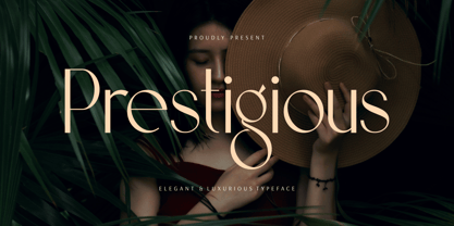 Prestigious is a luxury and elegant display font. That is both classically elegant and modern. Create beautiful wedding invitations, use it as an elegant solution for your next magazine layout, branding, social media, product design, stationery and advertising. It will elevate any design idea with its timeless class.
 - Rabenk by Sealoung,
$20.00 Rabenk is a fun quirky look serif. With a modern look, it looks perfect when paired with conventional serif/sans serifs. It can be used for mastheads, posters, business identities and just about anything. Use this font to beautify your designs and make your work look more beautiful.
 - Selfish Jeans by Bogstav,
$16.00 The song "Selfish Jean" by Travis inspired me to name this font, and a runny pen made me draw the letters. Actually, I started making the font while listening to that particular song - and the whole atmosphere about that situation, suited me perfect to make this handmade font! :)
 - Metafiz by Java Pep,
$17.00 Hello, proudly present my newest serif font. Metafiz is an elegant typeface that presenting standout, classy, sophisticated, and outstanding purpose. Metafiz comes with 4 styles - regular, italic, bold, and bold italic. Don't worry about the features, Metafiz completed with uppercase & lowercase, numeral, punctuations, and multilingual that support 17 languages.
 - Disposable by PizzaDude.dk,
$20.00 Disposable is somewhat similar to some letters that are about to disintegrate. The letters are a little worn and give a good impression of something eco or organic. I've created 6 different versions of all the letters, just so your text will look even more organic and handmade!
 - Rolphie by Aah Yes,
$9.95 Rolphie can be your go-to sans-serif, with 16 easy-to-read weights and 10 versions for each weight, and the subtlety of choice that represents. The versions contained in each weight are: Regular; Condensed; Half-Condensed; Expanded; Small Capitals: and their italic counterparts. (At heavier weights particularly it seemed to be justified to have two Condensed versions). Plus there's 20 funky versions with the letters all shook up (that would make a good title for a song), or jumbled around, plus some Shadow, Doubled-Up, College, and other FX versions. In total there's 180 variations, giving a comprehensive selection of both standard and funky fonts, and that subtle degree of choice of weight. To make things easier, the weights are put in ascending numerical order from 01 to 16, and the FX versions have been stuck in the 80s and 90s, (like two musicians I know). There are grouped packages available for certain weights (which have 10 fonts in them) and the complete family package (180 fonts) which represent better value than the individual fonts, and there's a basic package containing the Normal and Italic versions of all 16 weights (32 fonts). A limit of 5 sub-family packages has been imposed, unfortunately, which precludes a more comprehensive selection. To let you know what's in the font that you might otherwise never know about . . . With Discretionary Ligatures on, you get special characters if you type Mc St. Rd. Bd. Ave. c/o No. (p) (P) - include the full-stop/period. With Stylistic Alternates switched on, you get plenty of extra characters - including a WiFi symbol (type Wifi or WiFi) / bullet numbers instead of ordinary numbers / that different U-dieresis / special characters for c/o No. Mc / an upside down ~ / a huge bullet, and different forms for cent, dollar, percent, per-thousand. As you'd expect, there's all the accented characters for all Western European scripts using Latin letters, and standard ligatures, plus other Open Type features including Class Kerning, Slashed-Zero, Historical Forms, Sub- and Superscript numbers, fractions for halves, thirds and quarters, Ornamental forms giving bullet numbers, etc. There's also the main mathematical operators, symbols like card-suits and male/female signs and so on, and some more obscure stuff like schwa and O-horn, U-horn - and there's lots more if you can Access All Alternates. Much will depend on what your software recognises. The Small Caps versions have (intentionally) lost the ligatures for lower case ff, fi, fj, fl, fr, fu, ffi, ffj, ffl, ffr, ffu. The names for the weights are not absolute - we had to make up some names to make them stretch out to sixteen - so rather - see them as relative to each other, being in ascending numerical order by weight.
 - Erotica by Lián Types,
$49.00 “A picture is worth a thousand words” and here, that’s more than true. Take a look at Erotica’s Booklet; Erotica’s Poster Design and Erotica’s User’s Guide before reading below. THE STYLES The difference between Pro and Std styles is the quantity of glyphs. Therefore, Pro styles include all the decorative alternates and ligatures while Std styles are a reduced version of Pro ones. Big and Small styles were thought for better printing results. While Big is recommended to be printed in big sizes, Small may be printed in tiny sizes and will still show its hairlines well. INTRODUCTION I have always wondered if the circle could ever be considered as an imperfect shape. Thousands of years have passed and we still consider circles as synonyms of infinite beauty. Some believe that there is something intrinsically “divine” that could be found in them. Sensuality is many times related to perfectly shaped strong curves, exuberant forms and a big contrasts. Erotica is a font created with this in mind. THE PROCESS This story begins one fine day of March in 2012. I was looking for something new. Something which would express the deep love I feel regarding calligraphy in a new way. At that time, I was practicing a lot of roundhand, testing and feeling different kinds of nibs; hearing the sometimes sharp, sometimes soft, sound of them sliding on the paper. This kind of calligraphy has some really strict rules: An even pattern of repetition is required, so you have to be absolutely aware of the pressure of the flexible pen; and of the distance between characters. Also, learning copperplate can be really useful to understand about proportion in letters and how a minimum change of it can drastically affect the look of the word and text. Many times I would forget about type-design and I would let myself go(1): Nothing like making the pen dance when adding some accolades above and below the written word. Once something is mastered, you are able to break some rules. At least, that’s my philosophy. (2) After some research, I found that the world was in need of a really sexy yet formal copperplate. (3) I started Erotica with the idea of taking some rules of this style to the extreme. Some characters were drawn with a pencil first because what I had in mind was impossible to be made with a pen. (4) Finding a graceful way to combine really thick thicks with really thin hairlines with satisfactory results demanded months of tough work: The embryo of Erotica was a lot more bolder than now and had a shorter x-height. Changing proportions of Erotica was crucial for its final look. The taller it became the sexier it looked. Like women again? The result is a font filled with tons of alternates which can make the user think he/she is the actual designer of the word/phrase due to the huge amount of possibilities when choosing glyphs. To make Erotica work well in small sizes too, I designed Erotica Small which can be printed in tiny sizes without any problems. For a more elegant purpose, I designed Erotica Inline, with exactly the same features you can find in the other styles. After finishing these styles, I needed a partner for Erotica. Inspired again in some old calligraphic books I found that Bickham used to accompany his wonderful scripts with some ornated roman caps. Erotica Capitals follows the essentials of those capitals and can be used with or without its alternates to accompany Erotica. In 2013, Erotica received a Certificate of Excellence in Type Design in the 59th TDC Type Directors Club Typeface Design Competition. Meet Erotica, beauty and elegance guaranteed. Notes (1) It is supossed that I'm a typographer rather than a calligrapher, but the truth is that I'm in the middle. Being a graphic designer makes me a little stubborn sometimes. But, I found that the more you don't think of type rules, the more graceful and lively pieces of calligraphy can be done. (2) “Know the forms well before you attempt to make them” used to say E. A. Lupfer, a master of this kind of script a century ago. And I would add “And once you know them, it’s time to fly...” (3) Some script fonts by my compatriots Sabrina Lopez, Ramiro Espinoza and Alejandro Paul deserve a mention here because of their undeniable beauty. The fact that many great copperplate fonts come from Argentina makes me feel really proud. Take a look at: Parfumerie, Medusa, Burgues, Poem and Bellisima. (4) Some calligraphers, graphic and type designer experimented in this field in the mid-to-late 20th century and made a really playful style out of it: Letters show a lot of personality and sometimes they seem drawn rather than written. I want to express my sincere admiration to the fantastic Herb Lubalin, and his friends Tony DiSpigna, Tom Carnase, and of course my fellow countryman Ricardo Rousselot. All of them, amazing.
 - Forest Glade Cyrillic by Ira Dvilyuk,
$16.00 Forest Glade playful Cyrillic script font with the dancing baseline is perfect for use in all your design projects be it logos, signatures, labels, packaging design, blog headlines. Also, it will look great in mugs, cards, gorgeous typographic designs, wedding stationery, and much more. Forest Glade playful Cyrillic sctipt font includes a full set of gorgeous uppercase 2 sets of lowercase letters, numerals, a large range of punctuation and 27 ligatures, giving realistic hand-lettered style. Forest Glade Symbols is a font with 26 unique, hand-drawn illustrations and elements that can help to make your design more original. A different symbol is assigned to every uppercase and lowercase a standard character so you do not need graphics software just simply type the letter you need. Multilingual Support for 27 languages: Afrikaans, Albanian, Basque, Bosnian, Catalan, Danish, Dutch, English, Estonian, Faroese, Filipino, Finnish, French, Galician, Indonesian, Irish, Italian, Malay, Norwegian Bokmål, Portuguese, Slovenian, Spanish, Swahili, Swedish, Turkish, Welsh, Zulu And Cyrillic glyphs support for Russian, Belorussian, Bulgarian, and Ukrainian languages.
 - Soft Serve by Sentinel Type,
$24.90Looking like happy frosting on a cupcake at a twiddle bug party, this bouncy food entry from Canadian designer Haley Fiege turns the original Jellybrush type into organic happiness you can spread on pancakes, ice-cream, sorbets, sauces and condements, oh peanut butter! Yeah, all kinds of sandwich fillings. Anything really. What else? People who own rubber factories. Anybody in the food business, like green grocers or your local bakery. Thrift stores. Falling somewhere between cushions and cat food, this flexible and inviting letter mixes simplicity with organic character and humor for a wide range of uses. Soft Serve’s compact cursive forms and bouncy friendliness draw on artbrush scripts and the typo-italic model of Renaissance Vatican scribe Ludovico Arrighi. A versatile workhorse ideal for: * Dairy & beverage * Sweets & soft drink * Five minute food & sauces * Pet food & accessories * Bathroom & kitchen * Cushions, pillows, rubber & swimming pool, etc. - Mayfair by Canada Type,
$24.95The long awaited and much requested revival of Robert Hunter Middleton's very popular classic is finally here. Mayfair Cursive was an instant hit for Middleton in 1932, and it went on being used widely until late into the 1970s, in spite of it never having crossed over to film type technology. Like a few of its contemporary designs, most notably the work of Lucien Bernhard, Mayfair is a formal script that is somewhat based on traditional italic forms with swash uppercase, but also employs subsidiary hairline strokes in some of its lowercase as an emphasis to the script's cursive traits. Why these gorgeous letters never made the leap into photo typesetting is a mystery to us. But here they are now in digital form, almost three quarters of a century since they first saw the light in metal. Mayfair was redrawn from original 48 pt specimen. It also underwent a major expansion of character set. Plenty of swash characters and ligatures were added. An alternate set of lowercase was also made, in order to give the user a choice between connected and disconnected variations of the same elegant script. Mayfair ships in all popular font formats. While the Postscript Type 1 and True Type versions come in two fonts (Mayfair and Mayfair Alt), the OpenType version is a single font containing all the extra characters in conveniently programmed features that are easily accessible by OpenType-supporting software applications. We are quite sure today's graphic designers will be appreciative of having access to the face that all but defined menus, romance covers, wine and liquor labels and chocolate boxes for almost two 20th century generations. - 1864 GLC Monogram by GLC,
$20.00 This family of two character monograms and initial letters was inspired from a French portfolio containing about two hundred examples of "Chiffres - deux lettres", destinated to engravers and jewelers, published in Paris in 1864, drawn by French engraver, C. Demengeot. Unfortunately, a large part of the pages were lost, so we have had to redraw about two thirds of the complete monogram family. Each package contains numerals and two complete sets of two-letter monograms, for example the A-B set, containing AA AB AC... corresponding to caps keys alphabet and BA, BB, BC... corresponding to lower case keys alphabet. We have added an Initial set, with two choices of single characters. Warning: I and J have strictly identical monograms.
 - Tati by Wiescher Design,
$33.33I only had this bouncy curve and a photograph of a daily menu (Truite Meunière) I took outside an obscure Paris restaurant when starting the design of this font. But while working on it I suddenly started thinking about Jacques Tati the famous but almost forgotten french director of Les Vacances de Monsieur Hulot, Jour des Fêtes, Mon Oncle, Playtime, Trafic etc. I thought about his bouncy walk and his hilarious ideas. The memories never left me while working on the font, so I decided to name the font after this great French moviemaker who gave me so many happy hours. Since Tati was a very funny character, I gave my characters a funny price. Thank you Jacques Tati, yours Gert Wiescher - Bombelli Light Hand by Wiescher Design,
$39.50 Bombelli is a font that looks like it has been handwritten by a meticulous architect in one of those hand-drawn blueprints of the old days. I chose the name to honor one of my ex-bosses -- a graphic designer-architect who taught me a lot of things when I was young and needed the money. One of the things he taught me – and probably the most important one – was to always be on time in the morning. He never said a word about me being late, but it worked. He taught me about being meticulous in detail and many other things I only appreciated much later. This clear and straightforward font deserves bearing his name. Your grateful type designer Gert Wiescher
 - Humana by Linotype,
$29.99The story of Humana begins with an exclusive volume about some manuscripts in Biblioteca Palatina in Parma, Italy. The title page uses the characters upon which I designed Humana. I suppose they were drawn for that volume. Examining the reproductions in the book I found that the characters on the title page immitate the lettering in a manuscript from the 15th century with Petrarca's Rime volgari". Not bad as origin! But I cannot free myself from the thought that there may be a typeface with that looks, not just a few characters drawn for that volume. My reference books could not give me any answer about that. The name Humana refers to the humanistic era from which the characters originate. Humana was released in 1994. - Tilaa by Brenners Template,
$19.00If you want to design a classic yet strong touch, try these typography combinations. Tilaa Sans Logo Fonts The Tilaa Sans Logo Fonts were designed by combining Ligatures and Alternates for modern and interactive imaginations. You can enjoy the joy of design through these Opentype Features. Tilaa Serif Display Fonts Tilaa Serif is a beautiful typeface with extensive coverage ranging from editorial design to web design. Manually adjusted italic inclination and 124 Ligatures are innovative solutions for classic and defiant styles. And it is excellent for creating modern and luxurious logos and titles by incorporating rebellious ligatures while maintaining classic skeletons. And, they each contain exquisitely designed Ligatures, and in the case of Tilaa Sans, the best typography solution for 3D effects. - Weaver - Unknown license

- WHISPERS CALLIGRAPHY_DEMO_essential_BOLD - Personal use only

- Syphon Spritz - Personal use only

- HelenaDEMOVERSION - Personal use only

- Narnia BLL - Unknown license

- Parasight - Unknown license


