10,000 search results
(0.031 seconds)
- Barclay Outline by Monotype,
$29.99Barclay Outline is a headline font in the style of a modern typeface. The letters of the Barclay Outline font are like a bold modern face with a fine outline contrasted and strong shadow strokes. - Lebensjoy by Monotype,
$29.99Lebensjoy was used by the Co-op chain stores in Sweden for a nationwide fortnightly flyer (called Livsgldje = Joy of Life) during 1993 and 1994. They wanted a simple but still lively and active letterform. - Lancet-Aken by Akenlee Type,
$39.00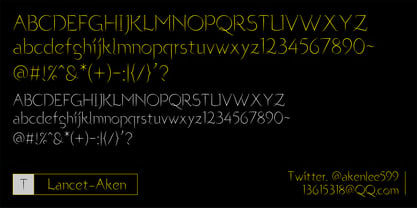 I want the font to have a vitality of life, Visually, the details are beautiful, long and fashionable, low-key and elegant, quiet and delicate, with the aesthetic feeling of fashion, not aggressive.
 - Hoppa by Soar Studio,
$29.00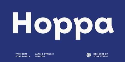 Hoppa is a clean geometric typeface with a fun twist. It was carefully designed to the modern standards like big x-height and short descenders. With its smooth curves and loop-alike shapes, Hoppa will add a fresh and lively feel to your designs. Although it has been created to be used as a display face, it performs well in longer texts. Thanks to alternate glyphs, font gets more legible, neutral look. Hoppa supports most of Latin and Cyrillic languages and includes range of OT features.
 - Weeneez JNL by Jeff Levine,
$29.00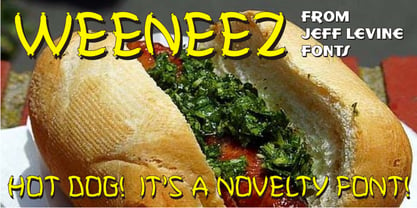 Weeneez JNL is an out-and-out novelty font made entirely of hot dogs. The font contains only the alphabet and numerals and a few other symbols including basic punctuation marks.
 - FE Blacking Out by Egor Stremousov,
$50.00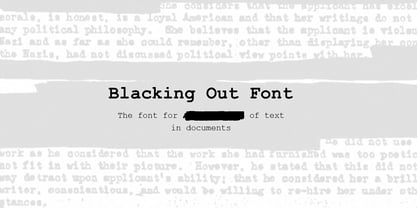 A bunch of OpenType features to blacking out of texts. The font does not contain glyphs. Only black blocks that replace your text with OpenType features. Watch demo: https://youtu.be/qUQgUV0PIT0
 - Coffinated by Ingrimayne Type,
$9.00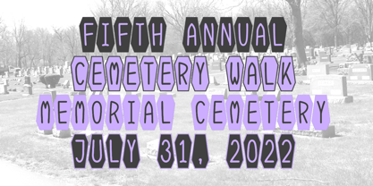 Coffinated features letters on coffin shapes. This caps-only family has two sets of characters, with one on coffins that are flipped from those in the other set. The OpenType feature contextual alternatives (calt) prevents two characters from the same set being adjacent. The two styles, bold and regular, can be used in layers to add color. There are not a lot of uses for macabre lettering (horror? Halloween?) but Coffinated is available for those who do find a use.
 - Waiting For My Girl by Hanoded,
$15.00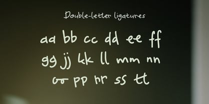 Waiting For My Girl comes from a System of a Down song (Hypnotize). I was listening to it when I created this font and I liked the name! Waiting For My Girl is a script font - it’s quite loose and uneven, just like proper hand writing. It comes with double letter ligatures and a lot of character!
 - Attention Seeker by Hanoded,
$15.00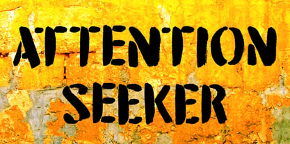 Attention Seeker does seek attention: it looks like a stencil font, and it sort of is, but it wasn’t made with stencils. It was made with a brush and ink on paper - just like that! Use Attention Seeker for your revolutionary posters, your books, your products or your posters, I am sure the end result will make heads turn.
 - TessieSpinners by Ingrimayne Type,
$13.95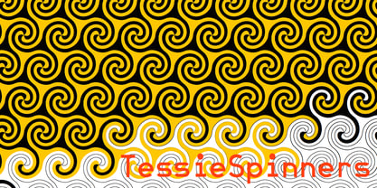 A tessellation is a shape that can be used to completely fill the plane—simple examples are isosceles triangles, squares, and hexagons. Tessellation patterns are eye-catching and visually appealing, which is the reason that they have long been popular in a variety of decorative situations, such as quilting. Most of the shapes in TessieSpinners suggest a spinning motion. Most do not resemble real world objects. The TessieSpinners fonts contain shapes that can be used to construct tessellation patterns. It has two styles, an outline style and a filled or black style. The black style can be used to construct colored patterns. To see how patterns can be constructed, see the “Samples” file here. Most or all of these shapes were discovered/created by the font designer during the past twenty years in the process of designing maze books, coloring books, and a book about tessellations.(Earlier tessellation fonts from IngrimayneType, the TessieDingies fonts, lack a black or filled version so cannot do colored patterns. Make sure the leading is the same as font size or the rows will not line up.)
 - Brewery No 2 Paneuropean by Linotype,
$103.99An entry in the Second Linotype Design Contest, Linotype Brewery, designed by Gustavs Andrejs Grinbergs, became part of the TakeType Collection in 1997. Brewery No 2 represents a significantly improved version of its precursor, and the typeface has been both extended and enhanced. When asked about prototypes, Grinbergs cites German typefaces of the early 20th century. It is thus not surprising that the characters of Brewery™ No 2 are based on geometrical forms. However, this is no mere synthetic Grotesque-derived typeface. It has significant contrasts in line thickness and triangular line terminals that are not unlike serifs, placing it in the middle ground somewhere between a Grotesque and serif font. The contrast between the features of a synthetic Grotesque and an Antiqua gives the characters of Brewery No 2 their distinctive charm and is the distinguishing attribute of this contemporary typeface. Additional vibrancy is provided by bevelled line endings (as in the case of the 'E' and the 'F'), the circular punctuation marks and the slight curve of the descending bar of the 'k'. Thanks to a generous x-height and its open counters, Brewery No 2 is also highly legible in small point sizes. Only in its bolder versions is another aspect of Brewery No 2 apparent; Grinbergs has here made the linking elements more rectangular and has emphasized the counters, so that the Bold variants of Brewery No 2 exhibit elements typical of a broken typeface. Brewery No 2 is available in seven finely graduated weights, ranging from Light to Black. Every variant has a corresponding, slightly narrower Italic version. In addition, the lowercase 'a' is given a closed form, the 'e' is more rounded and the 'f' has a descender. The character sets of Brewery No 2 leave nothing to be desired. In addition to small caps and ligatures, there are various numeral sets with old style and lining figures for setting proportional text and table columns. In its most extensive form (the Pan-European variant), Brewery No 2 can be used to set texts in many languages that employ the Latin alphabet and also texts in international languages that use Cyrillic or monotonic Greek orthography. Although some of the features of Brewery No 2, such as the tiny serifs, are only evident in the larger point sizes, this typeface is not just at home when used to set headlines. Brewery No 2 also cuts a good figure in short or medium length texts. This contemporary typeface with its formally elegant quality looks good, for example, on posters, in newspapers and promotional material. It can also be used for websites as it is also available as a web font. - Brewery No 2 by Linotype,
$40.99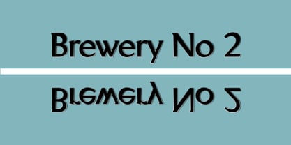 An entry in the Second Linotype Design Contest, Linotype Brewery, designed by Gustavs Andrejs Grinbergs, became part of the TakeType Collection in 1997. Brewery No 2 represents a significantly improved version of its precursor, and the typeface has been both extended and enhanced. When asked about prototypes, Grinbergs cites German typefaces of the early 20th century. It is thus not surprising that the characters of Brewery™ No 2 are based on geometrical forms. However, this is no mere synthetic Grotesque-derived typeface. It has significant contrasts in line thickness and triangular line terminals that are not unlike serifs, placing it in the middle ground somewhere between a Grotesque and serif font. The contrast between the features of a synthetic Grotesque and an Antiqua gives the characters of Brewery No 2 their distinctive charm and is the distinguishing attribute of this contemporary typeface. Additional vibrancy is provided by bevelled line endings (as in the case of the 'E' and the 'F'), the circular punctuation marks and the slight curve of the descending bar of the 'k'. Thanks to a generous x-height and its open counters, Brewery No 2 is also highly legible in small point sizes. Only in its bolder versions is another aspect of Brewery No 2 apparent; Grinbergs has here made the linking elements more rectangular and has emphasized the counters, so that the Bold variants of Brewery No 2 exhibit elements typical of a broken typeface. Brewery No 2 is available in seven finely graduated weights, ranging from Light to Black. Every variant has a corresponding, slightly narrower Italic version. In addition, the lowercase 'a' is given a closed form, the 'e' is more rounded and the 'f' has a descender. The character sets of Brewery No 2 leave nothing to be desired. In addition to small caps and ligatures, there are various numeral sets with old style and lining figures for setting proportional text and table columns. In its most extensive form (the Pan-European variant), Brewery No 2 can be used to set texts in many languages that employ the Latin alphabet and also texts in international languages that use Cyrillic or monotonic Greek orthography. Although some of the features of Brewery No 2, such as the tiny serifs, are only evident in the larger point sizes, this typeface is not just at home when used to set headlines. Brewery No 2 also cuts a good figure in short or medium length texts. This contemporary typeface with its formally elegant quality looks good, for example, on posters, in newspapers and promotional material. It can also be used for websites as it is also available as a web font.
 - CoolDots - Unknown license

- TB Matrix by TrueBlue,
$10.00A creative dot matrix font with more likeable and funny types of dots. Also contains an extended set of characters. - Guild of Professional Actors - Unknown license

- Abduction2002 - Unknown license

- TrickTag - Unknown license

- Ruinik - Unknown license

- Sassoon Infant by Sassoon-Williams,
$48.00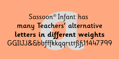 An upright typeface family developed to meet the demand for letters to produce pupil material for handwriting as well as for reading. Upright letters with extended ascenders and descenders are ideal on screen. They facilitate word recognition. The exit strokes link words together visually, and in handwriting they lead to spontaneous joins along the baseline leading logically to a joined-up hand. Teachers can print desk strips, charts of letter families and alphabet friezes, as well as consistent material across the curriculum. Together these typefaces provide a valuable resource for special needs teachers. When starting point and stroke direction has been learned, the arrow font (Tracker B) can be dropped and the simpler Tracker font used. Tracker B font, with its direction arrows helps pupils to start in the correct place. Motor movements can be refined by keeping inside the line. When starting and direction is no problem, the arrow can be dropped and the plain Tracker font used. When starting point and stroke direction have been learned, the arrow font (Dotted B) can be dropped and the simpler Dotted font used. Free to download resources How to access Stylistic Sets of alternative letters in these fonts Purchasers of this font package may use their Order Number to receive a free Copybook PDF by Rosemary Sassoon recommended for effective teaching
 - Bunbury by Monotype,
$15.99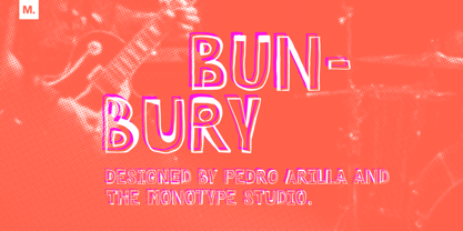 For playfulness and something a little less ordinary, Bunbury is a wonderful script that’s packed with personality. Created using a felt marker and available as an all capitals display font, SC Bunbury’s style is sort of awkward and a lot of fun, with defined outlines and uneven line thicknesses that make for letters packed with hand drawn quirks.
 - Caesar Pro by RMU,
$35.00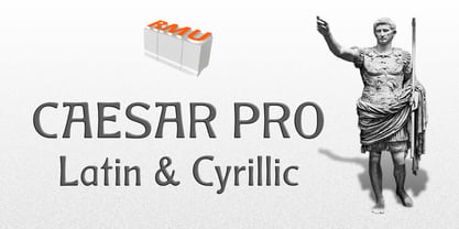 In 1913, Leipzig-based foundry C. F. Ruehl released a hot-metal font called Caesar-Schrift which was cut by the engraver and medalist Georg Schiller (1858-1937). This humanist sans combines successfully traditional classic forms with the flowing lines of the Art Nouveau period. Now revived as Caesar Pro, this font was carefully extended and made multilingual.
 - Fat Ink by High Peak,
$20.00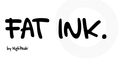 This handwritten font is as juicy as the strokes from a fat marker! Unpredictable but harmonious, the lines and shapes give this font a fun, funky vibe. Perfect for creating logos, charts, pricing, and more. Full uppercase and lowercase, it supports several languages, lots of discretionary ligatures, and alternatives that combine with each other. Have fun! High Peak
 - Sugar & Spice by Brittney Murphy Design,
$8.00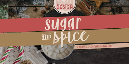 Sugar and Spice is a sweet & scrumptious font duo! Designed with short descenders, so there’s less of that awkward white space, these work great for multi-line designs! Both include lots of alternates, the script includes plenty of ligatures, and the hand-sans has small-caps, so you can mix and match to create a custom look!
 - Kitchen Disaster by PizzaDude.dk,
$18.00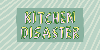 Kitchen Disaster is a wordplay, and not really a disaster! I deliberately made the lines a bit off here and there, to mimic bad poster design. In order to make your text even more natural, I added 5 different versions of each letter - and they automatically cycle as you type! Besides that, Kitchen Disaster comes with multilingual support!
 - Curious Monkey by Abo Daniel,
$17.00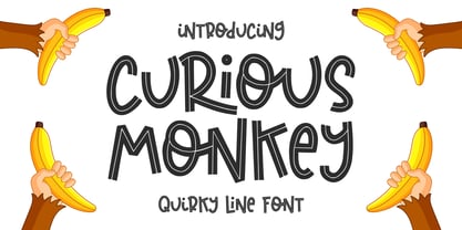 introducing CURIOUS MONKEY - the quirky line font - This font is great for cutting, printing, logo, quotes, branding, packaging and any more craft project. What's included? Basic characters Numeral & punctuation a lot of Ligatures Multilingual Support PUA encoded This font is user friendly. Very easy to use even you use standard software. Hope you love it. Regards, Abo Daniel Studio
 - Skorid by Totem,
$20.00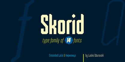 Skorid is a geometric condensed sans serif font family, constructed only out of straight lines. Coming in 7 weights, regular and italic, from thin to black, you have a wide array of possibilities of using Skorid for any purpose you need. Skorid speaks around 70 languages, including Cyrillic. Contains a lot of alternative letters to boost your creativity.
 - Many Weatz - Personal use only

- ALCATRAZ - Personal use only

- LOL! - Personal use only

- Beckasin - Personal use only

- Fangtasia - Personal use only

- Chavenir - Personal use only

- TRUEblood - Personal use only

- Merlin by Linotype,
$29.00Linotype Merlin is part of the Take Type Library, which features the winners of Linotype’s International Digital Type Design Contest from 1994 to 1997. This font was designed by Anne Boskamp and its alphabet consists exclusively of capital letters. At the same time aggressive and sensitive, Merlin looks as though it were scratched onto paper with a pen tip saturated with ink. Like characters from another time, the letters fall into place and make an impression which is both vulnerable and strong, lively and reserved. Merlin’s historical roots lie in the archaic pictograms in the caves of Stone Age civilizations. - Coma by Volcano Type,
$19.00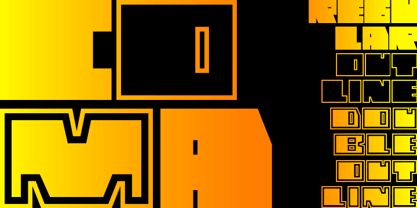 Originally designed by Alois Ganslmeier as a Billboard-Font, the Coma Font was later developed into a complete typeset with capitals and small letters, Cyrillic letters, Greek letters and Hebrew letters by Andy Jörder and Jörg Herz. The Coma Font is a massive constructed font which can be used for headlines. When only typed in capitals it gives the impression of blocks for there are no ascenders or descenders. The font comes alive because of its massive appearance, its edgy form and the opulence impression when used line-by-line. Not without reason, the font is named “dick und eckig”.
 - Lev Serif by TypeFaith Fonts,
$15.00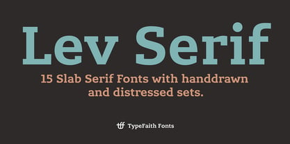 Lev is a slab serif font, the rectangular serifs and the straight angled shoulders and links contrasting the curves and loops. Lev Serif is characterized by thick, block-like serifs. Lev contains 12 high quality fonts.
 - Monas Grotesk by Arodora Type,
$30.00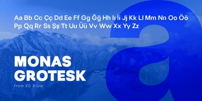 With Monas Grotesk, you can write bold banner writings and bring your slogans to life. Monas supports many language options and will not let you down. Also includes many alternative glyphs, ligatures and more.
 - Guilloche B by Wiescher Design,
$24.00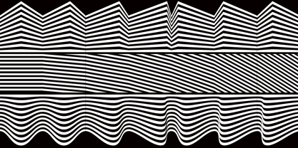 »Guilloche B« is a set of graphics that join with each other to form very sophisticated, op-art-like borders. Try them on lots of different assignments, they form very surprising bands or patterns.
 - Cansum Hand by Bülent Yüksel,
$19.00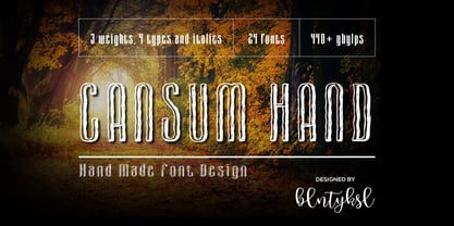 Cansum Hand, 24 fonts and 448 glyphs. It was made to brighten your projects, everything more beautiful. Cansum is my daughter name. Mean is life water. The hand drawn sans serif - display type family is intended to be used in applications like: websites, print, motion graphics, logo design, packaging design, t-shirts, food, clothes, living, wedding stationery and more... Cansum Hand for professional typography. As an exclusively OpenType release, these fonts have an extended character set to support Central and Eastern European as well as Western European languages. Alternates, Ligatures, Oldstyle, Fractions, Superior, Numerators, Denominators, Inferior and much more. You can enjoy using it.
 - Bergell by ITC,
$29.00Inspired by the work of famed Swiss artist Alberto Giacometti, the German designer Thomas Finke created Bergell, a lively and natural script face. Bergell's calligraphic style is both dynamic and elegant, like the kind of special, festive handwriting many desire, but few ever manage to achieve. Why spend so much time at your drawing table when there are great fonts like this one?





