10,000 search results
(0.038 seconds)
- Hackman by The Northern Block,
$32.00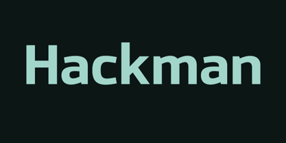 A geometric sans serif with contemporary lines. Distinctive curves are combined with classical letterforms to produce a clean, linear typeface best suited to identity, mobile and web applications. Details include 9 weights with italics, 500 characters, 5 variations of numerals, stylistic alternatives, manually edited kerning and OpenType features.
 - FF Stargate by FontFont,
$41.99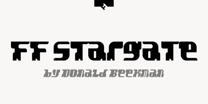 Dutch type designer Donald Beekman created this display FontFont in 1999. The family contains 2 weights: Regular and Italic and is ideally suited for music and nightlife. FF Stargate provides advanced typographical support with features such as ligatures and case-sensitive forms. It comes with proportional lining figures.
 - FF Cavolfiore by FontFont,
$41.99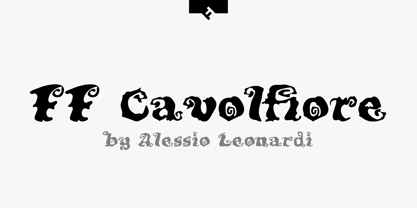 Italian type designer Alessio Leonardi created this display FontFont in 1994. The font is ideally suited for festive occasions, music and nightlife as well as software and gaming. FF Cavolfiore provides advanced typographical support with features such as ligatures and case-sensitive forms. It comes with proportional lining figures.
 - MBF Reute by Moonbandit,
$42.00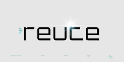 Introducing MBF Reute, a cutting-edge font that redefines modern typography. With its squared, minimalist design, this typeface strikes a perfect balance between rounded warmth and sharp precision. Clean lines and a contemporary aesthetic make MBF Reute the go-to choice for a sleek and versatile visual language.
 - Morris Sans by Linotype,
$40.99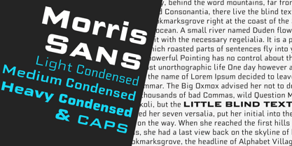 Morris Sans is a newly revised and extended version of a small geometric family of typefaces originally produced by Morris Fuller Benton in 1930 for ATF. His initial design consisted of an alphabet of squared capital letters with a unique twist that characterized its appearance: corners with rounded exteriors and right-angle interiors. The types were intended for use in the fine print found on business cards, banking or financial forms, and contracts. But over the ensuing decades, this design became a popular element in all sorts of design environments, and several foundries revived the typeface in digital form. Since digital fonts are bicameral, with slots for both upper and lowercase letters, new cuts of the type opted filled the lowercase slots with small caps. In 2006, Linotype commissioned its own version of the typeface-an extension for 21st century use. Under the advisement of Linotype's type director Akira Kobayashi, Dan Reynolds redrew the uppercase and added an original lowercase for the first time. Additionally, a number of extras were brought into the fonts, including six figure styles (tabular and proportional lining figures, tabular and proportional oldstyle figures, and special tabular and proportional small cap" figures). Small caps, which have become an iconic element over time, are accessible in each font as an OpenType feature. To differentiate this version from the original, Linotype's new family is named Morris Sans, in honor of Morris Fuller Benton. All fonts in the Morris Sans family are OpenType Com fonts; they include a character set capable of setting 48 European languages that employ the Roman alphabet, including all Central and Eastern Europe languages, those from the Baltics, and Turkish. This glyph coverage extends to the small caps as well. Morris Sans is a wide typeface, especially in its regular widths; the condensed faces set a more conventional line of text. The new lowercase letters are less geometric than the uppercase, except for those that share the same basic forms (e.g., c, o, and s). Instead of following this geometric trend, the new lowercase tends to strengthen the humanist elements that were present in several characters from the original type, including the uppercase D and the figures 5, 6, and 9. Morris Sans also sports a number of glyphic flares, like the stroke found on the original uppercase Q. Morris Sans is a clean, modern design best suited for headlines, advertising, posters, expressive signage (especially on storefronts), and corporate identity work."
 - MOO! - Personal use only

- Pistacho by Estudio Calderon,
$20.00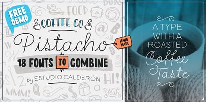 Are you looking for an appropriate typeface for coffee shops concept? We want to introduce Pistacho, the new type family of Estudio Calderon that contains 18 fonts to design great illustrations and to be applied, especially, in coffee shops, bakeries, ice-cream shops, candy stores, pastry shops, fruit shops and all those places where food is the center. Pistacho was designed by hand using pencils and markers that let us get a handcrafted and rough texture. Below, a brief description of each style: Display: A fresh and modern type, perfect to be used in coffee shops outdoor signs. The logotype of “Central Perk”, the coffee shop of the tv show “Friends” was our inspiration to develop this beautiful font that contains 317 characters and three variables: Display 1, Display 2 and Display 3, each one has specific characteristics that will be an excellent resource for your designs. Sans: Style that contains 7 fonts that can be mixed to get interesting finishes in your designs, each variable has 363 characters with standard ligatures and stylistic alternatives. You can find this styles as: Sans 1, Sans 2, Sans 3, Sans 4, Sans 5, Sans 6 and Sans 7. Good news, you can get Sans 5 DEMO for free. Script: Script 1 and Script 2, two monolineal fonts with a generous spacing that provides contrast and movement, being a suitable complement for the rest of the types of Pistacho family. Serif: Font with a lot of style and personality, inspired in the interlock alphabets shown in «Photo-Lettering´s One Line Manual of Style». Serif 1, Serif 2, Serif 3 and Serif 4 contain a great number of ligatures that generate nice compositions by combining them. One of the characteristics of this style is the combination of upper case and lower case giving as a result a different touch in each design. Soft: Humanist type with a rustic texture and geometric forms ideal for long texts and small sizes. Dingbats: We have designed a package of 244 graphics, illustrations and ornaments that are the perfect complement to combine with each font of this family. Get Pistacho type family, enjoy using it… and do not forget your cup of coffee.
 - Esfand by Naghi Naghachian,
$98.00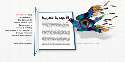 Esfand is a modern Sans Serif font family in three weights, Light, Medium and Bold.The Esfand innovation is a contribution to the modernisation of Arabic typography; gives the Arabic font letters real typographic arrangement and provides for more typographic flexibility. Esfand supports Arabic, Persian, and Urdu and includes proportional and tabular numerals for the supported languages. The Esfand Font family is available in Three weights; Light, Medium and Bold. Its intuitive design arrangement fulfills the following needs: - It is precisely crafted for use in electronic and print media. Esfand is not based on any pre-digital typefaces and it is not a revival. Rather, its forms were created with today’s ever-changing technology in mind. - Esfand is suitable for multiple applications, and gives the widest potential for acceptability. - It is extremely legible not only in its small sizes, but also when the type is filtered or skewed, e.g., in Photoshop or Illustrator. Esfand's simplified forms may be artificially oblique with InDesign or Illustrator, without any degradation of its quality for the effected text. - Esfand is an eye-catching and classy typographic image that was developed for multiple languages use and writing conventions. - Esfand uses the very highest degree of geometric clarity along with the necessary amount of calligraphic references. The Esfand typeface is of a high vibration that is finely balance between calligraphic tradition and the contemporary sans serif aesthetic commonly seen in Latin typography.
 - Jasna by Naghi Naghachian,
$95.00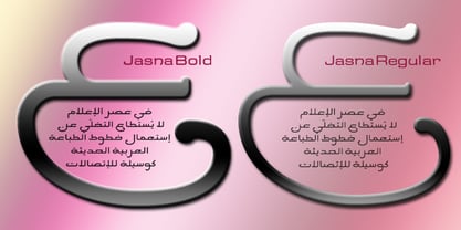 Jasna is designed by Naghi Naghashian. This Font is developed on the basis of specific research and analysis on Arabic characters and definition of their structure. This innovation is a contribution to modernisation of Arabic typography, gives the font design of Arabic letters real typographic arrangement and provides more typographic flexibility. This step was necessary after more than two hundred years of relative stagnation in Arabic font design. Jasna supports Arabic, Persian, and Urdu. It also includes proportional and tabular numerals for the supported languages. Jasna Font is available in two weights, Jasna Regular and Jasna Bold. Jasna design fulfills the following needs: A Explicitly crafted for use in electronic media fulfills the demands of electronic communication. Jasna is not based on any pre-digital typefaces. It is not a revival. Rather, its forms were created with today's technology in mind. B Suitability for multiple applications. Gives the widest potential acceptability. C Extreme legibility not only in small sizes, but also when the type is filtered or skewed, e.g., in Photoshop or Illustrator. Jasna's simplified forms may be artificial obliqued in InDesign or Illustrator, without any loss in quality for the effected text. D An attractive typographic image. Jasna was developed for multiple languages and writing conventions. E The highest degree of geometric clarity and the necessary amount of calligraphic references. This typeface offers a fine balance between calligraphic tradition and the contemporary sans serif aesthetic now common in Latin typography.
 - ITC Werkstatt by ITC,
$29.99ITC Werkstatt is a result of the combined talents of Alphabet Soup's Paul Crome and Satwinder Sehmi, along with Ilene Strizver and Colin Brignall. It is inspired by the work of Rudolph Koch, the renowned German calligrapher, punchcutter, and type designer of the first third of this century, without being based directly on any of Koch's typefaces. Werkstatt has obvious affinities with the heavy, woodcut look of Koch's popular Neuland, but also with display faces like Wallau and even the light, delicate Koch Antiqua. Brignall began by drawing formal letters with a 55mm cap height, which Sehmi reinterpreted using a pen with a broad-edge nib. “Not an easy process,” says Brignall, “since one of the features of Koch's style is that while it was calligraphic in spirit, most of the time his counter shapes did not bear any resemblance to the external shapes, as they would in normal calligraphy. This meant that Sehmi could not complete a whole character in one go, but had to create the outside and inside shapes separately and then ink in the center of the letters.” The process was repeated, only without entirely filling in the outlines, for the Engraved version. Crome handled the scanning and digitization, maintaining the hand-made feel while creating usable digital outlines. “The collaboration of artisans with particular skills,” says Brignall, “in a modern-day, computer-aided studio environment, seems very much in step with the 'workshop' ethos that Rudolph Koch encouraged and promoted so much.” - Parsi by Naghi Naghachian,
$105.00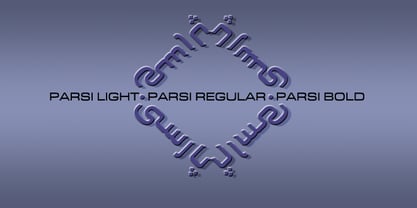 Parsi Font family is designed by Naghi Naghashian. This Font is developed on the basis of specific research and analysis on Arabic characters and definition of their structure. This innovation is a contribution to modernization of Arabic typography, gives the font design of Arabic letters real typographic arrangement and provides more typographic flexibility. This step was necessary after more than two hundred years of relative stagnation in Arabic font design. Parsi supports Arabic, Persian, and Urdu. It also includes proportional and tabular numerals for the supported languages. Parsi Font is available in Light, Regular and Bold. Parsi design fulfills the following needs: A Explicitly crafted for use in electronic media fulfills the demands of electronic communication. Parsi is not based on any pre-digital typefaces. It is not a revival. Rather, its forms were created with today’s technology in mind. B Suitability for multiple applications. Gives the widest potential acceptability. C Extreme legibility not only in small sizes, but also when the type is filtered or skewed, e.g., in Photoshop or Illustrator. Parsi's simplified forms may be artificial obliqued in InDesign or Illustrator, without any loss in quality for the effected text. D An attractive typographic image. Parsi was developed for multiple languages and writing conventions. E The highest degree of geometric clarity and the necessary amount of calligraphic references. This typeface offers a fine balance between calligraphic tradition and the contemporary sans serif aesthetic now common in Latin typography.
 - Crack Babies - Unknown license

- Jerk - Unknown license

- Baronessa by Juraj Chrastina,
$39.00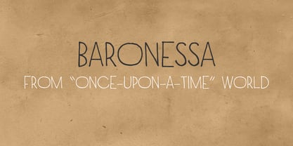 Baronessa is a handmade font with a “once-upon-a-time” world feeling, warm and friendly but not excessively childish. No swashes or ornaments, subtle irregularity and carefully chosen letter shapes make it sweet and funny but not crazy.
 - Random Phrase by Bogstav,
$18.00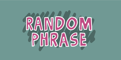 Every now and then you can use a good phrase, and luckily there's a lot to choose from. This font also have a lot to choose from, because I've added 7 different (and hastily written) versions of each letter.
 - Viva Beautiful Collection by Cultivated Mind,
$19.00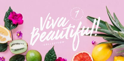 Continue your branding with the ever popular Viva Beautiful font. A new hand-painted brush script collection by Cultivated Mind. Viva Beautiful is back with nine new fonts that include six scripts, a caps font, free words font, free extras and plenty of alternates/ligatures. There are five sets of alternates for every letter adding to the uniqueness of your designs. The new Viva Beautiful scripts are a much cleaner brush script than the original. All scripts come in pro and regular versions. Both versions are Latin Pro. Pro scripts include 260 alternates and 8 common ligatures. Ligatures are programmed to pop up when specific letter pairs are typed. Try the alternates and ligatures together to give your designs a realistic hand-painted look. The all caps font is a basic version that includes 5 common ligatures and looks great paired with the scripts. Regular versions include Latin Pro characters but do not include alternates and ligatures. Viva Beautiful Collection works best for beauty products, music branding, film, television, cookbooks, book covers, food marketing, magazines, and websites. Check out Cultivated Mind Type on Instagram for fun Viva design ideas. Bring beauty to your designs with Viva Beautiful! Fonts designed by Cindy Kinash. Poster designs by Corinne Alexandra.
 - Nautilus Text by Linotype,
$29.99Hellmut G. Bomm first released his Linotype Nautilus typeface in 1999. Ten years later, he updated and expanded the design. Now users have two additional families at their disposal: Nautilus Text and Nautilus Monoline. Nautilus Text bears more similarities to the original Linotype Nautilus. The letters shows a high degree of contrast in their stroke modulation. Bomm's intention was to create a clear, highly legible face. While the even strokes of most sans serif types eventually tire the eyes in long texts, the marked stroke contrast of Nautilus Text lends the face its legibility. The characters were drawn with a broad tipped pen. Like serif typefaces, the forms of Nautilus Text display a variety of elements. Its characters are narrow, with relatively large spaces between them. This helps create an overall open appearance, and allows a large quantity of text to fit into a small space. Nautilus Monoline's letters share the same overall proportions as Nautilus Text's. But as their name implies, they are monolinear. Their strokes do not have the calligraphic modulation that Nautilus Text features. This allows them to set another sort of headline, making Nautilus Monoline a refreshing display type choice to pair with body text set in Nautilus Text. - Nautilus Monoline by Linotype,
$29.99Hellmut G. Bomm first released his Linotype Nautilus typeface in 1999. Ten years later, he updated and expanded the design. Now users have two additional families at their disposal: Nautilus Text and Nautilus Monoline. Nautilus Text bears more similarities to the original Linotype Nautilus. The letters shows a high degree of contrast in their stroke modulation. Bomm's intention was to create a clear, highly legible face. While the even strokes of most sans serif types eventually tire the eyes in long texts, the marked stroke contrast of Nautilus Text lends the face its legibility. The characters were drawn with a broad tipped pen. Like serif typefaces, the forms of Nautilus Text display a variety of elements. Its characters are narrow, with relatively large spaces between them. This helps create an overall open appearance, and allows a large quantity of text to fit into a small space. Nautilus Monoline's letters share the same overall proportions as Nautilus Text's. But as their name implies, they are monolinear. Their strokes do not have the calligraphic modulation that Nautilus Text features. This allows them to set another sort of headline, making Nautilus Monoline a refreshing display type choice to pair with body text set in Nautilus Text. - As SAHA by Sallam Type,
$20.00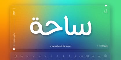 AS SAHA is a contemporary geometric Arabic font, drawn and constructed carefully Font design is inspired by the ARABIC calligraphic style. AS SAHA Its structure is equal and visually controlled. Character forms are a combination of vertical straight lines that integrate visually with soft angles in some areas. This makes it a line of nature suitable for today's technological and visual development. The variations and weights of this font are suitable to use companies in their names and appearance, and also suitable with the titles and logos and is also used in all the requirements of advertising and long texts, use in headlines, logotypes, branding, books, magazines, motion graphics, web and Tv. AS HAREF consists of 6-weight versions from Thin to Bold.
 - Monarky by YXType,
$22.00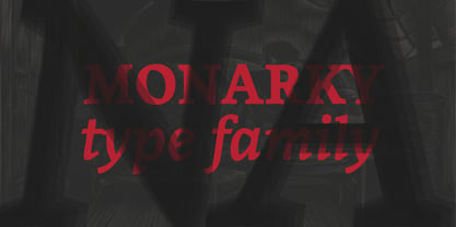 Monark family is designed with legibility and wide language support in mind. Rooted in Fyodor Dostoevsky's Crime and Punishment, it captures the anguish & distortion atmosphere and suppresses them into ruthless letterforms. Top-heavy stems, heavy serifs, and low-contrast forms are all extractions of Dostoevsky's dilemma. Rest assure this typeface would bring you all the needs for advanced typography with true small caps with symbols, 4 styles of figures, support for inferior/superiors, and more than 200 Latin languages. Features: • Support for 200+ Latin languages • Low contrast with unique details • Unique Italic letterforms • Small caps with symbols • Arbitrary and pre-defined fractions • Support for superscript & subscript in normal & scientific alignments • Proportional lining, proportional old-style, tabular lining, tabular old-style
 - YR Qaf by Alrefaiy,
$20.00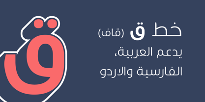 YR Qaf is a clean, modern, and highly legible font. Featuring clear, easy-to-read letterforms with a focus on legibility. The font is carefully crafted with balanced proportions and an emphasis on vertical lines, resulting in a harmonious and streamlined appearance. YR Qaf offers a sleek and modern aesthetic, with exceptional legibility and versatility. Its clean lines and balanced proportions make it a perfect choice for a variety of design projects where clarity and readability are essential. YR Qaf is ideal for a wide range of applications, including branding, web design, editorial design, and more. With a comprehensive set of glyphs, including both upper and lowercase letters, numerals, and symbols, this font can adapt to diverse design needs with ease.
 - Le Bonjour by Vintage Voyage Design Supply,
$14.00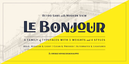 Classic retro sans with some modern looks. Contrast vertical and horizontal lines in Bold style and elegant and airy Light style. This font has no lowercase letters, only the small caps which makes it very suitable for Headers, Logotypes, sub-headers, etc. This family has a French mid-century spirit with the alternate underlined O, inherent in that time, ligatures for L-pairs and T-pairs letters and some decorative alternates for A, C, H, J, O, Q, and U letters. The Le Bonjour has three widths: Bold, Regular and Light. Four styles for Bold and Regular: Clear, Offset Decor Line, Pressed and Stroke. And two styles for Light: Clear and Stroke. (the light style is too narrow for Offset decor and Press styles)
 - AS Haref by Sallam Type,
$23.00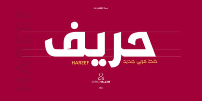 AS HAREF is a contemporary geometric Arabic font, drawn and constructed carefully Font design is inspired by the ARABIC calligraphic style. AS HAREF Its structure is equal and visually controlled. Character forms are a combination of vertical straight lines that integrate visually with soft angles in some areas. This makes it a line of nature suitable for today's technological and visual development. The variations and weights of this font are suitable to use companies in their names and appearance, and also suitable with the titles and logos and is also used in all the requirements of advertising and long texts, use in headlines, logotypes, branding, books, magazines, motion graphics, web and Tv. AS HAREF consists of 7-weight versions from Thin to Heavy.
 - Data Error Horiz AOE Pro by Astigmatic,
$24.00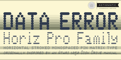 The Data Error Horiz AOE Pro family is a spinoff of my Data Error AOE Pro family. Quite simply, it takes on a slightly different feel than the original pin matrix grid by stroking across all horizontal glyph lines. The horizontal lines add more readability to the original grid and lend a more sci-fi vibe to the family. Check out the range of posters created to see the various Capitals, Lowercase, smallcaps and varying styles that the family has to offer and how it both differs from and compliments the original Data Error AOE Pro family. Be sure to note that the "family" price is the same as the "individual" price, so buy the family for the price of a single font!
 - MBF Alligra by Moonbandit,
$17.00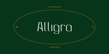 MBF Alligra is a modern geometric display font. It is inspired by a combination of modern digital life and the free will of human nature. This typeface is a perfect choice for urban life theme. Use Alligra as a logo, poster, headline, title, text and many more.
 - P22 Operina by IHOF,
$24.95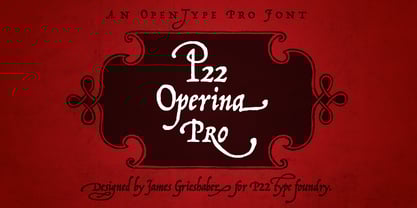 Operina is based on a 16th-century lettering model of the scribe Ludovico degli Arrighi (Vicentino Ludovico degli Arrighi) used in his 1522 instructional lettering book, "La Operina da Imparare di scrivere littera Cancellarescha." This book contains what is considered to be the earliest printed examples of Chancery Cursive. Rather than try to reproduce a perfect, smooth, type-like version of Ludovico's hand, which has been attempted in the past, the designer opted to leave in some rough edges and, thereby, create a look that mimics the endearing artifacts of quill and ink lettering on parchment. When reviving an old style, a designer is faced with many challenging decisions, such as whether to aim for ultimate authenticity or to modify the alphabet for modern use. The decision here was to create a font that resembles the 16th-century Italian hand-lettering master's, but is also useful to the contemporary user. Because the letters U u W w J j and our modern Arabic numerals were not in use during the advent of these original letterforms, these had to be interpolated. To make a complete and useable font set, we also had to fashion many of the extra and diacritical characters to match the look of the alphabet. There are three fonts in this set: Romano(simple), Corsivo(more complex), and Fiore(swash). Romano is the most subdued, it contains Roman looking caps and has lining figures. Corsivo is more elaborate, it has more decorative capital letters and an alternate version of the lowercase with longer ascenders and descenders, and old style figures. Fiore, the swash font, is the most elaborate with the longest ascenders and descenders. You may not wish to use the Fiore version on its own, especially as all caps; it is meant to enhance the other two alphabets because it contains the most elaborate capitals and has many extra ligatures. P22 Operina Pro is an OpenType version that contains over 1200 characters. It features Small Caps, Old Style Figures, full European, Cyrillic and Greek character sets and a new OpenType first with automatic Roman Numerals. Just type any number and with the feature, it will convert to Roman Numerals!
 - Hurringtown Script by OldStudioo,
$16.00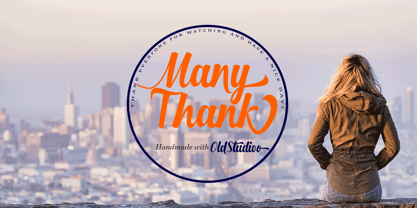 Hurringtown is a collective modern hand lettering. Come with uppercase and lowercase, stylistic set, alternates, multilingual, etc to mix and match your design. This font is perfect for your design, logo, label, badges, apparel design, etc. I also made a design to mix and match pairs of letters to fit your design. Files included: Hurringtown (OTF) Features you get: - Latin A -Z and a – z - Numbers - International Symbols - Multilingual Supports - Alternatives - Ligatures All characters are available through Glyph panel as well, even more each of the alternate letter has it’s own unicode (PUA) so you can copy/paste from Apple Font Book or Windows Character Map. Need to test out a word in this font? Just type it into the box below, and see what it looks like :) That's it! I really hope you enjoy it - please do let me know what you think, comments & likes are always hugely welcomed and appreciated. If you need help or advice, please contact me by e-mail " old.studio87@gmail.com "
 - With Love by Pen Culture,
$17.00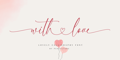 Introducing "With Love Calligraphy Font" With Love is a beautiful calligraphy font that features elegant and flowing letterforms. This font come with ligature and beginning and ending swashes, which are ornamental flourishes that extend from the first or last letter of a word, adding an extra touch of elegance and sophistication to your designs. These swashes are perfect for adding a romantic and intimate feel to your designs. With love also has a unique set of swashes that are shaped like the love sign. These swashes add a romantic and playful touch to the font, and are perfect for projects that require a bit of whimsy and charm. What will you get: With Love OTF With Love TTF With Love WOFF I really hope you enjoy it – please do let me know what you think, comments & likes are always hugely welcomed and appreciated. More importantly, please don’t hesitate to drop me a message if you have any issues or queries. Thank you
 - Willow - Unknown license

- YES! - 100% free

- D3 Calligraphism - Unknown license

- Hoho Christmas by Brithos Type,
$11.00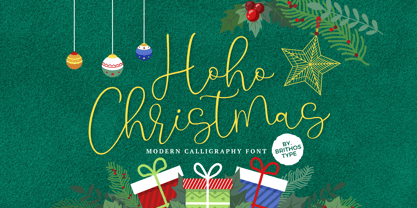 Hoho Christmas is an elegant and flowing handwritten font. Not too thin and not too thick, balanced and varied. Hoho Christmas is perfect for each of your winter designs. Add it confidently to your projects, and you won’t be disappointed.
 - Tanto by Lomax Design,
$17.00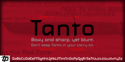 Tanto is a boxy, futuristic sans-serif that is not directly inspired by any particular typestyle, but is more of an exploration of shapes. It has a very modern feel and although very geometric, still has a character that's not robotic.
 - Mamut by Totem,
$29.00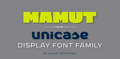 Mamut is a display type family of three weights. It has elegant and distinctive letterforms with lots of character. Mamut is your chunky friend, perfect for designing headlines, logos, labels, lettering works, posters and lots of eye-pleasing typographic works.
 - Daddy The Comicaze by Colllab Studio,
$19.00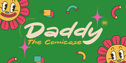 "Hi there, thank you for passing by. Colllab Studio is here. We crafted best collection of typefaces in a variety of styles to keep you covered for any project that comes your way! So, you know the fonts that look like handwriting in the movies by Disney? Well, ours is like that! But it can also be used for other purposes, and it's fun to write with. Daddy The Comicaze is fun handwriting font, it was inspired by our love of cartoons and comic books, but as always, we wanted to add a little bit of humor to it. So we played around with the kerning and spacing until we came up with something that was both fun-looking and easy to read. What else is special about Daddy The Comicaze? Well, for one thing, it includes a lot of different characters! There are tons of punctuation marks and accented letters you won't find in normal fonts. And since it's based on our handwriting style, each character has its own unique personality. Basically, we've taken the best parts of our handwriting and turned them into a beautiful font. A Million Thanks Colllab Studio www.colllabstudio.com
 - BK Claymore by Borislav Korablev,
$45.00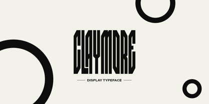 Claymore is an ultra-condensed variable display typeface mainly created for expressive and decorative purposes. Enriched with a wide list of alternates and ligatures which cover a huge range of letter combinations, Claymore can become a powerful weapon to those, who want to make their typographic accents in design bright and unique. Two types of font files are presented to your attention. Check the font names. 1. Basic. Claymore Regular, Oblique, Regular Hollow, Oblique Hollow, Variable, Variable Hollow. Uppercase glyphs only 338 Glyphs including 60 alternates Latin, Latin Extended, and Cyrillic alphabets Two variable fonts to customize height and slant. 2. Basic + Ligatures. Claymore Ligatures Regular, Ligatures Oblique, Ligatures Regular Hollow, Ligatures Oblique Hollow, Variable Ligatures, Variable Ligatures Hollow. Uppercase glyphs only 338 Glyphs including 60 alternates 1054 Ligatures total value (527 unique as they are doubled to be uppercase and lowercase). Latin, Latin Extended, and Cyrillic alphabets Two variable fonts to customize height and slant. Advice on ligatures usage. Ligatures work properly only with uppercase or lowercase typing like UTU or utu. Combination of uppercase and lowercase letters like uTu or UtU will not be considered as ligature. Enjoy using!
 - Sutro Shaded by Parkinson,
$25.00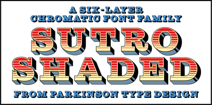 My affection for Slab Serifs began in the early 1960s in Kansas City when Rob Roy Kelly was at the Kansas City Art Institute, teaching and writing his book on American Wood Type. I got to know him just well enough to gain access to his fabulous collection of wood type and wood type catalogs. Later, in the1970s, I tried to re-create a Nebiolo Egiziano for Roger Black at New West magazine. And again for Roger, in the 1980s, I designed a Slab Serif logo for Newsweek Magazine. Finally, in 2003, designed the Sutro Family. There were things I didn't like about it, so, over time, I’ve been adding some things and dressing it up a little. Sutro Shaded has existed for a few years as a one color, outlined, drop-shadowed display font. It seemed like it was just dying for a little color. I added five more fonts: Fill, Gradient, Hatching, Rules and HiLite. These fonts can be used in different combinations to achieve various effects. There is a downloadable SUTRO SHADED USER MANUAL PDF in the Gallery section for this family.
 - Quiller by Canada Type,
$24.95Quiller is another catch from the hot metal days, another one that managed to slip through the fingers of both the photo-typers and digitizers of last 4 decades. JJ Sierke’s Privat design from 1966 is now resurrected and heavily extended to be used by computer users everywhere. The original design was revived, and two whole new fonts were added to it - one with very unique swash caps and alternates, and one with many many ligatures and letter-combination ornaments. Quiller is a cross between brush calligraphy and very casual fast handwriting. It even has a slight Arabic simulation to it. Given such traits, the addition of a swash font and a multitude of ligatures comes in very handy to keep the natural flow of the font and maintain the elegance of its spirit. Those who like the auto-magic of OpenType’s intelligent substitution should like the fact that the OTF version is a single font with all the bells and whistles ready to go in the swash and discretionary ligatures features. If you use the latest versions of Adobe programs, the OTF version of Quiller is highly recommended. - Spring Blush by Supfonts,
$17.00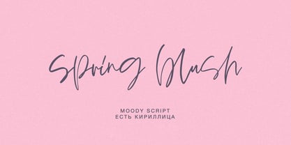 Here's my new experiment. This font breaks the boundaries even more. And most importantly, this font fully supports Cyrillic! Now you can diversify your projects, create cards and greetings, posts and titles for blogs. The scope is huge. Plus it's fresh, not like other fonts - the ability to stand out from the crowd! --- Здравствуйте, друзья. Вот мой новый эксперимент. Этот шрифт еще больше нарушает границы.И самое главное, он полностью поддерживает кириллицу! Теперь вы можете разнообразить свои проекты, создавать открытки и поздравления, посты и заголовки для блогов. Область применения просто огромна. Плюс это свежий, не похожий на другие шрифт - возможность выделиться из общей массы! --- - Fully supports Cyrillic - Uppercase and lowercase - Numbers and punctuation - Foreign language support - Ligatures Check out my blog: - https://www.instagram.com/zloillev - pinterest.com/dmitriychirkov7 Enjoy!
 - Unione GX by TOMO Fonts,
$32.00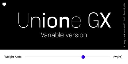 UnioneGX by TOMO FONTS is the variable version of Unione. A clean and modern sans-serif type family with a geometric touch. It has a single axes (Weight / Wgth) that you can control with a slider on Desktop apps or you can use it for the web, dramatically reducing file size for your web project. It's like magic! but no. If you want to learn more about variable fonts, please click here or if your are interested in web context read here. Geometric and modern Sans-Serif VARIABLE FONT! This means, you control the weight! 1000+ glyphs per font. Latin Plus support, Extended Latin Cyrillic support, Basic & Extended Fractions Circled Numerals & Letters Lots of Stylistic Alternates Interested in Unione 'static' family? Check it here


