10,000 search results
(0.033 seconds)
- PlainPensle by Ingrimayne Type,
$14.95 As its name suggests, PlainPensle is a handwriting font that emulates printing and writing with a pencil or ballpoint pen. The plain and bold styles have hand printing that is ordinary and nondescript. The italics and bolditalics contain simple handwritten cursive.
 - Breton by Latinotype,
$29.00 Breton is a geometric slab serif typeface inspired by Boston. Breton has a strong personality and it is an ideal face for headings and branding design. Its most noticeable characteristic is a great difference of proportions between rounded characters (like "o", "c" or "e") and non-rounded ones (like "n", "m" or "z"). By combining them, you will be able to give your compositions a very unique rhythm. Each font style comprises 417 characters, which support more than 200 Latin-based languages, as you would expect from Latinotype fonts. Breton comes in 10 styles, from Hair to Black, and includes matching italics. Breton was designed by Daniel Hernández and Rodrigo Fuenzalida.
 - Vandotta by Flawlessandco,
$9.00 Introducing Vandotta, a dynamic and powerful sport display font designed to make a bold statement. With its sleek lines and strong geometric shapes, Vendetta embodies the spirit of competition and athleticism. There's some connected letters and some alternates that suitable for any graphic designs such as branding materials, t-shirt, print, business cards, logo, poster, t-shirt, photography, quotes .etc This font support for some multilingual. Also contains uppercase A-Z and lowercase a-z, alternate character, numbers 0-9, and some punctuation. If you need help, just write me! Thanks so much for checking out my shop!
 - Filarion by Locomotype,
$15.00 Filarion is inspired by a bit of 60s typography. At first glance it looks contrasting but is executed in a different way. The lines are drawn irregularly so that it looks casual and not stiff. From a clean basic form (Regular), Filarion was developed into three different variants, namely Bulbous, Noetic and Print. Each of them has an oblique style. So you will get 8 fonts from Filarion family. This font is suitable for use as a title in broadcast videos, movies or poster designs. It can also be used on quotes and other promotional materials that require extra attention.
 - Camaro by Flawlessandco,
$9.00 Introducing "Camaro" - a dynamic and high-octane racing display font that embodies speed, excitement, and adrenaline. Camaro showcases a strong and sleek design that mimics the aerodynamic lines of racing cars. There's some connected letters and some alternates that suitable for any graphic designs such as branding materials, t-shirt, print, business cards, logo, poster, t-shirt, photography, quotes .etc This font support for some multilingual. Also contains uppercase A-Z and lowercase a-z, alternate character, numbers 0-9, and some punctuation. If you need help, just write me! Thanks so much for checking out my shop!
 - Sagira by Flawlessandco,
$9.00 Introducing "Sagira" - A Retro Display Font. Travel back in time with "Sagira," a nostalgic retro display font that pays homage to the past, complete with charming wavy line details that evoke a sense of vintage flair. There's some connected letters and some alternates that suitable for any graphic designs such as branding materials, t-shirt, print, business cards, logo, poster, t-shirt, photography, quotes .etc This font support for some multilingual. Also contains uppercase A-Z and lowercase a-z, alternate character, numbers 0-9, and some punctuation. If you need help, just write me! Thanks so much for checking out my shop!
 - SK Rohkea by Shriftovik,
$48.00 SK Rohkea is a modular display typeface that combines strict geometry and smoothness of lines. The main features of the typeface are the constant inclination of the oval and the elongation of forms. They give the typeface a unique character, especially when it is used in large inscriptions and headings. The SK Rohkea typeface has capital and lowercase letters that support the extended Latin and Cyrillic set and even icons! Thanks to the combination of modernity and refinement, the typeface is great for the widest range of design tasks, no matter whether it is printing or web design.
 - Gene Condensed JNL by Jeff Levine,
$29.00 Gene Gable is known to many graphic artists from his on-line column 'Scanning Around with Gene', which was on the Creative Pro website for a number of years, covering a variety of topics ranging from printing techniques to paper ephemera; water applied decals to lettering stencils. Gene has also been a great help in providing vintage source material to Jeff Levine, which resulted in many additional font designs. It seems only fitting that he should be bestowed with his own-named font as well. Gene Condensed JNL is offered in both regular and oblique versions.
 - Remixa by Narrow Type,
$35.00 Introducing Remixa, a cutting-edge modern sans-serif typeface that seamlessly incorporates elements from serif typefaces, resulting in a truly unique and captivating design. Remixa boasts a carefully crafted set of six weights, ranging from light to bold, allowing for versatile usage across a wide range of design projects. Each weight has been meticulously balanced to ensure optimal legibility and visual impact, empowering designers to create captivating and expressive compositions. Its clean lines and subtle serif-inspired details create a harmonious blend that stands out in both digital and print media. Experience the essence of modernity and timeless elegance with Remixa.
 - Chanley by Flawlessandco,
$9.00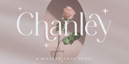 Chanley, a sleek and sophisticated modern serif font that is sure to make a statement. With its clean lines and contemporary design, Chanley strikes the perfect balance between elegance and versatility. An Original typeface that suitable for any graphic designs such as branding materials, t-shirt, print, business cards, logo, poster, t-shirt, photography, quotes .etc This font support for some multilingual. Modern Sweet Retro that contains uppercase A-Z and lowercase a-z, alternate character, numbers 0-9, and some punctuation. If you need help, just write me! Thanks so much for checking out my shop!
 - Nubian by G-Type,
$39.00 Nubian was one of the first typefaces ever designed by G-Type and is an elegantly proportioned, crisply modern sans serif family. Comprising five weights from Thin to Bold with true matching italics, each font also includes two sets of figures (lining and old-style numerals) and an extended European character set. Nubian has a noticeably open, semi extended appearance providing very even 'colour' and excellent legibility when set as text. The contemporary letterforms work well at all sizes in print and on screen making Nubian a great choice across all media. The family has been updated to OpenType with extended language coverage.
 - Salva by Flawlessandco,
$9.00 Introducing "Salva" - An Elegant Display Font. Prepare to be captivated by the distinctive allure of "Salva," an elegant display font that weaves waves into every line of its letters, redefining elegance with its truly unique design. There's some connected letters and some alternates that suitable for any graphic designs such as branding materials, t-shirt, print, business cards, logo, poster, t-shirt, photography, quotes .etc This font support for some multilingual. Also contains uppercase A-Z and lowercase a-z, alternate character, numbers 0-9, and some punctuation. If you need help, just write me! Thanks so much for checking out my shop!
 - Edda Script by URW Type Foundry,
$35.99 Edda Glaser’s digitized handwriting is a beautiful script containing many ligatures and alternates. The first lines were drawn in 2012 – however, there are now over 850 glyphs! The elegant and light typeface combines both connected and separate characters, in this way gaining a dynamic flow. The Open Type Features allow you to choose glyph alternates for the beginning and end of words. The script also contains lots of numbers as old-style and titling figures as well as sub- and superscript figures. The many alternates and swash uppercase letters let you create a versatile look which suits designing magazine and other print media.
 - Meguro Sans by GT&CANARY,
$27.00 Meguro Sans has a modern-styled boxy shape that achieves clean, industrial yet friendly style lends itself well to brand building. Its mono-line oriented and very high X-height ensure that it is extremely legible and creates a strong impression. Meguro Sans is Sans serif version of Meguro Serif. The Meguro sans font family is comprised of 10 styles with 5 different weights from light to black, along with matching italics offering possibilities for use in web, print, package and sign design, all with the goal of building an established look for brands in wide range of industries.
 - Strom by Lasse Strøm,
$35.00 STROM is а modern sans serif font with minimalistic and geometric characters. The rounded corners give the typeface a friendly look, yet it retains a professional quality. The attention to detail paid during its development means that this typeface offers a vast range of design possibilities – and helps users create eye-catching designs. The different font styles are built on the same foundation, so they can be mixed and matched while maintaining a harmonious look. The simple, clean lines make it noticeable and ideally suited in display settings, advertising, packaging, logo, branding, poster, billboards, film, television, web, screen and print design.
 - OC Blimp by OtherwhereCollective,
$99.00The inflatable font you never knew you always wanted! With its two axes you can literally blow this variable display font up and watch it float away… Uppercase display font built on OC Format Sans Print Bd Support for 84 languages 6 preset static Inflate styles gradually inflate and stay on the baseline. 6 preset static Float styles gradually inflate and rise from the baseline. Baseline punctuation and certain symbols don’t float to provide a grounded context. Various un-inflatable symbols carry over from Format Print Bd because they might come in handy as is. With a complete alternate set and double number ligatures years and zip codes don’t look repetitive (think 1991 – 10022 that sort of thing) Double letter ligatures prevent visual repetition in words like “balloon” and “coffee”. - Chunkfeeder by Typeco,
$29.00Chunkfeeder was inspired by the many vernacular forms of lettering created for high speed printing and electronic displays found in our modern techie world such as postal packing slips, airline tickets and informational video displays. Many of these type of fonts are designed by engineers and interface designers who presumably do not have a background in letterform design and consequently these glyphs have many quirky idiosyncrasies. In keeping with it's mechanical inspiration, Chunkfeeder is a monospaced font, much like an OCR type font. Chunkfeeder has a rather ridged modularity but it incorporates more typographic nuance into the letterforms than most other fonts of this style, while exploiting some of the visual artefacts of high speed printing. Chunkfeeder is a versatile family of 6 fonts -- 3 weights, each with an accompanying oblique. - Revolution Gothic P by Dharma Type,
$19.99 Revolution Gothic P font family is designed based on Revolution Gothic and a distressed offshoot from the original. Revolution Gothic is an arranged and extended version of PAG Revolucion released from Prop-A-Ganda type foundry in 2008. The original font is inspired by retro propaganda posters and wallpainting in Cuba from the 60s to 80s. And the original PAG Revolucion is the most popular font from Prop-A-Ganda. The glyphs that damaged by printing the original had been tweaked by hand work with great care to be looked like natural damaged effect. This Revolution Gothic P family contains basic Roman, Italic, Bold and it’s Italic to suit a wide range of your creative works and it will be one of the most powerful solutions for printing and web.
 - Antique by Storm Type Foundry,
$26.00The concept of the Baroque Roman type face is something which is remote from us. Ungrateful theorists gave Baroque type faces the ill-sounding attribute "Transitional", as if the Baroque Roman type face wilfully diverted from the tradition and at the same time did not manage to mature. This "transition" was originally meant as an intermediate stage between the Aldine/Garamond Roman face of the Renaissance, and its modern counterpart, as represented by Bodoni or Didot. Otherwise there was also a "transition" from a slanted axis of the shadow to a perpendicular one. What a petty detail led to the pejorative designation of Baroque type faces! If a bookseller were to tell his customers that they are about to choose a book which is set in some sort of transitional type face, he would probably go bust. After all, a reader, for his money, would not put up with some typographical experimentation. He wants to read a book without losing his eyesight while doing so. Nevertheless, it was Baroque typography which gave the world the most legible type faces. In those days the craft of punch-cutting was gradually separating itself from that of book-printing, but also from publishing and bookselling. Previously all these activities could be performed by a single person. The punch-cutter, who at that time was already fully occupied with the production of letters, achieved better results than he would have achieved if his creative talents were to be diffused in a printing office or a bookseller's shop. Thus it was possible that for example the printer John Baskerville did not cut a single letter in his entire lifetime, for he used the services of the accomplished punch-cutter John Handy. It became the custom that one type founder supplied type to multiple printing offices, so that the same type faces appeared in various parts of the world. The type face was losing its national character. In the Renaissance period it is still quite easy to distinguish for example a French Roman type face from a Venetian one; in the Baroque period this could be achieved only with great difficulties. Imagination and variety of shapes, which so far have been reserved only to the fine arts, now come into play. Thanks to technological progress, book printers are now able to reproduce hairstrokes and imitate calligraphic type faces. Scripts and elaborate ornaments are no longer the privilege of copper-engravers. Also the appearance of the basic, body design is slowly undergoing a change. The Renaissance canonical stiffness is now replaced with colour and contrast. The page of the book is suddenly darker, its lay-out more varied and its lines more compact. For Baroque type designers made a simple, yet ingenious discovery - they enlarged the x-height and reduced the ascenders to the cap-height. The type face thus became seemingly larger, and hence more legible, but at the same time more economical in composition; the type area was increasing to the detriment of the margins. Paper was expensive, and the aim of all the publishers was, therefore, to sell as many ideas in as small a book block as possible. A narrowed, bold majuscule, designed for use on the title page, appeared for the first time in the Late Baroque period. Also the title page was laid out with the highest possible economy. It comprised as a rule the brief contents of the book and the address of the bookseller, i.e. roughly that which is now placed on the flaps and in the imprint lines. Bold upper-case letters in the first line dramatically give way to the more subtle italics, the third line is highlighted with vermilion; a few words set in lower-case letters are scattered in-between, and then vermilion appears again. Somewhere in the middle there is an ornament, a monogram or an engraving as a kind of climax of the drama, while at the foot of the title-page all this din is quietened by a line with the name of the printer and the year expressed in Roman numerals, set in 8-point body size. Every Baroque title-page could well pass muster as a striking poster. The pride of every book printer was the publication of a type specimen book - a typographical manual. Among these manuals the one published by Fournier stands out - also as regards the selection of the texts for the specimen type matter. It reveals the scope of knowledge and education of the master typographers of that period. The same Fournier established a system of typographical measurement which, revised by Didot, is still used today. Baskerville introduced the smoothing of paper by a hot steel roller, in order that he could print astonishingly sharp letters, etc. ... In other words - Baroque typography deserves anything else but the attribute "transitional". In the first half of the 18th century, besides persons whose names are prominent and well-known up to the present, as was Caslon, there were many type founders who did not manage to publish their manuals or forgot to become famous in some other way. They often imitated the type faces of their more experienced contemporaries, but many of them arrived at a quite strange, even weird originality, which ran completely outside the mainstream of typographical art. The prints from which we have drawn inspiration for these six digital designs come from Paris, Vienna and Prague, from the period around 1750. The transcription of letters in their intact form is our firm principle. Does it mean, therefore, that the task of the digital restorer is to copy meticulously the outline of the letter with all inadequacies of the particular imprint? No. The type face should not to evoke the rustic atmosphere of letterpress after printing, but to analyze the appearance of the punches before they are imprinted. It is also necessary to take account of the size of the type face and to avoid excessive enlargement or reduction. Let us keep in mind that every size requires its own design. The longer we work on the computer where a change in size is child's play, the more we are convinced that the appearance of a letter is tied to its proportions, and therefore, to a fixed size. We are also aware of the fact that the computer is a straightjacket of the type face and that the dictate of mathematical vectors effectively kills any hint of naturalness. That is why we strive to preserve in these six alphabets the numerous anomalies to which later no type designer ever returned due to their obvious eccentricity. Please accept this PostScript study as an attempt (possibly futile, possibly inspirational) to brush up the warm magic of Baroque prints. Hopefully it will give pleasure in today's modern type designer's nihilism. - IM FELL FLOWERS 1 - Unknown license

- Monarda by Monotype,
$29.99 Monarda™ is Terrance Weinzierl’s take on the loud and splashy brush scripts of the 1950s. It’s energetic, playful, and equally at home in hardcopy headlines as it is in interactive banners. In addition to the basic alphabet, OpenType® fonts of Monarda are also awash in super-sized swash caps, contextual alternate characters and ligatures. Pair Monarda with a mid-century structural sans like Trade Gothic® or a sturdy slab serif like Egyptian Slate™ to create typographic counterpoint that’s confident, compelling and memorable! Named for a riotous bright red flower that attracts butterflies and humming birds, Monarda is a rare combination of flamboyance and effortless beauty. Weinzierl describes it as “casual yet precise: a stiff denim jacket or perfectly white sneakers at a formal event.” Monarda clearly stands out – and always fits in. Well, almost always. Drawn for print, the design’s robust x-height, open counters and wide apertures also make Monarda screen-friendly. Monarda can be perfect for a wide variety of food and lifestyle applications as well as travel, stationery and packaging projects. Advertising campaigns and product branding are also well within its reach. Monarda works best when used large – but economically. Two or three words are its sweet spot. Think: product name, print headline or the lettering on the side of a truck. It could easily become your go-to design for projects that call for a script with a bright personality and fearless demeanor. The excellence of Weinzierl’s work has been recognized by the Type Directors Club and Print Magazine. When not working on creating new typefaces, he augments his professional practice through calligraphy, lettering, and letterpress printing. Monarda is another winner from Weinzierl’s creative mind and talented hand.
 - Fidusmager by PizzaDude.dk,
$17.00 This is definitely a font suitable for kids toys. The letters are legible, and at the same time totally wacky! Kinda like what a kids toy should be! Fidusmager started out as a handdrawn, slightly rugged looking fon. However I ended up manually tracing each letter in order to have those smooth lines. By the way, Fidusmager is danish and actually means someone who’ll trick you - but as a kid I didn’t know that, and found that it most likely was something positive! :)
 - Poquito by La Boîte Graphique,
$15.00 Hand-printed caps font ideal for your graphic project.
 - Uni Magnetic by Substance,
$10.00 Hand drawn, photocopied, scanned, printed and rescanned x 3.
 - Squaripeg by Andy Peat,
$9.00 About this font family Squaripeg is a funky square typeface with geometric shapes to create impactful headlines and web banners. This typeface was designed so that it takes up less horizontal space but still has a lot of prominence on the page. Some letters have been combined into one unit to save further space. Features 8 weights (from thin to black) Multi language Ligatures To be able to access alternative fonts, make sure the software you use can support opentype features such as Microsoft Word, Paint, Adobe, Corel draw, Cricut and other applications. Designed and published by Andy Peat. Released April 2022
 - LTC Archive Ornaments by Lanston Type Co.,
$24.95 Unlike previous dingbat fonts released from Lanston Type Co., Archive Ornaments derives from a unique collection of brass ornament plates that were originally used in creating the matrices for casting metal type. Using the plates as a reference point allowed for a more precise rendering of the ornaments. Letterpress prints were made directly from the brass plates, which were then re-drawn and digitized. Each character has been optimized for the combination of decorative borders and patterns as well as individual accentuation. The completed digitized font contains over 100 glyphs, ranging in style from geometric to organic designs.
 - Mingler by Chank,
$99.00 The Mingler fonts have a great big smile and a crisp clear voice. They were originally created as a branding font for a restaurant chain to use in coupons, print ads and tv commercials. More recently this font is picking up popularity as a multi-purpose headline font for screens. It looks good on the web, in games and on-screen apps. Inspired by the subtle bends and flow of hand-painted signage, each stroke bends a bit in the middle and flairs out a bit on the ends. And look at that "e" —it is smiling!
 - MVB Gryphius by MVB,
$39.00MVB Gryphius is a digitization of uncommon type from an era normally associated with the work of Nicolas Jenson. Produced by Otto Trace, the fonts come from types used by Sebastian Gryphius in Lyon in the early 16th century. The italic appears in a book from 1524 and the roman and small caps appear with the same italic in another book printed by Gryphius in 1541. Retaining the rough contours and uneven texture of its source, MVB Gryphius is best used at text sizes from 12- to 15-point, but its old world character can work in display settings too. - CCS Wakatobi by Creative Corner Studio,
$19.00 Introducing Wakatobi, our newest font creation that exudes power and beauty through its condensed sans serif display. With a distinctive character and unique form, Wakatobi is a formidable typeface designed to captivate attention. Ideal for magazine spreads, covers, and posters in large print, this massive font is tailored for titles and wide spaces. Specifically crafted for covers and posters, Wakatobi ensures it doesn't go unnoticed, making a bold impact without compromising style or legibility. Whether in large-scale designs or smaller point sizes, Wakatobi stands out, delivering a visual punch that resonates with both impact and elegance.
 - TF The Fest by Tyfomono,
$29.00 Take your design game to the next level with a bold, thick and expressive font that truly looks hand painted. The Fest uses authentic looking fonts and is sure to grab the attention of customers and designers alike. We made 2 styles for The Fest, it lets you explore and improve the personality of your design works. This version is also great for blocks of text and small print. Slanted - With a little improvement for the slanted version, The Fest Slanted is fit for the any size. These style is alternative of your choices for the look.
 - Rattani by Allmo Studio,
$22.00 Rattani the graceful nature of the typeface, along with carefully designed details, allows to use it in large point sizes, for example in magazine layouts, packaging design and in many other ways. Rattani was unapologetically conceived as a display typeface meant to be used large as in magazine openings, drop caps or everywhere there’s a need for elegant impact. Rattani is perfect choice for people looking for clean, modern, minimalist, elegant, beauty design styles. Suitable for almost any graphic designs such as logo, business cards, t-shirt, cover, branding materials, poster, print, photography, thumbnail, gift cards.etc
 - Public Interest by Bogstav,
$16.00 Public Interest in my all caps fine looking handmade font. Each letter has 5 different versions and they automatically cycle as you type - making your text look even more lively and vibrant!
 - Bluebottle by Greater Albion Typefounders,
$14.50 Bluebottle is a lively fun family of typefaces, a boisterous fun design, BLuebottle brings a distinctive cheerful character where ever it's used. Use Bluebottle to bring life and fun wherever you will.
 - Vivian Script by Vástago Studio,
$19.95 Vivian Script was designed from the study of typeface references like Doyald Young. It has optical adjustment in the details and funny contrasts to get an amazing result. It can used to be applied on different commercial topics like street wear, food and traveling for tourism. This is Vivian Script, the love of my life.
 - Vandal Lineros by Sipanji21,
$17.00 Vandal Linerous sounds like a cool graffiti typeface. Graffiti fonts often have a unique and artistic style that can add an edgy and urban feel to various design projects. If you have any specific questions or if there's anything specific you'd like to know or discuss about graffiti fonts or design, feel free to ask!
 - JBP Pro by PizzaDude.dk,
$25.00 Wicked, cheeky and geeky! That's what went through my mind when updating this font. Originally made around year 2000, and now it comes in a restored and updated version. I cleaned up all curves and lines, added multilingual support and kerning. Based upon classic typefaces like Bodoni and Baskerville, but far more unpredictable and wild.
 - Terfens by insigne,
$24.99 Terfens is a sans serif with inspiration from chancery scripts like Stefania. Subtly rounded and eschewing harsh technical lines, Terfens is a warm and inviting typeface. Its tall x-height gives it a friendly but not overly informal feel. Its readability and unique contemporary look makes it suitable for a wide range of design applications.
 - ALS Agrus by Art. Lebedev Studio,
$63.00 Agrus in Ukrainian means "gooseberry". The letters are rounded like the berries and the sharp end elements remind of the barbs. In fact, the font is an intricate italic type. Optical compensations are purely decorative and rhyme with thin connecting lines. Design of this font is one hundred percent due to “strength of material”
 - Shaken, Not Stirred by Hanoded,
$15.00 Shaken, Not Stirred. A famous line from just about every James Bond movie (yes, we're talking Martini-time). The font is also quite shaken (and not stirred). It looks like someone scrawled something onto paper, or etched the letters in metal. Shaken, Not Stirred comes with a set of diacritics befitting a Secret Agent.
 - Rephran by Mirror Types,
$20.00 Rephran is a font completely designed by hand, with brush and black indian ink,all the lines were softly made by hand. Every letter is like a piece of art, including the numbers and signs. Check the PDF in the gallery section to see the details. It includes Capitals, lower case letters, Signs and Numbers.
