10,000 search results (0.02 seconds)
  1. VegasTWENTYTWO - Unknown license
  2. Rubbed - Unknown license
  3. SF Foxboro Script - Unknown license
  4. SF Foxboro Script Extended - Unknown license
  5. SF Cartoonist Hand SC - Unknown license
  6. SF Foxboro Script Extended - Unknown license
  7. SF Cartoonist Hand - Unknown license
  8. NewStyle - Unknown license
  9. Alphawave - Unknown license
  10. SF Cartoonist Hand SC - Unknown license
  11. SF Zimmerman - Unknown license
  12. Critical Mass - Unknown license
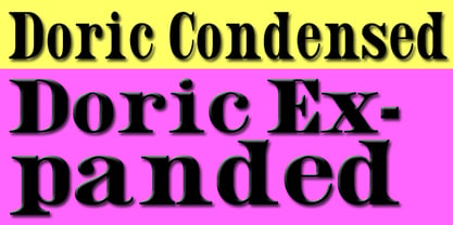
  13. Doric by Wooden Type Fonts, $15.00
    A revival of one of the popular wooden type fonts of the 19th century, suitable for text.
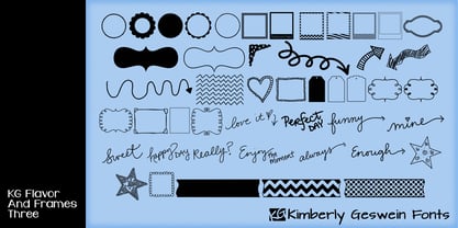
  14. KG Flavor And Frames Three by Kimberly Geswein, $5.00
    Frames and borders of various types. Also includes a series of words perfect for accenting Instagram photos.
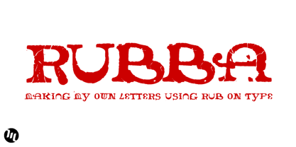
  15. Rubba by MADType, $19.00
    Rubba was created using rub-on type to create completely new letterforms from the bits of others.
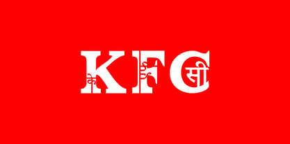
  16. Habibi by Habibi Shaikh, $99.00
    Its Indian language Hindi/Marathi mixed with English alphabets for exp. A mixed with Hindi type (A)
  17. Wynwood JNL by Jeff Levine, $29.00
    Wynwood JNL is a wider treatment of the same vintage wood type source used for Broadletter JNL.
  18. Clarendon Condensed by Wooden Type Fonts, $15.00
    A revival of one of the popular wooden type fonts of the 19th century; suitable for text.
  19. Number 154 by Wooden Type Fonts, $15.00
    A revival of one of the popular wooden type fonts of the 19th century. Suitable for display.
  20. Gothic by Wooden Type Fonts, $15.00
    Gothic Bold Condensed, first shown in 1889 by Hamilton wooden type founders. With lowercase. Gothic Bold Expanded.
  21. Northfork JNL by Jeff Levine, $29.00
    Northfork JNL is based on a William H. Page wood type alphabet called Parisian, circa 1857-58.
  22. Clarendon Heavy by Wooden Type Fonts, $15.00
    A revival of one of the popular wooden type fonts of the 19th century, suitable for display.
  23. Gargoyle by Red Rooster Collection, $45.00
    Based on an Adrian Williams design, circa 1976 and Brook Type in 1903 designed by Lucien Pissaro.
  24. Mayville JNL by Jeff Levine, $29.00
    Mayville JNL is a re-drawing of an all-caps Clarendon Wood Type font from the 1800s.
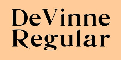
  25. De Vinne by Wooden Type Fonts, $15.00
    A revival of one of the popular wooden type fonts of the 19th century; suitable for text.
  26. Columbian Slab by Wooden Type Fonts, $20.00
    One of the classic display types of the 19th century, an Egyptian with slab serifs. Quite bold.
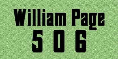
  27. William Page 506 by Wooden Type Fonts, $15.00
    A revival of one of the popular wooden type fonts of the 19th century, somewhat condensed, square.
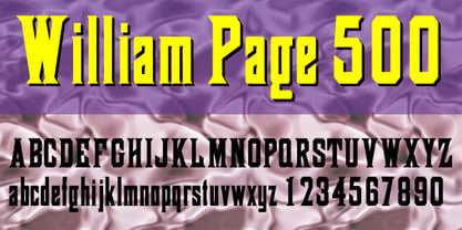
  28. William Page 500 by Wooden Type Fonts, $15.00
    A revival of one of the popular wooden type fonts of the 19th century, somewhat condensed, square.
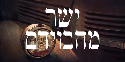
  29. Shtetl MF by Masterfont, $59.00
    Inspired by traditional old Biblical type, this font has a rich and unique style, with modern touch.
  30. Antique Three by Wooden Type Fonts, $15.00
    A revival of one of the popular wooden type fonts of the 19th century, suitable for text.
  31. Columbian by Wooden Type Fonts, $20.00
    One of the classic display types of the 19th century, an Egyptian with bracketed serifs. Quite bold.
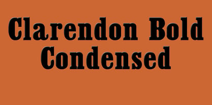
  32. Clarendon Condensed Bold by Wooden Type Fonts, $15.00
    A revival of one of the popular wooden type fonts of the 19th century, suitable for display.
  33. Schrodingers Signature by Ferry Ardana Putra, $12.00
    Schrödinger's is a remarkable signature font which was made hand-drawn manually using Hitech-C pen, This typeface is very natural-like and make your design stand out! Schrödinger's is perfect for gorgeous logos, cards, quotes, posters, wedding invitations, blog posts, social media, and more! To keep it more natural-like, we provide you hundreds of ligature! Schrödinger's font contains following ligatures: aa ab ac ad ae af ah ak al am an ar as and ant at att all av aw ax ay az bb bl bt cc cd ce ch ck cl cm cn cr cs ct db dd dl dt ea eb ec ed ee ef eh ek el em en er es end ent est et ett ell ev ex ey ez ff fi fl fo gh ght gt he ht ib ic idd ie if ih ik il im in ir is ind int ist it itt ill iv ix iy iz kk la le ll lt mm mt ns nt oa oe of oh oi ok ol om oo or os ond ont ost ot ott oll ov ow ox oy oz pp rr sh sl ss st th the tl tt ub uc ud ue uf uh uk ul um un ur us und unt ut utt ull uv uw ux uy uz wh yy zz nn Not only that, we also include swashes and love swashes for those who interested in valentine stuff! Schrödinger's features: A full set of upper & lowercase characters Numbers & punctuation Multilingual language support PUA Encoded Characters +418 Glyph Up to 163 Ligatures Swashes OpenType Features In order to use the beautiful swashes, you need a program that supports OpenType features such as Adobe Illustrator CS, Adobe Photoshop CC, Adobe Indesign and Corel Draw. For more information about accessing alternative, you can see this link: http://adobe.ly/1m1fn4Y
  34. Defense by Reserves, $49.00
    Defense is an unyielding rectangular slab-serif stencil face designed with consistently balanced letterforms and a refined finish. It’s extremely angular geometric form commands attention in display settings, yet is also legible in short text blocks. The stencil mark width varies accordingly with each weight, helping to further define each style. Numerous alternate character sets allow room for customization, while the expanded ligatures push letter combinations to the limit. Stylistically, Defense’s almost crude, sharp-cornered construction is balanced by it’s sophisticated finish and attention to detail, often unrealized in similar faces of this genre. The upright weights are complimented by pairings of true italics, completely rebuilt, slightly narrower in width with modified letterforms, increasing their contrast and flow. Features include: Precision kerning Standard Ligatures set including 'f' ligatures (fi, fl, ff, fh, fj, ffl, ffi, ffj) Discretionary Ligatures set including (ft, rt, ae, oe, st, ft, ct, oc, oo, ry, AE, OE, AL, TH, HE, AK, AN, TT, HD, AM, AP, AR, NF, NE, NH, NL, NB, FL, ND, FE, AB, OB, OD, OF, OG, OH, OK, OL, OM, ON, OO, OP, OQ, OR, OU, AH, UE, UF, UB, UD, UH, UK, UL, UM, UN, UP, UR, UU, MP, XY, YX, KY, WY, VY, AF, FF, FI) Alternate characters (O, o, S, s, a, h circumflex, @, ®, ™, ¶, $, &, _, and various ligature alternates) Case forms (shifts various punctuation marks up to a position that works better with all-capital sequences) Capital Spacing (globally adjusts inter-glyph spacing for all-capital text) Slashed zero Full set of numerators/denominators Automatic fraction feature (supports any fraction combination) Extended language support (Latin-1 and Latin Extended-A) *Requires an application with OpenType and/or Unicode support.
  35. DeDisplay by Ingo, $24.99
    A type designed in a grid, like on display panels Type is not only printed. There were always and still are a number of forms of type versions which function completely differently. Even very early in the history of script there were attempts to combine a few single elements into the diverse forms of individual characters and also efforts to construct the forms of letters within a geometric grid system. The “instructions” of Albrecht Dürer are probably most well-known. But although designers of past centuries assumed the ideal to basically be an artist’s handwritten script, the idea which developed in the course of mechanization was to “build” characters in a building block system only by stringing together one basic element — the so-called grid type was discovered, represented most commonly today by »pixel types.« But even before computers, there were display systems which presented types with the help of a mechanical grid display, like the display panels in public transportation (bus, train) or at airports and train stations. In a streetcar, I met up with a modern variation of this display which reveals the name of each tram stop as it is approached. This system was based on a customary coarse square grid, but the individual squares were also divided again diagonally in four triangles. In this way it is possible to display slants and to simulate round forms more accurately as with only squares. The displayed characters still aren’t comparable to a decent typeface — on the contrary, the lower case letters are surprisingly ugly — but they form a much more legible type than that of ordinary [quadrate] grid types. DeDisplay from ingoFonts is this kind of type, constructed from tiny triangles which are in turn grouped in small squares. The stem widths are formed by two squares; the height of upper case characters is 10, the x-height 7 squares. DeDisplay is available in three versions: DeDisplay 1 is the complex original with spaces between the triangles, DeDisplay 2 forgoes dividing the triangles and thus appears somewhat darker or “bold,” and DeDisplay 3 is to some extent the “black” and doesn’t even include spaces between the individual squares.
  36. Caslon #540 by ITC, $29.00
    The Englishman William Caslon punchcut many roman, italic, and non-Latin typefaces from 1720 until his death in 1766. At that time most types were being imported to England from Dutch sources, so Caslon was influenced by the characteristics of Dutch types. He did, however, achieve a level of craft that enabled his recognition as the first great English punchcutter. Caslon's roman became so popular that it was known as the script of kings, although on the other side of the political spectrum (and the ocean), the Americans used it for their Declaration of Independence in 1776. The original Caslon specimen sheets and punches have long provided a fertile source for the range of types bearing his name. Identifying characteristics of most Caslons include a cap A with a scooped-out apex; a cap C with two full serifs; and in the italic, a swashed lowercase v and w. Caslon's types have achieved legendary status among printers and typographers, and are considered safe, solid, and dependable. A few of the many interpretations from the early twentieth century were true to the source, as well as strong enough to last into the digital era. These include two from the American Type Founders Company, Caslon 540 and the slightly heavier Caslon #3. Both fonts are relatively wide, and come complete with small caps, Old style Figures, and italics. Caslon Open Face first appeared in 1915 from the Barnhart Bros & Spindler Foundry, and is not anything like the true Caslon types despite the name. It is intended exclusively for titles, headlines and initials, and looks elegant whether used with the more authentic Caslon types or by itself.
  37. Bauer Bodoni by Linotype, $45.99
    Giambattista Bodoni (1740-1813) was called the King of Printers; he was a prolific type designer, a masterful engraver of punches and the most widely admired printer of his time. His books and typefaces were created during the 45 years he was the director of the fine press and publishing house of the Duke of Parma in Italy. He produced the best of what are known as "modern" style types, basing them on the finest writing of his time. Modern types represented the ultimate typographic development of the late eighteenth and early nineteenth centuries. They have characteristics quite different from the types that preceded them; such as extreme vertical stress, fine hairlines contrasted by bold main strokes, and very subtle, almost non-existent bracketing of sharply defined hairline serifs. Bodoni saw this style as beautiful and harmonious-the natural result of writing done with a well-cut pen, and the look was fashionable and admired. Other punchcutters, such as the Didot family (1689-1853) in France, and J. E. Walbaum (1768-1839) in Germany made their own versions of the modern faces. Even though some nineteenth century critics turned up their noses and called such types shattering and chilly, today the Bodoni moderns are seen in much the same light as they were in his own time. When used with care, the Bodoni types are both romantic and elegant, with a presence that adds tasteful sparkle to headlines and advertising. The Bauer Bodoni was done by Heinrich Jost for Bauer Typefoundry in 1927. This version has finer details of the original Bodoni types. It works well for headlines, logos, advertising.
  38. FloraDings - Unknown license
  39. ImperatorBronzeSmallCaps - Unknown license
  40. My Puma Outlined - Unknown license
Looking for more fonts? Check out our New, Sans, Script, Handwriting fonts or Categories
abstract fontscontact usprivacy policyweb font generator
Processing