10,000 search results (0.037 seconds)
  1. Lido STF - Personal use only
  2. Bellerose - Unknown license
  3. DejaVu Sans Condensed - Unknown license
  4. monofur - Unknown license
  5. Beroga Fettig - 100% free
  6. Cranberry Cyr - Unknown license
  7. Mager - Unknown license
  8. Mops - 100% free
  9. Improvisation - Unknown license
  10. Eau - 100% free
  11. Bertolt Brecht - Unknown license
  12. PTF NORDIC Rnd - Unknown license
  13. Clip - Unknown license
  14. Lamini EQ - Personal use only
  15. id-asobi_LightOT - Personal use only
  16. Retriga - Unknown license
  17. 20th Century Font - Unknown license
  18. BodinSmall - Unknown license
  19. New Cicle - Unknown license
  20. CarawayBold - Unknown license
  21. D3 Roadsterism Wide Italic - Unknown license
  22. Gainsborough - Unknown license
  23. Panther - Unknown license
  24. Perestroika - Unknown license
  25. Héloïse - Unknown license
  26. Scoglietto - Unknown license
  27. Blue Highway D Type - Unknown license
  28. Tristan - Unknown license
  29. M+ 2c - Unknown license
  30. Chachie - Personal use only
  31. Fudd - Unknown license
  32. Bulka - Unknown license
  33. Donaire Black - Personal use only
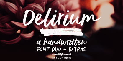
  34. Delirium Duo by Ana's Fonts, $15.00
    Delirium Duo is a handwritten font duo, consisting of: - A textured brush font with ligatures; - A casual all-caps font with different upper case and lower case characters for a more natural handwritten feel. - Plus two sets of swashes and ornaments that complement each font nicely. This font duo makes it so easy to create beautiful designs, and is perfect for logos, quotes, cards, social media posts, websites, magazines, and packaging.
  35. ITC Minska by ITC, $29.99
    ITC Minska is the work of Carl Crossgrove, who used a combination of upper and lower case shapes together to create new letter forms. Crossgrove created unconventional yet immediately recognizable variations in two different alphabets, which cannot quite be classifed as upper and lower case in themselves. With opulant curves and sharp angles, ITC Minska projects an unorthodox energy which is ideal for unusual effects and display settings.
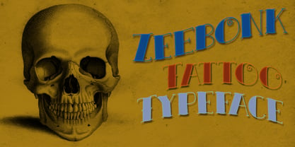
  36. Zeebonk by Hanoded, $15.00
    Zeebonk (literally 'Sea Chunk') is Dutch for a sailor - in particular, a large, pickled and brined, seven-seas-been-there-done-that specimen. The font itself brings back memories of the outrageous tattoos those same 'zeebonken' used to have. Zeebonk comes with extensive language support, alternates for the upper case (and some lower case letters as well) and a healthy dose of good old fashioned sea dog humor!
  37. Library Book Initials JNL by Jeff Levine, $29.00
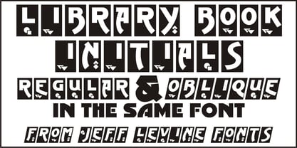
    Library Book Initials JNL was modeled from examples of Sidney Gaunt's Publicity Initials; originally sold in metal type by Barnhart Brothers and Spindler as a companion to the Publicity Gothic typeface. The smoothed-down lines of the original characters allow for these initials to balace better when set against complementary type faces. A regular version is on the upper case keys, with an oblique version on the lower case keys.
  38. LTC Obelysk Grotesk by Lanston Type Co., $24.95
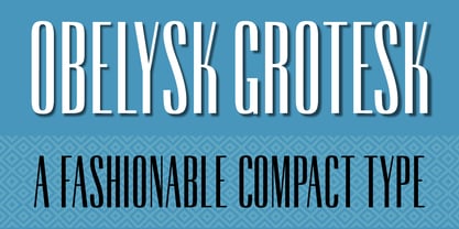
    Obelysk Grotesk was designed by the Lanston Drawing Office in the late 1980s. This face is a reconstruction of Spire (1937) drawn by Sol Hess. The skeleton of Spire Roman stands with the serifs removed. Like Spire, this font has no lower case, but does offer alternate cap styles in some of the lower case positions. Spire and Obelysk have both been used prominently in the fashion industry.
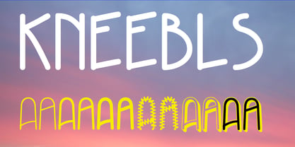
  39. Kneebls by Ingrimayne Type, $9.95
    Kneebls was inspired by Art Deco lettering. It is monoline and all caps, with most of the letters on the lower-case keys different from those on the upper-case keys. It comes in three weights: thin, regular, and bold. There is also a distorted, wavy version, KneeblsRuffled, and a shadowed version. The shadowed-inside style is designed to be used in a layer with the shadowed style.
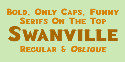
  40. Swanville by Ingrimayne Type, $5.00
    Swanville developed as part of a train font that eventually became LetterTrain. The letters of Swanville are bold, have a funny “serif” on the top but not on the bottom, and when the letters have interiors, the interior has the shape of the letter. Lower-case letters are smaller versions of the upper-case letters. Because development of this face stopped long ago, it has a limited character set.
Looking for more fonts? Check out our New, Sans, Script, Handwriting fonts or Categories
abstract fontscontact usprivacy policyweb font generator
Processing