10,000 search results
(0.038 seconds)
- Itoxina by FSdesign-Salmina,
$39.00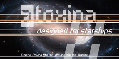 Itoxina is designed especially for the burgeoning market of starships and other space cruisers. Itoxina has been developed with the contribution of experts in navigation through space and time. The fonts are ideal for internal and external use (including zero-g and occasional bursts of cosmic rays), and with their simplified forms are expected to survive well in non-linear galaxies. With their unusual diagonal half-pixels the fonts are striking as abstract designs at astronomical sizes, where small text may be placed within the black holes formed inside the letters. On explicit suggestion of Mr. Spock true capital letters have been added.
 - MODERN Hand Fraktur by TypoGraphicDesign,
$19.00 KONZEPT/BESONDERHEITEN Der schludrige und raue handgeschriebene Fraktur Charakter, geben der Schrift eine hohe Wiedererkennung und eine gewisse Einzigartigkeit. Das Motto lautet handgemacht, rau, Fraktur & modern. EINSATZGEBIETE Das dreckige, dicke Aussehen der handgeschriebenen Schrift würde sich über folgende Gebiete sehr freuen und sich dort dreckig heimisch fühlen: Logos/Wortmarken aller Art, Flyer für fast jede Party, PlattenCover, Comic-Cover und Graphic Novel Lettering, Plakat Design, Movie-Font, als Headlineschrift für print und digitale Magazine, Bücher und Webseiten u.v.m. TECHNISCHE INFORMATIONEN Überschriften | Auszeichnungsschrift | Fraktur Handschrift »Modern Hand Fraktur«. OpenType Schrift mit 258 Glyphen & 1 Schriftschnitt (regular). Symbole und Ligaturen (mit diakritischen Zeichen & €)
 - Modulario by K-Type,
$20.00 Modulario is a geometric sans with some disturbingly individual features. A few capitals owe a bit too much to Roman proportions. The circular O serves to distinguish it from the zero, and the luxuriously wide W and M are both pointed in the middle, although alternatives to the more contentious letters are available within the font. The lowercase shows a little more handwriting influence than is customary – we are used to seeing a writing-style curve at the base of the l, Modulario extends the influence to the i and a, and also sports a uniquely scripty s.
 - Bergie Seltzer by Hanoded,
$15.00 It could be you’ve never heard of Bergie Seltzer - and neither had I. Basically, Bergie Seltzer is the fizzing sound an iceberg makes when it melts. We are having a bit of a heat wave right now, so I needed to give this font a ‘cool’ name! Bergie Seltzer font is a cool, all caps display font. It has a slightly eroded look (like a melting iceberg if you will) and a laid back attitude. Use it for your summer magazines, your ultra-cool websites and your bottles of fizzy drink! Just don’t melt the polar cap!
 - Rhythm by Positype,
$42.00 I hate the idea of revivals. I have publicly said I choose not to do revivals because they make me uncomfortable. This is as close as I have been to crossing my own line. To be direct, Rhythm is based on the ATF typeface, Ratio (I just recently learned the foundry of origin). I came across this typeface from a printed specimen years ago when I was in school and held onto it. It was unique and I loved how well integrated the inline worked within both the flourish and serif of the glyphs—it was old, but not, reminiscent, but fresh. My specimen was limited in the glyph offering (it was c. 1930ish) and I realized a lot would need to be done to ‘finish’ it and bring it to contemporary expectations. I didn't want to do ‘retro’ and tried to avoid the visual trappings associated with it. What I did want to do is interpret what I had in the specimen and reinterpret it digitally, refining its construction and extending its typographic equity along the way. The ‘One’ and ‘Two’ (and their matching ‘Solids’) styles diverge providing various elaborations that coordinate well between rigid bracketed serifs and compact tails. I further expanded the glyph offering to include a full diacritic set, old style numerals, fractions, stylistic alternates, swashes, titling alternates and controlled flourishes that adhere to the efficient framework of the script. And yes, I refer to it as a ‘script’ because calling it a ‘cutesy serif’ seems wrong :) I hope this is seen less as a slavish revival and more as a championing of a really unique typeface. The Original Typeface was Adastra, designed by Herbert Thannhaeuser for the Foundry D. Stempel AG in Frankfurt, Germany.
 - Grandiose by Ahmad Jamaludin,
$13.00 Say hello to New Stylish Script, Grandiose! This font combines stylish letter shapes with contemporary twist. It's the perfect fit for all luxury projects, such as elegant logos, printed quotes, lovely wedding invitation cards, social media headers, product packaging and a lot more! It includes full set of elegant uppercase and lowercase letters, multilingual symbols, numerals, punctuation. The font has smooth wet ink texture, so would be perfect for all types of printing techniques+you can do embroidery, laser cut, gold foil etc. What's Included? - Grandiose OTF - More than 100 of glyphs - Ligatures - Works on PC & Mac - Simple Installations - Accessible in the Adobe Illustrator, Adobe Photoshop, Adobe InDesign, even work on Microsoft Word. - PUA Encoded Characters - Fully accessible without additional design software. - Multilingual Support Let me know if you have any other questions. Thanks and have a wonderful day, dharmas
 - Treading by Prioritype,
$19.00 Presents new paired fonts. A minimal and clean feel paired with a handwritten script font makes your designs even more special. This script font also features ligatures, alternatives, and swash or underscore characters that make it more realistic. Great for logo design, branding, quotes and more. Features: Serif: Uppercase, Lowercase, Numeral, Punctuation & Multilingual. Script: Uppercase, Lowercase, Numeral, Punctuation, Multilingual, Ligatures, Alternates & Swash. Multilingual contained: Afrikaans, Albanian, Asu, Basque, Bemba, Bena, Breton, Catalan, Chiga, Cornish, Danish, Dutch, English, Estonian, Filipino, Finnish, French, Friulian, Galician, German, Gusii, Indonesian, Irish, Italian, Kabuverdianu, Kalenjin, Kinyarwanda, Luo, Luxembourgish, Luyia, Machame, Makhuwa-Meetto, Makonde, Malagasy, Manx, Morisyen, North Ndebele, Norwegian Bokmål, Norwegian Nynorsk, Nyankole, Oromo, Portuguese, Quechua, Romansh, Rombo, Rundi, Rwa, Samburu, Sango, Sangu, Scottish Gaelic, Sena, Shambala, Shona, Soga, Somali, Spanish, Swahili, Swedish, Swiss German, Taita, Teso, Uzbek (Latin), Volapük, Vunjo, Zulu. Thanks!
 - Carrolin Script by Zane Studio,
$12.00 Carrolin Script is a new modern script font with an irregular base line, making it look trendy and feminine. Carrollina script looks beautiful in wedding invitations, thank you cards, quotes, greeting cards, logos, business cards, and more. Including beginning and end letters, alternatives and support for many languages. To enable the OpenType Stylistic alternative, you need a program that supports OpenType features such as Adobe Illustrator CS, Adobe Indesign & CorelDraw X6-X7, Microsoft Word 2010 or newer versions. There are additional ways to access alternatives / swashes, using Character Maps (Windows), Nexus Fonts (Windows), Font Books (Mac) or software programs such as PopChar (for Windows and Mac). How to access all alternative characters: https: //www.youtube.com/watch? v = Go9vacoYmBwhttps: //www.youtube.com/watch? v = XzwjMkbB-wQhttps: //www.yo If you need help or have questions, let me know. I am happy to help. Thank you.
 - Karmina Sans by TypeTogether,
$49.00 Karmina Sans follows the steps of its successful award winner cousin, Karmina Serif. It shares the same technical excellence and it achieves similar stylistic features, but the new sans serif version proposes a much more versatile tool for editorial designers. Karmina Sans has six different weights with their matching italics, from light to heavy and from continuous text to headlines to small text. The heavy weight delivers one of the darkest and most powerful impressions out there while the text weights are perfect companions for Karmina Serif. The OpenType Pro package of Karmina Sans includes nearly 900 characters per weight, including small caps, fractions, old style and lining numbers, scientific superior/inferior figures, complete ordinal and inferior alphabet, and a set of symbols and arrows. It supports over 40 languages that use the Latin extended alphabet.
 - Kaneda Gothic by Dharma Type,
$19.99 Kaneda Gothic is a whole new basic gothic. Philosophically, Kaneda Gothic is the one of the niche answers in the interspace between these antinomies. Image of near-future and giant metropolis in 80s, 90s vs our real life in the 2010s,20s. What we acquired by Industrial, scientific developments vs our emotional demands, imagination in our brain. Design transition in short period of time vs the consistency of real function which laid along the human history. Technically, Kaneda Gothic has a geometric letterform which called “gaspipe” or “Gothic” in woodtype era. But Kaneda has very sharp curves and lines for contemporary demands, that is to say, impact and clearness. Geometric and clear letterform is perfect for eye-catching part such like company logo, movie title and picture’s captions. Consists of seven weights and their matching italics. Supporting almost all latin languages.
 - Boxr by R9 Type+Design,
$38.00 Boxr™ is a contemporary font family named after its boxy, square shape. We softened all the sharp corners on stems and connections to achieve a harmonious balance between the clean, corporate look and the warm, friendly feel. This versatile rectangular sans serif typeface is an excellent choice for your prints, packaging, editorial, and digital design projects. Boxr™ comes in 5 weights, 10 styles, and 1,100 glyphs/style. This Canadian-designed typeface also packs with OpenType features such as stylistic alternates, case-sensitive punctuations, ligatures, and date vs fraction recognitions. It also supports 200+ Latin-based languages and comes 120 essential UX/UI icons available in three different stylistic options. Try Boxr™ on your new design projects today! To find out more about Boxr™ Opentype features and type specimen, please visit https://r9typedesign.com/boxr-fonts-features-specimen
 - Fugenta Script by madjack.font,
$13.00 Fugenta Script is a new modern script font with an irregular base line. With its trendy and feminine style, Fugenta Script looks beautiful on wedding invitations, thank you cards, quotes, greeting cards, logos, business cards, and more. Includes beginning and end letters, alternatives and support for many languages. To enable the OpenType Stylistic alternative, you need a program that supports OpenType features such as Adobe Illustrator CS, Adobe Indesign & CorelDraw X6-X7, Microsoft Word 2010 or newer versions. There are additional ways to access alternatives/swashes, using Character Maps (Windows), Nexus Fonts (Windows), Font Books (Mac) or software programs such as PopChar (for Windows and Mac). How to access all alternative characters: https://www.youtube.com/watch?v=Go9vacoYmBw https://www.youtube.com/watch?v=XzwjMkbB-wQ Need help or have questions, please let me know. I am happy to help.
 - Jetlab by Swell Type,
$15.00 Jetlab is a typographic time machine that drops you squarely into the techno-futuristic optimism of the 1960s, 1970s and 1980s! While certain weights may conjure familiar space race-era logos from the sci-fi movies, board games, sports teams, new wave bands and sneaker brands of the late 20th century, the complete 45-weight Jetlab font family is loaded with modern features to power your retro-futuristic designs with near-infinite versatility. Features: 45 weights provide widths from squeezed to stretched and weights from light to heavy, plus reverse-stress (that's thick horizontal strokes with thin verticals) high, medium and low crossbar options upper and lowercase letters provide two distinct styles a four-axis variable font provides precise control of width, vertical & horizontal weight, and crossbar height 500 glyphs support 223 languages, including Western & Central Europe and Vietnamese
 - Ante Cf by Creative17studio,
$9.00 Introducing Ante Cf Fonts. A font that's modern, clean, and bold like the roman sans serif font. This font comes in many weights up to 18 weights. The contrasts between thick and thin make this font unique. This font is made with modern characteristics which can give a bold impression in each character, making this font suitable for corporate needs for larger business needs. For branding purposes? Sure. This font is also made for the needs of this field, so that your branding seems more modern. And this font is also useful for news editorial purposes. Coupled with serif types and scripts are also very suitable. You can see all the examples of using this font above. Ante cf also supports various languages, so that it can make it easier for all countries to use and language usage.
 - Strengthen Script by Zane Studio,
$15.00 Strengthen Script is a new modern script font with an irregular base line. Trendy and feminine style. Strengthen Script looks beautiful in wedding invitations, thank-you cards, quotes, greeting cards, logos, business cards, and more. Perfect for use in ink or watercolors. Includes initial letters and terminals, alternatives and support for many languages. To activate the OpenType Stylistic alternative, you need a program that supports OpenType features such as Adobe Illustrator CS, Adobe Design & CorelDraw X6-X7, Microsoft Word 2010 or newer versions. Use Character Maps (Windows), Nexus Fonts (Windows), Book Fonts (Mac) or software programs like PopChar (for Windows and Mac). How to access all alternative characters: https: //www.youtube.com/watch? v = Go9vacoYmBw https: //www.youtube.com/watch? v = XzwjMkbB-wQ need help or have questions, let me know. I am happy to help :) Thank you & Congratulations on the Design!
 - Nympho by Ahmad Jamaludin,
$15.00 Introducing our exciting new font, NYMPHO! 🎉✨ Nympho - The perfect blend of modern Y2K vibes and unique style, featuring letter shapes that resemble playful rectangles. Nympho - Incredibly versatile and will elevate your projects, whether it's designing eye-catching magazine layouts, captivating posters, or any other creative endeavor. With its style preview channeling the coolness of the 90s and a touch of Y2K nostalgia, "Nympho" is ready to add a friendly and trendy twist to your designs. Features: Nympho Instructions ( Access special characters, even in Cricut Design ) Have alternate with all characters (Uppercase & Lowercase) Regular and Clean version Unique letterforms Works on PC & Mac Simple Installations Accessible in Adobe Illustrator, Adobe Photoshop, Microsoft Word even work on Canva! PUA Encoded Characters Fully accessible without additional design software. Get ready to unleash your creativity with Nympho! Enjoy Designing! Dharmas Studio
 - Morrita by Rotterlab Studio,
$12.00 Morrita Script is a new modern script font with an irregular base line. With its trendy and feminine style, Morrita Script looks beautiful on wedding invitations, thank you cards, quotes, greeting cards, logos, business cards, and more. Includes beginning and end letters, alternatives and support for many languages. To enable the OpenType Stylistic alternative, you need a program that supports OpenType features such as Adobe Illustrator CS, Adobe Indesign & CorelDraw X6-X7, Microsoft Word 2010 or newer versions. There are additional ways to access alternatives / swashes, using Character Maps (Windows), Nexus Fonts (Windows), Font Books (Mac) or software programs such as PopChar (for Windows and Mac). How to access all alternative characters: https: //www.youtube.com/watch? v = Go9vacoYmBwhttps: //www.youtube.com/watch? v = XzwjMkbB-wQhttps: //www.yo Need help or have questions, please let me know. I am happy to help.
 - The Baghtone Script by Figuree Studio,
$18.00 Hello, This is The Baghtone Script! The Baghtone Script is a strong bold script that comes from hand scratches to get natural writing. With the main style of the hand-lettering script, it will be very interesting if it is added with a variety of Alternates and also Stylistic Sets that are very suitable. The Headlight is very suitable for use in various media such as; packaging, logos, labels, posters, shirt designs, wisdom quotes, bulletins, typography, and many other media, especially with retro or vintage look. Features: Two Style small-caps Stylistic Alternates, Stylistic Sets (SS01-SS06) and Swash variant. PUA Encoded open Support for MAC or PC Simple installation for Adobe Illustrator, Corel Draw, Photoshop, or Procreate (New Updated) Support Multilanguage That's it! If you have any questions don't hesitate to ask! Stay Classy! Fadhil - Figuree Studio
 - Gerald Battom by Rotterlab Studio,
$12.00 Gerald Battom is a new modern script font with an irregular base line. Gerald Battom looks beautiful in wedding invitations, thank you cards, quotes, greeting cards, logos, business cards, and more. Perfect for use in ink or watercolors. It includes initial and terminal letters, alternatives and support for many languages. To activate the OpenType Stylistic alternative, you need a program that supports OpenType features such as Adobe Illustrator CS, Adobe Indesign & CorelDraw X6-X7, Microsoft Word 2010 or newer versions. There are additional ways to access alternatives / swashes, using Character Maps (Windows), Nexus Fonts (Windows), Font Books (Mac) or software programs such as PopChar (for Windows and Mac). How to access all alternative characters: https: //www.youtube.com/watch?v=Go9vacoYmBw https: //www.youtube.com/watch?v=XzwjMkbB-wQ Need help or have questions, let me know. I am happy to help :) Thank you & Congratulations on Design!
 - FF Unit Slab by FontFont,
$104.99 German type designer Erik Spiekermann, American type designer Christian Schwartz, and New Zealand type designer Kris Sowersby created this slab FontFont in 2009. The family has 14 weights, ranging from Thin to Ultra (including italics) and is ideally suited for editorial and publishing, logo, branding and creative industries as well as web and screen design. FF Unit Slab provides advanced typographical support with features such as ligatures, small capitals, alternate characters, case-sensitive forms, fractions, and super- and subscript characters. It comes with a complete range of figure set options – oldstyle and lining figures, each in tabular and proportional widths. As well as Latin-based languages, the typeface family also supports the Cyrillic and Greek writing systems. This FontFont is a member of the FF Unit super family, which also includes FF Unit and FF Unit Rounded.
 - Beauty Dina by Aldedesign,
$19.00 Beauty Dina // Playful Script Font is a stunning font with a stylish and lovely font that features a varying baseline, smooth line, modern, and with a depth of love. For those of you who need a touch of love and modernity for your designs or branding, it can be used for various purposes such as headings, weddings, invitations, signatures, logos, branding, t-shirt, letterhead, signage, labels, news, posters, badges, etc. We have a special font namely "Beauty Dina // Playful Script Font ". The font design looks simple without losing its elegance and warmness. The function of the font is to show that you have a modern spirit to serve high-quality products and services. We design this font with Open Type features to give an artistic touch to it. This font is also applicable for numbers, punctuation, and other languages. It is also a multi-functions font where you can use for a business logo, branding, wedding invitation, and anything you want. We have more great and artistic fonts. Just check my font collection by visiting Our Profile. Then, pick your most favorite font and use it to reach your goals.
 - Goldney by Set Sail Studios,
$16.00 There are a lot of script fonts out there - but Goldney isn't your average one, it's designed to be your go-to modern handwriting font. Goldney produces incredibly realistic letterforms and free-flowing sentences - this was achieved by writing out hundreds of individual words, then hand-picking the most natural looking letters. Also hand-picked was a whopping 90 Ligatures - these unique letter combinations give even more authenticity to each word layout. It's the perfect choice for genuine handwritten logos & branding, advertisement text, quotes, headers and product packaging. Goldney consists of 4 fonts files; Goldney • A handwritten script font containing upper & lowercase characters, numerals, and a large range of punctuation. Goldney Alt • This is a second version of Goldney, with a completely new set of both upper and lowercase characters. If you wanted to avoid letters looking the same each time to recreate a custom-made style, or try a different word shape, simply switch to this font for an additional layout option. Slanted Versions • Are included for both regular and alternate fonts. These can be used for a more italicised, fast-hand flow to your text.
 - Soprani by insigne,
$39.00 Soprani is a unique typeface inspired by a plaque found in New Zealand dating from the 1920s. The design was contemporized and brought 100 years into the future. The serifs are dramatically flared at the end of the stems, while in the middle, they contract. This leads to a unique shimmering effect that draws the eye and catches your user's attention. This typeface meets the demand for unique serif types that are both eye-catching and delicate. It’s a display face that's ideal for very contemporary work. This typeface has plenty of alternates and has a full complement of OpenType features. The 1920s inspire the design, with a bit of art nouveau and arts and crafts, yet the typeface is designed to meet contemporary design requirements. It has a unique elegance and the letterforms are condensed more than most. Soprani is suggested for table books, menus, and various promotional materials, newspapers, television, motion pictures and other media. There is a wide range of widths and weights available, from the thin, which is delicate and graceful, to a bold and robust black. Production assistance by Lucas Azevedo and ikern.
 - Kimilove by Aldedesign,
$17.00 Kimilove // Monogram Script font is a stunning font with a stylish and lovely font that features a varying baseline, smooth line, modern, and with a depth love. For those of you who need a touch of love and modernity for your designs or branding, it can be used for various purposes such as headings, wedding, invitation, signature, logos, branding, t-shirt, letterhead, signage, labels, news, posters, badges, etc. We have a special font namely "Kimilove // Monogram Script font". The font design looks simple without losing its elegance and warmness. The function of the font is to show that you have a modern spirit to serve high-quality products and services. We design this font with Open Type features to give an artistic touch on it. This font is also applicable for numbers, punctuation, and other languages. It is also a multi-functions font where you can use for a business logo, branding, wedding invitation, and anything you want. We have more great and artistic fonts. Just check my font collection by visiting Our Profile. Then, pick your most favorite font and use it to reach your goals.
 - Kintamani Script by Ardyanatypes,
$19.00 Introducing a new modern calligraphy font called Kintamani Script. Kintamani Script is made as natural as possible to create a beautiful and beautiful impression, this script is made for those who need a beautiful and graceful style so that it makes their design look more luxurious, this will be very suitable for use as wedding invitations, branding, fashion, titles books, business cards, and many more that can be combined with this Kintamani script. Kintamani Scrip has many stylistic features that can be used so that it gives a different and more modern impression than the standard and also has a bonus flower hand drawing to complement and beautify the design. The Kintamani script includes a complete set of all the basic characters of upper and lower case, numbers and punctuation, and also has alternative ligatures and styles that can exquisitely give a natural impression. This Kintamani script font is available for All fonts available for Western European, Central European and Southeast European Languages. You can define your language typing character in the text box below. A guide to accessing all alternatives can be read at: http://adobe.ly/1m1fn4Y Thank you and have a nice day
 - Electric Cable by Harald Geisler,
$39.00 ''Sometimes, you fall in love with someone, and, sometimes, you fall in love with something. I fell in love with the work of Harald Geisler. Harald and I met through our work on a couple of Kickstarter projects (Typographic Wall Calendar and The Montserrat Typeface). We sympathised immediately with each other, and that lead us to start a new project. The electricity we felt was captured in Electric Cable (that’s what we named it), a typeface designed in our own image and likeness. Electric cable is connected, and that power leads it to write unexpected things. It’s a letter for the flâneur: it carries within itself a high voltage that makes it lively. It has energy and spark. That’s exactly what we would like in a person. It is a display typeface, current and contemporary. It is based on the connection of two friends who felt the need to create a common language even without speaking the same language. In editorials use, your words will become strikingly beautiful. Electric Cable features geometric, humanistic qualities,and also some script, but ,above all, it has a sense of humor.’’ Julieta Ulanovsky (Usage tip: Use the “
 - Cinnamon Peach by Abbasy Studio,
$8.50 Let me introduce my first ever product on my shop. Cinnamon Peach - Layered Font After 2 years of learning how to create a fonts, learn about the anatomy of typography, features of the OpenType fonts, and all of the experience on my collaborations with many friends, Finally I just launched my first personal product with the name Cinnamon Peach. Cinnamon Peach is beauty combinations of layered font. It has a Serif and Script style inside. Both of them are layered font, which is you can express the style on both of it. You can add shadow, inline or hatch on Serif style. Changing the color of the other layer as just easy as change standard color of the fonts but it’s more deep in detail. On the Script style, I give you more freedom of choosing which style do you want, if you want a deep style of layer, you can choose regular and inside with different color. but if you want the outline style, it also available as a single fonts. Looks like on the display that I Created, You can see the most of combinations font in there are perfectly matched even on script version doesn’t include the Uppercase character. Because of the strong characteristic of this fonts you can see the combinations are great with or without layer, monochrome or multi color, pastel or watercolour. It’s great for posters, display, logos, header website, magazine, animation text, etc. Thank You very much, hope you enjoy this fonts !
 - Big Dreams by Twinletter,
$12.00 Introducing the Big Dreams font. As the name implies, this font will give an extraordinary impression and an experience that will never be forgotten, if you use this font in your design. We designed this font with thorough attention to each letter so that it has the right portion if it is arranged in a word or title and if it is made into a sentence it will be easy to remember and pleasing to the eye. Not limited to that, the bold calligraphy font is designed to keep paying attention to the beauty of each letter, there are alternate options for the letters which are certainly easy for you to access, so you can automatically customize the letters you want to enhance the visual appearance of your design project. This charming font also offers the beauty of abstract typography harmony for a wide variety of design projects, including digital natural handwriting for designs, quote designs, for social media business designs, advertisements, trademarks, food and beverage promotion banners, text, posters, a signature, and all designs require handwriting or whatever design you want. ============================================================================================================ What’s Included : File font Web Fonts Standard glyphs Ligature Works on PC & Mac Simple installations Accessible in Adobe Illustrator, Adobe Photoshop, Adobe InDesign, even work on Microsoft Word. PUA Encoded Characters – Fully accessible without additional design software. Fonts include multilingual support for; Afrikaans, Albanian, Croatian, Czech, Danish, Dutch, English, Estonian, Finnish, French, German, Hungarian, Italian, Norwegian, Polish, Portuguese, Slovak, Slovenian, Spanish, Swedish Thank you for your purchase! Hope you enjoy our font!
 - Postea by TypeTogether,
$47.00 The Postea font family is Veronika Burian and José Scaglione’s take on German geometric typefaces, reshaped with the right attributes for setting paragraphs and headings, and perfect for branding and text use. Some typefaces are a rough tool, like a pumice rock: abrasive to the senses, unforgiving, and unhelpful for most reading situations. Postea is an obsidian: smooth and classy, with attractive nuances in any light. The classic curves and purposeful details keep its individuality intact while allowing it to fit an incredible range of geometric font needs. Because of these qualities, Postea makes normal reading in paragraphs a cinch and your branding memorable. Compared to midcentury attributes of restraint and a sparse appearance, Postea’s deliberate play between character widths injects life and distinctiveness into its personality. The default ‘t, f’ have lyrical doses akin to a robust evening drink and are rounded out with a serpentine ‘s’ and rotund ‘o, g, b’. Another nice surprise awaits: spacing for the Hairline weight is tighter for optimal use in large headings and titles, while the regular weights have the expected, slightly looser spacing for text. Setting the test word ‘bogarts’ brings all this together nicely, invoking a balance between a constructed and human feel while brushing away the dust from a century of derivatives. Postea is opinionated and its modern stylistic sets allow it to be accommodating with softer, specially-designed alternative characters. SS01 replaces ‘b, f, M, m, t’, while SS02 changes only the lowercase ‘a’ to the round style, and SS03 swaps out the angled ‘y’ for a straight version. The fourth and sixth stylistic sets are packed with wallpaper-worthy geometric patterns, ornaments, arrows, and symbols aplenty. Postea’s 14 styles (seven upright and italic) and two variable fonts are accompanied by an all-new family of icons in three weights, which we developed a new, easy way to activate. Simply bookend the desired icon name with colons (:arrowUp: :chargingStation: :aid: :firstAid:), making sure to capitalise each word after the first word, then highlight and activate SS05. Icons include wayfinding, social interface, sanitary precautions like face masks, thermometers, and hand washing, and much more. Postea is resilient in the number of ways the family can be used, and its recognisable characters make it a prime selection for branding, signage, corporate typefaces, and magazines. Beginning with midcentury virtues, Postea is the rational response for text — a lyrical take on geometric sans serifs.
 - DIN Next Arabic by Monotype,
$155.99 DIN Next is a typeface family inspired by the classic industrial German engineering designs, DIN 1451 Engschrift and Mittelschrift. Akira Kobayashi began by revising these two faces-who names just mean ""condensed"" and ""regular"" before expanding them into a new family with seven weights (Light to Black). Each weight ships in three varieties: Regular, Italic, and Condensed, bringing the total number of fonts in the DIN Next family to 21. DIN Next is part of Linotype's Platinum Collection. Linotype has been supplying its customers with the two DIN 1451 fonts since 1980. Recently, they have become more popular than ever, with designers regularly asking for additional weights. The abbreviation ""DIN"" stands for ""Deutsches Institut für Normung e.V."", which is the German Institute for Industrial Standardization. In 1936 the German Standard Committee settled upon DIN 1451 as the standard font for the areas of technology, traffic, administration and business. The design was to be used on German street signs and house numbers. The committee wanted a sans serif, thinking it would be more legible, straightforward, and easy to reproduce. They did not intend for the design to be used for advertisements and other artistically oriented purposes. Nevertheless, because DIN 1451 was seen all over Germany on signs for town names and traffic directions, it became familiar enough to make its way onto the palettes of graphic designers and advertising art directors. The digital version of DIN 1451 would go on to be adopted and used by designers in other countries as well, solidifying its worldwide design reputation. There are many subtle differences in DIN Next's letters when compared with DIN 1451 original. These were added by Kobayashi to make the new family even more versatile in 21st-century media. For instance, although DIN 1451's corners are all pointed angles, DIN Next has rounded them all slightly. Even this softening is a nod to part of DIN 1451's past, however. Many of the signs that use DIN 1451 are cut with routers, which cannot make perfect corners; their rounded heads cut rounded corners best. Linotype's DIN 1451 Engschrift and Mittelschrift are certified by the German DIN Institute for use on official signage projects. Since DIN Next is a new design, these applications within Germany are not possible with it. However, DIN Next may be used for any other project, and it may be used for industrial signage in any other country! DIN Next has been tailored especially for graphic designers, but its industrial heritage makes it surprisingly functional in just about any application. The DIN Next family has been extended with seven Arabic weights and five Devanagari weights. The display of the Devanagari fonts on the website does not show all features of the font and therefore not all language features may be displayed correctly.
 - DIN Next Devanagari by Monotype,
$103.99DIN Next is a typeface family inspired by the classic industrial German engineering designs, DIN 1451 Engschrift and Mittelschrift. Akira Kobayashi began by revising these two faces-who names just mean ""condensed"" and ""regular"" before expanding them into a new family with seven weights (Light to Black). Each weight ships in three varieties: Regular, Italic, and Condensed, bringing the total number of fonts in the DIN Next family to 21. DIN Next is part of Linotype's Platinum Collection. Linotype has been supplying its customers with the two DIN 1451 fonts since 1980. Recently, they have become more popular than ever, with designers regularly asking for additional weights. The abbreviation ""DIN"" stands for ""Deutsches Institut für Normung e.V."", which is the German Institute for Industrial Standardization. In 1936 the German Standard Committee settled upon DIN 1451 as the standard font for the areas of technology, traffic, administration and business. The design was to be used on German street signs and house numbers. The committee wanted a sans serif, thinking it would be more legible, straightforward, and easy to reproduce. They did not intend for the design to be used for advertisements and other artistically oriented purposes. Nevertheless, because DIN 1451 was seen all over Germany on signs for town names and traffic directions, it became familiar enough to make its way onto the palettes of graphic designers and advertising art directors. The digital version of DIN 1451 would go on to be adopted and used by designers in other countries as well, solidifying its worldwide design reputation. There are many subtle differences in DIN Next's letters when compared with DIN 1451 original. These were added by Kobayashi to make the new family even more versatile in 21st-century media. For instance, although DIN 1451's corners are all pointed angles, DIN Next has rounded them all slightly. Even this softening is a nod to part of DIN 1451's past, however. Many of the signs that use DIN 1451 are cut with routers, which cannot make perfect corners; their rounded heads cut rounded corners best. Linotype's DIN 1451 Engschrift and Mittelschrift are certified by the German DIN Institute for use on official signage projects. Since DIN Next is a new design, these applications within Germany are not possible with it. However, DIN Next may be used for any other project, and it may be used for industrial signage in any other country! DIN Next has been tailored especially for graphic designers, but its industrial heritage makes it surprisingly functional in just about any application. The DIN Next family has been extended with seven Arabic weights and five Devanagari weights. The display of the Devanagari fonts on the website does not show all features of the font and therefore not all language features may be displayed correctly. - DIN Next Cyrillic by Monotype,
$65.00DIN Next is a typeface family inspired by the classic industrial German engineering designs, DIN 1451 Engschrift and Mittelschrift. Akira Kobayashi began by revising these two faces-who names just mean ""condensed"" and ""regular"" before expanding them into a new family with seven weights (Light to Black). Each weight ships in three varieties: Regular, Italic, and Condensed, bringing the total number of fonts in the DIN Next family to 21. DIN Next is part of Linotype's Platinum Collection. Linotype has been supplying its customers with the two DIN 1451 fonts since 1980. Recently, they have become more popular than ever, with designers regularly asking for additional weights. The abbreviation ""DIN"" stands for ""Deutsches Institut für Normung e.V."", which is the German Institute for Industrial Standardization. In 1936 the German Standard Committee settled upon DIN 1451 as the standard font for the areas of technology, traffic, administration and business. The design was to be used on German street signs and house numbers. The committee wanted a sans serif, thinking it would be more legible, straightforward, and easy to reproduce. They did not intend for the design to be used for advertisements and other artistically oriented purposes. Nevertheless, because DIN 1451 was seen all over Germany on signs for town names and traffic directions, it became familiar enough to make its way onto the palettes of graphic designers and advertising art directors. The digital version of DIN 1451 would go on to be adopted and used by designers in other countries as well, solidifying its worldwide design reputation. There are many subtle differences in DIN Next's letters when compared with DIN 1451 original. These were added by Kobayashi to make the new family even more versatile in 21st-century media. For instance, although DIN 1451's corners are all pointed angles, DIN Next has rounded them all slightly. Even this softening is a nod to part of DIN 1451's past, however. Many of the signs that use DIN 1451 are cut with routers, which cannot make perfect corners; their rounded heads cut rounded corners best. Linotype's DIN 1451 Engschrift and Mittelschrift are certified by the German DIN Institute for use on official signage projects. Since DIN Next is a new design, these applications within Germany are not possible with it. However, DIN Next may be used for any other project, and it may be used for industrial signage in any other country! DIN Next has been tailored especially for graphic designers, but its industrial heritage makes it surprisingly functional in just about any application. The DIN Next family has been extended with seven Arabic weights and five Devanagari weights. The display of the Devanagari fonts on the website does not show all features of the font and therefore not all language features may be displayed correctly. - DIN Next Paneuropean by Monotype,
$92.99DIN Next is a typeface family inspired by the classic industrial German engineering designs, DIN 1451 Engschrift and Mittelschrift. Akira Kobayashi began by revising these two faces-who names just mean ""condensed"" and ""regular"" before expanding them into a new family with seven weights (Light to Black). Each weight ships in three varieties: Regular, Italic, and Condensed, bringing the total number of fonts in the DIN Next family to 21. DIN Next is part of Linotype's Platinum Collection. Linotype has been supplying its customers with the two DIN 1451 fonts since 1980. Recently, they have become more popular than ever, with designers regularly asking for additional weights. The abbreviation ""DIN"" stands for ""Deutsches Institut für Normung e.V."", which is the German Institute for Industrial Standardization. In 1936 the German Standard Committee settled upon DIN 1451 as the standard font for the areas of technology, traffic, administration and business. The design was to be used on German street signs and house numbers. The committee wanted a sans serif, thinking it would be more legible, straightforward, and easy to reproduce. They did not intend for the design to be used for advertisements and other artistically oriented purposes. Nevertheless, because DIN 1451 was seen all over Germany on signs for town names and traffic directions, it became familiar enough to make its way onto the palettes of graphic designers and advertising art directors. The digital version of DIN 1451 would go on to be adopted and used by designers in other countries as well, solidifying its worldwide design reputation. There are many subtle differences in DIN Next's letters when compared with DIN 1451 original. These were added by Kobayashi to make the new family even more versatile in 21st-century media. For instance, although DIN 1451's corners are all pointed angles, DIN Next has rounded them all slightly. Even this softening is a nod to part of DIN 1451's past, however. Many of the signs that use DIN 1451 are cut with routers, which cannot make perfect corners; their rounded heads cut rounded corners best. Linotype's DIN 1451 Engschrift and Mittelschrift are certified by the German DIN Institute for use on official signage projects. Since DIN Next is a new design, these applications within Germany are not possible with it. However, DIN Next may be used for any other project, and it may be used for industrial signage in any other country! DIN Next has been tailored especially for graphic designers, but its industrial heritage makes it surprisingly functional in just about any application. The DIN Next family has been extended with seven Arabic weights and five Devanagari weights. The display of the Devanagari fonts on the website does not show all features of the font and therefore not all language features may be displayed correctly. - Given my artistic inclination and optimistic outlook, it's delightful to delve into describing a font named "Tangled". The name itself conjures images of whimsy and adventure, perhaps inspired by fai...
- Antique Tuscan No 9 by HiH,
$8.00 Antique Tuscan No.9 was one of the earlier wood-type designs by William Hamilton Page. It was first shown among the specimens produced in 1859, shortly after Page entered into a new partnership with Samuel Mowry, owner of the Mowry Axle Company. The new company was named Page and Company and was located at the Mowry facility in the Greenville section of Norwich, Connecticut. Antique Tuscan No.9 is an extra-condensed version of the tuscan style that had been released in moveable type by Vincent Figgins of London in 1817 and had become so popular for advertising in the intervening years. Because of the extreme compression in the design, we might be tempted to describe it as "Triple-X," but that might be misleading. The analogy would, of course, be to clothing sizes, not movie ratings. Because of the compression, this typeface reads best when set extra-extra-extra large. For printing, we recommend 36 points or larger. For the screen, we suggest at least 72 points. An unusual and distinctive design, it is best used with discretion. If I were doing a term paper for school or submitting an article to a magazine for publication, I might use it for the title page, to grab someone’s attention. I would certainly not use it for the main body of text - not if I expected anyone to read what I wrote. If you wonder why we make this recommendation, take the Ten-Point challenge. Print this paragraph using Antique Tuscan No.9 and set the font size at 10 points. If you are young and blessed with good eyesight, you will probably be able to read it - with effort. So, here is the challenge: hand it to your Grandmother and ask HER to read it.
 - Otoboke by Typodermic,
$11.95 Far out, fellow psychonauts, have you checked out the trippy typeface called Otoboke? Let me tell you, this font is not from this world—it’s straight from the cosmos! With its mind-bending letter pair thingamajigs, even repeating letters are otherworldly. Take a closer look at Otoboke, and you’ll notice the fur texture—it’s like the letters are alive and ready to party! But where did this font’s tripped-out, letterforms come from, you ask? Well, they were inspired by none other than Louis Minott’s 1965 classic, Davida, channeling the vibes, and taking it to a whole new level. So, if you’re ready to take your graphic design to a whole new dimension, look no further than Otoboke. This typeface is not for the faint of heart—it’s for the true freakazoids. Most Latin-based European writing systems are supported, including the following languages. Afaan Oromo, Afar, Afrikaans, Albanian, Alsatian, Aromanian, Aymara, Bashkir (Latin), Basque, Belarusian (Latin), Bemba, Bikol, Bosnian, Breton, Cape Verdean, Creole, Catalan, Cebuano, Chamorro, Chavacano, Chichewa, Crimean Tatar (Latin), Croatian, Czech, Danish, Dawan, Dholuo, Dutch, English, Estonian, Faroese, Fijian, Filipino, Finnish, French, Frisian, Friulian, Gagauz (Latin), Galician, Ganda, Genoese, German, Greenlandic, Guadeloupean Creole, Haitian Creole, Hawaiian, Hiligaynon, Hungarian, Icelandic, Ilocano, Indonesian, Irish, Italian, Jamaican, Kaqchikel, Karakalpak (Latin), Kashubian, Kikongo, Kinyarwanda, Kirundi, Kurdish (Latin), Latvian, Lithuanian, Lombard, Low Saxon, Luxembourgish, Maasai, Makhuwa, Malay, Maltese, Māori, Moldovan, Montenegrin, Ndebele, Neapolitan, Norwegian, Novial, Occitan, Ossetian (Latin), Papiamento, Piedmontese, Polish, Portuguese, Quechua, Rarotongan, Romanian, Romansh, Sami, Sango, Saramaccan, Sardinian, Scottish Gaelic, Serbian (Latin), Shona, Sicilian, Silesian, Slovak, Slovenian, Somali, Sorbian, Sotho, Spanish, Swahili, Swazi, Swedish, Tagalog, Tahitian, Tetum, Tongan, Tshiluba, Tsonga, Tswana, Tumbuka, Turkish, Turkmen (Latin), Tuvaluan, Uzbek (Latin), Venetian, Vepsian, Võro, Walloon, Waray-Waray, Wayuu, Welsh, Wolof, Xhosa, Yapese, Zapotec Zulu and Zuni.
 - Retroxoid by PizzaDude.dk,
$20.00 You may recognize the looks of Retroxoid - if not, then let me help you out: Retroxoid is actually a font I made back in 2007. I ran prints of the font, through a very bad copymachine, used a wet cloth to make the print look worn, scanned the prints and voila! Retrozoid, my very first Open Type font, was born! Now in 2010, Retroxoid has risen from the past, and is ready to burst your designs with clean, round and futuristic shapes!
 - PiS VinoZupa by PiS,
$28.00 PiS VinoZupa is based on a logo found on an old Serbian bottle of brandy. The vintage 1971 plum fuel burns down your throat and blinds your eyes, the serifs you draw grow bigger and bigger with every sip you take. A Western-style slab serif font, coming from the finest distilleries in an Eastern European village. Features heavy caps with a few alternating glyphs in the lowercase letters and all the nice diacritics you need for super-drunk Serbian babble.
 - Spy Stencil JNL by Jeff Levine,
$29.00 Dean Martin starred in four movies as Matt Helm, the titular character in a series of spy novels by Donald Hamilton. Martin’s version of the government counter-agent followed his TV persona – a fun-loving ladies man who (in this case) just happened to be a spy. The movie poster for 1966’s “The Silencers” has its title hand lettered in an extra bold sans serif stencil style. This is now available as Spy Stencil JNL in both regular and oblique versions.
 - 1491 Cancellaresca by GLC,
$38.00 This font was inspired by the very well-known humanistic script called "Cancellaresca". This variant was used by a lot of calligraphers in the late 1400s, specially by the Venetian Giovannantonio Tagliente, whose patterns were mainly used for this font. You can compare this with 1610 Cancellaresca. Numerals were inspired by Da Vinci manuscripts, from the same period. We added accented characters and a few others not currently existing at the time. A lot of titling alternates and ligatures are also included.