10,000 search results
(0.076 seconds)
- Atlantic Avenue by Fonts of Chaos,
$10.00 Atlantic Avenue is an experimental font made with paint brush on wood, large scan and vectorized.
 - Directors Cut Pro by Type Innovations,
$39.00 Directors Cut Pro is a compelling new font series designed by Alex Kaczun. It recently won the second place—a commendation in the Canberra Typeface Competition. This handsome Geometric Antique serif design is based on the early 19-century Moderns and Scotch styles, infused with the warm charm of traditional antique, added for interest. Capturing the best of both ages: it's warm, comforting and persuasive. Directors Cut Pro's graceful aspects naturally invite uses at large sizes, for which we have created a stunning and elegant lighter weight. But, this workhorse typeface series incorporates a solid regular weight, along with its italic—ideal for a multitude of text purposes, at varying point sizes. A robust Bold weight is available for headlines and emphasis. Director Cut Pro comes with proportional as well as tabular lining figures for quickly setting up charts and tables. It also contains an extended character set—including most Central European languages. Alex Kaczun is in the process of expanding this typeface series to include additional weights, styles and proportions. Stay tuned! The large Pro font character set supports most Central European and many Eastern European languages.
 - Kostic Serif by Kostic,
$50.00 Kostic Serif is a classic transitional typeface (like Baskerville, Bookman, Caslon, Times) with tall, clean characters and a large glyph set to support all European languages - Greek and Cyrillic script included. Excellent for setting multiple pages of text and packed with OpenType features (proportional lining and oldstyle numbers, tabular figures, superscript and subscript, numerator and denominator figures, fractions and 31 ligature in 659 characters), it should meet the demands of even the most demanding typographic works. Kostic Serif is made with fairly large x-height, so the text is legible in very small sizes. Zoran began the work on Kostic Serif around 2002 and after completing Regular, Bold and matching italics, he wasn’t too pleased with the design, so he dropped further work on it to make other fonts. In 2010 Nikola came upon unfinished files for Kostic Serif, and decided to redesign the letters, while retaining basic proportions and widths that Zoran established earlier. When they were both pleased with the new look of the font, they made Medium and decided to add CE and Greek script to the glyph set, to make it pan-european.
 - Linotype Punkt by Linotype,
$29.99 Linotype Punkt, from US designer Mischa Leiner, is part of the TakeType Library, chosen from the entries of the Linotype-sponsored International Digital Type Design Contest 1999 for inclusion on the TakeType 3 CD. This font, from US designer Mischa Leiner is available in three weights, light, regular and bold. The basic forms are those of a robust sans serif, however the figures are composed of evenly placed dots, hence the name Punkt, the German word for dot. This distinguishing characteristic lets this font look as though it appears on a background of light. One other unique trait of this font is the nature of the three weights. The figures of each weight have exactly the same measurements, the same width, breadth, etc. The only variable measurements are those of the individual dots making up the forms, making the bold weight much darker than the light while retaining the same outer contours. Linotype Punkt should be used in larger point sizes, as when it is too small the dots blur together and rob the font of its 'light'. The font is therefore best for headlines in large and very large point sizes.
 - Arca by PintassilgoPrints,
$20.00 A charming font inspired by the Brazilian beloved album for children by Vinicius de Moraes, author of the bossa nova classic 'Garota de Ipanema' (Girl from Ipanema) with his partner Tom Jobim. The font has a cheerful cutout look, as does the original album cover designed by Elifas Andreato in 1980. Arca font is loaded with alternates for a nice natural look and has yet quite cool interlocks. Its complementary font brings handsome graphic elements to add some bossa here and there. Now let's dance!
 - Didona by ParaType,
$30.00 Designed at ParaType (ParaGraph) in 1992 by Vladimir Yefimov. Based on letterforms of Firmin Didot, a French typographer from the 18th century, ITC Didi, of 1970, by Herb Lubalin and Tom Carnase, and Russian typefaces of the 18th-19th centuries. A little extragerrated decorative stylization of letterforms in the spirit of Modern Serif, with elements of an irony. For use in headlines, in advertising and display typography. Improved and added with Extra Bold, old style figures, ligatures and other symbols in 2010 by the same author.
 - VTC Bad DataTrip - Unknown license

- VTC Anglika Bent - Unknown license

- Moire by Microsoft Corporation,
$39.00Moire™ Regular is a block-style sans serif font designed by Jim Ford in the spirit of typefaces popular during the 1950's. The Moire Regular font is slightly more streamlined for a more contemporary voice than its predecessors. Moire Regular is useful for all modern display settings in signs, publications, reports and presentations. The Moire Regular font will also reproduce well in on-screen uses from User Interfaces to web graphics. Character set: Latin 1. - Jugenstil Kunsthand by Scriptorium,
$12.00Jugendstil Kunsthand is based on a sample of late 19th century lettering in a style often associated with artists of the Jugendstil Art Nouveau movement in Germany. The characters are done in heavy outline with a rough-hand drawn look. The style is interesting because it shows the influence of the Arts and Crafts movement on Art Nouveau with many of the characters featuring alternate versions that nest together in a manner typical of Arts & Crafts lettering. - Green Delight by Putracetol,
$22.00 Introducing “Green Delight,” a quirky vegetarian-themed font that embodies the essence of freshness, health, and the vibrant world of fruits and vegetables. This display font, with its rounded edges and unique design, is crafted for those who are passionate about nature, wellness, and creativity. Each letter is infused with elements inspired by various greens - from leafy vegetables to succulent fruits - making it a perfect choice for projects related to children, crafting, or any fun and playful themes.
 - Sweetie Banana by Almarkha Type,
$23.00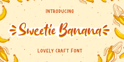 Sweetie Banana - is a Cute & Lovely Craft font with a natural handwritten feel. This handmade font will make your design has a beautiful natural touch for each details. It is perfect for any design project as Invitation,logo, book cover, craft or any design purposes. This font is PUA encoded which means you can access all of the magical glyphs and swashes with ease! It also features a wealth of special features including alternate glyphs and ligatures.
 - Lovely Sweetie by Almarkha Type,
$25.00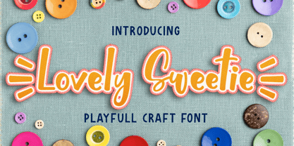 Lovely Sweetie - is a Playful Craft font with a natural handwritten feel. This handmade font will make your design has a beautiful natural touch for each details. It is perfect for any design project as Invitation,logo, book cover, craft or any design purposes. This font is PUA encoded which means you can access all of the magical glyphs and swashes with ease! It also features a wealth of special features including alternate glyphs and ligatures.
 - Athens by EllenLuff,
$38.00 Athens is an elegant typeface of contrast. Designed for branding, headlines and titles. The family offers class and clarity at larger and smaller sizes. Its a modern take of the old didone genre, confidently playing with extremes of thick strokes and whisper-thin curves, but removing the serifs, planting it firmly in modern day design. Its a careful collaboration between beauty and function. FEATURES 10 Fonts (4 weights + inline + matching italics) Supports ALL Latin based languages. (657 Glyphs per font) 2 options of numbers (Basic and stylistic) Athens features upper and lower cases, USE Each font offers something different and are all crafted to work harmoniously together. Athens Light, Regular, Bold and inline is designed specifically for headlines, titles and branding. Athens Book is optically designed for use in smaller sizes, making great body copy.
 - Blueberry Spot by Kaer,
$14.00 I’m glad to present my new hand-drawn typeface Blueberry Spot. The clearances in some letters are filled as if somebody put a blueberry blot in them. Also, I created the second style of this font. If you don’t want blots use a clear style. This font is perfect for making your project look pleasantly scruffy, handmade. Use it for nice identity, funny craft package, blog posts, holidays poster, etc. What's included? Regular and Clean styles Uppercase and lowercase Multilingual support Numbers Symbols Punctuation I hope you enjoy this font. Follow my shop to receive updates of products and the very hottest news! If you have any question or issue, please contact me: kaer.pro@gmail.com Please request to add additional characters and glyphs if you need! Thank you!
 - Teenage Rockstar by Teenage Foundry,
$19.00 TF Teenage Rockstar Display Script Font - a stylized design that is sure to bring a touch of elegance and sophistication to your projects. Our font features swooping tails on select lowercase letters, adding an extra level of flourish and personality that is sure to capture attention. There are 2 styles available (Regular & Extrude). Both font versions are meticulously crafted with attention to detail, ensuring that each letterform maintains its structural integrity while still conveying its unique style. With our display script font, you can create designs that are both elegant and impactful, giving you the freedom to express your creativity with confidence. Features: Uppercase, Lowercase, Numeral, Opentype Features, Punctuation & Multilingual. Note: To access tails, just type underscore + underscore + numeral. The alternates feature must be active. Example __3 For any questions please contact me 🙂 Thanks!
 - Mister Bones NF by Nick's Fonts,
$10.00Alpha Midnight, reconstructed from an unnamed source by Dick Pape for Solotype, provided the pattern for this big, bold, unconventional stencil face, sure to grab your readers' attention. Both versions include the complete Latin 1252, Central European 1250 and Turkish 1254 character sets, as well as localization for Moldovan and Romanian. - Picaro NF by Nick's Fonts,
$10.00A rather quaint but charming typeface, originally named Harlequin, provide the inspiration for this typeface. Its mild eccentricities will add an inviting warmth to your next project. Both versions of this font contain the Unicode 1252 (Latin) and Unicode 1250 (Central European) character sets, with localization for Romanian and Moldovan. - Ekberg by Scriptorium,
$12.00Ekberg is based on a sample of poster lettering by Samuel Welo. It's got a spare but stylish and rather modern look. It's a bit of a change from our usual fare, but a gap we need to fill. Ekberg features more than one version of a lot of the characters. - Maleys by Luxfont,
$48.00 Welcome to the world of Maleys color fonts - where trendiness and playfulness meet in dynamic harmony. These fonts give your designs a breath of fresh air, adding originality and inspiration. Features: - Real Golden effect - Extras - Kerning - Multilingual IMPORTANT: - Check the glyphs in the font before buying! - SVG fonts contain raster letters.
 - Memorial by Solotype,
$19.95The Fredrick Ullmer Co. in London acted as agent for many typefoundries, and this was one of their offerings. Some of the letters were rather outlandish, so we fearlessly decided to improve them. The result is this dated but pleasant font. The original didn't have a lowercase, so we added it. - Medieval Gunslinger by Ingrimayne Type,
$14.95 What would happen if one took a rather crude, squared-serifed typeface of the type popular in the 19th century and added medieval and calligraphic ornamentation? Maybe the result would be Medieval Gunslinger. The MedievalGunslingerShadOverlay font is spaced so that it can be layered with MedievalGunslingerShadow to produce bicolored lettering.
 - Veljovic Script by Linotype,
$103.99ITC Veljovic Script was designed by Jovica Veljovic and displays an obvious calligraphic heritage. The designer was strongly influenced by German designer Hermann Zapf and Israeli designer Henri Friedlander. ITC Veljovic Script exhibits a crisp precision, as if the letters were cut in stone rather than drawn with pen and ink. - Art Week JNL by Jeff Levine,
$29.00 Art Week JNL is a wider variant of the lettering style used on many WPA (Works Progress Administration) posters for the arts in the Depression-era 1930s. Wider than the version used for Concert Series JNL, it also features an ‘A’ with a rounded top rather than the flat, square version.
 - Farm Bluster by Zeenesia Studio,
$14.00 Farm Bluster is a sweet and friendly handwritten font. Its natural and unique style makes it incredibly fitting to a large pool of designs. perfect for large design project like Tshirt, Advertising, bags, quotes, food , poster, fashion, custom sticker, magazine, and many others. It completed with numbers and punctuation. Multilingual support, and came with PUA encoded.
 - KellyAnnGothic - Unknown license

- LaurenScript - Unknown license

- PerryGothic - Unknown license

- Best Choice Demo - Personal use only

- Basic Map - Personal use only

- Nightbird is a font created by David Kerkhoff that captures the essence of spontaneity and a touch of eerie allure, transporting its viewers into a world that blurs the line between the fantastical a...
- Neacademia by Rosetta,
$70.00 Neacademia is a Latin and Cyrillic type family inspired by the types cut by 15th century punchcutter Francesco Griffo for Venetian printer Aldus Manutius. Beyond the letterforms themselves, however, the digital fonts themselves are based on the techniques and methods Griffo employed. The family comprises four distinct variants optimised for specific point sizes, as was traditional in metal type. While the display sizes maintain a visual link to calligraphic roots, text sizes exhibit more typographic qualities, following the hand of the carver. Likewise, Neacademia maintains its even colour on the page by carefully employing alternative letterforms, rather than leaning on a multitude of kerning pairs. A geeky little detail you’ll likely need to point out with a magnifying glass to your type friends, but creating a neat texture that works in readers favour nonetheless. Neacademia’s historically sensitive eye is put to work for modern typographers’ needs. It incorporates Griffo’s italic capitals and harmonizes them with the lowercase and the romans — where the original Aldine italics had no capitals of their own and simply re-used the uprights. It was designed with specific allowances for letterpress photopolymer printing. Printed digitally, it can tolerate – and even benefit from – low resolution, rough paper, and low-grade presswork. In many ways, it feels like using metal type again!
 - Capital by Fenotype,
$19.00 Capital is a multifunctional super family with modernist roots. It is comprised of two distinct subfamilies: Gothic and Serif. Both share the same structure and proportions and come in seven weights – thin, light, regular, bold, extra bold and black, along with corresponding italics. Both Capital families are equipped with a full set of Cyrillic characters, making them a versatile choice for multinational use. All Capital fonts come with the following Open Type features: Small Caps, Old Style Figures, Fractions, Numero-sign & Ligatures. Features specific for Gothic roman versions only are Circle Numerals, Titling alternate for the R character and Arrows. The Gothic italics have a Titling alternates feature where the true italic forms are omitted and replaced with simpler stroke endings. Both Capital gothic and Serif families are true workhorse fonts that can carry out almost any typographic task. Combine them both for the best results – multi-pack available for a no-brainer price.
 - M Lady PRC by Monotype HK,
$523.99 M Lady is a design inspired by Agfa Waddy’s rather elegant design comes with narrow proportion. M Lady is a rare condensed design in world of Chinese typefaces. Entry and finial points of strokes are squarish, with a sharp but small symmetric serif. It has a medium contrast to improve character recognition. Its thin stems (豎) make it suitable for fine print with minimal conglutination. Dots (點) are straight, reversely curved or round. Downstrokes (撇、捺), ticks (剔) and hooks (勾) are highly regular and consistent. Dots (點), downstrokes (撇、捺) and ticks (剔) are long, smooth, monolinear and curved with small symmetric serif and sometimes angled entry and finial points of strokes to create subtle sharpness in the midst of its softness and elegance, which is better for larger text print. Its features and construction create subtle sharpness in the midst of softness and slim elegance. It is best suited for casual subheading or display, set upright (non-slanted), non-condensed (naturally condensed).
 - Boldest Romance by Nathatype,
$29.00 If you are looking for an aesthetically fun, legible font, Boldest Romance is the perfect choice. It is a thickly designed weight display font to be legible and beautiful at the same time. This is perfect to apply for serious, formal contents as it gives a strong impression. Furthermore, this legible font has regular structures easing readers to recognize every letter correctly. You can also enjoy interesting features available here. Features: Alternates Ligatures Multilingual Supports PUA Encoded Numerals and Punctuations Boldest Romance fits best for various design projects, such as brandings, posters, banners, logos, magazine covers, quotes, headings, printed products, greeting cards, merchandise, social media, etc. Find out more ways to use this font by taking a look at the font preview. Thanks for purchasing our fonts. Hopefully, you have a great time using our font. Feel free to contact us anytime for further information or when you have trouble with the font. Thanks a lot and happy designing.
 - Smart Bars12 by Postage Saver Software,
$15.00 This is a special font for use creating US Postal Service "Intelligent Mail" barcodes. Those are the barcodes you see on most cards and envelopes. Commercial mailers get the best pricing by printing barcodes when they address the mail, saving the Postal Service a step. The barcodes are also used on reply mail and Share mail, and for "Informed Visibility" tracking. Software to create these barcodes, including the USPS Intelligent Mail Small Business (IMsB) tool, typically provide an output of 65 characters, each character being an A, D, T or F, corresponding to each of the styles of bar. SmartBars 12 replaces those characters with the corresponding bar. When doing a mail merge to print addresses, the user would set the barcode field on their merge template to be printed using SmartBars 12, at 12 point, regular, and the barcode will print with the correct bars and at the required size to meet USPS requirements.
 - M Lady HK by Monotype HK,
$523.99 M Lady is a design inspired by Agfa Waddy’s rather elegant design comes with narrow proportion. M Lady is a rare condensed design in world of Chinese typefaces. Entry and finial points of strokes are squarish, with a sharp but small symmetric serif. It has a medium contrast to improve character recognition. Its thin stems (豎) make it suitable for fine print with minimal conglutination. Dots (點) are straight, reversely curved or round. Downstrokes (撇、捺), ticks (剔) and hooks (勾) are highly regular and consistent. Dots (點), downstrokes (撇、捺) and ticks (剔) are long, smooth, monolinear and curved with small symmetric serif and sometimes angled entry and finial points of strokes to create subtle sharpness in the midst of its softness and elegance, which is better for larger text print. Its features and construction create subtle sharpness in the midst of softness and slim elegance. It is best suited for casual subheading or display, set upright (non-slanted), non-condensed (naturally condensed).
 - Balcony by Shaily Patel,
$10.00 Balcony is a decorative display typeface inspired by the patterns of metal safety grills. Its highly geometric features may be used to identify it as Art Deco. It is a monospaced type family with all characters confined in a square frame. The main idea of Balcony is to create a grill-like pattern when letterforms are placed together. This creates an illusionary experience for the reader. The best way to use this typeface is without leading, as shown in the visuals. Balcony also comes with two stylistic sets. The first stylistic set contains most characters with more decorative elements and the second one includes Dingbats. These Dingbats are motifs with simple geometric patterns that may be used for any kind of ornamentation. The diacritics letterforms are geometrically squeezed within the square frame to include the accents. This experimental typeface comes with about 650 characters and four weights (Thin, Light, Regular and Bold). The font family supports Western and Central European languages.
 - Armature Neue by fontBoy,
$15.00 Armature Neue is an extension and clarification of the original Armature family released in 1997. We made the distribution of weights more even, and added italics extra light and black weights. Originally consisting of four fonts, Armature Neue has twelve: six weights with accompanying italics. Although conceived as a display face, a number of alternate characters are included that can be used to regularize the type for text setting. Armature is one result of my interest in typefaces that are constructed, rather than drawn. Although it is basically a monoline design, there are subtle details throughout that compensate for a monoline’s evenness. As with all fontBoy fonts, there are dingbats hidden away in the dark recesses of the keyboard. When I first started designing this face in 1992, I called it Dino-I thought I would name all my fonts after famous pets-so the dingbats for Armature are dinosaurs. Designed by Bob Aufuldish with editing and production by Psy/Ops.
 - Trick Or Treating by Graphicxell,
$19.00 inspired by the famous minimalist logo perfect for the purposes of designing templates, brochures, videos, advertising branding, logos, invitation, layout design, elegant crafting, beauty design and other


