10,000 search results
(0.071 seconds)
- LD Remington Portable by Illustration Ink,
$3.00This font represents the type style created by this very famous classic typewriter. Remington was considered the father of all typewriter companies. - Onyx by Monotype,
$29.99 Gerry Powell, typographer, industrial designer, and director of typographic design for American Type Founders, designed Onyx font for ATF in 1937. A very popular advertising type in the 1940s, Onyx resembles an extremely condensed, bold member of the Bodoni family. Onyx is a good display font, with proportions that make it readable even when space is at a premium.
 - It Ain't Rocket Science - Personal use only

- Lady Ice - Extra Light - Unknown license

- Lady Ice - Small Caps - Unknown license

- Lady Ice - Extra Light - Unknown license

- Lady Ice Revisited Upper - Unknown license

- Zany Whatever It Means - Unknown license

- Do It Yourself JNL by Jeff Levine,
$29.00 Do It Yourself JNL was modeled after self-adhesive vinyl letters and numbers manufactured by Duro Art Industries of Chicago - formerly the Duro Decal Company. The hand-drawn look of the original lettering was retained by Jeff Levine to stay true to the design, and the rectangles that border each glyph represent the pieces of self-adhesive vinyl onto which the characters were silk screened. Limited character set.
 - KG Shake It Off by Kimberly Geswein,
$5.00 Hand-drawn by my 10-year-old daughter, this font comes in 4 whimsical styles- chunky, 3D, regular, and outline.
 - Microsoft JhengHei UI TC by Microsoft Corporation,
$129.00 - M XiangHe Hei TC by Monotype,
$187.99 The M XiangHe Hei Traditional Chinese typeface merges traditional brush strokes with modern letterforms to carefully balance traditional calligraphy with humanist design. Named for the smooth movements of a flying crane, the M XiangHe Hei typeface is designed to glide across the page, and features strokes that are partly derived from the Kaishu calligraphic style – an everyday script which dates back hundreds of years. M XiangHe Hei TC features Neue Frutiger for its Latin glyphs, and works harmoniously Neue Frutiger World and Monotype’s CJK typefaces: Tazugane Gothic (Japanese) and Seol Sans (Korean). M XiangHe Hei TC is a great choice for global brands using sans serif Latin typefaces looking to maintain their visual identity, and communicate with a consistent tone of voice with Traditional Chinese. The M XiangHe Hei TC fonts have over 19,000 glyphs, and support the BIG5/HKHCS and CP950 character sets for Traditional Chinese.
 - M Ling Wai TC by Monotype HK,
$523.99 - Brer Rabbit by Kitchen Table Type Foundry,
$15.00 Brer Rabbit (or Brother Rabbit) is the central figure in an oral tradition passed down by African-Americans. Brer Rabbit is a trickster, just like the other popular trickster character in African stories called Anansi the spider. Brer Rabbit was based on an old font of mine called Rabbit On The Moon. It is a nice, cute children’s book font that comes with extensive language support and Brer Rabbit himself, in the shape of the alternative asterisk glyph.
 - Customs Paperwork Pro AOE by Astigmatic,
$24.00 Customs Paperwork Pro brings the unique style of the NuMode Type No. 61 vintage typewriter keyset to the digital age. Antique typewriters have an incredible warmth and appeal to them, primarily because of their unpredictable "grunge" results that were a mix from the force of keystrokes to the wear of the ribbon and paper texture. This typeface is further fleshed out with SmallCaps and extensive figure sets to add a more serious note to the nature of the typeface, when needed. WHAT'S INCLUDED: Extensive language support. Customs Paperwork Pro has accented and special characters that support the following languages: Afrikaans, Albanian, Basque, Bosnian, Breton, Catalan Cornish, Corsican, Croatian, Czech, Danish, Dutch, Embu, English, Esperanto, Estonian, Faroese, Filipino, Finnish, French, Galician, German, Hungarian, Icelandic, Irish, Indonesian, Italian, Kurdish, Leonese, Luxenbourgish, Malay, Maltese, Manx, Maori, Meru, Morisyen, North Ndebele, Norwegian Bokmål, Norwegian Nynorsk, Nyankole, Occitan, Oromo, Polish, Portuguese, Rhaeto-Romanic, Romanian, Scottish Gaelic, Scots, Serbian (Latin), Slovak, Slovenian, Spanish, Swahili, Swedish, Tagalog, Turkish, Walloon, & Welsh. Antique typewriters are incredible, but they aren't something easily accessible to everyone, nor do most people want to fiddle with white out edits and the like. That's why typewriter fonts that capture the flavor of vintage typewriters are a no brainer (convenient and easily editable). I hope you enjoy playing with it just as much as I had fun making it.
 - Restraining Order Pro AOE by Astigmatic,
$24.00 Restraining Order Pro brings the unique style of a vintage typewriter keyset to the digital age. Antique typewriters have an incredible warmth and appeal to them, primarily because of their unpredictable "grunge" results that were a mix from the force of keystrokes to the wear of the ribbon and paper texture. This typeface is further fleshed out with SmallCaps and extensive figure sets to add a more serious note to the nature of the typeface, when needed. WHAT'S INCLUDED: Extensive language support. Restraining Order Pro has accented and special characters that support the following languages: Afrikaans, Albanian, Basque, Bosnian, Breton, Catalan Cornish, Corsican, Croatian, Czech, Danish, Dutch, Embu, English, Esperanto, Estonian, Faroese, Filipino, Finnish, French, Galician, German, Hungarian, Icelandic, Irish, Indonesian, Italian, Kurdish, Leonese, Luxenbourgish, Malay, Maltese, Manx, Maori, Meru, Morisyen, North Ndebele, Norwegian Bokmål, Norwegian Nynorsk, Nyankole, Occitan, Oromo, Polish, Portuguese, Rhaeto-Romanic, Romanian, Scottish Gaelic, Scots, Serbian (Latin), Slovak, Slovenian, Spanish, Swahili, Swedish, Tagalog, Turkish, Walloon, & Welsh. Antique typewriters are incredible, but they aren't something easily accessible to everyone, nor do most people want to fiddle with white out edits and the like. That's why typewriter fonts that capture the flavor of vintage typewriters are a no brainer (convenient and easily editable). I hope you enjoy playing with it just as much as I had fun making it.
 - Magisk Time by Bogstav,
$11.00 This is my roughly handprinted typewrite-ish font. It has all the cool and classic moves of the traditional typewriter look, but with a more rough attitude due to the contextual alternates (which offer 6 different versions of each letter!)
 - Wistar Type by Ana's Fonts,
$15.00 Wistar Typewriter is a monospaced typewriter font in two styles: Regular and Faded, in both vector and SVG versions, with dashed line and underline alternatives and a bonus caps font, for a total of 14 fonts. This font family is versatile and ready to use in modern and retro designs alike. With its soft realistic texture, Wistar looks great in both long or short texts, in digital collages, branding and packaging, social media posts, logotypes, etc. Software requirements for the SVG font: Photoshop CC2017+ // Illustrator CC2018+ No SVG support? No problem! The font includes a vector version of the font that keeps its textured goodness.
 - North by Wilton Foundry,
$29.00North is an elegant Light Condensed that provides some interesting surprises to conventional condensed fonts. Ideal for fashion, cosmetics, editorials and premium packaging design. - Click Clack by Fonthead Design,
$15.00ClickClack is a family designed by Ethan Dunham that is made of hand-drawn typewriter letters. An actual sample of a typewriter alphabet was blown up and carefully traced into the two versions, regular and light. This family has a bouncy, informal feel and is a departure from other typewriter fonts. - Apothecary by Pixel Colours,
$26.00 Apothecary is a modern stylish font duo that includes a sweet flowing script font and a typewriter font made from an authentic typewriting. Combine both fonts to create beautiful logos and branding. Design professional apothecary and botanical labels and packaging or make elegant wedding invitations. Includes: Apothecary regular: a script flowy monoline font Apothecary typewriter: an antique typewriter font perfect for small texts, taglines or info Lowercase and uppercase characters Numerals, alternates and ligatures. Language support
 - Monospasz by Yanone,
$30.00Monospasz means mono-fun in English. It's spelled with 'sz' instead of 'ß' for all you english speaking folks out there who always mistake it with a 'B'. Monospaced fonts keep on drawing attention to them because their proportions stand out from the canon of common fonts. "Yuck. Look at the condensed little m. Isn't that ludicrous?" But Monospasz isn't copycatting traditional typewriters, the most popular of monospaced fonts. It's completely manually ink-written and hand crafted. Monospasz has been designed and first used for the third incarnation of our annual Weimar based typography symposium dubbed "TypograVieh lebt" in the summer 2006. - Franklin Gothic by Linotype,
$45.99Franklin Gothic was designed by Morris Fuller Benton for the American Type Founders Company in 1903-1912. Early types without serifs were known by the misnomer "gothic" in America ("grotesque" in Britain and "grotesk" in Germany). There were already many gothics in America in the early 1900s, but Benton was probably influenced by the popular German grotesks: Basic Commercial and Reform from D. Stempel AG. Franklin Gothic may have been named for Benjamin Franklin, though the design has no historical relationship to that famous early American printer and statesman. Benton was a prolific designer, and he designed several other sans serif fonts, including Alternate Gothic, Lightline Gothic and News Gothic. Recognizable aspects of Franklin Gothic include the two-story a and g, subtle stroke contrast, and the thinning of round strokes as they merge into stems. The type appears dark and monotone overall, giving it a robustly modern look. Franklin Gothic is still one of the most widely used sans serifs; it's a suitable choice for newspapers, advertising and posters. - Monotype Goudy Catalogue by Monotype,
$29.99Originally designed for American Type Founders, Goudy drew inspiration from the classical old style faces for Goudy Old Style. Round characters have a strong diagonal stress, ascenders are fairly long but descenders are very short. Goudy bold was introduced in 1920; this was designed by Morris Fuller Benton. This typeface has been particularly popular in America where it is extensively used in advertising, book jackets, for labels and packaging. - Khonsong by Jipatype,
$27.00 ขอแนะนำฟอนต์ Khonsong ฟอนต์แบบ semi-condensed sans serif ซึ่งผสมผสานความทันสมัยและอนาคตเข้าด้วยกันอย่างกลมกลืน ด้วยรูปลักษณ์ที่โฉบเฉี่ยวและร่วมสมัย ความกว้างแบบ semi-condensed ทำให้มีความสมดุลที่สมบูรณ์แบบระหว่างการประหยัดพื้นที่และความสามารถในการอ่าน ทำให้เป็นตัวเลือกที่เหมาะสำหรับการใช้งานที่หลากหลาย ตั้งแต่สื่อออนไลน์ไปจนถึงสื่อสิ่งพิมพ์ Introducing "Khonsong," a semi-condensed sans serif font that embodies a harmonious blend of modernity and futurism. With its sleek and contemporary appearance, Its semi-condensed proportions strike a perfect balance between space-saving efficiency and legibility, making it an ideal choice for various applications, from online media to print media.
 - Uncle Sam Slim NF by Nick's Fonts,
$10.00Based on Morris Fuller Benton's 1905 oeuvre American Extra Condensed, this titling face packs a lot of information into very little horizontal space. Its champfered corners give the font an industrial feel which remains fresh even after more than a century. Both versions include the complete Latin 1252, Central European 1250 and Turkish 1254 character sets, with localization for Lithuanian, Moldovan and Romanian. - Genial by Scholtz Fonts,
$16.95 Genial is an elegant, contemporary script font in nine styles, specifically designed for maximum versatility. All of the styles, ranging from condensed thin to expanded fat, are clear and legible. The font conveys a feeling of relaxed elegance. The Family: Medium weights - Regular: of medium weight and regular width - Expanded: of medium weight and wide - Condensed: of medium weight and condensed width (narrow characters) - perfect for limited space Black weights (for best readability) - Regular: for bolder statements - Expanded: expanded width for bolder statements Light weights - Regular: regular width, delicate line - Expanded: wide characters and a delicate line - Condensed: condensed width (narrow characters) and a delicate line Fat weight - Expanded: for maximum impact (wide and extra-bold) Use a combination of styles for product branding, book covers, invitations, greeting cards. The Genial combination will enable you to use different styles of the same font for headings, sub-headings and body text. Genial contains over 250 characters - (upper and lower case characters, punctuation, numerals, symbols and accented characters are present). It has all the accented characters used in the major European languages.
 - Quadrus by ITC,
$29.99Quadrus is the work of New York graphic designer Peter Fahrni, a condensed open slab serif typeface. Fahrni was inspired by the lettering styles typical of baseball, basketball and American football sportswear. Quadrus is an all caps alphabet ideal for a variety of applications, particularly for those related to sports. - Franklin Gothic Pro by Red Rooster Collection,
$60.00 The original Franklin Gothic was designed in 1903 by Morris Fuller Benton. Franklin Gothic is named after Benjamin Franklin, America’s greatest printer. Our Franklin Gothic Black Condensed is unique because it is designed to set properly in all display applications. It contains all the high-end features expected in a quality OpenType Pro font.
 - Olympia by Linotype,
$29.99The typewriter font Olympia was developed by Hell Design Studio and is available in one weight. A typical characteristic of a typewriter face is that it is monospaced, meaning all characters take up the same amount of space, whether a relatively wide m or a relatively narrow i. Typewriters have all but disappeared from the workplace and such faces have lost their original, practical use, but their style and effect has kept them alive and well, especially in advertisements. - NorB Type Writer Roughen by NorFonts,
$25.00 NorB TypeWriter Roughen is the roughen version of my NorB TypeWriter typeface witch's my emulation of the IBM Selectric 'Light Italic' ball witch was used by my grand-brother for his correspondance during the 70’s and 80’s. It's however a slanted mono-spaced looking typewriter font. You may want to use this font with any word processing program for text and display use, print and web projects, apps and ePub, comic books, graphic identities, branding, editorial, advertising, scrapbooking, cards and invitations and any casual lettering purpose… or even just for fun! NorB TypeWriter Roughen features 677 glyphs, OpenType features and comes in 6 weights each with their matching italics and in a Light, Normal and Bold version.
 - Goudy National by Matteson Typographics,
$19.95 Frederic Goudy designed National Old Style Roman in 1916. It is loosely based on a logo he lettered for the National Biscuit Company in 1901. Steve Matteson expanded on Goudy’s original by designing a bold, semibold and matching italics. While much of Goudy’s work is strongly influenced by Venetian types of the 15th and 16th centuries - this design has a truly American quality about it. The design is useful for text or headlines that captures a sense of Americana.
 - Typist Slab Mono by VanderKeur,
$25.00 The typeface Typist originated during an extensive research on the origin and development of typewriter typestyles. The first commercially manufactured typewriter came on the market in 1878 by Remington. The typestyles on these machines were only possible in capitals, the combination of capitals and lowercase came available around the end of the nineteenth century. Apart from a few exceptions, most typestyles had a fixed letter width and a more or less unambiguous design that resembled a thread-like structure. A lot of this mechanical structure was due to the method the typestyles were produced. Looking at type-specimens for print before the first typewriters were good enough to came on the market we can see that in 1853 and in 1882 Bruce’s Type Foundry already had printing type that had a structure of the typewriter typestyles. Of course printing types were proportional designed as typewriter typestyles had a fixed width. So it is possible that except from the method of production for typewriter typestyles, the design of printing types were copied. In the design of the Typist, the purpose was – next to the monospace feature – to include some of the features of the early typewriter typestyles. Features such as the ball terminals and the remarkable design of the letter Q. This new typeface lacks the mechanical and cold look of the early typewriter typestyles. The Typist comes in six weights with matching italics in two versions. One that resembled the early typewriter typestyles (Typist Slab) and a version designed with coding programmers in mind (Typist Code).
 - Typist Code Mono by VanderKeur,
$25.00 The typeface Typist originated during an extensive research on the origin and development of typewriter typestyles. The first commercially manufactured typewriter came on the market in 1878 by Remington. The typestyles on these machines were only possible in capitals, the combination of capitals and lowercase came available around the end of the nineteenth century. Apart from a few exceptions, most typestyles had a fixed letter width and a more or less unambiguous design that resembled a thread-like structure. A lot of this mechanical structure was due to the method the typestyles were produced. Looking at type-specimens for print before the first typewriters were good enough to came on the market we can see that in 1853 and in 1882 Bruce’s Type Foundry already had printing type that had a structure of the typewriter typestyles. Of course printing types were proportional designed as typewriter typestyles had a fixed width. So it is possible that except from the method of production for typewriter typestyles, the design of printing types were copied. In the design of the Typist, the purpose was – next to the monospace feature – to include some of the features of the early typewriter typestyles. Features such as the ball terminals and the remarkable design of the letter Q. This new typeface laks the mechanical and cold look of the early typewriter typestyles. The Typist comes in six weights with matching italics in two versions. One that resembled the early typewriter typestyles (Typist Slab) and a version designed with coding programmers in mind (Typist Code).
 - Keystoned by TypeArt Foundry,
$45.00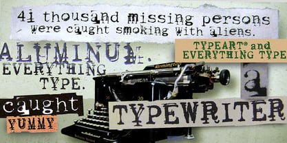 Typewriter with problem keys.
 - Special Elite Pro by Stiggy & Sands,
$29.00 Our Special Elite Pro brings the unique individuality of the Special Elite Type No. NR6 vintage typewriter keyset to the digital age. Antique typewriters would type with a warmth and appeal to them, primarily because of their unpredictable “grunge” results from force of keystrokes to ribbon and paper. The SmallCaps and extensive figure sets add a more serious note to the nature of the typeface. OpenType features include: - SmallCaps. - Full set of Inferiors and Superiors for limitless fractions. - Tabular, Proportional, and Oldstyle figure sets (along with SmallCaps versions of the figures). - Stylistic Alternates for Caps to SmallCaps conversion.
 - Rick's Cafe by NorFonts,
$30.00 Rick's Cafe font is my emulation of those typefaces used in newspapers, it's being inspired from my "NorB TypeWriter" typeface. You may want to use this font with any word processing program for text and display use, print and web projects, apps and ePub, comic books, graphic identities, branding, editorial, advertising, restaurant menus, newspapers, scrapbooking, cards and invitations and any casual lettering purpose… or even just for fun! Rick's Cafe font comes in 4 styles, Normal and Bold each with Italic and Condensed versions.
 - Galexica Mono by Ingrimayne Type,
$6.00 GalexicaMono is an attempt to create a futuristic typewriter font, which may be an oxymoron. Unlike most typewriter fonts, it is sans-serif. The family has two weights, plain and bold, each with an oblique style. For a variant of the design that is not monospaced, see Galexica.
 - Type Wronger JNL by Jeff Levine,
$29.00 A typewriter gives you clean, crisp text from its keys, but Type Wronger JNL does anything but this. A distressed typewriter font, this font emits a rough, crude imprint as if the original had been photocopied, copied from that copy and re-copied until the original message had degenerated.
 - Be safe - Unknown license


