10,000 search results
(0.095 seconds)
- Osbourne by Latinotype,
$39.00 Osbourne is a display typeface with titles based on a refresh, a revival of Salem, originally designed by Keystone Type Foundry. A font with elevated x-height and condense proportions. Visibly “sharp.” In addition to the default version, it has two other versions: one that is sharper and another with wide alternatives to the circular characters. Between these and its five weights, Osbourne has a range of personalities to fit a designer’s needs. Think titles, branding, short texts, whatever you want to make look good. Yet another font in the Latinotype arsenal that covers more than 200 languages within the Latin alphabet and basic Cyrillic.
 - Valverde by Jehoo Creative,
$20.00 Valverde is a super-serif font family with 2 widths condensed and normal, each width consists of 18 fonts and has a complete weight from thin to black combined with beautiful italic cuts to meet the needs of any design in any format. Inspired by the type of vintage look that has recently become a trend, this letter character has an elegant, sharp impression. Opentype features such as Stylistic Alternate and Ligature on the Valverde family make it look more aesthetic so that it fits in a classy modern look. Stunningly beautiful and modern serifs make them an essential addition to any type of tool kit.
 - Francker by Linotype,
$29.99 Francker is a sans-serif, based on clean and simple design principles that betray its Danish origin. Its curves are based on the “super ellipse”, a mathematical shape about half-way between an ellipse and a rectangle. Francker’s lowercase lettershapes a, b, n, and u, have no spurs, emphasizing the simplicity of their construction. The Francker family is available in two widths, normal and condensed, each in nine weights, from extra light to extra black. Use Francker for signage, posters, magazines, advertisements, or corporate identity projects—wherever an industrial, contemporary look is needed. The Francker type was developed and designed by Anders Francker, an engineer and designer living in Denmark.
 - Kamenica by Tour De Force,
$25.00 “Kamenica” - named after a beautiful small mountain river in Serbia - is a font family containing 3 weights: Light, Regular and Bold. The Kamenica river is only a few meters wide. Mostly shallow and cold, clear and green, it was the direct inspiration source for the creation of this condensed typeface. As our other typefaces, “Kamenica” also combines traditional shapes with modern forms, tall x-height and a collection of more than 300 glyphs. Comparing the river with the font, we could say that letters are the fishes that lives in the Kamenica river and that the font weights are the seasons in which this river shows most of its own character.
 - Actay by Arodora Type,
$50.00 Actay Font is an elegant and remarkable family with its highly legible geometric lines. Crowded family members are divided into three separate groups: Normal, Condensed, and Wide. Each group has 20 weights. Actay Font also provides Cyrillic Alphabet support, providing unlimited possibilities in many languages and will not let you down. The fluent functionality of Actay is achieved with multiple OpenType features, such as case-sensitive forms, contextual and stylistic alternates. The standard numerals set encompasses tabular figures and symbols, superiors and inferiors, numerators and denominators, plus fractions. Thanks to its corporate structure, Actay can be shaped and used in accordance with many design trends.
 - Mozzart Rough by Posterizer KG,
$19.00 Vintage, printed look Mozzart Rough typeface from Posterizer KG Type Foundry is one of two decorative versions of Mozzart Sans font family (slightly rounded, Neo-Grotesque corporate font, created for MOZZART D.O.O. company from Belgrade, Serbia). Mozzart Rough contains: 2 Weights, 2 Condensed and 1 Oblique version of the font, complementing each other perfectly. All versions contains completely MacOS Roman and MacOS Cyrillic code pages, tabular figures, small caps... Along with all of this, you will also discover extra added unique ornaments and symbols. It will be helpful for users to create realistic letterpress pages. Enjoy! Because of its complex outlines, Eveleth may process slowly in some applications.
 - Flinscher by Greater Albion Typefounders,
$16.00 The Flinscher family contains twenty display typefaces, in weights that vary from light to black, and widths that extend from condensed to expanded. The family’s design inspiration traces its roots to the early portion of the twentieth century. In essence, it is a calligraphic script typeface family with blackletter influences. The letter forms are decorative and distinctive, yet clear and easy to read, and in use set up a regular rhythm that leads the eye from character to character. The Flinscher typefaces are well suited to design work that needs to combine formality with fun. Just the thing for a certificate or a book cover!
 - Rockers Garage by Fikryal,
$18.00 Rockers Garage – Font is a display brush font. It’s perfect for logo, branding, title, social media posts, advertisements, product packaging, product designs, label, photography, watermark, special event, magazine, web designs, etc. If you have any questions please don’t hesitate to contact me. follow my Instagram: fkryall Thank you 🙂
 - Coconut Charcoal by Fikryal,
$18.00 Coconut Charcoal – Font is a display brush font. It’s perfect for logos, branding, title, social media posts, advertisements, product packaging, product designs, label, photography, watermark, special event, magazine, web designs, etc. If you have any questions please don’t hesitate to contact me. follow my Instagram: fkryall Thank you 🙂
 - Cream Soup by Fikryal,
$15.00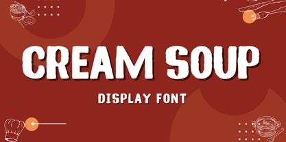 Cream Soup – Font is a display brush font. It’s perfect for logos, branding, title, social media posts, advertisements, product packaging, product designs, label, photography, watermark, special event, magazine, web designs, etc. If you have any questions please don’t hesitate to contact me. follow my Instagram: fkryall Thank you 🙂
 - Story Night by Fikryal,
$22.00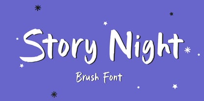 Story Night – Font is a display brush font. It’s perfect for logo, branding, title, social media posts, advertisements, product packaging, product designs, label, photography, watermark, special event, magazine, web designs, etc. If you have any questions please don’t hesitate to contact me. follow my Instagram: fkryall Thank you 🙂
 - Beatrise by Fikryal,
$15.00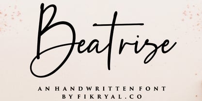 Beatrise is a new modern and stylish handwritten font. It's perfect for logos, branding, invitations, tittles, wedding designs, social media posts, advertisements, product packaging, product designs, labels, photography, watermarks, special events, magazines, web design, etc. If you have any questions please don't hesitate to contact me. :) Thank you
 - Mickstone Crush by Java Pep,
$17.00 Introducing Mickstone Crush script font that is equipped with tons of alternates characters starting of uppercase and lowercase. Mickstone Crush font it's perfect for logotype, branding identity, headline text, title, advertising, social media, and etc. Mickstone Crush font is available with multilingual support that is more than 30+ languages.
 - Courier Now is a refined version of the classic Courier font, which has long been a staple in the realm of typewriters and early computer systems. It embodies the spirit of the traditional Courier fo...
- Pulchra SPF by S6 Foundry,
$25.00 Pulchra is a stylish Brutalist font. The font displays a playfulness personality, vitality, with a strong and elegant appearance. The typeface has the right visual consistency for branding communications. It comes with unique lower and uppercase plus numbers, punctuation & multilingual letters. Its thick curves give the 60s & 70s groovy vibe. What you get: - Letters, numbers, punctuation, multilingual support, alternate and ligature - Light, Regular, Medium, and Bold version.
 - FS Truman by Fontsmith,
$80.00 Beyond broadcast Like Truman Burbank, the star of The Truman Show, FS Truman was born for TV. You’ll know it from Sky One’s on-screen trails and announcements, but it’s just as at home in other media. Its starting point was the skeleton of a highly legible, space-saving, corporate font with some of FS Dillon’s geometric discipline built in. Its distinctive tone of voice and “ownability” are in its boxy but friendly shapes, and characters with hybrid features. FS Truman’s weights and widths were honed to work at TV screen resolutions. A face for TV it may have been, but this is a font that works on every level, on screen, in print, in headlines, in listings, in longer text, in tight corners and open spaces. The space-saver Compact, condensed but crystal clear, FS Truman comes into its own where a lot needs to be said in not a lot of space. Its letter spacing allows the type room to breathe, even at small sizes, while its fulsome x-height and diminutive descenders pave the way for tighter leading. A natural for headlines and titles over three or four lines. “Hybrid” features With every font, Fontsmith look for crafty new ways to imbue letterforms with a consistent character. The idea with FS Truman was to introduce “hybrid” features. In open letters such as “c” and “s”, for example, the top terminals have straight, vertical cuts while their lower terminals have a more angular, cursive finish. Boxy, spacious forms with unusual curves and angles create not just highly legible and efficient letters but strongly distinctive ones, too.
 - M Razor HK by Monotype HK,
$523.99 M Razor is so called ""neo Sung-style"" typefaces. Crossbars (橫) and stems (豎) are orthogonal and upright. Their entry and finial points are squarish, parallel without flare. Contrast of strokes is extremely high. This creates sharpness, stiffness in the midst of elegance of Sungti. Even distribution of space, careful positioning, size and proportion of radicals create a slightly expanded, opened and balanced construction. Zhonggong are slightly expanded, its relatively less inter-character spacing makes the line of text better coupled and aligned. Its features and construction create a feel of wholesome, elegance with contrasting sharpness and stiffness. It is best suited for casual, creative display eye-catching text, set upright (non-slanted), non-condensed.
 - Cherritt by Greater Albion Typefounders,
$9.95 We think of Cherritt as a 'bullnosed' serif face, because of its rounded off serifs. What that phrase may not convey is the friendly, approachable nature of this large family of faces. The design was originally inspired by traditional draftsmens' hand-drawn serif lettering, but has been given a precise geometric flavor that suits it for work owing its inspiration to any era, from Victorian times through to the purely modern. They are ideal for headings and poster work, but also for setting small volumes of text. Four weights are included in the family, as well as wide, expanded and condensed forms, true small capitals and openface forms. All family members embody extensive OpenType features.
 - M Razor PRC by Monotype HK,
$523.99 M Razor is so called ""neo Sung-style"" typefaces. Crossbars (橫) and stems (豎) are orthogonal and upright. Their entry and finial points are squarish, parallel without flare. Contrast of strokes is extremely high. This creates sharpness, stiffness in the midst of elegance of Sungti. Even distribution of space, careful positioning, size and proportion of radicals create a slightly expanded, opened and balanced construction. Zhonggong are slightly expanded, its relatively less inter-character spacing makes the line of text better coupled and aligned. Its features and construction create a feel of wholesome, elegance with contrasting sharpness and stiffness. It is best suited for casual, creative display eye-catching text, set upright (non-slanted), non-condensed.
 - Sica Expanded by dooType,
$30.00The Sica Family was designed in order to address issues related to technology, while maintaining humanistic forms. Thus, a font with square shapes emerged, but with smooth curves and slightly rounded terminals making it friendly. The family has three widths – condensed, normal and expanded – each of them with six weights and their respective italics, resulting in 36 fonts. With particular details and open shapes that increase legibility, it can be used for both text compositions as well for display sizes. It has 774 glyphs, covering more than 50 languages, as well as ligatures, lining, oldstyle, tabular and proportional figures, fractions, superiors, inferiors, and small caps, all of them accessible through OpenType features. - Sica by dooType,
$30.00The Sica Family was designed in order to address issues related to technology, while maintaining humanistic forms. Thus, a font with square shapes emerged, but with smooth curves and slightly rounded terminals making it friendly. The family has three widths – condensed, normal and expanded – each of them with six weights and their respective italics, resulting in 36 fonts. With particular details and open shapes that increase legibility, it can be used for both text compositions as well for display sizes. It has 774 glyphs, covering more than 50 languages, as well as ligatures, lining, oldstyle, tabular and proportional figures, fractions, superiors, inferiors, and small caps, all of them accessible through OpenType features. - Acustica by Andinistas,
$49.67 Acústica is a display font family designed by Carlos Fabian Camargo G. Its styles were designed to form words and phrases related to delicate and feminine contexts. Acústica Caps, Italic, Swashes and Ornaments are drawn investigations with flexible tip pen inspired by Didot capitals. All ideal for mixing with Acústica Script whose idea represents the volatile sound of a fine tip brush against rapid tracing paper. Its script path in width condensed lowercase and uppercase letters in loose horizontal proportions are generous between letters laced with long, agile and thin connecting strokes. Its script sensitivity is in Italian calligraphy with uninterrupted lines of cursive English. Acústica was selected at the Bienal Tipos Latinos 2014. Photos by http://www.desdeesteladodemimundo.blogspot.com
 - Abrade by J Foundry,
$25.00 Abrade is a geometric sans serif with rational design choices for contemporary functionality. The family is designed with a medium x-height to provided great legibility in both display and text sizes. The forms are refined to work well in print and on screen. The italics maintain the rational forms, with only the essential structural changes. With 12 weights, the family is ideal for publications, digital media, corporate systems, branding, as well as your band’s gig poster. Abrade is equipped with extended language support, including Extended Latin, Greek, and Cyrillic. Features include: stylistic alternates, small caps, figure sets, and lots of OpenType features to keep designers happy.
 - Bordershine Script by CBRTEXT Studio,
$15.00 Bordershine Script is a beautiful and elegant modern calligraphy font. It's perfect for branding, wedding invitations, photography, bloggers, logos, content, greeting cards and more. Bordershine script calligraphy has beautiful uppercase and lowercase letters, numbers, and ligatures. If you have any questions, before or after purchase, please feel free to get in touch. Thank You.
 - ApronSoft by Hurufatfont,
$19.00 The genesis of ApronSoft font type family is inspired by soft-vertical structure of airplane window. On the other hand ApronSoft is making a reference to technological design mentality of early 2000's. In short texts it has stable view and also humanist effect. Very suitable for mobile apps, web designs, sportive & technological product packs and ads designs. Especially Narrow Bold and Condensed Bold Italic weights have fluid and strong expression for striking headlines. User friendly ApronSoft serves rich opentype properties; small capitals, alternative letters (a, c, e, g, k, l, q, s, y, A, C, G, K, M, N, R, S), stylistic sets, standart and optional ligatures, oldstyle figures, tabular linings, arrows, bullets and wide money currencies, fractions and math symbols. With reduced file size, it’s softer now!
 - Pariphoom by Jipatype,
$27.00 ขอแนะนำ Pariphoom แบบอักษรอันโฉบเฉี่ยวและทันสมัย เหมาะสำหรับงานออกแบบหลากหลายประเภท ด้วยอักษรแบบ sans-serif condensed และมุมโค้งมน แบบอักษรนี้ให้ความสมดุลที่ระหว่างความเป็นทางการและความเข้าถึงได้ง่าย ชื่อปริภูมิมาจากภาษาไทย แปลว่า “Space” และเช่นเดียวกับชื่อของมัน ฟอนต์นี้สามารถให้พื้นที่มากขึ้นในงานออกแบบของคุณ ไม่ว่าคุณกำลังสร้างสื่อสำหรับสร้างแบรนด์ พัฒนาแคมเปญการตลาด หรือออกแบบเว็บไซต์ Pariphoom มอบความยืดหยุ่นและความอเนกประสงค์เพื่อให้ได้รูปลักษณ์ที่คุณต้องการ Pariphoom มาพร้อมกับรูปแบบที่แตกต่างกันถึง 18 รูปแบบ สิ่งนี้ทำให้คุณมีตัวเลือกมากมายและมีความยืดหยุ่นในการใช้งานในหลากหลายบริบท นอกจากนี้ ฟอนต์นี้รองรับหลายภาษาสำหรับภาษาต่างๆ มากมาย แต่นั่นไม่ใช่ทั้งหมด Pariphoom มาพร้อมกับฟีเจอร์ Opentype เจ๋ง ๆ เช่น Small Caps และ Tabular ซึ่ง Small Caps เป็นวิธีที่ยอดเยี่ยมในการเพิ่มความหลากหลายให้กับงานออกแบบของคุณโดยใช้ตัวพิมพ์ใหญ่แทนตัวพิมพ์เล็ก ในขณะเดียวกัน Tabular ก็สมบูรณ์แบบสำหรับการสร้างตารางและจัดตำแหน่งตัวเลขเพื่อให้ดูเป็นระเบียบมากขึ้น โดยรวมแล้ว Pariphoom ทำให้เป็นตัวเลือกที่ยอดเยี่ยมสำหรับนักออกแบบที่ต้องการสร้างผลงานการออกแบบที่น่าจดจำและมีประสิทธิภาพ Introducing Pariphoom, a sleek and modern typeface that is perfect for a wide range of design projects. With its condensed sans-serif design and rounded corners, this font offers a unique balance of professionalism and approachability. Derived from the Thai language, the name Pariphoom means "Space" and just like its name suggests, this font can give you more space in your design. Whether you're creating branding materials, developing marketing campaigns, or designing websites, Pariphoom offers the flexibility and versatility you need to achieve your desired look. Pariphoom comes with 18 different styles. This gives you plenty of options to choose from and the flexibility to use it in various design contexts. Additionally, this font offers multi-language support for a wide range of languages. But that's not all – Pariphoom comes with some cool Opentype features such as Small Caps and Tabular. Small Caps are a great way to add variety to your design by using small capital letters instead of lowercase letters. Meanwhile, Tabular is perfect for creating tables and aligning numbers for a more organized look. Overall, Pariphoom making it a great choice for designers who want to create memorable and effective design projects.
 - LT Hakuna Matata by Latam Type Foundry,
$15.00 Introducing "LT Hakuna Matata" font collection, inspired by The Classic Movie Lion King. Styles: Normal, Outline, Shadow, Ink. Captures Timon and Pumbaa's essence. Normal exudes joy, Outline adds an artistic touch. Shadow creates depth, Ink offers handcrafted charm. Experience African savannah's energy in typography.- Where typography meets the magic of The Lion King. Enjoy! Thank's for Support!
 - Gineso by insigne,
$- Michaelangelo. da Vinci. Bellini. Rafael. Masters of Italian art whose names have dwarfed those of many other great Italian artists. Yet relics from these other artists remain, though often unnoticed because of their practical nature. These unknowns are the Italian Masters of vernacular sign painting, and insigne now gives a nod to their work with its new sans serif, Gineso. Based on its inspiration, Gineso was created for posters, headlines and logotypes. (It does well in apps, too, though the sign painters probably weren’t thinking about that at the time.) Aesthetically remedied, yet still with an uncut charm, Gineso’s condensed qualities make it especially nice for signs and titling where horizontal space is at a premium. The tight, narrow forms of its geometric design leave you with a robust flavor that will remind you of mamma’s spaghetti. But don’t worry; the font’s ample counters ensure your audience won’t be reading through a bowl of pasta. These condensed forms look great on their own or when their seven different weights and matching italics are utilized together. With the included OpenType features, fractions and superior/inferior positions are also available to broaden your palette. Even more, this font is ready for complex, professional typography with OpenType features like alternate letters and a large character set including Central and Eastern European Languages. So when you find yourself (or your project) in a tight space, stir in Gineso to get the right taste for your copy. It may just make all the difference.
 - Ocean View by Mans Greback,
$59.00 Ocean View is a beautiful handwriting lettering. This script typeface is cute and feminine, optimized for a modern signature logotype with a genuine craft style. Its monolined strokes and hand drawn letterforms emits optimism and lightheartedness. Use underscore _ to make a swash. Example: Cle_arly Use multiple underscores to make different swashes. Example: Super__________star (Download required.) The Ocean View family consists of five high-quality cursive fonts: Thin, Light, Regular, Bold and Black The font is built with advanced OpenType functionality and has a guaranteed top-notch quality, containing stylistic and contextual alternates, ligatures and more features; all to give you full control and customizability. It has extensive lingual support, covering all Latin-based languages, from Northern Europe to South Africa, from America to South-East Asia. It contains all characters and symbols you'll ever need, including all punctuation and numbers.
 - Mandoul Script by Mans Greback,
$59.00 Mandoul Script is a sharp, active calligraphy typeface. With extra attention to quick letterforms and sharp details, this modern typeface turns any graphic project into a strong and confident work. It is provided in six styles, and three thicknesses: Thin, Regular and Bold, and each weight as Italic. Use underscore _ anywhere in a word to create a swash. Example: Hand_script Use multiple underscores for different swashes. Example: Bea__utiful (Download required.) Mandoul is built with advanced OpenType functionality and has a guaranteed top-notch quality, containing stylistic and contextual alternates, ligatures and more features; all to give you full control and customizability. It has extensive lingual support, covering all Latin-based languages, from North Europe to South Africa, from America to South-East Asia. It contains all characters and symbols you'll ever need, including all punctuation and numbers.
 - Dakota Motors by Mans Greback,
$69.00 Dakota Motors is a bold script font. This retro font is expressive, and is constructed of sharp strokes and heavy letterforms. Use it for a cool logotype or headline to give your work that genuine look. Use underscore _ to make a swash. Example: Puch_ Use multiple underscores to make longer swashes. Example: RaceCar_____ (Download required.) The Dakota Motors family consists of four high-quality fonts: Regular, Italic, Bold and Bold Italic The font is built with advanced OpenType functionality and has a guaranteed top-notch quality, containing stylistic and contextual alternates, ligatures and more features; all to give you full control and customizability. It has extensive lingual support, covering all Latin-based languages, from Northern Europe to South Africa, from America to South-East Asia. It contains all characters and symbols you'll ever need, including all punctuation and numbers.
 - Danbury by Mans Greback,
$49.00 Danbury is a modern sans-serif typeface. Drawn and created by Mans Greback between 2020-2022, this slanted font has a distinct style and a strong personality. Danbury is a typeface with velocity and power: Use it in a sports campaign, a fresh headline or a cool logotype. The Danbury family is provided in the styles Regular and Bold, Caps and Caps Bold, Small and Small Bold: the perfect setup for a diverse design usage. The font is built with advanced OpenType functionality and has a guaranteed top-notch quality, containing stylistic and contextual alternates, ligatures and more features; all to give you full control and customizability. It has extensive lingual support, covering all Latin-based languages, from North Europe to South Africa, from America to South-East Asia. It contains all characters and symbols you'll ever need, including all punctuation and numbers.
 - Saint Carell by Mans Greback,
$69.00 Saint Carell is a decorative serif typeface. With Victorian letterforms, this elegant font has great contrast, a classic appearance and floral details. Drawn and created by Mans Greback in 2022, it is a fancy typeface with a luxurious style and a chic personality. The Saint Carell typeface family consists of six professional styles: The clean Regular font, the ornamental Deco style, plus four more decorated versions for the greatest variability in your design. The font is built with advanced OpenType functionality and has a guaranteed top-notch quality, containing stylistic and contextual alternates, ligatures and more features; all to give you full control and customizability. It has extensive lingual support, covering all Latin-based languages, from Northern Europe to South Africa, from America to South-East Asia. It contains all characters and symbols you'll ever need, including all punctuation and numbers.
 - Anthro by Studio Few,
$24.00 Tall X-Height, Angled Terminals and Medium Contrast, Anthro is a UI font designed with personality. Concieved as a hybrid between Grotesk & Humanist, Anthro pairs legibility with character.
 - Juggler by Jonahfonts,
$25.00 Juggler is a medium-line font suitable for work requiring a friendly style. Ideal for packaging, also suitable for special invitations, birthday cards, posters, ads and book jackets.
 - Camber by Emtype Foundry,
$69.00 Camber is the last in a personal series of squarish sans. It is a noiseless typeface with a geometric base, it has a synthetic and clean design, but with a human sensitivity where the geometry fails. It tries to be more versatile and simpler than its predecessors, with a pragmatic approach, having less visual noise and virtually removing the disturbing elements. The family is generous in width meeting a certain shortage of wider fonts. Camber works well in both display and text, it is a multipurpose font suited for magazine, branding and web. The type family consists of 14 styles, 7 weights (Thin, UltraLight, Light, Regular, Medium, SemiBold and Bold) plus italics and it’s available in Open Type format. For more details please see the Camber PDF.
 - Monologue by Halfmoon Type,
$20.00 MONOLOGUE is a simple, condensed sans serif font with bold and complex personality. It was purposely crafted to be used in large point sizes, although it doesn't lose it's magic in small point sizes. It is perfect for headline, billboard, magazines, website, titles, poster, branding, and logos. With tons of ligatures, alternates, and other features to choose from, you can make your project stand out from the rest. FEATURES: Basic latin characters, numerals, punctuations and symbols. Extensive language support, including slavic languages with cyrillic alphabet. Stylistic Alternates Stylistic Sets (ss01–ss06) 100+ Discretionary Ligatures Ordinals Preconstructed fractions Fractions Superscript and Superscript Numerals Kerned, spaced, and hinted If you have any questions, please don't hesitate to contact me via email at muhtadi.yusril@gmail.com. Check out my other works, such as font design, lettering, and type exploration on Instagram @yusril.muhtadi (https://www.instagram.com/yusril.muhtadi) Thank you for visiting and have a great, great day! Yusril Muhtadi
 - london 2012 - Personal use only

- Beton by Linotype,
$29.99The Bauer Typefoundry first released the Beton family of types in 1936. Created by the German type designer Heinrich Jost, the present digital version of the Beton family consists of six slab serif typefaces. First developed during the early 1800s, by the 1930s slab serif faces had become one of many stock styles of type developed by foundries all over the world. Because of their distance from pen-drawn forms and their industrial appearance, they were seen as “modern” typefaces. (Their serifs kept them from being too modern.) The first slab serif typefaces were outgrowths of didone style text faces (e.g., Walbaum). As newspapers and advertising grew in importance in the western world (especially in “Wild West” America), type founders and printers began to create bigger, bolder typefaces, which would set large headlines apart from text, and each other. Through display tactics, businesses and industry could begin to visually differentiate their products from one another. This craze eventually led to the development of monster sized wood type, among other things. By the 20th Century, the typographic establishment had begun to tame, categorize, and codify 19th Century type styles. It was in the wake of this environment that Jost developed Beton. The Beton family is a type “family” in a pre-1950s sense of the word. Although six styles of type are available, only four of them fit in logical progression with each other (Beton Light, Beton Demi Bold, Beton Bold, and Beton Extra Bold). The other two members of the family, Beton Bold Condensed and Beton Bold Compressed, are more like distant cousins. They function better as single headlines to text set in Beton Light or Beton Demi Bold, of as companions to totally separate typefaces. - Arial by Monotype,
$45.99 Arial is one of the most widely used designs of the last 30 years. Drawn in 1982 by Robin Nicholas and Patricia Saunders for use in an early IBM® laser printer, Arial has become a staple for textual content. While it is widely believed that Arial's design was based on Helvetica, it is more accurate to consider Monotype Grotesque as its ancestor.
