10,000 search results
(0.085 seconds)
- Skyline by Font Bureau,
$40.00 Skyline was commissioned from Font Bureau by Condé Nast specifically as a headline typeface for Traveler magazine. This strongly personal work by Imre Reiner from 1929 and 1934 was known in Europe as Corvinus. Skyline Black and Bold Condensed offer immediate headline recognition through Reiner’s variations on the themes found in the classical Modern structure. Both styles were adapted by Jane Patterson; FB 1992
 - Garth Graphic by Monotype,
$29.99Released by the Compugraphic Corporation in 1979, the Garth Graphic font family is based on a design by John Matt from the 1960's, reworked by Renee LeWinter and Constance Blanchard. Garth Graphic was named after Bill Garth, a founder of Compugraphic. A fairly strong old style face suitable for text setting; the heavier weights and condensed forms are most used for display work. - Centima Mono by TipografiaRamis,
$29.00 Centima Mono is a subfamily addition to Centima type family. Centima Mono is a condensed geometric monospaced san serif, built in six styles. The typeface is intended for use in display sizes, but also is quite legible in text and is well suited for editorial and brand design. Centima Mono is released in OpenType format with support for most European languages and includes some opentype features.
 - Talesha by Seniors Studio,
$15.00 Talesha is a high contrast typeface inspired by old style and contemporary fonts. Talesha family consist of 8 fonts: Sans and Serif Font: Normal, Condensed, Slant with 239 glyphs each. Opentype features allow for the implementation of typographic niceties such ligatures and extended language support. Perfectly for elegant branding, web design, magazine design, logo design, headlines, posters, packaging, cards or wedding invitation and more.
 - Press Grotesk by Studio Vachement,
$19.99 Press Grotesk is a handmade sans serif, condensed font that takes inspiration from old letterpress printing processes & handcrafting. The font's slightly imperfect, uneven appearance works perfectly for surfing, skating, motorcycling, coffee shops, health, wellness, adventure brands, and much more. Press Grotesk features 2 weights (fat and skinny), upper- and lowercase, many advanced characters and illustrations in order to achieve a truly hand painted look.
 - Agharti by That That Creative,
$15.00 Agharti is a bold condensed display font perfect for headlines with a punch. The lowercase glyphs reach as high as the capitals so even if you are not typing in all caps you will have a solid impactful block of text. These extra tall lowercase letters will be sure to catch attention from any viewer and add some playful delight to any design project.
 - PAG Club by Prop-a-ganda,
$19.99Prop-a-ganda offers retro-flavored fonts inspired by lettering on retro propaganda posters, retro advertising posters, retro packages all the world over. This is perfect font for your retrospective project. PAG Club is a condensed font with a funny and retro character. The features of the typeface is in unusual figures of unbalanced characters. Ideal font to all kinds of retro design project. - Quick Meal by Jeff Levine,
$29.00 Quick Meal JNL is a ‘hand lettered’ interpretation of Morris Fuller Benton’s 1905 design “Miehle Extra Condensed Title”, no doubt named for [or on behalf of] the manufacturer of printing and die cutting presses that were used for years within the printing industry. The type face is available in both regular and oblique versions. Quick Meal JNL is a pun on the pronunciation of ‘Miehle’.
 - Etzada MF by Masterfont,
$59.00 Unique elegant font with condensed biblical scent. OpenType Pro Excellent support for Niqqud (Vowels). All marks are programmed to fit each glyph's shape and width. OpenType Pro includes new advanced features like Dagesh Hazak, ShevaNa, Qamatz Katan, Holam Haser and wide letters. Best used with Adobe InDesign CC that support complex Hebrew text. Please check these advanced features in this link: https://tinyurl.com/ybgdsxme
 - Morton by Deltatype,
$59.00 Morton, another modern grotesque typeface which deliver a extraordinary unique within typeface with the style of condensed let you create more impact with your design. Morton Type Family available in nine weights, the Thin weight deliver you a simple hair line stem until you reach the bold weight, you will get more dynamic with three stem weights which give you a modern, old school look and feel.
 - Nina by Microsoft Corporation,
$49.00Nina™ Family is a new condensed sans serif typeface designed to be as readable as possible at small sizes, whilst squeezing in as many characters per inch as feasibly possible. Nina Family typeface was designed for Microsoft by world renowned type designer Matthew Carter, and hand-instructed by leading hinting expert, Tom Rickner. Character Set: Latin-1, WGL Pan-European (Eastern Europe, Cyrillic, Greek and Turkish). - People Talk JNL by Jeff Levine,
$29.00 A title card with cast credits for the 1935 movie “The Whole Town’s Talking” (starring Edward G. Robinson and Jean Arthur) formed the basis for People Talk JNL. The hand lettered names were done in a slightly condensed slab serif – mostly rectangular in shape with rounded corners. A few characters take on their own unique appearance. People Talk JNL is available in both regular and oblique versions.
 - Integrity JY Pro by JY&A,
$49.00 Because of the need for a new condensed serif font family, Jack Yan created this individualistic style of typefaces complete with one of the largest collections of unusual ligatures available at the time of launch in the mid-1990s. As well as the usual selection of double-f and ct, JY&A has provided gr, gt, ty, and other ligatures for JY Integrity Roman and Italic.
 - Boughy by Craft Supply Co,
$17.00 Boughy – Font Family is a versatile display serif font family with 9 weights from ultra condensed to extra expanded. perfect for headings, titles, branding and much more. Boughy – Font Family contains everything you need to create stunning typography – from headline fonts to body text fonts – all in one place. Whether you’re starting out or you’ve been designing for years, Boughy has everything you need.
 - Yanice by Viaction Type.Co,
$20.00 Yanice is a semi-condensed sans serif font that has a strong and subtle character. Perfect for modern & industrial themed designs. Yanice is available in 4 styles that you can use according to your needs. Get the Yanice font now at a great price to speed up your work. Feature Font : Standard Ligature Multilingual Support Symbol & Punctuation I hope you enjoy and thank you. Viaction Type
 - Beagley by Seniors Studio,
$35.00 Beagley Display is a contemporary serif typeface, special designed for printing and advertising. With deliberately tight kerning. Beagley provides a warm and friendly atmosphere. Suitable for logotypes, brands, magazines and editorial. The font contains 6 styles from condensed, normal and expanded, plus matching italics. 250 glyphs include ligatures, discretionary ligatures and a wide range of flexibility for Latin language support for every typographical needs.
 - Famiar by Mans Greback,
$39.00 Famiar is a professional sans-serif typeface. It is friendly and optimistic while retaining an intellectual appearance and smooth, balanced curvatures. Drawn and created by Mans Greback between 2020-2022, Famiar has a fresh style and a strong personality, and is a great option for many modern designs. Provided in 18 high-quality styles, such as Thin, Light, Regular, Bold, SemiBold, ExtraBold, Black and Italic, the diversity of the typeface family ensures it can always be used to its fullest potential. Famiar is built with advanced OpenType functionality and has a guaranteed top-notch quality, containing stylistic and contextual alternates, ligatures and more features; all to give you full control and customizability. It has extensive lingual support, covering all Latin-based languages, from Northern Europe to South Africa, from America to South-East Asia. It contains all characters and symbols you'll ever need, including all punctuation and numbers.
 - Bion by Type Forward,
$38.00 Bion is a contemporary geometric sans serif with a down-to-earth attitude. It is distinguished by a high x-height, vertically cut terminals, and a minimal stroke contrast, giving it a distinctive, sharp look that is both timeless and universally appealing. Bion comes with 40 weights in a single variable file, ranging from Hairline to Black. We also included Upright, Italic, and Condensed variations to give you a fresh and diverse look for poster and title designs. Whatever message you want to get across, Bion has you covered - with support for 220 languages and 1,220 glyphs in total, as well as Extended Latin, Cyrillic and Greek scripts and an exhaustive list of typographic symbols. Our latest typeface also arrives packed full of OpenType features, including an alternative glyph set that will transform the way your text looks, giving it a more squarish appearance and offering additional visualization options. The Bion type family also includes an extensive set of standard and discretionary ligatures, tabular and small figures, fractions, and language localizations. These features work in static and variable fonts alike, providing a ready-made solution to all your advanced typographic needs. This functional, pragmatic typeface is clean and easily readable, making it an ideal choice for both print and on-screen media.
 - Blackoak by Adobe,
$29.00Joy Redick designed Blackoak, a big and heavy Egyptienne-sytle titling slab serif face, in 1990. The extremely robust style of the characters in this typeface was consciously distorted; creating letterforms that appear flattened and stretched, like a rubber band. Blackoak is drawn in the style of old wood tpes, just like those that one envisions when one thinks of the large, decorative posters that once filled Wild West America. The wood type collection of the Smithsonian Institute in Washington, DC acted as a primary source of inspiration for this design. True to its rooks, Blackoak is meant for use exclusively in headlines in very large point sizes, or for logos and other corporate advertising purposes. - NS Lasttown by Novi Souldado,
$40.00 Inspired by the 18th - 19th century of Penmanship specimens archive from Europe and America, carefully crafted with precise mood, technique, and visual touch to bring back your design works into that specific era. It comes with a collection of 3 fonts that match well with each other. Also a set of wide features such as Ligatures and alternative swashes. Lasttown will be a great choice for your classy and formal visual looks such as certificate design, vintage label, commercial lettering works, sign painting, glass gilding, logo type projects, liquor store branding, wine packaging, anytime you need a classic visual touch, please, be our guest. What you get : Standard & Discretionary Ligatures Stylistic set Numerals & Punctuation
 - Urban Blocker by Din Studio,
$25.00 Have you been looking for a graffiti font? Do you dream of creating headings that stand out and inspire creativity, imagination, modernity, and endless fun? Then we’ve got just the font for you! Introducing Urban Blocker-A Graffiti Font This bubble graffiti font can be used for a host of different content needs and projects. An excellent choice to add the right amount of street vibe and playfulness. Create gorgeous printed quotes, standout packaging, or beautiful t-shirts! You can even use it to create amazing headings, logos, menus, and social media graphics. Chalkboard includes multilingual options to make your branding reach a global audience. Features: Standart Ligatures Multilingual Support PUA Encoded Numerals and Punctuation Thank you for downloading premium fonts from Din Studio
 - Gazzetta by TipoType,
$24.00 Gazzetta is a condensed font family with a display character and neo-grotesque nature, friendly and energetic. It exhibits softened features and curves, very sharp joins between some strokes, and a slight reverse contrast in its thicker weight. Characteristics that give it a lot of personality and display capacity.The family is made up of 8 weight variables and their respective slanted versions, with substitutions in some glyphs that seek to maintain an italic flavor. It has a repertoire of OpenType features, including Stylistic Alternates, Case Sensitive Forms and Old Style Figures. In addition to decorative resources such as circled numbers, arrows and quotation marks. Its aesthetic and technical attributes can be used in the design of book covers, newspapers, magazines, posters, large format materials, websites and apps.
 - Geographica Script by Three Islands Press,
$39.00 Time-tested elegance is what you’ll get with Geographica Script, a handwritten typeface steeped in 18th century sophistication. Source materials include the maps of Emanuel Bowen (circa 1694–1767), Geographer to King George II, as well as English and American trade cards from the middle 1700s, including the work of artist and printmaker William Hogarth (1697–1764). A kindred font to our Geographica serif family, Geographica Script is a painstaking replication of the elegant roundhand cursive seen in engravings of the period. Geographica Script has more than 1,100 glyphs, including scores of standard and contextual ligatures, three full uppercase alphabets, historical forms, decorative flourishes, and full Latin support. It’s also got fifty evocative ornaments inspired by map and trade card illustrations, e.g., lion rampant, unicorn rampant, crowns, anchors, sailing ships, whale, dolphin, sun, moon, and many others. Note: To prevent Microsoft Word from cutting off Geographica Script’s extra-long descenders, set line spacing (Format —> Paragraph —> Spacing) to 1.5 lines.
 - Upper Clock by Casloop Studio,
$5.00 Introducing Upper Clock Typeface, your ticket to a world of typographic innovation, drawing inspiration from the sleek design of the ETCH Clock. Prepare to explore a myriad of creative possibilities for your Display Text with this cutting-edge typeface. Tired of mundane, uninspiring fonts that lack personality and flair? Upper Clock Typeface is here to infuse your digital designs with the vivacity of Retro Flat, the whimsy of Memphis, and the evocative nostalgia of Modern Nostalgia. Comprehensive multi-language support, including Western European, Central European, South Eastern European, South American, Oceanian, and even Esperanto. Upper Clock isn't merely a typeface; it's your ultimate solution to typographic challenges. This versatile tool is your gateway to crafting visually stunning, one-of-a-kind designs within the realm of Display Text. As you implement Upper Clock Typeface, watch in awe as your typographic dilemmas seamlessly transform into relics of the past. Take your design endeavours to new heights with Upper Clock Typeface today! Upper Case.
 - Kiperman by Harbor Type,
$29.00 🏆 Selected for Tipos Latinos 9. 🏆 Selected for the 13th Biennial of Brazilian Graphic Design. 🏆 Hiii Typography 2018 Merit Award. Kiperman is a text typeface designed in honor of Henrique Leão Kiperman, founder of the publishing house Artmed, now Grupo A. Its forms are simple and straightforward, with no unnecessary embellishments that could disturb the reading. The fonts are slightly narrower than normal, which yields higher efficiency without compromising reading comfort. Besides that, its italics are not just a slanted version of the romans, but rather a separate drawing. With a slope of 8°, its calligraphic structure provides the right amount of emphasis when necessary. The Kiperman typeface works best when setting books, magazines, ebooks and websites. It will also work very well in branding and packaging projects where a sober typeface is needed. The inspiration for the design came from the personality of the honoree. Just as Henrique always wanted to stay away from spotlights, the Kiperman typeface was designed so that it would not call attention to itself or impose any obstacles in the understanding of the text. In this way, the fonts revere Henrique’s legacy by respecting and honoring the published content. Henrique Leão Kiperman began his career in 1958, selling medical books in travels through the interior of the Brazilian states of Paraná and Santa Catarina. In 1973, he opened a bookstore in downtown Porto Alegre, the Artes Médicas Sul, and a few years later edited his first book. Since then, his company has grown to become one of the most important publishers in Brazil in the area of scientific, technical and professional books, with more than 2400 active titles distributed among the McGraw Hill, Bookman, Artmed, Penso and Artes Médicas imprints. Henrique passed away in 2017 at the age of 79. The Kiperman type family has been commissioned by Grupo A and is available for licensing. This was the way found for the fonts to be read by more people, spreading some of his spirit around the world.
 - Sadi Slab by Koray Özbey,
$19.00 Sadi Slab is designed to be used on small scales like book texts, newspapers, magazines etc. Also its large counters make the font suitable for digital screens. The anatomy of the typeface gives a formal appearance which is a more fitting choice for subjects like law, finance, medical science etc.
 - Roadkill by Device,
$39.00 Derived from a photograph Rian Hughes took in Hong Kong, the Roadkill family of typefaces is a literal interpretation of rough and worn road lettering. The original provided almost all of the key character shapes, with the others being designed to keep the unique hand painted feel intact. Most of the letters have alternate versions provided. This font works equally well at wider letterspacing settings. Roadkill Alternates provides curved versions of the 2 and the S, a G with higher crossbar, and less worn versions of several other characters. The heavy version packs even more gritty wallop in a non-condensed and blacker weight. Roadkill Heavy packs even more gritty wallop in a non-condensed and blacker weight. Use in conjuction with the original Roadkill and Roadkill Alternates. A set of arrows and other road symbols again taken directly from tarmac to Mac, thus preserving the worn and eroded appearance of the original characters is also part of the Roadkill family.
 - Kimono Kong - Unknown license

- Haigrast Script by Mans Greback,
$59.00 Haigrast Script is the light and thin handwritten font that brings a touch of fashion and fun to any project. Designed by Mans Greback in 2023, this signature script font is the perfect choice for designers looking to add a touch of personality to their work. With its cute and feminine design, Haigrast Script is ideal for wedding invitations, fashion logos, and other creative projects that require a fast, active and wild style. This font is perfect for those who want to make a bold statement in their design work. Whether you're creating a fashion magazine cover, a social media post, or a wedding invitation, Haigrast Script is the perfect choice for designers who want to make a lasting impression. Use underscore _ to make an underline swash. Example: Love_letter Use multiple underscores different underlines. Hand__________writer The Haigrast Script family consists of four high-quality fonts: Regular, Italic, Bold and Bold Italic The font is built with advanced OpenType functionality and has a guaranteed top-notch quality, containing stylistic and contextual alternates, ligatures and more features; all to give you full control and customizability. It has extensive lingual support, covering all Latin-based languages, from Northern Europe to South Africa, from America to South-East Asia. It contains all characters and symbols you'll ever need, including all punctuation and numbers.
 - State Machine by Barnbrook Fonts,
$30.00 State Machine is a display typeface inspired by lettering applied to American and Russian Cold War-era military vehicles. It also features an alternate character set inspired by 1970s hand-made political banners. The name State Machine is a term found in both political theory and computer programming. The theoretical definition describes the political and bureaucratic organisation of a state as well as the repressive state apparatuses such as the military and police. Max Weber describes the state as "a human community that (successfully) claims the monopoly of the legitimate use of physical force within a given territory". In computer programming, a state machine is a mathematical model of computation used to design computer programs. It is conceived as an abstract machine that is in one of a finite number of states. It can change from one state to another when initiated by a triggering event or condition. Taken at a wider conceptual level, when these two definition are combined the meaning becomes analogous to a tool (such as a philosophical idea) with which to transform a society.
 - Xpress by Wiescher Design,
$12.00 »XPress« is a very distinct, expressive, typical new Sans. »XPress« is my new Sans-Serif that impresses – especially in small sizes – with its outstanding readability. Seven precisely calibrated weights from »Thin« to »Heavy« and its corresponding italics make this font-family universally usable. »XPress« got its bearings from the fabulous American »Gothic« fonts of the twenties of last century. Modern, present day elements, high lowercase letters and infinitesimal elegant slight curves in start- and end strokes make the font family not only great for body copy, but also very useful in advertising. »XPress« ist eine individuelle, expressive, typische neue Sans. »XPress« ist meine neue Serifenlose die – speziell in kleinen Schriftgraden – durch aussergewöhnliche Lesbarkeit auffällt. Sieben präzise aufeinander abgestimmte Schnitte von »Thin« bis »Heavy« und dazu passende Kursive machen die Schriftfamilie vielseitig einsatzfähig. »XPress« orientiert sich bewusst an den grossen amerikanischen Groteskschriften der zwanziger Jahre des letzten Jahrhunderts. Durch moderne Formelemente, große Mittellängen und unendlich leichte, elegante An- und Abstriche ist die Schrift jedoch nicht nur als Textschrift, sondern auch im gesamten Bereich der Werbung vielseitig einsetzbar.
 - News Gothic No. 2 by Linotype,
$40.99News Gothic No. 2 is an enhanced version of News Gothic produced by the D. Stempel AG type foundry in 1984. It added more weights to the News Gothic family than were available in other versions, increasing its use in contemporary design and communication. The lighter weights of the original News Gothic were designed by Morris Fuller Benton in 1908 for American Typefounders (ATF). News Gothic typeface is quite similar to Benton's other sans serifs from the early twentieth century, including Franklin Gothic and Lightline Gothic. The bold weights were added to the News Gothic scheme in 1958. The capital letters in News Gothic No. 2, just like those found in News Gothic, have a similar visual width to each other. The lowercase is compact and powerful. These design attributes contributed to Benton's strong handle on the sans serif genre, and for years his types have been popular for newspaper headlines and many other uses. Still a popular presence on the font charts, News Gothic has proven its ability to get the job done right. - Braga Huis by Juru Rancang Studio,
$15.00 Braga Huis typeface is a font family that is inspired by the famous street in Bandung that was made to embodies the atmosphere and the environment of Netherland-Indie city at its golden time, whereby all the elements were designed to give the impression of structural, artistic, and advance. Braga Huis typeface has a strong Art Deco character, where the impression is depicted from the strong lines, curvy passion so it is very appropriate to describing the future atmosphere from the perspective of the 19th century. Braga Huis typeface has 3 font styles consisting of uppercase, lowercase and various alternative options that can be customize to your taste, poster is one of the media form of presentation that we believe is very appropriate for this type of font. But whatever the medium is, honestly we say; using Braga Huis typeface will make your artwork will never be cracked by time.
 - Aesthetic Romance by Sign Studio,
$15.00 Sign Studio presents a new font which is beautiful and romantic style. Aesthetic Romance is medium thick which means it can be versatile for captioning as well as Title Display. Equipped with beautiful Ligature characters and alternative characters. This font would be perfect for any design of titles, headers, branding, labels, magazines, posters and more.
 - Antique Ornaments JNL by Jeff Levine,
$29.00Antique Ornaments JNL collects twenty-six vintage printers' ornaments from the 1800s into one convenient digital font file. - Vtg Stencil US No. 4 by astype,
$18.00 The Vtg Stencil fonts from astype are based on real world stencils from several countries. The US No. 4 design was derived from a typical antique US-American stencil-plate. This revolving stencil-plate was invented by Eugene L. Tarbox and patented in 1868. It was a mass factored product and a very common tool in the United States until the success of the interlocking stencils. In case of US No. 4 an original early stencil plate from New York Stencil Works was used. The Regular font style is a clean font design featuring an extended Latin glyph set including some typical stencil ornaments and tabular figures. The Paint font style is made from true stenciled letters and features all the letters of the stencil-plate only. If you like the later interlocking design have a look to my Vtg Stencil US No.2 font. More info: pdf specimen
 - FF Unit by FontFont,
$104.99 German type designer Erik Spiekermann and American type designer Christian Schwartz created this sans FontFont between 2003 and 2011. The family has 14 weights, ranging from Thin to Ultra (including italics) and is ideally suited for advertising and packaging, book text, editorial and publishing, logo, branding and creative industries, small text, wayfinding and signage as well as web and screen design. FF Unit provides advanced typographical support with features such as ligatures, small capitals, alternate characters, case-sensitive forms, fractions, and super- and subscript characters. It comes with a complete range of figure set options – oldstyle and lining figures, each in tabular and proportional widths. As well as Latin-based languages, the typeface family also supports the Cyrillic and Greek writing systems. In 2004, FF Unit received the TDC2 award. This FontFont is a member of the FF Unit super family, which also includes FF Unit Rounded and FF Unit Slab.
 - Trade Gothic Next Rust by Linotype,
$29.00 Trade Gothic Next is Akira Kobayashi's 2008 revision of Jackson Burke's 1948 design. Developed over many years, the original Trade Gothic was filled with many inconsistencies. Under the direction of Akira Kobayashi, Linotype's Type Director, the american type designer Tom Grace, a graduate of the MA Typeface Design in Reading, was commissioned to redesign, revise, and expand the Trade Gothic family. Kobayashi and Grace refined many details such as the terminals and stroke endings, symbols, and the spacing and kerning. Moreover, there are newly added compressed widths and heavy weights perfect for setting even more powerful headlines. The Regular weight has been beefed up making it stronger and more robust in text settings. Trade Gothic is a staple of the advertising and newspaper industries, and now Trade Gothic Next brings more features and better quality for today's astute typographers. In addition several weights are available as soft rounded versions.
 - Chaloops by Chank,
$99.00 Where the heck does a name like Chaloops come from? You know that Chihuahua that used to sell the tacos? Chank's mother-in-law calls him Chalupa. And the American pluralization for that must be Chaloops, because that's her nickname for her two little spoiled fuzzball dogs. Another comic variation on Chank's whimsical handwriting, Chaloops is bouncy, quirky, and light-hearted like the Chauncy fonts. But Chaloops has more squiggles and its stroke terminals are mostly square. Just like you. Chaloops the font comes with a few alternate characters to give your designs a more authentic hand-drawn look. Happy and playful like a pair of frolicsome puppies, this font is perfect for kids’ products and marketing. Advanced OpenType features include "Stylistic Set #1: Decaf" which gets you a calmer, more legible variation. The fonts in this family come in 3 weights in cross-platform OpenType format for both Mac & Windows.
 - Marnilla Signature by AEN Creative Studio,
$15.00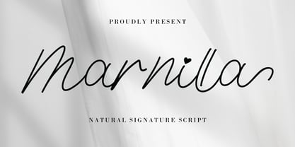 Marnilla Signature is a beautiful, elegant, yet casual and simple script font, featuring a natural look & feel. It has beautiful swashes and ligatures and it’s perfect for logos, wedding invitations, posters, social media posts, signatures, quotes, and much more!
