10,000 search results (0.061 seconds)
  1. Boneribbon Tall - Unknown license
  2. Berthside - Personal use only
  3. GearBox - Unknown license
  4. Roskell - Personal use only
  5. British Outline Majuscules - Unknown license
  6. Gears - Unknown license
  7. Chemical Reaction B BRK - Unknown license
  8. BONES - Unknown license
  9. Gumtuckey - Unknown license
  10. KR Snowman - Unknown license
  11. Avondale Outline - Unknown license
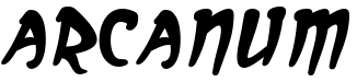
  12. Arcanum - Personal use only
  13. Umberto - Personal use only
  14. Rogue Hero Expanded Italic - Unknown license
  15. Chow Fun - Unknown license
  16. Chlorinej - Unknown license
  17. Spat Crumb - Unknown license
  18. GloucesterInitialen - Personal use only
  19. Geared Up - Unknown license
  20. Puritan Alternate - Personal use only
  21. Electrik Hollow - Unknown license
  22. GALLAECIA - Unknown license
  23. Iphegenia™ - Unknown license
  24. KR Down By The Sea - Unknown license
  25. Kremlin Starets - Unknown license
  26. HOUSEPIPES - Unknown license
  27. Quixotic - Unknown license
  28. Atlas of the Magi - Unknown license
  29. AmericanText BT - Unknown license
  30. Asrafel - Unknown license
  31. CochinArchaic - Unknown license
  32. DS CenturyCapitals - Unknown license
  33. Tiffy - Unknown license
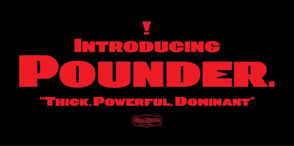
  34. Pounder by CozyFonts, $20.00
    Pounder Fonts were designed by Tom Nikosey / CozyFonts Foundry. This font, as all my fonts started with pencil sketches based on the letter O. Once I arrived at the comfortable shape I worked out the C, G, & Q. The H, M, T matched the visual weight and so I moved on to E & S. As the E & S are 2 of the most repeated characters in fonts' I wanted a little bit extra here. The font is obviously heavy weighted yet very legible and almost architectural in presence. There are flashes of Art Deco yet futuristic style. After sketching the feel of this font I was excited by the possibility of the numerals styling. I can see these used for many applications. Why the title Pounder? Why not it seems to fit.
  35. Beaumaris by Roland Hüse Design, $30.00
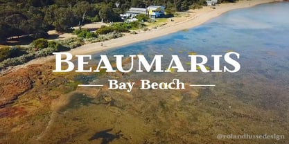
    Beaumaris is a serif typeface named after a nice bay area in Australia which I would like to visit one day. A modern bold serif with an art deco touch, this font is great choice for fashion brands, jewellery and magazine headlines. It contains stylistic alternates, discretional and standard ligatures, small caps and fractions (see image gallery for details). The character set covers all Latin accented characters (including Schwa) and Russian cyrillic alphabet. For additional customization please message me at: contact@rolandhuse.com Thank you & I hope you like this font!
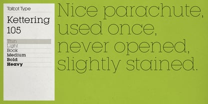
  36. Kettering 105 by Talbot Type, $12.99
    Kettering 105 is inspired by the classic, geometric slab-serifs such as Lubalin, but has shallower ascenders and descenders for a more compact look. It's a versatile, modern slab-serif, highly legible as a text font and with a clean, elegant look as a display font at larger sizes. It includes old style non-aligning (lower case) numbers, both proportional and tabular, as well as accented characters for Central European languages. The Kettering 105 family comprises of six weights and is closely related to Kettering 205, its more intensely Deco flavoured cousin.
  37. Eckhardt Dualine JNL by Jeff Levine, $29.00
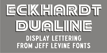
    While searching online for vintage type inspirations, an image was spotted of an old letterhead for a steel manufacturing company. The hand lettering of the word 'Ludlum' only offered D,L,M and E as visual examples, but from this Jeff Levine has designed Eckhardt Dualine JNL - a Deco-flavored dual-line type font. As with a number of other releases that emulate hand-lettering or sign painting, Jeff has named this font in honor of his good friend, the late Albert Eckhardt, Jr.; who ran Allied Signs in Miami from 1959 until his passing.
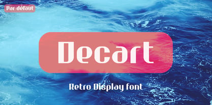
  38. Decart by Par Défaut, $9.00
    Decart is retro display font inspired by "Art Deco" style with more than 1100 characters, covering many languages using latin and cyrillic alphabet. The font also has 15 OpenType features : (All access Alternative (aalt) - Contextual Alternates (calt) - Fraction (frac) - Numerator (numr) - Denominator (dnom) - Superior (sups) - Inferior (sinf) - Tabular Figure (tnum) - Old Style (onum) - Ordinals (ordn) - Small Capital (smcp) - Small Capital From Capital (c2sc) - Case Sensitive Forms (case) - Stylistic Set (ss01 - ss02 - ss03) and Kerning (kern). Decart has, in addition, circled letters (basic latin & cyrillic), figures, fraction and arrows.
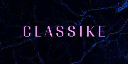
  39. Classike by Emtype Foundry, $69.00
    Classike is a high contrast squarish display typeface. Inspired by the Art Déco period from a modern perspective. Refined and elegant yet with a mechanical vibe, it is ideal for pairing with any functional font, it works especially well with Geogrotesque, from which it inherited its proportions and soul. Classike adds an exclusive touch and helps enrich your graphic voice. A Variable Font version is included with the family or as a separate style. Read some thoughts about the design process at the Emtype's blog. For more details see the PDF.
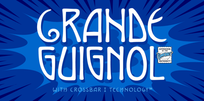
  40. Grand Guignol by Comicraft, $19.00
    A gruesome operatic drama is about to unfold, a tragic performance of the macabre! We offer for your entertainment a series of unfortunate events full of shocks and lugubrious revelations which will chill you to the bone! We also offer you this font, which may have similar effects, including nausea, migraine, heart palpitations and stomach upset. Pretty, though, isn't it? Art Deco & Art Nouveau posters, this font pair defined the look of John's MARVEL'S FINEST book designs in the early 2000s, and Richard's comic ASK FOR MERCY in the 2020s!
Looking for more fonts? Check out our New, Sans, Script, Handwriting fonts or Categories
abstract fontscontact usprivacy policyweb font generator
Processing