10,000 search results
(0.05 seconds)
- Graziella Script by Black Studio,
$25.00 Graziella Script is a calligraphy script font that comes with exquisite character changes, a kind of classic decorative copper script with a modern twist, designed with high detail for an elegant style. Graziella Script Manuscript is attractive because it is smooth, clean, feminine, sensual, glamorous, simple and very readable, because of its many fancy letter joints. I also offer a number of decent stylistic alternatives for multiple letters. Classic styles are very suitable to be applied in various formal forms such as invitations, labels, restaurant menus, logos, fashion, make up, stationery, novels, magazines, books, greeting / wedding cards, packaging, labels or all kinds of advertising purposes. . . . . . . Graziella Script has 436+ Glyph alternative characters, including multiple language support. With OpenType features with alternative styles and elegant binding. The OpenType feature works automatically, but you can access it manually and for the best results necessary for your creativity in combining these variations of the Glyph. I really hope you enjoy it! I can't wait to see what you do with the Graziella Script! Feel free to use the #Black Studio tag and the #Graziella Script font to show what you've been up to.
 - Gazi by Fontuma,
$24.00 Gazi is the honorary title given by the state to the commanders who defeated the enemy by showing extraordinary benefits. This title was first given to Mustafa Kemal Atatürk by the Turkish Grand National Assembly on September 19, 1921. Gazi font was designed for Mustafa Kemal Atatürk, who founded the Turkish Republic. This type face consists of two families:: ▪ Gazi: Font family with Latin alphabets ▪ Gazi Pro: Font family including Latin and Arabic alphabets The Gazi font family is ideal for those looking for a new and aesthetic serif font. This font with modern lines can be used in all broadcast and printing areas. Gazi font will meet your needs and expectations in terms of the number of glyphs and the languages it supports. The font family includes many open type features, as well as some ligatures, and many currency symbols.
 - Gazi Pro by Fontuma,
$38.00 Gazi is the honorary title given by the state to the commanders who defeated the enemy by showing extraordinary benefits. This title was first given to Mustafa Kemal Atatürk by the Turkish Grand National Assembly on September 19, 1921. Gazi font was designed for Mustafa Kemal Atatürk, who founded the Turkish Republic. This type face consists of two families:: ▪ Gazi: Font family with Latin alphabets ▪ Gazi Pro: Font family including Latin and Arabic alphabets The Gazi font family is ideal for those looking for a new and aesthetic serif font. This font with modern lines can be used in all broadcast and printing areas. Gazi font will meet your needs and expectations in terms of the number of glyphs and the languages it supports. The font family includes many open type features, as well as some ligatures, and many currency symbols.
 - Termit by Ditatype,
$29.00 Termit is a striking display font designed with a game theme, featuring large letters with a fairly thick weight and a rectangular shape with sharp corners. This font shows large letters that demand attention and create a bold statement. The rectangular shape with sharp corners in Termit adds a sense of structure and stability to the font. The clean lines and defined angles create a visually bold and impactful appearance. This unique feature evokes a sense of strength and resilience, reflecting the competitive and strategic nature of the gaming world. Each character shares the same height and width, creating a cohesive and pleasing visual experience. With its low-contrast design, it offers a subtle and understated look. The minimal variation in stroke width adds a sense of uniformity and simplicity to the font, allowing the overall design to take center stage. This feature ensures that the focus remains on the content while still maintaining a strong visual impact. Enjoy the available features here. Features: Stylistic Sets Multilingual Supports PUA Encoded Numerals and Punctuations Termit fits in headlines, logos, posters, titles, branding materials, print media, editorial layouts, website headers, and any other game-themed projects. Find out more ways to use this font by taking a look at the font preview. Thanks for purchasing our fonts. Hopefully, you have a great time using our font. Feel free to contact us anytime for further information or when you have trouble with the font. Thanks a lot and happy designing.
 - Spaclar by Ditatype,
$29.00 Spaclar is a captivating display font with a game-themed design, featuring uppercase letters with consistent proportions and rectangular shapes with sharp corners. This font shows uppercase letters with uniform proportions, ensuring a clean and balanced visual experience. Each character maintains the same size and shape, resulting in a cohesive and harmonious composition. This design choice creates a sense of order and precision, reflecting the strategic nature of gaming. The rectangular shapes with sharp corners in Spaclar add a modern and futuristic touch to the font. The clean lines and defined angles exude a sense of sleekness and sophistication, reminiscent of advanced technology and sci-fi aesthetics. This unique feature adds an element of visual intrigue, making this font the perfect choice for game-related designs that embrace a cutting-edge atmosphere. For the best legibility you can use it in the bigger text. Enjoy the available features here. Features: Alternates Ligatures Multilingual Supports PUA Encoded Numerals and Punctuations Spaclar fits in headlines, logos, posters, titles, branding materials, print media, editorial layouts, website headers, and any other game-themed projects. Find out more ways to use this font by taking a look at the font preview. Thanks for purchasing our fonts. Hopefully, you have a great time using our font. Feel free to contact us anytime for further information or when you have trouble with the font. Thanks a lot and happy designing.
 - Corporate S by URW Type Foundry,
$180.99 The Corporate ASE typeface trilogy was designed by Prof. Kurt Weidemann, a well-known German designer and typographer, from 1985 until 1990. This superb trilogy consisting of the Corporate A (Antiqua), Corporate S (Sans Serif), and Corporate E (Egyptian) is a design program of classical quality, perfectly in tune with each other. Weidemann says: “My ASE trilogy, quite like triplets, is in perfect harmony and covers all needs of modern typography!” Initially exclusively designed for DaimlerChrysler as a corporate font, the ASE trilogy may be now licensed and used without restriction. URW++ digitized the ASE for DaimlerChrysler and Prof. Weidemann and is the exclusive licensing agent for this outstanding and extremely popular typeface program. Meanwhile, URW++ enhanced the Corporate ASE family in regular, bold, italic, and bold italic by Greek, Cyrillic, and all additional Latin characters to cover Eastern Europe including the Baltic Rim, Romania and Turkey. Corporate ASE in regular, bold, italic, and bold italic is now available in the WGL 4 character complement.
 - Corporate S WGL by URW Type Foundry,
$210.99 The Corporate ASE typeface trilogy was designed by Prof. Kurt Weidemann, a well-known German designer and typographer, from 1985 until 1990. This superb trilogy consisting of the Corporate A (Antiqua), Corporate S (Sans Serif), and Corporate E (Egyptian) is a design program of classical quality, perfectly in tune with each other. Weidemann says: “My ASE trilogy, quite like triplets, is in perfect harmony and covers all needs of modern typography!” Initially exclusively designed for DaimlerChrysler as a corporate font, the ASE trilogy may be now licensed and used without restriction. URW++ digitized the ASE for DaimlerChrysler and Prof. Weidemann and is the exclusive licensing agent for this outstanding and extremely popular typeface program. Meanwhile, URW++ enhanced the Corporate ASE family in regular, bold, italic, and bold italic by Greek, Cyrillic, and all additional Latin characters to cover Eastern Europe including the Baltic Rim, Romania and Turkey. Corporate ASE in regular, bold, italic, and bold italic is now available in the WGL 4 character complement.
 - Corporate A WGL by URW Type Foundry,
$210.99 The Corporate ASE typeface trilogy was designed by Prof. Kurt Weidemann, a well-known German designer and typographer, from 1985 until 1990. This superb trilogy consisting of the Corporate A (Antiqua), Corporte S (Sans Serif), and Corporate E (Egyptian) is a design program of classical quality, perfectly in tune with each other. Weidemann says: "My ASE trilogy, quite like triplets, is in perfect harmony and covers all needs of modern typography!" Initially exclusively designed for DaimlerChrysler as a corporate font, the ASE trilogy may be now licensed and used without restriction. URW++ digitized the ASE for DaimlerChrysler and Prof. Weidemann and is the exclusive licencing agent for this outstanding and extremely popular typeface program. Meanwhile, URW++ enhanced the Corporate ASE family in regular, bold, italic, and bold italic by Greek, Cyrillic, and all additional Latin characters to cover Eastern Europe including the Baltic Rim, Romania and Turkey. Corporate ASE in regular, bold, italic, and bold italic is now available in the WGL 4 character complement.
 - Joyline Notes by Essentials Studio,
$16.00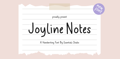 introducing by Essentials Studio Proudly Present, Joyline Notes Delmonte Is a A Cute Handwritten Font Delmonte is perfect for product packaging, branding project, megazine, social media, wedding, or just used to express words above the background.
 - TT Trailers by TypeType,
$39.00 Meet the new TT Trailers! The first version of TT Trailers was conceived as a font suitable for the film industry. The font harmoniously looks in posters, it is ideally suited for setting titles. However, the font has gained wide popularity among designers, and now you can find TT Trailers on the covers of magazines, on restaurant signs and on the main pages of websites. TT Trailers useful links: Specimen | Graphic presentation | Customization options Since 2019 when we released the first version, the TypeType studio team has released dozens of fonts, constantly improving our skills. In 2022, we decided to look at TT Trailers again, improving and expanding the font. In the new TT Trailers, we expanded the character set, corrected the contours, and improved the technical content. We have added extended Latin and Cyrillic characters, new symbols, and additional sets of numbers. The number of glyphs in one style has increased from 1081 to 1242. The inclined styles were long-awaited. The italics in TT Trailers are as eccentric as the upright fonts. The 15-degree tilt looks absolutely harmonious, complementing the character of the font family. We added italics to the variable font, so the new font changes along two axes at once, weight and slant. From the technical point of view, TT Trailers has become more modern and correct, and the number of OpenType features has increased from 29 to 42. We have added new alternative versions of glyphs and created a large number of localized features. The font retained all the qualities thanks to which designers fell in love with it, but became even more convenient. TT Trailers in the new version is suitable for titles and posters, for websites and printed materials. The font will embellish in restaurant and cafe signs and look beautiful in posters. There are 19 styles in TT Trailers: 9 upright, 9 italic and 1 variable font.
 - Flirt by Canada Type,
$25.00It's a very happy day when we stumble upon beautiful alphabets that were never digitized. It is even a happier day when the beautiful alphabet finds its way to us through friends and people who like our work. Some two months ago, the forms of this gorgeous font were pointed to us by a friend who saw it in an old Dover Publications specimen book showcasing historical alphabets. It was there under the name Vanessa, with nothing else to go by. We looked and researched for further information but found nothing else. So this gem comes to you like a coal that winked its way out of the ashes because it wanted to shine again. Flirt is very authentic art deco with a noticeable element of artistic pride, swashy delicate majuscules and very aristocratic, fashionable and flirty minuscules. The majuscules can be used as every other capitals usually are, or as initial caps. The minuscules can very nicely stand on their own quite independently from the caps whenever desired. These letters are quite similar to the hand lettering used on of the kind of theater posters, specifically burlesque and opera entertainment, which are now considered very retro-chic and fashionable to see hanging on walls in home or office. The initial specimen we worked from showed a single basic art deco alphabet with numerals which seemed as they belonged to another font. That alphabet became the base Flirt font, the numerals were redrawn to fit much better with the minuscules, and the character set was greatly expanded to include punctuation, accented characters, and many many alternates, especially for the majuscules. Majuscules with a descending right vertical stroke were a common artistic touch in the high days of theater posters, so we thought they would be great additions to the character set. These alternates can be found all over the font. So to maximize the design fun, have a character map or glyphs palette handy when you use Flirt. After the base font was finished, we thought it would be a good idea to give it a bold treatment unlike anything seen out there, and the farthest thing from the mechanical bolds seen everywhere now. This bolding treatment consisted of thickening the lowercase's vertical strokes inwards, but leaving the horizontal stroke weight as is, and thickening only the thicker vertical strokes of the uppercase. The result is quite the visual feat. We encourage you to test both the regular and bold weights and see for yourself. - Caroni by Franzi draws,
$- Caroni is a cute handmade typeface, which was originally created in 2018 as a free font. It has a simple and clean look, and works great for longer texts. Caroni has already been used in numerous children's books, so now it was time to extend Caroni's look, and add more styles. The Caroni Family at a glance If you like Caroni, you will love the Caroni font family! Caroni now comes in bold and italic, and it has nine awesome siblings: Avenue (all dressed up with stylish serif strokes) Lime (the skinny version of Caroni) Avenue Lime (the skinny version of Caroni Avenue) Tabanca (dark and heavy, this is Caroni's brush version) Doubles (enhanced with fine lines) Fete (with fun little dots) Coconut (Caroni's outline style) Soursop (Outline with dots, a great display font) Carnival (a quirky and fun all-caps version) Caroni was created while staying with a friend in Trinidad, hence the names :) Languages supported: Afrikaans, Albanian, Asu, Basque, Bemba, Bena, Bosnian, Catalan, Cebuano, Chiga, Colognian, Cornish, Corsican, Croatian, Czech, Danish, Dutch, English, Estonian, Faroese, Filipino, Finnish, French, Friulian, Galician, Ganda, German, Gusii, Hungarian, Icelandic, Ido, Inari Sami, Indonesian, Interlingua, Irish, Italian, Javanese, Jju, Jola-Fonyi, Kabuverdianu, Kalenjin, Kinyarwanda, Kurdish, Latvian, Lithuanian, Lojban, Low German, Lower Sorbian, Luo, Luxembourgish, Luyia, Machame, Makhuwa-Meetto, Makonde, Malagasy, Malay, Maltese, Manx, Maori, Morisyen, North Ndebele, Northern Sami, Northern Sotho, Norwegian Bokmål, Norwegian Nynorsk, Nyanja, Nyankole, Occitan, Oromo, Polish, Portuguese, Romanian, Romansh, Rombo, Rundi, Rwa, Samburu, Sango, Sangu, Sardinian, Scottish Gaelic, Sena, Shambala, Shona, Slovak, Slovenian, Soga, Somali, South Ndebele, Southern Sotho, Spanish, Swahili, Swati, Swedish, Swiss German, Taita, Taroko, Teso, Tsonga, Tswana, Turkish, Turkmen, Upper Sorbian, Vunjo, Walloon, Welsh, Western Frisian, Wolof, Xhosa, Zulu
 - mortis - Unknown license

- RoundWhy by Ingrimayne Type,
$6.95 Font breeding is much like animal breeding, where stallion and mare, or bull and cow, or boar and sow are carefully matched in hopes of yielding a robust and useful offspring. When typefaces RoundUp with fat, rounded serifs and WyomingSpaghetti with fat, squarish serifs were chosen to be parents, it was clear that their offspring would inherit large serifs. But to discover exactly what the offspring would look like, the pairing needed to be consummated, which was done with the “Blend Fonts” commend in Fontographer. The two styles of RoundWhy are the result.
 - MFC Voyeur Monogram by Monogram Fonts Co.,
$24.95 The source of inspiration for Voyeur Monogram is the 1934 "Book of American Types" by American Type Founders. Found in that specimen book was a charmingly sophisticated diagonal monogram alphabet known as “Broadway Monogram Initials”. This wonderful typeface is now digitally recreated, revived, and updated for modern use. Download and view the MFC Voyeur Guidebook if you would like to learn a little more. MFC Voyeur comes complete with Pro format fonts. You will require with programs that can take advantage of OpenType features contained within the Pro fonts.
 - QuickType by Wiescher Design,
$39.50 QuickType is a typeface I designed for demonstration purposes. I used it to illustrate my first book about type design. It has crooked slab serifs and looks very much like a typewriter font. But in order to make things clear I had to overdo some curves and so QuickType turned out a very distinct typewriter typeface. Since those days I worked on the shapes from time to time, so it got better and I extended it to include several neccessary cuts. Now it is a full fledged very usable font. Yours very quick Gert Wiescher.
 - STCO Prescissa by Shaltype Co,
$15.00 Prescissa is inspired by Textualis, also known as textura or Gothic bookhand, which was the most calligraphic form of blackletter, and today is the form most associated with “Gothic”. Written manually by hands, and reform into clean Typeface. Natural stroke from original handwriting. It can be used for just Title or even writing. In this font, you will get : Over 449 Glyphs 12 OpenType features Multilingual languages. Get Prescissa now! It will best use for any design requirement, many fonts will coming with a unique concept. Thank you! Best Regards, FM-STCO.
 - Mighty Mouth by Comicraft,
$39.00 Trouble never hangs around, when it hears this Mighty sound, These letters come to save the day -- Mighty Mouth is on the way! When there's Danger, never Despair; The Sound of Mighty Mouth is in the air! Now YOU TOO can shoot your mouth off with the Mouth Almighty of Mighty Mouth. Comicraft’s latest offering utilizes variable type technology, for user-adjustable bold, italic and BOUNCE in illustrator (or any other program that handles variable fonts)! CAUTION: You may wish you’d never opened it, this font has no control over your tongue!
 - Emporia JNL by Jeff Levine,
$29.00 Emporia JNL is a wonderfully decorative and vintage wood type named for a city in Kansas, and modeled from just a dozen images of individual type blocks spotted for auction online. The release of this typeface is also a milestone for Jeff Levine Fonts. The foundry started in January, 2006 with only ten releases, and has now grown to be an impressive library of unique lettering designs from the past. The collection also contains numerous original and novelty creations. Emporia JNL is proudly released as the 500th font design to join this extensive library.
 - Squoosh Gothic by Thinkdust,
$10.00 Squoosh Gothic is a serious new contender in the arena of headline fonts. Upright and condensed, Squoosh’s whimsical name belies its true nature. Though, that’s not to say it’s totally devoid of a sense of merriment – it just values a more orderly, regulated kind of tomfoolery. Mad-libs for instance, or The Times cryptic crossword. Its mature but unmistakably witty attitude can go a great distance to lending a sense of culture and an air of scintillation to your designs. Don’t miss out on this sanguine new font, Squoosh Gothic from Thinkdust, available now.
 - Hugh Ultra Wide by Fateh.Lab,
$15.00 Hugh is the development of a wide type font, we create a work of art that combines a very strong spirit of wide type, for those of you artistic art lovers, this good news for you, because Hugh has a high artistic soul. This is the start of a happy year for you, get this font right away and develop your wild ideas, Hugh is the answer for you now. Its weight is superior in posters, social media, headlines, titles, large format print - and wherever you want to be noticed
 - Klasted by Arendxstudio,
$18.00 Klasted Brush Script Font is a font with distinctive handwritten characters perfect for branding projects, logos, wedding designs, media posts, advertisements, product packaging, product designs, labels, photography, watermarks, invitations, stationery, and any project that needs a handwritten feel. Features : • Character Set A-Z • Numerals & Punctuations (OpenType Standard) • Accents (Multilingual characters) • Ligature • Swash There it is! I really hope you enjoy it - comments & likes are always welcome and accepted. And more importantly, don't hesitate to send a message if you have a problem or question. Now just read this, go there and make it happen!
 - Swingdancer by Chank,
$99.00 With a swooshy hand-painted flow, the strokes of this vintage brush script will make your designs sing and dance. While each character is charming on its own merit, put 'em together and this font dances with the swing rhythm and bursting energy of Benny Goodman’s big band. And don't miss the dandy special characters for letter combinations tt, th, or, os, and an extra fancy alternate capital M. Without a doubt, Swingdancer will satisfy the script jones of any retro font fan. Now available in new OpenType format, too!
 - Frequent Flyer by Hanoded,
$16.00 I used to be a frequent flyer; as a tour guide I often had 6 to 10 international flights per year. At the time I didn’t even think about the consequences of flying, as I loved my job and the job was all about travel. Now, with the planet in deplorable state, I try to keep flying to an utter minimum. I guess you call it ’shame of flying’… Frequent Flyer font is a nice, eroded, all caps font. It comes with multilingual support, so you may come across it during your travels.
 - Motley Crew by Hanoded,
$20.00 Motley Crew is my last font for 2016. It is quite a lively, quirky and a little bit scary typeface, which will give your designs a little more ‘joie de vivre’. It was made with a soft brush and Chinese ink. The splatter was added after I had painted the glyphs. I forgot to put away my laptop, which now looks like this font… Motley Crew wishes you all the best for the coming year - in a lot of languages, as it comes with a generous splatter of diacritics.
 - Rondell by Scrowleyfonts,
$12.00 Rondell was originally designed in 2011 as a reasonably priced variable width and weight font. There were a couple of things about it that I didn't like and so I withdrew it from sale. Since then I have found myself using it for many different projects and have realised how useful and versatile it is. Therefore I have fixed the things I didn't like about it and it is now available again. Rondell is a simple, smart, sans serif font. Rounded corners make it slightly informal and friendly.
 - Overly Sweet by Bogstav,
$16.00 Usually I prefer desserts that aren't overly sweet, but a week ago I lost my sense of tasting - due to Corona, and when I wanted something sweet...I preferred it overly sweet...of course because I hardly could taste the overwhelming sweetness! But now, I have my sense of tasting (and smelling!) back, and everything is back to normal. And since I completed this easy-recipe-inspired handmade font while suffering from Corona, I thought I'd name it Overly Sweet. And...well. because, the font is somewhat overly sweet (without being over the top sweet!)
 - Toadstool by Hanoded,
$15.00 My kids love toadstools, especially the red capped ones with the white spots (they’re called Amanita muscaria, a.k.a. fly agaric - in case you’re wondering). A couple of months ago you could find loads of them in the forest, but now they’ve all disappeared. Toadstool font will not disappear, however. It is a very legible, clean and neat text font with an uneven baseline, slightly bouncy glyphs and more diacritics than a forest has mushrooms. Use if for packaging, kids’ book covers and posters. This toadstool is the non-toxic variety, so go nuts.
 - Hollister by Arendxstudio,
$18.00 Hollister is a modern script font created with a natural brush. This font is very beautiful when combined with era now design concepts. Hollister comes with OpenType features such stylistic alternates, stylistic sets & ligatures which are good for logotype, poster, badge, book cover, t-shirt design, packaging and much more. Features : Character Set A-Z, Numerals & Punctuations (OpenType Standard), Accents (Multilingual characters), Ligatures, Swashes. There it is! I really hope you enjoy it - comments & likes are always welcome and accepted. More importantly, don't hesitate to send a message if you have a problem or question.
 - Guttie by Yukita Creative,
$14.00 Guttie Display Typeface says something about graphics and usability. People tell stories for a reason. We want to convey certain information, change a reader's opinion or make them feel something; Guttie Display Typeface helps you to do all this easily. --- It's all about visuals and functionality. For example, people will use words to convey information, convince readers of something specific, or share emotions they are feeling right now. --- - Fonts can be read from a much larger distance than regular fonts - Elegant letters give the impression of luxury - Smooth curves for elegant typography
 - Heartwave by Shaltype Co,
$12.00 Heartwave is a handcraft display typeface that's inspired by old signs, 70's posters, and mixed with modern trend design. Build manually by hands, and reform into clean Typeface. Natural stroke from original hand-lettering. It can be used for just Title or even writing. In this font, you will get : Over 276 glyphs, 49 ligatures in 3 OpenType features, Support for 67 languages. Get HEARTWAVE now! It will best use for any design requirement, many fonts will come with a unique concept. Thank you! Best Regards, PUDJI PANGESTOE STUDIOS
 - Astonia by Dora Typefoundry,
$23.00 Introducing,Astonia is a serif typeface crafted with elegance and luxury, exuding femininity and glamor but also a side of beauty with plenty of alternatives and bindings to help you create unlimited variations for your creative needs. Its stark contrasts and subtle details, together with sumptuous strokes and voluptuous curves, create a beautiful and powerful statement for any typographic composition, blending glamor with contemporary aesthetics. Astonia elegant serif really helps you create unlimited variations for your creative needs in creating your project titles: such as fashion, magazines, logos, branding, photography, invitations, wedding invitations, quotes, blog headers, posters, advertisements, postcards, books, websites web, etc. Features • Full set of uppercase, lowercase letters • 25 Ligatures • 148 Alternates • Numbers, symbols & punctuation • Characters with accents • Supports Multiple Languages • PUA Encoded WHAT’S INCLUDED • Astonia – Regular This type of family has become a work of true love, making it as easy and enjoyable as possible. I really hope you enjoy it! I can't wait to see what you do with Astonia! Feel free to use the #Dora Typefoundry tag and # Astonia font to show what you've done Thank You!
 - Most Faster by Din Studio,
$29.00 Most Faster’s cool designs and spectacular features will bring your designs into a brand new level. It is a font created in capital letters with the racing theme reflecting courageous masculine impressions. The strokes on each letter are similar to a sharp-angled rectangle. Features: Multilingual Supports PUA Encoded Numerals and Punctuation Use Most Faster for any design projects such as posters, banners, logos, book covers, headings, printed products, merchandise, social media, and so on. Find out more ways to use this font by taking a look at the font preview. Get it now. Happy designing.
 - Darion by HandletterYean,
$14.00 Darion is a modern bold script font with natural handwriting touch. This font ready to make all your designs looks awesome. Its clean and strong looks are suitable for projects such as crafts, quotation, decoration text, prints, advertising, packaging, logos, business cards, invitations, labels, products, T-shirt designs, social media posts and much more. Get this font now, have fun! To access the alternate glyphs, you need a program that supports OpenType features such as Adobe Illustrator CS, Adobe Photoshop CC, Adobe Indesign, and CorelDraw. More information about how to access alternate glyphs, check out this link: http://goo.gl/ZT7PqK
 - Sensual Initials JNL by Jeff Levine,
$29.00Sensual Initials JNL is a revamped and cleaned-up version of an old freeware font by Jeff Levine. Redrawn, and now utilizing the typeface French Art Initials JNL - FeggoliteHatched by Ingrimayne Type,
$4.95 The name FeggoliteHatched comes from the fact that it was created with the help of an old font manipulation program called Incubator Pro. It was an attempt to create a more conventional typeface from the odd monospaced font, FeggoliteMono. As a monospaced font, FeggoliteHatched could be considered a typewriter face, but no typewriter ever produced letters like these. The original version from 1994 is now the italic style and it has a leftward or back slant. The upright or plain version was added much later, in 2018. There is also a choppy upright version included in this family.
 - Maringue by Shaltype Co,
$12.00 MARINGUE is Retro Western Font that is well-produced by hand and generate into a clean form, that will be best when used in any placement like logo, poster, t-shirts, or any display. Build manually, and reform into a clean Typeface. Natural stroke from original hand-lettering. It can be used for just Titles or even writing. In this font, you will get : Over 234 glyphs Ligatures in OpenType features Support for 66 languages. Get MARINGUE now! It will be best used for any design requirement, many fonts will come with a unique concept. Thank you! Best Regards, PUDJI PANGESTOE STUDIOS
 - Quincy by Wiescher Design,
$12.00 »QUINCY« started as an art project. I was stitching roughly cutout letters together on a piece of wooden board, but I didn’t like the result! So I ended up with a font in three cutout styles. I thought it was so unusual and really beautifully ugly, that I finished it, adding flashes here and there. Now I am offering this absolutely unusual font as a packet of three for you to enjoy. Have at least as much fun working with it as I had designing the packet. The font is great for packaging or posters, or whatever comes to your imaginations.
 - Donphan by Shaltype Co,
$12.00 DORPHAN is Retro Font that is well-produced by hand and generate into a clean form, that will be best when used in any placement like logo, poster, t-shirts, or any display. --- Build manually, and reform into a clean Typeface. Natural stroke from original hand-lettering. It can be used for just Titles or even writing. --- In this font, you will get : Over 223 glyphs Ligatures in OpenType features Support for 66 languages. --- Get DORPHAN now! It will be best used for any design requirement, many fonts will come with a unique concept. --- Thank you! Best Regards, PUDJI PANGESTOE STUDIOS
 - Unger Fraktur by RMU,
$25.00 In the wake of the Enlightenment and the French Revolution there was a desire for a clear classical blackletter font without frills. That is why in 1793 the famous printer and editor Johann Friedrich Unger and his partner Johann Christian Gubitz accomplished their own fraktur. Now you will be able to use both regular and bold styles of this highly readable blackletter font. It is recommended to activate both OT features Standard and Discretionary Ligatures to access all ligatures in both these fonts. Typing N-o-period and activating the ordinal feature gives you the numero sign.
