10,000 search results
(0.025 seconds)
- Anything Okay by Aldedesign,
$13.00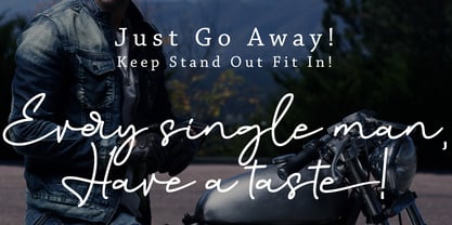 Anything Okay is a simple, yet classy signature typeface. It includes beautiful swashes, that will add an organic feel to any design project.
 - Laudiea by Nissa Nana,
$19.00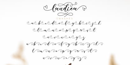 Laudiea is a beautiful script font with a classy, elegant, and modern look. It will add a handwritten touch to any design project!
 - LD Kooky by Illustration Ink,
$3.00This kooky font has thick bold style letter. They are slightly toggled to give it a fun look. You will enjoy this one. - Butter Bold by Jackson's Lettering,
$19.95 Use your imagination. Butter Bold Brush Script is a fun universal font that will work with almost anything you want it to do!
 - Tascinorm by Abdullah Tasci,
$40.00 Specially designed to improve legibility in long texts, Tascinorm is a unique, modern typeface which will meet the needs of a vast audience.
 - Mango Gothic by BA Graphics,
$45.00A new high contrast gothic; works great for many different applications. This font will add a nice elegant touch to all your designs. - Basilica by Monotype,
$29.99Basilica is a calligraphic typeface that will add style and grace to short copy. Use the Basilica font for poetry, menus and stationery. - Lauren Hansley by Fargun Studio,
$14.00 Introducing the new ‘Lauren Hansley’ script font - A fashionable and super-chilled new handwriting font script with some sexy stylish ligatures and alternates ;)
 - Mono Hexular by PizzaDude.dk,
$20.00 A wrecked, monospaced font containing 278 ligatures and unique accented characters! You will need to use OpenType supporting applications to use the autoligatures.
 - Porte by Groteskly Yours,
$18.00 - Unique Modernist Look - 590+ characters per font - Standard & Discretionary Ligatures - Multiple Stylistic Sets - Old Style Figures - Case-Sensitive Punctuation - Multilingual - Cyrillic Included - Uppercase + Lowercase Porte is an elegant sans serif font inspired by stone carving and modernist typefaces of early 20th century. While at its core Porte is a display font, it can also be used for larger bodies of text and in a variety of projects. Thanks to its unique proportions and feel Porte is reminiscent of early 20th century type, wherein aesthetic qualities often overweighed matters of practicality and applicability. Porte is at once delicate and sturdy, subtle and unyielding. Porte is very OpenType friendly, boasting an awesome selection of useful OpenType features, precise and exhaustive kerning (around 1000 pairs) and lots of discretionary ligatures to make your designs look amazing. A selection of wider and narrower alternate glyphs allow the designer to modify the rhythm of the typeface, extending its application and impact. With 590+ characters on board, Porte supports all major Latin based languages as well as a number of Cyrillic languages. Porte received its first major update in fall 2022. Not only was the character set expanded considerably, but also some glyphs were re-drawn to fix visual inconsistencies, and a large number of stylistic alternates was added. The kerning, too, was re-done to accommodate new letterforms. Trials available upon request.
 - Wingdings by Microsoft Corporation,
$29.00The Wingdings™ 1 font was designed by Kris Holmes and Charles Bigelow in 1990 and 1991. Wingdings 1 originally named Lucida Icons, Arrows, and Stars to complement the Lucida text font family by the same designers. Renamed, reorganized, and released in 1992 as Microsoft Wingdings(TM), the three fonts provide a harmoniously designed set of icons representing the common components of personal computer systems and the elements of graphical user interfaces. There are icons for PC, monitor, keyboard, mouse, trackball, hard drive, diskette, tape cassette, printer, fax, etc., as well as icons for file folders, documents, mail, mailboxes, windows, clipboard, and wastebasket. In addition, Wingdings includes icons with both traditional and computer significance, such as writing tools and hands, reading glasses, clipping scissors, bell, bomb, check boxes, as well as more traditional images such as weather signs, religious symbols, astrological signs, encircled numerals, a selection of ampersands and interrobangs, plus elegant flowers and flourishes. Pointing and indicating are frequent functions in graphical interfaces, so in addition to a wide selection of pointing hands, the Wingdings fonts also offer arrows in careful gradations of weight and different directions and styles. For variety and impact as bullets, asterisks, and ornaments, Windings 1 also offers a varied set of geometric circles, squares, polygons, targets, and stars. Character Set: Picture/Symbol - LiebeDoni by LiebeFonts,
$29.90 LiebeDoni is pure Italian art. A contemporary nod to Italian typographic heritage, LiebeDoni’s warm and friendly style is perfect for—literally—bold headlines and impressive invitations. Take a seat on LiebeDoni’s Vespa and enjoy the sweet curves of dolce far niente. But don’t let the relaxed hand-crafted appearance fool you: You’re dealing with a solid quality typeface that has received painstaking attention to detail. Round like the Colosseum, some lines are as colloquial as the Tower of Pisa—but all this with almost Teutonic obsession for technical perfection. Feature-wise, we went the full quattro stagioni: Variations and alternatives for many letters, swashy initials and swirly ligatures—plus language support that goes way beyond English and Italiano. Double-o ligature, anyone? Two different www ligatures? Check. (Please make sure your software supports OpenType if you wish to use the advanced features.) Get both the outline and the filled version and go crazy on creative layering and endless possibilities. Each font contains over 600 glyphs and both contain the full character set. Make a bold move to italy—treat yourself with this font. If you like LiebeDoni, you may also like its perfectly matching sisters LiebeErika and LiebeOrnaments—or any of our other 100% compatible LiebeFonts.
 - Scholz Secession by HiH,
$8.00 We named this font Scholz Secession. Fin-de-siecle Vienna, Austria is the source of this Jugendstil design from Schriftgiesserei Eduard Scholz. The original release was under the name Reklameschrift Secession. Most of the curve strokes look like commas to me. The letters are as soft and plump as the comforter on the bed I slept on in a Salzburg B&B many years ago. I was traveling with a college buddy and our next stop was Vienna. There a kind, young student named Hanna and her boyfriend took us under their wing. One of the places Hanna proudly showed us was Otto Wagner’s Majolika Haus, built in 1898, and only about 8 blocks from Secession Hall. Hanna explained to us that the style was called Jugendstil and represented Art Nouveau as interpreted within the framework of their culture. I even took a picture. After all, memories are part of who we are. Figures are old-style for text use. This font would not be my first choice for a spread sheet. Included are German ligatures ch (alt-0123) & ck (125), two period ornaments (135, 175) and lower case o and u with Hungarian long umlaut (215, 247)). A very likeable and easy-to-use font.
 - Grand Atlantic by Fenotype,
$35.00 Grand Atlantic is a powerful display package by Fenotype. It’s a genuine Brush script packed with features and Swoosh extras and it’s a striking condensed flared serif in two weights, designed with the same sharp edges on the flares as the Brush. Together they make stunning logotypes, posters or headlines. On top of that there’s a “Printed” version of each. Printed versions are the same but with rugged outlines and a print texture. Grand Atlantic is great for creating powerful identities for artisanal coffee brands, craft beer, organic juice or a sports teams. Grand Atlantic Brush is equipped with Standard Ligatures and Contextual alternates that help keeping the connections between letters smooth. They’re automatically on as you should normally keep them. On top of that Grand Atlantic Brush has Stylistic, Titling and Swash Alternates for standard characters if you need more ornamental letters and if you want to break up the rectangular word shapes. There’s even more alternates in the glyph palette, making it total more than 600 glyphs. Grand Atlantic Swoosh contains 52 shapes designed to go with the Brush. There’s many “terminal swashes” that you can put in the end of a word and it will connect to the last letter, and swirl under the word from there.
 - Denedo by Andinistas,
$19.95Just like the M.C. Escher impossible figures and optical illusions, "Denedo" is a font that is impossible to construct in three dimensions because it only exists as a drawing. This font is based on the "0, 1, 2, 3, 4, 5, 6, 7, 8, 9" characters of one of the alphabets published by Nedo Mion Ferrario in the "Letromaquia" exhibition that was shown in Caracas, Venezuela in the 70's. The reason why I chose to restore and complete this font is that unique and exceptional personality that each word acquires when it is written with this alphabet. Denedo is a typographic family in three styles: Denedo 1A, 1B and 1C. When mixing them in big sizes you will emphasize the balance and incongruity of its shapes, providing originality and a unique identity to every word. All of the 3 variations include a complete character set with the lower and upper case letters, numbers, accents, diacritic signs, punctuation and monetary signs. All the fonts included in this family are available in Open Type format and are perfectly compatible with Mac and PC. I want to express my sincere gratitude to all my friends at Typophile who supported and motivated me during the final stages in the development of this font. - Sihmittree by Ingrimayne Type,
$9.00 Sihmitree is a gimmick typeface in which all glyphs have reflective (mirror) or rotational symmetry (or both). Sihmitree has two weights and is caps only, with most of the lower-case letters identical to the upper-case letters. It includes only those accented characters that are symmetrical. The letters of the alphabet are often used to explain symmetry. BCDEK are given as examples of shapes that can easily be formed with symmetry over a horizontal line. AMQTUVWY can easily be formed so that they mirror over a vertical line. Letters HIOX can be formed so they mirror over both horizontal and vertical lines, and as a result they will also have rotational symmetry. Letters NSZ can be formed so that they reproduce themselves with a rotation of 180º. That leaves letters FGJLPR, which are usually considered examples of asymmetry. However, there are script versions of J, L, and R that can be formed with symmetry, and variants of lower-case f and g can be made that are symmetrical. P looks a lot like the thorn character. Some of the numbers also present challenges when trying to form them symmetrically. The symmetrical alphabet is not stylistically harmonious and has limited use other than as an exploration of symmetry.
 - FS Matthew by Fontsmith,
$80.00 Developed for screen For not the first time, Fontsmith was commissioned to develop a font for one of the UK’s terrestrial TV channels. The product was a clearly-defined three-weight family. When italics were added, it became FS Matthew, a clean, stylish, structured sans serif with swooping, open curves and a bright, lively personality. Southbank Inspiration for many of the forms of FS Matthew came from details found within the modernist buildings and architecture of London’s Southbank, such as the Royal Festival Hall. During the font’s gestation, Jason had found himself at London Studios, a TV studio on Southbank, and a wander around the neighbouring arts buildings proved thought-provoking. The result was a font with a very British character: solid forms that provide the platform for innovation and distinctiveness. Feelgood efficiency FS Matthew’s trademark is efficiency with a feelgood factor: disciplined enough for corporate identities, websites and signing systems, and colourful enough for logotypes and advertising. Its versatility and excellent legibility are achieved via some unexpected details: the reaching curves of the “g” and “y”; the simple shape of the “u”; an off-kilter “k”; generous counters; and a slightly condensed aspect that makes FS Matthew a space-saver in text or title sizes.
 - Polotan by Look Minus Today,
$16.00 Introducing Polotan, the ultimate futuristic and modern sans-serif font. With its sleek and streamlined design, Polotan is perfect for creating a cutting-edge, high-tech look that's perfect for a variety of design applications. Featuring strong lines that convey a sense of power and confidence, Polotan is perfect for headlines, titles, and branding materials. But what sets it apart is its unique alternates, which give you the flexibility to create custom designs that stand out from the crowd. And with its alternates, you can take your designs even further and truly make them your own. Its clean and minimalist design makes it easy to read, while its sharp angles and unique letterforms create a sense of energy and movement!. Whether you're designing a high-tech website, a sleek user interface, or a modern brand identity, Polotan will help you make a bold and unforgettable impression. So why settle for a boring and outdated font when you can make a statement with Polotan sans-serif? Try it today and see how it can take your designs to the next level. And please message me if you want your language included or if there are any features or glyph requests, feel free to send me a message.
 - Poultry Sign by Ingrimayne Type,
$5.95 While searching through microfilm of an old, 1932 newspaper, I stumbled on the word "Poultry" written with trapezoidal letters. I did not recall seeing lettering like this and it inspired me to design a typeface that could produce a similar result. Poultry Sign has two widths each with three weights giving the family six styles. It is monoline, monospaced, and all caps. The letters on the lower-case keys reverse the trapezoid of those on the upper-case keys. The designer's expectation is that the most common use for this typeface will alternate upper-case and lower-case keys, and to make this effect easy, included in the font is a contextual alternatives (calt) OpenType feature that automatically produces this result if your word processor supports this feature. To get text with all letters with big bottoms or all letters with with big tops, this feature must be turned off. The spacing of the letters is identical within each width so the styles can be layered to produce bi-colored or tri-colored letters. There is a second set of numbers that can be accessed with an OpenType stylistic alternative. Also accessible with OpenType stylistic alternatives are variations of letters T, N, L, Y, and V.
 - Lavoza by Alit Design,
$22.00 Presenting the LAVOZA typeface from alitdesign. LAVOZA font is designed by combining a slant blackletter font with a classic serif font style. The Lavoza font is inspired by a classic roman design that we apply modern elements according to current trends. This bold classic concept will create a design that is frightening but still looks modern and elegant. The Lavoza font is perfect for the design of young people who dare to be different and unique from the current trending design concept. Lavoza font is highly recommended to be a collection of fonts for current or future design creation. LAVOZA is perfect for magazine cover designs, brochures, flyers. Instagram ads, Canva Design and so on with unique and modern and brave concepts. besides that this font is very easy to use both in design and non-design programs because everything changes and glyphs are supported by Unicode (PUA). The "LAVOZA"contains 587 glyphs with many unique and interesting alternative options. Language Support : Latin, Basic, Western European, Central European, South European,Vietnamese. In order to use the beautiful swashes, you need a program that supports OpenType features such as Adobe Illustrator CS, Adobe Photoshop CC, Adobe Indesign and Corel Draw. but if your software doesn't have Glyphs panel, you can install additional swashes font files.
 - World Discovery by Mans Greback,
$69.00 World Discovery is a stunning calligraphy font that exudes a sense of beauty, romance, and exploration. The artistic swirls and slanted serifs come together to create a distinctive, high-quality, and exclusive typeface that will bring an antique charm to your designs. World Discovery has its origin in 15th-century discovery maps. Designer Mans Greback procured maps from the state library, and the exquisite penmanship and intricate details on the map, showcasing the venture of exploration and the grandeur of the Age of Discovery, sparked the unique and evocative letterforms that now make up the World Discovery font. The font offers an impressive array of 19 styles, including six distinctive main styles, their italic versions, as well as light, regular, and bold weights, as well as a Swash style for added flair. Combining the fonts gives you infinite possibilities to create a truly customized typographical artwork. The font is built with advanced OpenType functionality and has a guaranteed top-notch quality, containing stylistic and contextual alternates, ligatures, and more features; all to give you full control and customizability. It has extensive lingual support, covering all Latin-based languages, from Northern Europe to South Africa, from America to South-East Asia. It contains all characters and symbols you'll ever need, including all punctuation and numbers.
 - Taglio by Wilton Foundry,
$29.00 Taglio’s name is derived from intaglio, which means “incised carving” or “an impression from an engraving”. Indeed, Taglio looks like an incised engraving with a contemporary calligraphic interpretation. The down strokes start with a single horizontal line that curves into a dual vertical line and ends with the same single line at the base. The dual elongated strokes create a bold overall impression but is literally twice as sophisticated than if the two lines were solid. That was exactly the goal in creating this font. We managed to create a font that is distinctive, elegant, and crisp that is also intentionally stencilled for more flexibility. For instance, it is ideal for laser cutting signage. One of the unique features in using the capital glyphs is that they stack perfectly without losing legibility, primarily because of the slanted ends of the dual vertical lines - see the example “Miami Fashion Week” display ad. Taglio’s unusual style was carefully crafted to come to life at display sizes. It is therefore ideal for use in branding fashion, restaurants, buildings, packaging, museums, signage, etc. An ideal pairing font is our WERK family which can be seen on some of the display ads below. Taglio has a sparkling and sophisticated personality that will absolutely delight!
 - Pocketknife by Blank Is The New Black,
$13.00 Pocketknife is a simple grid-based titling font on it’s surface, but it has a surprisingly prolific set of features under the surface. The most notable of these features is an abundant set of ligatures that give Pocketknife it’s unique look. There are very few kerning pairs contained within Pocketwatch, and these ligatures fill in most gaps that could be created by letters with more empty space, such as L and T, and also give a more playful look to an otherwise sharp-edged typeface. Pocketknife also contains with 2 full sets of alternate characters, one pairing with the uppercase set and one pairing with the lowercase—available as OpenType stylistic alternates or individually in the Glyphs panel. Pocketknife Regular is designed to be used on it’s own, while the Inline and Base fonts are designed to be used as a simple layered combination. The Base font is nearly identical to Regular, but contains a few specially adjusted characters that better accommodate the Inline style. Pocketknife Outline is a combination of the Inline/Base styles, to be used individually. Pocketknife is sharp, but playful. Simple, but sophisticated. Sporty, technical, and aggressive, yet elegant and fun. Pocketknife, while simple at first glance, is a deceivingly versatile typeface.
 - Ideal Gothic by Storm Type Foundry,
$44.00At the turn of the 20th century monolinear alphabets were often despised for their dullness. Typographers, therefore, took great pains to breathe some kind of individuality into the monotonous sans-serif scheme. They started with subtle differentiation in the thickness of vertical and horizontal strokes and finished by improving details. By this they arrived at a more decorative appearance of the type face which thus became more regardful of the eye of the bourgeoisie. Ideal Gothic is no exception. It is characterized by a correct stiffness which will improve the morals of every idea printed by this type face. The awkward curves of the italics are a little suggestive of openwork iron products or the bent iron of the decorative little railings in a Prague park. The so-called "hidden" and, furthermore, curved serifs complete the inconspicuous "charm" of this type face. All its above-mentioned features, however, suddenly turn into advantages when we need to design a magazine, a brochure or an annual report, in short whenever illustrations dominate. It is not by accident that the basic design of "Ideal Gothic" has such a light tonal value - it competes neither with fine pencil sketches, nor with sentimental landscapes. It is very suitable for business cards and corporate identity graphics. - Hermanz Titling by California Type Foundry,
$47.00 Hermanz™ Titling is inspired by the most majestic caps that Hermann Zapf ever drew. They are inscriptional caps, square caps, or “capitalis monumentalis”. These caps are some of the most beautiful letters made by one of the greatest talents of our time; so beautiful they deserve to be seen and appreciated by everyone. If you do any work for churches, wedding, funeral, anniversary, or other ceremonies, for the fine arts, exclusive clubs, or higher education—you will love how these letters make your brochures, pamphlets and announcements look. Hermanz Titling works for anything labeled "fine": fine dining, fine music, fine art (pamphlets, books, posters, cookbooks). It also fits well for religious topics: posters, events, websites, hymnals, for biblical; and ceremonies, religious or otherwise. Emotions It Can Communicate: • Importance • Timelessness • Special Event • Tradition • Reverence • Artistry • Beauty Released June 2021 on the Memorial of Hermann Zapf, as part of the California Type Foundry Memorial Series: Honoring the life and work of the great font designers. FONT STORY The Majestic Caps When I was on one of my visits to rare books rooms I found some large caps of Hermann Zapf, and I knew that I had to make a font inspired by these. I was surprised that no one had ever made them into a font. They were some of the most beautiful caps I had ever seen. These caps were surprisingly difficult to make. I thought it would take me a week or two; to get the detail and spirit right took significantly longer– but it was well worth the effort! When you print Hermanz Titling on a page, you will see what I mean. Even when printed digitally, it’s the closest thing to letterpress. You might even have some people thing it was printed by a traditional method with ink! (Note: Unless printed at very large sizes, this font is not recommended for actual letterpress, because the serifs are too thin.) If you do any work for churches, wedding, funeral, anniversary, or other ceremonies, for the fine arts, exclusive clubs, or higher education—you will love how these letters make your brochures, pamphlets and announcements look. Enjoy this breathtaking font, and may it help inspire people with your messages! –Dave Lawrence & the California Type Foundry
 - Fragilita by SilverStag,
$24.00 Introducing Fragilità, a captivating serif font that embodies the delicate balance of classic elegance and modern innovation. With its exquisitely crafted characters, high contrast, and subtle ligatures, Fragilità seamlessly blends the charm of yesterday with the spirit of today. Fragilità's unique design harmoniously blends elements of both retro and modern aesthetics. Its condensed letterforms evoke a touch of nostalgia, reminiscent of classic serif fonts from the past. Yet, the font's modern sensibilities shine through in its circular O, Q, and C characters, which retain their full circularity, adding a touch of contemporary sophistication. Fragilità's high contrast between the thick and thin strokes of its characters ensures exceptional readability across various mediums. Whether gracing the pages of a book, adorning a website, or captivating viewers on a digital screen, Fragilità remains effortlessly legible. Fragilità's extensive library of ligatures adds a touch of refinement and sophistication to your text. These intricate pairings of letters flow seamlessly together, creating a sense of continuity and elegance that elevates your written expression. Fragilità's comprehensive support for over 92 languages makes it an invaluable tool for anyone seeking a versatile font that can transcend cultural boundaries. With its adaptability to a wide range of languages, Fragilità ensures that your message resonates with audiences worldwide. We understand that quality fonts shouldn't be a luxury reserved for a select few. That's why Fragilità is available for an incredibly affordable price of just $24, making it accessible to designers and creative professionals of all levels. With its exquisite design, exceptional readability, and ligature-rich character, Fragilità is a font that will elevate your creative projects to new heights. Whether you're crafting elegant body text, designing eye-catching headlines, or creating captivating marketing materials, Fragilità will add a touch of timeless elegance and modern sophistication to your work. Embrace the delicate balance of classic charm and modern innovation with Fragilità, your new go-to serif font for all your creative endeavors. Would you like to get 5 completely free fonts worth over $75? No tricks, no hidden words, terms or anything. Just subscribe to my newsletter, make sure to check your email to approve the subscription, add me to your contacts so that the emails don't end up in spam folder and you will get 5 fonts for free. The fonts are packed with alternates, ligatures and some even come with extra goodies. https://view.flodesk.com/pages/63594052b967a943dd6cc528 Happy creating everyone!
 - Oh, the enigma that is Rusted Plastic, a font straight out of the dystopian DIY workshop of Last Soundtrack, a name that hints at its creator's possible final act in the font-making saga—an exclamati...
- Manilla - Unknown license

- Ginky by PizzaDude.dk,
$20.00Ginky is another one of those grafitti- and comic-inspired pizzadude.dk fonts! You will need to use OpenType supporting applications to use the ligatures. - Colaneira by Forberas Club,
$16.00 Colaneira is handwritten font. Will be nice if you application this font for cute, special moment, beauty, tees, simple word quotes, wedding party, invitation.
 - Degaule by Forberas Club,
$16.00 Degaule is handwritten font. Will be nice if you application this font for cute, special moment, beauty, tees, simple word quotes, wedding party, invitation.
 - Purify Signature by Aestherica Studio,
$9.00 Purify Signature is a modern and simple handwritten script font. Contemporary and fashionable, this font will look great for a wide variety of projects.
 - Corinthian by ITC,
$29.99Corinthian is the work of Colin Brignall, a clean sans serif which was inspired by Edward Johnston's Railway Type and Eric Gill's Gill Sans. - Klumpft by PizzaDude.dk,
$20.00 A noisy, clumsy and spattered font. Comes with ligatures for double letters. You will need to use OpenType supporting applications to use the autoligatures.
 - The Show by Sakha Design,
$14.00 The Show is a fun and friendly display font. Whimsical and a little bit quirky, this font will brighten up each of your designs!
 - Steeplechase by BA Graphics,
$45.00A decorative Barnum-like design. Great for headlines with that circus type atmosphere; will also work for Christmas, western and children's books and ads. - Jumpalitan by Forberas Club,
$16.00 Jumaplitan font special for retro modern style. Will be good if you use for something like logotype, retro logo, typeface, simple and clean design.
 - Oh Beloved by Nissa Nana,
$19.00 Oh Beloved is a beautiful script font with a classy, elegant, and modern look. It will add a personal touch to any design project!
 - Tomcat by Trim Studio,
$8.00 The Tomcat Bold is a playful display font. It comes in a regular and bold style which will give your design a fun touch.
 - Sir Spicious by PizzaDude.dk,
$20.00 Handtraced comic font. Supersteady and perfect for massive text or just headlines. You will need to use OpenType supporting applications to use the autoligatures.
