10,000 search results
(0.092 seconds)
- Rouge by Dharma Type,
$14.99 This unique font has been designed and is based on lip rouge on windscreen. But it inspires a different feeling for different people; e.g. Organic, mathematical or ancient. Rising Star on April 2008.
 - Chen Xing by Pelavin Fonts,
$25.00 Chen Xing, literally “morning star”, a font both futuristic yet mystifyingly ancient is cast in contemporary forms on the cutting edge of the present moment, but harkens back centuries to endless cultural heritage.
 - Roothinkyu by Twinletter,
$12.00 Roothinkyu is a signature font with modern and elegant styled writing, with a natural and aesthetic flow. This font has a dazzling shape when applied to your various projects, both for branding and your various creative needs. This font is perfect for business cards, photography studios, autographs, interior design, model names, coffee late, traveling, weddings, cosmetics, jewelry, social media posts, product packaging, watermarks, special events, or anything else. Start using this font to add an authentic and heartfelt vibe to any design project.
 - Katastrofe by PizzaDude.dk,
$20.00 Katastrofe is danish for … well, catastrophe - you may have guessed that! This font was almost a catastrophe to make! I cut out all the letters in a cardboard, and went outside to spray the letters with a spraycan. Everything went smooth as planned, but suddenly the wind started to blow and the papers started to fly away! Luckily I found some stones I used to make the papers stay in place. Lucky for me - otherwise it would have been a catastrophe! Seconds after finishing this font project, it started to rain…I just avoided a catastrophe! But is this font really a catastrophe, or does it just mimic punk/spray/grunge/riot? Make your own statements using Katastrofe, or perhaps your very own punk sayings like “Punk is not dead”, “Anarchy Rebel” or what suits you the best. Whatever you choose to write, you will definitely get that real punk look! Perhaps you could even do a t-shirt print that says “Katastrofe” :) Comes with different upper and lowercase letters along with alternate versions of each letter - and of course a lot of foreign letters, because punk is not dead and punk is universal!
 - Pea Roxygirl - Unknown license

- Winter Heart by Realtype,
$12.00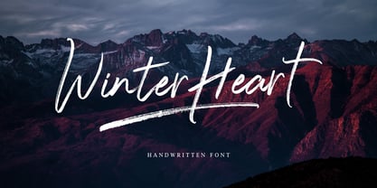 Winter Heart, a handwriting brush with awesome character. Winter Heart is a natural, smooth and stylish brush font. This font will give you a design that looks fresh and modern.
 - Impulsa by Just Font You,
$16.00 Impulsa is a very impulsive handwritten font. It is finished with digital touch but still keep holding on to the honest of the handwriting feeling. I believe messages with personalized handwriting vibes always deliver deeper feelings to anybody. Impulsa is an all-caps font. You can play with the uppercase and lowercase mix to get the different vibes of every letters so it looks seamlessly handwritten.
 - Kedira Signature by Zeenesia Studio,
$15.00 edira Signature is a monoline script font with handwritten signature Style. Kedira Signature font was created with original handwritting pen. This collection of scripts is perfect for personal branding. this works well for many applications. Kedira Signature would perfect for photography, watermark, social media posts, advertisements, logos & branding, invitation, product designs, label, stationery, wedding designs, product packaging, special events, fashion, website or anything that need handwriting taste.
 - Amstone by Multype Studio,
$15.00 Amstone is a monoline stylish script font make this font looks elegant, natural, stylish and perfect for any awesome projects that need handwriting taste. Features : uppercase, lowercase, symbol, number, ligature, and also support multi language. Amstone is perfect for photography, watermark, social media posts, advertisements, logos & branding, invitation, product designs, label, stationery, wedding designs, product packaging, special events or anything that need handwriting taste.
 - Louisville Script by Ascender,
$50.99 Louisville Script is an informal script font based loosely on the handwriting of its designer, Steve Matteson. It was named for the town of Louisville, Colorado (pronounced "Lewis-ville"). Louisville Script is a youthful, casual handwriting script font. It is ideal for casual correspondence including cards, scrapbooks, menus and flyers. Louisville Script is also great for educational materials including the school newsletter or yearbook!
 - Meredith by Aestherica Studio,
$9.00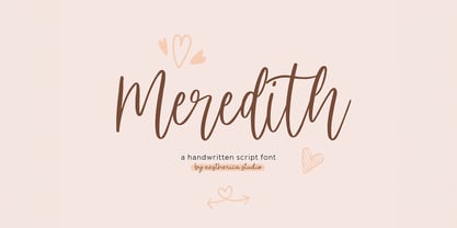 Meredith is a handwritten script typeface specially made by the hands of experts, making this font look so beautiful and natural. This font can be used for products that use a natural, beautiful, and charming handwriting feel. Meredith is perfect for branding projects, logos, wedding designs, social media posts, advertisements, product packaging, product designs, label, photography, watermark, invitation, stationery, and any projects that need handwriting taste.
 - ALS Agrus by Art. Lebedev Studio,
$63.00 Agrus in Ukrainian means "gooseberry". The letters are rounded like the berries and the sharp end elements remind of the barbs. In fact, the font is an intricate italic type. Optical compensations are purely decorative and rhyme with thin connecting lines. Design of this font is one hundred percent due to “strength of material”
 - Rhino by Canada Type,
$24.95This is Canada Type's second Helmut Matheis revival. Rhino is what Matheis did under the name Mobil for the Ludwig & Mayer foundry in 1960. It's an informal text face with some attractive irregularities relating to the traits of handwriting. The influence of the human hand can be clearly seen in letters like the A, J, Q, R, T and pretty much all of the lowercase. Though obviously inspired by and tooled after the human touch, Rhino's functionality extends to even a page or two of text setting. Aside from its functionality, Rhino gives short paragraphs what the classic immersive-reading fonts are not built for: immediate friendliness and natural humility. A few alternates and ligatures are included within the font. - LazovBold - Unknown license

- Hullunkruunu - Unknown license

- Cool Daddy by Hanoded,
$15.00 It’s a brand new year, but I have been going back in time. To the seventies to be precise. A ‘bubblegum’ font was on the top of my to-do list, so when it was finally finished, it reminded me of seventies posters. As if by magic, a catchy bassline started playing in my head and before I knew it, Boney M appeared - all dressed up in Purple and singing Daddy Cool. Cool Daddy is a fat, rounded bubblegum font, which will take you back to the decade of moustaches, afros and glitter. This ultra groovy font will funk up your designs 4-sho. So boogie on, take it back to your crib and get down with it. You diggin’?
 - Life by Linotype,
$29.99Life was designed in 1964 by W. Bilz and marks the beginning of a new generation of newsprint fonts. The Ionic style had replaced Modern Face and was now replaced by this new innovative style, which mixed elements of Old Face, Transitional and Modern Face forms. Life’s characters are based on the forms of Times and are the result of a time of change and experimentation. - TextFace Type by Forme Type,
$9.99 The idea for this font family, derived from SMS text message faces (Emojis) and found photographs of faces collected over the last ten years. The concept for this project was to a create text-face characters using only the glyphes found in a standard version of a Sans Serif typeface. There are 36 different Textfaces. Available in three weights, Regular, Bold and a Stencil version.
 - P22 Founders by IHOF,
$24.95 Based on turn-of-the-century advertising type. A condensed, fat-faced display font with a touch of the medieval. The influence of art nouveau is also present in the high-waisted caps and flowing lines, putting the face into the early 20th century.
 - F2F Whale Tree by Linotype,
$29.99Heavy techno music, a personal computer, a font creation program and some inspiration had been the sources to the Face 2 Face font series. Thomas Nagel and his friends had the demand to create new unusual faces that should be used in the leading german techno magazine Frontpage" Even typeset in 6 point to nearly unreadability it was a pleasure for the kids to read and decrypt the messages. WhaleTree is a hommage to Walbaum. The word is a gemanized translation where Wal means Whale and Baum means Tree. :-)" - Bollifia by Letterara,
$12.00 Bollifia is a stunning monoline-style script font as charming and elegant. This stunning handwritten font is a stylish homage to classic handwriting. It also features many special features including glyphs and ligatures so that it displays natural and original handwriting. Bollifia font It looks beautiful on a variety of designs requiring a personalized style, such as wedding invitations, thank you cards, advertising, poster, greeting cards, logos, and so on. This font is PUA-coded which means you can access all the amazing glyphs!
 - Occam by Veil of Perception,
$20.00 Occam is an informal calligraphic script face. The letter forms were drawn and constructed rather than penned or brushed but reflect a definite flat pen influence. The ascenders and descenders incorporate an abstract implied loop form. Some curves that would normally be round are pointed and some transitions that would normally be sharp and pointed have been made round. A few exit strokes curve back instead of moving up and out for a little different look. This font could be put to good use as a contrasting style combined with sans and serif faces in applications such as newsletters, brochures, invitations and annual reports. It could be used for heads, subheads, pull quotes, drop caps and as a title font for covers.
 - Snowfall by Elemeno,
$32.00Hand-lettered font, based on the designer's own handwriting. Perfect for indy comics or for lending almost anything a personal touch. - Wildflower by Calamar,
$15.00 Introducing my new handwriting font - Wildflower. It's perfect for creating quotes, logos, or just adding a handmade touch to any project.
 - KG Lego House by Kimberly Geswein,
$5.00 Neat handwriting perfect for teachers. This font includes extra math symbols for teachers. Just enough personality while still being perfectly neat.
 - Fox in the snow by Roland Hüse Design,
$15.00 FOX IN THE SNOW is a cursive, casual handwriting font. Please contatct me if you have any questions, requests or feedback.
 - Lumios Typewriter by My Creative Land,
$19.99 Lumios Typewriter is a slab serif font that was inspired by, as you may guess, an old typewriter letters. The family has 4 unique styles: New, Used, Old and texturized Tape. All fonts benefit from OpenType features such as stylistic alternates that enhance a natural look of this font family. As well as Latin-based language support, it also offers a basic Cyrillic one. It is ideally suited for websites, packaging, editorial and branding design needs as well as for posters, greeting cards, billboards etc. Lumios Typewriter is a perfect companion to Lumios Marker, sharing the same soft curves and clean letter edges (excluding theTape style).
 - Gabby by Bellafonts,
$25.00 Gabby is an authentic handwriting of a First Grader. I took all the papers from her backpack during her first grade year and scanned in various letters, cleaned them up, and turned them into a font. This font is how I captured memories of my daughter's handwriting. This font is perfect for projects requiring the handwriting of a child, such as kid-friendly t-shirts and school projects. Comic Sans can move over because Gabby is readable and authentic. Unlike many decorative fonts, Gabby works well in All Caps or Caps and Lower case. The license allows creative and commercial use, meaning you can use this font on t-shirts, marketing gear, and just about any project you want to do, whether you make money or not. The only stipulation I have is try not to be a jerk with the font. This is my daughter's handwriting, and we would both cringe if we discovered it was used to bully or threaten people. The license attempts to protect religious icons and the US Military, but overall, just don't be mean with the font. If you want to be mean, try Comic Sans.
 - Logger - Unknown license

- Grenale by insigne,
$24.00 The elegant Grenale brings a new look to the classic didone. This shimmering sans-serif family with its mild deco shades alters the typical serifs and terminals of the classic style to form a gracefully eye-catching, high-contrast font. While high-contrast, sans serif forms tend to disappear in the copy, Grenale's meticulously designed features exhibit proper balance in the spacing and in the thorough improvements of its contours. The rigorous consideration given these details leaves a delicate typeface that doesn't get washed out in certain applications. Its pure, polished, geometric structure has a glamorous sensitivity, drawing heavily from the inspiration of the haute couture influence. Grenale's thin weights are simple but vibrant--elegant forms that naturally lend themselves to high fashion journals, high-end branding, and other five star applications. With added energy and power, the thicker weights with their ink traps and optical compensation intensify the gravitas for a statelier look to the graceful forms. Grenale's upright versions are also matched by optically adjusted italics, intentionally tailored to maintain their counterparts' sharp edge, causing the font's fierce characteristics to shine through the refined face. The typeface also includes a wide variety of alternates that can be accessed in any OpenType-enabled application. The stylish features include a large group of alternates, swashes, and meticulously precise details with teardrop terminals and alternate titling caps to accessorize the font. Also included are capital swash alternates, old style figures, and small caps. Take a look at the informative PDF brochure to see these features in action. OpenType enabled applications such as the Adobe suite or Quark can take full advantage of the automatic replacing ligatures and alternates. This family also offers the glyphs to support a wide range of languages. It's time to think high-class. Graceful and confident, Grenale's carefully crafted features transfer pleasantly to each page with elegant charm. With its variety of alternate glyphs and its high, classy contrast, this five star font is a great option for bringing a more refined look to your work. Production assistance for Grenale provided from Lucas Azevedo and iKern.
 - CG Symphony by Monotype,
$29.99CG Symphony was among the first one hundred PostScript faces released by Compugraphic in 1988. The original version of CG Symphony font is the Linotype Original font family Syntax. - Pen Nib Square JNL by Jeff Levine,
$29.00 The idea started with the 1934 sheet music of “Mazurka Amabile”. Its hand drawn title had most of the letters rendered in a rectangular shape [‘square’ in the sign trade] that featured rounded corners and terminals made by the shape of the lettering pen nib. A few letters were rounder in design than others, so those were scrapped in favor of a more consistent character shape throughout the font. Pen Nib Square JNL is available in both regular and oblique versions.
 - Rebel Train Goes by Dharma Type,
$14.95 Based on retro vinyl records in the middle of 20th century. There are three other fonts designed by in the same concept. -Word From Radio -African Elephant Trunk -Moon Star Soul -Rebel Train Goes
 - Big Fish DD by Doffdog,
$14.00 Big Fish DD is a decorative, metal and punk rock music inspired font. It is perfect for: Logos Posters Headlines Apparel Music covers & more Stay true! Stay metal!
 - Latim by Ixipcalli,
$26.00 Latim es una tipografia inspirada en el esitlo románico latino La fuente amplía su uso proporcionando 4 pesos desde delgado hasta negrita; mientras que los pesos más delgados han reducido el contraste y las correcciones ópticas para crear una apariencia cálida y suave. Los tamaños de letra grandes, puede apreciar las formas de las letras, mientras que la misma moderación y enfoque crean una textura uniforme para tamaños de letra pequeños y lectura larga. ------- Latim is a typeface inspired by the Latin Romanesque style The font expands its use by providing 4 weights from thin to bold; while thinner weights have reduced contrast and optical corrections to create a warm, soft look. Large font sizes, you can appreciate the shapes of the letters, while the same restraint and focus create an even texture for small font sizes and long reading.
 - Trigomy by Markus Reiter,
$24.90 Trigomy is a proportional pixel font designed on a 5 pixel grid. It is intended for either very small text or as huge display font for posters and the like. To get a crisp look this font should be used at 10 pt or multiples of 10 pt. (A tip for Adobe Creative Suite applications is to change the standard anti-aliasing method from “sharp” to “crisp” and to align the text to whole pixels. Also avoid centered text.) To get started with type design I thought it was best to start with a pixel font because you don't have to focus much on the design itself, but rather have to focus on how kerning and spacing works and the various features you can implement with OpenType. And of course I wanted to have a pixel font that had all that I was missing from other pixel fonts. We were learning trigonometry at the time I started designing Trigomy, and most of the time I misspoke it “trigometry”. So, when I had to come up with a name for my first font I thought: "Why not go with Trigomy?"
 - Roundel by K-Type,
$20.00 Roundel is a paradoxical, modern heraldic typeface. It is a display face of simple, angular and curved shapes, with each main glyph contained within a circle.
 - Cratch SS by Sensatype Studio,
$15.00 Cratch Vintage font is a well-balanced contemporary font with a fancy, unique, and versatile heritage vintage serif font that you can combine to get any variations and unique shapes easily just in seconds. It is a serif display font with moderate contrast that perfect for branding projects, logo, wedding designs, social media posts, advertisements, product packaging, product designs, label, photography, watermark, invitation, stationery, and any projects, it makes with a high level of legibility. What's Included: 4 Styles Fonts Character set A-Z Uppercase & Lowercase Numerals & Punctuation Accented Characters (West Europe) Stylistic alternates Works on PC & Mac Recommended using Adobe Illustrator or Adobe Photoshop. Wish you enjoy our font. :)
 - Horrified Tonight by Arendxstudio,
$16.00 Horrified Tonight - Halloween Font Horrified Tonight - Halloween Font is a display font that is inspired by horror style because its shape is very unique and is perfect for any project that you will use with this theme. Horrified Tonight came with opentype features such stylistic alternates, stylistic sets & ligatures good for logotype, poster, badge, book cover, tshirt design, packaging and any more. Features : 1.Uppercase & Lowercase 2.Multilingual support 3.Number 4.Symbol 5.Punctuation 6.Extra Dingbat 7.Support in Mac and Windows OS -Support in design application (photoshop, illustrator, and more)
 - Carpe Noctem by Hanoded,
$20.00 Carpe Noctem (Latin for ‘Seize The Night’), was a bit of a surprise. Someone asked me if I could create a lower case for my Closet Skeleton font. I began working on it and lo and behold, a beautiful font started taking shape. So, if you’re in need of a slightly scary fairytale font, complete with angled edges, swirly bits, a couple of alternate - even more curly - glyphs and an alternate medieval ampersand, then Carpe Noctem is your typeface!


