10,000 search results
(0.07 seconds)
- Pea Stacy's Doodles - Unknown license

- Pea Jean Script - Personal use only

- Pea Katie Shea - Unknown license

- Pea Johanna Script - Unknown license

- Pea Sara Script - Unknown license

- Pea Carrie Script - Unknown license

- Pea Happy Girl - Unknown license

- Pea Gretchie Print - Unknown license

- Pea Lou Who - Unknown license

- Pea Jenny Script - Unknown license

- Pea Yar Yar - Unknown license

- Pea Jeannie Script - Unknown license

- Balletica by Balpirick,
$15.00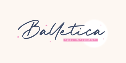
- Boldman by Balpirick,
$15.00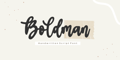
- Cloudy Aurora by Sarid Ezra,
$17.00
- Lonsome Town by Balpirick,
$15.00
- Thinker Justice by Balpirick,
$15.00
- Ancestry by Bedoodle,
$12.00 - Banderole by Bedoodle,
$11.00 - Lovely Emily by Olivetype,
$18.00
- Night Club 70s - Personal use only

- Ellograph CF by Connary Fagen,
$35.00
- Street Corner Racing by Sipanji21,
$15.00
- Cosmo Sheep by Sipanji21,
$18.00
- Speed Impact by Sipanji21,
$17.00
- Vertigo Death by Mirco Zett,
$10.00
- ZP Lycan by Illustration Ink,
$3.00
- Ratushy by Sealoung,
$19.00
- Basilio by Canada Type,
$29.95
- Pea Karen's Doodles - Unknown license

- Pea Whinney Skinney - Unknown license

- Pea Amy*Rica - Unknown license

- Pea Mystie Unicase - Unknown license

- Pea Karen's Print - Unknown license

- Pea Beth R - Unknown license

- Pea cammi-pea - Unknown license

- Pea Daisy Doodles - Unknown license

- Pea Marcie Script - Unknown license

- Pea Sue's Print - Unknown license

- Heisenberg by Letteralle,
$17.00


