3,388 search results
(0.03 seconds)
- Lucifer Sans by Daniel Brokstad,
$29.00 Lucifer Sans is a modern sans serif font rooted in Scandinavian geometry and minimalism, mixed with a healthy dose of black metal and irreverent attitude. Harsh vertical cuts and angles throughout the font creates a very strict and hard look, that can either be amplified or loosened up through its stylistic sets. Lucifer Sans family contains 162 font, 9 different weights and width, plus italics. In addition there are 3 different stylistic sets. This creates substantially diverse set of characters for contrasting against another and makes it a versatile font for different formats. Style 01 takes on an almost hand drawn style, while Style 02 enhances the geometric aspects of the font further. Style 03 uses only the rounded letter 01 without the hand drawn variations.
 - Insula - Unknown license

- Palatino Nova Paneuropean by Linotype,
$67.99Palatino® Nova is Prof. Hermann Zapf's redesign of his own masterpiece, Palatino. The original Palatino was cut in metal by August Rosenberger at D. Stempel AG typefoundry in Frankfurt, and released in 1950. Palatino was later adapted for mechanical composition on the Linotype machine, and became one of the most-used typefaces of the 20th Century. Palatino was designed for legibility, and has open counters and carefully weighted strokes. The type was named after Giambattista Palatino, a master of calligraphy from the time of Leonardo da Vinci. Palatino is a typeface based on classical Italian Renaissance forms. A modern classic in its own right, Palatino is popular among professional graphic designers and amateurs alike, working well for both text and display typography. Hermann Zapf and Akira Kobayashi redeveloped Palatino for the 21st Century, creating Palatino Nova. Released by Linotype in 2005, the Palatino Nova family is part of Linotype's Platinum Collection. Palatino Nova includes several weights (Light, Regular, Medium, and Bold), each with companion italics. Four styles (Regular, Italic, Bold, and Bold Italic) have Greek and Cyrillic glyphs built into their character sets. The Palatino Nova family also includes revised versions of Aldus (now called Aldus Nova), as well as two titling weights. The first titling weight, Palatino Nova Titling, is based on Hermann Zapf's metal typeface Michelangelo, including Greek glyphs from Phidias Greek. The heavier titling weight, Palatino Nova Imperial, is based on Sistina. The fonts in the Palatino Nova family support all 48 Western, Central, and Eastern European languages. Additional features: ligatures and historical ligatures, Small Caps, ornaments, and a range of numerals (proportional & tabular width lining and Old style Figures, fractions, inferiors, and superiors)." - Palatino Nova by Linotype,
$50.99 Palatino® Nova is Prof. Hermann Zapf's redesign of his own masterpiece, Palatino. The original Palatino was cut in metal by August Rosenberger at D. Stempel AG typefoundry in Frankfurt, and released in 1950. Palatino was later adapted for mechanical composition on the Linotype machine, and became one of the most-used typefaces of the 20th Century. Palatino was designed for legibility, and has open counters and carefully weighted strokes. The type was named after Giambattista Palatino, a master of calligraphy from the time of Leonardo da Vinci. Palatino is a typeface based on classical Italian Renaissance forms. A modern classic in its own right, Palatino is popular among professional graphic designers and amateurs alike, working well for both text and display typography. Hermann Zapf and Akira Kobayashi redeveloped Palatino for the 21st Century, creating Palatino Nova. Released by Linotype in 2005, the Palatino Nova family is part of Linotype's Platinum Collection. Palatino Nova includes several weights (Light, Regular, Medium, and Bold), each with companion italics. Four styles (Regular, Italic, Bold, and Bold Italic) have Greek and Cyrillic glyphs built into their character sets. The Palatino Nova family also includes revised versions of Aldus (now called Aldus Nova), as well as two titling weights. The first titling weight, Palatino Nova Titling, is based on Hermann Zapf's metal typeface Michelangelo, including Greek glyphs from Phidias Greek. The heavier titling weight, Palatino Nova Imperial, is based on Sistina. The fonts in the Palatino Nova family support all 48 Western, Central, and Eastern European languages. Additional features: ligatures and historical ligatures, Small Caps, ornaments, and a range of numerals (proportional & tabular width lining and Old style Figures, fractions, inferiors, and superiors)."
 - Diotima Classic by Linotype,
$29.99Diotima Classic is a total upheaval for the 21st century of Gudrun Zapf von Hesse's mid-20th-century Diotima, one of the most beautiful types ever cast in metal. Its roots lay in a calligraphic sheet written by Gudrun Zapf von Hesse. The text was the Hyperion to Diotima" by Friedrich Hölderlin; Diotima is the name of a Greek priestess in Plato's dialogue about love. In the philosopher's imagination, she should appear slim and beautiful. In 1948, Gudrun Zapf von Hesse finished the typeface's Roman. The Diotima family was released as a metal typeface for hand setting by D. Stempel AG in 1951-53. This original Diotima is a festive design particularly suited to invitations, programs, and poems. The delicate Italic drew attention to text passages that should be emphasized. Linotype's previous digital Diotima only had one weight, which looked great in display sizes, but was too thin for text setting. Diotima Classic has four weights. The new Regular has more robust serifs and thicker hairlines, making it more appropriate for text sizes. The Diotima variation with finer serif remains under the name Light. Gudrun Zapf von Hesse also took the opportunity in 2008 to add an extremely heavy weight to the family. In comparison to the old Diotima, letterforms of the Diotima Classic are more harmonious and balanced. The rhythm of the Italic letters in Diotima Classic is more consistent. The lining figures of the Diotima Classic align with caps, and the letter spacing of the tabular lining figures in Diotima Classic is significantly better. The forms of the figures have been improved as well." - Neue Haas Grotesk Display by Linotype,
$33.99 The first weights of Neue Haas Grotesk were designed in 1957-1958 by Max Miedinger for the Haas’sche Schriftgiesserei in Switzerland, with art direction by the company’s principal, Eduard Hoffmann. Neue Haas Grotesk was to be the answer to the British and German grotesques that had become hugely popular thanks to the success of functionalist Swiss typography. The typeface was soon revised and released as Helvetica by Linotype AG. As Neue Haas Grotesk had to be adapted to work on Linotype’s hot metal linecasters, Linotype Helvetica was in some ways a radically transformed version of the original. For instance, the matrices for Regular and Bold had to be of equal widths, and therefore the Bold was redrawn at a considerably narrower proportion. During the transition from metal to phototypesetting, Helvetica underwent additional modifications. In the 1980s Neue Helvetica was produced as a rationalized, standardized version. For Christian Schwartz, the assignment to design a digital revival of Neue Haas Grotesk was an occasion to set history straight. “Much of the warm personality of Miedinger’s shapes was lost along the way. So rather than trying to rethink Helvetica or improve on current digital versions, this was more of a restoration project: bringing Miedinger’s original Neue Haas Grotesk back to life with as much fidelity to his original shapes and spacing as possible (albeit with the addition of kerning, an expensive luxury in handset type).” Schwartz’s revival was originally commissioned in 2004 by Mark Porter for the redesign of The Guardian, but not used. Schwartz completed the family in 2010 for Richard Turley at Bloomberg Businessweek. Its thinnest weight was designed by Berton Hasebe.
 - Christmas Card - Unknown license

- Fortune Coin by Gassstype,
$25.00 Fortune Coin is a Cartoon Display Font with alot of ligature. it will make your designs look modern, unique and fun. It’s perfect for labels, quotes, posters, DIY projects, branding, packaging, greeting cards, websites, photos, photography overlays, signs, window art, scrapbooking, tags and so much more!
 - Love Bug by PizzaDude.dk,
$20.00Yet another one of those romantic looking fonts. The lowercase looks pretty ordinary, while the uppercase swings around with a mixture of tagging / grunge / comicscript and casual handwriting. It works out extremely well with letters and stuff!. For fun, try writing in uppercase only...looks swell!! - Melodiously by Get Studio,
$19.00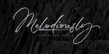 Melodiously Script is handwritten signature style font with stunning brush characters. Include OpenType alternates and common ligatures. Ideal for logos, name tag, handwritten quotes, product packaging, merchandise, social media & greeting cards. Try the alternates and ligatures to give your designs looks good, fresh, casual, stylish, and modern.
 - Roasted lime by Gassstype,
$27.00 Roasted Lime is a Cartoon Display Font with alot of ligature. it will make your designs look modern, unique and fun. It’s perfect for labels, quotes, posters, DIY projects, branding, packaging, greeting cards, websites, photos, photography overlays, signs, window art, scrapbooking, tags and so much more!
 - Rangedit by Muksal Creatives,
$15.00 Rangedit is a Display font created especially for projects that need vintage and Retro typography! Use it for projects like magazines, banners, stationery, branding, name tags, invitations, and more. This font is PUA encoded, which means you can access all of the glyphs and swashes with ease!
 - Margoth by Asterisk,
$33.00 Margot font family, has more than 1000 + glyphs in each font. The font includes advanced language support, fractions, table shapes, ligatures, and more. Perfect for graphic design and any display use. It can easily work for websites, signage, corporate, and editorial design. documents and folders, mobile interface.
 - Covington Condensed, designed by Apostrophic Labs, is a versatile and elegant font that seamlessly blends classic charm with modern sophistication. This typeface stands out for its condensed nature, ...
- Plastic No.20, crafted by Apostrophic Labs, embodies a unique place in the world of typography due to its playful and modern essence. This typeface stands out with its distinctively stylized forms, c...
- Stoic by Up Up Creative,
$29.00 Introducing Stoic, a bold, full-featured script font with tons of OpenType features. With its smooth connections and considerable charm, Stoic is perfect for logos, wedding invitations, stationery design, branding projects, photo overlays, editorial features, and more. Stoic comes with more than 550 glyphs! Specific OpenType features include contextual alternates, stylistic alternates, initial and final forms, multiple alternate glyphs for many letters (accessed through the glyphs panel), multilingual support (including multiple currency symbols), three ampersands, 101 standard and discretionary ligatures, and standard numbers. The OpenType features can be very easily accessed by using OpenType-savvy programs such as Adobe Illustrator and Adobe InDesign. (To access these awesome features in Microsoft Word, you'll need to get comfortable with the advanced tab of Word's font menu.)
 - Rakesly by Typodermic,
$- Are you looking for a typeface that exudes style and class? Look no further than Rakesly, the zesty compact grotesque headliner that’s sure to add some piquant charm to your message. Rakesly boasts well-balanced, charismatic letterforms that draw inspiration from a variety of late nineteenth-century and early twentieth-century sans-serif metal typefaces. Its upright styles feature tasty, cherry-picked features, while its italics draw upon the unique industrial essence of the Art Deco era. This stunning typeface is available in six weights and italics, including the wispy and delicate Rakesly Ultra-Light. Plus, Rakesly includes OpenType fractions and numeric ordinals, mathematical symbols, and a wide variety of currency symbols. For those who love a bit of texture in their designs, Rakesly also offers four grainy, letterpress texture styles called Rakesly Iron, which are available in Regular, Italic, Bold, and Bold Italic. And if you want to add a little extra spice to your typography, Rakesly even includes OpenType contextual alternates that automatically shuffle three letter/numeral variations for a more convincing effect. And if you’re a typography pro who likes to get hands-on, the Iron styles contain private use (PUA) encoding that lets you manually access alternate characters via a glyph table or character table. So why settle for a boring historical revival when you can add Rakesly’s peppery blend of classical elements to your typographic spice rack? Try Rakesly today and experience the rare flavor that only this typeface can provide. Most Latin-based European writing systems are supported, including the following languages. Afaan Oromo, Afar, Afrikaans, Albanian, Alsatian, Aromanian, Aymara, Bashkir (Latin), Basque, Belarusian (Latin), Bemba, Bikol, Bosnian, Breton, Cape Verdean, Creole, Catalan, Cebuano, Chamorro, Chavacano, Chichewa, Crimean Tatar (Latin), Croatian, Czech, Danish, Dawan, Dholuo, Dutch, English, Estonian, Faroese, Fijian, Filipino, Finnish, French, Frisian, Friulian, Gagauz (Latin), Galician, Ganda, Genoese, German, Greenlandic, Guadeloupean Creole, Haitian Creole, Hawaiian, Hiligaynon, Hungarian, Icelandic, Ilocano, Indonesian, Irish, Italian, Jamaican, Kaqchikel, Karakalpak (Latin), Kashubian, Kikongo, Kinyarwanda, Kirundi, Kurdish (Latin), Latvian, Lithuanian, Lombard, Low Saxon, Luxembourgish, Maasai, Makhuwa, Malay, Maltese, Māori, Moldovan, Montenegrin, Ndebele, Neapolitan, Norwegian, Novial, Occitan, Ossetian (Latin), Papiamento, Piedmontese, Polish, Portuguese, Quechua, Rarotongan, Romanian, Romansh, Sami, Sango, Saramaccan, Sardinian, Scottish Gaelic, Serbian (Latin), Shona, Sicilian, Silesian, Slovak, Slovenian, Somali, Sorbian, Sotho, Spanish, Swahili, Swazi, Swedish, Tagalog, Tahitian, Tetum, Tongan, Tshiluba, Tsonga, Tswana, Tumbuka, Turkish, Turkmen (Latin), Tuvaluan, Uzbek (Latin), Venetian, Vepsian, Võro, Walloon, Waray-Waray, Wayuu, Welsh, Wolof, Xhosa, Yapese, Zapotec Zulu and Zuni.
 - Krydderi by PizzaDude.dk,
$15.00 A touch of spice is often what makes a good meal even better. In Danish, spice is called "krydderi" I chose that particular name for this font because it is the kind of brush font that most likely could spice up your next design. I've added 6 different versions of each letter, and they automatically cycle as you type, leaving the result like authentic brush written text. All Caps Fonts.
 - Alcapone by Adam Fathony,
$17.00 Alcapone, a name based from legendary donuts on some brand, It's crunchy and melty. So, I've created this fonts while eating this meal. The Concept is Groovy, Retro & Psychedelic look. Created with a base on standard Serif fonts, playing with melted on the serif itself giving more weight to represent the grooviness and retro-ish look. Alcapone are good for Display, Header, Headline, Poster, Logos, or etc on a big typography.
 - Italiano Fushion Color by RM&WD,
$35.00 Italiano Fushion is part of an expanding project on which we have been working for several years and is the colors ersion of ITALIANO FUSHION. Starts from the study of the great Futurist adventure of the early 1900s by great artists such as DEPERO and MARINETTI, who twisted the world of typography with shapes and colors. Italian Fushion is made up of almost 2,000 glyphs for each weight and in addition to hundreds of alternatives mainly, such as initials and endings of each word but also different alternatives for the letters I, J, Y. Thanks to the characteristics of Open Type, you can change them in automatic many of the alternatives, use it as a simple text font by changing only the I's and J's that have the typical capital dot, and giving the text a more fun breath to the composition. Italiano Fushion is suitable for large texts and to get the most out of it it is compulsory to transform the text into UPPERCASE text using the tabs of graphic applications such as Illustrator, or activate the Alternavive tabs and the various options of SS. You just need do a sandwitch between the 1 ( on the top ) and the 2 ( on the bottom ), choose the 2 different color and you hae finished. by transforming them into traces you can enrich the interaction between the two levels with nuances of pleasure. If you would like to be above layer 2, you can make the text parts transparent without swashes. Ideal for creating Logos, Head Lines, Web Titles, Posters, Epub Covers, Tatoo Projects, T-Shirts, Drink Labels ...
 - Bouncy PERSONAL USE ONLY - Personal use only

- Ogonyok by Russian Fonts,
$15.00 Accidental grotesque with a fiery character. Three font styles: Regular, Italic, Retalic. For each typeface an additional ornament was developed. The «Ogonyok» works well in larger sizes. Looks cool on titles, logos, music album covers, posters, packaging and in short texts. Special gorgeous ornaments will complement and enhance any design. Just try to type the text at the bottom of this page and you will see for yourself. Multilingual. Support: Cyrillic, Latin, extended Latin (Western European, Central European, South-East).
 - Happy Easter by Trim Studio,
$15.00 **Happy Easter **A cute script font that's perfect for Easter-themed moments is whimsical and playful. It has flowing, organic lines that resemble the curves of an Easter egg or the curling petals of a spring flower. The letters are so airy, with a gentle bounce that gives them a sense of movement and liveliness. --- File Include: - Readme.pdf Thank you for let us be your design partner, If you have any questions please don't hesitate to drop me a message
 - Moneta by Monotype,
$35.99 Moneta is an elegant transitional serif with high contrast. Its morphology is based on the study of traditional broad-edge pen script. It comes in 4 different weights (Light, Regular, Bold and Black) and has variable features. Designed by Santi Rey and launched on January 2020.
 - QuaText by LucasFonts,
$39.00 This special newstext version of TheAntiqua was developed in close collaboration with the Berlin newspaper Die Tageszeitung (taz). Its sturdy forms were optimized for newspaper stock. This font family is currently being reworked and will be further developed with variable weights that can be adjusted to clients’ specifications.
 - Marshrut by Gaslight,
$20.00 Another stencil font? Oh, yes. Circular trip time of bus number 17 is so long and designer has one relaxation: look over the letters in the bus. So many tables with bus stop names in it! And now you can write it yourself - enjoy new Marshrut Stencil typeface.
 - Milky Bar by Malgorzata Bartosik,
$29.00 Milky Bar is retro style sans family inspired by food tables in milky bars in Warsaw. It contains Latin and Cyrillic alphabet, Latin with Western, Central and South Eastern European diacritics. This typeface family contains 3 styles from Condensed to Normal. Milky Bar is perfect for display purposes.
 - Stolen Cassette by Gassstype,
$28.00 Stolen Cassette is a Playful Display Font that will make your designs look modern, unique and fun. This is Font Stolen Cassette 2 Style. It’s perfect for labels, quotes, posters, DIY projects, branding, packaging, greeting cards, websites, photos, photography overlays, signs, window art, scrapbooking, tags and so much more!
 - Harpo by Elemeno,
$25.00Harpo is a naturally condensed font, better at large sizes. Harpo Wide is a more versatile version of the same font. Part of The Algonquin Collection, Harpo was named for occasional Round Table member, Harpo Marx. Light, narrow and discreet this font brought to mind the silent Marx brother. - Cervin Asenoy by Muksal Creatives,
$15.00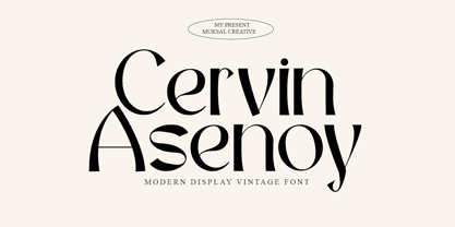 Cervin Asenoy is a Modern Display font created especially for projects that need vintage and Retro typography! Use it for projects like magazines, banners, stationery, branding, name tags, invitations, and more. This font is PUA encoded, which means you can access all of the glyphs and swashes with ease!
 - TagBoyHardcore by PizzaDude.dk,
$15.00TagBoyHardcore is based on my own tagging style when I did graffiti in the mid-eighties. The font is roughly scanned and spaced narrowly in order to keep the original bad boy style. Pump up your text by starting and ending sentences with parentheses, brackets or the curly brackets. - Fresno by Parkinson,
$15.00 Fresno is a two-font family. Fresno Inline and Fresno Black. Fresno Black is a recent addition. It can be used alone, and it is carefully tailored to fit behind the Inline font to add color to the inline. There are alternate characters: A, M & N in the caps and lowercase key positions. Fresno is a square gothic style typical of Mid-20th Century Showcard Lettering. A lettering genre known as “Gaspipe.” Signage samples similar to this still exist on buildings in my home town, Oakland, California. I have designed over a half dozen variations of this form over the years. Including Amboy. Golden Gate Initials, Matinee, Motel, and Hotel. Designed in 2001 by Jim Parkinson, Fresno has recently been refreshed, enhanced, and re-released.
 - Grange by Device,
$39.00 The Device interpretation of the classic “Grot” thick/thin sans style. Unlike the traditional models on which it is based, Grange takes a rational, consistent approach across wide range of weights and widths for contemporary use. The "Text" weights are designed for use at smaller sizes, and have more open character shapes and spacing for legibility. The font includes alternative curved and straighter versions of key characters, most obviously the lower-case ‘g' and capital ‘R', allowing the font to take on either a sharper or warmer, more playful appearance. These can be toggled on or off using the ‘Alts' feature in Illustrator, or ‘Stylistc Sets’ in Indesign. Contains proportional, lining and tabular numerals. Perfect for both headline and text.
 - Amboy by Parkinson,
$20.00 Amboy is a two-font family. Amboy Inline and Amboy Black. Amboy Black is a recent addition. It can be used alone, but it is carefully tailored to fit behind the Inline font to add color to the inline. There are alternate characters: A, M & N in the caps and lowercase key positions. Amboy is a square gothic style typical of Mid-20th Century Showcard Lettering. A lettering genre known as “Gaspipe.” Signage samples similar to this still exist on buildings in my home town, Oakland, California. I have designed over a half dozen variations of this form over the years. Including Golden Gate Initials, Matinee, Motel, Hotel and Fresno. Designed in 2001 by Jim Parkinson, Amboy has been refreshed, enhanced, and re-released.
 - Transcend by Monotype,
$31.99 Transcend has been designed specifically for titling and branding purposes. This 8-font, all caps typeface is packed with OpenType features including discretionary ligatures and alternates that – when used subtly – help you to create distinctive headline typography. Transcend aims to be “The Ultimate Titling Typeface”. This typeface is an exploration of my own “Carrig” from 2014. I have evolved its core personality and embellished it by means of crisp, sharp lines and serifs, adding stylised ink traps/notches, as well as carefully considered swashes, flourishes, and ligatures that add a touch of class and refinement to every word you type. Key features: • 8 weights – Thin to Ultra • Alternates, Discretionary Ligatures, and Old Style Figures • European Character Set – Latin Only • 600+ glyphs per font.
 - Gable Antique Condensed SG by Spiece Graphics,
$39.00 This Art Nouveau typeface was created around the turn of the 20th century by the Bauer Type Foundry in Germany. A unique foot and head serif treatment is the key design feature in this antique revival. Many vertical stems terminate in what has been called “the swooping, pointy-foot look.” A marvel to look at and a joy to set, Gable Antique Condensed will be a lasting asset to your growing typeface collection. Gable Antique Condensed is also available in the OpenType Std format. Some new characters have been added to this OpenType version. Advanced features currently work in Adobe Creative Suite InDesign, Creative Suite Illustrator, and Quark XPress 7. Check for OpenType advanced feature support in other applications as it gradually becomes available with upgrades.
 - Twilight Script by Get Studio,
$15.00 Twilight Script is a dry handbrushed font, designed to combine perfectly and allow you to create stunning hand-lettering quickly and easily. Ideal for logos, handwritten quotes, product packaging, header, poster, merchandise, social media & greeting cards. Twilight Script comes with upper and lowercase characters, large set of punctuation glyphs, numerals, and supports international languages. Stylistic alternates for several key lower case characters are also available. Note : To access all the alternate letters for this font you will need software with a glyphs panel - such as Adobe Photoshop CC 2015 , Adobe Illustrator, Adobe Indesign. The subset of Twilight Script Regular in this kit supports the following languages: Albanian, Basque, Breton, Chamorro, Danish, Dutch, English, Finnish, Frisian, Galician, German, Italian, Malagasy, Norwegian, Portuguese, Spanish, Swedish
 - Cream by Monotype,
$30.00 Cream is a retro soft serif typeface comprising 12 fonts. It can handle most typographic applications from branding to body copy with its range of weights and inherent legibility. Whatever you type will have a friendly message, but it really comes into its own when you start applying some of the additional ligatures and alternates that are built into this type family. You’ll soon be creating distinctive typographic compositions that are pleasing to the eye. There are 12 fonts altogether, ranging from Light to Black weights in both roman and italic. It has an extensive character set that covers all Latin European languages. Key features: 6 weights in Roman and Italic 75 Alternates 37 Ligatures Full European character set (Latin only) 730 glyphs per font.
 - Weaving by Ingrimayne Type,
$9.00 Weaving is a family in which the letters fit together so that wavy lines separate them both horizontally and vertically. It creates this effect by alternating letters on upper-case keys with those on lower-case letters and this alternating is done automatically in applications that support the OpenType feature of contextual alternatives (calt). (The upper-case can be used alone but it unlikely that the lower-case characters could be used by themselves.) The family is a thinner and condensed version of the typeface Woven, but in condensing it, the tessellation properties that a were in Woven are lost. It is a decorative display face but because there are few typefaces similar to it, it is hard to predict what uses it may have. Be creative!
 - Sanity by Popkern,
$- The design of Sanity typeface is modernized by abandoning any characteristics associated with hand writing, such as curved lines or elaborate corner details. The design is based on a rigid geometric grid and radiates confidence with its daring contrasts and provocative style. In large amounts of text the font “Sanity” can be hard to read due to a «dazzle» effect caused by alternating thick and thin strokes, particularly as the thin strokes are hardly visible at small point si es. Due to this quality, the “Sanity” font-family is best suitable for titles or large print advertisements. There are five key stylistic principles taken as a main framework for the creation of the “Sanity”: symmetry, contrast, geometry, artificiality and monospacing.


