10,000 search results
(0.066 seconds)
- Engebrechtre - Unknown license

- Vahika - Personal use only

- Screengem - Unknown license

- Olivita by Plau,
$49.00 Innocent until proven otherwise, Olivita is a heavyweight interpretation of the Typewriter genre. Typewriter fonts have captivated generations of designers and found its way into infinite applications, including Milton Glaser’s classic I heart NY logo. Olivita is a fat-face take on the same idea. There’s a lot to negotiate in making type as bold as possible, with shapes having to contort and distort in order to make a cohesive whole. The x-height is tall yet ascenders and descenders are long. Super size it and see the rich, creamy texture come forward.
 - Textan - Piple - Unknown license

- Hexonu by Ingrimayne Type,
$6.95 Hexonu is a weird, awkward, monospaced font family. In place of true lower-case letters, it has a second set of capitals that, through the magic of the OpenType contextual alternatives (calt) feature, automatically alternates with the set on the upper-case keys. If one wants to use only one set of letters, the contextual alternatives must be turned off and character spacing adjusted. Hexonu is another effort to create a font with alternating sets of letters (see PoultySign, Lentzers, and Caltic for others). The base shape for forming the letters is a lopsided hexagon that resembles an old coffin. In four of the six family members, the alternating shape is a distorted hour-glass. In the other two, coffin shapes heads-up alternate with coffin shapes heads-down. The family was created as an experiment with the calt feature and not for any particular use. It does not work as text but its bizarreness makes it appropriate for some poster and signage applications.
 - American Scribe by Three Islands Press,
$39.00 The Declaration of Independence was authored by Thomas Jefferson, but his is not the classic handwriting on the engrossed copies familiar to most Americans. That belonged to Timothy Matlack, an early patriot who fought in the Revolution, sat as prosecutor at Benedict Arnold’s court martial, and also penned copies of a number of documents for then-General George Washington. Matlack’s script was compact but legible, perfect for the first and most famous of American documents. Now you, too, can write that way. Please note: The font does not include any of the signatures from the Declaration of Independence.
 - Wormwood Gothic by Device,
$39.00 Retaining all the imperfections and irregularities of wood type, Wormwood Gothic is a gothic sans with all the naive and uneven character shapes typical of the period. The ‘capitals’ feature extended characters, while the ‘lower case ’ features capitals of squarer proportions. Freely mix the two in word settings or colour in red and black for a Dada collage, billposter, urban grit or antique Americana atmosphere.
 - Bolt Display by SilverStag,
$19.00 Introducing Bolt Display – picture this: uppercase letters with rounded corners, inviting you in with a warm, approachable embrace. Or, if you're feeling adventurous, the outlined uppercase stylistic set that adds that contemporary edge to your work. On the flip side, lowercase letters with sharp corners confidently declare their presence, while the lowercase outlined stylistic set strikes the perfect balance between structure and artistic freedom.
 - Bonnycastle by Three Islands Press,
$39.00 Sir Richard Henry Bonnycastle (1791–1847) was an English officer and military engineer who served in the War of 1812 and ultimately settled in Canada. I stumbled upon copies of some of his charts and maps, became infatuated with the hand-lettered titles—and the result is the eponymous Bonnycastle. The font has a bold weight and an italic style but is intended as an eye-catching standalone, evocative of its period in history. Use as a titling face on branding materials, event posters, book covers, presentation graphics, historical illustrations, and the like.
 - Shanks Antique 5 AOE Pro by Astigmatic,
$24.95 Shanks Antique 5 Pro is an iconic antique English typestyle rooted in tradition. It is the historical revival and elaboration of the “Antique No. 5” typeface created by Stevens, Shanks & Sons in 1865. What began as a basic character set of Capitals, lowercase, numerals, and a small handful of punctuation characters has been expanded to a full character set including unlimited fractionals, superiors & inferiors, ordinals, tabular & proportional figures, and an expanded language glyph set, all with a smallcaps and Caps to Smallcap set to match. Reviving history looks and feels good. Perfect for wedding invitations, historical ephemera recreations, and classically elegant text settings.
 - 14 minutes - Unknown license

- Horror - Unknown license

- Bodoni Classic Pro by Wiescher Design,
$49.50 This is my new, completely worked over and fine-tuned Bodoni Classic for Europe (no Greek and Cyrillic). I have added a set of elegant Swashes (B) and 2 alternating uppercase swirly Initials (C) as well as two lowercase end-letters (D). The fonts A and B have extensive kerning, which the initials (C) don't need, they are aligned to replace the standard capital letter. The lowercase end-letters (D) are aligned to replace the standard lowercase letters, so you might need to add a blank after the swirl. For good measure I throw in an extra set of swings for 1 Dollar (E). Your Bodoni maniac, Gert Wiescher
 - Dirty Numbers by Coniglio Type,
$9.00 DIRTY NUMBERS LTD At $1 US dollar each: Dirty Numbers - Provides (9) individual sets of unique numerals [0 thru 9] and nothing else. That is all. Very limited character sets integrated into one font by Coniglio Type -and- a very inexpensive set of marketing numerals. They are revivals from type crafted images and they are monospaced, easy to use and to kern the way you wish. You will have to review your glyphs to locate them and they were pasted in the most logical and accessible places and made economical to you for your special design and crafts needs. Dirty Numbers by Joseph Coniglio, Coniglio Type 2021.
 - Zalcony by HandletterYean,
$16.00 Introducing Zalcony, a captivating handmade font exuding a simple yet alluringly distorted brush aesthetic. Every letter and character carries its own unique size, beautifully showcasing the authentic, natural flow of handwritten script. With Zalcony, add a touch of genuine, personalized charm to your designs.
 - Gravure by Intellecta Design,
$14.90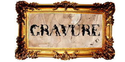 a historical human figure font
 - Triad XS - Unknown license

- Diego - Unknown license

- Nautical Doodles by Outside the Line,
$19.00 Sail the seas with Nautical Doodles. This seaworthy font has 32 illustrations of water craft, anchors, star, compass, flags, whale, shark, birds, starfish, seahorse, rope etc. Even a mermaid... and the scripted word Ahoy! If you would like the character chart go to the Gallery Tab and print. (PDFs are no longer downloaded with the font.)
 - Space Captain by Patria Ari,
$15.00Space Captain is a modern all caps font with uniquely sharp and geometric shapes. Alternative wing shapes in the left and right in alphabet included in stylistic alternates. This font perfect for logotype such as technology, construction, automotive, heavyweight, etc. - DR Krapka Square by Dmitry Rastvortsev,
$29.99 In the DR Krapka Square typefamily, the pixel has a square shape. The font supports OpenType features and contains small capitals, ligatures, oldstyle figures, terminal forms, historical forms, stylistic sets. The dingbats, arrows, emoji are also present. For small texts, it is recommended to use DR Krapka Square-FontSize10px in the font size 10 px. DR Krapka Square typefamily supported European languages based on Latin, Cyrillic and Greek scripts. If you want to use fonts with a different shape of pixels, there are also typefaces from DR Krapka family: DR Krapka Round, DR Krapka Rhombus.
 - Teacup by Hanoded,
$15.00 I remember a tea ceremony I attended in Fukuoka, Japan. The teahouse was set in a small, but beautiful garden and the whole idea of the ceremony was to appreciate the view from the porch. I thought the tea was quite bitter, but the view was unsurpassed. From time to time these memories pop up and I have to use them - that is why I named this font Teacup. Teacup is a slightly eroded all caps font, made entirely by hand with a Japanese marker pen and some high quality textured paper. It comes in a romantic open style and a more solid closed style. Teacup is filled to the brim with diacritics.
 - Craft by Alfareaniy,
$200.00 Craft is a unique and cool kids font model. The horror and sharp shape makes your design very stunning
 - 1913 Typewriter by GLC,
$38.00 This font was patterned after a few characters on a genuine old 1913 small portable typewriter. It looks like those early typescripts, rough, irregular and eroded, suggestive of mythical famous authors, such as Hemingway, as well as “serie noire” movies or anonymous state employee working in a gloomy Kafkaesque office. It is a complete alphabetic full font. It can be used as web-site titles, poster design, or book editing. It may be preferable, if possible, when printing, to choose a pale color a little rather than condensed - dark grey instead of heavy black, for example - to give the best appearance and to benefit from the full details. The old typewriter character size is 11 to 12 points, but this font easily supports enlargement.
 - Evuschka by Petra Sucic Roje,
$33.00 A dramatic contrast between thick and thin strokes, “ball” shapes at stroke terminals, and straight hairline serifs are main Evuschka characteristics. In this font, the x-height is specifically accentuated in relation to body height. In spite of its extreme geometrical shape, Evuschka exudes fairytale romance. Belonging to decorative type fonts, it is best suited for headlines, titles, and small amounts of text in large sizes. Evuschka was selected for TDC Certificate of Typographic Excellence 2017.
 - Vinho De Amora by Mans Greback,
$59.00 Vinho De Amora is a truly vintage serif font. Drawn by Mans Greback between 2019 and 2021, this font is created with inspiration from wine cellars, painted typography and genuine quality produce. It has a distinct sharp character, steady legs and a bold and wide appearance. The Vinho De Amora family consists of three styles: Black, White and Stencil; each one geometrically consistent and complimenting, perfect for stacking on top of each other to create more variations. The font is built with advanced OpenType functionality and has a guaranteed top-notch quality. It has extensive lingual support, covering all European Latin-based languages. It contains all characters and symbols you'll ever need, including all punctuation and numbers.
 - Toppler by K-Type,
$20.00 TOPPLER is a top-heavy comic font, K-Type’s salute to nineties freebies such as Ben Balvanz’s Baby Kruffy, Comix Heavy from WSI, and Dave Bastian’s Startling. Unlike those glorious fonts-of-old, Toppler contains a complete repertoire of symbols, dingbats and Latin Extended-A accented characters, as well as a proper lowercase, careful spacing and tasty kerning. Toppler also boasts cleaner outlines and more refined shapes. The Toppler family comprises four fonts that share spacing and kerning, so can be overlapped to produce bicolor and multicolor effects. In addition to the regular, solid style of Toppler, there is a shaded ‘Popdots’ style, plus thick and thin outline fonts.
 - Sunkist Agness by Alit Design,
$15.00 Introducing Sunkist Agness Typeface The Sunkist Agness inspired by chill and playful street font combined with stencil font style. this font have rough and distorted shape which is become its own characteristic and uniqueness. Designed with 3 characters: Slab Serif, Sans Serif, and Serif, Sunkist Agness font is suitable to be combined into a playful and interesting combinations, not to mention the alternates from each characters that will add more uniqueness to your design! The "Sunkist Agness" are very easy to apply to any design, especially those with an retro and classic, army, playful and retro concept, besides that this font is very easy to use both in design and non-design programs because everything changes and glyphs are supported by Unicode (PUA).
 - Grungy Old Typewriter by FontFuel,
$14.00 Grungy Old Typewriter is based on two typed letters, each on two pages and dated 1901. The results are eroded, rough, irregular and grungy. The final results are a vintage look. As a designer, I wanted as much flexibility as possible, so there are six versions that are designed to work together. Additionally, I decided to keep the grunge and irregularities within the shape and not include surrounding typewriter or paper marks. I leave it to the design to add those elements as desired. One note, the letter spacing is much tighter than an old typewriter. I felt that readability for modern readers suffered from the added space. Of course, you can get that same look by increasing the letter spacing in your favorite design program.
 - Holocene Typewriter by Ana's Fonts,
$16.00 Holocene Typewriter is a soft typewriter font sampled from old documents, for an authentic vintage look. Holocene Typewriter includes: a Typewriter font in Regular, Slant, Underlined and Crossed-out styles SVG fonts of the Regular and Slant styles Use this font in any designs that needs a vintage touch. Use it in long or short texts, in digital collages, branding and packaging, social media posts, logotypes, etc.
 - Bell Centennial by Bitstream,
$29.99 Designed specifically for AT&T by Matthew Carter at Mergenthaler to replace Bell Gothic with a typeface that made effective use of digital typesetting technology, Bell Centennial gets several more lines per page than Bell Gothic, reduces calls to information because of its significantly higher legibility under adverse printing conditions, saving AT&T many millions of dollars per year. Although intended for use at small sizes, Mazda UK used Bell Centennial at huge sizes to striking effect in a mid-1990s ad campaign.
 - Love And Peace by Fenotype,
$25.00 What's so funny 'bout peace love & understanding? Nothing really. Love and Peace is an Art Nouveau style typeface inspired by Eckmann-Schrift by Otto Eckmann in 1900. Love and Peace is filled with ethereal elegance and it's great for posters, magazines and psychedelic LP covers. Love and Peace is equipped with few Contextual Alternates and Standard Ligatures to prevent characters from colliding. In addition it has Stylistic Alternates for lowercase a, k, r and s, and Swash Alternates for ampersand and dollar sign.
 - Velvenda Megablack - 100% free

- Smeethe by Aah Yes,
$4.95Smeethe manages to look almost out of focus while being slightly degraded and distorted, but has a smoothed outline. - Navaja by Andinistas,
$39.95 Very few letter types with the context of grunge style fonts offer hierarchies to differentiate words in sentences or paragraphs. With Navaja I developed a font family that meets this need. This family is useful to organize the information into a hierarchy with an eroded look. Its central idea mixes grotesque, geometric and humanistic letter conventions. This way, Navaja is a grunge-sans with dense proportions to make graphic design with eroded character. Its main purpose appeared when one of my customers asked me for a t-shirt design for a fan club of an important football player. For this reason its starting point were stained and muddy letters characterizing the toughness and coldness of the sport. Over time their glyphs began to imitate the robustness of "wood type & Tuscan Type" widely used in posters in the late nineteenth century. Its purpose was strengthened in a family with 6 members that when mixed they produce mind catching contrast levels ideal for designing T-shirts, stickers, flyers, brochures, posters, billboards, cinema or TV. Therefore its variants are short up and down height X combined with different widths that by working together produce information that radiates outstanding apparently destroyed controlled violence. Navaja Dingbats consists of 52 illustrations useful for frames and textures. In that vein, the origin of each member comes from skeletons of Roman and Italic calligraphy. The low amount of contrast between thick and thin lines matching the contours apparently gnawed but strictly regulated by optical adjustments equating the sum between full and empty areas. Factors such as finishes, shapes and counter internal and external forms are meticulously planned although its scruffy look which strategic arrangements are offset to provide color typographical homogeneous. And in conclusion, I have plans to continue expanding the family with more complete versions in the future.
 - Lunar Modular by Comicraft,
$19.00 TOUCHDOWN! This is not a Hoax, not a What If, not an Imaginary Font! The Eagle has Landed... Comicraft's latest manned mission: Space Age Faces for Space Age Spaces! Our Apollo Modules have settled in the moondust and our Astronauts are buckled up in the Rover collecting little rocks and looking for suitable spots to play golf. We invested billions and billions of dollars to send these fonts into space using the largest and most powerful rockets ever built, and rest assured, our Orbiter is coated with a phenolic epoxy resin ablative heatshield to protect you for your journey back to Earth. Features: Six fonts (Modular, Modular-Bold, Orbiter, Orbiter-Bold, Rover, Rover-Bold) with upper and lower case characters. Opentype version of Orbiter also includes 52 auto-ligatures.
 - P22 Elven by IHOF,
$24.95 The rounded shapes of P22 Elven show the influence of the 10th-century Irish half-uncial. Effective for projects dealing with mystery, fantasy, or historical drama.
 - Portsmouth Second Fleet by Open Window,
$19.95 Portsmouth Second Fleet is the rag tag, wild bunch companion to Portsmouth. It is a strong, sturdy typeface with historical character. Its inspiration comes from the height and strength of the wooden tall ships that sailed into port in their day. With caps and small caps, this typeface is great for headlines or subheads for design projects that need a historical or retro feel, such as from the 1940s and earlier. Two different styles that can be layered allow for different colored drop shadows, outlines and fill for even more customization.
 - New York Line by Kustomtype,
$30.00 When you go traveling you always fall in love with something… At this time, it is the inscription of Holland America Line which is sparkling on ‘New York Hotel’, Rotterdam-Holland. Based on the letters I had at my disposal from the Holland America Line inscription at ‘Hotel New York,’ I started to complete the alphabet in the same style as the original text. Eventually, I digitized everything in order to acquire a usable and modern font to be able to use it for all graphic purposes. The font is ideal for head text, posters, logos, editorial, branding, signage, web applications, modern design, etc... Don't hesitate to use this unique historical font! It will give your work that glamour that you will find in this extraordinary font. Enjoy the New York Line. The Holland America Line was founded in 1873 as the Dutch-America Steamship, a shipping, and passenger line. Because it was headquartered in Rotterdam and provided service to the Americas, it became known as Holland America Line (HAL). From 1901 the iconic building on the Kop van Zuid shines. It previously housed the Holland America Line; now it houses the hotel-restaurant, Hotel New York. A building with a great history. Hotel New York has a beautiful history. Built in 1901, many ships sailing away and opened in 1993 as a hotel and restaurant. The New York Line Font comes with uppercase, lowercase, numerals, punctuations so you can use it to customize all your designs. Perfect for Logos, Letterhead, Poster, Apparel Design, Package design, Label design etc. The New York Line Font is designed by Coert De Decker in 2018 and published by Kustomtype Font Foundry. Enjoy your journey with the New york Line!


