10,000 search results
(0.095 seconds)
- Tipperary eText by Monotype,
$57.99Tipperary was designed by Steve Matteson and named for a favorite 'single track' bike trail, Tipperary is a monoline Humanist Sans Serif typeface. The clear, open, letter forms curve abruptly in an almost squarish geometry much like the sharp turns on the Tipperary trail. The clear, austere forms offer exceptional legibility for both interface designs and extended reading. Small size package labels and crisp branding programs benefit from Tipperary's emphasis on clean, readable design. eText typefaces are designed to meet the challenges of extended reading in digital environments such as mobile devices or desktop screens. Their forerunners are among the world's most popular and important book typefaces for print media. These classic designs were reinterpreted to conform to technological constraints of LCD and e-Paper while retaining the properties of proportion and form which made them favorites for print. - Tornelsen Curkee by madeDeduk,
$16.00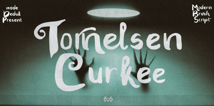 Really excited to introduce Tornelsen Curkee is a realistic brush script! Tornelsen Curkee will be perfect for all your designs project. Tornelsen Curkee Included: Uppercase Lowercase Number & Symbol International Glyphs Ligature Alternative Hope you enjoy it.
 - Homage Condensed by GarageFonts,
$49.00 Paying homage to the 1960s and 1970s designs of Tom Carnase and Herb Lubalin, Homage Condensed is a digital revival and recutting of LSC Condensed in two weights along with italics and numerous stylistic alternate characters.
 - Flamenco Inline by ITC,
$29.99Flamenco is the work of British artist Tony Geddes. Its versatile display style has an inline contour decoration and a controlled yet casual appearance. Flamenco will guarantee visual excitement across a vast range of advertising applications. - Obschepit by Zaporozhan Dmitriy,
$15.00 When did it start. One day I was designing some stuff for a fast food café. By style the Café was made as an old Soviet canteen. So I had to do a special accent on this in menu, advertising posters and other print products. I decided to do this by interesting old school font. There are many cool retro fonts on the Internet, but not one of them satisfied me on 100%. The next step was to look at the old posters and find some inspiration. So I found some cool pictures with exact letters that I needed, but there were no typefaces to buy so that I can print some text with this exact letters. That's why I decided to do such typeface for my own. You can use this typeface in the field of nutrition, and it also will suit for cinema posters.
 - Franqueline Slab by Sudtipos,
$39.00 Introducing Franqueline Slab, the captivating new typeface family passionately designed by Estudio Vástago and expertly distributed by Sudtipos! This versatile font offers a diverse array of styles, ranging from delicately refined to boldly eye-catching on the weight axis, all elegantly inspired by the timeless Egyptian fonts of the late 19th century. With expressive character and exquisitely unique shapes, Franqueline Slab harmoniously blends the finesse of its delicate strokes with sophisticated endings, resulting in a truly remarkable typography. Every letter in Franqueline Slab has been meticulously crafted to strike the perfect balance between a contemporary edge and a touch of traditional charm, appealing to both the younger generation and typography enthusiasts who appreciate the artistry of the past. Its adaptability makes it ideal for captivating headlines that convey a message of youthful energy and playfulness, while still exuding the timeless elegance that only classic fonts can deliver. Embrace distinction and originality in your designs with Franqueline Slab. Whether it graces an editorial project, logo, or advertising material, this exceptional typeface family will undoubtedly stand out, leaving a lasting impression with its captivating personality. Watch your messages come to life and shine with the unparalleled charm of Franqueline Slab!
 - Down Home JNL by Jeff Levine,
$29.00 In the October 31, 1920 edition of Wid's Daily (the predecessor to The Film Daily), a block of ad copy from a 1920 film called "Down Home" had the text printed in such a fluent pen-lettered style that a bit of a shortcut was used at the beginning of the design process for this typeface. Normally, font inspirations are redrawn [and not by simply using auto-trace] except under specialized circumstances like this one where that feature is a help, rather than a replacement for the creative process. The entire block of text copy was auto-traced, then the necessary letters were selected from the available wording and cleaned up to remove any sharp points and irregular curves in an effort to make the end results as close to the original and unusual hand-drawn text. From there the missing characters needed to produce a finished type font were created utilizing the standard methods of drawing and font construction. The end results turned out very well. Using the film's title as its namesake, this design is now available digitally as Down Home JNL in both regular and oblique versions.
 - Emily Lime Brush by Emily Lime,
$16.00 This brush script is what you call real. Designed using a pentel brush pen on paper, it captures all the nuances of real lettering. Texturized streaks are inconsistent, just as you would expect in real life. This font has tons of personality but it doesn't yell at you like many brush scripts can. Emily Lime Brush is an easy choice that can cover many design projects. Designed to be straight-forward & easy to use. Multilingual support.
 - Pea Mystie Unicase - Unknown license

- Pea Beth R - Unknown license

- True Golden™ - Unknown license

- Starlit Neon by Ditatype,
$29.00 Starlit Neon is a delightful display font that combines the elegance of rounded letterforms with the captivating allure of neon lights. With its bold uppercase characters and unique design, this typeface adds a touch of playfulness and charm to your projects. The defining feature of Starlit Neon lies in its rounded letterforms, which exude a sense of softness and approachability. Each letter is meticulously crafted with smooth curves, creating a harmonious and pleasing aesthetic. The rounded shapes give the font a friendly and welcoming appearance, while the neon style adds a touch of excitement and vibrancy. Inspired by the mesmerizing glow of neon signs, Starlit Neon infuses a sense of enchantment and allure into each character. The font captures the captivating charm of neon lights, casting a radiant glow that evokes a magical atmosphere. In some letters, you'll find additional subtle accent lines, which enhance the overall composition with a touch of sophistication. The uppercase letterforms of Starlit Neon are bold and assertive, commanding attention with their rounded shapes. Each letter of Starlit Neon is thoughtfully crafted to strike a balance between rounded shapes and legibility. The uppercase characters are distinct and easily recognizable, ensuring your message remains clear and impactful. The additional subtle accent lines in select letters add an extra touch of visual interest, elevating the font's overall composition. Find out more ways to use this font by taking a look at the font preview. Features: Alternates Multilingual Supports PUA Encoded Numerals and Punctuations Starlit Neon perfect for designs like headlines, logos, and eye-catching titles that seek to make a bold statement with a touch of whimsy. Whether you're creating posters, branding materials, digital artwork, or anything in between, this font will infuse your projects with a sense of joy and uniqueness. It particularly shines in applications related to entertainment, children's products, beauty, and lifestyle themes. Find out more ways to use this font by taking a look at the font preview. Thanks for purchasing our fonts. Hopefully, you have a great time using our font. Feel free to contact us anytime for further information or when you have trouble with the font. Thanks a lot and happy designing.
 - Houdini by Solotype,
$19.95Houdini was extemporized from the single word "Houdini" on a lithographed poster for the magician. The original was a shaded outline like our Houdini Shaded font, but we felt that a solid version would be worthwhile too. Like the companion font Houdini, the shaded version was created from the single word Houdini on an old lithographed poster for the famous magician. The original was hand-lettered by a litho lettering artist. - Kremlin Kourier II - Unknown license

- Ersatz by Galapagos,
$39.00Ersatz has its vibrant roots in the Mediterranean climate of Spain. Tired of the functional monoline sanserif fonts used throughout Europe from road signage to corporate identity, Richard Dawson and Dave Farey, British type designers who crave color and sunlight, created a style that is refreshing and lively. The basic constructions are simple and attractive, mixing lower case shapes into the capitals - and unique letterforms into the lower case. There's a raunchy feel to Ersatz, soft curves and back kicks, if you listen very carefully you can hear the sharp guitars and the soft tambourine of the Flamenco. - Audela by Fontfabric,
$40.00 Surpassing traditional Antiqua, our new collaborative font family Audela emerges after overcoming time, national borders, language differences, cultural gaps, and professional challenges. Starting off as an exercise project of our very first intern Léa Bruneau in 2018, Audela slowly shaped into a full-fledged elegant serif typeface of 14 styles under the watchful eye of Plamen Motev, Fontfabric’s Type Director. Three years later, Audela is internally regarded as a breaker of limits earning its name from the French “au-delà,” meaning “beyond.” This new rising star features sharp serifs, flowing letterforms, advanced OpenType features, Extended Latin and Cyrillic support, to name a few.
 - Dahliana by Luhop Creative,
$10.00 Dahliana is a humanist serif type family that has the heritage of classic Old Style and Transitional type while having the crisp lines and functionality of contemporary fonts. Its defining features include a high-contrast combined with diagonal stress, along with pinched stems and horizontals. There are 18 fonts altogether over 9 weights in roman and italic, you can also avail of one variable fonts which allow you to fine tune the weight to your exact liking.
 - Industria by Linotype,
$40.99Brody’s fonts borrow elements from both Art Deco and non-Western styles. His designs received international recognition for their innovative, computer-oriented style, reaching almost cult status. Four original Brody fonts are available from Linotype Library GmbH: Insignia, Industria-Solid, Industria Inline and Arcadia. For your convenience, we have gathered all four into one package. Industria is a font which speaks of mechanical exactness, cool and reserved. Industria Inline is a lighter version of Industria Solid. - So Far So Good by Papermode Co,
$20.00 So Far So Good is a Decorative display font. So Far So Good come with ROUGH style, it will make this typeface can be used in all design projects and works perfectly for pairing with script typeface or handmade fonts, Headlines, Posters, Packaging, Postcards, Invitation, Wedding Sign, Sign Painting, Signboard, and much more. Try So Far So Good, and let her fun and elegant excitement make you happy and enhance your creativity! You can use this font very easily.
 - Gendos by Febri Creative,
$14.00 Gendos is a sans serif condensed font family that is designed with a simple but unique shape. This font family has 10 styles consisting of 5 normal shapes and 5 italics. Gendos font can be used for logos, book or magazine cover titles, product brands, or just for writing articles.
 - Soft Hits - Unknown license

- Moscovium by Throndsen,
$29.99 Moscovium is a radioactive, synthetic element about which little is known. It is classified as a metal and is expected to be solid at room temperature. It decays quickly into other elements, including nihonium. The element had previously been designated ununpentium, a placeholder name that means one-one-five in Latin. Element 115
 - ITC Resavska by ITC,
$29.99 Olivera Stojadinovic made her first sketches of the ITC Resavska family with the goal of creating a typeface that would be readable at small sizes. Stojadinovic added geometric serifs to the original design to create four weights in serif and sans serif sub-families. Each weight (except the black) has an italic counterpart.
 - ITC Resavska Sans by ITC,
$40.99Olivera Stojadinovic made her first sketches of the ITC Resavska family with the goal of creating a typeface that would be readable at small sizes. Stojadinovic added geometric serifs to the original design to create four weights in serif and sans serif sub-families. Each weight (except the black) has an italic counterpart. - Casta by Dirtyline Studio,
$39.00 Casta is strong Modern contrasts make this typeface both impressive at display sizes and easily readable in text size, while the sharp shapes of the triangular serifs and the distinctive letter shapes show their strength in logo design and impressive editorial use. Casta come with elegant style, strength and contrasts, with features an extended latin character set of 429 glyphs covering over 28 languages, and includes advanced open type features like standard and discretionary ligatures, positional numerals, stylistic alternates and case sensitive brackets. Mixing versatility and personality, Casta is ready to be like a top model on the design catwalk, making your projects looking classic but contemporary, finely tuned but assertive, and elegant as the best luxury fashion.
 - Grafilone by Linotype,
$29.99Linotype Grafilone is part of the Take Type Library, which features winners of Linotype’s International Digital Type Design Contest. In creating his font, Bo Berndal combined elements of the constructed and Art Deco styles. Slender and angular, Grafilone is mechanically exact and coolly resesrved. A distinguishing characteristic is the combination of angular and sloping strokes, which give the font a dynamic feel. Grafilone is particular good as a headline font and for initials when combined with constructed sans serif fonts. - Flagtail Display by Pekotype,
$23.00 Flagtail Display combines the familiar feeling of classic typeface with the modernish touch to suit the nowadays trend. With its semi-bold and sharp type of shape, it can easily catch and engage the reader's attention in an instant. The excellent readability of Flagtail Display will put any of the messages being delivered to be the limelight. This typeface suits for you who aim to catch attention through headlines, rebrand your products, and beyond.
 - You Are Loved - Personal use only

- TMBFont - Unknown license

- Thorowgood Sans by HiH,
$8.00 A three-dimensional all-cap font for title use, Thorowgood Sans Shaded was released by the Fann Street Foundry of W. Thorowgood & Co. in 1839. Interestingly, it more closely resembles Figgins' Four-Line Emerald Sans-Serif Shaded of 1833 than Fann Street’s own Grotesque Shaded of 1834 (with light and shadow reversed). The idea of a shaded font is of an outline font whose letters have each been extruded through a die and then viewed from the lower right to reveal the third dimension. That third dimension has also been referred to as a shadow. Vincent Figgins' 1815-release of a shaded serif typeface was the first known of many shaded faces, as the other foundries rushed to bring out their own versions. Thorowgood Sans Shaded may be gainfully used today as a eye-catching headline font, just as it was so popularly used in the early nineteenth century. To assist with the usual all-cap letter-spacing problem, the following pre-kerned pairs are included: AT, AV, AW and AY. Be sure to download the Type Specimen showing the full character set, as well as a sample text. Live large - use it boldly.
 - Poligon by Halbfett,
$30.00 Poligon is a large family of geometric sans serif fonts. It is inspired by classic typefaces from the geometric-sans genre, like Futura and Avant Garde Gothic, whose shapes were constructed from circles and straight lines. Every character has been crafted to give it a distinct and individual feel. The family is an excellent choice for both corporate design and editorial design projects because of its range of weights, as well as its legibility in text. The typeface family ships in two different formats. Depending on your preference, you can install the typeface as two Variable Fonts or use the family’s eight static OpenType font files instead. Those weights run from Thin to Black. While the static-format fonts offer a good intermediary-step selection, users who install the Variable Fonts have vastly greater control over the stroke width in their upright and italic texts. The weight axes in Poligon’s Variable Fonts allow users to differentiate between almost 1,000 possible font weights. That enables you to fine-tune your text’s exact appearance on-screen or in print. But even the static fonts satisfy the need for flexibility, creating harmonious variations of texture and emphasis. Despite their rigid geometry, the fonts have a playful air to them. That playfulness and uniqueness can be dialed up by applying stylistic alternates via the fonts’ four Stylistic Sets. The first of these replaces “G”, “M”, and “&” with alternate, more outgoing shapes. Stylistic Set 2 has an alternate “ß”; Stylistic Set 3 has a “Q” with a longer tail and another “G”. Stylistic Set 3 has alternates for “A”, “K“, “Q”, “R”, “S”, “Y”, and “Z”.
 - New Lanzelott by Otto Maurer,
$12.00 The New Lanzelott is a brand new Version of an old Font of me called Lanzelott. The new Version get more curves and round Glyphes, it get more Soul. The Serif - Versions are shorter but more exactly. Every Font comes with many Open-type-features and Handmade Kerning. I like the old Version but this much better, much beautyfuller. All Fonts come with the German new big sharp S and a smaler sharp S and the normal sharp S. I you Write SS and want the big sharp S, you have only to make it with the Ligatur-Feature I hope you ll like it...
 - Hand Shop Pack by Fontscafe,
$29.00 We’re really excited to unveil our all-new line of ‘HAND SHOP FONTS’. As the name suggests, these are fonts that have a hand-made or hand-typography feel reminiscent of shop signboards from the past with an attentive focus by the shop owners, always looking to discover exciting and unique ways to promote their products or services. While for decades typography has strived hard for perfection, one of the routes taken by the typography world as a whole has been to eliminate any form of ‘human imperfection’ in the typesets, but what about the times when you DO want to send across emotions of a personal human touch through your fonts? We did a step back...these fonts will give your shop-signs a personal touch, telling your buyers that they will get personalized attention, be it through an online or an offline business…We hope you love them as much as we do. The “Hand Shop EXTENDED Pack” containing a total of 14 fonts from the “Hand Shop Banners & Elements Pack” (3 fonts) , the “Hand Shop Typography Pack 01” (8 fonts) and the “Hand Shop Typography Pack 02” (3 fonts)
 - KG All Of The Stars by Kimberly Geswein,
$5.00 A whimsical star-themed font with letters inside a star shape.
 - Bursa MF by Masterfont,
$59.00 Geometric shapes are the building blocks the construct these 2 fonts.
 - Morvien by Alit Design,
$19.00 Introducing Morvien Typeface - a bold and dynamic display font that brings a unique edge to your creative projects. With its distinctive torn shapes and powerful design, Morvien Typeface is the perfect choice for film titles, game interfaces, comic book lettering, superhero themes, and music posters. This font is not just a typeface; it's an artistic statement that adds a touch of drama and excitement to your visual creations. Torn Shapes Design: Morvien Typeface stands out with its edgy and torn shapes, giving your text a rebellious and energetic vibe. Each character is carefully crafted to convey a sense of dynamism and movement. Display Style: Morvien Typeface is designed specifically for display purposes, ensuring that your headlines and titles command attention. The bold and impactful strokes make it ideal for creating a strong visual impact. Ligatures and Alternatives: Morvien Typeface includes a rich set of ligatures and alternative characters, providing you with creative flexibility. Experiment with different combinations to customize your text and make it uniquely yours. 633 Characters: Morvien Typeface boasts an extensive character set with 633 characters, offering a wide range of options for your design needs. Whether you're working on a detailed project or a quick creative piece, Morvien Typeface has you covered. Multilingual Support: Morvien Typeface is crafted with global compatibility in mind, supporting multiple languages. Now you can express your creativity in various linguistic contexts without compromising on style. Versatile Usage: Morvien Typeface is well-suited for a variety of creative projects, including film titles, game interfaces, comic book lettering, superhero-themed designs, and music posters. Its versatility makes it a go-to choice for projects that demand a bold and expressive typographic style. Elevate your design projects with Morvien Typeface and let your text speak with intensity. Embrace the torn shapes, explore ligatures, and make a lasting impression with this powerful and versatile display font. Your creativity knows no bounds with Morvien!
 - Anface by Andfonts,
$17.00 Anface is a bold, square font with a playful, creative letters. This font is unique because of its bold and strong letterforms that evoke a feeling of confidence and strength. The square shapes add a modern, geometric element that gives it a cool and contemporary look. In terms of functionality, Anface offers a range of styles, including regular and bold, as well as a full character set that supports multiple languages. Its special features include a full range of punctuation and symbols, making it a versatile choice for a variety of design projects. The design concept behind Anface was to create a font that was both bold and playful, making it perfect for a variety of creative projects: headlines, logos, and other design elements that required a strong and confident visual impact. Its unique square shape and bold letterforms make it a fresh and exciting addition to any designer's toolkit. Here are a few ideas for where Anface could be used: Tech companies: The geometric design of Anface could be a good fit for technology or software companies, as it has a modern and futuristic feel. Sports teams: The bold, strong letterforms of Anface could be used for sports team logos, jerseys, and other branding materials. Its square shape gives it a sporty and athletic look. Architecture firms: The clean, modern lines of Anface make it a great choice for architecture firms or any businesses related to construction or design. Art and design studios: Anface's playful, creative design would be well-suited for art and design studios, or any business related to the creative industries. Music industry: Anface's bold, attention-grabbing design could be used for music album covers, posters, or other promotional materials. Cafes and restaurants: Anface's square shape and bold design could be a good fit for cafes or restaurants that want to create a modern and unique brand identity. Its playful and creative look could help businesses stand out and create a unique visual identity.
 - Claremont by Red Rooster Collection,
$45.00Claremont is a serif font family designed by Les Usherwood (Typsettra). Usherwood originally created four weights – a light, extra bold, light italic, and extra bold italic. Paul Hickson (P&P Hickson) and Steve Jackaman (ITF) digitized the family and created eight new weights, and it was released exclusively for the Red Rooster Collection in 1993. Claremont shares similarities to Bookman Old Style, but also shares properties with slab serif Egyptian-style typefaces. Like all Usherwood typefaces, the family was engineered with great care for maximum legibility and aesthetics. ©1993. International TypeFounders, Inc. - ELEKTRA ASSASSIN - Personal use only

- Porkshop by Chank,
$99.00 Porkshop is a font of retro vintage flavor with a hefty dose of immigrant-influenced naive typography. It's fundamentally inspired by an old-but-still-prominent "Pork Shop" sign in Manhattan. I like to think that this font was made by a signmaker's apprentice who didn't yet have a grasp on the subtleties of elegant letterforms, but put his gusto into perfectly sharp serifs. While pointy little serifs are cool, the real shine of this font comes from the imaginative combination of uppercase and lowercase shapes. This unique mixture in the lowercase reminds me of an indeterminate European accent in the big city. Big and strong and easy to understand. Best rendered in 3-foot tall metal type, Porkshop works well in print and on screens, too. The Bolds and Italics are brand new in 2011.


