10,000 search results
(0.093 seconds)
- Adams by Canada Type,
$24.95 Adams is a revival and major expansion of Dolf Overbeek's Studio typeface and Flambard, its bold counterpart, originally published by the Amsterdam Type Foundry in 1946 and 1954. This digital version adds small caps and a new light weight. Adams is a simple upright, flat brush script, with stroke angles carefully designed to give the same color in all sizes. It is reminiscent of the sign lettering commonly found in the 1930s and 1940s. The Adams fonts are available in all popular font formats, and the character sets cover a wide range of codepages, including Central and Eastern European languages, Esperanto, Turkish, Baltic, Celtic/Welsh.
 - Wooden Log - Personal use only

- Brush Script by Bitstream,
$29.99 The archetype of the Brush Script, designed for ATF by R.E. Smith in 1942.
 - Lydian Cursive by Bitstream,
$29.99Lydian is Warren Chappell’s almost calligraphic sanserif, designed for ATF in 1938. Lydian Cursive, done by Chappell in 1940, is much freer and more calligraphic. Life is a journey. - Sporten by Din Studio,
$29.00 Sporten is a classic sport font. Made for any professional project especially that related to the sports. Beside that, this font can be used for printing, branding and quotes. Includes: Sporten (OTF) Features: PUA Encoded Multilingual Support Numerals and Punctuation Bonus Esport Logo Thank you for downloading premium fonts from Din Studio
 - Times New Roman PS Cyrillic by Monotype,
$67.99In 1931, The Times of London commissioned a new text type design from Stanley Morison and the Monotype Corporation, after Morison had written an article criticizing The Times for being badly printed and typographically behind the times. The new design was supervised by Stanley Morison and drawn by Victor Lardent, an artist from the advertising department of The Times. Morison used an older typeface, Plantin, as the basis for his design, but made revisions for legibility and economy of space (always important concerns for newspapers). As the old type used by the newspaper had been called Times Old Roman," Morison's revision became "Times New Roman." The Times of London debuted the new typeface in October 1932, and after one year the design was released for commercial sale. The Linotype version, called simply "Times," was optimized for line-casting technology, though the differences in the basic design are subtle. The typeface was very successful for the Times of London, which used a higher grade of newsprint than most newspapers. The better, whiter paper enhanced the new typeface's high degree of contrast and sharp serifs, and created a sparkling, modern look. In 1972, Walter Tracy designed Times Europa for The Times of London. This was a sturdier version, and it was needed to hold up to the newest demands of newspaper printing: faster presses and cheaper paper. In the United States, the Times font family has enjoyed popularity as a magazine and book type since the 1940s. Times continues to be very popular around the world because of its versatility and readability. And because it is a standard font on most computers and digital printers, it has become universally familiar as the office workhorse. Times?, Times? Europa, and Times New Roman? are sure bets for proposals, annual reports, office correspondence, magazines, and newspapers. Linotype offers many versions of this font: Times? is the universal version of Times, used formerly as the matrices for the Linotype hot metal line-casting machines. The basic four weights of roman, italic, bold and bold italic are standard fonts on most printers. There are also small caps, Old style Figures, phonetic characters, and Central European characters. Times? Ten is the version specially designed for smaller text (12 point and below); its characters are wider and the hairlines are a little stronger. Times Ten has many weights for Latin typography, as well as several weights for Central European, Cyrillic, and Greek typesetting. Times? Eighteen is the headline version, ideal for point sizes of 18 and larger. The characters are subtly condensed and the hairlines are finer." - Times New Roman Seven by Monotype,
$67.99In 1931, The Times of London commissioned a new text type design from Stanley Morison and the Monotype Corporation, after Morison had written an article criticizing The Times for being badly printed and typographically behind the times. The new design was supervised by Stanley Morison and drawn by Victor Lardent, an artist from the advertising department of The Times. Morison used an older typeface, Plantin, as the basis for his design, but made revisions for legibility and economy of space (always important concerns for newspapers). As the old type used by the newspaper had been called Times Old Roman," Morison's revision became "Times New Roman." The Times of London debuted the new typeface in October 1932, and after one year the design was released for commercial sale. The Linotype version, called simply "Times," was optimized for line-casting technology, though the differences in the basic design are subtle. The typeface was very successful for the Times of London, which used a higher grade of newsprint than most newspapers. The better, whiter paper enhanced the new typeface's high degree of contrast and sharp serifs, and created a sparkling, modern look. In 1972, Walter Tracy designed Times Europa for The Times of London. This was a sturdier version, and it was needed to hold up to the newest demands of newspaper printing: faster presses and cheaper paper. In the United States, the Times font family has enjoyed popularity as a magazine and book type since the 1940s. Times continues to be very popular around the world because of its versatility and readability. And because it is a standard font on most computers and digital printers, it has become universally familiar as the office workhorse. Times?, Times? Europa, and Times New Roman? are sure bets for proposals, annual reports, office correspondence, magazines, and newspapers. Linotype offers many versions of this font: Times? is the universal version of Times, used formerly as the matrices for the Linotype hot metal line-casting machines. The basic four weights of roman, italic, bold and bold italic are standard fonts on most printers. There are also small caps, Old style Figures, phonetic characters, and Central European characters. Times? Ten is the version specially designed for smaller text (12 point and below); its characters are wider and the hairlines are a little stronger. Times Ten has many weights for Latin typography, as well as several weights for Central European, Cyrillic, and Greek typesetting. Times? Eighteen is the headline version, ideal for point sizes of 18 and larger. The characters are subtly condensed and the hairlines are finer." - Times New Roman WGL by Monotype,
$67.99 In 1931, The Times of London commissioned a new text type design from Stanley Morison and the Monotype Corporation, after Morison had written an article criticizing The Times for being badly printed and typographically behind the times. The new design was supervised by Stanley Morison and drawn by Victor Lardent, an artist from the advertising department of The Times. Morison used an older typeface, Plantin, as the basis for his design, but made revisions for legibility and economy of space (always important concerns for newspapers). As the old type used by the newspaper had been called Times Old Roman," Morison's revision became "Times New Roman." The Times of London debuted the new typeface in October 1932, and after one year the design was released for commercial sale. The Linotype version, called simply "Times," was optimized for line-casting technology, though the differences in the basic design are subtle. The typeface was very successful for the Times of London, which used a higher grade of newsprint than most newspapers. The better, whiter paper enhanced the new typeface's high degree of contrast and sharp serifs, and created a sparkling, modern look. In 1972, Walter Tracy designed Times Europa for The Times of London. This was a sturdier version, and it was needed to hold up to the newest demands of newspaper printing: faster presses and cheaper paper. In the United States, the Times font family has enjoyed popularity as a magazine and book type since the 1940s. Times continues to be very popular around the world because of its versatility and readability. And because it is a standard font on most computers and digital printers, it has become universally familiar as the office workhorse. Times?, Times? Europa, and Times New Roman? are sure bets for proposals, annual reports, office correspondence, magazines, and newspapers. Linotype offers many versions of this font: Times? is the universal version of Times, used formerly as the matrices for the Linotype hot metal line-casting machines. The basic four weights of roman, italic, bold and bold italic are standard fonts on most printers. There are also small caps, Old style Figures, phonetic characters, and Central European characters. Times? Ten is the version specially designed for smaller text (12 point and below); its characters are wider and the hairlines are a little stronger. Times Ten has many weights for Latin typography, as well as several weights for Central European, Cyrillic, and Greek typesetting. Times? Eighteen is the headline version, ideal for point sizes of 18 and larger. The characters are subtly condensed and the hairlines are finer."
 - Times New Roman by Monotype,
$67.99 In 1931, The Times of London commissioned a new text type design from Stanley Morison and the Monotype Corporation, after Morison had written an article criticizing The Times for being badly printed and typographically behind the times. The new design was supervised by Stanley Morison and drawn by Victor Lardent, an artist from the advertising department of The Times. Morison used an older typeface, Plantin, as the basis for his design, but made revisions for legibility and economy of space (always important concerns for newspapers). As the old type used by the newspaper had been called Times Old Roman," Morison's revision became "Times New Roman." The Times of London debuted the new typeface in October 1932, and after one year the design was released for commercial sale. The Linotype version, called simply "Times," was optimized for line-casting technology, though the differences in the basic design are subtle. The typeface was very successful for the Times of London, which used a higher grade of newsprint than most newspapers. The better, whiter paper enhanced the new typeface's high degree of contrast and sharp serifs, and created a sparkling, modern look. In 1972, Walter Tracy designed Times Europa for The Times of London. This was a sturdier version, and it was needed to hold up to the newest demands of newspaper printing: faster presses and cheaper paper. In the United States, the Times font family has enjoyed popularity as a magazine and book type since the 1940s. Times continues to be very popular around the world because of its versatility and readability. And because it is a standard font on most computers and digital printers, it has become universally familiar as the office workhorse. Times?, Times? Europa, and Times New Roman? are sure bets for proposals, annual reports, office correspondence, magazines, and newspapers. Linotype offers many versions of this font: Times? is the universal version of Times, used formerly as the matrices for the Linotype hot metal line-casting machines. The basic four weights of roman, italic, bold and bold italic are standard fonts on most printers. There are also small caps, Old style Figures, phonetic characters, and Central European characters. Times? Ten is the version specially designed for smaller text (12 point and below); its characters are wider and the hairlines are a little stronger. Times Ten has many weights for Latin typography, as well as several weights for Central European, Cyrillic, and Greek typesetting. Times? Eighteen is the headline version, ideal for point sizes of 18 and larger. The characters are subtly condensed and the hairlines are finer."
 - Times New Roman Small Text by Monotype,
$67.99In 1931, The Times of London commissioned a new text type design from Stanley Morison and the Monotype Corporation, after Morison had written an article criticizing The Times for being badly printed and typographically behind the times. The new design was supervised by Stanley Morison and drawn by Victor Lardent, an artist from the advertising department of The Times. Morison used an older typeface, Plantin, as the basis for his design, but made revisions for legibility and economy of space (always important concerns for newspapers). As the old type used by the newspaper had been called Times Old Roman," Morison's revision became "Times New Roman." The Times of London debuted the new typeface in October 1932, and after one year the design was released for commercial sale. The Linotype version, called simply "Times," was optimized for line-casting technology, though the differences in the basic design are subtle. The typeface was very successful for the Times of London, which used a higher grade of newsprint than most newspapers. The better, whiter paper enhanced the new typeface's high degree of contrast and sharp serifs, and created a sparkling, modern look. In 1972, Walter Tracy designed Times Europa for The Times of London. This was a sturdier version, and it was needed to hold up to the newest demands of newspaper printing: faster presses and cheaper paper. In the United States, the Times font family has enjoyed popularity as a magazine and book type since the 1940s. Times continues to be very popular around the world because of its versatility and readability. And because it is a standard font on most computers and digital printers, it has become universally familiar as the office workhorse. Times?, Times? Europa, and Times New Roman? are sure bets for proposals, annual reports, office correspondence, magazines, and newspapers. Linotype offers many versions of this font: Times? is the universal version of Times, used formerly as the matrices for the Linotype hot metal line-casting machines. The basic four weights of roman, italic, bold and bold italic are standard fonts on most printers. There are also small caps, Old style Figures, phonetic characters, and Central European characters. Times? Ten is the version specially designed for smaller text (12 point and below); its characters are wider and the hairlines are a little stronger. Times Ten has many weights for Latin typography, as well as several weights for Central European, Cyrillic, and Greek typesetting. Times? Eighteen is the headline version, ideal for point sizes of 18 and larger. The characters are subtly condensed and the hairlines are finer." - Times New Roman PS Greek by Monotype,
$67.99In 1931, The Times of London commissioned a new text type design from Stanley Morison and the Monotype Corporation, after Morison had written an article criticizing The Times for being badly printed and typographically behind the times. The new design was supervised by Stanley Morison and drawn by Victor Lardent, an artist from the advertising department of The Times. Morison used an older typeface, Plantin, as the basis for his design, but made revisions for legibility and economy of space (always important concerns for newspapers). As the old type used by the newspaper had been called Times Old Roman," Morison's revision became "Times New Roman." The Times of London debuted the new typeface in October 1932, and after one year the design was released for commercial sale. The Linotype version, called simply "Times," was optimized for line-casting technology, though the differences in the basic design are subtle. The typeface was very successful for the Times of London, which used a higher grade of newsprint than most newspapers. The better, whiter paper enhanced the new typeface's high degree of contrast and sharp serifs, and created a sparkling, modern look. In 1972, Walter Tracy designed Times Europa for The Times of London. This was a sturdier version, and it was needed to hold up to the newest demands of newspaper printing: faster presses and cheaper paper. In the United States, the Times font family has enjoyed popularity as a magazine and book type since the 1940s. Times continues to be very popular around the world because of its versatility and readability. And because it is a standard font on most computers and digital printers, it has become universally familiar as the office workhorse. Times?, Times? Europa, and Times New Roman? are sure bets for proposals, annual reports, office correspondence, magazines, and newspapers. Linotype offers many versions of this font: Times? is the universal version of Times, used formerly as the matrices for the Linotype hot metal line-casting machines. The basic four weights of roman, italic, bold and bold italic are standard fonts on most printers. There are also small caps, Old style Figures, phonetic characters, and Central European characters. Times? Ten is the version specially designed for smaller text (12 point and below); its characters are wider and the hairlines are a little stronger. Times Ten has many weights for Latin typography, as well as several weights for Central European, Cyrillic, and Greek typesetting. Times? Eighteen is the headline version, ideal for point sizes of 18 and larger. The characters are subtly condensed and the hairlines are finer." - Times New Roman PS by Monotype,
$67.99In 1931, The Times of London commissioned a new text type design from Stanley Morison and the Monotype Corporation, after Morison had written an article criticizing The Times for being badly printed and typographically behind the times. The new design was supervised by Stanley Morison and drawn by Victor Lardent, an artist from the advertising department of The Times. Morison used an older typeface, Plantin, as the basis for his design, but made revisions for legibility and economy of space (always important concerns for newspapers). As the old type used by the newspaper had been called Times Old Roman," Morison's revision became "Times New Roman." The Times of London debuted the new typeface in October 1932, and after one year the design was released for commercial sale. The Linotype version, called simply "Times," was optimized for line-casting technology, though the differences in the basic design are subtle. The typeface was very successful for the Times of London, which used a higher grade of newsprint than most newspapers. The better, whiter paper enhanced the new typeface's high degree of contrast and sharp serifs, and created a sparkling, modern look. In 1972, Walter Tracy designed Times Europa for The Times of London. This was a sturdier version, and it was needed to hold up to the newest demands of newspaper printing: faster presses and cheaper paper. In the United States, the Times font family has enjoyed popularity as a magazine and book type since the 1940s. Times continues to be very popular around the world because of its versatility and readability. And because it is a standard font on most computers and digital printers, it has become universally familiar as the office workhorse. Times?, Times? Europa, and Times New Roman? are sure bets for proposals, annual reports, office correspondence, magazines, and newspapers. Linotype offers many versions of this font: Times? is the universal version of Times, used formerly as the matrices for the Linotype hot metal line-casting machines. The basic four weights of roman, italic, bold and bold italic are standard fonts on most printers. There are also small caps, Old style Figures, phonetic characters, and Central European characters. Times? Ten is the version specially designed for smaller text (12 point and below); its characters are wider and the hairlines are a little stronger. Times Ten has many weights for Latin typography, as well as several weights for Central European, Cyrillic, and Greek typesetting. Times? Eighteen is the headline version, ideal for point sizes of 18 and larger. The characters are subtly condensed and the hairlines are finer." - Ramona - Unknown license

- Chapeau by Milieu Grotesque,
$99.00 Chapeau is loosely inspired by a Johnny Cash letter written on an old IBM typewriter. The original typeface called “Doric” was a rare example of a proportionally aligned typewriter face, supplied by IBM in the late 1960s. Based on simple geometric shapes, Chapeau is a low contrast sans-serif with rounded endings. The letterforms have been carefully aligned to avoid exceeding width and to achieve an efficient, contemporary appearance.
 - Wudoo Mono by Vishnu Sathyan,
$19.00 A font inspired by the classic typewriter fonts of yesteryear. With its unique design and vintage feel, Wudoo Mono is perfect for adding a touch of nostalgia to your next design project. Its monospace style ensures that your text is always neatly aligned, while its simple and legible design makes it easy to read.
 - FF Karton by FontFont,
$62.99 Dutch type designer Just van Rossum created this display FontFont in 1992. The font is ideally suited for advertising and packaging, festive occasions, editorial and publishing as well as poster and billboards. FF Karton provides advanced typographical support with features such as ligatures. It comes with proportional lining figures. As well as Latin-based languages, the typeface family also supports the Greek writing system.
 - FF Flightcase by FontFont,
$59.99 Dutch type designer Just van Rossum created this display FontFont in 1992. The font is ideally suited for advertising and packaging, festive occasions, editorial and publishing as well as poster and billboards. FF Flightcase provides advanced typographical support with features such as ligatures. It comes with proportional lining figures. As well as Latin-based languages, the typeface family also supports the Greek writing system.
 - Jazzfest NF by Nick's Fonts,
$10.00Based on the 1932 typeface Newport, designed by Willard T. Sniffin for ATF, this Art Deco standard packs a lot into multi-line heads and subheads due to its very short descenders, cleverly accomplished by “fudging the baseline” on the g, p, q, and y. All versions of this font include the Unicode 1250 Central European character set in addition to the standard Unicode 1252 Latin set. - Road Racer by Creativework Studio,
$12.00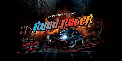 Road Racer is an esport style font that has a sporty character, very suitable for automotive design projects, sports and all products with a dynamic character.
 - Absolutely Vintage by Letteralle,
$19.00 Introducing, Absolutely Vintage Font! As the name implies, Absolutely Vintage brings a retro and nostalgic feel. This font is made to mimic the typing of a typewriter. With a simple and organic impression, this font is able to create a warm and friendly feel. Absolutely Vintage also brings alternates to each letter to give it a unique feel for display purposes.
 - Endast by Cercurius,
$19.95 Sans-serif reversed capitals in outlined circles, resembling old-fashioned typewriter keys. Intended for logos and signs, and for enhancement in lists and maps.
 - Resiliency2 by Alphabet Agency,
$15.00 Resiliency2 has been designed for use in sports,and fitness themes to elevate design work in those genres. The fonts work great with esports themes, in particularly. .The font family contains 6 fonts;3 weights, 2 styles
 - Resiliency by Alphabet Agency,
$15.00 Resiliency font family offers 6 font; 3 weight in regular and italic that provides a variety of looks and possible combinations. Resiliency offers great looks on esports themed designs and other sports in general.
 - Tee Franklin by Suomi,
$19.00 The British Vogue commissioned this typeface for their magazine re-design in 2001. After studying the originals of Morris Fuller Benton and the existing versions, this font was designed with all new thin weights. Just when the family was finished, Vogue informed that they had decided to use American Typewriter instead. Bastards. But here is a true classic typeface with a facelift. The pun intended. Tee Franklin has seven weights with obliques, the Heavy being just slightly heavier than the existing versions from Adobe and ITC, and moving down to totally new Ultra Light, using Luc(as) de Groot's formula to keep the weights optically correct. The glyphs are the same as the Morris Fuller Benton's original from 1902, except for the upper case Q, which was re-designed with a loop in the counter for added differentiation.
 - Reaver - Personal use only

- P22 Frenzy by IHOF,
$24.95 Frenzy evolved from a logo for a Gen X product offered by a very staid company. It is a sythesis of Classic Roman Capitals and American Typewriter—with a bit of frenetic energy stirred in. It is dedicated to the designers son, who is the epitome of the font... contained chaos.
 - Res Publica by Linotype,
$29.99Res Publica is a workhorse. It is quite anonymous as typeface, without any distinctive marks. But it gives a harmonious text body, well suited for large amounts of text, such as official public reports, magazines based mainly on text, school books, and so on. The public" concept is part of the name. Res Publica is Latin for "public matters". The word republic has the same origin. Res Publica was released in 1992. - Nicolas Cochin by Linotype,
$40.99Georges Peignot designed the font Nicolas Cochin based on copper engravings of the 18th century and Charles Malin cut the typeface in 1912 for the Paris foundry Deberny & Peignot. The font is named after the French engraver Charles Nicolas Cochin (1715-1790) although its style had little to do with that of the copper artist. Nicholas Cochin is a freer variation of another Peignot font, Cochin, a bit more balanced and elegant. - Amerika - Unknown license

- DXAngelus Mediaval by DXTypefoundry,
$45.00 The font DXAngelusMediaval was developed on the basis of the Angelus Mediaval font, which was issued by Russian type foundry from the beginning of the 20th century (type foundry of G. Bertgold, St. Petersburg and Moscow, before 1904). Probably, the font is a reworking of the DeVinne font (1892 (?), Designer Nicholas J. Werner) of the American Central Type Foundry. For the reconstruction, we used examples of font prints: Cyrillic from the catalog "Art Fonts", 1929, Latin part - Chicago font, from the catalog "La Fonderie Typographique Francaise" (FTF) 1924. In addition, in the font are available Digits of the old style and ligature.
 - Selectric - Unknown license

- Excalibur Monospace - Unknown license

- Gommogravure - Unknown license

- Amoonk by Product Type,
$18.00 techno, fancy, racing, super, movie, race, superhero, tech, film, automotive, calendar, font, motor, running, typography, futuristic, speed, drive, display, fast, power, action, game, branding, logotype, rally, sport, modern, car, esport
 - MadAve - Unknown license

- Łucznik 1303 Plus - Personal use only

- Prestige Elite M by URW Type Foundry,
$35.99 Prestige Elite is a word processor face which offers clear and monospaced type. The slanted versions have kept the same design as the roman font. The word Elite denoted a specific size of typewriter face. The Prestige Elite font family is easy to read, even in small sizes and is useful for tabular material with narrow columns, such as directories and lists.
 - Qbicle 4 BRK - Unknown license

- Discorgasmique by Fonts of Chaos,
$10.00 Discorgasmique is a font take inspiration from the 1940' years with a futuristic mood.
 - Backspacer by Emigre,
$39.00 Years ago, by happenstance, designers Nancy Mazzei and Brian Kelly found an old decrepit typewriter in an abandoned lot with tall grass in Brooklyn. They kept it around their apartment for two years. Then one day they decided that it was time to move and they planned to throw the old typewriter away. But it was so beautiful they wanted to keep at least a part of it. So they decided on keeping the keys. They kept the keys in a brown bag until one fine day the keys were introduced to a camera. It was a match made in heaven that resulted in some beautiful quirky images of typewriter keys. These images were the inspiration for Backspacer. They were scanned, traced and turned into a working typeface by Zuzana Licko.


