10,000 search results
(0.083 seconds)
- Handhuel by PojolType,
$12.00 The font is great for logos, branding, apparel and headlines. This typeface encapsulates a wide range of nuances, seemingly, opposite elements such as technology with friendly rounded shapes.
 - Clarence Pro by RodrigoTypo,
$29.00 Clarence pro, is a version with many alternatives such as ligatures and alternatives in letters, it also contains the Greek and Cyrillic alphabet, especially for children and teenagers!
 - Convert Light by Mindtype Co.,
$5.00 Convert Light is something unique and interesting to display and can be used for various media needs, such as social media, brochures, posters, movies, cartoons, horrors, and more.
 - Skincare Monoletter by Wontenart,
$12.00 A font devoted to female elegance such as products used by women, beauty salons, fancy clothes, shoes, bags, magazines, and something very elegant for women's luxury. thank you
 - Letterpress Studio by Fenotype,
$15.00 Letterpress Studio -Crafted Vintage Goods Letterpress Studio includes following • 7 fonts - a textured and clean version of each • Ornaments • Catchwords • 25 Logo Templates Letterpress Studios core is seven fonts - textured and clean version of each. Fonts are designed in same proportions and work great together. Here’s a short introduction to the fonts: • Letterpress Script -A connected script with lot’s of OpenType features • Letterpress Script Bold -Bold version of Letterpress Script • Letterpress Condensed -A condensed sans-serif typeface with swash uppercase characters on • Letterpress Gothic -A sans-serif typeface with swash uppercase characters • Letterpress Sans -An extended sans-serif typeface with swash uppercase characters • Letterpress Wood -A woodcut style serif typeface with swash uppercase characters • Letterpress Black -A black woodcut style serif typeface with swash uppercase characters • Letterpress Ornaments -A set of pictograms, ornaments, borders and badges (OTF, AI & PDF) • Letterpress Catchwords -A set of over 100 woodcut-style catchwords (OTF, AI & PDF) All fonts have West European, Central European, Baltic, Turkish and Romanian character sets. Fonts come in OTF format. TTF are also available but OpenType features won’t work with them. Letterpress Templates -25 templates (AI) Letterpress Templates is a set of 25 ready made compositions with font pairings, shapes, ornaments and ready made 2-4 color schemes for each. Templates can be used as such or as a starting point for your own project. Download Letterpress Templates here.
 - The font named "I Want My TTR! (Condensed)" by Iconian Fonts is a distinctive and highly stylized typeface that captures the essence of retro television and media nostalgia. Designed by the prolific ...
- Mr Eaves Modern by Emigre,
$59.00 Mr Eaves is the often requested and finally finished sans-serif companion to Mrs Eaves, one of Emigre’s classic typeface designs. Created by Zuzana Licko, this 2009 addition to the Emigre Type Library expands the versatility of the original Mrs Eaves with two complimentary families: Mr Eaves Sans and Mr Eaves Modern. Mr Eaves was based on the proportions of Mrs Eaves, but Licko took some liberty with its design. One of the main concerns was to avoid creating a typeface that looked like it simply had its serifs cut off. And while it matches Mrs Eaves in weight, color, and armature, Mr Eaves stands as its own typeface with many unique characteristics. The Sans version relates most directly to the original serif version, noticeably in the roman lower case letters a, e, and g, as well as in subtle details such as the angled lead in strokes, the counter forms of the b, d, p, and q, and the flared leg of the capital R, the tail of the Q. The distinctly loose-fitting letter spacing of Mrs Eaves was applied also to the Sans version. This, together with generous built-in line spacing due to a small x-height and extended ascenders and descenders, renders the same kind of lightness and airiness when setting text that is so characteristic of Mrs Eaves. Deviations from the original Mrs Eaves are evident in the overall decrease of contrast, as well as in details such as the flag and tail of the f and j, and the finial of the t, which were shortened to maintain a cleaner, sans serif look. And the lower case c had to be balanced out differently after it lost its top ball terminal. And with the loss of serifs, Mr Eaves set width is slightly narrower. Mr Eaves Italic also carries over many forms from its Mrs Eaves model, most notably the v, w, and z, which are unusually flamboyant for a sans italic design. It also utilizes lead in and terminal tails that are reminiscent of the serif italic. The biggest departure here is the width of the characters. The extra narrow gauge and delicate features seemed more appropriate for the Serif than the Sans. To allow for a comfortable fit, Mr Eaves Italic has a more robust design and wider character width. Meanwhile, the Modern family provides an overall less humanistic look, with simpler and more geometric-looking shapes, most noticeably in the squared-off terminals and symmetric lower case counters. This family has moved furthest from its roots, yet still contains some of Mrs Eaves’ DNA. The Modern Italic is free of tails, and overall the Modern exhibits more repetition of forms, projecting a cleaner look. This provides stronger differentiation from the serif version whenever a more contrasting look is desired. Each version (Sans and Modern) contains its own set of alternates providing unique options for applications such as headlines, word logos, letterheads, pull quotes, and other short text settings. Both the Sans and Modern come in six weights. The simpler forms of a sans-serif provide the opportunity of more weights than do serif letter forms, which are more complex in structure, making it difficult to accommodate additional weight without distortions. Regular and Bold match the original Mrs Eaves weights, while the Heavy provides an additional weight for extra emphasis.
 - Mr Eaves Sans by Emigre,
$59.00 Mr Eaves is the sans-serif companion to Mrs Eaves, one of Emigre’s classic typeface designs. Created by Zuzana Licko, this 2009 addition to the Emigre Type Library expands the versatility of the original Mrs Eaves with two complementary families: Mr Eaves Sans and Mr Eaves Modern. Mr Eaves was based on the proportions of Mrs Eaves, but Licko took some liberty with its design. One of the main concerns was to avoid creating a typeface that looked like it simply had its serifs cut off. And while it matches Mrs Eaves in weight, color, and armature, Mr Eaves stands as its own typeface with many unique characteristics. The Sans version relates most directly to the original serif version, noticeably in the roman lower case letters a, e, and g, as well as in subtle details such as the angled lead in strokes, the counter forms of the b, d, p, and q, and the flared leg of the capital R, the tail of the Q. The distinctly loose-fitting letter spacing of Mrs Eaves was applied also to the Sans version. This, together with generous built-in line spacing due to a small x-height and extended ascenders and descenders, renders the same kind of lightness and airiness when setting text that is so characteristic of Mrs Eaves. Deviations from the original Mrs Eaves are evident in the overall decrease of contrast, as well as in details such as the flag and tail of the f and j, and the finial of the t, which were shortened to maintain a cleaner, sans serif look. And the lower case c had to be balanced out differently after it lost its top ball terminal. And with the loss of serifs, Mr Eaves set width is slightly narrower. Mr Eaves Italic also carries over many forms from its Mrs Eaves model, most notably the v, w, and z, which are unusually flamboyant for a sans italic design. It also utilizes lead in and terminal tails that are reminiscent of the serif italic. The biggest departure here is the width of the characters. The extra narrow gauge and delicate features seemed more appropriate for the Serif than the Sans. To allow for a comfortable fit, Mr Eaves Italic has a more robust design and wider character width. Meanwhile, the Modern family provides an overall less humanistic look, with simpler and more geometric-looking shapes, most noticeably in the squared-off terminals and symmetric lower case counters. This family has moved furthest from its roots, yet still contains some of Mrs Eaves' DNA. The Modern Italic is free of tails, and overall the Modern exhibits more repetition of forms, projecting a cleaner look. This provides stronger differentiation from the serif version whenever a more contrasting look is desired. Each version (Sans and Modern) contains its own set of alternates providing unique options for applications such as headlines, word logos, letterheads, pull quotes, and other short text settings. Both the Sans and Modern come in three weights. The simpler forms of a sans-serif provide the opportunity of more weights than do serif letter forms, which are more complex in structure, making it difficult to accommodate additional weight without distortions. Regular and Bold match the original Mrs Eaves weights, while the Heavy provides an additional weight for extra emphasis.
 - As of my last update in April 2023, "Winob" does not appear to be a widely recognized font within the traditional or digital typography communities, so my depiction will lean into imaginative interpr...
- Bethlehem Ephrath by HiH,
$10.00 One menorah that I have long found particularly appealing was named The Tree of Life Menorah, a replica of which I gave as a gift one holiday to a kindly old couple who were neighbors and became friends. It had a simple, organic elegance that I see in the best of Art Nouveau sculpture. To me personally, Judeism is a celebration of life, like the triumph of the flower that blossoms in the crack of the city sidewalk. Just as Hanukkah celebrates the rededication of the temple and the miracle of the oil, it celebrates the victorious quest for freedom of the Hebrew people led by Judah Maccabee. Hanukkah represents determination and courage and faith — and it represents the presence of God in the lives of His people. It is interesting to note that the founding of the Albanian nation in the early twentieth century grew out of the resistance of the Albanian people to the imposition of Greek language and culture in the aftermath of the dissolution of the Ottoman Empire. The typeface, HADASSAH, designed by Henri Friedlander (1904-1996), is my favorite Hebrew typeface. Thirty years in the crafting, I believe it is unsurpassed for its shear beauty, combining a subtle modulation of stroke with a simplicity and clarity of form. No doubt, that is why it has become so popular. For me, the Sîyn/Shîyn characters are especially satisfying. For a Hanukkah message in Hebrew, I would choose HADASSAH LIGHT for a headline and print it as large as I could. If, however, you are looking for a friendly, warm face for a seasonal message in a roman-letter based language, may I suggest BETHLEHEM EPHRATH. It will be as comfortable as a bulky, hand-knit sweater on a frosty afternoon and reflects the solid, encompassing, family orientation of this holiday. It was on the way to Ephrath that Jacob’s beloved wife Rachel gave birth to Benjamin and then died from her labor. It was to Ephrath that Naomi and Ruth returned and in Ephrath that we have the wonderful, heart-warming story of the marriage between Ruth and her Redeemer-Kinsman, Boaz. And it was to Ephrath that prophet, Samuel, went to find a new king and there in Ephrath that the prophet annointed a small shepherd boy named David. The Proverbs tell us to seek wisdom. Never underestimate the impact you have on others. Words of kindness can change people’s lives. The Talmud says that the highest form of wisdom is kindness. Be wise this holiday season. The font BETHLEHEM EPHRATH is based on the typeface Accent with the permission of URW++ of Hamburg, Germany. Like most display fonts, it is most effective at 18 points and larger. Like most script fonts, it is most effective when set with both upper and lower case. Although this font is readable in all caps (many scripts are not), that does not make it a good idea. Do so only with caution.
 - TT Ricks by TypeType,
$19.00 Attention! Important information! There is no Cyrillic support in TT Ricks! TT Ricks useful links: Specimen | Graphic presentation | Customization options About TT Ricks: We are glad to present you the new font TT Ricks, which continues the line of trendy and yet affordable TypeType Starter Kit fonts. TT Ricks is a flamboyant elzevir-type serif, for which the words “cute” or “calm” are not a fitting definition. TT Ricks can be classified as a display title typeface that works especially well at large and medium sizes in packaging design, book graphics and posters. The typeface is inspired by the pre-digital font “De Vinne”, which was designed in 1892 by the designer Gustav F. Schroeder. We liked certain aspects of the historical prototype, but at the same time, when creating TT Ricks, we did not want to limit ourselves—on the contrary, we were eager to discover a completely new spirit and bring bright details to the font. The TT Ricks typeface stands out for its strong contrast, noticeable sharp serifs, narrow letterforms with a pronounced displacement of flows in the arches. The typeface has very dense spacing, and in the bold style, the text set begins to resemble Gothic by its richness and tension. Important visual features of TT Ricks are the dashing shapes of ascenders and descenders, the thin and sharp stroke endings, and the “elzevier legs” of the letters R K k. In the lowercase round characters c e s, you can notice the pronounced slope of the oval, which contrasts with the general set of the font. These "slanted" signs and ascenders and descenders of the letters f and y are designed to cut the monotony of a set and to entertain the reader's eyes. The TT Ricks typeface consists of three weights (Regular, Medium, Bold) and one variable font. Each style consists of 553 glyphs and contains 18 OpenType features. The most interesting features are stylistic alternates for the letters R K k with alternative short leg shapes, two sets of figures for working with upper and lower case characters, and a set of original icons that further reveal the spirit of the family. Please note! If you need OTF versions of the fonts, just email us at commercial@typetype.org Attention! Important information! There is no Cyrillic support in TT Ricks! TT Ricks OpenType features: aalt, ccmp, locl, numr, ordn, tnum, onum, lnum, pnum, case, liga, calt, ss01, ss02, ss03, ss04, ss05, ss06 TT Ricks language support: Acehnese, Afar, Albanian+, Aleut (lat), Alsatian, Aragonese, Arumanian+, Asu, Aymara, Azerbaijani +, Banjar, Basque +, Belarusian (lat), Bemba, Bena, Betawi, Bislama+, Boholano+, Bosnian (lat), Breton +, Catalan+, Cebuano+, Chamorro+, Chichewa, Chiga, Colognian+, Cornish, Corsican +, Cree, Croatian, Czech+, Danish, Dutch+, Embu, English+, Esperanto, Estonian+, Faroese+, Fijian, Filipino+, Finnish, French, Frisian, Friulian+, Gaelic, Gagauz (lat), Galician+, Ganda, German+, Gikuyu, Guarani, Gusii, Haitian Creole, Hawaiian, Hiri Motu, Hungarian+, Icelandic+, Ilocano, Indonesian+, Innu-aimun, Interlingua, Irish,
 - Tropical Tourist JNL by Jeff Levine,
$29.00 A 1934 advertisement for the Roney Plaza Hotel at 23rd Street and Collins Avenue on Miami Beach yielded the inspiration for Tropical Tourist JNL. While this wonderful example of Art Deco lettering survived, sadly the original Roney was torn down around 1969 and replaced with a modern apartment house/condos bearing the same name.
 - Highbrow Cafetorium JNL by Jeff Levine,
$29.00Highbrow Cafetorium JNL is a very "minimalist" font in the sense that there's only the basic lower case characters and essential punctuation. The lettering is based on a neon-and-bulb wall sign for a long-closed cafeteria on Lincoln Road in Miami Beach, Florida. The 'b', 'd', 'k' and 'l' have unusually high verticals. - Fong Shay Noon JNL by Jeff Levine,
$29.00 Fong Shay Noon JNL is a non-traditional approach to an Oriental-styled font as there are some letter forms with curves and others with straight lines. The name derives from a Chinese restaurant in North Miami Beach, Florida during the 1960s, which in turn took its name from a play on a Yiddish phrase.
 - HeLLO MIAMI by Yoga Letter,
$15.00 "Hello Miami" is a unique display font. This font is complemented by palm tree and beach decorations. It is perfect for your summer season. In addition, this font can also be used for a variety of your needs (product promotion, holiday promotion, congratulations, invitations, quotes, social media status, logos, branding, banners, posters, prints, etc.)
 - European Soft Pro Variable by Bülent Yüksel,
$99.00 EUROPEAN SOFT PRO VARIABLE ABOUT FAMILY: What makes "European Soft Pro Variable" elegant, friendly and contemporary is its very rounded curves with very open terminals. "European Soft Pro Variable" has been designed with a higher "x-height" than other fonts in its class to make tiny readability more obvious in any use situation. It will be ideal for use in small sizes such as business cards or mobile applications. This typeface is also equipped with powerful OpenType features to satisfy the most demanding professionals. It has solid features like case sensitivity, small, true capitals, full ligatures, tabular figures for tables, old style figures to elegantly insert numbers into your sentences and more alternative characters to give personality to your projects. The extended, "European Soft Pro Variable" supports around 85 languages in the Latin, Cyrillic and Greek scripts, and its non-Latin components were developed with native consultants. With over 1200+ glyphs per style, "European Soft Pro" cares about localised letterforms and has the OpenType features to match. FEATURE SUMMARY: - 9 weights: Thin, ExtraLight, Light, Book, Regular, Medium, Bold, ExtraBold, and Black. - 4 widths: Normal, Narrow, Condensed, and Extra Condensed. - Matching italics (12º) for all weights and widths . - Matching small caps for all weights and widths. - Lining and old style figures (proportional and tabular). - Alternate characters (A, G, M, N, R, U, a, g, l, m, n, u, y). - Unlimited fractions. - Automatic ordinals (1st, 2nd, 3rd, etc.). - 24 Dingbats + 19 Social Media and Block Chain icons. - Extended language support: Most Latin-based scripts (including Vietnamese), Cyrillic, and Greek. - Extended currency support. You can contact me at buyuksel@hotmail.com, pre-purchase and post-purchase with questions and for technical support. You can enjoy using it.
 - Fracktif by Degarism Studio,
$30.00 NEW UPDATE Ver 2.0 Now is support font Variable with 2 axes (Weigh + Italic) + Adding selected Emoji Fracktif typeface is a modern Grotesk, Reveals a strong constructivist identity with classic type character proportions. Inspired by the historical German classic Grotesk designed by Genzsch & Heyse in 1874. Fracktif develops with simplicity in mind and refers to radical shapes by combining with calligraphic contrast logic there are many distinctive letters with clear modernist roots and a strongly contemporary finish, They were solid designs, suitable for advertisements, titles, and posters. Fracktif typeface family consists of 7 weight plus matching italics, Designed with powerful OpenType features such as alternate characters, Standard ligatures, discretionary ligature, case-sensitive forms, fractions, super- and subscript Language Support: anguages Support: Afrikaans, Albanian, Arapaho, Alsatian, Aragonese, Aromanian, Arrernte, Asturian, Asu, Aymara, Basque, Belarusian (lacinka), Bislama, Bemba-lang., Bena, Bokmål, Bosnian, Breton, Catalan, Cebuano, Chamorro, Cheyenne, Cimbrian, Corsican, Chichewa (nyanja), Croatian, Czech, Danish, Demo, Dutch, English, Esperanto, Estonian, Faroese, Finnish, French, French (creole), Frisian, Fijian, Friulian, Galician, German, Genoese, Gilbertese, Greenlandic, Gusii-lang., Hungarian, Haitian (creole), Hawaiian, Hiligaynon, Hmong, Hopi, Icelandic, Italian, Ibanag, Iloko (ilokano), Indonesian, Interglossa (glosa), Interlingua, Irish (gaelic), Istro-romanian, Jerriais, Kashubian, Kurdish (kurmanji), Latinbasic, Latvian, Lithuanian, Ladin, Lojban, Lombard, Low (saxon), Luxembourgeois, Malagasy, Makonde, Maltese, Malay (latinized), Manx, Māori, Megleno (romanian), Mohawk, Morisyen, Norwegian, Nahuatl, Norfolk (pitcairnese), Northern (sotho), North-Ndebele-lang., Occitan, Oromo, Pare, Polish, Portuguese, Pangasinan, Papiamento, Piedmontese, Potawatomi, Quechua, Romanian, Rhaeto-romance, Romansh, Rombo, Rotokas, Rukiga, Rundi, Rwa, Rwandan, Sami (lule), Samoan, Serbian, Slovak, Slovenian, Spanish, Sardinian, Scots (gaelic), Sena, Seychelles (creole), Shona, Sicilian, Somali, Soga, Southern (ndebele), Southern (sotho), Swahili, Swati (swazi), Turkish, Tagalog (filipino), Taita, Tahitian, Tausug, Teso, Tetum, Tok (pisin), Tongan, Tswana, Turkmen (latinized), Tuvaluan, Ubasic, Uyghur (latinized), Volapuk, Veps, Votic (latinized), Vunjo, Walliser German, Walloon, Warlpiri, Xhosa, Yapese, Zulu.
 - Eksja by Protimient,
$29.00 Eksja is a modern slab serif available in four weights, each with a corresponding italic. All the fonts in the family have small caps, the extended latin character set, diacritical f-ligatures, enclosed numerals (numbers in circles) and case-sensitive punctuation. The general design of the typeface has been with a strong human touch in mind. The ends of the serifs have been given a subtle rounding, just enough to take the edge off which, when coupled with the largely humanist structure of the design, creates an open, friendly and approachable design, abandoning the usual geometric severity commonly associated with slab serif typefaces. Eksja contains quite a comprehensive numerals system. Obviously, each font has the standard proportionally and tabularly spaced lining and old-style figures but, crucially, the tabular numerals share the exact same width in each font variant. That means that you can choose to use the thin, regular, bold, black and their italic forms all in the same setting and they will always line up. In addition to the 'normal' numerals there are super-script and sub-script numerals and OpenType fractions that can be automatically composed as you type. There are also the enclosed numerals, numbers inside a circle, that are useful for numerically listing items and, thanks to the wizardry of OpenType, they can contain any number of digits (typically, enclosed numerals are precomposed single digits, only encompassing the 0–9 range, the enclosed numerals in Eksja can go to double digits, triple digits or, in fact, any number of digits*). *The automation of the enclosed numerals is accessed via either "Stylistic Set #1" or "Stylistic Alternates" which requires the use of an application that supports OpenType stylistic sets or stylistic alternates, such as Adobe's InDesign or Photoshop.
 - European Sans Pro Variable by Bülent Yüksel,
$99.00 EUROPEAN SANS PRO VARIABLE ABOUT FAMILY: What makes "European Sans Pro Variable" elegant, friendly and contemporary is its very rounded curves with very open terminals. "European Sans Pro Variable" has been designed with a higher "x-height" than other fonts in its class to make tiny readability more obvious in any use situation. It will be ideal for use in small sizes such as business cards or mobile applications. This typeface is also equipped with powerful OpenType features to satisfy the most demanding professionals. It has solid features like case sensitivity, small, true capitals, full ligatures, tabular figures for tables, old style figures to elegantly insert numbers into your sentences and more alternative characters to give personality to your projects. The extended, "European Sans Pro Variable" supports around 85 languages in the Latin, Cyrillic and Greek scripts, and its non-Latin components were developed with native consultants. With over 1200+ glyphs per style, "European Sans Pro" cares about localised letterforms and has the OpenType features to match. FEATURE SUMMARY: - 9 weights: Thin, ExtraLight, Light, Book, Regular, Medium, Bold, ExtraBold, and Black. - 4 widths: Normal, Narrow, Condensed, and Extra Condensed. - Matching italics (12º) for all weights and widths . - Matching small caps for all weights and widths. - Lining and old style figures (proportional and tabular). - Alternate characters (A, G, M, N, R, U, a, g, l, m, n, u, y). - Unlimeted fractions. - Automatic ordinals (1st, 2nd, 3rd, etc.). - 24 Dingbats + 19 Social Media and Block Chain icons. - Extended language support: Most Latin-based scripts (including Vietnamese), Cyrillic, and Greek. - Extended currency support. You can contact me at buyuksel@hotmail.com, pre-purchase and post-purchase with questions and for technical support. You can enjoy using it.
 - Varstate by Alphabet Agency,
$15.00 The Varstate font family is a versatile collection of fonts inspired by the varsity team name lettering often seen on apparel such as Letterman jackets, t-shirts and hoodies. The fonts can be used in combination to provide a variety of design options and different looks in genres such as sports, leisure and industry. The family contains fonts in 4 weights; Normal, Semi Light, Light and Extra Light. Each font includes Latin basic characters which includes uppercase, lowercase, numbers, punctuation and much more.
 - Heart love by Amarlettering,
$25.00 Heart Love come with 320+ glyphs. The alternative characters were divided into several OpenType features such as Swash, Stylistic Sets, Stylistic Alternates, Contextual Alternates. The OpenType features can be accessed by using Open Type savvy programs such as Adobe Illustrator, Adobe InDesign, Adobe Photoshop Corel Draw X version, And Microsoft Word. And this Font has given PUA unicode (specially coded fonts), so that all the alternate characters can easily be accessed in full by a craftsman or designer. Happy Designing
 - Wirophant by Youngtype,
$18.00 Wirophant are modern font sets featuring an organic, dynamic and energetic style. They can be used for a variety of purposes, such as titles, signatures, logos, correspondence, wedding invitations, letterheads, nameplates, labels, newsletters, posters, badges and much more. To enable the OpenType Stylistic alternative, you need a program that supports OpenType features such as Adobe Illustrator CS, Adobe Indesign & CorelDraw X6-X7, Microsoft Word 2010 or a later version. Contains full set: Uppercase Lowercase Ligatures Punctuation number multilingual support. Thank You
 - Rasendrya by Amarlettering,
$15.00 Rasendrya script come with 310+ glyphs. The alternative characters were divided into several OpenType features such as Swash, Stylistic Sets, Stylistic Alternates, Contextual Alternates. The OpenType features can be accessed by using OpenType savvy programs such as Adobe Illustrator, Adobe InDesign, Adobe Photoshop Corel Draw X version, and Microsoft Word. This font has given PUA unicode (specially coded fonts) so that all the alternate characters can easily be accessed in full by a craftsman or designer. Thanks and happy designing :-)
 - Misteria by Amarlettering,
$30.00 Misteria come with 250+ glyphs. The alternative characters were divided into several Open Type features such as Swash, Stylistic Sets, Stylistic Alternates, Contextual Alternates. The Open Type features can be accessed by using Open Type savvy programs such as Adobe Illustrator, Adobe InDesign, Adobe Photoshop Corel Draw X version, And Microsoft Word. And this font has given PUA unicode so that all the alternate characters can easily be accessed in full by a craftsman or designer. Email : amarlettering@gmail.com Happy Designing! Thanks
 - P22 Tulda by IHOF,
$24.95 Tulda is a very lively lettering font originally drawn for a German calendar. The optional symbols feature over 72 festive renderings for just about any occasion. This font is also available as an OpenType font with over 500 characters. For the OpenType version: standard Opentype features such as ligatures & oldstyle figures are available through the features menu in programs such as InDesign or other applications that support OpenType. Additional ornaments and alternate characters can be inserted through the glyph pallet.
 - Britta Connie by Amarlettering,
$15.00 Britta connie Script come with 250+ glyphs. The alternative characters were divided into several Open Type features such as Swash, Stylistic Sets, Stylistic Alternates, Contextual Alternates. The Open Type features can be accessed by using Open Type savvy programs such as Adobe Illustrator, Adobe InDesign, Adobe Photoshop Corel Draw X version, And Microsoft Word. And this Font has given PUA unicode (specially coded fonts). so that all the alternate characters can easily be accessed in full by a craftsman or designer.
 - Bertilda Script by Amarlettering,
$15.00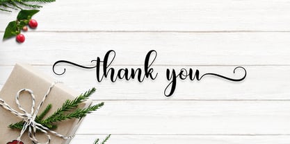 Bertilda Script come with 250+ glyphs. The alternative characters were divided into several OpenType features such as Swash, Stylistic Sets, Stylistic Alternates, Contextual Alternates. The OpenType features can be accessed by using OpenType savvy programs such as Adobe Illustrator, Adobe InDesign, Adobe Photoshop Corel Draw X version, And Microsoft Word. And this Font has given PUA unicode (specially coded fonts). so that all the alternate characters can easily be accessed in full by a craftsman or designer. Happy Designing Thanks
 - Hand Megical by Youngtype,
$19.00 Hand Megical are modern font sets featuring an organic, dynamic and energetic style. They can be used for a variety of purposes, such as titles, signatures, logos, correspondence, wedding invitations, letterheads, nameplates, labels, newsletters, posters, badges and much more. To enable the OpenType Stylistic alternative, you need a program that supports OpenType features such as Adobe Illustrator CS, Adobe Indesign & CorelDraw X6-X7, Microsoft Word 2010 or a later version. Contains full set: Uppercase Lowercase Ligatures Punctuation number multilingual support. Thank You :)
 - Guess Who by Gassstype,
$23.00 Hello Everyone, introduce our new product Font Guess Who is a Fun Display Typeface .This is a Textured Natural Style and classy style with a clear style and dramatic movement. This font Guess Who is great for your next creative project such as logos, printed quotes, invitations, cards, product packaging, headers, Logotype, Letterhead, Poster, Design this font is great for your creative projects such as watermark on photography. You can activate 8 Ligatures glyphs and 8 Alternates glyphs OpenType panel.
 - Maryellen by Amarlettering,
$15.00 Maryellen come with 300+ glyphs. The alternative characters were divided into several Open Type features such as Swash, Stylistic Sets, Stylistic Alternates, Contextual Alternates. The Open Type features can be accessed by using Open Type savvy programs such as Adobe Illustrator, Adobe InDesign, Adobe Photoshop Corel Draw X version, And Microsoft Word. And this font has given PUA unicode so that all the alternate characters can easily be accessed in full by a craftsman or designer. Email : amarlettering@gmail.com Happy Designing!
 - Syakaila Script by Bejeletter,
$10.00 This is our newest product called Syakaila Script. The alternative characters were divided into several OpenType features such as Title and Swash. Syakaila can be used for wide ranges of application, such as wedding design, logo, invitations, social media posts, clothing, invitation, poster, cafe/resto sign, and many others. Features: Syakaila Script Regular Syakaila Script Italic OpenType features (Titling and Swash) Ligatures Multilingual glyphs - spread your message globally AÀÁÂÃÄÅCÇDÐEÈÉÊËIÌÍÎÏNÑOØÒÓÔÕÖUÙÜÚÛWYÝŸÆßÞþ Fonts: You can use any software that fonts can be used on it
 - Shepia Script by Seniors Studio,
$19.00 Shepia script is a monoline cursive handwriting. It is a classic and fun vintage script. With almost 390 glyphs and 188 alternative characters, it contains a plethora of opentype features (including stylistic alternates, ornaments, swashes and more). Can be used for various purposes such as logos, wedding invitations, t-shirts, letterheads, signage, labels, news, posters, badges etc. To enable the OpenType Stylistic alternates, you need a program that supports OpenType features such as Adobe Illustrator CS, Adobe Indesign & CorelDraw X6-X7.
 - Nightwear Script by Amarlettering,
$30.00 Nightwear Script come with 300+ glyphs. The alternative characters were divided into several Open Type features such as Swash, Stylistic Sets, Stylistic Alternates, Contextual Alternates. The Open Type features can be accessed by using Open Type savvy programs such as Adobe Illustrator, Adobe InDesign, Adobe Photoshop Corel Draw X version, And Microsoft Word. And this Font has given PUA unicode (specially coded fonts) so that all the alternate characters can easily be accessed in full by a craftsman or designer. Happy Designing!
 - Handy Pen by Gassstype,
$23.00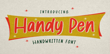 Hello Everyone, introduce our new product Font Handy Pen it is Handwritten Font,This is a Textured Natural Style and classy style with a clear style and dramatic movement. This font Handy Pen is great for your next creative project such as logos, Logotype, Letterhead, Poster, Design this font is great for your creative projects such as watermark on photography, and perfect for logos & branding, invitation,advertisements,product designs, stationery, wedding designs,label ,product packaging, special events or anything that need handwritting taste.
 - Sinthya Script by Black Studio,
$15.00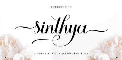 Sinthya Script is a beautiful, modern and new calligraphy font with many alternative styles, swashes make this font look natural, elegant and perfect for extraordinary projects. Sinthya Script is perfect for various projects such as invitations, product packaging, product design, labels, photography, watermarks, logos & branding or whatever. To use beautiful swash, you need a program that supports OpenType features such as Adobe Illustrator CS, Adobe Photoshop CC, Adobe Indesign and Corel Draw. Please send message if you have any questions, thank you
 - Leisha Script by Amarlettering,
$30.00 Leisa Script come with 250+ glyphs. The alternative characters were divided into several Open Type features such as Swash, Stylistic Sets, Stylistic Alternates, Contextual Alternates. The Open Type features can be accessed by using Open Type savvy programs such as Adobe Illustrator, Adobe InDesign, Adobe Photoshop Corel Draw X version, And Microsoft Word. And this font has given PUA unicode so that all the alternate characters can easily be accessed in full by a craftsman or designer. Email : amarlettering@gmail.com Happy Designing!
 - Astonice by Asritype,
$26.00 Astonice is a beautiful calligraphy font family with 3 weight variants: Regular, Semibold and Bold. Astonice has more than 1100 glyphs each, has opentype feature such as stylistic sets, stylistic alternatives, and old number form. Astonice supports a wide range language: Latin plus Greek and Cyrillic. Astonice is suitable for most typing and design such as cards, logos, banner, posters and others as you intended. Beautiful glyphs, OpenType features and 3 weight, Astonice provide you the right choice for your best design.
 - Chattey by Amarlettering,
$15.00 Chattey come with 350+ glyphs. The alternative characters were divided into several Open Type features such as Swash, Stylistic Sets, Stylistic Alternates, Contextual Alternates. The Open Type features can be accessed by using Open Type savvy programs such as Adobe Illustrator, Adobe InDesign, Adobe Photoshop Corel Draw X version, And Microsoft Word. And this font has given PUA unicode so that all the alternate characters can easily be accessed in full by a craftsman or designer. Email : amarlettering@gmail.com Happy Designing!
 - Logik by Monotype,
$25.00 Logik is a futuristic square sans serif typeface. Its personality is defined by squared-off corners that you would normally expect to be rounded, this sharpness gives the glyphs an eccentricity that the eye quickly adjusts to. Sharp, incised/stylised ink traps along with slightly tapered/curved horizontals and verticals add to the character of each letterform. These subtleties combine to give Logik a distinctively futuristic aura. Logik’s main use would be for headlines, short runs of text, branding and display purposes – ideally suited for film and book titles, Logik could be widely used for sports, media and recreation purposes also. Logik comes in 7 weights (from Thin to Black) across 3 widths – Regular, Wide, and Extended. Each font covers all European Latin-based languages and includes Old Style Figures, Small Caps, and some Case-Sensitive Forms. Key features: 7 Weights in Roman and Oblique 3 Widths – Regular, Wide, Extended Small Caps Old Style Figures European Language Support (Latin) 550+ glyphs per font.
 - Gloria Monoline by IM Studio,
$15.00 Gloria Monoline is a text serif with an editorial focus designed by Ikhsan Maulana. The idea for a typography job came from a design school letter-making exercise: Get a pair of scissors and some large sheets of paper, and start cutting. The resulting letters and the act of cutting them from paper inform the type design process, resulting in strong, simple shapes and open, inviting textures. The tone is crisp and straightforward. The classic letterforms, with a playful touch, give the design a personality that is both practical and spontaneous. The text weight is capable of adjusting copies at various sizes to print and render clearly on screen. Its lightest and heaviest weights work best at display sizes. Great care has been taken to save typists time with OpenType features including contextual punctuation and symbols to match case-sensitive, lower-case, and all-caps settings, as well as set images set for each use.