10,000 search results
(0.113 seconds)
- Slim James JNL by Jeff Levine,
$29.00Tall, condensed and square in shape... Slim James JNL balances well against bolder Deco-style sans or novelty type faces. - Bigfoot by Canada Type,
$24.95 Bigfoot is the fattest font ever made. It began as a simple exercise given to students in a design course: Most people don't appreciate type because they don't really know what it actually is. One way to understand it is looking at it like a combination of sculptures that have to work together to achieve a certain harmony, where each letter form is one of those sculptures. Most people understand and appreciate that a sculpture starts from a rock of an incomprehensible form, which is manipulated by someone into becoming the recognizable or abstract work of art it eventually is. Consider type design a kind of two-dimensional sculpting. You have a rectangle. Take away as a little as possible from it until it is recognizable as the letter A. Repeat to get the letter B, and so on. After all 26 minimal letters are made, do they actually function as an alphabet to build words and sentences that are recognizable to the human eye? This exercise can trigger thoughts and theories about the overall subjective nature of identifying abstract yet somewhat familiar shapes. It can go into the psyche of art in general. But one thing for certain, this exercise has so far helped a few people find a new appreciation for finely crafted typefaces. If you are a design educator, your students' typographical perspective and arguments would benefit from it. And if you are a designer, well, fat faces are all the rage these days, and this is as fat as it can get. Please note that that this typeface, due to its minimalistic nature, does not include accented characters. It does however support the full C0 Controls and Basic Latin Unicode set. All proceeds from this font go to support the Type Club of Toronto.
 - Marvelan by Mega Type,
$15.00 Marvelan is a display font with a touch of style that's cheerful, elegant and strong. So it is suitable for use in product design and appearance, both in modern or vintage designs. OpenType feature with several alternative characters that allow you to mix and match letter pairs to suit your design. Marvelan also includes 3 different styles, namely Regular, Outline and Extrude which are made with different styles but still have the same characters. Marvelan is included in a display font so it is very suitable for use in titles, poster products, logos, book menus, websites, books, t-shirts, posters, book covers, labels, business cards, branding, print templates and many other designs according to your needs. Marvelan includes a complete set of upper and lowercase letters, as well as multi-language support, punctuation, ligatures and alternatives. Thank you very much for looking and Enjoying it!
 - Spooky Treat by Ahmad Jamaludin,
$15.00 Introducing a new Halloween event font, SPOOKY TREAT! The ultimate Halloween font that will send shivers down your spine! SPOOKY TREAT features a haunting dripping effect, complete with ghostly elements, spiders, and cobwebs, making it the perfect addition to your spooky projects. SPOOKY TREAT is incredibly versatile and ideal for a wide range of creative endeavors, including Cricut designs, t-shirts, retro-themed projects, Halloween invitations, mugs, stickers, materials for teachers, Goodnotes, and so much more! What's included? Spooky Treat Main File Unique Alternates with spooky element Instructions (Access special characters, even in Cricut Design) Works on PC & Mac Simple Installations Accessible in Adobe Illustrator, Adobe Photoshop, Microsoft Word even Canva! PUA Encoded Characters. Fully accessible without additional design software. Multilingual Supports: (Afrikaans, Albanian, Catalan, Croatian, Czech, Danish, Dutch, English, Estonian, Finnish, French, German, Hungarian, Icelandic, Italian, Lithuanian, Maltese, Norwegian, Polish, Portuguese, Slovenian, Spanish, Swedish, Turkish, Zulu) Thank you, Dharmas Studio
 - Magical Tours by IKIIKOWRK,
$17.00 Proudly Present Magical Tours - Psychedelic Type, created by ikiiko. Magical Tours is a stunning typeface with the retro appeal and allure of a psychedelic design. This distinctive bottom thickness typeface takes you on a fantastic journey through time while still maintaining a timeless aesthetic. Magical Tours, inspired by the writing styles of the 60s, where the psychedelic trend perfectly encapsulated the restless essence of youth at the time. This font has a distinct personality due to its inventive mix of vintage components and psychedelic influences, making it ideal for evoking the romance of the past. This typeface is perfect for an vintage stuff, retro poster layout, fashion ads, book cover, packaging, food & beverages and also good for quotes, or simply as a stylish text overlay to any background image. What's included? Uppercase & Lowercase Number & Punctuation Multilingual Support Works on PC & Mac Enjoy our font and if you have any questions.
 - Anberta by IM Studio,
$12.00 Anberta is a new variant of the beautiful script type with linkable hearts which is here to complete your script font collection. Anberta is perfect for branding, wedding invitations, business cards, posters, quotes and other romantic projects. Anberta features OpenType style alternatives, international binders and support for most Western Languages included. To enable the OpenType Stylistic alternative, you need a program that supports OpenType features such as Adobe Illustrator CS, Adobe Indesign & CorelDraw X6-X7, Microsoft Word 2010 or a later version. Anberta is coded with PUA Unicode, which allows full access to all additional characters without having to design special software. Mac users can use Font Book , and Windows users can use Character Map to view and copy any additional characters to paste into your favorite text editor/application. If you need help or have any questions, let me know. I'm happy to help. Thank you. IM Studio.
 - ST Gaidar by ShimanovTypes,
$9.00 The font "Gaidar" named in the honour of Arkady Gaidar. He was a Soviet writer, whose stories were very popular among Soviet children, and a Red Army commander. He died in combat fighting with German nazis in 1941. Few generations of Soviet kids are raised on his books and a number of films were made based on his stories. This font inspired by posters, movie titles and book covers of this writer. The letterforms are bold and gnarly and comes in 2 styles: uppercase and small caps. It has LATIN and Extended Eastern Europe CYRILLIC letters. "ST-Gaidar" created for titles, poster design, web design, branding and packaging works, illustrations, badges and other typography works. Pls, don't use it for for typing large arrays of text. ST Gaidar supports 15+ languages: Belarusian, Bosnian, Bulgarian, Croatian, Dutch, English, German, Macedonian, Norwegian, Russian, Serbian, Swedish, Spanish, Slovenian, Ukrainian and probably others
 - Kingston by The Paper Town,
$20.00 Introducing Kingston an handwritten font with a high detailed dry brush texture. Kingston has been designed to fit a wide range of projects from urban style to classic branding with a full alternative characters set to completely change the look of your design. It also includes a set of 52 hand-drawn elements that will add a nice finishing touch to your text. You can use it for business branding, Instagram quotes, blog headers, fashion apparel, stationery and more... What's included: Kingston • A dry brush script font with uppercase and lowercase characters, alternative alphabet, ligatures, numerals and punctuation. Kingston Extras • A full set of brushed elements : 33 hand-drawn swashes, 4 doodles and 14 paint drips and splatters you can easily access by typing any letter from A-Z and a-z. Multilingual support • Kingston supports multilingual characters for western, central and south-east European languages.
 - Melkslijter by PintassilgoPrints,
$29.00 With a stylish Dutch accent, this font draws inspiration from a 1935 brochure by the talented graphic designer and artist Dirk Hart. Carrying different hand-drawn lettershapes on upper and lower case slots despite being a unicase typeface, this font also brings a nice set of ornaments and complete sets of initial and terminal swash forms. When working with OpenType savvy applications these can conveniently be applied at the click of a button, thanks to the smart swashes programming, which will change the first and last letters in words with its corresponding initial or terminal forms. There are also some stylistic alternates for a (yet) more decorated look. The black version, with a somewhat art-deco feeling with added boldness, is also very decorative and contains the same features as the regular cut: smart swashes, different letterforms on upper and lowercase slots, ornaments and stylistic alternates.
 - Salitia by Ahmad Jamaludin,
$21.00 Introducing Salitia – A brand-new serif with a complete dot swash! Salitia is a modern serif family featuring tightly-spaced serifs reminiscent of the 80s and 90s, making a stylish comeback. We aimed to create the perfect font for you too! With 6 style families (Thin to Black), unique ligatures and beautiful alternates this font suitable for short text and long word such as headlines, logos, UI design, magazine text, product descriptions, and other design needs What's Included? Salitia Main File 175+ Special Alternates and Ligatures Instructions (Access special characters in all apps, even in Cricut Design) Accessible in Adobe Illustrator, Adobe Photoshop, Microsoft Word even Canva! PUA Encoded Characters. Fully accessible without additional design software Language Support: Danish, English, Estonian, Filipino, Finnish, French, Friulian, Galician, German, Gusii, Indonesian, Irish, Italian, Luxembourgish, Norwegian Bokmål, Norwegian Nynorsk, Nyankole, Oromo, Portuguese, Romansh, Rombo, Spanish, Swedish, Swiss-German, Uzbek (Latin) Thanks Dharmas Studio
 - Geometrica by PeGGO Fonts,
$24.00 Behance presentation https://www.behance.net/gallery/51305239/Geometrica Geometrica is a low contrast rounded geometric Sans with a mid 19th/early 20th century simplicity air yet modern and minimalist. The font was inspired by the idea of creating a typeface with uppercase/lowercase characters and small caps having the same proportion. The result is a font with a moderate width, generous x-height, and short ascenders and descenders, giving it a compact and clean look. Geometrica comes in 10 weights plus italics—each variant with 589 glyphs—and contains a number of OpenType features that allow you to create very ‘good looking’ designs. Geometrica provides a wide range of choices for any design project and it is especially recommended for UI/UX and app design, branding and corporate design, in 2017 it was selected as one of the 10 best Sans of the year by FontShop.
 - Ryo Gothic PlusN by Adobe,
$79.00Ryo Gothic is a new Japanese sans serif (or gothic) kana typeface design. Created by Adobe type designer Ryoko Nishizuka , the typeface has a bright and speedy calligraphic touch and can be used to compose readable body text, as it gives a calm and well-controlled color to the typeset page. Supplied in OpenType format, each Ryo Gothic font includes hiragana, katakana and some punctuation marks and should be combined with the kanji and other glyphs in existing Japanese gothic typefaces that contain full character sets. This typeface family is available in seven weights--extra light, light, regular, medium, bold, heavy, and ultra heavy--which allow end users to select the best-matching weight for their favorite full-set Japanese gothic typeface. Creative professionals using the Japanese version of Adobe InDesign may use that program's Composite Font tool to easily combine Ryo Gothic with other typefaces. - Hothen by AF Type,
$10.00 Hothen is a new variant of the beautiful script type with linkable hearts which is here to complete your script font collection. Hothen is perfect for branding, wedding invitations, business cards, posters, quotes and other romantic projects. Hothen features OpenType style alternatives, international binders and support for most Western Languages ??included. To enable the OpenType Stylistic alternative, you need a program that supports OpenType features such as Adobe Illustrator CS, Adobe Indesign & CorelDraw X6-X7, Microsoft Word 2010 or a later version. Hothen is encoded with PUA Unicode, which allows full access to all additional characters without having to design special software. Mac users can use Font Book , and Windows users can use Character Map to view and copy any additional characters to paste into your favorite text editor/application. If you need help or have any questions, let me know. I'm happy to help. Thank you. AF Type
 - Sinttesy by Sabrcreative,
$25.00 Introducing Sinttesy, a stunning signature monoline font that brings sleekness and style to your designs. With its smooth and consistent lines, Sinttesy is perfect for adding a touch of elegance to logos, branding materials, social media posts, and more. The combination of uppercase and lowercase letters in Sinttesy allows for creative versatility, enabling you to craft unique typographic compositions. From sophisticated business cards to modern website headers, this font delivers a professional and polished look. In addition to its aesthetic appeal, Sinttesy is highly functional. It includes numbers and punctuations, ensuring seamless integration into your projects. The multilingual support further expands its usability, allowing you to communicate your message across different languages and cultures. Sinttesy is PUA encoded, making it effortless to access special characters and ligatures. This feature adds an extra layer of creativity and customization, allowing you to add decorative flourishes and embellishments to your designs.
 - Mogila Display by Letterfreshstudio,
$15.00 Mogila is a display font with a touch of style that's cheerful, elegant and strong. So it is suitable for use in product design and appearance, both in modern or vintage designs. OpenType feature with several alternative characters that allow you to mix and match letter pairs to suit your design. Mogila also includes 4 different styles, namely Regular,Italic, Bold and Outline which are made with different styles but still have the same characters. Mogila is included in a display font so it is very suitable for use in titles, poster products, logos, book menus, websites, books, t-shirts, posters, book covers, labels, business cards, branding, print templates and many other designs according to your needs. Mogila includes a complete set of upper and lowercase letters, as well as multi-language support, punctuation, ligatures and alternatives. Thank you very much for looking and Enjoying it!
 - Matrole by Viaction Type.Co,
$15.00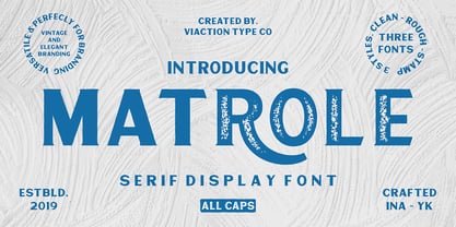 Matrole is a Display Serif with 3 styles: clean, rough and stamp, nice applied in various products. Complete with multilingual characters and stylistic alternates. It is suitable for quote, clothing design, vintage logo, label, poster, packaging design and other designs.
 - Frankie by Type-Ø-Tones,
$60.00 Frankie remains a classic among classics. A pioneer of the Type-Ø-Tones catalog, this is their personal eroded Franklin Gothic. Avoid imitations. Try Frankie, today still their best-seller. Now, in this updated version with a complete CE Character Set.
 - Fairgrounds JNL by Jeff Levine,
$29.00Fairgrounds JNL is the direct descendant of Twelve Oaks JNL, complete with a field of stars to draw attention to your layout for political posters, holiday events, charity bazaars, local fairs or any project that needs extra emphasis in its headlines. - Digitalika by PizzaDude.dk,
$15.00 Inspired by some scribbles I made as a young kid in the 80'ies at school - when I should have paid attention to the teacher! Comes with a complete multilingual set of letters with alternate versions of both upper- and lowercase
 - TOMO Bossa by TOMO Fonts,
$12.00 TOMO Bossa is a cartoon inspired sans serif, ideal for kids related stuff, in print or digital, like posters, video, websites or books! This beauty also speak Cyrillic! The complete family comes with a Black and Black Rough style. Enjoy!
 - HU Blackout KR by Heummdesign,
$25.00 HU BlackoutKR is a typeface for titles that feels like letters are trapped in a square and has a constant and very narrow inner space. It is composed of three types of family typeface to increase usability. HU BlackoutKR includes Korean.
 - VTG Watson Steel Pen by Voltage Ltd,
$35.00 If you're regularly compelled to scrawl fiery French poetry, declare independence, or design indie folk albums, then Chris Watson's romantic Steel Pen typeface is for you. With old-school edge and spirited opentype alternates, it's as gallant as type gets.
 - Dschoyphul by Ingrimayne Type,
$9.95 Dschoyphul is a serifed typeface that was crudely drawn with a pen. It is sloppy and irregular. It was one of several efforts to draw a serifed typeface by pen; see also SarahfSlob, which contains a complete family of styles.
 - Light Up by SweetCake,
$11.90 Light Up is a fun versatile display typeface that can be used in various ways, from company logos to eco bags. It has a complete family set, including italic versions. It also includes accented Latin characters for multi-lingual support.
 - Horyzen - Personal use only

- Ainslie Slab by insigne,
$- Holy Dooley! It’s a new Ainslie! Based on the inspiration from Mt. Ainslie and the Ainslie suburb outside Canberra, the original Ainslie adds geometric simplicity with a hint of aboriginal flair to the project. And now the muses of Ainslie are back at work, lending their structure as the foundation of Ainslie Slab. Like its big brothers, the new Ainslie Slab puts together a great mix of influences from Oz for a great looking typeface with some ace new shoes. Slab’s spiffy new slab serifs complement the classic frame, making the result a ripper Aussie typeface that can be used in a great number of applications. Take a look at the trendy typeface’s alternates in action, too. You can access these in any OpenType-enabled application. Alternates, swashes and alternate titling caps allow you to customize your look and feel. Capital swash alternates, old style figures, and compact caps are included to add a bit more flexibility to your work as well. OpenType enabled applications can take complete benefit of your automatic replacing ligatures and alternates, and this font also presents the glyphs to help a wide array of languages. View all of these in the PDF brochure. And then try them out. Combine it with the original Ainslie and Ainslie Sans for more flexibility. Whether you need a good slab for the copy or you want a clean, upbeat look for your headline, Ainslie Slab offers you a unique touch of the Outback that’s anything but out of touch.
 - Frogurt by Missy Meyer,
$14.00 Frogurt is a soft, plump, rounded slab serif font full of fun! Its fat curves make me think of frozen yogurt, and I've always preferred the shorthand "frogurt" to "fro-yo." I was inspired by a 30-year-old hand-carved wooden sign; when I went to try to find a font with a similar look, I couldn't really find anything soft and funky enough! It was a real Goldilocks situation: that one was too thin, that one's corners were too sharp, that one's baseline was too strict. So since I couldn't find something I liked, I made something I liked! I gave Frogurt big pillowy slab serifs, a slightly irregular baseline, and just enough tilt and variation to be fun while still keeping things really clean and readable. The outlines are cleaned up and sharp, so Frogurt will work well for both printing and cutting. Frogurt clocks in with just over 570 glyphs total, including all of the basics (A-Z, a-z, 0-9, and a ton of punctuation), plus over 310 extended Latin characters for language support, and over 50 alternates and ligatures to add some variety and flair. Frogurt is PUA-encoded for easy access to all characters.
 - Walonka by TripleHely,
$18.00 Hello! Let me introduce Walonka – a modern calligraphy font. With its natural, elegant shapes Walonka is the perfect choice for logos, branding, web, blog headlines, invitations, magazine and book design, product packaging – or for any text on postcards and on your favorite photos. Walonka includes: a standard set of characters with wide multilingual support: Western-, Central- and Eastern-European, Baltic, Turkish, Latin-type Africans, and Asian (94 languages in total) two additional character sets: lowercase letters with alternates shapes and lowercase letters without a connection stroke - for the position at the end of a word another two additional lowercase character sets – initial and final swashed forms 75 ligatures for double letters and frequent combinations Walonka has a large number of embedded context-dependent auto-replacement features that give the text a natural, handwritten look and correct inharmonious combinations of letters. These features work well in many apps (even simple ones like Notepad/TextEdit), and if you need to customize their application – you could use programs that support OpenType features (for example, Adobe apps or CorelDraw). All these additional glyphs are PUA-encoded, so if your software does not support OpenType — you could access them through Character Map (Windows) or Font Book (Mac). I hope you will like Walonka and create great designs with it!
 - Yellow Magician - Unknown license

- GEIST KNT - Unknown license

- GEIST RND - 100% free

- Dream Script by Lián Types,
$49.00 One of my dreams as a type-designer was making a good looking chancery cursive. Full of life, like some of the best calligraphers around the world do on their artworks. With Julian Waters, John Stevens and Denis Brown (just to name a few of them) (1) chancery, or italic script, was transformed into a new, exciting and very fresh style of calligraphy mainly at the end of 20th Century. Dream Script may be that dream named above made true. I have been practicing chancery in the way I learnt from those calligraphers for many years now. Making a font out of my ink-sketches was a tough work, since they were closer of -being art- than of -being type-. However, this font rescues many aspects of handmade calligraphy: You have to look at it really close to notice it is actually a font, and that was one of my goals. The secret of a good looking chancery is on its subtle details: pen angle is constantly changing, even on the strokes which seem straight. Capitals and swashes have to be done a little faster than lowercase letters. The rhythm has to be even, in spite of its playful look. The fact that makes Dream look alive is that it has many alternates per glyph. This makes each word look unique like it happens in calligraphy: you will find alternates for the beginning/ending of a word/phrase, some for the middle of it, some interchangeable. Also, to accompany the script, you will find Dream Caps, which was inspired in the eternally beautiful trajan capitals. Place them like I did on the posters and you will have great results for sure. The font works great in small, middle and big sizes and can be a great selection for magazines, wedding invitations, perfumes, and posters. Close your eyes, and Dream with me... TECHNICAL Dream Script Pro is the most complete style, it contains all the alternates and ligatures (OT programmed, better if you use Adobe applications) If you plan to use the font for text, be sure to activate the less decorative capitals, which are placed in the “salt” group of alternates. Dream Script Standard has less glyphs than the Pro one, it contains just some ligatures for a better legibility. (OT programmed, better if you use Adobe applications) NOTES (1) Not only are they great artists, but also good people, who are always willing to share with their students all what they know. I would also like to thank Ricardo Rousselot, whose work inspired me this time to make “The Dream Script” exlibris; and to Alisara Tareekes, a very talented friend which international calligraphy conferences gave me: She kindly helped me with some tips to make this font better.
 - Grenale by insigne,
$24.00 The elegant Grenale brings a new look to the classic didone. This shimmering sans-serif family with its mild deco shades alters the typical serifs and terminals of the classic style to form a gracefully eye-catching, high-contrast font. While high-contrast, sans serif forms tend to disappear in the copy, Grenale's meticulously designed features exhibit proper balance in the spacing and in the thorough improvements of its contours. The rigorous consideration given these details leaves a delicate typeface that doesn't get washed out in certain applications. Its pure, polished, geometric structure has a glamorous sensitivity, drawing heavily from the inspiration of the haute couture influence. Grenale's thin weights are simple but vibrant--elegant forms that naturally lend themselves to high fashion journals, high-end branding, and other five star applications. With added energy and power, the thicker weights with their ink traps and optical compensation intensify the gravitas for a statelier look to the graceful forms. Grenale's upright versions are also matched by optically adjusted italics, intentionally tailored to maintain their counterparts' sharp edge, causing the font's fierce characteristics to shine through the refined face. The typeface also includes a wide variety of alternates that can be accessed in any OpenType-enabled application. The stylish features include a large group of alternates, swashes, and meticulously precise details with teardrop terminals and alternate titling caps to accessorize the font. Also included are capital swash alternates, old style figures, and small caps. Take a look at the informative PDF brochure to see these features in action. OpenType enabled applications such as the Adobe suite or Quark can take full advantage of the automatic replacing ligatures and alternates. This family also offers the glyphs to support a wide range of languages. It's time to think high-class. Graceful and confident, Grenale's carefully crafted features transfer pleasantly to each page with elegant charm. With its variety of alternate glyphs and its high, classy contrast, this five star font is a great option for bringing a more refined look to your work. Production assistance for Grenale provided from Lucas Azevedo and iKern.
 - Acarau Display by Tipogra Fio,
$30.00 Acarau is a 6 fonts display typeface with high reverse contrast—since from Roman capitals and calligraphy, usually Latin alphabet letters have thiner horizontal steams and thicker verticals, these features being optical or visual—quite adequate for logos, headlines and posters. Moreover, the style of the typeface is inspired by Italics form factor: lowercase letters having less strokes to make their shapes; A has one story; E has one stroke shape, such as K, G, Y and Z; F has a descent. To give it more calligraphic feeling, there is contrast for uppercases as well, this is very perceived by the diagonal letters like A, K, M, N, V, W, X, Y and Z. J also has a descent. Q and R have natural swashes, but they have alternates in case the costumer want to go for more usual forms—including accent marked letters. Acarau is a 12 months project, the contrast for uppercases were increasing as the process was made. In the middle it is found suitable blend the letter shapes with the history of Brazilian music from the 70’s and 80’s, since the font has a tropical, warm, spicy and nostalgic feeling. Songs from bands and singers that emerged on Rio de Janeiro like Paralamas do Sucesso, Cazuza, Lulu Santos and Kid Abelha bring the beach accent and rhythm that this font has. OpenType features complement the set, which has Multi-Lingual support for a comprehensive Latin set, including Vietnamese—meaning more than 640 glyphs: Case-Sensitive forms, so symbols can properly align to uppercase letters; Ligatures, to better reading for z_y and L_I, and style for s_s, w_w_w; also for ease arrows and punctuation typing; Stylistic Set 1: two story a—including accent marked letters; Stylistic Set 2: two story g—including accent marked letters; Stylistic Set 3: diagonal (usual) z—including accent marked letters; Stylistic Set 4: flower i and j dots; Contextual alternates; Terminal forms, for R and Q; Ordinals.
 - FS Neruda by Fontsmith,
$80.00 A literary font FS Neruda takes its name from Chilean poet Pablo Neruda, described as “the greatest poet of the 20th century in any language”. As such, it’s a font that references the very best literary typeface traditions. Smart, sharp and classical, FS Neruda bridges the gap between the classical and the offbeat. This font started life in the world of newspapers and books and is the perfect storytelling typeface for savvy, inquiring readers whether in printed journals, hard news, short online missives or poetry. Idiosyncratic precision FS Neruda is clear and legible in body text, while also being a space-saver fitting in more characters on each line than the typefaces that inspired it. In larger sizes it becomes a different beast – livelier, quirkier, but no less sharp. This is a truly classic typeface designed with long text setting in mind, thanks to its large x-heights, and short ascenders and descenders. FS Neruda mixes suave, sharp confidence with a sense of fragility and quirkiness. It’s knowledgeable, informative and idiosyncratic; one for readers and enquiring minds. Subtle weight modifications The construction and details of the letterforms differ across each of the five weights, with each cut separately to evoke different flavours: Thin is typewriter-like, Light is classy, Regular is canonical, Bold is robust, Black is magazine-esque. FS Neruda also boasts a radiant italic companion, a wide set of small caps, lower and uppercase ligatures, case punctuation and spacing, four sets of figures, and some ageless typographic symbols such as manicules, fleurons and teardrop crosses. Suggestive simplicity “The key to success in the current type design landscape is to design a typeface which looks conventional at text sizes but has a few small, suggestive touches visible at bigger sizes that make it distinct,” says designer Pedro Arilla. “Another thing we wanted to achieve with this typeface is simplicity.” FS Neruda is available in ten carefully crafted styles: it’s designed to work perfectly at text sizes, but still glows as a display typeface.
 - Geogrotesque Condensed Series by Emtype Foundry,
$69.00 The popular Geogrotesque family becomes an extended system with the inclusion of three new members to the family; Geogrotesque Condensed, Geogrotesque Compressed and Geogrotesque Extra Compressed. The condensed series keep the spirit of the original one, and give way to a superfamily up to 56 styles. This new system fluidly varies between widths, ranging from the original width to a 55% of it in the narrower one. As their original partner, the new fonts are great headline families for publications, but will also work in text of intermediate length and point size. The Geogrotesque superfamily offers now one font for each design need. It is available in Open Type format and includes Ligatures, Tabular Figures, Fractions, Numerators, Denominators, Superiors and Inferiors. All of them with support for Central and Eastern European languages. This type family consists of 42 styles, 7 weights plus italics in 3 widths. For more details see the PDF.
 - Kleptocracy by Typodermic,
$11.95 Introducing Kleptocracy: the compact industrial typeface that’s taking the design world by storm. With a sleek and efficient assembly line design, this font purrs where other factory-made fonts rattle and buzz. But don’t be fooled by its hard edges and utilitarian lines. Kleptocracy’s cursive elements add a touch of warmth and whimsy, bringing together the best of both worlds. From the gentle curves of the “g” to the playful loop of the “y”, this font is anything but stark and frigid. Available in three weights, three widths, and italics, Kleptocracy is the versatile typeface that can adapt to any project. Its compact design makes it perfect for small spaces and modern layouts, while its industrial roots give it a bold and confident presence. So whether you’re designing a logo, creating a website, or crafting the perfect brochure, Kleptocracy has you covered. It’s time to ditch those outdated fonts and upgrade to the sleek and stylish Kleptocracy. Most Latin-based European writing systems are supported, including the following languages. Afaan Oromo, Afar, Afrikaans, Albanian, Alsatian, Aromanian, Aymara, Bashkir (Latin), Basque, Belarusian (Latin), Bemba, Bikol, Bosnian, Breton, Cape Verdean, Creole, Catalan, Cebuano, Chamorro, Chavacano, Chichewa, Crimean Tatar (Latin), Croatian, Czech, Danish, Dawan, Dholuo, Dutch, English, Estonian, Faroese, Fijian, Filipino, Finnish, French, Frisian, Friulian, Gagauz (Latin), Galician, Ganda, Genoese, German, Greenlandic, Guadeloupean Creole, Haitian Creole, Hawaiian, Hiligaynon, Hungarian, Icelandic, Ilocano, Indonesian, Irish, Italian, Jamaican, Kaqchikel, Karakalpak (Latin), Kashubian, Kikongo, Kinyarwanda, Kirundi, Kurdish (Latin), Latvian, Lithuanian, Lombard, Low Saxon, Luxembourgish, Maasai, Makhuwa, Malay, Maltese, Māori, Moldovan, Montenegrin, Ndebele, Neapolitan, Norwegian, Novial, Occitan, Ossetian (Latin), Papiamento, Piedmontese, Polish, Portuguese, Quechua, Rarotongan, Romanian, Romansh, Sami, Sango, Saramaccan, Sardinian, Scottish Gaelic, Serbian (Latin), Shona, Sicilian, Silesian, Slovak, Slovenian, Somali, Sorbian, Sotho, Spanish, Swahili, Swazi, Swedish, Tagalog, Tahitian, Tetum, Tongan, Tshiluba, Tsonga, Tswana, Tumbuka, Turkish, Turkmen (Latin), Tuvaluan, Uzbek (Latin), Venetian, Vepsian, Võro, Walloon, Waray-Waray, Wayuu, Welsh, Wolof, Xhosa, Yapese, Zapotec Zulu and Zuni.
 - Minuet by Canada Type,
$24.95 Minuet, an informal script with crossover deco elements giving it an unmistakable 1940s flavor, is a revival and expansion of the Rondo family, the last typeface drawn by Stefan Schlesinger before his death. This family was initially supposed to be a typeface based on the strong, flowing script Schlesinger liked to use in the ads he designed, particularly the ones he did for Van Houten’s cocoa products. But for technical reasons the Lettergieterij Amsterdam mandated the face to be made from unattached letters, rather than the original connected script. Schlesinger and Dooijes finished the lowercase and the first drawings of the uppercase just before Schlesinger was sent to a prison camp in 1942. Dooijes completed the design on his own, and drew the bold according to Schlesigner’s instructions. The typeface family was finished in February of 1944, and Schlesinger was killed in October of that same year. Though he did see and approve the final proofs, he never actually saw his letters in use. It took almost four more years for the Lettergieterij Amsterdam to produce the fonts. The typeface was officially announced in November of 1948, and immediately became a bestseller. By 1966, according to a memo from the foundry, the typeface had become “almost too popular”. This digital version of Schlesigner’s and Dooijes’s work greatly expands on the metal fonts. Both weights include a complete set of lowercase alternates — based on Schlesinger’s own drawings, as well as alternative variations for some of the capitals, a few ligatures, and extended language support covering Western, Eastern and Central European languages, plus Baltic, Celtic/Welsh, Esperanto, Maltese and Turkish. Minuet is available in all popular formats. The OpenType version, Minuet Pro, takes advantage of internal font programming to combine the main and alternate fonts into a single file per weight, making all alternates and ligatures automatically available at the push of a button in OpenType supporting programs.
 - SF Nizar by Sultan Fonts,
$19.99 In July 2014, using my light pen, I completed the work in designing the font - Nizar, which was named in honor of the great poet Nizar Qabbani who inspired millions through poetry and prose. The font depends mainly on the characteristics of the traditional Ruq'ah handwriting, but the spirit of the letters tend to embrace the distinguished style that we knew of the poet in his hand-written poetry books. Due to the fact that I could not find all the alphabets in the great poet's handwriting, I adopted the method of measurement and prediction for structure of the missing letters, Which resulted in a new style of the Ruq'ah Typeface; a closer look at the font highlights the common characteristics of all the usual Ruq'ah writings, which are the height of the character "Alef" and spaces and formation on the line, the contextual replacement and convergence of when a letter meets another, closed and open letters, letters coming down from the baseline, and the forms of dots. That been said, hidden touches in the details of Nizar Typeface can be observed, the characters are all dependent on one pen stroke thickness, and are attracted to the baseline as much as possible when vertically and horizontally formed, and the distance between words and lines grows leading to creating both an aesthetic and typographical touch distinguishing this font from the conventional Ruq'ah – which can be found in some of my previous Ruq'ah projects. It is important to mention that after the completion of the Arabic characters and punctuation, I began drawing the Latin alphabets, punctuation and necessary symbols. I cannot fail to also note that the Arabic characters include the Persian, and the Urdu characters. This Typeface is fit to be used in lengthy texts, especially in literary works, artistic print, and diverse visual display, giving the design striking features, modernity and distinction. Sultan Mohammed Saeed
 - Monotype Goudy by Monotype,
$40.99Over the course of 50 years, the charismatic and enterprising Frederic W. Goudy designed more than 100 typefaces; he was the American master of type design in the first half of the twentieth century. Goudy Old Style, designed for American Type Founders in 1915-1916, is the best known of his designs, and forms the basis for a large family of variants. Goudy said he was initially inspired by the cap lettering on a Renaissance painting, but most of the flavor of this design reflects Goudy's own individualistic style. Recognizable Goudy-isms include the upward pointing ear of the g, the diamond-shaped dots over the i and j, and the roundish upward swelling of the horizontal strokes at the base of the E and L. The italic was completed by Goudy in 1918, and is notable for its minimal slope. Goudy Bold (1916-1919) and Goudy Extra Bold (1927) were drawn not by Goudy, but by Morris Fuller Benton, who was ATF's skillful in-house designer. Goudy Catalogue was drawn by Benton in 1919-1921 and was meant to be a medium weight of Goudy Old Style. Goudy Heavyface was designed by Goudy for Monotype in 1925, and was intended to be a rival to the successful Cooper Black. Goudy Modern was designed by Goudy in 1918; its small x-height, tall ascenders and shorter caps impart a spacious and elegant feeling. Benton designed Goudy Handtooled, the shaded version that has just a hairline of white through its bold strokes. The Goudy faces, especially the bolder weights, have long been popular for display and advertising design. They continue to pop up all over the world, and still look reassuring to our modern eyes."


