10,000 search results
(0.065 seconds)
- Dust Serif - Personal use only

- Nautica Line by Resistenza,
$39.00 Nautica Line is a new version of Nautica font. This fonts family contains 10 fonts, made by different weight of lines. The Features of this fonts are: Contextual Alternates, Standart ligatures, Stylistic Alternates and Stylistic sets.
 - Denmas by Beewest Studio,
$50.00 Denmas Font is Engaved Bold Decorative Font that ornamental. This Font is Best as tittle of the novel, Poster, Theatre, Logo and also tatoo. This font is bold , strong , classic and luxurious in the same time.
 - Prismatic Spirals Pro by MMC-TypEngine,
$182.00 PRISMATIC SPIRALS PRO FONT! The Prismatic Spirals PRO is a Decorative Type-System and ‘Assembling Game’, itself. Settled in squared pieces modules or tiles, embedded by unprecedented Intertwined Prismatic Structures Design, or intricate interlaced bars that may seem quite “impossible” to shape. Although it originated from the ‘Penrose Square’, it may not look totally as an Impossible Figures Type of Optical Illusions. More an “improbable” Effect in its intertwined Design, that even static can seem like a source of Kinetical Sculptures, or drive eyes into a kind of hypnosis. Prismatic Spirals Pro has two related Typefaces both more basic or easier to use versions, the Default Family plus its “bold” braided version Prismatic Interlaces… PRO provides a more advanced, complex, and twisted Design, plus requires to be typed alternating caps. Instructions: Use the Map Font Reference PDF as a guide to learn the 'tiles' position on the keyboard, then easily type and compose puzzle designs with this font! All alphanumeric keys are intuitive or easy to induce, you may easily memorize it all! Plus, often also need to consult it! *Find the Prismatic Spirals Pro Font Map Reference PDF Here! (!) Is recommended Print it to have the Reference or open the PDF to also copy and paste, when consulting is required or when it may be difficult to access, depending on the keyboard script or language. The 2 glyphs sets are separated in colors for facilitating. Also use the Map Font with key captions or switch to it for ensure that the characters are alternating between both uppercase and lowercase letters as other Keys as numbers, marks, and punctuation along the strings, holding Shift one by one or actually two by two. As a Tiles Type-System, the line gap space value is 0, this means that tiles line gaps are invisibly grouted, so the user can compose designs, row by row, descending to each following row by clicking Enter, same as line break, while advances on assembling characters. Background History: The first sketches of my Prismatic Knots or Spirals Designs dates back then from 2010, while started developing hand-drawn Celtic Knots and Geometric Drawings in grid paper, while engage to Typography, Sacred Geometry and the “Impossible Figures” genre… I started doing modulation tests from 2013, until around 2018, I got to unravel it in square modules or tiles from the grid, then idealized it as fonts, along with other Type projects. This took 13 years to come out since the first sketches and 6 months in edition. During the production process some additional tiles or missing pieces were thought of and added to the basic set, which firstly had only the borders, corners, crossings, nets, Trivets connectors or T parts and ends, then added with nets and borders integrations. Usage Suggestions: This type-system enables the user to ornate and generate endless decorative patterns, borders, labyrinthine designs, Mosaics, motifs, etc. It can seem just like a puzzle, but a much greater tool instead for higher purposes as to compose Enigmas and use seriously. As like also to write Real Text by assembling the key characters or pieces, this way you can literarily reproduce any Pixel Design or font to its Prismatic Spirals correspondent form, as Kufic Arabic script and further languages and compose messages easily… This Typeface was made to be contemplated, applied, and manufactured on Infinite Decorative Designs as Pavements, Tapestry, Frames, Prints, Fabrics, Bookplates, Coloring Books, Cards, covers or architectonic frontispieces, storefronts, and Jewelry, for example. Usage Tips: Notice that the line-height must be fixed to 100% or 1,0. In some cases, as on Microsoft Word for example, the line-height default is set to 1,15. So you’ll need to change to 1,0 plus remove space after paragraph, in the same dropdown menu on Paragraph section. Considering Word files too, since the text used for mapping the Designs, won't make any literal orthographical sense, the user must select to ignore the Spellcheck underlined in red, by clicking over each misspelled error or in revision, so it can be better appreciated. Also unfolding environments as Adobe Software’s, the Designer will use the character menu to set body size and line gap to same value, as a calculator to fit a layout for example of 1,000 pts high with 9 tiles high, both body size and line gap will be 111.1111 pts. Further Tips: Whenever an architect picks this decorative system to design pavements floor or walls, a printed instruction version of the layout using the ‘map’ font may be helpful and required to the masons that will lay the tiles, to place the pieces and its directions in the right way. Regarding to export PNGs images in Software’s for layered Typesetting as Adobe Illustrator a final procedure may be required, once the designs are done and can be backup it, expanding and applying merge filter, will remove a few possible line glitches and be perfected. Technical Specifications: With 8 styles and 4 subfamilies with 2 complementary weights each (Regular and Bold) therefore, Original Contour, Filled, Decor, with reticle’s decorations and 2 Map fonts with key captions. *All fonts match perfectly when central pasted for layered typesetting. All fonts have 106 glyphs, in which 96 are different keys with 2 versions of each of both caps and shift keys, plus a few repeated for facilitating. It was settled this way in order for exchanging with its Prismatic relative fonts which has only 48 different keys repeated twice. Concerning tiles manufacturing and Printed Products as stickers or Stencils, any of its repeated pieces was measured and just rotated in different directions in each key, so when sided by other pieces in any direction will fit perfectly without mispatching errors. Copyright Disclaimer: The Font Software’s are protected by Copyright and its licenses grant the user the right to design, apply contours, plus print and manufacture in flat 2D planes only. In case of the advent of the same structures and set of pieces built in 3D Solid form, Font licenses will not be valid or authorized for casting it. © 2023 André T. A. Corrêa “Dr. Andréground” & MMC-TypEngine.
 - Tomato by Canada Type,
$22.95Tomato is the digitization and quite elaborate expansion of an early 1970s Franklin Photolettering film type called Viola Flare. This typeface is an obvious child of funk, the audio-visual revolution that swept America and put an end to the art nouveau period we now associate with the hippy era. Funk is of course little more than jazz with a chorus and an emphatic beat. Nevertheless, it became the definition of cool in the 1970s, thanks to blaxploitation movies with excellent soundtracks like Shaft and Superfly. Funk began as a commercial audio experience, then later expanded its signature to cover everything, from design to fashion to the later birth of disco, which is really a further simplification of funk. Funk had very strong and unique typographical elements, particularly a kind of titling with an essentially western, wooden core that suddenly changed and flared in unexpected areas until a very individual brand was achieved. Everything that can be tacked on to the alphabet was used towards that individuality. Things like curls, swirls, swashes, ligatures were always plentiful in funk, sometimes giving the titling a specific gender, sometimes bulging, sometimes speeding, sometimes fading in the distance, sometimes doing nothing but crazily aligning with other design elements, but the result was always a fascinating creature that seemed to invariably want to dance and have fun. Tomato was built in exactly that spirit. The original film type certainly had enough swashes and curls to be an unmistakable funk font in itself, but our further expansion of it cements it and makes it the definite font for the genre. With as many as 12 different possibilities for some letters, the designer's choices for a titling set in Tomato are virtually limitless. The Postscript and True Type versions of Tomato come in five fonts, including two fonts for alternates, one font for ligatures, and one font for swashes. These are split into two affordable packages. The entire family package is also available at an even more affordable price, and includes complimentary Cyrillic, Greek, Turkish, and Central European versions of Tomato. A Tomato Pro OpenType version is also available. It is a single font that includes over 650 characters, glued together with extensive programming for convenience of use in OpenType-friendly applications, where you can watch the letters morph and dance as you push the buttons and change the options of your OT palette. Now you know which font will come to mind when someone says the word "funky". - Boeotian by Fatchair,
$9.95A modern interpretation of Ancient letter shapes - Lawabo by Schriftlabor,
$30.99 The original Lawabo was started many years ago by Rainer Scheichelbauer. Its minimalistic and rounded shapes are reminiscent of bathroom ceramics, hence the name. Schriftlabor designer Miriam Surányi added bold and italic shapes, and produced the family.
 - Sangli by insigne,
$- It started in 2007 with Chennai, the first of a three-part series of sans that I envisioned with slab serif counterparts. Each font would differ from the others in how the stem terminals were expressed. The initial font was extremely well received, and a revitalized and remastered Chennai made its appearance two years later, complete with new weights and new, novel OpenType features. Then came Madurai, a variation of Chennai based on the same core, only without the rounded stems. Chennai’s rounded stems made it distinctive and great for headlines but left it lacking appeal as copy--a problem that Madurai easily solved. And now comes Sangli, the final iteration of my original 2007 vision. Sangli is a happy medium. Like Chennai, it’s great for headlines--but not too distinct for copy. Sangli keeps the same core structure as the other two, but new less sharp forms give this latest font a friendlier look that’s more versatile than the original Chennai and less formal than Madurai. The font includes a whole range of six weights from light to black, along with condensed and extended options as well for a total of 54 fonts. There are plenty of OpenType features, including small caps. Alternates include normalized capitals and lowercase letters that include stems for when you want a more traditional look or when you’re writing copy. Sangli also supports over 70 languages that use the extended Latin script. Use Chennai, Madurai, and their slab serif variants interchangeably with Sangli, too, for even more options in your work. All three complement one another well. So when you need a balanced font that stands boldly on the page and commands your reader’s attention, look within and find your Sangli.
 - FranklinGothicHandLight by Wiescher Design,
$39.50 FranklinGothicHandLight is part of a series of hand-drawn fonts from way back in time – before computers changed the way we worked. When I was in advertising – before computers – a very time consuming part of my daily work was sketching headlines. I used to be able to sketch headlines in Franklin Gothic, Times, Futura, Helvetica and several scripts. We had a kind of huge inverted camera – which we called Lucy. We projected the alphabet onto a sheet of transparent paper, outlined the letters with a fineliner and then filled them in. It was very tedious work, but the resulting headline had its own charm and we had a permanent race going on who was best and fastest. I won most of the time! They used to call me the fastest "Magic Marker" this side of the Atlantic. Great days, just like today! Your sentimental type designer from the past Gert Wiescher
 - FranklinGothicHandDemi by Wiescher Design,
$39.50 FranklinGothicHandDemi is part of a series of hand-drawn fonts from way back in time – before computers changed the way we worked. When I was in advertising – before computers – a very time consuming part of my daily work was sketching headlines. I used to be able to sketch headlines in Franklin Gothic, Times, Futura, Helvetica and several scripts. We had a kind of huge inverted camera – which we called Lucy. We projected the alphabet onto a sheet of transparent paper, outlined the letters with a fineliner and then filled them in. It was very tedious work, but the resulting headline had its own charm and we had a permanent race going on who was best and fastest. I won most of the time! They used to call me the fastest "Magic Marker" this side of the Atlantic. Great days, just like today! Your sentimental type designer from the past Gert Wiescher
 - Barata Display by Estudio Arellano Type Foundry,
$25.00 Barata Display is an all caps script family font inspired by the street vendors and informal commerce in Latin countries. A condensed defined and thick stroke evokes the chalk signs that are made in "tianguis", markets, greengrocers, barbecues and flea markets from Los Angeles to Buenos Aires. It is a typeface that "SCREAM" buy me, save money, discounted, almost Free, opportunity!. What distinguishes the New Barata Display from Estudio Arellano Type Foundry is the expressive power of its structure. The Alphabet is built on the geometric principle of free traces from freehand writing. Composed of 236 capital Roman characters, Barata Display includes most common accents and diacritics. Barata Display can be used in any kind of commercial or personal promotion, in graphic design, web, print, animation, etc. Perfect for price labels, tags and other applications such as posters and t-shirts. It is a typeface ideal for headlines and Lettering.
 - Terrapin by Missy Meyer,
$12.00 Introducing Terrapin! I named this after listening to a song called "Terrapin on a Tightrope." Considering the fact that a terrapin is a kind of turtle, it makes that song title seem pretty harrowing! This font has heavy roots in one of my favorite lettering styles. It's rough, scrappy, and likes to do its own thing. It has a full uppercase and lowercase set, numbers, punctuation, and lots of extended Latin characters for language support. It also includes alternate versions of 17 lowercase letters. Where Terrapin really shines is in the ligatures. I've written separate two- and three-letter combined forms for some of the most common letter combinations, and a few uncommon ones to boot. There are almost 100 ligatures in here, all PUA-encoded so everyone can access them (and also coded so if your software does automatic ligature replacement, they'll pop right in).
 - Blushbutter Whimsy by Blushbutter,
$45.00I've always loved drawing faeries and I love using them in my scrapbooking pages. So after hunting around for a unique decorative fairy font for my crafts I couldn't quite find what I wanted to use, so I decided to create a whimiscal set of fairy drawings and characters that would suffice. I was influenced in the drawing of the fairies by my love of the 3D poser graphics art,several awesome comics, Alphonse Mucha and several Masters of Art. I couldn't really say what influenced me to draw the letter charaters as I did except I just sat down to draw and they appeared on my blank photoshop canvas. These decorative Fairy Uppercase letters would be great to use in fabric crafts,textiles, embroidery patterns, scrapbooking, greeting cards, Rubber stamps, name titles, Calligraphy, the possiblities I feel are endless when thinking of craft applications. - Cosmetiqa by Mysterylab,
$15.00 Here's a posh serif typeface and its matching italic. Glowing with elegance, Cosmetiqa can go head to head with classic evergreens like Bodoni, Didot, or Century. And just like those go-to favorites, Cosmetiqa really shines at the huge, layout-dominating sizes which have been a staple of top-shelf fashion branding and magazine design since at least the mid-1980s. You'll also find this font to be a great workhorse at much smaller sizes and in extended text passages, as the hairline serifs don't disappear in the smaller size ranges. As its title suggests, Cosmetiqa's unique look works perfectly in cosmetics and fashion branding, but also try it with 1990s-style message forward ad headline applications if you're after a retro look with a hint of a modern twist. The semi-condensed proportions and tall x-height make it great for pull quotes, page banners, and logo design.
 - Blushbutter Fairy Floss by Blushbutter,
$45.00I've always loved drawing faeries and I love using them in my scrapbooking pages. So after hunting around for a unique decorative fairy font for my crafts I couldn't quite find what I wanted to use, so I decided to create a whimiscal set of fairy drawings and characters that would suffice. I was influenced in the drawing of the fairies by my love of the 3D poser graphics art,several awesome comics, Alphonse Mucha and several Masters of Art. I couldn't really say what influenced me to draw the letter charaters as I did except I just sat down to draw and they appeared on my blank photoshop canvas. These decorative Fairy Uppercase letters would be great to use in fabric crafts,textiles, embroidery patterns, scrapbooking, greeting cards, Rubber stamps, name titles, Calligraphy, the possiblities I feel are endless when thinking of craft applications. - Poruka by Tour De Force,
$30.00 Poruka is slanted script typeface with connected letters with gently condensed look. Letters are designed as monoline forms with decent dose of elegancy and stylistic uniformity. Poruka is imagined mainly as typeface for shorter texts or headlines, where text needs to stand out from other elements of content. It can be used successfully both as webfont and on printed materials – all kinds of invitations, labels, packages, posters and editorial use. Poruka comes with two Stylistic Sets – 01 which activates uppercase letters with full font height (from the top of ascender to the bottom of descender) and 02 – which activates handwritten forms on "b", "d", "h" and "l" letters. Also, Poruka is equipped with Swashes and Discretionary Ligatures which doesn't really represent classical pack of expected ligatures, but more as graphical version of a couple of words like "yes", "no", "wait", "ciao" and a few more.
 - Salvatore by W Type Foundry,
$25.00 Salvatore is the neo-grotesque younger brother of Nutmeg type family. It comes with 36 weights that have been separated in two flavours. The first half is Salvatore normal, which has more neutral features; and the second one is Salvatore Roman, which has more versatility at the end of the characters. The name comes from the Mad Men character Salvatore Romano, who was a publisher in the mid 60s. In that period, grotesques typefaces ruled advertising, nevertheless, there wasn't a typeface that represented publishers as Salvatore Romano, that’s why we gave birth to this project. Designed with powerful OpenType features in mind, each weight includes alternate characters, ligatures, fractions, special numbers, arrows, extended language support and many more… Perfectly suited for graphic design and any display/text use. The 36 fonts are the first part of a larger Salvatore family. We’re proud to introduce: Salvatore.
 - FacetsNF - 100% free

- JunebugStompNF - 100% free

- UppenArmsNF - 100% free

- Traseraha by IbraCreative,
$17.00 Traseraha – A Retro Cartoon Font Traseraha, a captivating retro cartoon font, effortlessly channels the whimsical charm of classic animated aesthetics. Designed by the creative minds at Traseraha Studios, this font pays homage to the golden era of cartoons with its playful curves and vibrant personality. Each letter exudes a nostalgic vibe, reminiscent of vintage comic strips and animated shows, making it an ideal choice for projects seeking a touch of retro flair. The Traseraha font seamlessly blends fun and readability, allowing it to shine in a variety of applications, from logo designs to creative headlines. With its unique character and timeless appeal, Traseraha captures the essence of a bygone era while injecting a dose of lighthearted energy into contemporary design projects. Traseraha is perfect for branding projects, logo, wedding designs, social media posts, advertisements, product packaging, product designs, label, photography, watermark, invitation, stationery, game, fashion and any projects. cartoon font, cute font, traseraha font, retro, vintage, 90s, 80s, 70s, cartoon, cartoon font, comic, comic font, delicious, display, display font, distressed, hand drawn, handwritten font, headline, holiday font, lettering, mexican, mexico, mexico font, packaging, playful, poster, retro, sticker, vintage font Fonts include multilingual support for; Afrikaans, Albanian, Czech, Danish, Dutch, English, Estonian, Finnish, French, German, Hungarian, Italian, Latvian, Lithuanian, Norwegian, Polish, Portuguese, Slovak, Slovenian, Spanish, Swedish.
 - Earthbound - 100% free

- Cute Snow by Putracetol,
$20.00 Cute Snow - Quirky Winter Font. Cute Snow a quirky playful font with 7 different style of the font. Each style has a difference in the decoration of the ornaments. This font is a winter theme font, so all the decorations are winter-related, such as: snow, snow cap, snowman, snow frezze, melt ice, snow pile and sparkle. With these decorations, this font will be perfect for your winter-themed projects. This font is also suitable for logos, branding, quotes, posters, stickers, greeting cards, invitation cards, birthday cards, quotes, crafting, svg, banners, movies, headlines and more. This font is also support multi language.
 - Vintage Crafted by Edignwn Type,
$18.00 The Vintage Crafted Font is hand drawn typeface with retro themes. This font collections contain script and sans serif font. Every font comes with 3 style typefaces (regular, rough and stamp). This sans serif font includes some ligatures. The Vintage Crafted matches apply in some designs such as the logo, poster, label, badge, packaging, t-shirt, branding, quotes and more custom design. Vintage Crafted includes : 6 fonts (script and sans serif) 3 style typefaces (regular, rough and stamp) Uppercase, lowercase, numeral, symbol and punctuation in script font All-caps, numeral, symbol, punctuation and ligature in sans serif font Multilingual and PUA Encoded
 - Snow Away by Putracetol,
$18.00 Snow Away - Quirky Winter Font. Snow Away a quirky playful font with 6 different style of the font. Each style has a difference in the decoration of the ornaments. This font is a winter theme font, so all the decorations are winter-related, such as: snow flag, ribbon, bell, Christmas earmuff, Christmas tree, and sparkle. With these decorations, this font will be perfect for your winter-themed projects. This font is also suitable for logos, branding, quotes, posters, stickers, greeting cards, invitation cards, birthday cards, quotes, crafting, svg, banners, movies, headlines and more. This font is also support multi language.
 - DXAngelus Mediaval by DXTypefoundry,
$45.00 The font DXAngelusMediaval was developed on the basis of the Angelus Mediaval font, which was issued by Russian type foundry from the beginning of the 20th century (type foundry of G. Bertgold, St. Petersburg and Moscow, before 1904). Probably, the font is a reworking of the DeVinne font (1892 (?), Designer Nicholas J. Werner) of the American Central Type Foundry. For the reconstruction, we used examples of font prints: Cyrillic from the catalog "Art Fonts", 1929, Latin part - Chicago font, from the catalog "La Fonderie Typographique Francaise" (FTF) 1924. In addition, in the font are available Digits of the old style and ligature.
 - Banuk by Grontype,
$16.00 Banuk is a brand new techno font designed with slanted line accent, the fonts is rounded edges and little imminent space between fonts. This font is a regular bold font and all caps with different style between uppercase and lowercase. Banuk is perfectly used font in any project such as logo font, flyer header, name card, invitational header, movie poster, poster, website header and much more. Features: Uppercase and lowercase Numeral and punctuation More Alternates and Ligatures Multilingual Support What inside Main Files Banuk .ttf Banuk .otf webfont Thankyou for choosing this font, i hope you enjoy it. Regard, Grontype
 - Majadira by Attype Studio,
$14.00 Introducing Majadira Font - a beautiful digital font that comes in two versions, Regular and Extrude. When combined, these two fonts give a 3D-like appearance to your designs. With its stylistic alternates, Majadira Font is visually appealing and perfect for wedding designs and Valentine's Day themes. Create stunning invitations, posters, and banners with this elegant font. Whether you're designing for a romantic event or just looking for a stylish touch, Majadira Font is the perfect choice. Features : - Majadira Font Family - Stylistic Alternates - Multilingual, US Roman, Latin 1 Support Hope you enjoy with our font! Attype Studio
 - Anger & Wrath by Omaikraf Studio,
$10.00 Introducing "Anger Style": Unleash the Power of Emotion Are you ready to harness the raw energy of emotions and bring them to life in your designs? Look no further than "Anger Style," an electrifying and dynamic font that will leave a lasting impact on your audience. Designed by our team of expert font designers, "Anger Style" is a captivating blend of intensity, power, and expressiveness. Possible Design Uses: "Anger Style" is a font that excels in making a bold statement. Its commanding presence and fiery nature make it perfect for various design applications, including: Headlines and Titles: Grab your audience's attention and make a lasting impression with powerful headlines that demand to be noticed. Logos and Branding: Infuse your brand identity with passion and intensity, creating a memorable and distinct visual presence. Posters and Flyers: Advertise events, concerts, or special promotions with eye-catching designs that embody rebelliousness and energy. Book Covers: Create striking covers that captivate readers and convey the emotional depth of your story or message. Apparel and Merchandise: Add an edgy touch to your clothing designs, making a statement that resonates with your target audience. Unique Qualities: What sets "Anger Style" apart from other fonts is its ability to evoke a wide range of emotions, not just anger. It transcends its name, allowing you to express passion, determination, and rebellion through your designs. Its versatility lies in its bold strokes and sharp edges, which convey a sense of intensity and power. By choosing "Anger Style," you gain access to a font that embodies the very essence of raw human emotion. Font Pairing: "Anger Style" pairs exceptionally well with other fonts that complement its intensity and create harmonious combinations. Consider combining it with: "Bold Sans Serifs": The clean lines and strong presence of a bold sans serif font can enhance the impact of "Anger Style," creating a balanced and eye-catching composition. "Elegant Script Fonts": To add a touch of contrast and sophistication, pairing "Anger Style" with an elegant script font can create a visually engaging and dynamic design. Functional Aspects: "Anger Style" offers a range of functional aspects designed to enhance your creative possibilities: Styles: "Anger Style" is available in bold and regular styles, allowing you to emphasize different levels of intensity within your designs. Character Sets: The font includes an extensive character set, covering uppercase and lowercase letters, numbers, punctuation marks, and special characters. This ensures versatility and legibility across various design projects. Special Features: "Anger Style" includes stylistic alternates and ligatures, providing you with additional design options and allowing you to create a truly customized and unique look.
 - Hebrew Stam by Samtype,
$34.00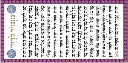 Beautiful Caligraphic font and also readable font.
 - Lost Forever - Unknown license

- High Country by FontMesa,
$25.00Although this font resembles the FontMesa High noon font a closer look reveals much more rounded serifs to this Antique Tuscan font. - GHEA Narek Serif by Edik Ghabuzyan,
$65.00 This font family can be used as Display as well as text font. The font family includes Armenian, Cyrillic and Latin alphabets.
 - KG PDX Blocks by Kimberly Geswein,
$5.00 This cute flag or banner font contains a unicase font inside. Enclosed PDF guides you on how to use the font effectively.
 - Ken Aroque by Beewest Studio,
$90.00 Ken Aroque Font is Engraved Bold Decorative Font that ornamental. This Font is Best as tittle of the novel, Poster, Theater, Logo and also tatoo. This font is bold , strong , classic and luxurious in the same time.
 - Brettisa by Rockboys Studio,
$28.00 Brettisa is a dazzling script font. This font is neatly crafted and highly detailed. Whatever the topic, this font will be a wonderful asset to your font library, as it has the potential to enhance any creation.
 - Roselitta by Rockboys Studio,
$23.00 Roselitta is a dazzling script font. This font is neatly crafted and highly detailed. Whatever the topic, this font will be a wonderful asset to your font library, as it has the potential to enhance any creation.
 - Tropical Drink by Sronstudio,
$23.00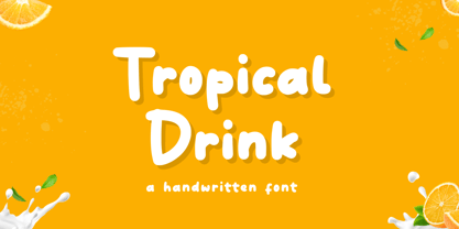 Tropical Drink – Handwritten Font is a fun display Font font, this font Is perfect for product packaging, product designs, label, photography, watermark, special events, or anything. Features: Uppercase and lowercase letters Multilingual, numerals, and punctuation Thank You!
 - Tahu Kotak by Sronstudio,
$23.00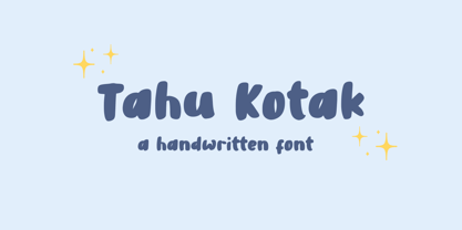 Tahu Kotak – Handwritten Font is a fun display Font font, this font Is perfect for product packaging, product designs, label, photography, watermark, special events, or anything. Features: Uppercase and lowercase letters Multilingual, numerals, and punctuation Thank You!
 - Dreaming by Amarlettering,
$15.00 Dreaming is a dazzling script font. This font is neatly crafted and highly detailed. Whatever the topic, this font will be a wonderful asset to your font library, as it has the potential to enhance any creation.


