10,000 search results
(0.061 seconds)
- Vanilla Shake JF by Jukebox Collection,
$36.99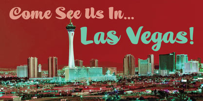
- Selfie Neue Sharp by Lián Types,
$29.00 INTRODUCTION When I started the first Selfie back in 2014 I was aware that I was designing something innovative at some point, because at that time there were not too many, (if any) fonts which rescued so many calligraphy features being at the same time a monolinear sans. I took inspiration from the galerías’ neon signs of my home city, Buenos Aires, and incorporated the logic and ductus of the spencerian style. The result was a very versatile font with many ligatures, swashes and a friendly look. But… I wasn’t cognizant of how successful the font would become! Selfie is maybe the font of my library that I see the most when I finally go out, (type-designers tend to be their entire lives glued to a screen), when I travel, and also the font that I mostly get emails about, asking for little tweaks, new capitals, new swashes. Selfie was used by several renowned clients, became part of many ‘top fonts of the year’ lists and was published in many magazines and books about type-design. These recognitions were, at the same time, cuddles for me and my Selfie and functioned as a driving force in 2020 to start this project which I called Selfie Neue. THE FONT "Selfie for everything" Selfie Neue, because it’s totally new: All its glyphs were re-drawn, all the proportions changed for better, and the old and somehow naive forms of the first Selfie were redesigned. Selfie Neue is now a family of many members (you can choose between a Rounded or a Sharp look), from Thin to Black, and from Short to Tall (because I noticed the feel of the font changed notoriously when altering its proportions). It also includes swashy Caps, which will serve as a perfect match for the lowercase and some incredibly cute icons/dingbats (designed by the talented Melissa Cronenbold, see also Selfie Neue Rounded for more!) which, as you see in the posters, make the font even more attractive and easy to use. You'll find tons of alternates per glyph. It's impossible to get tired with Selfie! Like it happened with the old Selfie, Selfie Neue Sharp was thought for a really wide range of uses. Magazines, Book-covers, digital media, restaurants, logos, clothing, etc. Hey! The font is also a VF (Variable Font)! So you can have fun with its two axes: x-height and weight, in applications that support them. Let me take a New Sharp Selfie! TECHNICAL If you plan to print Selfie Neue VF (Rounded or Sharp), please remember to convert it to outlines first. The majority of the posters above have the "contextual" alternates activated, and this makes the capitals a little smaller. I'd recommend deactivating it if you plan to use Selfie for just one word. Use the font always with the "fi" feature activated so everything ligatures properly. The slant of the font is 24,7 degrees, so if you plan to have its stems vertical, you may use Selfie with that rotation in mind. THANKS FOR READING
 - Archive French Shaded by Archive Type,
$19.95Engraved display typeface. - DIN Next Shapes by Monotype,
$29.99 Sabina Chipară's DIN Next Shapes typeface is a twist on the original German industrial classic, taking its skeleton and re-clothing it in dots, hearts, snowflakes and stars. The design offers a more approachable and whimsical tone of voice than the original, while maintaining all the legibility and clarity of form that makes DIN Next such a reliable and versatile design. It works in harmony with DIN Next, and is particularly suited for designers looking to be a little more expressive. DIN Next Shapes includes four fonts: Dots, Flakes, Hearts and Stars, and has pan European language support including Greek and Cyrillic. It also has OpenType features including stylistic alternatives, ligatures and fractions.
 - Archive Grotesque Shaded by Archive Type,
$19.95Grotesque shaded display typeface. - Standard Shaded Slab by Yes Please,
$35.00 The Standard Shaded family is an homage to the grandiose Woodtypes of yesteryear. Standard blends a contemporary sense of craft and proportion with a dash of Woodtype-era personality to keep things interesting. The Standard Shaded family features OpenType conventional ligatures, discretionary ligatures and stylistic alternates as well as a standard set of accents and symbols to provide a versatile end-user experience. The Standard Shaded family has seen action in the print, web and motion arenas for clients such as IFC, Showtime, Nike Women's Training, Nike Sportswear, Target and Starbucks.
 - !Disc Inferno® BASIC - Unknown license

- Black Shirt Slime Trail - Unknown license

- HS Al Basim A by Hiba Studio,
$59.00 HS Albasim A is an Arabic display typeface. It is useful for headlines, books covers and other graphic projects. It is a collaborative effort, as "HS Albasim A" first letters were designed and drawn by Basim Salem Al Mahdi from Iraq and then developed and digitalized as a typeface by Hasan AbuAfash from Palestine. The font is based on the simple lines of Fatmic Kufi but was it distinguished by two main ideas: First, it contains a nice serf in the vertical strokes of its letters. The second, some of storks in its letter differ in the thickness instead of being similar, as it is in the Fatmic Kufi style. The font contains only two weights: regular and bold. Both of them support the OpenType features of Arabic, Persian and Urdu.
 - Happy Brain Creepy Thalamus by TypoGraphicDesign,
$19.00 CONCEPT/ CHARACTERISTICS The base was a head-vein illustration. This served as a design grid. Novel letterforms were sought and found. Hand-drawn analog and digitized later. Experimentally, novel, fresh and an eye-catcher. Completely new insights into the human brain. A font for happy thoughts. ghostly visions, or simply for the next freshen party flyers. APPLICATION AREA The happy, creepy, Horror handmade font »Happy Brain Creepy Thalamus« with many language support would look good at headlines. Magazines or websites, party flyer, movie posters, music Poster, music covers or webbanner. TECHNICAL SPECIFICATIONS Headline Font | Display Font | Handmade Horror Font "Happy Brain Creepy Thalamus" OpenType Font with 283 glyphs, alternative letters and ligatures (with accents & €) & 1 style (regular).
 - Old Brass Stencil JNL by Jeff Levine,
$29.00 An antique barrel lid stencil spotted in an online auction for a company once located in Guttenberg, NJ provided the hand-cut sans serif lettering which inspired Old Brass Stencil JNL; available in both regular and oblique versions.
 - MFC Brass Rules Petit by Monogram Fonts Co.,
$9.95 Although brass line rules were a common feature in almost every vintage type catalog, these were recreated from those by the Franklin Type Foundry. Filling the Numerals and all Capital and Lowercase glyph slots are a total of 62 traditional Brass Rule designs, all extendable by combining with other rules, or by extending the pin line by simply typing a dash "-". A truly sleek and simple utilitarian font for invitations, menus, business cards, and whatnot. Download and view the "MFC Brass Rules Petit Guidebook" if you would like to learn a little more.
 - MFC Brass Rules Grand by Monogram Fonts Co.,
$9.95 The inspiration source for Brass Rules Grand is a collection of the brass rules from the 1889 “Convenient Book of Specimens” from Franklin Type Foundry in Cincinnati. This is a collection of basic utilitarian brass rules that has been created as combinable and endlessly expanding. Filling the Numerals and all Capital and Lowercase glyph slots are a total of 62 traditional Brass Rule designs, all extendable by combining with other rules, or by extending the pin line by simply typing a dash "-" or ".". A truly sleek and simple utilitarian font for invitations, menus, business cards, and whatnot. Download and view the “MFC Brass Rules Grand Guidebook” if you would like to learn a little more.
 - Mengelt Basel Antiqua Paneuropean by Linotype,
$103.99Inspired by the excellent serif fonts of the Basel printer of the 15th and 16 Century, Christian Mengelt designed the Mengelt Basel Antiqua. The typeface is a Renaissance Antiqua with stylistic reference to the historical model, but with the technical and typographic qualities of a modern text typeface with excellent reading quality. - Stamped Brass Stencil JNL by Jeff Levine,
$29.00 Up until the advent of modern packing and shipping methods, the common way to mark merchandise or other items to be transported was through the use of a brass stencil. These marking devices were hand stamped (or punched) using metal dies that were struck against sheets of brass to create the letters, numbers and other symbols [unlike the steel rule die cutting method used for manufacturing paper stencils]. One such example of an antique marking stencil had letters and numbers approximately one quarter of an inch in height, and Stamped Brass Stencil JNL recreates the design complete with the unusual variations of character shapes and widths.
 - Basic Commercial Soft Rounded by Linotype,
$29.99 Basic Commercial is a font based on historical designs from the hot metal typeface era. It first appeared around 1900, and was created by type designers whose names have not been recorded but whose skills cannot be overlooked. This typeface's design has been popular among groups and movements as diverse as the Bauhaus, Dadaism, and the masters of Swiss/International-Style typography. It influenced for a variety of later grotesque fonts, such as Helvetica and Univers. Basic Commercial was distributed for many years in the United States under the name Standard Series. The typeface worked its way into many aspects of daily life and culture; for instance, it became the face chosen for use in the New York City subway system's signage. The Basic Commercial's font family members have a clear and objective design. Their forms exhibit almost nothing unusual, but remain both lively and legible nonetheless. Perhaps for this reason, Basic Commercial's design has been popular with graphic designers for decades. To read more about the history of typefaces like Basic Commercial, visit our font feature, The Sans Serif Typefaces. In addition several weights of this typefamily are available as soft rounded versions."
 - Ongunkan Carpathian Basin Rovas by Runic World Tamgacı,
$60.00 Carpathian Basin Rovas The Carpathian Basin Rovas script, or Kárpát-medencei rovás in Hungarian, was used in the Carpathian Basin between about the 7th and 11th centuries. Most of the inscriptions are in Hungarian, but some were in Onogur, As-Alan, Slavic or Eurasian Avar. Carpathian Basin Rovas is thought to be a descendent of the Proto-Rovas script, which was used to the east of the Aral Sea between about the 1st century AD and 567, when the tribes who were using it, the Avars and Ogurs, started to move into the Carpathian Basin. That process took until about 670 AD, after which the Proto-Rovas script became the Carpathian Basin Rovas and the Khazarian Rovas scripts. The Proto-Rovas script was perhaps a descendent of the Aramaic script. Since 2009 efforts have been made to revive the use of this alphabet. Some letters were added to it to represent sounds in modern Hungarian that weren't used historically.
 - Sangkuriang - Unknown license

- 20.000 dollar bail - Unknown license

- Rail Line JNL by Jeff Levine,
$29.00 Rail Line JNL is a font for the railroad enthusiast for making their own model train car emblems. The logos contained in this font are or may be the property of the various rail companies, their assigns and/or successors. Outside of non-profit hobby use or for historical/educational purpose under the Fair Use rules, any commercial application of these logos must be obtained by written permission by the respective logo owner or owners. Jeff Levine fonts provided Rail Line JNL strictly as a hobby font. We assume no liability for the use, misuse or misrepresentation of any of the logos contained within the font file.
 - Rail Bum JNL by Jeff Levine,
$29.00 Morris Fuller Benton's Hobo [designed in 1910] is one of a number of fonts which have been so over-used that many designers shy away from it altogether. However, Jeff Levine had often wondered what the design might look like it given a serif treatment. The result is Rail Bum JNL, named for the hobos and transients who hitched along on freight cars to ride the rails across the country during the years when trains were the mainstay of American transportation.
 - Rail Travel JNL by Jeff Levine,
$29.00 Here’s yet another interpretation of the classic “thick and thin” sans serif lettering most popular during the Art Deco era. This particular design comes to you through the courtesy of a hand lettered 1930s travel poster from the Pennsylvania Railroad. Some capitals are much wider than others, while the lower case ‘i’ is somewhat truncated. Rail Travel JNL is available in both regular and oblique versions.
 - Rail Service JNL by Jeff Levine,
$29.00 The extra bold, squared Art Deco sans hand lettering found on a 1940s travel poster for the Pennsylvania Railroad inspired Rail Service JNL, which is available in both regular and oblique versions.
 - Do not eat this Fat Italic - Unknown license

- GHOSTS ITALC PERSONAL USE - Personal use only

- LudwigHohlwein - 100% free

- SpideRaY - Personal use only

- Action Is, Shaded JL - Unknown license

- SF Slapstick Comic Shaded - Unknown license

- SF Archery Black Shaded - Unknown license

- SF Eccentric Opus Shaded - Unknown license

- SF Eccentric Opus Shaded - Unknown license

- SF Orson Casual Shaded - Unknown license

- SF RetroSplice SC Shaded - Unknown license

- SF Comic Script Shaded - Unknown license

- SF Buttacup Lettering Shaded - Unknown license

- SF Pale Bottom Shaded - Unknown license

- SF Orson Casual Shaded - Unknown license

- SF Synthonic Pop Shaded - Unknown license

- SF Square Root Shaded - Unknown license


