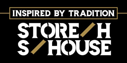
Storehouse Font is an old fashioned typeface with a modern touch. Inspired by tradition, hardworking brewers and 1800s it come up with 10 strong, confident and powerful styles, included: Regular, Italic, Thin, Black, Outline, Shadow, Used, Wide, Soft and Stencil. The font looks great when put on signs, shirts or labels of the bottles. Also, it works perfect as font for a branding and commercial uses. What is included: Shapes: 1.Storehouse Shapes EPS – EPS file 2.Storehouse Shapes PDF – PDF file Fonts: Storehouse Regular - OpenType font file - Regular old fashioned typeface with a modern touch. Full set of uppercase letters, international support, punctuation, and a wide variety of extra characters. Storehouse Thin - OpenType font file - Thin version. Full set of uppercase letters, international support, punctuation, and a wide variety of extra characters. Storehouse Wide - OpenType font file – Wide version, big spaces. Full set of uppercase letters, international support, punctuation, and a wide variety of extra characters. Storehouse Black - OpenType font file - Extra, extra bold version. Full set of uppercase letters, international support, punctuation, and a wide variety of extra characters. Storehouse Outline - OpenType font file – Outline version of regular version, amazing in matching with regular version as a back shadow. full set of uppercase letters, international support, punctuation, and a wide variety of extra characters. Storehouse Shadow - OpenType font file – Old fashioned shadow of regular version. Full set of uppercase letters, international support, punctuation, and a wide variety of extra characters. Storehouse Italic - OpenType font file – Regular version with smooth edges. Full set of uppercase letters, international support, punctuation, and a wide variety of extra characters. Storehouse Soft - OpenType font file - full set of uppercase letters, international support, punctuation, and a wide variety of extra characters. Storehouse Stencil - OpenType font file – Stencil font with amazing old fashioned modern touch. Full set of uppercase letters, international support, punctuation, and a wide variety of extra characters. Storehouse Used- OpenType font file – Softer edges, smooth lines. Full set of uppercase letters, international support, punctuation, and a wide variety of extra characters. Multilanguage Support: English, Albanian, Danish, Dutch, Estonian, Croatian, Bosnian, Slovenian, Finnish, French, German, Icelandic, Italian, Norwegian, Portugese, Spanish, Swedish with a lot of other languages; see Full Character List. Note: To access the extra alternate letters, you will need to use the glyphs panel. Many design programs offer this ability, including Adobe Photoshop CC 2015 , Adobe Illustrator, Adobe Indesign. Works with Cricut, Silhouette, PicMonkey, Photoshop, Illustrator and many more applications!