10,000 search results
(0.081 seconds)
- Hardley Brush by Negara Studio,
$17.00 Hardley x Rocky Sanz is Font Duo, modern brush style and modern sans. The best for labels, poster, project designs look modern, authentic and cool . It’s perfect for labels, quotes, posters, DIY projects, branding, packaging, greeting cards, websites, photos, photography overlays, signs, scrapbooking, tags and so much more! That is why Hardley has a textured, and authentic characteristic more natural look. You can activate Alternates glyphs OpenType panel. What’s Included : Standard glyphs Alternates glyphs Bonus extra font (52 swashes) Web Font Works on PC & Mac Simple installations Accessible in Adobe Illustrator, Adobe Photoshop, Adobe InDesign, even work on Microsoft Word. Image used: All photographs/pictures/vectors used in the preview are not included, they are intended for illustration purposes only. Hardley x Rocky Sanz supports the following languages; English, French, Italian, Spanish, Portuguese, German, Swedish, Norwegian, Danish, Dutch, Finnish, Indonesian, Malay, Hungarian, Polish, Croatian, Turkish, Romanian, Czech, Latvian, Lithuanian, Slovak, Slovenian ~Anugerah
 - Royal Palms by Set Sail Studios,
$16.99 Let the natural letterforms flow with Royal Palms, a clean & casual script font by Set Sail Studios. The Royal Palms family includes four fonts; The Signature version contains a larger, more exaggerated set of capital letters which is perfect for signature-style logos and display text. The Regular version offers a more practical set of smaller capital letters, for use when space is more limited. Both the Regular and Signature styles include a full set of alternate characters available as their own separate fonts, which can be used for an alternative word layout, or to mix and match with the regular versions to create a more customised look. It’s a timeless script set which is equipped to tackle a variety of design briefs for years to come. Language Support • English, French, Italian, Spanish, Portuguese, German, Swedish, Norwegian, Danish, Dutch, Finnish, Indonesian, Malay, Hungarian, Polish, Croatian, Turkish, Romanian, Czech, Latvian, Lithuanian, Slovak, Slovenian. Standard Ligatures • ti, tt, tl, ll, lt, ve, ov, wr, ox, nx, wx, rx.
 - Decking by Din Studio,
$29.00 Are you trying to find a font to get your brand globally accepted? Worry no more as Decking is the key to unlock the door. Decking is a racing-themed script font to give you artistic, firm impressions due to the balance between solid designs and unique strokes on the edges of each character. The font’s thickness is able to show you the power to any title or header you make. In addition, Decking is still suitable to apply to smaller-sized texts owing to its good legibility. The available features in this font are: Stylistic Sets Ligatures Swashes Multilingual Supports PUA Encoded Numerals and Punctuations Decking fits best for various designs, such as posters, banners, logos, book covers, headings, printed products, merchandise, social media, and more. Find out more ways to use this font by taking a look at the font preview. Enjoy your experience with this font and feel free to contact us for further product information or trouble complaints. Thank you and wish you good luck with your designs.
 - Star Castle by Nathatype,
$29.00 Star Castle is a sophisticated serif font. It's a versatile tool that allows you to infuse your projects with a sense of elegance and modernity. The deliberate use of high contrast ensures not only readability but also adds a touch of modern elegance to this timeless typeface. The characters in Star Castle are meticulously crafted, each possessing an elongated and rectangular form that contributes to the font's unique visual identity. The thin weight offers a delicate touch, allowing the tall letter design to stand out while maintaining an overall sense of grace. Enjoy the features here. Features: Ligatures Multilingual Supports PUA Encoded Numerals and Punctuations Star Castle fits in headlines, logos, posters, flyers, branding materials, greeting cards, print media, editorial layouts, and many more designs. Find out more ways to use this font by taking a look at the font preview. Thanks for purchasing our fonts. Hopefully, you have a great time using our font. Feel free to contact us anytime for further information or when you have trouble with the font. Thanks a lot and happy designing.
 - Sweetie Darling by Nathatype,
$29.00 Finding a perfect font for your designs may be tough work and time-consuming. Definitely, you never want to have a too plain, common font, but you have trouble finding the one to express your creativity and visions precisely. For that reason, Sweetie Darling is here to meet your needs. Sweetie Darling is a cursive-style handwriting script font. Like other cursive font designs, the letters are interconnected, but another character of this font is that the letters have high contrasts in curved edges to beautify the display. Due to the seemingly complex font style details to add the font’s legibility, it is suggested to apply this font for big text sizes. Additionally, you can enjoy the available features here. Features: Alternates Ligatures Multilingual Supports PUA Encoded Numerals and Punctuations Sweetie Darling fits best for various design projects, such as brandings, headings, magazine covers, quotes, invitations, greeting cards, printed products, merchandise, social media, etc. Find out more ways to use this font by taking a look at the font preview. Thanks for purchasing our fonts. Hopefully, you have a great time using our font. Feel free to contact us anytime for further information or when you have trouble with the font. Thanks a lot and happy designing.
 - Polyphonic by Monotype,
$31.99 Polyphonic is a highly versatile slab serif typeface comprising 60 fonts across 6 weights and 5 widths. It is a no-nonsense, clear and legible type family whose multiple voices will suit numerous typographic applications. Its overall personality is polite, understated and formal – there are no frills with this typeface, it conveys messages simply and efficiently without hyperbole. Polyphonic’s lighter weights are great for body text and its heavier weights the perfect complement for branding, titles, headings and logotype options. Small Caps are included with each font and available with one click, as are Old Style Figures, there is extensive language support too – European/Latin only. Key features: • 6 Weights in Roman and Italic • 5 Widths – Condensed, Narrow, Regular, Wide, Extended • Small Caps • Old Style Figures • European Language Support (Latin) • 600 glyphs per font. See more detailed examples at the Polyphonic microsite.
 - Brinar by Hackberry Font Foundry,
$24.95 I've been working on a usable sans serif for body copy since the mid-1990s (though I certainly did not know it at the time). This one works well. It started life back in the mists of time as a scan of an old German font by Carl Fahrenwaldt. It was developed fully as a synergized serif with strong traditional roots and released as Bergsland Pro. Now it finally makes it to where I was headed all along as a sans text font. This is a well modulated humanist, sans serif font family with many OpenType features and over 600 characters: Caps, lower case, small caps, ligatures, swashes, small cap figures, old style figures, numerators, denominators, accents characters, ordinal numbers, and so on. It is designed for text use in body copy. But it also works very well for elegantly stylized display.
 - Ephemera Kingsford by Ephemera Fonts,
$39.00 A new vintage display typeface by Ilham Herry. Started from the passion of collecting the old tin packaging with classic labels on it, the layout and composition make Ilham pretty inspired and the urge of crafting the letters is getting bigger since that day. That's what comes first as a motivation in making this Ephemera Kingsford typeface.Adapted and referencing from the real physical collectible old tins and cans to a single pack of digital fonts asset. Packed up with 9 layered fonts, 1 font as a pair, and of course ornaments and vintage panels as a vector file.Perfectly fit for display printing, handcrafted product, screen printing industry such as apparel, packaging, labels, and also sign painting, scrapbook, glass gilding, et cetera. Not every visual can go vintage but if you want to, there's no other choice, oldsport. check Ephemera Kingsford type specimen here
 - Phoenix Squad by Stringlabs Creative Studio,
$29.00 Phoenix Squad is a modern and bold display font. Add this font to your favorite creative ideas and notice how it makes them come alive!
 - Battom Glory by Sealoung,
$10.00 Battom Glory is a bold and distinct blackletter font. Add this font to your creative ideas and notice how it will make them stand out!
 - Times Eighteen by Linotype,
$29.00In 1931, The Times of London commissioned a new text type design from Stanley Morison and the Monotype Corporation, after Morison had written an article criticizing The Times for being badly printed and typographically behind the times. The new design was supervised by Stanley Morison and drawn by Victor Lardent, an artist from the advertising department of The Times. Morison used an older typeface, Plantin, as the basis for his design, but made revisions for legibility and economy of space (always important concerns for newspapers). As the old type used by the newspaper had been called Times Old Roman," Morison's revision became "Times New Roman." The Times of London debuted the new typeface in October 1932, and after one year the design was released for commercial sale. The Linotype version, called simply "Times," was optimized for line-casting technology, though the differences in the basic design are subtle. The typeface was very successful for the Times of London, which used a higher grade of newsprint than most newspapers. The better, whiter paper enhanced the new typeface's high degree of contrast and sharp serifs, and created a sparkling, modern look. In 1972, Walter Tracy designed Times Europa for The Times of London. This was a sturdier version, and it was needed to hold up to the newest demands of newspaper printing: faster presses and cheaper paper. In the United States, the Times font family has enjoyed popularity as a magazine and book type since the 1940s. Times continues to be very popular around the world because of its versatility and readability. And because it is a standard font on most computers and digital printers, it has become universally familiar as the office workhorse. Times™, Times™ Europa, and Times New Roman™ are sure bets for proposals, annual reports, office correspondence, magazines, and newspapers. Linotype offers many versions of this font: Times™ is the universal version of Times, used formerly as the matrices for the Linotype hot metal line-casting machines. The basic four weights of roman, italic, bold and bold italic are standard fonts on most printers. There are also small caps, Old style Figures, phonetic characters, and Central European characters. Times™ Ten is the version specially designed for smaller text (12 point and below); its characters are wider and the hairlines are a little stronger. Times Ten has many weights for Latin typography, as well as several weights for Central European, Cyrillic, and Greek typesetting. Times™ Eighteen is the headline version, ideal for point sizes of 18 and larger. The characters are subtly condensed and the hairlines are finer. Times™ Europa is the Walter Tracy re-design of 1972, its sturdier characters and open counterspaces maintain readability in rougher printing conditions. Times New Roman™ is the historic font version first drawn by Victor Lardent and Stanley Morison for the Monotype hot metal caster." - Times Europa LT by Linotype,
$29.99In 1931, The Times of London commissioned a new text type design from Stanley Morison and the Monotype Corporation, after Morison had written an article criticizing The Times for being badly printed and typographically behind the times. The new design was supervised by Stanley Morison and drawn by Victor Lardent, an artist from the advertising department of The Times. Morison used an older typeface, Plantin, as the basis for his design, but made revisions for legibility and economy of space (always important concerns for newspapers). As the old type used by the newspaper had been called Times Old Roman," Morison's revision became "Times New Roman." The Times of London debuted the new typeface in October 1932, and after one year the design was released for commercial sale. The Linotype version, called simply "Times," was optimized for line-casting technology, though the differences in the basic design are subtle. The typeface was very successful for the Times of London, which used a higher grade of newsprint than most newspapers. The better, whiter paper enhanced the new typeface's high degree of contrast and sharp serifs, and created a sparkling, modern look. In 1972, Walter Tracy designed Times Europa for The Times of London. This was a sturdier version, and it was needed to hold up to the newest demands of newspaper printing: faster presses and cheaper paper. In the United States, the Times font family has enjoyed popularity as a magazine and book type since the 1940s. Times continues to be very popular around the world because of its versatility and readability. And because it is a standard font on most computers and digital printers, it has become universally familiar as the office workhorse. Times™, Times™ Europa, and Times New Roman™ are sure bets for proposals, annual reports, office correspondence, magazines, and newspapers. Linotype offers many versions of this font: Times™ is the universal version of Times, used formerly as the matrices for the Linotype hot metal line-casting machines. The basic four weights of roman, italic, bold and bold italic are standard fonts on most printers. There are also small caps, Old style Figures, phonetic characters, and Central European characters. Times™ Ten is the version specially designed for smaller text (12 point and below); its characters are wider and the hairlines are a little stronger. Times Ten has many weights for Latin typography, as well as several weights for Central European, Cyrillic, and Greek typesetting. Times™ Eighteen is the headline version, ideal for point sizes of 18 and larger. The characters are subtly condensed and the hairlines are finer. Times™ Europa is the Walter Tracy re-design of 1972, its sturdier characters and open counterspaces maintain readability in rougher printing conditions. Times New Roman™ is the historic font version first drawn by Victor Lardent and Stanley Morison for the Monotype hot metal caster." - Times Ten by Linotype,
$40.99In 1931, The Times of London commissioned a new text type design from Stanley Morison and the Monotype Corporation, after Morison had written an article criticizing The Times for being badly printed and typographically behind the times. The new design was supervised by Stanley Morison and drawn by Victor Lardent, an artist from the advertising department of The Times. Morison used an older typeface, Plantin, as the basis for his design, but made revisions for legibility and economy of space (always important concerns for newspapers). As the old type used by the newspaper had been called Times Old Roman," Morison's revision became "Times New Roman." The Times of London debuted the new typeface in October 1932, and after one year the design was released for commercial sale. The Linotype version, called simply "Times," was optimized for line-casting technology, though the differences in the basic design are subtle. The typeface was very successful for the Times of London, which used a higher grade of newsprint than most newspapers. The better, whiter paper enhanced the new typeface's high degree of contrast and sharp serifs, and created a sparkling, modern look. In 1972, Walter Tracy designed Times Europa for The Times of London. This was a sturdier version, and it was needed to hold up to the newest demands of newspaper printing: faster presses and cheaper paper. In the United States, the Times font family has enjoyed popularity as a magazine and book type since the 1940s. Times continues to be very popular around the world because of its versatility and readability. And because it is a standard font on most computers and digital printers, it has become universally familiar as the office workhorse. Times™, Times™ Europa, and Times New Roman™ are sure bets for proposals, annual reports, office correspondence, magazines, and newspapers. Linotype offers many versions of this font: Times™ is the universal version of Times, used formerly as the matrices for the Linotype hot metal line-casting machines. The basic four weights of roman, italic, bold and bold italic are standard fonts on most printers. There are also small caps, Old style Figures, phonetic characters, and Central European characters. Times™ Ten is the version specially designed for smaller text (12 point and below); its characters are wider and the hairlines are a little stronger. Times Ten has many weights for Latin typography, as well as several weights for Central European, Cyrillic, and Greek typesetting. Times™ Eighteen is the headline version, ideal for point sizes of 18 and larger. The characters are subtly condensed and the hairlines are finer. Times™ Europa is the Walter Tracy re-design of 1972, its sturdier characters and open counterspaces maintain readability in rougher printing conditions. Times New Roman™ is the historic font version first drawn by Victor Lardent and Stanley Morison for the Monotype hot metal caster." - Times Ten Paneuropean by Linotype,
$92.99In 1931, The Times of London commissioned a new text type design from Stanley Morison and the Monotype Corporation, after Morison had written an article criticizing The Times for being badly printed and typographically behind the times. The new design was supervised by Stanley Morison and drawn by Victor Lardent, an artist from the advertising department of The Times. Morison used an older typeface, Plantin, as the basis for his design, but made revisions for legibility and economy of space (always important concerns for newspapers). As the old type used by the newspaper had been called Times Old Roman," Morison's revision became "Times New Roman." The Times of London debuted the new typeface in October 1932, and after one year the design was released for commercial sale. The Linotype version, called simply "Times," was optimized for line-casting technology, though the differences in the basic design are subtle. The typeface was very successful for the Times of London, which used a higher grade of newsprint than most newspapers. The better, whiter paper enhanced the new typeface's high degree of contrast and sharp serifs, and created a sparkling, modern look. In 1972, Walter Tracy designed Times Europa for The Times of London. This was a sturdier version, and it was needed to hold up to the newest demands of newspaper printing: faster presses and cheaper paper. In the United States, the Times font family has enjoyed popularity as a magazine and book type since the 1940s. Times continues to be very popular around the world because of its versatility and readability. And because it is a standard font on most computers and digital printers, it has become universally familiar as the office workhorse. Times™, Times™ Europa, and Times New Roman™ are sure bets for proposals, annual reports, office correspondence, magazines, and newspapers. Linotype offers many versions of this font: Times™ is the universal version of Times, used formerly as the matrices for the Linotype hot metal line-casting machines. The basic four weights of roman, italic, bold and bold italic are standard fonts on most printers. There are also small caps, Old style Figures, phonetic characters, and Central European characters. Times™ Ten is the version specially designed for smaller text (12 point and below); its characters are wider and the hairlines are a little stronger. Times Ten has many weights for Latin typography, as well as several weights for Central European, Cyrillic, and Greek typesetting. Times™ Eighteen is the headline version, ideal for point sizes of 18 and larger. The characters are subtly condensed and the hairlines are finer. Times™ Europa is the Walter Tracy re-design of 1972, its sturdier characters and open counterspaces maintain readability in rougher printing conditions. Times New Roman™ is the historic font version first drawn by Victor Lardent and Stanley Morison for the Monotype hot metal caster." - Times by Linotype,
$40.99In 1931, The Times of London commissioned a new text type design from Stanley Morison and the Monotype Corporation, after Morison had written an article criticizing The Times for being badly printed and typographically behind the times. The new design was supervised by Stanley Morison and drawn by Victor Lardent, an artist from the advertising department of The Times. Morison used an older typeface, Plantin, as the basis for his design, but made revisions for legibility and economy of space (always important concerns for newspapers). As the old type used by the newspaper had been called Times Old Roman," Morison's revision became "Times New Roman." The Times of London debuted the new typeface in October 1932, and after one year the design was released for commercial sale. The Linotype version, called simply "Times," was optimized for line-casting technology, though the differences in the basic design are subtle. The typeface was very successful for the Times of London, which used a higher grade of newsprint than most newspapers. The better, whiter paper enhanced the new typeface's high degree of contrast and sharp serifs, and created a sparkling, modern look. In 1972, Walter Tracy designed Times Europa for The Times of London. This was a sturdier version, and it was needed to hold up to the newest demands of newspaper printing: faster presses and cheaper paper. In the United States, the Times font family has enjoyed popularity as a magazine and book type since the 1940s. Times continues to be very popular around the world because of its versatility and readability. And because it is a standard font on most computers and digital printers, it has become universally familiar as the office workhorse. Times™, Times™ Europa, and Times New Roman™ are sure bets for proposals, annual reports, office correspondence, magazines, and newspapers. Linotype offers many versions of this font: Times™ is the universal version of Times, used formerly as the matrices for the Linotype hot metal line-casting machines. The basic four weights of roman, italic, bold and bold italic are standard fonts on most printers. There are also small caps, Old style Figures, phonetic characters, and Central European characters. Times™ Ten is the version specially designed for smaller text (12 point and below); its characters are wider and the hairlines are a little stronger. Times Ten has many weights for Latin typography, as well as several weights for Central European, Cyrillic, and Greek typesetting. Times™ Eighteen is the headline version, ideal for point sizes of 18 and larger. The characters are subtly condensed and the hairlines are finer. Times™ Europa is the Walter Tracy re-design of 1972, its sturdier characters and open counterspaces maintain readability in rougher printing conditions. Times New Roman™ is the historic font version first drawn by Victor Lardent and Stanley Morison for the Monotype hot metal caster." - Captain Tall Ship by Alphabet Agency,
$20.00 Captain Tall Ship is the clean version of Captain Tall Shipwreck. The font can be used in many project themes, from birthday party invitations to beer labels. The font could be potentially used is a number of design themes including bars, pubs, pirate, navy, seafarer, alcohol products, western/cowboy, card game/gambling, biker gang, tattoos, emblems and crests, old military & hunting to name a few.
 - Lakshmi by Océane Moutot,
$32.90 Lakshmi is an elegant and friendly script font. Inspired by brushed typography, it adds elegance, tension and typographic rigour to traditional script fonts. It's identified by its dynamic curves and the softness of its design. Lakshmi is ideal for display use, logotype, headline, packaging and advertising. Lakshmi is designed with extended language support, alternative characters as well as various ligatures and old-style numbers.
 - Ironwood by Adobe,
$29.00Ironwood is an Adobe Originals typeface designed by Joy Redick in 1990. Ironwood font is a homage to the old woodtypes made popular by the wanted posters in Western films. Adrian Frutiger designed his typeface Westside with the same idea in mind. Ironwood font is reminiscent of the Wild West and its shoot-out heroes, and its robust figures are particularly good for headlines. - Fordier by Jehansyah,
$15.00 Fordier is a type of serif display font that is very charming, elegant and stylish, with alternate characters that are tailored to the user, very suitable for all types of designs, titles, book covers, invitations, movie titles, social media, stickers, old and classic looks combined in greetings, and this font is also encoded with PUA which means you can easily use all the letters on all glyphs,
 - Thinset by Josh Grzybowski,
$19.99 The original intent for Thinset was to be used strictly as a display font only, but this single weight typeface can at times work great as a body of text as well. It's a clean, legible, and light font which is ideal for publications like fashion and editorial magazines. In addition to ligatures and fractions, Thinset’s other OpenType features include old style numbers and small caps.
 - Obsypac by Fontdation,
$18.00 Introducing Obsypac, our latest vintage serif. Inspired by the old lettering/signpainting, refined to make it relevant in this modern era. This all-caps font will give a strong and clean look on your design, make it work perfectly for headlines, logos/logotypes, labels and packagings, t-shirt designs, etc. If you're a fan of classic typography, make sure you add this font to your design toolbox.
 - Cranach by profonts,
$41.99 This picturesque, beautiful German Blackletter typeface was originally released by Benjamin Becker Succ, Frankfurt am Main, then named ?K�nstlergotisch?. Ralph M. Unger redesigned, digitally remastered and completed the font based on old catalogues/specimen. In honor of the famous Cranach family, German artists in medieval times, we renamed the font after them. The shadowed version was added for even more eye-catching purposes, e.g. in headlines.
 - Rancho Quito by Fat Hamster,
$25.00 Rancho Quito - Modern and elegant font in warm southwestern style Rancho Quito is a unique & stylish typeface inspired by southwestern & Mexican culture. Desert, country, old west vibes. Sleek and classy ligatures will add a special spirit to your fantastic projects. You can use Rancho Quito font for logo & branding, label & packaging design, heading, magazine and book covers, invitations and postcards, wedding stationery and pretty quotes.
 - Foreman by Anthony Prudente,
$15.00 This typeface is inspired from the old display fonts that used to decorate the world around us, but just because we don't see such beautiful signage these days, doesn't mean we should lose the great typefaces used. Foreman is a condensed serif display typeface, with hard geometric lines inspired from fonts used in the 1930s and 1940s, and very much used by the American Art Deco movement.
 - Hoyer Script by RMU,
$30.00 Hoyer Script™ is a fresh redesign of Hans Hoyer’s Schoenschrift, a slender vintage italic with a calligraphic touch. This font should be used like my blackletter fonts. It means that the s-key is occupied by the long s, and the round s lies on the #-key. By typing N, o, and period plus activating Ordinals feature you will get an old-style number sign.
 - Unger Script by profonts,
$39.99Unger Script is a script design which is obviously based on H. Matheis' Slogan typeface designed for Ludwig & Mayer in 1957. This very expressive script design is defined by its widely swinging upper case and its quite narrowly designed lower case characters. Ralph M. Unger redrew and digitized this font exclusively for profonts in 2001. His work is based on artwork taken from old font catalogues. - Liturgisch by Lamatas un Slazdi,
$19.00 Liturgisch was created by Otto Hupp for Klingspor foundry in 1906. The basis of this font is a publication in the magazine "Das Plakat" of October 1921. The font contains contextual alternates, ligatures, discretional ligatures for use in German, ornamental bullets and other OpenType features. It supports all the European languages using Latin alphabets (including slashed S and slashed longs used in Latvian old orthography till 1930s).
 - Farson Family by Garisman Studio,
$20.00 Proudly Present Farson - Vintage Typeface Farson born from an inspiring vintage display. This font gives a feel of a vintage, classic, old, and based on handmade. Already PUA Encoded and I think this font is perfect for people looking for vintage aesthetic or logo-type. Suitable for any graphic designs such as branding materials, t-shirt, print, business cards, logo, poster, t-shirt, photography, quotes .etc.
 - Lemondrop - Personal use only

- Hello Pirates - Personal Use - Personal use only

- Notice2Std - 100% free

- Wildcat by K-Type,
$20.00 The starting point for Wildcat was the 3×5 squared grid popular for tiled lettering and American sportswear typefaces. However, Wildcat breaks free of the net whenever necessary. This typeface comes across as tough, it has no soft curves, and evokes strength and confidence. Unlike other collegiate-style fonts, Wildcat includes a real lowercase which makes the face particularly usable and adaptable. Wildcat also contains a full complement of Latin Extended-A characters. Three fonts are included in the download; Regular, College and Outline. The College and Outline fonts share identical spacing and kerning, so can be overlapped to create bicolor artwork.
 - Buenos Signature by Balpirick,
$15.00 Buenos Signature - a beautiful monoline script that's clean, elegant and perfect for a range of design projects! With its smooth, effortless lines and understated sophistication, this font is the perfect choice for those who want a modern look that's still timeless in its appeal. Crafted with precision and care, this font is incredibly versatile and can be used for a range of design projects, including logos, branding, invitations, packaging, and more. With its simple yet refined aesthetic, it's sure to make a lasting impression on anyone who sees it. - also multilingual support Enjoy the font! Feel free to comment or feedback! Thank you!
 - Gloriant by Letterhend,
$13.00 Introducing Gloriant Signature Script Font with two styles : clean and brush! Both of them looks nice and elegant, naturally made by handwriting. This font is suitable for any design purposes such as logos, headlines, quotes, apparel, wedding invitations, and of course as your digital signature. Gloriant Signature comes with OpenType features like ligatures, stylistic alternates, contextual alternates, swashes, and multi-language support. We hope you enjoy the font, please feel free to comment if you have any thoughts or feedback. Or simply send me a PM or email me at letterhend@gmail.com. Thanks for purchasing and have fun!
 - Boldfire by VP Creative Shop,
$15.00 Introducing Boldfire - creative font duo Boldfire is elegant and organic typeface with multilingual support. It's a very versatile font that works great in large and small sizes. This font duo is perfect for branding projects, home-ware designs, product packaging, magazine headers - or simply as a stylish text overlay to any background image. FEATURES Uppercase, lowercase, numeral, punctuation & Symbol Regular Script Multilingual support No special software is required to type out the standard characters of the Typeface. Canva friendly Feel free to contact me if you have any questions! Mock ups and backgrounds used are not included. Thank you! Enjoy!
 - Walnut Cream by Nathatype,
$29.00 Want to live up the hype of your brand? It's all here. The cute elegant Walnut Cream is a beautiful combination of the handcrafted script font and the uppercase display font to beautify your designs. The font features a set of lower and uppercases, numerals, punctuations, multilingual supports, stylistic sets, ligatures and swashes. It is best to apply for various purposes, such as branding, logotypes, promotions, quotes, and more. See the previews above to get some inspiration on how to use them. Happy designing! Thank you for purchasing from Natha Studio. For further details and queries, feel free to contact us.
 - Floral Bouquet by Balpirick,
$15.00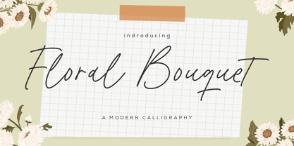 Floral Bouquet - a modern calligraphy that's clean, elegant and perfect for a range of design projects! With its smooth, effortless lines and understated sophistication, this font is the perfect choice for those who want a modern look that's still timeless in its appeal. Crafted with precision and care, this font is incredibly versatile and can be used for a range of design projects, including logos, branding, invitations, packaging, and more. With its simple yet refined aesthetic, it's sure to make a lasting impression on anyone who sees it. - also multilingual support Enjoy the font! Feel free to comment or feedback! Thank you!
 - Esthetic Boots by Balpirick,
$15.00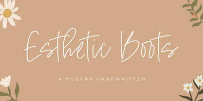 Esthetic Boots - a modern handwritten that's clean, elegant and perfect for a range of design projects! With its smooth, effortless lines and understated sophistication, this font is the perfect choice for those who want a modern look that's still timeless in its appeal. Crafted with precision and care, this font is incredibly versatile and can be used for a range of design projects, including logos, branding, invitations, packaging, and more. With its simple yet refined aesthetic, it's sure to make a lasting impression on anyone who sees it. - also multilingual support Enjoy the font! Feel free to comment or feedback! Thank you!
 - Brutal Milk No 3 by Casloop Studio,
$9.00 Dear Reviewer Team, Completing the trilogy, Brutal Milk No. 3 Display is our grand finale. This font embodies sophistication and innovation, aiming to provide users with a distinctive and memorable visual element for their creative projects. We believe it enriches the Trilogy font family, offering a comprehensive solution for diverse design needs. We appreciate your time and consideration in reviewing our submission. If you have any questions or require additional information, please feel free to reach out. We look forward to the opportunity to contribute to the marketplace's diverse and high-quality font offerings. Thank you for your attention. Best regards, Nina :)
 - Orange Beauty by Balpirick,
$15.00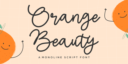 Orange Beauty - a Monoline Script that's clean, elegant and perfect for a range of design projects! With its smooth, effortless lines and understated sophistication, this font is the perfect choice for those who want a modern look that's still timeless in its appeal. Crafted with precision and care, this font is incredibly versatile and can be used for a range of design projects, including logos, branding, invitations, packaging, and more. With its simple yet refined aesthetic, it's sure to make a lasting impression on anyone who sees it. - also multilingual support Enjoy the font! Feel free to comment or feedback! Thank you!


