10,000 search results
(0.055 seconds)
- Silvercrush by IKIIKOWRK,
$17.00 Introducing SILVERCRUSH Typeface, created by ikiiko. A rough letters with expressive strokes and have a strong character for street art typeface. Silvercrush typeface is perfect for an poster event, urban brand, hipster magazine, fashion stuff, quotes, and all the design elements that require a street vibes. What's included? Uppercase & Lowercase Number & Punctuation Bonus Alternates Multilingual Support Enjoy our font and if you have any questions, you can contact us by email : ikiikowrk@gmail.com
 - Raittens by Gassstype,
$22.00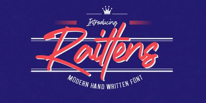 Introducing Raittens is Modern Handwritten Font is a Authentic Style and classy style, Raittens a natural handwritten feel. This handmade font will make your design has a beautiful natural touch for each details. It is perfect for any design project as Invitation,logo, book cover, craft or any design purposes,photography overlays, signs, window art, scrapbooking, tags and so much more! This font is PUA encoded which means you can access all of ligatures.
 - Jackleen by Create Big Supply,
$15.00 Jackleen is a signature font with ligature. Be mesmerized by its beautiful style and use it to create beautiful wedding invitations, beautiful stationary art, eye-catching social media posts and more! This font is PUA encoded which means you can access all the amazing glyphs and ligatures easily Features: Uppercase & lowercase Numbers and punctuation Multilingual Ligatures PUA Encoding Full Character Set !"#$%&'()*+,-./0123456789:;?@ABCDEFGHIJKLMNOPQRSTUVWXYZ[\]^_`abcdefghijklmnopqrstuvwxyz{|}~¡¢£¤¥§¨©ª«®¯°±²³´¹º»¿ÀÂÃÄÅÆÇÈÉÊËÌÍÎÏÑÒÓÔÕÖ×ØÙÛÜÝÞßàáâãäåæçèéêëìíîïñòóôõö÷øùúûüýþÿ•†‹›‒–ˆˇ˜€“‘ŸœŒš˚”’ıžŠ
 - Vennesia by Andrey Font Design,
$10.00 Vennesia is a sweet handwritten font. Fall in love with its authentic feel and use it to create gorgeous social media posts, wedding invitations, beautiful stationary art and much more! It also features a wealth of special features including alternate glyphs and ligatures. This font is PUA encoded which means you can access all of the cute glyphs and swashes with ease! Whether you’re looking for fonts for Instagram or calligraphy scripts for DIY projects.
 - Soleil by TypeTogether,
$49.00 Soleil, designed by Wolfgang Homola, is a geometric sans serif typeface. Unlike most existing geometric sans serif typefaces, it has asymmetrical counters, making it look fresher, more dynamic and more contemporary. Simple geometric forms – such as the circle or the square – played a certain role in the design of the letterforms, but in order to introduce more fluidity into the rather stiff and rigid concept of geometric sans serif typefaces, a lot of optical corrections were necessary. Soleil is based on the modernist ideas of simplicity, clarity and reduction to essential forms. Yet its letter shapes are not the result of geometric construction, but of a design process that brings together simplicity and fluidity, clarity and rhythm. Soleil has a rather large x-height, making it legible also in small sizes or from a bigger distance. The typeface family consists of six weights. The Opentype version also allows for the implementation of typographic features such as Small Caps, lining and old-style figures, both tabular and proportional, ligatures, alternate characters, case-sensitive variants and fractions. Soleil offers a wide range of potential applications: signage and wayfinding systems, book and magazine design, branding and corporate publications.
 - Solitas Slab by insigne,
$- Slab serif, meet the curves of Solitas. The new slab sister of insigne’s successful Solitas family will turn your head with its soft, but distinct look. Solitas Slab defies the typical feel of the robust slab category with her more compact structure and rounded corners to create a confident charm that complements everything sweet from cookies and puppies to whiskers on kittens. Solitas Slab offers you a full suite of 42 well-rounded fonts that read well both in print and online. Its round, open letter types make it quick to read, and the intermediate weights execute impeccably for copy, while bolder versions make expressive headlines and subheadings. Using its subtle geometry, its seven weights and three widths along with its optically adjusted italics tackle even the most complicated, ambitious typography with heart-warming grace and poise. Solitas Slab OpenType options include titling caps, small capitals, ligatures, ordinal characters, fractions, numerator and denominator as well as superscript and subscript. Solitas Slab also supports Western European, Central and Eastern European languages. Enjoy the softer side of Solitas Slab today for your packaging, web, or print. You’ll soon find this friendly font to be one of your favorite things.
 - Sweet Gothic by Sweet,
$39.00 Sweet Gothic is a 2009 addition to the Sweet Collection of engraved lettering styles from the 20th Century. Sweet Gothic Light is closely based on lettering from an engravers pattern from the early 1900s that was used for tracing letterforms with the engraving machine (pantograph) to make steel engraving plates. The design is related to many similar engravers gothics developed in the early 1900s, but as each engraving house created by hand their own patterns for popular styles of the time, there is variation among the models. Sweet Gothic offers contrast in stroke weight and its unique personality. The bolder weights are new designs, based on the characteristics of the Light. A serif variant (Sweet Gothic Serif) has also been developed to expand the usefulness of the family, offering an alternative to Copperplate Gothic. As such, most of the fonts are new designs, yet may seem familiar and ubiquitous given their model. The fonts offer two sizes of figures and monetary symbols: one set is intended for use with upper- and lowercase settings; the second set is the same height as the small caps.
 - Sweet Gothic Serif by Sweet,
$39.00Sweet Gothic Serif is a 2009 addition to the Sweet Collection of engraved lettering styles from the 20th Century. It is a serif variant of Sweet Gothic. Sweet Gothic Light (without serifs) is closely based on lettering from an engravers pattern from the early 1900s that was used for tracing letterforms with the engraving machine (pantograph) to make steel engraving plates. The design is related to many similar engravers gothics developed in the early 1900s, but as each engraving house created by hand their own patterns for popular styles of the time, there is variation among the models. Sweet Gothic offers contrast in stroke weight and its unique personality. The bolder weights are new designs, based on the characteristics of the Light. Sweet Gothic Serif has been developed to expand the usefulness of the Sweet Gothics, offering an alternative to Copperplate Gothic. As such, most of the fonts are new designs, yet may seem familiar and ubiquitous given their model. The fonts offer two sizes of figures and monetary symbols: one set is intended for use with upper- and lowercase settings; the second set is the same height as the small caps. - Sealt by Michael Rafailyk,
$9.00 Sealt Typeface is inspired by the oldest saltworks in Eastern Europe, founded in 1390 in Drohobych. Sealt means salt in Old English, so most letters are rough and sharp like salt crystals and seem to be carved out of the rock. View PDF Specimen: https://michaelrafailyk.com/typeface/specimen/Sealt.pdf Variable font: Sealt VF has weight axis and includes hundreds of weights ranging from Light (300) to Bold (700), so feel free to choose the most accurate weight that you need, using a slider. Localized Forms: 47 character substitutions for Azeri, Bulgarian, Catalan, Dutch, German, Kazakh, Moldavian, Polish, Romanian, Tatar, Turkish. Glyph Composition/Decomposition (Diacritics): Full Latin and based Vietnamese set of diacritics (561 characters). Precomposed. Ordinals: adehnorst. Superscript, Subscript, Numerator, Denominator: 0123456789. Fractions: ¼½¾⅐⅑⅒⅓⅔⅕⅖⅗⅘⅙⅚⅛⅜⅝⅞⅟ (precomposed). Any other fractions (even those typed through a slash) will also be displayed correctly, with the automatic replacement to Numerator + fraction + Denominator. Slashed Zero: All 0 figures, including Lining, Superscript, Subscript, Numerator, Denominator, and Fractions. Contextual Alternates: ΆΈΉΊΌΎΏ. Greek uppercase accented characters lose their tonos accent and retain only dieresis in All Caps mode. Turned on by default. If you need tonos accents in All Caps then turn off Contextual Alternates (calt) feature. Standard Ligatures: OO TT tt fi. Turned on by default. Language count: 480+. Kerning Class pairs: 4295. The promo images used photos of Albin Berlin, Hervé Piglowski, Karolina Grabowska, Scott Webb from Pexels and Dollar Gill from Unsplash.
 - Graduate by Fontforecast,
$54.00 Graduate Script is a contemporary calligraphic script. With over 825 glyphs Graduate Script can be dressed up or down, to enliven its style. You can add curls to beginning and end of any lowercase letter, or even in between them. Alternates for both upper and lowercase, as well as ligatures for double letters are included too. OpenType features such as five numeral styles, fractions and both standard and discretionary ligatures, make Graduate Script a well equipped font. Graduate Ornaments has over 300 glyphs and expands the design possibilities of Graduate Script even further. It offers additional ornaments and curls to add to lowercase letters, frames, automated borders that can be accessed by the keyboard and a lot more fun glyphs to work with. On top of that there are catchwords in different styles. Not finding the catchword you’re looking for? Just create your own! A full set of capitals, including roman accented caps, currency, numerals and punctuation is part of Graduate Ornaments. Designed to fit the same frames that are being used for the different catchword-styles, so you can easily integrate custom text with the existing catchwords. A detailed user guide is available in the gallery section.
 - Gruenewald VA - 100% free

- Steno Pro by DBSV,
$10.00 About family “StenoPro” Short for stenography… The name of the font was taken from the method of high-speed writing (shorthand) with a special alphabet. In shorthand, the rule "write as you hear" applies, that is, spelling is not observed. Capitalization, accents, ghosts, and punctuation except the semicolon are removed. In narrow letters you have the advantage of more words in a limited space… This series is composed and includes dozen fonts with 633 glyphs each, with true italics, and supports of course: Latin, Greek & Cyrillic.
 - Semisonic by Putracetol,
$26.00 Semisonic is a captivating modern display font that defies convention and stands out from the ordinary. It seamlessly blends the essence of modernity with a fusion of sans serif and decorative elements, creating a font that's truly exceptional. This unique font is the perfect choice for those seeking to make a bold statement in their designs. Whether it's a logo, branding materials, invitations, packaging, posters, headlines, business collateral, greeting cards, magazines, or any other creative project, Semisonic will add a touch of individuality and originality.
 - Herra Maddison by Jinan Studio,
$20.00 Herra Maddison is the embodiment of modern elegance, offering you an exquisite script font with exceptional swashes and multilingual support. Whether you’re a designer working on wedding themes, branding, or promotional materials, this font will elevate your work, infusing it with a timeless and stylish charm that captivates the eye and the heart. Make Herra Maddison your choice for sophisticated, elegant designs that leave a lasting impression. Features A set of uppercase and lowercase glyphs Number, symbol, and punctuation Multilingual Support Alternates and ligatures PUA encoded
 - HS Loxy Gold by Helipad Space,
$21.00 Introducing, HS Loxy Gold! A Stencil Bold Display Font with the strong touch. It looks heavy and boldy that can be used for all your project needs.This font can be used at any time and on any project. So, HS Loxy Gold Font can't wait to give its touch to all your design projects such as magazine, book, poster design, printing, personal branding, promotional materials, logotype, product packaging, etc. Thank You HS
 - Bitstream Vera Sans - Unknown license

- Celari Titling by insigne,
$- Need for speed? Satisfy it with insigne’s Celari. Take it for a drive and watch how its simple curves, easy lines, and sturdy shapes handle the edges and corners of your projects with smooth and rapid execution. The negative space cuts through the rounded sans serif letterforms of Celari, giving this all-caps typeface a strong impression of dimension and speed. Celari’s organic stroke direction allows you to ease through its gentle turns, too, causing the font to hum around the lines of your project like a V8 engine on an open Nevada highway. The speed and agility of Celari is built for nothing less than a headline. Use the larger-than-life power of this face for any number of oversized applications--mastheads, posters, web headlines, flyers. It provides excellent performance for service-oriented ads where efficiency and quick buyer service are priorities. Customize your ride, too. The OpenType version of Celari includes some serious add-ons to make it your design. The font incorporates discretionary ligatures for some funky combinations and adds in stylistic and contextual alternates for virtually endless possibilities with the characters, ligatures, and composites. Make sure your setup allows for OpenType fonts (Adobe CS suite or Quark) before unleashing the fun of Celari, though. Be confident with your design. Be quick with your message. Again, take Celari for a drive and unleash the strength and velocity of its character in your design. You've been holding back long enough.
 - Nadhiratil Mahira by MonoLIne Calligraphy,
$21.00 Nadhiratil Mahira is interesting because the typeface is pleasing to the eye, clean, feminine, sensual, glamorous, simple and very easy to read, because there are many fancy letter connections. I also offer a number of decent stylistic alternatives for multiple letters. Classic styles are very suitable to be applied in various formal forms such as invitations, labels, restaurant menus, logos, fashion, make up, stationery, novels, magazines, books, greeting / wedding cards, packaging, labels or all kinds of advertising purposes. . . Nadhiratil Mahira has alternative characters, including support for multiple languages. With OpenType features with an alternative style and elegant binding. The OpenType feature does not work automatically, but you can access it manually and for the best results required for your creativity in combining these Glyph / Character variations. Font Features : * Lowercase beginning and ending swash * Uppercase beginning swash * Initials * International Language I heavily use programs that support OpenType features and the Glyphs panel such as Adobe Illustrator, Adobe Photoshop CC, Adobe InDesign, or CorelDraw, so that you can view and access all the variations of the Glyph. Nadhiratil Mahira is coded with Unicode PUA, which allows full access to all additional characters without having any special design software. Mac users Mac users, and Windows users can use Character Map to view and copy any of the additional characters to paste into your favorite editor / application. Please send a message if you have questions or problems, and don't hesitate to say hello on Instagram : @monolinecalligraphy Thank you & Happy Designing!
 - Hatelliya by MonoLIne Calligraphy,
$23.00 Hatelliya Script Font is interesting because the typeface is pleasing to the eye, clean, feminine, sensual, glamorous, simple and very easy to read, because there are many fancy letter connections. I also offer a number of decent stylistic alternatives for multiple letters. Classic styles are very suitable to be applied in various formal forms such as invitations, labels, restaurant menus, logos, fashion, make up, stationery, novels, magazines, books, greeting / wedding cards, packaging, labels or all kinds of advertising purposes. . . Hatelliya has alternative characters, including support for multiple languages. With OpenType features with an alternative style and elegant binding. The OpenType feature does not work automatically, but you can access it manually and for the best results required for your creativity in combining these Glyph / Character variations. Font Features : * Lowercase beginning and ending swash * Uppercase beginning swash * Initials * Intenational Language I heavily use programs that support OpenType features and the Glyphs panel such as Adobe Illustrator, Adobe Photoshop CC, Adobe InDesign, or CorelDraw, so that you can view and access all the variations of the Glyph. Hatelliya Font is coded with Unicode PUA, which allows full access to all additional characters without having any special design software. Mac users Mac users, and Windows users can use Character Map to view and copy any of the additional characters to paste into your favorite editor / application. Please send a message if you have questions or problems, and don't hesitate to say hello on Instagram : Thank You & Happy Designing!
 - Fragilita by SilverStag,
$24.00 Introducing Fragilità, a captivating serif font that embodies the delicate balance of classic elegance and modern innovation. With its exquisitely crafted characters, high contrast, and subtle ligatures, Fragilità seamlessly blends the charm of yesterday with the spirit of today. Fragilità's unique design harmoniously blends elements of both retro and modern aesthetics. Its condensed letterforms evoke a touch of nostalgia, reminiscent of classic serif fonts from the past. Yet, the font's modern sensibilities shine through in its circular O, Q, and C characters, which retain their full circularity, adding a touch of contemporary sophistication. Fragilità's high contrast between the thick and thin strokes of its characters ensures exceptional readability across various mediums. Whether gracing the pages of a book, adorning a website, or captivating viewers on a digital screen, Fragilità remains effortlessly legible. Fragilità's extensive library of ligatures adds a touch of refinement and sophistication to your text. These intricate pairings of letters flow seamlessly together, creating a sense of continuity and elegance that elevates your written expression. Fragilità's comprehensive support for over 92 languages makes it an invaluable tool for anyone seeking a versatile font that can transcend cultural boundaries. With its adaptability to a wide range of languages, Fragilità ensures that your message resonates with audiences worldwide. We understand that quality fonts shouldn't be a luxury reserved for a select few. That's why Fragilità is available for an incredibly affordable price of just $24, making it accessible to designers and creative professionals of all levels. With its exquisite design, exceptional readability, and ligature-rich character, Fragilità is a font that will elevate your creative projects to new heights. Whether you're crafting elegant body text, designing eye-catching headlines, or creating captivating marketing materials, Fragilità will add a touch of timeless elegance and modern sophistication to your work. Embrace the delicate balance of classic charm and modern innovation with Fragilità, your new go-to serif font for all your creative endeavors. Would you like to get 5 completely free fonts worth over $75? No tricks, no hidden words, terms or anything. Just subscribe to my newsletter, make sure to check your email to approve the subscription, add me to your contacts so that the emails don't end up in spam folder and you will get 5 fonts for free. The fonts are packed with alternates, ligatures and some even come with extra goodies. https://view.flodesk.com/pages/63594052b967a943dd6cc528 Happy creating everyone!
 - New Year Deco by Wing's Art Studio,
$9.00 New Year Deco: An Art Deco Font for Festive Celebrations! Raise a glass to the New Year with this elegant, vintage inspired Art Deco header font. This first edition of New Year Deco is the introduction to an experimental design that I hope will evolve into the ultimate in Art Deco fonts. Starting with 4 alternative styles with varying degrees of decorative flourish, this all-caps design is tailor-made for invitations, award ceremonies, elegant title designs and logos. It includes unique uppercase and lowercase characters, along with numerals, punctuation and language support. And also includes a variety of illustrated symbols, underlines and icons for an extra graphic touch. See the visuals for more. For the future development of this font I encourage my customers to contact me with suggestions and requests. If you would like to see a bolder, thinner, fatter, taller or wider version, contact me and I’ll add it to the next update!
 - Mihbur by Twinletter,
$17.00 Introducing Mihbur, an Art Deco-inspired font that exudes elegance and sophistication. With its sleek lines and geometric shapes, this font captures the essence of the Art Deco movement while also offering a modern twist. Mihbur comes equipped with 51 alternate characters and 43 ligatures, giving you plenty of options to make your designs truly unique. Plus, it’s multilingual, making it a versatile choice for any project. Whether you’re designing invitations, posters, or branding materials, Mihbur is the perfect font to add a touch of vintage glamour to your work. So why settle for a plain font when you can elevate your designs with Mihbur? Try it out today and see the difference for yourself. What’s Included : - File font - All glyphs Iso Latin 1 - Alternate, Ligature - Simple installations - We highly recommend using a program that supports OpenType features and Glyphs panels like many Adobe apps and Corel Draw so that you can see and access all Glyph variations. - PUA Encoded Characters – Fully accessible without additional design software. - Fonts include Multilingual support
 - African Paradise by Gilar Studio,
$9.00 African Paradise a Handwritten Display Font With 3 Style (Regular,Outline and Shadow) You Can Mix And Match for Your Awesome Project This fonts is ideal for crafting, branding and decorate your any project. This fonts are perfect for wedding invitation or your blog. Also with their help, you can create a logo or beautiful frame for your home. Or just use for your business, book covers, stationery, marketing, magazines and more. FEATURES : Uppercase & Lowercase Number & Punctuation More than 251 of glyphs Multilingual Language PUA Encode Ligatures Alternate The alternative characters were divided into several Open Type features can be accessed by using Open Type savvy programs such as Adobe Illustrator, Adobe InDesign, Adobe Photoshop Corel Draw X version, And Microsoft Word. And this Font has given PUA unicode (specially coded fonts). so that all the alternate characters can easily be accessed in full by a craftsman or designer. If you don't have a program that supports OpenType features such as Adobe Illustrator and CorelDraw X Versions, you can access all the alternate glyphs using Font Book (Mac) or Character Map (Windows). To Access Alternate Characters Click The Link Below: Adobe illustrator CS https://www.youtube.com/watch?v=geL0Ye02Ryk Adobe illustrator CC https://www.youtube.com/watch?v=V25yiUh8BcE Ms Word https://www.youtube.com/watch?v=HxkhZiCuwEw Coreldraw X7 https://www.youtube.com/watch?v=UBVsufJjons Adobe Photoshop CC https://www.youtube.com/watch?v=BYKXl58AdNY Indesign CS https://www.youtube.com/watch?v=HgZTCxKG14Q Thanks and happy designing :-) NOTE : The Mock-ups and photos used in the presentation of the font are for Preview Purposes only (Unsplash & Freepik source), not included in main file.
 - Fansan by W Type Foundry,
$25.00 Organic and sublime, Fansan is an Art Nouveau type family that includes roman, italic, and optical sizes. Its roots can be found in famous works such as Benguiat, Windsor, and Melbourne — worldwide typographic references which all have a sense of being imperfectly appealing. The aesthetic influence of Art Nouveau on Fansan can be seen in the top-heavy stress found in most characters. Applying this stress consistently throughout the character set was a significant challenge in the design of the family. The sharp terminals of numerous lowercase characters — including the a, f and g — provide a visual link between the upper and lowercase forms. As a result, Fansan is able to be elegant and pointed in its lighter weights, and playful and full of character in its heavier styles. Fansan is ideally suited for use at display sizes where personality is needed.
 - CrEAtOR CamPotype by Campotype,
$15.00 So far the Creator Campotype standard version known in the form of free font (published on several websites by license: free for personal use). The font takes the basic form of modern typography, but some user feedback consider it in the medieval look. Whatever it is, the inspiration of the font was originally set off from the logotype of internal student magazine where the designer had studied in the late 80s. Creator Campotype is a pure display font. This fonts do not have faces lowercase, but all caps. Nevertheless forms of different characters can be accessed by pressing the uppercase and lowercase on the keyboard. Maximum usage can be made by combining them as necessary. Some forms of characters were made more stylistic such as slash and backslash which “out of” the conventional form. In addition, the circle effects on several glyphs were created by default (as found on the free version) so that the glyph was enough to generated with the keyboard access as usual. Information for those who have access to the free version, there are significant changes in this version (2001) as described in the file “creator ct pdf” (gallery)
 - Neo Latina by deFharo,
$12.00 Neo Latina is a classic sans serif typography in small caps of square proportions and rectilinear character with the ends of the rounded horns and a semi-stencil design that gives a futuristic aspect and of science fiction. Neo Latina is the right heiress of geometric fonts from the early 20th century inspired by the Bauhaus school and is specially designed for use in any size for both screen and print. Neo Latina is a very versatile typography for graphic design, you can use it in advertising posters, video games, film titles, logos, editorial design, etc. The Commercial version includes: - Two fonts: Regular & Bold - 460 glyphs. Latin Extended-A • OTF & TTF - Neo Latina fonts can be used unlimited for both Commercial and Personal projects. - The download file includes a PDF with the specimen sheet of typography. - OpenType features compatible with: Photoshop, Illustrator, QuarkXpress, Indesign. - OpenType Features: Subscript, Additional languages, Alternate Annotation Forms, Capital Spacing, Denominators, All Alternates, Oldstyle Figures, Superscript, Superiors, Superior letters, Standard Ligatures, Kerning, Extended Fractions, Small Capitals, Historical Forms, Inferiors, Fractions, Localized Forms, Numerators, Ordinals, Discretionary Ligatures, Scientific Inferiors, Slashed Zero. - Bitcoin & Chaos symbol: b# - a#(ligatures)
 - Varidox by insigne,
$35.00 Varidox, a variable typeface design, allows users to connect with specific design combinations with slightly varied differences in style. These variations in design enable the user to reach a wider scope of audiences. As the name suggests, Varidox is a paradox of sorts--that is, a combination of two disparate forms with two major driving influences. In the case of type design, the conflict lies in the age-old conundrum of artistic expression versus marketplace demand. Should the focus center primarily on functionality for the customer or err on the side of advancing creativity? If both are required, where does the proper balance lie? Viewed as an art, type design selections are often guided by the pulse of the industry, usually emphasizing unique and contemporary shapes. Critics are often leading indicators of where the marketplace will move. Currently, many design mavens have an eye favoring reverse stress. However, these forms have largely failed to penetrate the marketplace, another major driving factor influencing the font world. Clients now (as well as presumably for the foreseeable future) demand the more conservative forms of monoline sans serifs. Typeface designers are left with a predicament. Variable typefaces hand a great deal of creative control to the consumers of type. The demands of type design critics, personal influences of the typeface designer and the demands of the marketplace can all now be inserted into a single font and adjusted to best suit the end user. Varidox tries to blend the extremes of critical feature demands and the bleeding edge of fashionable type with perceptive usability on a scalable spectrum. The consumer of the typeface can choose a number between one and one-thousand. Using a more conservative style would mean staying between zero and five hundred, while gradually moving higher toward one thousand at the high end of the spectrum would produce increasingly contemporary results. Essentially, variable fonts offer the ability to satisfy the needs of the many versus the needs of the few along an axis with a thousand articulations, stabilizing this delicate balance with a single number that represents a specific form between the two masters, a form specifically targeted towards the end user. Practically, a user in some cases may wish to use more conservative slab form of Varidox for a more conservative clientele. Alternatively, the same user may then choose an intermediate instance much closer to the other extreme in order to make a more emphatic statement with a non-traditional form. Parametric type offers a new options for both designers and the end users of type. In the future, type will be able to morph to target the reader, based on factors including demographics, mood or cultural influences. In the future, the ability to adjust parameters will be common. With Varidox, the level of experimentality can be gauged and then entered into the typeface. In the future, machine learning, for example, could determine the mood of an individual, their level of experimentality or their interest and then adjust the typeface to meet these calculated parameters. This ability to customize and tailor the experience exists for both for the designer and the reader. With the advent of new marketing technologies, typefaces could adjust themselves on web pages to target consumers and their desires. A large conglomerate brand could shift and adapt to appeal to a specific target customer. A typeface facing a consumer would be more friendly and approachable, whereas a typeface facing a business to business (B2B) customer would be more businesslike in its appearance. Through both experience, however, the type would still be recognizable as belonging to the conglomerate brand. The font industry has only begun to realize such potential of variable fonts beyond simple visual appearance. As variable font continues to target the user, the technology will continue to reveal new capabilities, which allow identities and layouts to adjust to the ultimate user of type: the reader.
 - Allektra by Hackberry Font Foundry,
$24.95Allektra is a humanist sans serif with a modern feel. It is not as whimsical as many of my fonts, but there are many special dingbats for bullets, and so on. It has oldstyle numbers and the small caps versions have lining numbers and small caps numbers. The Fat version is especially interesting and useful. - Quimby by Match & Kerosene,
$25.00 Quimby is a retro inspired design marrying love for wedge serifs with grotesque fonts. Inspiration comes from various signage in Detroit, MI. Great for headlines, displays, logos, and short bodies of text. Quimby comes in two styles, and features true small caps, lining numerals for both cap heights, catch phrase words, fractions, and alternates.
 - FF Good by FontFont,
$72.99 FF Good is a straight-sided sans serif in the American Gothic tradition, designed by Warsaw-based Łukasz Dziedzic. Despite having something of an “old-fashioned” heritage, FF Good feels new. Many customers agree: the sturdy, legible forms of FF Good have been put to good use in the Polish-language magazine ‘Komputer Swiat,’ the German and Russian edition of the celebrity tabloid OK!, and the new corporate design for the Associated Press. Although initially released as a family of modest size, the typeface was fully overhauled in 2010, increasing it from nine styles to 30 styles, with an additional 30-style sibling for larger sizes, FF Good Headline. In 2014, the type system underwent additional expansion to become FontFont’s largest family ever with an incredible 196 total styles. This includes seven weights ranging from Light to Ultra, and an astonishing seven widths from Compressed to Extended for both FF Good and FF Good Headline, all with companion italics and small caps in both roman and italic. With its subtle weight and width graduation, it is the perfect companion for interface, editorial, and web designers. This allows the typographer to pick the style best suited to their layout. As a contemporary competitor to classic American Gothic style typefaces—like Franklin Gothic, News Gothic, or Trade Gothic—it was necessary that an expanded FF Good also offers customers both Text and Display versions. The base FF Good fonts are mastered for text use, while FF Good Headline aims for maximum compactness. Its low cap height together with trimmed ascenders and descenders give punch to headlines and larger-sized copy in publications such as newspapers, magazines, and blogs. There is even more good news about FF Good: it has something of a serif companion. Łukasz Dziedzic built FF Good to work together with FF More, creating in a powerhouse superfamily that is versatile in both its function and aesthetic.
 - Nouveau Eccentrique JNL by Jeff Levine,
$29.00 Nouveau Eccentrique JNL is a novelty Art Nouveau lettering style found on some 1920s sheet music cheerfully entitled "I'm Glad I Can Make You Cry".
 - Anjelina by Nandatype Studio,
$12.00 Anjelina is a beautiful and romantic script font. It is PUA encoded which means you can access all of the glyphs and swashes with ease!
 - Karmina by TypeTogether,
$49.00 Karmina is a text typeface developed mainly for pocket books and budget editions. It was built to withstand the worst printing conditions: low quality papers, high printing speed with web presses and variations in the ink level of the printing press. Some of Karmina's most representative features are the rather large serifs, intended to work perfectly in small reproduction sizes, the sharpness of the shapes, including some calligraphic reminiscences, and the large and yet graceful ink traps in the acute connections. Structurally, Karmina combines a significantly large x-height with relatively compressed letterforms. The result of these features grants Karmina outstanding legibility and economy. Karmina features four weights and 800 characters per weight, including small caps, discretionary ligatures, fractions and a complete range of numerals for every use. It also supports over 40 languages that use the latin extended alphabet. Karmina was selected in the text typography category at the Letras Latinas exhibition 2006 and won a merit in the European-wide ED-Awards competition 2007. Karmina Basic is a reduced version of Karmina. It is still an OT-font but without any particular features except of a set of ligatures, class-kerning and language support including CE and Baltic.
 - FF Kievit Serif by FontFont,
$68.99 FF Kievit Serif subtlety melds oldstyle design traits and a 21st century mien into a clean, straightforward suite of typefaces. As part of the FF Kievit super family it helps brands carry their voices effectively and legibly. This includes small text to display sizes, in both print and digital environments, for internal and external audiences. FF Kievit takes inspiration from classic designs like Garamond and Granjon, and is available in seven weights, plus italics. Drawn as a collaboration between Michael Abbink, Paul van der Laan, FF Kievit Serif is a natural extension to the other members of the FF Kievit super family, that also includes FF Kievit and FF Kievit Slab. FF Kievit Serif stands on its own as a multi-talented and exceptionally legible design. Large counters, a generous x-height and ample apertures ensure that FF Kievit Serif translates well to both hardcopy and interactive environments. FF Kievit Serif is available in carefully defined weights, ranging from Light to Black. The Regular, Book and Bold weights are ideally suited to long form text copy. Ligatures, several suites of numbers and small caps are also available. In addition, FF Kievit Serif benefits from the same extensive language support of the other designs in the family.
 - Atomic Wedgie by Comicraft,
$19.00 Tighten up your capes, pull those cowls over your eyes and hoist your underpants over your trousers as far as they will go! Silver Age super heroes know that Men of Action can never look foolish fighting crime in their pyjamas and neither will you with the help of our latest crack-kerning offering.
 - Neutraface Text by House Industries,
$33.00 Although better known for his residential buildings, Richard Neutra’s commercial projects nevertheless resonate the same holistic ecology—unity with the surrounding landscape and uncompromising functionalism. His attention to detail even extended to the selection of signage for his buildings. It is no wonder that Neutra specified lettering that was open and unobtrusive, the same characteristics which typified his progressive architecture. House Industries brings the same linear geometry to Neutraface without sacrificing an unmistakably warm and human feel. FEATURES AUTOMATIC SMALL CAPS: If you specify “Small Caps”, InDesign and Photoshop will automatically substitute the true small caps charac- ters as well as the corresponding figures and punctuation for any lowercase characters. NEUTRAFACE TEXT ALTERNATES: Neutraface Text contains several stylistic alternate characters. LIGATURES: This feature is on by default. It will substitute a long list of “f” and “t” ligatures. For example, open InDesign or Photoshop and type “ff” or “tt”. Like all good subversives, House Industries hides in plain sight while amplifying the look, feel and style of the world’s most interesting brands, products and people. Based in Delaware, visually influencing the world.
 - Ah, the distinguished PaddingtonSC, a font that carries an air of mystery, sophistication, and a touch of whimsy, much like a well-dressed gentleman who knows how to tell a captivating story. If font...
- Misdirection JNL by Jeff Levine,
$29.00Fonts can be both functional and attractive, but there's no rule against them being fun. Misdirection JNL is an assortment of 52 outrageous road signs - perfect for protests against government inefficiency or used on novelty note pads... as attention-getting spot art for ads or for whatever your imagination can deliver... - The Tork font exists as a compelling and dynamic creation by the renowned type designer Ray Larabie, who is revered for his ability to craft fonts that carry unique character and stylistic flair. Tor...
- Deus by Renegade Fonts,
$22.00 Deus is when type design is brought to extreme. It tries to answer the question whether you can design all glyphs in one axis of stress. It does not try to be all purpose, useful at all sizes, legible or readable and most of all it does not try to be neutral. It has its own style you either accept or not. But if you do so, it has many great stuff inside. Every glyph has the same width across four masters, so you can change the style in one title or even make an animation out of that. It also has some cool animated emojis, so make sure you take all four styles! Deus has two sets of styles. "Deus" that has an expanded glyph set, and "Deus Basic" that comes with a limited glyph set. You can play around with "Deus Basic" since you get it for free, then fall in love with this font family and go for the full version.

