2,160 search results
(0.015 seconds)
- Portculliard Engraved by Greater Albion Typefounders,
$20.00 Portculliard is in the finest traditions of 19th century blackletter revival. It's a lively mock medieval face, engraved in the manner of many a 19th century printer's plate ideal for recreating traditional certificates and invitations.
 - Christmas Sabila by Yoga Letter,
$18.00 "Christmas Sabila" is an elegant and simple blackletter font. This font is equipped with uppercase, lowercase, numerals, punctuation, and multilingual support. very suitable for Christmas, weddings, invitations, certificates, Valentine's, spring, summer, winter, parties, and others.
 - Despatxada by Type-Ø-Tones,
$40.00 Despatxada letters are the scans of the alphabet of a manual rubber press. Letter by letter. Real prints. Real textures. You will not find another typeface like this. An heroic font in the digital era.
 - Tinga - 100% free

- Quick Poster JNL by Jeff Levine,
$29.00 A vintage poster from the British Columbia Forest Service on the subject of forest fire prevention provided the hand lettering that was the design model for Quick Poster JNL; available in both regular and oblique versions.
 - Kimberly Christmas by Yoga Letter,
$20.00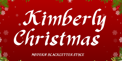 "Kimberly Christmas" is a unique and elegant blakcletter font. This font is equipped with uppercase, lowercase, numerals, punctuation, and multilingual support. Very suitable for Christmas, weddings, Valentine's, winter, engagement, invitations, certificates, stickers, branding, logos, and others.
 - Browser Serif by AVP,
$19.00 Browser Sans is a companion to Browser Sans, sharing similar forms and metrics. The four styles (Regular, Italic, Bold and Bold Italic) make it simple to use in desktop applications and easy to implement on websites.
 - Browser Sans by AVP,
$19.00 Browser Sans is a companion to Browser Serif, sharing similar forms and metrics. The four styles (Regular, Italic, Bold and Bold Italic) make it simple to use in desktop applications and easy to implement on websites.
 - Joker by ParaType,
$30.00 The original sketch of Joker was drawn by Viktor Kharyk in 1978 as experiment on creation type by a method of subtraction. In 2000 the font was digitized, modified and Hebrew, Greek, Georgian, Armenian and Arabi? alphabets and outline style were added. As a display face, Joker allows the creation of decorative compositions, easily combining a vertical and horizontal arrangement of words. Its characters are easy for filling with images. In line the face creates ornamental effect very appropriate for logotype design. The font is good to set small expressive advertising texts also. Joker type family received the third prize at TypeArt 2001 Cyrillic type design competition in Moscow.
 - Vanio by Eko Bimantara,
$24.00 Vanio is a wedge serif font family that crafted with precision, focused on both aesthetic and legibility. The letterforms and other typographic elements are made in a way to achieve optical recognition and fit for various typesetting. Its have a strong serif and spacious width letterforms on the upright styles. Its shown a medium contrast and caligraphic strokes. Its have a moderate vertical heights either at the x-height, caps, ascender or descender. Vanio consist of 10 styles from regular to extrabold with each matching italics. Its contain more than 460 glyphs which support broad latin languages. Also contain several opentype features; Ligature, oldstyle figures, fraction, and other variation of figures.
 - Bookman Old Style by Monotype,
$40.99 The origins of Bookman Old Style lie in the typeface called Oldstyle Antique, designed by A C Phemister circa 1858 for the Miller and Richard foundry in Edinburgh, Scotland. Many American foundries made versions of this type which eventually became known as Bookman. Monotype Bookman Old Style roman is based on earlier Lanston Monotype and ATF models. The italic has been re drawn following the style of the Oldstyle Antique italics of Miller and Richard. Although called Old Style, the near vertical stress of the face puts it into the transitional category. The Bookman Old Style font family is a legible and robust text face.
 - Industria Sans by Resistenza,
$39.00 This a big family called Industria Sans made of 36 cuts. Industria is modular, geometric, with ink traps and a lot of opentype features. We wanted to create a modular sans serif family with a good legibility. If you are working on branding and designing project for large scale identity then this font family is perfect for you. You can a give a bold and strong look to your design projects with Industria Sans. With its strong vertical appearance and soft rounded corners, ink traps Industria Sans is very versatile. Perfect for posters, logos, headlines, branding, blogs and more. With 446 Glyphs More About Opentype Features: https://bit.ly/opentype-rsz
 - ITC Malstock by ITC,
$29.99ITC Malstock is the work of Czech designer Frantisek Storm. The idea is based on a sign painting technique that uses a flat brush and a Maalstok, a long bar with soft padding which is used as a rest for the painter's hand and a guide for vertical lines. The strokes of this font end with a split stem which recalls the traces of the writer's brush. ITC Malstock is a narrow typeface which is ideal for headlines, invitations and advertisements. The designer recommends combining his typeface with others, to create harmony with sans serif typefaces in text sizes or contrast with serif typefaces. - TDL Ruha Hairline by Tipos Das Letras,
$15.00 Ruha Harline is a modern and mechanical serif typeface and is the result of stencil's RUHA development. Being the first typeface of the family, it sets the basic concepts for further development, on each version to come. The design approach, results from a rigid geometrical connection with the Roman du Roi, since the letterforms are imposed by the constraints of the RUHA ruler. The main typographic proportions are connected with the modern typefaces, like Didot or Bodoni. Maintaining the same structure with different typographical and stylistic properties, the stencil allows to explore a modern typeface, with vertical stress, high contrast between the thick and thin strokes and hairline serifs.
 - Dudu by Borutta Group,
$10.00Dudu is a font which I made mainly for my own purposes. A lot of times in many projects I was looking for elegant vertical and modular typeface. There is a lot of fonts that overall look good but if You take a closer look, You can clearly see they have mistakes. That's why I made Dudu. Dudu is a font designed with a highest attention to the detail. Each Dudu glyph has the same modular construction. Dudu Font contains over 400 glyphs ready to use in various languages. I'm also working on a cyrillic version of a Dudu Font which soon is going to be published. - Monocto by Lafonts,
$29.00 Monocto is an upright italic, clearly evidenced by the lowercase letters a, e, f, g, i, k, l, v, w, x, y and several capitals. On one hand, the design is inspired by an historical German running hand written with a pen angle of 45°, and on the other, by rational, utilitarian monospace types, similar to those designed for the mechanical typewriter during the Industrial Revolution. As the writing tool touches the paper, a double-square with broken corners is produced, which then, according to ductus, transforms itself into letter components that are either 90°-verticals or 45°-diagonals. The systematic geometry of Monocto offers unexpected design possibilites.
 - Mailbox Letters JNL by Jeff Levine,
$29.00Many items we use in our day-to-day lives offer wonderful source material for font designs. Mailbox Letters JNL was inspired by a set of self-stick adhesive letters used on mailboxes, doors and other areas of identification at home or in business. Each letter, number and punctuation mark is centered on a black rectangle - just as the actual model for this font. Use it as spaced, or hand set it tighter to form a ribbon with white-on-black text. To provide continuity for the ribbon effect, a blank rectangle is provided on the vertical bar key (the shift position of the backslash key). Limited character set. - Nomos Slab by Identity Letters,
$45.00 What is a brutalist typeface? The exact definition is anyone’s guess. Regardless, the Nomos superfamily is our take on the genre. Like the eponymous architectural style, Nomos is raw, direct, and honest. Its unrefined aesthetics reveal an orderly construction that is as firmly rooted in classic modernism as in the internet age—with simple, functional letterforms and the blunt convergence of diagonal and vertical stems. The low-contrast Nomos Slab subfamily has 18 styles and a set of 1000+ characters. Its tense curves let it shine in contemporary applications such as UI/UX design, AR/VR apps, and multimedia branding everywhere from banking to beverages. Pairs gracefully with Nomos Sans.
 - Agatha by Underground,
$25.00 2015 First Prize TipoType award. Agatha is a new typeface for titles and short texts in big sizes. It can be use both in editorial publishing and brand design. From gothic geometric bases, the letters resemble the Nordic style in order to be more feminine, rhythmical and vertical. The two versions, Regular & Outline, let the designer choose between two contrasts: one heavy version that emphasize the rhythm and a lighter one that intensifies the subtlety. The third version, Blossom, combines light and color with ornaments that highlight the style. The three fonts have in addition a ligature set and some decorative glyphs that increase the possibilities of use.
 - Amaretto by JVB Fonts,
$39.00 AMARETTO, inspired by classic structure of italics, as an original variation of vertical style. Ludovico Arrighi has given us the legacy of classical calligraphic structures that times later lays the foundations of Cancelleresca style and then, the italics as extension of a classic roman serif used in the Renaissance, as main typographic way of expression in Italian printed books. The name Amaretto reminds one of the most representative and delicious liqueur as strong distinctive Italian taste. AMARETTO can be used mainly in titles, long and display texts. Supports East Europe languages. Includes standard and discretionary ligatures, complete small caps, old style numbers, fractions, numerators and denominators and several OpenType features included.
 - Quimera by PampaType,
$19.00A happy, and delicate family, available in 5 weights. Being very legible in small sizes, it pays tribute to French designer Roger Excoffon, particularly to his Antique Olive type. Antique Olive combines two features which inspired the design of Quimera: a large x-height with open counters which ensures legibility at tiny body sizes; and letterforms with a horizontal stress which contradicts the logics of calligraphic tradition (thick verticals, thin horizontals). Quimera has a typical sanserif stroke modulation, but letters have a very thin, capricious serif, which helps to keep the texline's continuity. This 'genetic' contradiction is the reason for its name: Khimera, as it would be a 'sanserif avec'! - Agatha by TipoType,
$25.00 2015 First Prize TipoType award. Agatha is a new typeface for titles and short texts in big sizes. It can be use both in editorial publishing and brand design. From gothic geometric bases, the letters resemble the Nordic style in order to be more feminine, rhythmical and vertical. The two versions, Regular & Outline, let the designer choose between two contrasts: one heavy version that emphasize the rhythm and a lighter one that intensifies the subtlety. The third version, Blossom, combines light and color with ornaments that highlight the style. The three fonts have in addition a ligature set and some decorative glyphs that increase the possibilities of use.
 - Sequel 100 Wide by OGJ Type Design,
$35.00 Sequel 100 Wide is a static sans-serif or neogrotesque with generous horizontal proportions. A variant of the original Sequel Sans, it considerably expands the stylistic scope of the Sequel superfamily. In addition to its wider letterforms, it has got a larger x-height, slightly shifting the historical flavor from the 1950s to the 1960s. Yet, at its core, it’s as clean and functional as the main font family, with perfectly horizontal stroke endings and vertical terminals. Six weights from 45 (Regular) to 95 (Black), matching italics, and limitless possible interpolations by means of two Variable Fonts offer a rich typographic palette for any situation.
 - Fournier by Monotype,
$29.99 Fournier was made by Monotype in 1924. The design is based on types cut by Pierre Simon Fournier circa 1742, some of the most influential designs of the eighteenth century. Fournier's types were among the earliest of the transitional" style of typeface and were a stepping stone to the more severe "modern" style made popular by Bodoni later in the century. They had more vertical emphasis than the old style types, greater contrast between thick and thin strokes and little or no bracketing on the serifs. Fournier has a light, clean look on the page, provides good economy in text and retains an even colour.
 - Ames' Text by Greater Albion Typefounders,
$16.00 Ames’ text is designed for use in its own right and also as a complement to our Ames’ Roman family. Ames’ text is a ‘New-Style’ Didone family offered in three weights and three widths. It is designed to embody clarity combined with contrast between horizontal and vertical strokes, but with sufficient stroke width in both directions to display well at small point sizes. All typefaces include small capital forms, new and old style numerals (and ‘small capital’ numerals for consistency). Ames’ text is distinctive enough for use in headings and titles, but comes into it own as a text face. Keep a lookout for our forthcoming Ames Display faces…
 - Recherche by Laura Worthington,
$29.00 Recherche means “studied refinement or elegance” and suits this typeface perfectly. Based on italic, calligraphic letterforms, its long, arking verticals and oval counters convey airy sophistication. Recherche is packed with swashy alternates, making it easy to create unique settings and wordmarks for menus, wine labels, wedding invitations, and more. It includes a full set of swash capital letters and 89 lowercase swashes. See what’s included! http://bit.ly/2bUYhqk *NOTE* Basic versions DO NOT include swashes, alternates or ornaments This font has been specially coded for access of all the swashes, alternates and ornaments without the need for professional design software! Info and instructions here: http://lauraworthingtontype.com/faqs/
 - Motiva Sans by Plau,
$20.00 Motiva Sans is the chosen typeface for Valve’s Steam OS, a 125.000.000+ users gaming platform. With 7 weights and matching italics (a total of 14 fonts), it comes with essential OpenType features such as small caps, caps to small caps, tabular, lining, oldstyle figures, fractions as well as extended language support and alternate characters in the italic weights. It performs well in printed and digital environments. The italics are more cursive than the average sans serif design and provide very good contrast to the their roman counterparts. Motiva Sans pairs beautifully with our high-contrast didone serif Tenez or with our cute vertically connected script Primot.
 - Virna by FSD,
$60.00In September, 2003 I was contacted by MTV for the restyling of mtv.it I started from the beginning to work on a radical simplification of its visual elements, to achieve a better usability. It didn't take me so much to realize the basic design I attempted would have called for a notable reduction of the rich imagery distinguishing MTV's visual identity. As a visual aid to help me in this process I designed Virna, a headline "op-art" inspired face with the ability to create both vertical and horizontal ligatures between single words among two text lines, with the same ease of linking letters in handwriting or a linked script typeface. - Scatio by Wahyu and Sani Co.,
$16.00 Scatio is squarish with vertical terminal cut, a multi-purpose sans serif which can be use for many kind of graphic design projects. The Light, Regular and Medium weight have good legibility for text, the bolder and lighter weights can be used for headlines, display, posters, and more. Each members of the Scatio family contains 400+ glyphs which covers Western and Eastern Latin based languages. Each font is also equipped with some useful OpenType Features, such as: Fraction (frac) Numerator (numr) Denominator(dnom) Standard Ligatures (liga) Localized Forms (locl) Ordinals (ordn) Proportional and Tabular Lining (pnum & tnum) Superscript and Subscript (sups & subs) Scientific Inferior (sinf)
 - Bookman Old Style Paneuropean by Monotype,
$92.99The origins of Bookman Old Style lie in the typeface called Oldstyle Antique, designed by A C Phemister circa 1858 for the Miller and Richard foundry in Edinburgh, Scotland. Many American foundries made versions of this type which eventually became known as Bookman. Monotype Bookman Old Style roman is based on earlier Lanston Monotype and ATF models. The italic has been re drawn following the style of the Oldstyle Antique italics of Miller and Richard. Although called Old Style, the near vertical stress of the face puts it into the transitional category. The Bookman Old Style font family is a legible and robust text face. - Goudy Trajan Pro by CastleType,
$59.00 Goudy Trajan Pro is based on the drawings by F.W. Goudy of his rendition of the capital letters inscribed on the Trajan column in Rome, rather than on his subsequent metal type, Trajan (Title), released in 1930. Goudy Trajan Pro includes almost 1500 glyphs in each of three weights, including: uppercase, alternates, swash caps, small caps, vertically centered small(er) caps, dozens of fleurons, and much more. Supports Latin, Cyrillic and modern Greek scripts. Many thanks to Krassen Krestev, Sergiy Tkachenko, and Adam Twardoch for their suggestions for improving the Cyrillic glyphs; and to Alex Sheldon for his suggestions for swash caps and improved OpenType features.
 - Batrider by Runsell Type,
$16.00 Batrider is a Script Display font inspired by vintage lettering in old labels. It comes in two style: regular and textured. Batrider textured contains rounded corner and authentic textured for an organic printing look. Carefully made with perfectly horizontal vertical bezier handles. Every single letter contains beautiful alternates characters (stylistic set 1 - stylistic set 16) and features ligatures. Batrider is great for designs such as the logotypes, packaging, branding, quotes, business cards and more custom design. The features are uppercase, lowercase, numeral, punctuation and symbols, ligatures, alternates, multi-lingual support, PUA encoded. How to get access alternate glyphs with designing software to open type fonts, click here.
 - Show Card Stencil JNL by Jeff Levine,
$29.00 For decades, the National Show Card Writer Company of Minneapolis, MN produced sign making kits used by shopkeepers, schools, churches and many other types of organizations. The standard sets were comprised of two part stencils that when overlaid, produced finished lettering, or a buyer could choose the same type style designs with a standard stencil letter. From one of these templates comes Show Card Stencil JNL, in both regular and oblique versions. Take note that the U, V and W have the heavier vertical strokes reversed. As this was the way the original stencil design was manufactured, it has been retained for this digital type as well.
 - Cambria Math by Microsoft Corporation,
$49.00OpenType Layout features: smallcaps, stylistic alternates, localized forms, standard ligatures, uppercase-sensitive forms and spacing, oldstyle figures, lining figures, smallcap figures, arbitrary fractions, superscript, subscript. Cambria has been designed for on-screen reading and to look good when printed at small sizes. It has very even spacing and proportions. Diagonal and vertical hairlines and serifs are relatively strong, while horizontal serifs are small and intended to emphasize stroke endings rather than stand out themselves. This principle is most noticeable in the italics, where the lowercase characters are subdued in style, to be at their best as elements of word-images. This font is suitable for business documents, email, web design. - Zega Grot by Isaco Type,
$24.00 Celebrate good times with Zega Grot family! This font is the companion of Zega Text but less “serious” than its predecessor. The Grot version has old vertical proportions, with higher capitals and asc-descenders, height difference between capitals and ascenders, beyond the redesign of various glyphs, giving a less formal tone, more rounded and cheerful. The family consists of 14 styles, 7 weights plus their respective italic versions. The fonts are available in OpenType PS and have extended character set to support CE, Baltic, Turkish as well as Western European languages. You can test Zega downloading the free trial font in Extrabold version (TT only).
 - Tighten - Personal use only

- Roosevelt - Unknown license

- AnglosaxOblique - 100% free

- Hassan by Linotype,
$187.99Hassan is a traditional-style Arabic text face designed by Hassan Sobhi Mourad, an experienced calligrapher and teacher of the art and first produced by the Linotype Design Studio (U.K.) as a PostScript font in 1993. An individual Naskh style, Hassan cleverly combines elegant proportions, echoing an inscriptional Thuluth in its tall vertical stems and deeply rounded final jim and ain. The effect of verticality is enhanced by the tense, reined-in kerning strokes of ra and waw, the well-poised lam-alif, and the compactly drawn ligatures. The broad-band strokes of Hassan Bold smooth some of the angularity and relax the tension apparent in the Light. The traditional-style ligatures are rendered with an easy flow. Because of the economical character count, Hassan Light and Bold text may be headed by the compact titling styles (Hisham, Mariam) as well as designs like Ahmed or Kufi which answer to the inscriptional qualities of Hassan. In addition to other uses, Hassan would be particularly suited to document text-setting. Hassan’s two OpenType weights include Latin glyphs from Janson Text Roman, and Janson Text Bold, respectively, inside the font files, allowing a single font to set text in both most Western European and Arabic languages. The OpenType glyph ranges incorporate Basic Latin and the Arabic character set, which supports Arabic, Persian, and Urdu. The fonts include tabular and proportional Arabic, Persian, and Urdu numerals, as well as a set of tabular European (Latin) numerals. - Festivo LC by Ahmet Altun,
$19.00 With the lowercases of Festivo Letters Font Family, Festivo LC comes with new sketches, new shadows and also ornaments. Festivo LC Font Family is a handmade layered font which includes several textures and shadows. Different font types can be created using various combinations of Festivo LC Fonts and colors. The kernings and the metrics of Festivo LC Fonts are not the same as Festivo Letters' kernings and metrics. It is advised not to use them together. The various possibilities of the Festivo Font Family allows you to create a lot of great works such as posters, magazines, printings, t-shirts etc.


