10,000 search results
(0.621 seconds)
- He's Dead Jim - Unknown license

- Care Bear Family - Unknown license

- brown bear funk - Unknown license

- F*ck Beans - 100% free

- Hemi Head 426 - Unknown license

- Dead Letter Office - Unknown license

- Samba is Dead - Unknown license

- KR Angel Bear - Unknown license

- Beam Rider 3D - Unknown license

- Beat My Guest - Unknown license

- Beam Rider Italic - Unknown license

- Feldicouth Italic Bend - Unknown license

- Beam Rider Laser - Unknown license

- KR Original Bean - Unknown license

- Beam Rider Laser - Unknown license

- Beam Rider Condensed - Unknown license

- Kiss Me Dead by PizzaDude.dk,
$20.00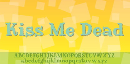
- Coffee Beans Time by TypoGraphicDesign,
$9.00 The typeface Coffee Beans Time is designed from 2018–2022 for the font foundry Typo Graphic Design by Manuel Viergutz and Annelena Grascht as a graphic design and photography project. The display font based on the original coffee beans and create a dingbat pattern. 3 font-styles (Dingbats, Mix, Coffee Ground) with 304 glyphs (Adobe Latin 2) incl. decorative extras like icons, arrows, dingbats, emojis, symbols, geometric shapes (type the word #LOVE for ♥︎ or #SMILE for ☺ as OpenType-Feature dlig) and stylistic alternates (2 stylistic sets). For use in logos, magazines, posters, advertisement plus as webfont for decorative headlines. The font works best for display size. Have fun with this font & use the DEMO-FONT (with reduced glyph-set) FOR FREE! ■ Font Name: Coffee Beans Time ■ Font Styles: 3 (Dingbats, Mix, Ground) + DEMO (with reduced glyph-set) ■ Font Category: Display for headline size ■ Glyph Set: 304 glyphs (Adobe Latin 2) incl. extras like icons (decorative extras like arrows, dingbats, emojis, symbols) ■ 93 languages: Afrikaans Albanian Asu Basque Bemba Bena Breton Catalan Chiga Cornish Danish Dutch English Estonian Faroese Filipino Finnish French Friulian Galician German Gusii Indonesian Irish Italian Kabuverdianu Kalenjin Kinyarwanda Luo Luxembourgish Luyia Machame Makhuwa-Meetto Makonde Malagasy Manx Morisyen North Ndebele Norwegian Bokmål Norwegian Nynorsk Nyankole Oromo Portuguese Quechua Romansh Rombo Rundi Rwa Samburu Sango Sangu Scottish Gaelic Sena Shambala Shona Soga Somali Spanish Swahili Swedish Swiss German Taita Teso Uzbek (Latin) Volapük Vunjo Welsh Western Frisian Zulu ■ Design Date: 2018–2022 ■ Type Designer: Manuel Viergutz und Annelena Grascht
 - H74 Dead Empire by Hydro74,
$7.99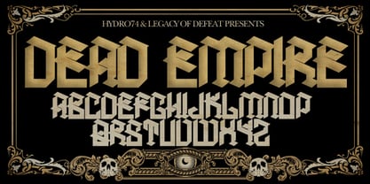
- Dead Wood Rustic by Intellecta Design,
$26.90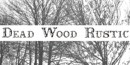
- Millrich Reading NF by Nick's Fonts,
$10.00The 1918 specimen book of the Miller and Richard Type Foundry of London and Edinburgh featured this endearing typeface. Both versions of this font include the complete Latin 1252 and Central European 1250 character sets, as well as a very tasty f_f_i ligature. - Joy Of Reading by Typephases,
$25.00The theme in these illustrations is the pleasure of books and reading wherever you are, at any time. This series collects illustrations of people enjoying the pleasure of reading in the most diverse places and situations, some of them frankly absurd and funny, ranging from children reading tales to a witch with her magic brewing manual. A fraction of the contained images comes from other Whimbats, but most of them are exclusive. We hope you will feel like reading and start reading a good book! These illustrations are ready to use at any size and in any application (their vectorial format ensures they can be scaled to any size with no loss of sharpness). They can be used out of the box, or easily customized in any graphics program, adding colour or texture, resizing, combining... the variety of suggested uses is huge, from small spot illustrations to full-page layouts. Use them to great effect in magazine spreads, advertisements, stationery, packaging, bulletins or poster creative designs. - Archive Copperplate Head by Archive Type,
$19.95Engraved shaded display typeface. - Super Head Club by Fonts of Chaos,
$10.00 Super head Club is a font made with line. The shape of the letters is a sans-serif style round and bold. Works perfectly for vintage artworks.
 - Drop Dead Gorgeous by Hanoded,
$22.00 Drop Dead Gorgeous is a slightly slanted all caps Brush font. I made it with the last of my Chinese ink (I ordered a new batch, it should arrive tomorrow). Drop Dead Gorgeous is a very legible font, ideal for headlines, posters and book covers. Comes with alternates for lower case letters and a truly breathtaking amount of diacritics.
 - Quick Or Dead by Vozzy,
$5.00 A vintage look layered label font named "Quick or Dead". This font was inspired by American wild west history. The family includes six styles (including effect styles), for sample look at preview. This font will good viewed on any retro design like poster, t-shirt, label, logo etc. For using effects layers: - Type your text in Regular. - Copy that and paste at the same position. - Change the style to Shadow or Texture. Alternates and catchwords: - Capital letters are different than small (look to the preview). - Several small letters have alternates (look to the preview). - For the catchwords type the word (for sample 'with'), select that and turn on 'Discretionary Ligatures' on the 'OpenType' tab. Or paste it from 'Glyphs' tab in any place on your text. This in Illustrator. In Photoshop 'Discretionary Ligatures' you can find in the menu Type - OpenType.
 - GR Read Family by Garisman Studio,
$20.00 GR Read is a very cool font for headline designs with a bold and bold theme. With a strong display and clean nodes make text in the design become more character and great. Inspired by headline trends in a poster or magazine today. So that with a firm and a very modern style makes your design better! This font is formed from the headline display font of a very careful title. GR Read has about 350 flying machines. Suitable for all graphic design projects, prints, logos, posters, t-shirts, packaging, website, ticket and applies to several types of graphic design. Especially for the use of a title! Very suitable! GR Read is compatible with any software without pain, especially in headlines with GR Read pairing
 - FP Head Pro by Fontpartners,
$29.00 Architectural yet human, as if the letter forms had been delicately carved in stone; their rounded stroke edges and corners lovingly eroded by the surf of the Baltic Sea; slightly overexposed, radiating comforting warmth, giving the impression one was looking at the characters against the setting sun. FP Head Pro reviewed by Yves Peters and Typographica.org: One of the most noteworthy typefaces for 2008.
 - The Reading Display by Great Studio,
$19.00 The Reading Display is a new editorial serif with all clean and soft lines, tight curves, and a trendy elegant look. The Reading Display has two versions of the font, namely Regular Serif & Condensed Serif which are equipped with an italic version style, very suitable for your design needs such as very suitable for creating nostalgic designs but still clean and elegant such as headlines, magazines, logos, packaging, editorial, and so on. much more. Cheers, Great Studio
 - Dead Rite PB by Pink Broccoli,
$14.00 A beefy unicase flare serif typeface inspired by a Frank Kane pulp paperback of the same name. Dead Rite is filled with awkward comic personality, mixing Capital and lowercase forms into a pseudo-unicase format that is a joy to play. A dangerous temptress, with large scale easily legible letterforms, this typographic conundrum is waiting for you to solve how it should be used for your designs!
 - Nouveau Heading JNL by Jeff Levine,
$29.00 Some pleasant Art Nouveau spurred serif hand lettering was found on the cover of a 1902 issue of “The Century Magazine”. This is now the digital typeface Nouveau Heading JNL, and is available in both regular and oblique versions.
 - MC Hork Beans by Maulana Creative,
$22.00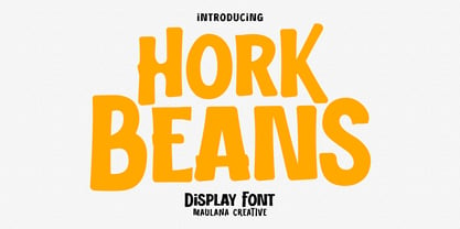 Hork Beans is a simply casual handwritten font. With medium low contrast stroke, fun character with a bit of ligatures and alternates. To give you an extra creative work. Hork Beans font support multilingual more than 100+ language. This font is good for logo design, Social media, Movie Titles, Books Titles, a short text even a long text letter and good for your secondary text font with sans or serif. Make a stunning work with Hork Beans font. Cheers, Maulana Creative
 - FF Real Head by FontFont,
$50.99 FF Real is a convincing re-interpretation of the German grotesque style from between 1998 and 1908, but with much more warmth and improved legibility as well as a hint towards the warmer American grotesques. Later on, not just slanted styles, but a “proper” italic version was added inspired by the way Roman and Italic are distinguished in traditional serif faces. NEW: a specially created set of obliques were added in 2018 to give designers more design flexibility, for those looking for a less calligraphic look. In 2020 the family was extended with matching condensed weights. FF Real was originally conceived by Erik Spiekermann as one text weight and one headline weight to be used as the only faces in his biography ‘Hello I am Erik’, edited by Johannes Erler, published in 2014. While Spiekermann drew the alphabets, he passed on the font data to Ralph du Carrois and Anja Meiners who cleaned it up and completed it. In the meantime, FF Real has been extended to a family of two styles and 65 weights each. The design of FF Real is rooted in early static grotesques from the turn of the century. Several German type foundries – among them the Berlin-based foundries Theinhardt and H. Berthold AG – released such designs between 1898 and 1908. The semi-bold weight of a poster-size typeface that was lighter than most of the according semi-bolds in metal type at the time, gave the impetus to FF Real’s regular weight. In the words of Spiekermann, the historical example is “the real, non-fake version, as it were, the royal sans serif face“, thus giving his new typeface the name “Real” (which is also in keeping with his four-letter names, i.e. FF Meta, FF Unit). FF Real is a convincing re-interpretation of the German grotesque style, but with much more warmth and improved legibility. With a hint towards the warmer American grotesques, Spiekermann added those typical Anglo-American features such as a three-story ‘g’ and an ‘8’ with a more defined loop. To better distinguish characters in small text sizes, FF Real Text comes in old style figures, ‘f’ and ‘t’ are wider, the capital ‘I’ is equipped with serifs, as is the lowercase ‘l’. What’s more, i-dots and all punctuation are round.
 - Dead Elder Metal by Studio Hello Good,
$45.00 Dead Elder is a font that embodies the raw, visceral essence of death metal in every stroke and curve. With an astonishing array of 952 meticulously crafted glyphs, this font unleashes a dark, otherworldly energy that is perfect for conveying the macabre and relentless intensity of the death metal genre.
 - Bread And Confectionery by Edyta Demurat,
$28.00 This is a modern icon set with geometric shapes. A tasty set for the creation of the visual identity of shops, restaurants or bars. Thanks to its simplicity it will be perfect for printed and online materials. Baobaby Studio prepared an entire delicious set specially for you. Apart from “Bread and Confectionery”, our offer also includes Dairy, Vegetables, Meat and Seafood and Fruits. Everything in one style. Mix and match as you see fit. Bon appetit!
 - Beat Poet JNL by Jeff Levine,
$29.00 Beat Poet JNL is a throwback to the late 50s and early 60s when Beatniks hung out at coffee houses to listen to poetry and folk songs and live the Bohemian lifestyle of the Pre-Hippie generation.
 - LT Bread Medium - 100% free

- Doing by Graphicxell,
$19.00 This typeface encapsulates a rhythm that is symmetrical and balanced due to a unique mix of different sources of inspiration. Proportions are precisely adjusted with subtle contours and subtle contrasts. These shapes give the font an attractive look without compromising on elegance and minimalism, ensuring that any glyph will work well in any graphic design purpose such as brochures, videos, advertising branding, logos, magazines, layout designs, posters, post templates, games and others
 - Preferred Shares JNL by Jeff Levine,
$29.00 A bold, condensed slab serif face A July 9, 1935 trade paper ad for Paramount Pictures’ 1st quarter film releases sported hand lettering with chamfered slab serifs. This condensed type design is now available as Preferred Shares JNL in both regular and oblique versions.
 - Do not eat this Fat Italic - Unknown license


