10,000 search results
(0.462 seconds)
- FS Elliot by Fontsmith,
$80.00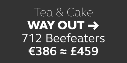 Rooted Rooted in 1960s Brit modernism and infused with a fresh, contemporary spirit, FS Elliot is a future-proof, workhorse sans serif, well-suited to any assignment. Open and harmonious, its clear, fluid shapes lend words a distinctive and optimistic bounce. Britishness FS Elliot came out of a desire to create something squarely in the British modernist tradition, drawing on influences such as Design Research Unit’s portfolio of type for famous British brands and products, and Margaret Calvert and Jock Kinneir’s work on the British road sign system. Nick Job took the openness and simplicity of that style and injected warmth and wide appeal, coming up with a highly practical, multi-purpose family of faces. Enduring appeal “The great thing about having an eye on the future,” says designer Nick Job, “is that most of it is unknown. It’s what encourages us to take risks. And it leaves an uncertainty which, I believe, gives the best work its enduring appeal.” FS Elliot is available in a Pro version with full language support and a full range of Roman, Cyrillic and Greek weights.
 - Carey Castle by Putracetol,
$24.00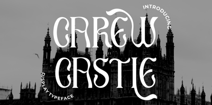 Introducing Carew Castle, a new display sans font inspired by luxury displays from classic book covers and combined with an elegant typeface style. With a total of 291 glyphs, this font offers endless display combinations for your lettering needs. Carew Castle comes packed with open type features, including numerous alternates and end swashes, to help you create amazing lettering. The font also supports multiple languages, making it a versatile choice for a wide range of design projects. Carew Castle is best used for logotypes, headings, covers, posters, logos, quotes, product packaging, headers, merchandise, social media, greeting cards, and more. To access the alternate glyphs, you will need a program that supports OpenType features, such as Adobe Illustrator CS, Adobe Photoshop CC, Adobe InDesign, or CorelDRAW. The zip package includes Carew Castle in otf, ttf, and woff formats, and comes with a range of features, including uppercase and lowercase letters, opentype alternates and ligatures, numbers, punctuation and symbols, and multilanguage support. Thanks for choosing Carew Castle - we can't wait to see what amazing designs you create
 - Sticky Written by Yumna Type,
$16.00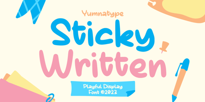 Sticky Written is a round, soft display font expressing funny, cute, fun nuances in every design. The letters look like soap bubbles flying around in the air in flowing shapes and balanced proportions. The Sticky Written font will live up and charm your designs in order to suggest positive and cute vibes to your target audience. You can apply this font, which provides a clipart as a bonus, for big text sizes to make it more legible and attractive. In addition, you can make use of some available features here. Features: Multilingual Supports PUA Encoded Numerals and Punctuations Sticky Written fits best for various design projects, such as brandings, headings, magazine covers, quotes, printed products, merchandise, social media, etc. Find out more ways to use this font by taking a look at the font preview. Thanks for purchasing our fonts. Hopefully, you have a great time using our font. Feel free to contact us anytime for further information or when you have trouble with the font. Thanks a lot and happy designing.
 - Brush Drops by Ditatype,
$29.00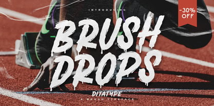 Brush Drops is a modern, impressive font that mixes the brush script characteristics and lovely, smooth ink drop details. This capital letter font shows stronger, more elegant displays. The letter shapes are in soft and smooth brush wipes with even edge lines to show firmer, clearer impressions. Furthermore, the ink drop details show personal, interesting touch on some of the letter parts. Bright, contrast colors will make this font outstanding and eye-catching. In addition, you may apply it for big text sizes to be greatly legible, and enjoy the available features here as well. Features: Multilingual Supports PUA Encoded Numerals and Punctuations Brush Drops fits best for various design projects, such as brandings, quotes, printed products, merchandise, social media, etc. Find out more ways to use this font by taking a look at the font preview. Thanks for purchasing our fonts. Hopefully, you have a great time using our font. Feel free to contact us anytime for further information or when you have trouble with the font. Thanks a lot and happy designing.
 - Black History by Ditatype,
$29.00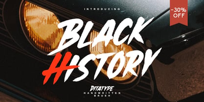 Black History is a handwriting script font to express personal, artistic nuances and is made in brush designs to produce casual and natural displays. The thick letter weight will show bolder impressions and emphasize the desired elements in the design. Combination of low contrasts, when the bright and the dark parts of the letters are not very significant, will create smooth effects. Unlike the other handwriting fonts, Black History’s letters are not always interconnected to each other. Furthermore, you can apply this font for big text sizes to be greatly legible and also enjoy the available features here. Features: Multilingual Supports PUA Encoded Numerals and Punctuations Black History fits best for various design projects, such as brandings, headings, magazine covers, quotes, printed products, merchandise, social media, etc. Find out more ways to use this font by taking a look at the font preview. Thanks for purchasing our fonts. Hopefully, you have a great time using our font. Feel free to contact us anytime for further information or when you have trouble with the font. Thanks a lot and happy designing.
 - Didot LP by LetterPerfect,
$39.00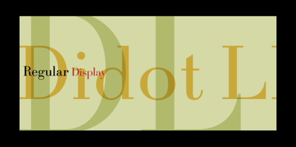 Didot LP is a very elegant rendition of the 18th-century French typeface -- Didot. This design took the earlier Italian neo-classical model (Bodoni) to a new level of refinement, with fully rationalized shapes and delicate hairlines. Didot LP accentuates these qualities, providing a classical text face with a clear and modern voice. The companion face -- Didot LP Display -- optimizes the proportions, spacing and hairlines for use at very large sizes.
 - Sheik Of Araby NF by Nick's Fonts,
$10.00This unusual penscript is based on letterforms discovered in the classic Zanerian Manual of Alphabets and Engrossing. The economy and the sinuous quality of the pen strokes, combined with the severe backslant, suggest--without mimicking--the grace and beauty of fine Arabic calligraphy. The Opentype, Truetype and Windows Postscript versions of this font contain both the Windows 1252/ANSI character set and the 1250/Central European character set. - Doric by Linotype,
$29.99Originally released by the Stephenson Blake foundry in England, Doric is modeled on one of the sans serifs of William Caslon IV, who was the first to interpret sans serif letterforms into a typeface (1816). Doric Bold has large, heavy capitals with uniform letter widths. It is often used for classified advertising in newspapers because these qualities coupled with a large x-height allow greater legibility at small point sizes. - Black Bamboo by Hanoded,
$15.00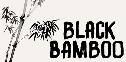 Black Bamboo is a beautiful plant. My father in law, who recently passed away, loved it and had a prized specimen growing in his garden. This font was named in his honour. Black Bamboo font is a bold typeface, created using a good brush and quality paint. It is all caps, but upper and lower case differ and can be freely interchanged. Of course, Black Bamboo comes with all diacritics.
 - Valibuk by Juraj Chrastina,
$39.00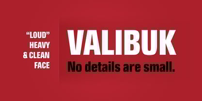 Valibuk is a compact clean typeface for headlines and short text. No details are small and it’s a bunch of details that make Valibuk as it is. It’s a heavy, condensed face with a high x-height and tight spacing and that’s why Valibuk can write loud. The quality of the spacing and kerning is ensured by Igino Marini. Lomidrevo is a grunge stencil family derived from Valibuk.
 - Morgana by Krismagraph,
$17.00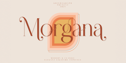 Hello, Start good day for new font! present to you, Morgana! A unique modern & classic ligature font that is a mix of old and new. It's soft curves mixed with high contrast glyphs lend it self to both feminine and masculine qualities. Equipped with epic ligature, great in layout design for quotes or body copy, and will be unique to the use of the logo design. And also multilingual support.
 - Nadia by Type Innovations,
$39.00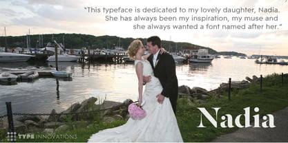 Nadia is an original design by Alex Kaczun. It is a modern stencil interpretation of Granjon Oldstyle, highlighted by large elongated serifs, generous proportions and a large x-height. It is an elegant display for headlines as well as text. Named after his daughter, Nadia has a distinctively vibrant and baroque quality which some would even call sensuous. It’s a truly unique stencil treatment characterized by crisp, clean, rounded shapes.
 - Botany by Adam Ladd,
$25.00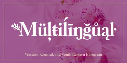 Botany is a distinct, hand-drawn display font with flourish designed to be unique and beautiful, yet functional — carefully drawn for quality but still rough enough to display the handmade, textured appearance. Capitals evoke a natural elegance and grab attention. Botany is great for display, branding, logos, packaging, titles, and more. Botany features: display (flourish) and text styles; regular and italic styles; flourish stylistic alternates; closed counter stylistic alternates.
 - Painter by Mans Greback,
$59.00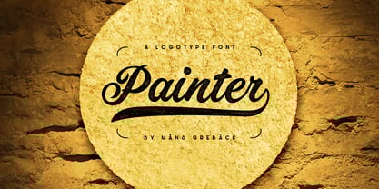 Painter is a bold script font, with wide and wet brush strokes. It is articulate and clean, holds a high quality and comes with many features. Some of them are contextual and stylistic alternates, support for hundreds of languages, ligatures and a lot of special characters. The typeface is created by Måns Grebäck and works great for logotypes and other graphics that require a confident, handcrafted impression. Use > or < after a word to add a swash effect. Example: Painter>
 - TD Neuth by Tribox Design,
$9.00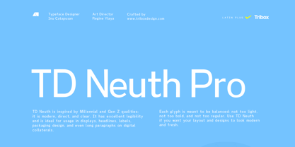 TD Neuth is inspired by Millennial and Gen Z qualities; it is modern, direct, and clear. It has excellent legibility and is ideal for usage in displays, headlines, labels, packaging design, and even long paragraphs on digital collaterals. Each glyph is meant to be balanced: not too light, not too bold, and not too regular. Use TD Neuth if you want your layout and designs to look modern and fresh.
 - Allen Keys by Letters&Numbers,
$18.00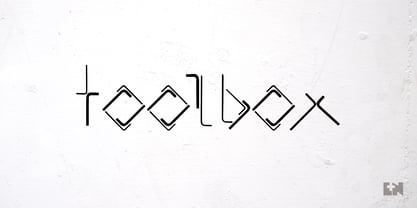 Rummaging through the toolbox recently, I was surprised by how many allen keys I had from years of assembling flat-pack furniture. After some experimenting with the keys to make up individual letters I was struck by their graphic quality. The typeface is defined by the slim, right-angled shape of the allen key; creating a geometrical, yet playful font. The typeface is suitable for logos and feature headings.
 - Linoscript by Linotype,
$29.99Linoscript was designed in 1905 by Morris Fuller Benton and displays the strong stroke contrasts of broken letter and the flowing quality of handwriting fonts of the 17th and 18th centuries. The font suggests a school book typeface common at the turn of the 20th century. Linoscript is suited for middle length texts and headlines, while its capitals can also be used as initials mixed with other alphabets. - Farm Girl by Open Window,
$19.95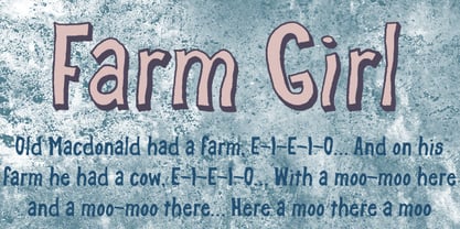 From the lab of Open Window comes Farm Girl. Farm Girl was inspired by old Art Nouveau posters from Toulouse Lautrec and others. Farm Girl utilizes the same 'loosey-goosey' quality as those posters. Farm Girl consists of 3 different styles which are designed to be used in combination with each other. Many different variations are possible. It's fresh cut and contemporary. It's ideal use is as a display font.
 - Satinado by AlexBlogoodf,
$6.00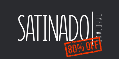 This typeface was designed specifically for your project. No matter what you create, this font is perfect for your design. A magnificent combination of lines and proportions creates a stunning and modern design. Created with passion to deliver the highest quality product. I hope that this font will help you in your work and you will create truly something unique. Latin and Cyrillic alphabets Multilingual Ligatures 555 glyphs
 - Writer Autograph by Smartfont,
$16.00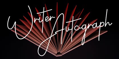 Writer Autograph font is inspired by writers and heroes. This family contains uppercase and lowercase glyphs alongside a large range of punctuation, symbols, numerals, and multilingual support. There are two weights - regular and bold - and built in OpenType kerning features for a professional touch. This font is perfect for creating slick & stylish lettering. Whether for logos, product packaging or merchandise, Writer Autograph is guaranteed to give your text an unmistakeable quality.
 - Taku by Thinkdust,
$10.00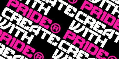 Taku comes in two styles, Taku regular and Taku Solid. As one of the most creative faces to date, this is a beautiful piece aimed at a whole range of markets for print and digital work. Super creative, extremely eye catching, and almost obsessively accurate. Taku is a typographers dream, over 300 hours of work on aesthetics and technical details, so you can expect the most high quality typeface around.
 - Foxglove by Set Sail Studios,
$14.00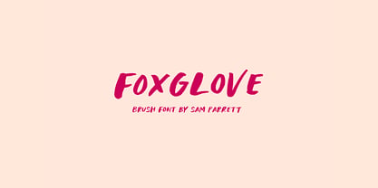 Foxglove is a playful, minimal brush font designed to add a personal, charming quality to quotes, branding, promotional images and product designs. Foxglove contains two sets of uppercase characters, you can switch between these simply by turning your caps-lock on & off. Contains language support for; English, French, Italian, Spanish, Portuguese, German, Swedish, Norwegian, Danish, Dutch, Finnish, Indonesian, Malay, Hungarian, Polish, Croatian, Turkish, Romanian, Czech, Latvian, Lithuanian, Slovak, Slovenian.
 - Asyatu by Twinletter,
$15.00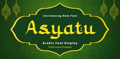 Asyatu Arabic style font. These fonts are not only useful and beautiful. They are also well made. Our designers work hard to ensure the quality of each font is similar to that of a professional calligrapher. This font is perfect for you whether you are designing Islamic greeting cards for your friends’ weddings. Invitations for big events like engagement parties or birthday parties, as well as your various special projects.
 - Negotiate Free - Unknown license

- Dickybird Doodles by Outside the Line,
$19.00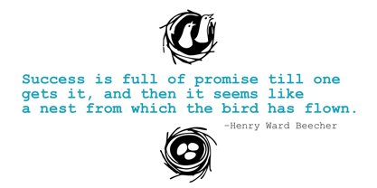 Dickybird Doodles? A dickybird is an ordinary bird, not a raptor or game bird. This illustration font has 32 of them. Birds in a cage, on a wire, in a nest. A flamingo, toucan, sandpiper, cardinal, penguin, heron, chicken & rooster, hummingbird, swan. Some line, some reverse and one with polka dots.
 - Thanks by Monotype,
$15.99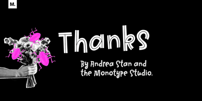 Designed by Romanian lettering artist Andrea Stan, Thanks is a contemporary script packed full of quirky shapes, bouncy baselines and uneven letter heights. This makes Thanks a truly fun and friendly design (Oh and also very polite!). This off-beat font is Bold, monolinear and has a subtle inline twist.
 - Checkout by Hanoded,
$15.00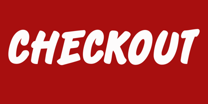 Checkout is a fat, slightly cursive, poster font. It was modeled after 'clearance sale' signs and a 1950 Mexican movie poster for Los Olvidados (directed by Luis Buñuel). Checkout can be used for headlines, posters and, of course, for your clearance sale! Comes with a hard-to-beat amount of diacritics.
 - Naroid Initials JNL by Jeff Levine,
$29.00Naroid Initials JNL is one of the most ultra-compressed sets of initials available in digital type. These twenty-six initials are so narrow that a test print with all of the letters at 2-1/2 inches in height took up no more than about 5 inches in width! - Stylized Deco JNL by Jeff Levine,
$29.00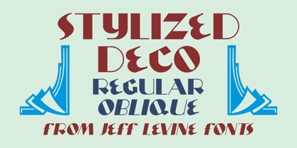 In their book "Lettering of Today" by W. Ben and Ed C. Hunt, an Art Deco "thick and thin" alphabet with some stylized characters (which leaned a lot toward a calligraphic style) stood out from the rest. This is now available as Stylized Deco JNL, in both regular and oblique versions.
 - Natom Pro Variable by Mostardesign,
$66.00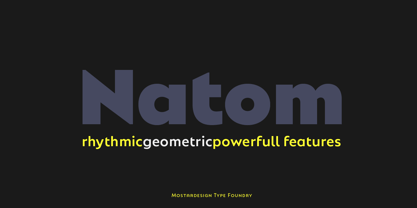 Pour ceux qui souhaitent utiliser la famille de fontes Natom Pro en version variable, cette famille se décline en 3 fichiers avec la Roman, la Roman italic et la version Title.
 - Marzo by Sudtipos,
$39.00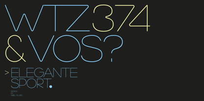 Marzo is a monoline, minimalist, modern typeface, that tries to take its forms to a state of natural purity, definitively elegant. Designed by Ariel Di Lisio and digitized by Alejandro Paul.
 - The font named Not Quite Right BRK by AEnigma is a distinctive and characterful typeface that embodies a unique blend of quirkiness and legibility. This semi-novelty font, designed by the prolific fo...
- Rock ‘n Roller is a dynamic and charismatic typeface that captures the rebellious spirit and energetic beat of rock and roll music. Its design is inspired by the vibrant aesthetics of rock culture, b...
- Freigeist by René Bieder,
$29.00 The story of Freigeist is a journey into the past, back to the early grotesk fonts and long before Helvetica and Co were standard fonts in operating systems. For what we take for granted today is the result of innovation and pioneering spirit of type foundries such as Caslon or Stephenson Blake in the 19th century, whose expressive designs are mostly forgotten today. The Freigeist family captures this untamed spirit — hence the name (German for “free spirit”) — and puts it into a contemporary context, resulting in a multi-faceted family with a wide range of applications, font styles and features for modern typesetting. Design Details Unlike other modern grotesk typefaces like Helvetica or Univers, Freigeist is characterized by a warm and dynamic appearance. It draws inspiration from various historical models such as Caslon’s Doric or the Grotesque variants of Stephenson Blake. Particularly noticeable are the narrow terminals, the serpentine S or the dynamic g in combination with ascenders that reach to the cap-height only. Italics Many italic grotesk fonts are strongly oriented towards their upright counterparts. Unfortunately, this often means that they cannot do justice to their actual task, which is to highlight words or sections of a text. The italic cuts of Freigeist try to remedy this situation by using the greatest possible formal distance while reinforcing the untamed spirit. What adds to this, is a reminiscent of handwritten forms, which can be found in a, n, y or g, as well as the German sharp s or the ampersand. Alternate Characters Alternative letterforms are ideal for customizing the overall appearance of a text, for usage in logos or they can even work as custom fonts for companies. Freigeist comes with ten stylistic alternatives that are easy to insert via the Opentype window, such as the single-storey a, a tail-less version of the a for compact text, when uses in condensed widths or a dialed down version of the r. Languages Freigeist has a built-in support for Latin and Cyrillic based languages and covers more than 210 languages. Opentype Features and Symbols The family comes with many opentype features to support modern typesetting. This includes ligatures, different number sets or alternative shapes for texts set in all caps. Styles Freigeist is available in five widths (XCon, Con, Normal, Wide, XWide) and six weights (Thin, Light, Regular, Medium, Bold, Black). Including the accompanying italics, the family comes in 60 cuts that are suitable for any application. Testfonts If you like to test the fonts before buying the full version, please follow the link below: https://www.renebieder.com/test-fonts Update 1 A lot has changed in this first update. It is more than just a 1.01 or 1.02. It is actually the 2.0! I’ve gone through all! single glyphs of the 18 master files, making the family more sharp and even a bit more modern. I’ve added some new opentype features and redesigned the italics, because I wasn’t happy enough with the result. I’ve added new kerning pairs, new metrics, and even new glyphs. Please check my website for more details on the new design and overview about the opentype features and alternate shapes. If you purchased the Freigeist family already, thanks a lot!! It is the most advanced family that I published so far. I hope that you’re happy with this new version. Thanks!
 - Neuzeit Office Soft Rounded by Linotype,
$29.99 Every year, more and more text is read directly on a computer screen in office applications, or from freshly printed sheets from a copier or laser printer. Clear, legible text faces are more imperative to office communication than ever before. Yet every worker desires a small bit of personality in the corporate world. Most office environments are only equipped with a few basic fonts that are truly optimized for use in text, with laser printers, and on screen. The Linotype Office Alliance fonts guarantee data clarity. All of the font weights within the individual family have the same character measurements; individual letters or words may have their styles changed without line wrap being affected! All numbers, mathematical signs, and currency symbols are tabular; they share the same set character width, ensuring that nothing stands in the way of clear graph, chart, and table design. In addition to being extremely open and legible, the characters in this collection's fonts also share the same capital letter height and the same x-height. The production and reading of financial reports is duly streamlined with the Linotype Office Alliance fonts. The Neuzeit Office family is designed after the model of the original sans serif family Neuzeit S, which was produced by D. Stempel AG and the Linotype Design Studio in 1966. Neuzeit S itself was a redesign of D. Stempel AG's DIN Neuzeit, created by Wilhelm Pischner between 1928 and 1939. Intended to represent its own time, DIN Neuzeit must have struck a harmonious chord. DIN Neuzeit is a constructed, geometric sans serif. It was born during the 1920s, a time of design experimentation and standardization, whose ethos has been made famous by the Bauhaus and De Stijl movements in art, architecture, and design. Upon its redesign as Neuzeit S in the 1960s, other developments in sans serif letter design were taken into account. Neuzeit S looks less geometric, and more gothic, or industrial. Separating it from typefaces like Futura, it has a double-storey a, instead of a less legible, single-storey variant. Unlike more popular grotesque sans serifs like Helvetica, Neuzeit S and especially the redesigned Neuzeit Office contain more open, legible letterforms. Neuzeit Office preserves the characteristic number forms that have been associated with its design for years. After four decades, Neuzeit has been retooled once again, and it is more a child of its age than ever before. Akira Kobayashi, Linotype's Type Director, created the revised and updated Neuzeit Office in 2006. His greatest change was to retool the design to make its performance in text far more optimal. Additionally, he created companion oblique to help emphasize text. The other three families in the Office Alliance system include Metro Office, Times Europa Office and Trump Mediaeval Office.Some weights of the Neuzeit Office are availabla as soft rounded versions. "
 - Junegull by Typodermic,
$11.95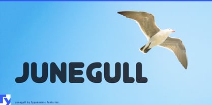 Introducing Junegull, the typeface that seamlessly blends retro-tech design with a contemporary twist. With its friendly all-caps rounded sans, Junegull is like a breath of fresh air—a perfect combination of technological prowess and gentle charm. But don’t let its cuddly appearance fool you; Junegull is like a murderous mechanical teddy bear, with a sharp edge that’s ready to take on any design challenge. For those who crave something wilder, Junegull Beach is the font for you. This wild sibling is perfect for those who want to take their designs to the next level. With Junegull Beach, every letter pair is carefully crafted to give you a more realistic, sandy feel. It’s like taking a walk on the beach, with every letter a grain of sand that transports you to a world of creativity. What sets Junegull Beach apart is its tailor-made pairs, giving you a font that’s uniquely yours. Whether you’re designing a logo, a website, or a poster, Junegull Beach will help you stand out from the crowd with its dynamic and playful style. So why settle for an ordinary font when you can have Junegull and Junegull Beach? With their retro-tech design and contemporary charm, these fonts are a must-have for any designer looking to create something truly extraordinary. Most Latin-based European writing systems are supported, including the following languages. Afaan Oromo, Afar, Afrikaans, Albanian, Alsatian, Aromanian, Aymara, Bashkir (Latin), Basque, Belarusian (Latin), Bemba, Bikol, Bosnian, Breton, Cape Verdean, Creole, Catalan, Cebuano, Chamorro, Chavacano, Chichewa, Crimean Tatar (Latin), Croatian, Czech, Danish, Dawan, Dholuo, Dutch, English, Estonian, Faroese, Fijian, Filipino, Finnish, French, Frisian, Friulian, Gagauz (Latin), Galician, Ganda, Genoese, German, Greenlandic, Guadeloupean Creole, Haitian Creole, Hawaiian, Hiligaynon, Hungarian, Icelandic, Ilocano, Indonesian, Irish, Italian, Jamaican, Kaqchikel, Karakalpak (Latin), Kashubian, Kikongo, Kinyarwanda, Kirundi, Kurdish (Latin), Latvian, Lithuanian, Lombard, Low Saxon, Luxembourgish, Maasai, Makhuwa, Malay, Maltese, Māori, Moldovan, Montenegrin, Ndebele, Neapolitan, Norwegian, Novial, Occitan, Ossetian (Latin), Papiamento, Piedmontese, Polish, Portuguese, Quechua, Rarotongan, Romanian, Romansh, Sami, Sango, Saramaccan, Sardinian, Scottish Gaelic, Serbian (Latin), Shona, Sicilian, Silesian, Slovak, Slovenian, Somali, Sorbian, Sotho, Spanish, Swahili, Swazi, Swedish, Tagalog, Tahitian, Tetum, Tongan, Tshiluba, Tsonga, Tswana, Tumbuka, Turkish, Turkmen (Latin), Tuvaluan, Uzbek (Latin), Venetian, Vepsian, Võro, Walloon, Waray-Waray, Wayuu, Welsh, Wolof, Xhosa, Yapese, Zapotec Zulu and Zuni.
 - Sure, let me paint a vivid picture of SF Big Whiskey, a font that seems to capture the essence of character and strength with its design. Imagine a font that cleverly blends the robustness of the w...
- Obschepit by Zaporozhan Dmitriy,
$15.00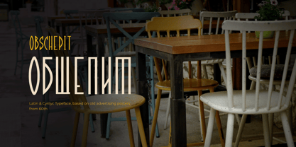 When did it start. One day I was designing some stuff for a fast food café. By style the Café was made as an old Soviet canteen. So I had to do a special accent on this in menu, advertising posters and other print products. I decided to do this by interesting old school font. There are many cool retro fonts on the Internet, but not one of them satisfied me on 100%. The next step was to look at the old posters and find some inspiration. So I found some cool pictures with exact letters that I needed, but there were no typefaces to buy so that I can print some text with this exact letters. That's why I decided to do such typeface for my own. You can use this typeface in the field of nutrition, and it also will suit for cinema posters.
 - VVE Giallo by vve.type,
$39.99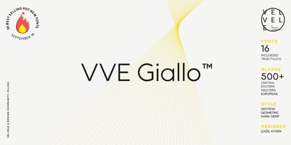 VVE Giallo brings simplicity, elegance and a certain warmth wherever a contemporary geometric typeface is needed. The balanced characteristics, clear and legible silhouette and simultaneously vivid appearance of VVE Giallo makes it perfect for any needs. VVE Giallo’s characteristic high x-height does not only give perfect legibility but also perfect matching for strong headlines, outstanding logos and also for long texts. By keeping the “o” and “a” perfect circles gives VVE Giallo the minimalist and modernist looking. VVE Giallo has six weights, thin to heavy, give it a full range of expression for branding; in print and on screen. Matching true italics, carefully slanted 10º, are perfectly designed one by one. The family totally consists of 16 styles. lt supports many OpenType features, such as tabular numerals, inferiors & superiors, numerators & denominators, fractions, discretionary ligatures, arrows and etc. It combined more than 500 glyphs.
 - Uranus by Supremat,
$12.00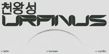 Uranus is a futuristic font inspired by space and extraterrestrial civilizations. The proportions of the letters are wide, the elements of the letters have organic curves, reminiscent of the design of streamlined spaceships. What gives the font a special character is the excessive contrast between the upper element and the crossbar in letters such as A, B, E, F, K, P, R. In these letters, there is a barely noticeable intra-letter gap in the form of a line. Due to this contrast and rounded elements in these letters, a negative space of a triangular shape also turned out. Particular attention should be paid to the broad language support for the font. The font has support for Latin, extended Cyrillic, and Korean (2780 base syllables). Total glyphs: 3562. Uranus is well-suited for large typography, logos, and any other design related to futurism and space.
