10,000 search results (0.058 seconds)
  1. Minya Nouvelle - Unknown license
  2. Freebooter - Personal use only
  3. Resurrection - Unknown license
  4. Thrust - Unknown license
  5. Chattery Teeth - Unknown license
  6. Sulphur - Unknown license
  7. Subatonik - Unknown license
  8. Theuerdank Fraktur - Personal use only
  9. Fire Of Ysgard Regular - Unknown license
  10. Gebetbuch Fraktur - Unknown license
  11. Red October - Personal use only
  12. Red October Stencil - Personal use only
  13. Roxborough CF by Connary Fagen, $35.00
    Roxborough CF is a dramatic serif, influenced by calligraphy and hand lettering. Built around a distinctive single-storey 'a' and full of rich detail, Roxborough pairs well with its expressive italics, lending an artful touch to text across print and digital. Roxborough CF pairs nicely with simple, bold headline typefaces, like Greycliff CF and Articulat CF. All typefaces from Connary Fagen include free updates, including new features, and free technical support.
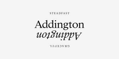
  14. Addington CF by Connary Fagen, $35.00
    Addington CF is a graceful and reliable serif, useful in any application. Beautiful and practical, Addington is designed for excellence at small point sizes, while doubling as a capable, bold display typeface. Includes roman and italic sets across seven weights. Addington CF pairs nicely with simple, bold headline typefaces, like Greycliff CF and Articulat CF. All typefaces from Connary Fagen include free updates, including new features, and free technical support.
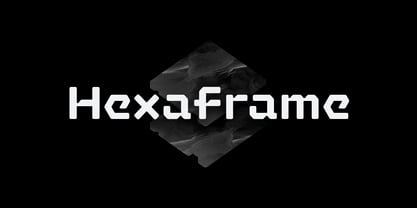
  15. Hexaframe CF by Connary Fagen, $35.00
    Hexaframe CF evokes the awe and potential of of heavy machinery and robotics. Clad in tough polygons and rounded edges, Hexaframe is a perfect typeface for corporate identity, STEM toys, and user interface design. Hexaframe CF pairs well with simple typefaces set in contrasting sizes, including Greycliff CF, Artifex CF, and Visby CF. All typefaces from Connary Fagen include free updates, including new features, and free technical support.
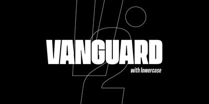
  16. Vanguard CF by Connary Fagen, $35.00
    Constructed for maximum impact in tight horizontal spaces, Vanguard's eight weights span a featherlight Thin to a striking Heavy, with accompanying obliques. Vanguard CF impresses in print, headlines, video, and social media. Vanguard CF pairs excellently with its sibling typeface, Integral CF. It also contrasts well with warmer styles, like Artifex CF and Greycliff CF. All typefaces from Connary Fagen include free updates, including new features, and free technical support.
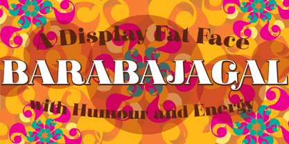
  17. P22 Barabajagal by IHOF, $29.95
    P22 Barabajagal is a unique take on the display fat face by way of doodling fun. Somewhat informed by the shapes of an early 1970s film type called Kap Antiqua Bold, this font’s aesthetic is the stuff of boundless energy and light humour, where an uncommon “peak” angle drawing perspective results in sturdy trunks, fat bottom curls, and active ascenders eager for mobility in space. This is the kind of font that makes you wonder whether it was drawn with rulers, protractors and compasses, or just by a mad doodler’s crazy-good free hand. Regardless, Barabajagal easily turns the geometry of modern forms into an exercise in sugar-loaded fun. It’s a very good tool to use in design geared at kids and young adults, such as food and toy packaging, books, animation, cartoons and games. Barabajagal comes with over 550 glyphs, lots of alternates, and a few ligatures and swash caps. It also contains extended support for Latin languages.
  18. Avenir by Linotype, $42.99
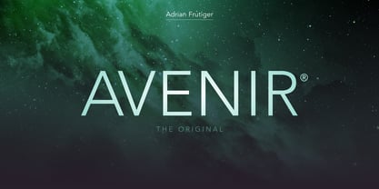
    In drawing the Avenir® typeface, Adrian Frutiger looked to both the past and the future for inspiration. His goal was to reinterpret the geometric sans serif designs of the early part of the 20th century in a typeface that would portend aesthetics of the 21st century. He succeeded handsomely. In doing so, Frutiger added a bit of organic humanism to the design, freeing Avenir from the rigid geometric overtones of the earlier designs. Avenir is employed on signage at Dallas Fort Worth and Hong Kong international airports. The city of Amsterdam adopted Avenir as its corporate typeface in 2003. The original Avenir family is made up of designs with gradual weight changes in order to satisfy the needs of specific text applications. While the book and light weights have similar stroke widths, the book weight is well suited for body text, whereas the light was designed for captions and subhead text. Featured in: Best Fonts for Resumes
  19. Headshop - Personal use only
  20. You Are Loved - Personal use only
  21. Angel Light - Personal use only
  22. STEAK - Personal use only
  23. Verdy - Personal use only
  24. 3rd Man - 100% free
  25. Grunge - Unknown license
  26. Mark - 100% free
  27. OldStyle 1 - Unknown license
  28. prayh - Personal use only
  29. acid_reflux - Unknown license
  30. Godzilla - Unknown license
  31. Xilosa - Unknown license
  32. Gazzarelli - Personal use only
  33. whatever - Unknown license
  34. BackSplatter - Unknown license
  35. KometenMelodie1 - Unknown license
  36. GhostTown - Unknown license
  37. Boneribbon Tall Outline - Unknown license
  38. Dead World - Unknown license
  39. !Sketchy Times - Unknown license
  40. Bionic Comic Italic - Unknown license
Looking for more fonts? Check out our New, Sans, Script, Handwriting fonts or Categories
abstract fontscontact usprivacy policyweb font generator
Processing