10,000 search results
(0.075 seconds)
- Collette by Scholtz Fonts,
$21.00Collette was named in honor of an art deco font called "Independent" designed in the 1930s by Collette and Dufour. Collette is influenced by the design of the original font, however, there are substantial differences: instead of small caps, a true lower case was created, the upper case character proportions and shapes have been greatly modified, and all missing characters have been created to make a truly modern font which nevertheless has all of the panache of the original. It is best used to create a retro feel and in headings, subheads and in short passages of text. - Higamlo by Mchcrafter,
$18.00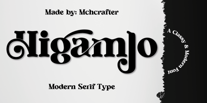 Higamlo font is a Modern Stylistic Serif typeface A new serif that we created specially for branding needs, with extra ligatures and alternates in a unique shape just to add value to your brand. It so nice to leverage designer or product owner that need solutions to make their design look more stylish and modern. And specially for Higamlo font, We prepared all the ligatures, and the alternates characters to help you create unlimited variations for your creative needs. Higamlo font includes: All uppercase & lowercase letters All numbers 0-9 & Punctuation Ligatures & Alternates Symbols Multiligual Letters
 - Otamendi by Pen Culture,
$19.00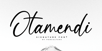 Proudly present "Otamendi Signature Font" Otamendi is beautiful signature font which has a beautiful and natural arch shape, this font is very suitable for various types, such as logos / brands, posters, magazines, Instagram templates, and many more. I really hope you enjoy it - please do let me know what you think, comments & likes are always hugely welcomed and appreciated. More importantly, please don't hesitate to drop me a message if you have any issues or queries. Guides to access all alternates glyphs : http://adobe.ly/1m1fn4Y Please fell free to contact me if you have any question Thank you
 - Demoise by Maculinc,
$14.00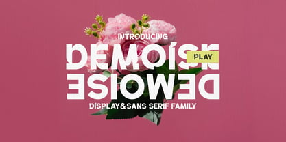 Demoise is a sans serif font family with 2 versions, a display version (Demoise Play) and a sans serif version (Demoise) containing 14 for each version and complete with italics. This font is styled unique enough to collaborate with the retro style, when you stick it on your designs such as posters, brochures, magazines, business cards or any other shape you will find something interesting and unique. This font is equipped with a multilingual system and various languages such as: Baltic, Basic Latin, Central European, Dutch, Euro, Romanian, Turkish, Western European and others. al European, Dutch, Euro, Romanian, Turkish, Western European and others.
 - Bhortead by Vultype Co,
$29.00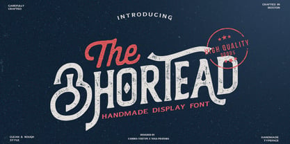 Bhortead that has a vintage theme that you can use for your project. This font has 2 styles, Clean and Rough, and so you can use that style according to the type of project. This font has many OpenType features so you can combine each font to be more dynamic. Special features include: stylistic alternates, ligatures and swashes. Bhortead includes western European characters (multilingual support). All characters have an imperfect shape that gives a natural look in design. It cooperates well for creating the traditional style logos, labels, package design, lettering for t-shirts and much others.
 - Lovely Bastilla by Mchcrafter,
$18.00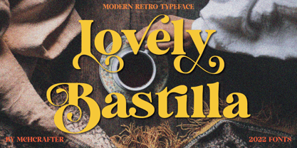 Lovely Bastilla font is a Modern Stylistic Serif typeface A new serif that we created specially for branding needs, with extra ligatures and alternates in a unique shape just to add value to your brand. It so nice to leverage designer or product owner that need solutions to make their design look more stylish and modern. And specially for Lovely Bastilla font, We prepared all the ligatures, and the alternates characters to help you create unlimited variations for your creative needs. Lovely Bastilla font includes: All uppercase & lowercase letters All numbers 0-9 & Punctuation Ligatures & Alternates Symbols Multiligual Letters
 - Milleniapolis by IKIIKOWRK,
$17.00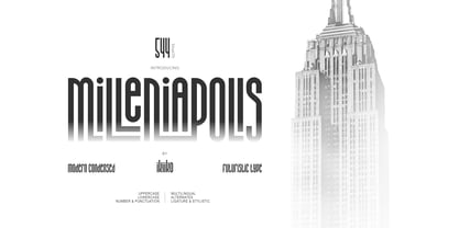 Introducing Milleniapolis - Futuristic Type, created by ikiiko. Milleniapolis is a condensed type with a simple and playable font. Thin and tall font characters make it easy to adjust and fun to explore different shapes and layouts. This typeface is perfect for an brand logo, fashion stuff, clean design, magazine cover, poster & flyer, or simply as a stylish text overlay to any background image. What's included? Uppercase & Lowercase Number & Punctuation Alternates & Stylistic Ligature Multilingual Support Get also a good offer & FREEBIE at our site : www.ikiiko.com Enjoy our font and if you have any questions, you can contact us by email : ikiikowrk@gmail.com
 - Kamundi by Mchcrafter,
$18.00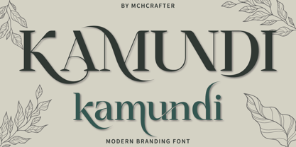 KAMUNDI font is a Modern Stylistic Serif typeface A new serif that we created specially for branding needs, with extra ligatures and alternates in a unique shape just to add value to your brand. It so nice to leverage designer or product owner that need solutions to make their design look more stylish and modern. And specially for KAMUNDI font, We prepared all the ligatures, and the alternates characters to help you create unlimited variations for your creative needs. KAMUNDI font includes: All uppercase & lowercase letters All numbers 0-9 & Punctuation Ligatures & Alternates Symbols Multiligual Letters
 - Bibalgo by Mchcrafter,
$18.00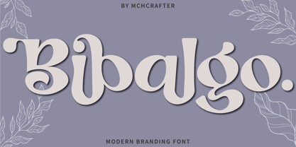 Bibalgo font is a Modern Stylistic Serif typeface A new serif that we created specially for branding needs, with extra ligatures and alternates in a unique shape just to add value to your brand. It is so nice to leverage designers or product owners who need solutions to make their designs look more stylish and modern. And specially for Bibalgo font, We prepared all the ligatures, and the alternate characters to help you create unlimited variations for your creative needs. Bibalgo font includes: - All uppercase & lowercase letters - All numbers 0-9 & Punctuation - Ligatures & Alternates - Symbols - Multiligual Letters
 - Demiella by Keristyper Studio,
$14.00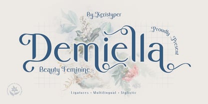 Demiella is an elegant beauty sans serif. Simple letter shapes with playful swash & stylistic, keeping its legibility high. This font is good for logo design, Social media, Movie Titles, Books Titles, short text even long text letters, and good for your secondary text font with sans or serif. Featured: Standard Uppercase & Lowercase Numeral & Punctuation Multilingual : ä ö ü Ä Ö Ü ß ¿ ¡ Alternate & Ligature PUA encoded We recommend programs that support the OpenType feature and the Glyphs panel such as Adobe applications or Corel Draw. so you can use all the variations of the glyphs. Hope you enjoy our fonts!
 - Double Frames by Putracetol,
$22.00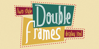 Introducing Double Frames - Display Font, a font with unique shape. there are two styles – standard and decorative. The modern and powerful display font you've been looking for. Each character is carefully crafted until the result is perfect. A lot of detail is preserved when characters are digitized, so uppercase looks fantastic up close Come with open type feature with a lot of alternates, its help you to make great lettering. best uses for wedding invitation, invitations, signature, typography lettering, branding, label, poster, logos, quotes, product packaging, header, merchandise, social media & greeting cards and many more. Double Frames is also support multi language.
 - RF Rostin by Russian Fonts,
$26.00Rostin is a modern monospaced typeface with half-open forms of characters. Contains 8 fonts. 4 regular and 4 true italic. Weights from ultralight to bold. Including modern and futuristic stylistic alternates. The typeface was designed to read well in small sizes (from 15px) and be bright in large sizes. With these characteristics and a wide palette of weights Rostin has a huge potential area for usage. Ideally suited for musical covers, posters, logos, street wear, movie titles, packaging, editorial, web and applications - here he will always be gorgeous. With a wide variety of alternate characters you can make your design bright, memorable and modern. Opentype features: old-style figures, fractions, stylistic alternates, superscript and subscript.Multilingual support: Latin, latin extended, cyrillic and cyrillic extended (more than 75+ languages) - spinwerad - Unknown license

- kawoszeh - 100% free

- Newark JNL by Jeff Levine,
$29.00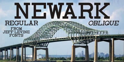 Inspired by a set of vintage alphabet game tile pieces, Newark JNL has similar traits to other slab serif Romans, but enough 'quirky' letter widths to break the rules and have it stand out on its own merits. The name derives from font work files in progress, often saved as 'new work' until a fitting name is decided upon. It seemed only right that this phrase be turned around into a font name itself. Newark JNL is available in both regular and oblique versions.
 - Loppemarked by PizzaDude.dk,
$17.00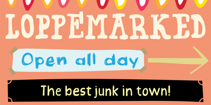 Loppemarked is Flea market in danish, and that’s where I got the inspiration to do these fonts from! Headline - chunky serifs here and there, and some are missing! No attempt to get it right…anywhere! Text - The letters are scribbled quickly, leaving not much attention to accuracy. Sans - With this font, there has been some effort to hit the same width of strokes, but it is still off here and there. All in all, the sweet innocence in these letters…I love it! <3</p>
 - Kitchen Utensils by Celebrity Fontz,
$24.99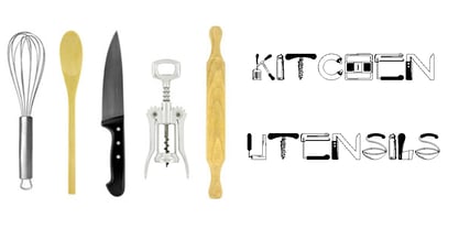 Kitchen Utensils is a pictorial font with 36 different common kitchen tools and appliances in the shape of the letters of the alphabet and numbers. Perfect for cooking and kitchen-related texts, recipes, and culinary publications.
 - Toscana by Hemphill Type,
$20.00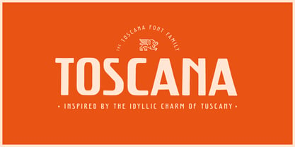 A traditional Italian style font family inspired by the rural landscape and characterful back streets of Tuscany. The blend of gently rolling hills leading onto sharply peaked mountains has influenced the natural shapes of the letterforms.
 - Haigrast Serif by Mans Greback,
$59.00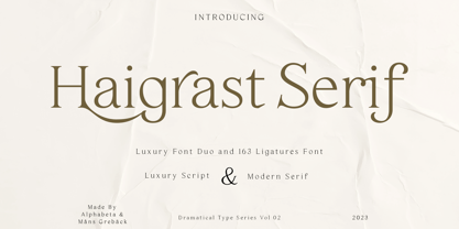 Haigrast Serif is a font that combines classic and modern design elements to create a look that is both tasteful and fashion-forward. This serif font is regular but with a very modern feel, making it the perfect choice for designers looking to add a touch of sophistication to their work. The sharp, crisp lines and swash alternates in addition to the decorative letterings add a unique touch, making Haigrast Serif a versatile font that can be used in a variety of projects. Whether you're creating a stylish magazine layout, a cool fashion logo, or a balanced design piece, Haigrast Serif is the perfect font to make your work stand out. Designed by Mans Greback in 2023, this font is the perfect choice for designers who want to make a bold statement in their design work. The Haigrast Script family consists of six high-quality fonts: Regular, Italic, Bold, Bold Italic, Black and Black Italic The font is built with advanced OpenType functionality and has a guaranteed top-notch quality, containing stylistic and contextual alternates, ligatures and more features; all to give you full control and customizability. It has extensive lingual support, covering all Latin-based languages, from Northern Europe to South Africa, from America to South-East Asia. It contains all characters and symbols you'll ever need, including all punctuation and numbers.
 - Raisin Rage by Missy Meyer,
$12.00 It's a weird name, but it's a weird font! Introducing RAISIN RAGE, a quirky font that expresses that feeling of when you bite into a cookie expecting it to be full of chocolate chips, but it's full of squishy, rubbery raisins instead. (Don't write to me, raisin lovers - you'll never change my mind.) Raisin Rage has some fun casual elements like varying stroke widths plus some bouncing heights which make this fun to use for branding, packaging, logos, and more; I've cleaned the letters up extensively, so the font is great for cutting and crafting as well!
 - VLNL Boulangerie by VetteLetters,
$35.00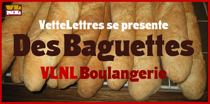 VLNL Boulangerie was originally an incomplete set of early 20th century wood type letters, that Donald Roos found in a dust covered carton box stashed away somewhere at the Royal Academy in The Hague. Charmed by the letter forms Donald decided to print them on paper with a printing press. Next he digitised the prints as they came out, including small imperfections and damages. The missing characters were composed and added digitally to complete the alphabet. (See if you can spot those!?) We think VLNL Boulangerie is a little French in appearance (hence the name), it's joyful, warm, a little crunchy and round-ish. It defenitely has that ‘je-ne-sais-quoi’ that seperates it from most wood type grotesques. It can be perfect for lettering on a storefront window of – let's say a bread shop or a lunchroom. Or a logo for a downtown hipster café. VLNL Boulangerie hardly has any limitations actually.
 - Morvien by Alit Design,
$19.00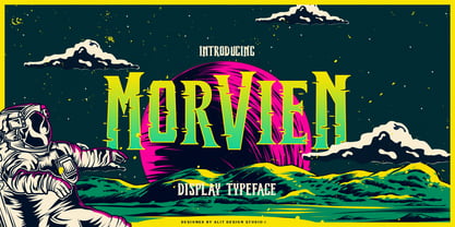 Introducing Morvien Typeface - a bold and dynamic display font that brings a unique edge to your creative projects. With its distinctive torn shapes and powerful design, Morvien Typeface is the perfect choice for film titles, game interfaces, comic book lettering, superhero themes, and music posters. This font is not just a typeface; it's an artistic statement that adds a touch of drama and excitement to your visual creations. Torn Shapes Design: Morvien Typeface stands out with its edgy and torn shapes, giving your text a rebellious and energetic vibe. Each character is carefully crafted to convey a sense of dynamism and movement. Display Style: Morvien Typeface is designed specifically for display purposes, ensuring that your headlines and titles command attention. The bold and impactful strokes make it ideal for creating a strong visual impact. Ligatures and Alternatives: Morvien Typeface includes a rich set of ligatures and alternative characters, providing you with creative flexibility. Experiment with different combinations to customize your text and make it uniquely yours. 633 Characters: Morvien Typeface boasts an extensive character set with 633 characters, offering a wide range of options for your design needs. Whether you're working on a detailed project or a quick creative piece, Morvien Typeface has you covered. Multilingual Support: Morvien Typeface is crafted with global compatibility in mind, supporting multiple languages. Now you can express your creativity in various linguistic contexts without compromising on style. Versatile Usage: Morvien Typeface is well-suited for a variety of creative projects, including film titles, game interfaces, comic book lettering, superhero-themed designs, and music posters. Its versatility makes it a go-to choice for projects that demand a bold and expressive typographic style. Elevate your design projects with Morvien Typeface and let your text speak with intensity. Embrace the torn shapes, explore ligatures, and make a lasting impression with this powerful and versatile display font. Your creativity knows no bounds with Morvien!
 - Rough Print JNL by Jeff Levine,
$29.00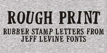 The Superior Marking Equipment Company was originally located in Chicago, Illinois and over the years produced a line of both commercial and toy rubber stamp printing sets which were used for making signs, posters, tickets and other printed items. Rough Print JNL reproduces the scanned images printed from one of the toy rubber stamp sets. The sample characters were smaller than one half inch in height and were further reduced during scanning. This gives the end result of a typeface which looks like rubber stamp imprints at small sizes, and very angular, distorted, somewhat grunge type when printed at larger sizes. There is a limited character set consisting of alphabet, numerals, some punctuation and currency symbols. No kerning was added to keep the hand-made appeal. Rough Print JNL is an all caps font with the letters and numbers jogged randomly on both the caps and lower case keystrokes. For a similar design with lower case, Amateur Printer JNL is recommended.
 - Funky Chicken Town by Comicraft,
$19.00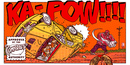 Ripped from the pages of the Art and Crazy Paving Lettering of The Lord of THE BEEF, SHAKY KANE, Comicraft Proudly Presents a font so wacky, so snakey, so achy-breaky, we could only call it FUNKY CHICKEN TOWN. And if that isn’t wacky ENOUGH — FUNKY CHICKEN TOWN features three — count ‘em — THREE versions of each letter!!! Opentype will automatically cycle between the alternates of each letter. FUNKY CHICKEN TOWN features solid and outline weights which can be layered in any number of funky ways, and features Comicraft’s trailblazing — often imitated never equalled -- Crossbar I Technology™ which automatically places capital “I” in i words like i, I’m, I’ll and I, and removes them from words like Chicken and Comics! Artwork by Shaky Kane from THE BEEF, available on Comixology.com
 - Bladesmith by Hanoded,
$15.00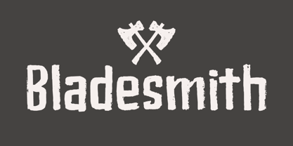 I have always had a keen interest in forging; I used to be a silversmith, and I love working with metal. Some time ago I forged my first axe (a skeggøx or bearded axe), sharpened it and fitted it with a handmade ash handle. It isn’t perfect, but it is my first ever forged axe and I’m pretty proud of it. All of this went through my head when I started drawing the glyphs for this font. And to be honest, I couldn’t find a more suitable name for it! Bladesmith is a handmade font, forged in fire (haha). It was actually made with an old sharpie. It is a rough and ready font, quite suited for headlines, book covers and posters.
 - Meloso by Rachel Kick,
$14.00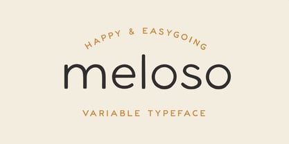 Meloso is an easygoing typeface. It has a playful and organic feel that has its own hand-drawn charm while still being incredibly legible due to its simple shapes and high x-height. It has the unique ability to stand alone as a title text or work in small paragraph form. It's the perfect way to bring the friendly feel of an "imperfect" and slightly rounded font into your next project. Meloso is a variable font with 6 set weights. If you're using a program that supports variable fonts, you'll be able to choose any point between the "Extra Thin" and "Extra Bold" weights to get the perfect thickness and adjust the italic to the angle you need. You can also use the standard OTF files to have the 6 set weights.
 - Haven by Signature Type Foundry,
$33.00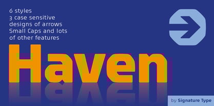 Haven font family is based on the compositionality of constructive elements that create the final shape of individual letters. Mechanical connecting was continuously adjusted by a type designer’s feeling. In this way Haven differs from similar typefaces of the 1960s and 1990s. Six fonts of different stroke intensity create a rich family of typefaces for a variety of uses in typography for special occasions. Although the typeface was drawn for headings, it is suitable for typesetting of long texts in a book. Even in extreme reduction it retains its technical basis, negating classic book alphabets, and it adds an experimental look to the text. Both extreme fonts Thin and Black create strong contrast and their magnification brings attention to their interconnection of all details. Serif version Haven Serif is also being prepared.
 - Maribor by Dima Pole,
$30.00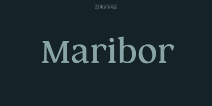 Maribor is a slab serif font with nice shapes, they are both soft and angular. It is perceived calmly and with a twist. Maribor means "Mara`s pinery". The energy of the Universe, reflecting the modification, renewal and change for the better is called Mara; Ancient wise ancestors called it so. Today it is known as the goddess Mara in the Vedic worldview of the Slavic-Aryan peoples. Maribor is a multilingual font, it contains characters for 104 Latin languages and all Slavic, including all capitals for them. There are all major currency signs, including the ruble and the Euro. Many OpenType features allow you to make a variety of compositions; as well as to see the font from the new side thanks to the stylistic sets for the Slavic alphabets.
 - Hopferian by 2D Typo,
$28.00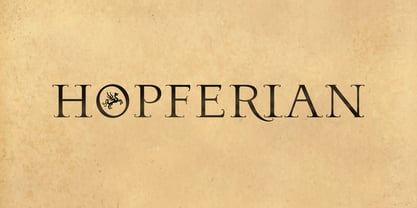 This font has been developed based on the engraving by the German artist Daniel Hopfer (1470-1536) listing the Latin ABC. While creating the font I tried to preserve the archaism and certain imperfection characteristic for the prototype to accentuate its charm. Fanciful convolution on the serif make it a bit fairy-tale like and cheerful. The font is also available with decorated dots as in the original version. All the letters in the font are capital.
 - Caligraf by Mans Greback,
$29.00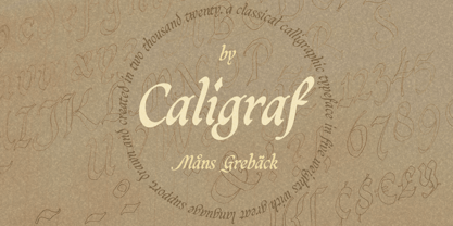 Caligraf is a classical calligraphy script. It was drawn and created by Måns Grebäck during 2019 and 2020. The character design blends traditional soft flowing handwriting with a modern, sharp look, and its angle and weight balance gives it a determined and progressive pace. Caligraf is a multistyle font family, composed of Thin, Light, Regular, Bold and Black. Its range ensures usability in any context, while also giving the ability to emphasize phrases or words. Use it in an invitation, a diploma, a logotype or in a decorative body text. Being a font with over 850 glyphs, it is guaranteed to contain all characters you'll ever need, including all punctuation and numbers. It has an extensive lingual support, covering European and Asian Latin scripts.
 - VLNL Wasabi Turbo by VetteLetters,
$35.00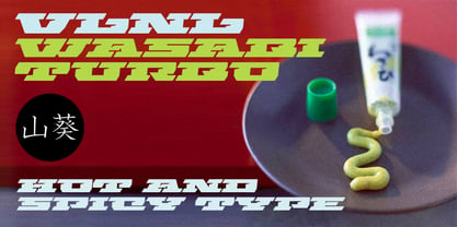 Wasabi is one of the key ingredients in the Japanese kitchen. Also known as japanese horseradish, it is an extremely spicy condiment made out of the graded root of the Wasabi plant. Its spiciness is different than that of a chili pepper though, more like a hot mustard. The spicy taste shoots right through your nose, but does not last for long. Wasabi is traditionally used in sushi and sashimi dishes, soba noodles, and in a number of Japanese snack foods. Equally sharp and stingy, VLNL Wasabi Turbo was designed by Donald Roos. Despite its japanese outward appearance, the font has its origin in lettering found on a German book. It is hot, and edgy like a samurai sword. Wasabi Turbo will stand out as headline and logo!
 - Lemon Lies by PizzaDude.dk,
$20.00A square but fair font, or as they say in Germany "kradratisch, praktisch, gut". Because of the simpleness in this font, I decided add two styles less square to the family: funky and zit. - Lagos by Scholtz Fonts,
$19.00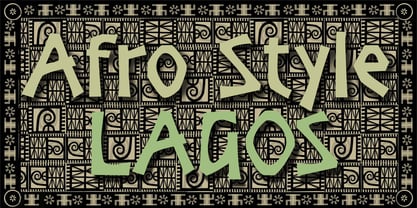 Lagos was created because of the lack of African-inspired fonts that are truly modern without being partly art-deco in origin. I wanted to make a vigorous, sharp-edged font that reflects the energy and dynamism of modern Africa. The lines of the font combine the sharp angularity of African rocks and mountains with the smooth fluidity of Africa's snake-black rivers. The font is supplied in two styles, Lagos Regular and Lagos Light. Lagos Light is not a simple, mechanical modification of Lagos Regular. The outlines and proportions have been subtly modified to accommodate the lighter weight. Lagos contains a full 256 character set (upper and lower case, punctuation, diacritical characters, special symbols and numerals), in which all characters have been fully kerned and letter-spaced.
 - Spooky Dracula by Hatftype,
$15.00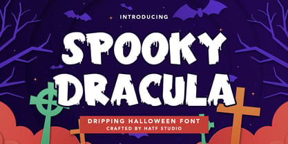 Spooky Dracula - Drpping Halloween Font is a display font that is inspired by gothic and horror style because its shape is very unique and is perfect for any project that you will use with this theme. Spooky Dracula with opentype features such stylistic alternates, stylistic sets & ligatures good for logotype, poster, badge, book cover, tshirt design, packaging and any more. Features : 1.Uppercase & Lowercase 2.Multilingual support 3.Number 4.Symbol 5.Punctuation. 6.Extra Dingbat 7.Support in Mac and Windows OS -Support in design application (photoshop, illustrator, and more). There it is. I really hope you enjoy it. Comments & likes are always welcome and accepted.
 - Screaming Inside by Hatftype,
$17.00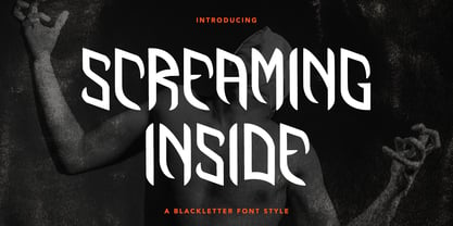 Screaming Inside - A Blackletter Font Style is a display font that is inspired by gothic and horror style because its shape is very unique and is perfect for any project that you will use with this theme. Wild Inferno with opentype features such stylistic alternates, stylistic sets & ligatures good for logotype, poster, badge, book cover, tshirt design, packaging and any more. Features : 1.Uppercase & Lowercase 2.Multilingual support 3.Number 4.Symbol 5.Punctuation. 6.Extra Dingbat 7.Support in Mac and Windows OS -Support in design application (photoshop, illustrator, and more). There it is. I really hope you enjoy it. Comments & likes are always welcome and accepted.
 - Toxic Inked by Hatftype,
$17.00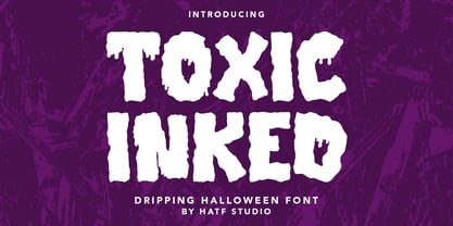 Toxic Inked - Dripping Halloween Font is a display font that is inspired by gothic and horror style because its shape is very unique and is perfect for any project that you will use with this theme. Toxic Inked with opentype features such stylistic alternates, stylistic sets & ligatures good for logotype, poster, badge, book cover, tshirt design, packaging and any more. Features : 1.Uppercase & Lowercase 2.Multilingual support 3.Number 4.Symbol 5.Punctuation. 6.Extra Dingbat 7.Support in Mac and Windows OS -Support in design application (photoshop, illustrator, and more). There it is. I really hope you enjoy it. Comments & likes are always welcome and accepted.
 - Kessel 105 Text by Talbot Type,
$19.50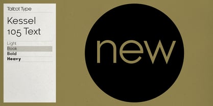 Kessel 105 Text is the text specific variation of stablemate, Kessel 105 . With a narrower x-height and longer ascenders and descenders, its more traditional proportions make it more economical with space and better suited to continuous text. It's a versatile, modern sans, highly legible as a text font and with a clean, elegant look as a display font at larger sizes. It has an art deco flavour with sharp points at the apex of many characters. The Kessel 105 Text family comprises of four weights and includes old style non-aligning (lower case) numbers, both proportional and tabular as well as accented characters for Central European languages.
 - Death Vanguard by Hatftype,
$17.00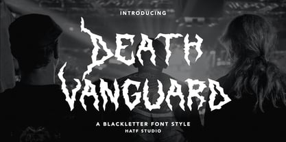 Death Vanguard - Blackletter Font Style is a display font that is inspired by gothic and horror style because its shape is very unique and is perfect for any project that you will use with this theme. Wild Inferno with opentype features such stylistic alternates, stylistic sets & ligatures good for logotype, poster, badge, book cover, tshirt design, packaging and any more. Features : 1.Uppercase & Lowercase 2.Multilingual support 3.Number 4.Symbol 5.Punctuation. 6.Extra Dingbat 7.Support in Mac and Windows OS -Support in design application (photoshop, illustrator, and more). There it is. I really hope you enjoy it. Comments & likes are always welcome and accepted.
 - Quality Letter by Hatftype,
$17.00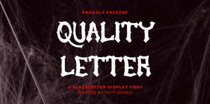 Quality Letter - Blackletter Display Font is a display font that is inspired by gothic and horror style because its shape is very unique and is perfect for any project that you will use with this theme. Quality Letter with opentype features such stylistic alternates, stylistic sets & ligatures good for logotype, poster, badge, book cover, tshirt design, packaging and any more. Features : 1.Uppercase & Lowercase 2.Multilingual support 3.Number 4.Symbol 5.Punctuation. 6.Extra Dingbat 7.Support in Mac and Windows OS -Support in design application (photoshop, illustrator, and more). There it is. I really hope you enjoy it. Comments & likes are always welcome and accepted.
 - Eternal Worse by Hatftype,
$17.00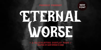 Eternal Worse - Blackletter Display Font is a display font that is inspired by gothic and horror style because its shape is very unique and is perfect for any project that you will use with this theme. Eternal Worse with opentype features such stylistic alternates, stylistic sets & ligatures good for logotype, poster, badge, book cover, tshirt design, packaging and any more. Features : 1.Uppercase & Lowercase 2.Multilingual support 3.Number 4.Symbol 5.Punctuation. 6.Extra Dingbat 7.Support in Mac and Windows OS -Support in design application (photoshop, illustrator, and more). There it is. I really hope you enjoy it. Comments & likes are always welcome and accepted.

