10,000 search results
(0.043 seconds)
- Retro Monkey by Shakira Studio,
$17.00 Say hello to new serif font, Retro Monkey! Retro Monkey is a display serif font that delivers a classic retro feel with strength and boldness. Characterized by striking bold letters, Retro Monkey exudes elegance and uniqueness in every detail. Its retro-inspired design evokes nostalgia and conveys a strong and charming style. Retro Monkey's lettering proportions are audacious in their clarity and legibility. With bold lines and strong contours, each letter looks tough while retaining the elegance of a retro aesthetic. Consistent letter thickness provides an appealing visual appeal and is easily recognizable. Retro Monkey is suitable for use in various design projects that want a strong retro classic impression. This font makes a perfect choice for headlines, titles, posters, merchandise designs, and more. In any context, Retro Monkey carries an impressive presence, inviting the audience to feel nostalgia for a different era. Here's what you get: Retro Monkey Regular, Italic All Multilingual symbol Opentype features ( ligature, alternate ) Accessible in the Adobe Illustrator, Adobe Photoshop, Adobe InDesign, even work on Microsoft Word. PUA Encoded Characters - Fully accessible without additional design software. Multilingual character supports : (Afrikaans, Albanian, Catalan, Croatian, Czech, Danish, Dutch, English, Estonian, Finnish, French, German, Hungarian, Icelandic, Italian, Lithuanian, Maltese, Norwegian, Polish, Portuguese, Slovenian, Spanish, Swedish, Turkish, Zulu) Thank you!
 - Arsapia by URW Type Foundry,
$49.99 Michael Hoffmann manufactures digital fonts for 30 years. At URW++ he contributed to the technological progress. Over the years, he also specialized in the ideal representation of fonts on screen and the complex assembly of international fonts with scripts of all countries. In his latest project he put the emphasis on developing a highly readable typeface. Less interested in the design as in the functionality of this typeface, he designed Arsapia which he has now installed as a system font on all his computers. Michael Hoffmann studied Japanology at the University of Hamburg and traveled in the early years of his professional activity frequently to Japan, there to train the IKARUS font production tools to Japanese customers. In his spare time he plays guitar or golf depending on the weather. The typeface Arsapia has been designed in such a way that all three font styles Light, Regular and Bold have the same width. When a user therefore opts for the use of Arsapia Light, even though he has already written his text in Regular, nothing changes with respect to the letter tracking. When choosing the Bold for emphasis: Nothing changes except the blackness of the letters. A font change does not engender unwanted line and page breaks of itself. All letters can be clearly distinguished from each other. 1 l I O 0 are all different. For programmers and lovers of monospaced fonts Michael Hoffmann has developed a fourth typeface: Arsapia Mono. This is the perfect terminal font.
 - Boilerplate by Wundes,
$18.00Gritty heat-forge stamped metally goodness. Can withstand up to 255 pounds of pressure psi, it even says so right on the graphic. This is a fun display font inspired by the stamped text on barbells, sewer drains, and of course boiler-plates, not that we see many of those anymore, but I digress... This font contains all the standard sub-255 unicode characters, plus a few extras for flavor. Apply this font with liberal amounts of axle grease and she should last ya a lifetime. - MGT Vallery Hills by Magetype,
$15.00 When I was surfing the internet, with rock n 'roll music. I accidentally found a picture of a hotel sign with a very unique style, namely: Mid-century Modern (MCM). It looks very pretty and charming to me. And inspired me to create Font Family. And I am proud to present the Vallery Hills Font Family. This font is in the Retro style of the 50s to 60s. Okay, here are the specifications. 1. Vallery Hills Schrift There is one unique thing about this font. Usually, script fonts with Retro style always have an angled anatomical shape, but I made this font upright. The goal is to make a difference with other script fonts I've seen. By the way, this font comes in two styles, namely: Regular and Bouncy. Why do I make it like that? Because I want to make this font into two different functions, namely: If you want to make it a Display Font, which is usually used for Headings, then use the Bouncy style. And if you want to use it as Bodytext, then use Regular. 2. Vallery Hills Sherift This second font is a font that is very synonymous with the Mid-century Modern (MCM) era. A very distinctive form of the serif font of that era. Similar to the first font, this font also has 2 styles, namely: Regular and Bouncy. You can combine this font with the other two fonts in Vallery Hills. It could be Title, or Bodytext. And you can also combine two styles, namely: Regular and Bouncy. Try! 3. Vallery Hills Suns Sherift This last font is Sans Serif. Also has 2 styles like his two brothers, namely: Regular and Bouncy. The goal is actually the same. I am sure you are cooler to create a design that uses this font family. Well, there is one advantage of this font from its two siblings, which is that it has a feature, namely: SMALLCAPS. Which will be an option when you are bored with the mediocre shape or style of Lowercase. Try combining the Smallcaps with Uppercase or Lowercase. Must be cool! : D Oops, almost forgot. This font consists of several font formats, namely: OTF, TTF, and Webfonts. And of course everything is MULTILANGUAGE. OK, friends. That's all I can describe about the Vallery Hills Family. Hopefully it will please all of you. Cheers!
 - Koorkin by Monotype,
$29.99 “I originally drew the primary characters with a felt tip marker, scanned them and then proceeded to noodle on the computer,” says George Ryan of his new typeface, Koorkin. “Over the years, I’ve designed many original typefaces, but Koorkin has become one of my favorites. I’ve worked on hundreds of highly structured text faces. For the most part, the roots of all of them can be found in the handwritten letterforms we learn as children. I enjoy going back to these shapes whenever the opportunity presents itself. ”The happy result of Ryan‘s felt tip marker sketches and his love of simple letterforms is a new family of upright and italic scripts in medium and bold weights.
 - Smooth Sailing JNL by Jeff Levine,
$29.00 Songs of the early 1900s were anything but the status quo in topic or style. Excessively long titles, novelty tunes and "foreign themes" permeated the piles of sheet music in the local music shops. 1916's "Oh How She Could Yacki Hacki Wicki Wacki Woo (That's Love in Honolu)" covered a number of these quirks within one publication. This Hawaiian-tinged song evoked the mysterious ways of the South Seas islands, despite the abridging of Honolulu to "Honolu". Nonetheless, the hand lettered title of this particular piece of sheet music featured an Art Nouveau-influenced bold block letter with rounded corners. It's now available digitally as Smooth Sailing JNL, in both regular and oblique versions.
 - Helena Signature by Pixesia Studio,
$15.00 Introducing Helena Signature - Signature Script Font Coming with special features combined with such an elegant style, Helena Signature becomes one of a kind typeface that you'll surely need. With its unique, bubbly yet extravagant mode, this Helena Signature typeface will suit any occasion. The handwriting style of this Helena Signature typeface not only shows the authenticity but also provides such a familiar and personal feeling—which adds the kind of intimacy that the readers are probably seeking. The beauty of its style is also engaging, easily catches the readers eye and creates the eager for them to read any kind of message that the Helena Signature is delivering. Hope you Like it. Thanks.
 - Jack Stanislav by deFharo,
$22.00 Very condensed typography, thick line and fun look for headlines and advertising where you are looking for saving space and originality at the same time. The upper inclination of the letters, the combination of horizontal with inclined forms, the ascending and descending short, and the lower elongation of some antlers will allow you to print varied styles with a lot of movement according to the context of the design. I started drawing this font with the intention of creating a new decorative typeface Blackletter style but modernizing the strokes, after drawing several letters imitating the ductus of this type of fonts trying to simplify them, emerged all the DNA of the current Jack Stanislav, finally a retro typography without Serif of linear strokes that mimic the angle of a thick pen. Use the following keys to write the bitcoin symbol and the Jack icon: b #, a #
 - ITC Blackadder by ITC,
$29.00ITC Blackadder is the work of British designer Bob Anderton, an eerie transformation of insurrectionist Guy Fawkes' signature after his torture. Anderton based his design on 16th century handwriting, captured the scrolls and curlicues and then added the sinister tremble. This elegant, yet potentially menacing display face is perfect for theatrical or scary" applications." - Ambassador by Juraj Chrastina,
$39.00 Hairline display fonts are elegant and subtle with touch of luxury. They are the Champagne of type. Ambassador represents a classy typeface best suitable for magazines, cosmetics packaging, advertising or any kind of fine and sensitive design. The quality of the display-oriented spacing and kerning of this font is ensured by Igino Marini.
 - Party Trick by PizzaDude.dk,
$15.00 Party Trick is loosely based on the capital letters of a classic typewriter, but I have added a bit sugar and spice to the letters - making them more funky and loose. Another great thing is the contextual alternates, which gives you 6 different versions of each letter - and they automatically changes as you type!
 - Austin Pen by Three Islands Press,
$29.00 Empresario Stephen F. Austin (1793-1836) is considered by many the “Father of Texas” for leading the first Anglo-American colony into the then-Mexican territory back in the 1820s. A few years later, while on a diplomatic mission to Mexico City, Austin was arrested on suspicion of plotting Texas independence and imprisoned for virtually all of 1834. During this time he kept a secret diary of his thoughts and musings—much of it written in Spanish. Austin Pen is my interpretation of Austin’s scribblings in this miniature prison journal (now in the collection of the wonderful Dolph Briscoe Center for American History, in the Texas city that bears his name). The little leather-bound book is filled with notes in ink and pencil—some of the faded penciled pages traced in ink years later by Austin’s nephew Moses Bryan. A genuine replication of 19th century cursive, Austin Pen has two styles: a fine regular weight, along with a bold style that replicates passages written with an over-inked pen. Each is legible and evocative of commonplace American penmanship of two centuries ago.
 - Juvenis by Storm Type Foundry,
$32.00Designs of characters that are almost forty years old can be already restored like a historical alphabet – by transferring them exactly into the computer with all their details. But, of course, it would not be Josef Tyfa, if he did not redesign the entire alphabet, and to such an extent that all that has remained from the original was practically the name. Tyfa published a sans-serif alphabet under the title Juvenis already in the second half of the past century. The type face had a large x-height of lower-case letters, a rather economizing design and one-sided serifs which were very daring for their time. In 1979 Tyfa returned to the idea of Juvenis, modified the letter “g” into a one-storey form, narrowed the design of the characters even further and added a bold and an inclined variant. This type face also shows the influence of Jaroslav Benda, evident in the open forms of the crotches of the diagonal strokes. Towards the end of 2001 the author presented a pile of tracing paper with dozens of variants of letter forms, but mainly with a new, more contemporary approach: the design is more open, the details softer, the figures and non-alphabetical characters in the entire set are more integral. The original intention to create a type face for printing children’s books thus became even more emphasized. Nevertheless, Juvenis with its new proportions far exceeds its original purpose. In the summer of 2002 we inserted all of this “into the machine” and designed new italics. The final computer form was completed in November 2002. All the twelve designs are divided into six variants of differing boldness with the corresponding italics. The darkness of the individual sizes does not increase linearly, but follows a curve which rises more steeply towards the boldest extreme. The human eye, on the contrary, perceives the darkening as a more fluent process, and the neighbouring designs are better graded. The x-height of lower-case letters is extraordinarily large, so that the printed type face in the size of nine points is perceived rather as “ten points” and at the same time the line spacing is not too dense. A further ingenious optical trick of Josef Tyfa is the figures, which are designed as moderately non-aligning ones. Thus an imaginary third horizontal is created in the proportional scheme of the entire type face family, which supports legibility and suitably supplements the original intention to create a children’s type face with elements of playfulness. The same applies to the overall soft expression of the alphabet. The serifs are varied; their balancing, however, is well-considered: the ascender of the lower-case “d” has no serif and the letter appears poor, while, for example, the letter “y”, or “x”, looks complicated. The only serif to be found in upper-case letters is in “J”, where it is used exclusively for the purpose of balancing the rounded descender. These anomalies, however, fit perfectly into the structure of any smoothly running text and shift Juvenis towards an original, contemporary expression. Tyfa also offers three alternative lower-case letters *. In the case of the letter “g” the designer follows the one-storey form he had contemplated in the eighties, while in “k” he returns to the Benda inspiration and in “u” adds a lower serif as a reminder of the calligraphic principle. It is above all the italics that are faithful to the tradition of handwritten lettering. The fairly complicated “k” is probably the strongest characteristic feature of Juvenis; all the diagonals in “z”, “v”, “w”, “y” are slightly flamboyant, and this also applies to the upper-case letters A, V, W, Y. Juvenis blends excellently with drawn illustrations, for it itself is modelled in a very creative way. Due to its unmistakable optical effect, however, it will find application not only in children’s literature, but also in orientation systems, on posters, in magazines and long short-stories. - FF Info Pict by FontFont,
$62.99 Erik Spiekermann, working in collaboration with Ole Schäfer, originally designed FF Info® Display for use in the context of wayfinding systems. The variants FF Info™ Text and FF Info™ Correspondence were developed later for text setting and office communication. FF Info Display The sober and clear forms of the sans serif FF Info Display have been deliberately molded to make them perfect for use on wayfinding systems. The font by Ole Schäfer and Erik Spiekermann not only takes the problem of lack of space into account - it is some 15% narrower than comparable typefaces - the characters have also been designed to ensure they remain legible even in adverse conditions for reading. As text on signs often contains words with which readers are unfamiliar and which are thus deciphered letter for letter rather than perceived as whole words, it is essential to provide for a clear differentiation between glyphs. Additional serifs on the lowercase "i" and uppercase "I" and a small arch on the terminal of the lowercase "l" ensure that it is possible to readily discriminate between these particularly problematic letters. Moreover, sharp corners on glyphs can also make it difficult to read signs with backlighting or when driving past. The rounded corners of FF Info Display counteract this effect and make sure that the character forms remain well defined.FF Info Display is available in five carefully coordinated weights, from Regular to Bold. In the corresponding italic variants, the letters appear overall more rounded while the lowercase "a" has a closed form and the "f" has a descender. Also included among the glyphs of FF Info Display are several ligatures and arrow symbols. Pictograms with different themes that complement the typeface are also available in four weights. FF Info Text Thanks to his know-how gained through designing other typefaces, Erik Spiekermann became aware that fonts created for use in problematic environments can be used in many different situations. In smaller point sizes, FF Info Display cuts a fine figure when used to set longer texts. So Spiekermann carefully reworked FF Info Display to produce FF Info Text, a font perfected for use in this context. Not only can the characters be more generously proportioned, certain features, such as additional serifs to aid with the differentiation of problematic letters, are also no longer necessary in textual surroundings. The upright styles have a double-story "g" while Spiekermann has added oldstyle figures and small caps. FF Info Correspondence FF Info Correspondence has also been designed for setting block text although it recalls the style of old typewriter characters and is specifically intended for use in office communication. The characters of this third member of the family are thus more formal, without rounded terminals but with rectangular punctuation marks. The narrower letters are provided with large serifs to give them more space although, at the same time, this reduces the differences in terms of letter width among the alphabet. In contrast with its two siblings, FF Info Correspondence has only three weights, each with corresponding italic.The three styles of the FF Info super family cover an extensive range of potential applications. If the different kerning is adjusted manually, the three styles harmonize happily with each other and can be readily used in combination to set, for example, headlines and texts and also creative display options.
 - IM FELL FLOWERS 1 - Unknown license

- Zambeza by Putracetol,
$28.00 Introducing Zambeza, a modern display font that draws inspiration from vintage posters and combines it with elegant typography styles. With Zambeza, you can create unique letter combinations for lettering with a wide range of options. The font comes with open type features, including alternate glyphs and end swashes, providing you with creative freedom for your lettering designs. Zambeza is perfect for various design applications, such as logotypes, headings, covers, posters, logos, quotes, product packaging, headers, merchandise, social media graphics, greeting cards, and more. Its versatile design makes it suitable for different creative projects, adding a touch of modernity and vintage charm. To access the alternate glyphs, you will need a software program that supports OpenType features, such as Adobe Illustrator CS, Adobe Photoshop CC, Adobe InDesign, or Corel Draw. This allows you to fully utilize the font's design possibilities and create unique compositions. Your zip package will include the Zambeza font files in otf, ttf, and woff formats, providing compatibility for different design projects. The font includes uppercase and lowercase letters, numerals, punctuation, and symbols, giving you all the essential elements for your designs. Zambeza also supports multilanguage characters, making it suitable for designing in various languages. Whether you're creating designs in English, Spanish, French, or any other language, Zambeza has you covered. In summary, Zambeza is a modern display font that combines vintage inspiration with elegant typography styles. With its open type features, multilanguage support, and versatile design applications, Zambeza is a great choice for your creative projects. Thank you for choosing Zambeza from our collection. Happy designing!
 - Mixiwa Faux by Twinletter,
$15.00 We introduce the Mixiwa typeface, which we created with great attention to give it a dashing and stylish appearance. If you choose this typeface, your entire project will be bombastic, striking, and will always grab your audience’s attention. Your entire project will be excellent if you use this font! Logotypes, food banners, branding, brochure, posters, movie titles, book titles, quotes, and more may all benefit from this font. Of course, using this font in your various design projects will make them excellent and outstanding; many viewers are drawn to the striking and unusual graphic display. Start utilizing this typeface in your projects to make them stand out.
 - PMN Caecilia eText by Monotype,
$29.99PMN Caecilia™ is the premiere work of the Dutch designer Peter Matthias Noordzij. He made the first sketches for this slab serif design in 1983 during his third year of study in The Hague, and the full font family was released by Linotype in 1990. The PMN prefix represents the designer's initials, and Caecilia is his wife's name. This font has subtle variations of stroke thickness, a tall x-height, open counters, and vivacious true italics. Noordzij combined classical ductus with his own contemporary expression to create a friendly and versatile slab serif family. With numerous weights from light to heavy, and styles including small caps, Old style figures, and Central European characters, PMN Caecilia has all the elements necessary for rich typographic expression. eText fonts - the optimum of on-screen text quality With our new eText fonts that have been optimised for on-screen use, you can ensure that your texts remain readily legible when displayed on smartphones, tablets or e-readers. The poor resolution of many digital display systems represents a major challenge when it comes to presenting text. It is necessary to make considerable compromises, particularly in the case of text in smaller point sizes, in order to adapt characters designed in detail using vector graphics to the relatively crude pixel grid. So-called 'font hinting' can help with this process. This, for example, provides the system with information on which lines are to be displayed in a particular thickness, i.e. using a specific number of pixels. As font hinting is a largely manual and thus very complex technique, many typefaces come with only the most necessary information. What is unimportant for a text printed in high resolution can result in a poor quality image when the same text is displayed on a screen, so that reading it rapidly becomes a demanding activity. Specially optimised eText fonts can help overcome this problem. An extremely refined and elaborate font hinting system makes sure that these fonts are optimally displayed on screens. Monotype has not only adopted font hinting for this purpose but has also thoroughly reworked the fonts to hone them for display in low resolution environments. For example, the open counters present in the letters C, c, e, S, s, g etc. have been slightly expanded so that these retain their character even in small point sizes. Also with a view to enhancing appearance in smaller point sizes, line thickness has been discreetly increased and x-height carefully adjusted. Kerning has also been modified. Don't leave the on-screen appearance of your creations to chance. Play it safe and use eText fonts to achieve perfect results on modern display devices. Many typefaces, including many popular classics, are already available as eText fonts and new ones are continually being published. The eText font you can purchase here are available for use as Desktop Fonts or Web Fonts. Should they be used in Mobile Devices such as smartphones, tablets or eReaders, please contact our OEM specialists at sales-eu@monotype.com. - Volta by Linotype,
$29.99Volta is a robust typeface from the 1950s. A revisit to styles that were en vogue at the turn of the century, Bauer type foundry designers Walter Baum and Konrad Bauer designed this type family in1955. The form of Volta's letters are similar to those in New Transitional Serif typefaces, like Cheltenham and Century. Developed after the Didone (i.e., Bodoni) style types, New Transitional Serifs speak more to the zeitgeist of the late 19th Cntury, and were typographic adaptations to it's newer technologies. Already in the period of mass production, typographers and printers at the dawn of the 20th Century had to cope with larger print runs on cheaper materials. The robust letterforms of New Transitional Serifs were designed to compensate for this, but they were also ingenious little inventions in their own right. Form the beginning, the new, peculiar forms of New Transitional Serif letters were adopted for use by advertisers. Their robustness also allowed them to be used in virtually all sizes. Volta was designed especially with advertising display usage in mind. The x-height of Volta's letters is higher than average for serif faces. It is recommended that Volta be used exclusively for shorter tracks of text, above 12 point. Headlines look dashing set in Volta. Four different font styles are available for the Volta typeface: Regular, Medium, Medium Italic, and Bold." - Myster by Serebryakov,
$49.00 Myster is a truly random font — each lowercase letter has three alternatives, that interchange in the set. This makes Myster look alive, hand-crafted, painted for a special occasion, rather than a font selected from a regular type case… Of course, the mystical character of the font defines the scope of its usage — film, gaming and publishing industries. However Myster’s field of application goes beyond them. This font is able to create a desired atmosphere in packaging, children books, magazines, as well as in advertising.
 - Chatterbox by Comicraft,
$49.00 Have you seen that new font from Comicraft it's lovely isn't it all soft and spongy it fair warms the cockles of me heart Mrs Robinson at number forty three she has one she got it down at the store on the corner you know the Indian convenience open all night my Albert gets his Heineken down there late of an evening and you know what I saw all manner of strange people down there last week super heroes I think they were Blimey!
 - Troyer AR by ARTypes,
$30.00The Troyer AR ornaments are based on the first series of ornaments designed for American Type Founders by Johannes Troyer (1902-69). They were cast in 36 and 48 point in 1953 by ATF who said that they ‘mark a distinct and refreshing departure from the motif of earlier ornaments, and add a crisp touch to your finer printing’. Kenneth Day, in The Typography of Press Advertisement (1956), found them 'clean-cut and bright and clearly showing their calligraphic origins . . . useful for single decorative touches'. - My Hands by Wiescher Design,
$49.50 The hands in this font are the pointing, counting, threatening, signaling, demonstrating and playing hands I use in my own design projects. I have drawn them all with a felt-tip marker, scanned and digitized for use in a font. This picture font is more user-friendly than having single ps-files. I usually convert the letter to paths once I have decided which one to use, because I might want to fill the lines or background with different colors. Yours very handy, Gert Wiescher.
 - Janda Hide And Seek by Kimberly Geswein,
$5.00 This fun, swirly unicase font features two styles- a thicker uppercase and a thin lowercase. Use them separately or mix-and-match for the look you want.
 - Refhdisav by Twinletter,
$17.00 Regards! Get to know Refdisav, a classic serif font that’s ready to add a magical touch to your design projects! With an elegant classic modernism theme, this font is the perfect choice to give any creation a timeless, classic feel. Rephdisav comes with an alluring elegance and a captivating serif style. Each letter is designed with great attention to detail and perfect proportions, creating an impressive and professional impression. In every project, Rephdisav is able to exude a classic modernist charm that is so charming. Not only that but Rephdisav is also equipped with great features such as ligatures and alternative characters that give flexibility in experimenting with interesting and unique letter combinations. You can easily create designs that are creative and different from the others. Apart from that, Rephdisav also supports multilingualism, allowing you to easily reach an international audience and broaden the scope of your designs. Whatever language you use, Rephdisav will be a loyal partner who is ready to give beauty and perfection to every design. With Refdisav, you can create works that depict the luxury and timelessness of classic modernism. Show an elegant, professional, and classic style in every touch of your design. Don’t miss the chance to own this eye-catching classic serif font. Rephdisav will be a bridge to satisfaction and beauty in your design projects. What’s Included : File font All glyphs Iso Latin 1 Alternate, Ligature Simple installations We highly recommend using a program that supports OpenType features and Glyphs panels like many Adobe apps and Corel Draw so that you can see and access all Glyph variations. PUA Encoded Characters – Fully accessible without additional design software. Fonts include Multilingual support
 - Zosma by Typodermic,
$11.95 When it comes to effective communication in the world of high-technology, every detail matters. Your message needs to be clear, concise, and precise. That’s why you need Zosma, the purpose-driven typeface designed to mirror the sleek lines of today’s hi-tech hardware. With Zosma, your designs will have the perfect balance of form and function. The stark precision of this typeface will convey your message with clarity and power, whether it’s on a product label or in a user manual. Zosma comes in three weights and italics, giving you the flexibility to create a variety of designs that perfectly match your brand’s aesthetic. Plus, with its techno letterforms and industrial style, Zosma is the perfect choice for any company looking to showcase its cutting-edge design prowess. So if you’re ready to take your designs to the next level, get Zosma today and start creating with confidence. Most Latin-based European writing systems are supported, including the following languages. Afaan Oromo, Afar, Afrikaans, Albanian, Alsatian, Aromanian, Aymara, Bashkir (Latin), Basque, Belarusian (Latin), Bemba, Bikol, Bosnian, Breton, Cape Verdean, Creole, Catalan, Cebuano, Chamorro, Chavacano, Chichewa, Crimean Tatar (Latin), Croatian, Czech, Danish, Dawan, Dholuo, Dutch, English, Estonian, Faroese, Fijian, Filipino, Finnish, French, Frisian, Friulian, Gagauz (Latin), Galician, Ganda, Genoese, German, Greenlandic, Guadeloupean Creole, Haitian Creole, Hawaiian, Hiligaynon, Hungarian, Icelandic, Ilocano, Indonesian, Irish, Italian, Jamaican, Kaqchikel, Karakalpak (Latin), Kashubian, Kikongo, Kinyarwanda, Kirundi, Kurdish (Latin), Latvian, Lithuanian, Lombard, Low Saxon, Luxembourgish, Maasai, Makhuwa, Malay, Maltese, Māori, Moldovan, Montenegrin, Ndebele, Neapolitan, Norwegian, Novial, Occitan, Ossetian (Latin), Papiamento, Piedmontese, Polish, Portuguese, Quechua, Rarotongan, Romanian, Romansh, Sami, Sango, Saramaccan, Sardinian, Scottish Gaelic, Serbian (Latin), Shona, Sicilian, Silesian, Slovak, Slovenian, Somali, Sorbian, Sotho, Spanish, Swahili, Swazi, Swedish, Tagalog, Tahitian, Tetum, Tongan, Tshiluba, Tsonga, Tswana, Tumbuka, Turkish, Turkmen (Latin), Tuvaluan, Uzbek (Latin), Venetian, Vepsian, Võro, Walloon, Waray-Waray, Wayuu, Welsh, Wolof, Xhosa, Yapese, Zapotec Zulu and Zuni.
 - LTC Camelot by Lanston Type Co.,
$24.95 Camelot was the first of over 100 typefaces designed by Frederic Goudy. The upper case characters were drawn in 1896 for the Dickinson Type Foundry. Goudy was so encouraged by his check for $10 (double what he asked for the drawings), that he spent the next 50 years designing type. The lower case was added by the Dickinson foundry. This Lanston digital release includes a Text version based on the smaller point sizes of the metal type and a Display version based on the larger sizes. The two appear different in size but share the exact same line weight when at the same point size.
 - Rugged Rock by Comicraft,
$19.00 Around the rugged rock the ragged rascal ran, Foregoing fancy fonts, the Fontographer fawned and fell! Alliteratively allowing for assonant aspects as well, He spoke of several sentences that some should never spell! This classic title font will deliver tall tales that tell!
 - Steelfish by Typodermic,
$11.95 Introducing Steelfish, a typeface that will take your designs to a whole new level. This condensed typeface is inspired by newspaper headlines from the turn of the twentieth century, and it is designed to be compact and efficient. Unlike other typefaces that try to emulate specific metal types, Steelfish is a unique blend of various headline fonts that gives it a one-of-a-kind character. Steelfish doesn’t rely on modern-day embellishments or antique ornamentation, which means it can be used seamlessly in both historical and contemporary themes. With its seven weights, including oblique styles, Steelfish is a versatile typeface that can be used for a wide range of design projects. Whether you’re working on a website, a brochure, or a poster, Steelfish is the perfect choice to add a touch of sophistication to your work. In addition to the classic Steelfish, there are other variations to choose from as well. The Steelfish Rounded is perfect for designs that require a softer touch, while the Steelfish Hammer is ideal for bold and impactful designs. Steelfish Steeled adds an industrial edge to your designs, and the Steelfish Unleaded is a stripped-down version for when you need a more minimalist look. Overall, Steelfish is the typeface you need to make a statement in your designs. Its compact letterforms and unique blend of headline fonts give it a character that is both historical and contemporary, making it a versatile and timeless choice for all your design needs. Most Latin-based European, Vietnamese, Greek, and most Cyrillic-based writing systems are supported, including the following languages. Afaan Oromo, Afar, Afrikaans, Albanian, Alsatian, Aromanian, Aymara, Azerbaijani, Bashkir, Bashkir (Latin), Basque, Belarusian, Belarusian (Latin), Bemba, Bikol, Bosnian, Breton, Bulgarian, Buryat, Cape Verdean, Creole, Catalan, Cebuano, Chamorro, Chavacano, Chichewa, Crimean Tatar (Latin), Croatian, Czech, Danish, Dawan, Dholuo, Dungan, Dutch, English, Estonian, Faroese, Fijian, Filipino, Finnish, French, Frisian, Friulian, Gagauz (Latin), Galician, Ganda, Genoese, German, Gikuyu, Greenlandic, Guadeloupean Creole, Haitian Creole, Hawaiian, Hiligaynon, Hungarian, Icelandic, Igbo, Ilocano, Indonesian, Irish, Italian, Jamaican, Kaingang, Khalkha, Kalmyk, Kanuri, Kaqchikel, Karakalpak (Latin), Kashubian, Kazakh, Kikongo, Kinyarwanda, Kirundi, Komi-Permyak, Kurdish, Kurdish (Latin), Kyrgyz, Latvian, Lithuanian, Lombard, Low Saxon, Luxembourgish, Maasai, Macedonian, Makhuwa, Malay, Maltese, Māori, Moldovan, Montenegrin, Nahuatl, Ndebele, Neapolitan, Norwegian, Novial, Occitan, Ossetian, Ossetian (Latin), Papiamento, Piedmontese, Polish, Portuguese, Quechua, Rarotongan, Romanian, Romansh, Russian, Rusyn, Sami, Sango, Saramaccan, Sardinian, Scottish Gaelic, Serbian, Serbian (Latin), Shona, Sicilian, Silesian, Slovak, Slovenian, Somali, Sorbian, Sotho, Spanish, Swahili, Swazi, Swedish, Tagalog, Tahitian, Tajik, Tatar, Tetum, Tongan, Tshiluba, Tsonga, Tswana, Tumbuka, Turkish, Turkmen (Latin), Tuvaluan, Ukrainian, Uzbek, Uzbek (Latin), Venda, Venetian, Vepsian, Vietnamese, Võro, Walloon, Waray-Waray, Wayuu, Welsh, Wolof, Xavante, Xhosa, Yapese, Zapotec, Zarma, Zazaki, Zulu and Zuni.
 - Spring Heart by Yoga Letter,
$14.00 This font is called "Spring Heart" which combines spring and a cozy heart. This font is a very beautiful, unique, and very easy to use calligraphy font. The embellishments on the letters are very easy to use, and besides that, there are instructions on how to use them as well. This font is perfect for spring, wedding, mother day, father day, patrick day, easter, earth day, and other projects.
 - Marianas by Typodermic,
$11.95 Marianas is a typeface that demands attention. With its militaristic, industrial-looking Art Deco design, it’s a force to be reckoned with. It’s the typeface you choose when you want to convey strength and power. But it’s not just its aesthetics that make Marianas stand out. This font has a history, a purpose. It was first recruited for a video game about the Pacific Air War, where it proved to be the perfect choice for conveying the bold, fearless attitude of the game’s characters. Marianas is a hybrid of two distinct styles—the suave elegance of the 1920s and the serious, mechanical precision of the 1940s. So if you want to make a statement, if you want to stand out from the crowd, choose Marianas. It’s a typeface that’s not for the faint of heart, but for those who are bold enough to embrace the power of design. Most Latin-based European, and some Cyrillic-based writing systems are supported, including the following languages. A Afaan Oromo, Afar, Afrikaans, Albanian, Alsatian, Aromanian, Aymara, Bashkir (Latin), Basque, Belarusian (Latin), Bemba, Bikol, Bosnian, Breton, Bulgarian, Cape Verdean, Creole, Catalan, Cebuano, Chamorro, Chavacano, Chichewa, Crimean Tatar (Latin), Croatian, Czech, Danish, Dawan, Dholuo, Dutch, English, Estonian, Faroese, Fijian, Filipino, Finnish, French, Frisian, Friulian, Gagauz (Latin), Galician, Ganda, Genoese, German, Greenlandic, Guadeloupean Creole, Haitian Creole, Hawaiian, Hiligaynon, Hungarian, Icelandic, Ilocano, Indonesian, Irish, Italian, Jamaican, Kaqchikel, Karakalpak (Latin), Kashubian, Kikongo, Kinyarwanda, Kirundi, Komi-Permyak, Kurdish (Latin), Latvian, Lithuanian, Lombard, Low Saxon, Luxembourgish, Maasai, Macedonian, Makhuwa, Malay, Maltese, Māori, Moldovan, Montenegrin, Ndebele, Neapolitan, Norwegian, Novial, Occitan, Ossetian, Ossetian (Latin), Papiamento, Piedmontese, Polish, Portuguese, Quechua, Rarotongan, Romanian, Romansh, Russian, Sami, Sango, Saramaccan, Sardinian, Scottish Gaelic, Serbian, Serbian (Latin), Shona, Sicilian, Silesian, Slovak, Slovenian, Somali, Sorbian, Sotho, Spanish, Swahili, Swazi, Swedish, Tagalog, Tahitian, Tetum, Tongan, Tshiluba, Tsonga, Tswana, Tumbuka, Turkish, Turkmen (Latin), Tuvaluan, Uzbek (Latin), Venetian, Vepsian, Võro, Walloon, Waray-Waray, Wayuu, Welsh, Wolof, Xhosa, Yapese, Zapotec Zulu and Zuni.
 - Nyxali by Typodermic,
$11.95 Nyxali exudes an industrial ruggedness, a typeface that is not content to be relegated to the background. No, Nyxali demands attention, with its rusted metal stamping style that creates an impression of hard work and gritty determination. This typeface’s design is inspired by a misaligned mechanism that is not afraid to show its imperfections. The result speaks to the rough-and-tumble nature of life and the willingness to get one’s hands dirty to get the job done. Nyxali’s alphabet is not content to be perfect; instead, it embraces the irregularity that comes with the cryptic stamping process. But make no mistake, while Nyxali may be rough around the edges, it is not without refinement. The letter pair ligatures are a testament to this, breaking up the monotony of plain, repeating characters and adding a touch of sophistication to an otherwise brutal design. With Nyxali, you can infuse your message with an element of cryptic allure, drawing in your audience with its mysterious and edgy charm. So, if you’re looking for a font that is bold, rugged, and industrial, look no further than Nyxali. It’s the perfect choice for designers who want to inject some personality into their designs and give their message an authentic, industrial edge. Most Latin-based European writing systems are supported, including the following languages. Afaan Oromo, Afar, Afrikaans, Albanian, Alsatian, Aromanian, Aymara, Bashkir (Latin), Basque, Belarusian (Latin), Bemba, Bikol, Bosnian, Breton, Cape Verdean, Creole, Catalan, Cebuano, Chamorro, Chavacano, Chichewa, Crimean Tatar (Latin), Croatian, Czech, Danish, Dawan, Dholuo, Dutch, English, Estonian, Faroese, Fijian, Filipino, Finnish, French, Frisian, Friulian, Gagauz (Latin), Galician, Ganda, Genoese, German, Greenlandic, Guadeloupean Creole, Haitian Creole, Hawaiian, Hiligaynon, Hungarian, Icelandic, Ilocano, Indonesian, Irish, Italian, Jamaican, Kaqchikel, Karakalpak (Latin), Kashubian, Kikongo, Kinyarwanda, Kirundi, Kurdish (Latin), Latvian, Lithuanian, Lombard, Low Saxon, Luxembourgish, Maasai, Makhuwa, Malay, Maltese, Māori, Moldovan, Montenegrin, Ndebele, Neapolitan, Norwegian, Novial, Occitan, Ossetian (Latin), Papiamento, Piedmontese, Polish, Portuguese, Quechua, Rarotongan, Romanian, Romansh, Sami, Sango, Saramaccan, Sardinian, Scottish Gaelic, Serbian (Latin), Shona, Sicilian, Silesian, Slovak, Slovenian, Somali, Sorbian, Sotho, Spanish, Swahili, Swazi, Swedish, Tagalog, Tahitian, Tetum, Tongan, Tshiluba, Tsonga, Tswana, Tumbuka, Turkish, Turkmen (Latin), Tuvaluan, Uzbek (Latin), Venetian, Vepsian, Võro, Walloon, Waray-Waray, Wayuu, Welsh, Wolof, Xhosa, Yapese, Zapotec Zulu and Zuni.
 - Chervels by Blankids,
$25.00 Hello, Are you looking for a vintage playful font? Do you want of creating Something that stand out and inspire creativity, imagination, and endless fun? Wait no more, we will give you the best choice. Chervels an old Fashioned Font Chervels an old Fashioned Font, Inspiring from vintage playful style typography. This font is perfect for a design that makes it more attractive and playful. made with a very good level of aesthetics making this font suitable for book cover, poster, packging, merchandise, logotype and much more. Chervels font includes Multilingual Support, among others : Afrikaans, Albanian, Asu, Basque, Bemba, Bena, Breton, Catalan, Chiga, Cornish, Danish, Dutch, English, Estonian, Faroese, Filipino, Finnish, French, Friulian, Galician, German, Gusii, Indonesian, Irish, Italian, Kabuverdianu, Kalenjin, Kinyarwanda, Luo, Luxembourgish, Luyia, Machame, Makhuwa, Meetto, Makonde, Malagasy, Manx, Morisyen, North Ndebele, Norwegian Bokmål, Norwegian Nynorsk, Nyankole, Oromo, Portuguese, Quechua, Romansh, Rombo, Rundi, Rwa, Samburu, Sango, Sangu, Scottish Gaelic, Sena, Shambala, Shona, Soga, Somali, Spanish, Swahili, Swedish, Swiss German, Taita, Teso, Uzbek (Latin), Volapük, Vunjo, Zulu FEATURES : Uppercase Lowercase Number Punctuation Multilingual PUA Encode Opentype
 - Break Brush by Blankids,
$24.00 Hello, Are you looking for a wild brush font? Do you want of creating Something that stand out and inspire creativity, imagination, and endless fun? Wait no more, we will give you the best choice. Break brush a Wild brush Font Break brush a Wild brush Font, Inspiring from brush lettering style typography. This font is perfect for a design that makes it more attractive and playful. made with a very good level of aesthetics making this font suitable for book cover, poster, packging, merchandise, logotype and much more. Break brush font includes Multilingual Support, among others : Afrikaans, Albanian, Asu, Basque, Bemba, Bena, Breton, Catalan, Chiga, Cornish, Danish, Dutch, English, Estonian, Faroese, Filipino, Finnish, French, Friulian, Galician, German, Gusii, Indonesian, Irish, Italian, Kabuverdianu, Kalenjin, Kinyarwanda, Luo, Luxembourgish, Luyia, Machame, Makhuwa, Meetto, Makonde, Malagasy, Manx, Morisyen, North Ndebele, Norwegian Bokmål, Norwegian Nynorsk, Nyankole, Oromo, Portuguese, Quechua, Romansh, Rombo, Rundi, Rwa, Samburu, Sango, Sangu, Scottish Gaelic, Sena, Shambala, Shona, Soga, Somali, Spanish, Swahili, Swedish, Swiss German, Taita, Teso, Uzbek (Latin), Volapük, Vunjo, Zulu FEATURES : Uppercase Lowercase Number Punctuation Multilingual PUA Encode Opentype
 - Baverline by Blankids,
$23.00 Hello, Are you looking for a cute playful font? Do you want of creating Something that stand out and inspire creativity, imagination, and endless fun? Wait no more, we will give you the best choice. Cuteline a Girly Outline Font Cuteline a Girly Outline Font, Inspiring from cute script style. This font is perfect for a design that makes it more attractive and playful. made with a very good level of aesthetics making this font suitable for book cover, poster, packging, merchandise, logotype and much more. Cuteline font includes Multilingual Support, among others : Afrikaans, Albanian, Asu, Basque, Bemba, Bena, Breton, Catalan, Chiga, Cornish, Danish, Dutch, English, Estonian, Faroese, Filipino, Finnish, French, Friulian, Galician, German, Gusii, Indonesian, Irish, Italian, Kabuverdianu, Kalenjin, Kinyarwanda, Luo, Luxembourgish, Luyia, Machame, Makhuwa, Meetto, Makonde, Malagasy, Manx, Morisyen, North Ndebele, Norwegian Bokmål, Norwegian Nynorsk, Nyankole, Oromo, Portuguese, Quechua, Romansh, Rombo, Rundi, Rwa, Samburu, Sango, Sangu, Scottish Gaelic, Sena, Shambala, Shona, Soga, Somali, Spanish, Swahili, Swedish, Swiss German, Taita, Teso, Uzbek (Latin), Volapük, Vunjo, Zulu FEATURES : Uppercase Lowercase Number Punctuation Multilingual PUA Encode Opentype
 - Rock Glader by Blankids,
$25.00 Hello, Are you looking for a strong serif font? Do you want of creating Something that stand out and inspire creativity, imagination, and endless fun? Wait no more, we will give you the best choice. Rock Glader a Serif Display Font Rock Glader a Serif Display Font, Inspiring from strong style typography. This font is perfect for a design that makes it more attractive and playful. made with a very good level of aesthetics making this font suitable for book cover, poster, packging, merchandise, logotype and much more. Rock Glader font includes Multilingual Support, among others : Afrikaans, Albanian, Asu, Basque, Bemba, Bena, Breton, Catalan, Chiga, Cornish, Danish, Dutch, English, Estonian, Faroese, Filipino, Finnish, French, Friulian, Galician, German, Gusii, Indonesian, Irish, Italian, Kabuverdianu, Kalenjin, Kinyarwanda, Luo, Luxembourgish, Luyia, Machame, Makhuwa, Meetto, Makonde, Malagasy, Manx, Morisyen, North Ndebele, Norwegian Bokmål, Norwegian Nynorsk, Nyankole, Oromo, Portuguese, Quechua, Romansh, Rombo, Rundi, Rwa, Samburu, Sango, Sangu, Scottish Gaelic, Sena, Shambala, Shona, Soga, Somali, Spanish, Swahili, Swedish, Swiss German, Taita, Teso, Uzbek (Latin), Volapük, Vunjo, Zulu FEATURES : Uppercase Lowercase Number Punctuation Multilingual PUA Encode Opentype
 - Pocka by Blankids,
$15.00 Hello, Are you looking for a bold playful font? Do you want of creating Something that stand out and inspire creativity, imagination, and endless fun? Wait no more, we will give you the best choice. Pocka a Playful Font Pocka a Playful Font, Inspiring from Playful typography. This font is perfect for a design that makes it more attractive and playful. made with a very good level of aesthetics making this font suitable for book cover, poster, packging, merchandise, logotype and much more. Pocka font includes Multilingual Support, among others : Afrikaans, Albanian, Asu, Basque, Bemba, Bena, Breton, Catalan, Chiga, Cornish, Danish, Dutch, English, Estonian, Faroese, Filipino, Finnish, French, Friulian, Galician, German, Gusii, Indonesian, Irish, Italian, Kabuverdianu, Kalenjin, Kinyarwanda, Luo, Luxembourgish, Luyia, Machame, Makhuwa, Meetto, Makonde, Malagasy, Manx, Morisyen, North Ndebele, Norwegian Bokmål, Norwegian Nynorsk, Nyankole, Oromo, Portuguese, Quechua, Romansh, Rombo, Rundi, Rwa, Samburu, Sango, Sangu, Scottish Gaelic, Sena, Shambala, Shona, Soga, Somali, Spanish, Swahili, Swedish, Swiss German, Taita, Teso, Uzbek (Latin), Volapük, Vunjo, Zulu FEATURES : Uppercase Lowercase Number Punctuation Multilingual PUA Encode Opentype
 - Bros Signage by Blankids,
$20.00 Are you looking for a vintage layering display font? Do you want of creating Something that stand out and inspire creativity, imagination, and endless fun? Wait no more, we will give you the best choice. Bros Signage a Vintage Layered Font Bros Signage a Vintage Layered Font, Inspiring from old signage typography. This font is perfect for a design that makes it more attractive and playful. made with a very good level of aesthetics making this font suitable for book cover, poster, packging, merchandise, logotype and much more. Bros Signage font includes Multilingual Support, among others : Afrikaans, Albanian, Asu, Basque, Bemba, Bena, Breton, Catalan, Chiga, Cornish, Danish, Dutch, English, Estonian, Faroese, Filipino, Finnish, French, Friulian, Galician, German, Gusii, Indonesian, Irish, Italian, Kabuverdianu, Kalenjin, Kinyarwanda, Luo, Luxembourgish, Luyia, Machame, Makhuwa, Meetto, Makonde, Malagasy, Manx, Morisyen, North Ndebele, Norwegian Bokmål, Norwegian Nynorsk, Nyankole, Oromo, Portuguese, Quechua, Romansh, Rombo, Rundi, Rwa, Samburu, Sango, Sangu, Scottish Gaelic, Sena, Shambala, Shona, Soga, Somali, Spanish, Swahili, Swedish, Swiss German, Taita, Teso, Uzbek (Latin), Volapük, Vunjo, Zulu FEATURES : Uppercase Lowercase Number Punctuation Multilingual PUA Encode Opentype
 - Brogles by Blankids,
$15.00 Hello, Are you looking for a bold rounded font? Do you want of creating Something that stand out and inspire creativity, imagination, and endless fun? Wait no more, we will give you the best choice. Brogles a Playful Rounded Font Brogles a Playful Rounded Font, Inspiring from Playful typography. This font is perfect for a design that makes it more attractive and playful. made with a very good level of aesthetics making this font suitable for book cover, poster, packging, merchandise, logotype and much more. Brogles font includes Multilingual Support, among others : Afrikaans, Albanian, Asu, Basque, Bemba, Bena, Breton, Catalan, Chiga, Cornish, Danish, Dutch, English, Estonian, Faroese, Filipino, Finnish, French, Friulian, Galician, German, Gusii, Indonesian, Irish, Italian, Kabuverdianu, Kalenjin, Kinyarwanda, Luo, Luxembourgish, Luyia, Machame, Makhuwa, Meetto, Makonde, Malagasy, Manx, Morisyen, North Ndebele, Norwegian Bokmål, Norwegian Nynorsk, Nyankole, Oromo, Portuguese, Quechua, Romansh, Rombo, Rundi, Rwa, Samburu, Sango, Sangu, Scottish Gaelic, Sena, Shambala, Shona, Soga, Somali, Spanish, Swahili, Swedish, Swiss German, Taita, Teso, Uzbek (Latin), Volapük, Vunjo, Zulu FEATURES : Uppercase Lowercase Number Punctuation Multilingual PUA Encode Opentype
 - Dark Brush by Blankids,
$20.00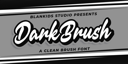 Hello, Are you looking for a clean brush script font? Do you want of creating Something that stand out and inspire creativity, imagination, and endless fun? Wait no more, we will give you the best choice. Dark brush a Clean Brush Font Dark brush a Clean Brush Font, Inspiring from brush lettering style typography. This font is perfect for a design that makes it more attractive and playful. made with a very good level of aesthetics making this font suitable for book cover, poster, packging, merchandise, logotype and much more. Dark brush font includes Multilingual Support, among others : Afrikaans, Albanian, Asu, Basque, Bemba, Bena, Breton, Catalan, Chiga, Cornish, Danish, Dutch, English, Estonian, Faroese, Filipino, Finnish, French, Friulian, Galician, German, Gusii, Indonesian, Irish, Italian, Kabuverdianu, Kalenjin, Kinyarwanda, Luo, Luxembourgish, Luyia, Machame, Makhuwa, Meetto, Makonde, Malagasy, Manx, Morisyen, North Ndebele, Norwegian Bokmål, Norwegian Nynorsk, Nyankole, Oromo, Portuguese, Quechua, Romansh, Rombo, Rundi, Rwa, Samburu, Sango, Sangu, Scottish Gaelic, Sena, Shambala, Shona, Soga, Somali, Spanish, Swahili, Swedish, Swiss German, Taita, Teso, Uzbek (Latin), Volapük, Vunjo, Zulu FEATURES : Uppercase Lowercase Number Punctuation Multilingual PUA Encode Opentype
