10,000 search results
(0.137 seconds)
- Sagasti by Eurotypo,
$32.00 Sagasti is a font family that contains two weights: Regular and Bold, with their corresponding Italics style. These fonts are characterized by a straight and generous serif that provides consistent stability. We have focused on controlling vertical, horizontal and oblique strokes thicknesses, as well as curved strokes. All glyphs were carefully drawn and precise kerning control has been made, providing optimal readability for texts and the beauty of the headlines.
 - Scary Night by Trim Studio,
$12.00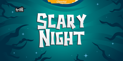 Scary Night is the perfect Halloween font: scary, weird and creepy. It will add a touch of horror to any design project! Its perfectly suited for crafter and graphic artist to complete their design such as invitation, Halloween Event, advertisement, poster, logo, birthday, product sign, and many more! Scary Night Font also Lightweight, even so contains All Standard glyphs and punctuations
 - Dufour by Scholtz Fonts,
$19.00 Dufour was named in honor of an art deco font called "Independent" designed in the 1930s by Collette and Dufour. "Dufour" is influenced by the original font, however, there are substantial differences: instead of small caps, a true lower case was created, the upper case character proportions and shapes have been greatly modified, and all missing characters have been created to make a truly modern font which nevertheless has all of the panache of the original. A related font is Collette, designed by Anton Scholtz, however, Dufour has a softer feel that is more true to the original art deco period. Dufour comes in four styles: Dufour Regular, Dufour Regular Outline, Dufour Condensed, and Dufour Condensed Outline. The font has been carefully kerned and best results are obtained if kerning is switched on. (All-caps passages work well.) It is best used to create a retro feel and in headings, subheads and in short passages of text. Very effective in marketing for products for children.
 - Brush Hand Marker by TypoGraphicDesign,
$19.00 The typeface Brush Hand Marker is designed from 2020 for the font foundry Typo Graphic Design by Manuel Viergutz. The rough sans-serif display typeface with 4 font styles (Italic, Invert, Shadow, 3d) is inspired by handwriting. 348 glyphs incl. 100+ decorative extras like icons, arrows, dingbats, emojis, symbols, geometric shapes, catchwords, decorative ligatures (type the word #LOVE for ❤ or #SMILE for ☺ as OpenType-Feature dlig) and stylistic alternates (2 stylistic sets). For use in logos, magazines, posters, advertisement plus as webfont for decorative headlines. The font works best for display size. Have fun with this font & use the DEMO-Font (with reduced glyph-set) for FREE! Font Specifications ■ Font Name: Brush Hand Marker ■ Font Weights: Italic, Invert, Shadow, 3d + DEMO (with reduced glyph-set) ■ Font Category: Display for headline size ■ Font Format:.otf (Mac + Win, for Print) + .woff (for Web) ■ Glyph Set: 348 glyphs ■ Specials: Alternative letters, stylistic sets, automatic contextual alternates via OpenType Feature. Dingbats & Symbols, arrows, hearts, emojis/smileys, stars, further numbers, lines & geometric shapes ■ Design Date: 2020 ■ Type Designer: Manuel Viergutz
 - Broadveau by Wundes,
$18.00Broadveau is retro typeface that embodies the feel of both Broadway and Art Nouveau. The upper case characters are standardized, while the lower case letters contains playful curvy alternates that give the font its character. While most fonts maintain a common baseline, and vary in height, some of Broadveau’s alternates vary on the baseline, making for an interesting, yet surprisingly readable, textual landscape. This is a title case font only, which contains all the standard sub-255 (upper case) unicode characters. With the alternates it’s almost like 2 fonts in one. - Canger staong by ryan creative,
$10.00 Introducing the Canger staong font which has a unique looking design. This font has curved joints like pipes. You can use Canger staong in modern and contemporary designs, and are suitable for use in various media such as stickers, posters, covers, typography and other digital media. -Uppercase. -Foreign Support, Numbers and Punctuation. -Alternates & ligatures -Simple installation. -Accessible in Adobe Illustrator, Adobe Photoshop. Adobe InDesign, it even works in Microsoft Word.
 - Breeze by Linotype,
$29.99Breeze is a fun font from Frank Marciuliano where the letters are formed like the sails from the boat. He may have been inspired from the sailboats which he sees on the walks along the shore on the Hudson River. There are two forms available. Left and right define the direction of the blowing wind. - Orbi Sans by ParaType,
$30.00 Orbi Sans was designed as an extension of the font system Orbi released on the end of 2010. It’s a low contrast humanist sans serif of open design with the elements of dynamic nature that inherited from Orbi its elegance and clearness. The faces were coordinated with Orbi on metrics, proportions, weights, and design features. Orbi Sans consists of 4 roman weights with corresponding true italics. It can be used together with Orbi and separately. Due to wide variety of styles the family is very good for books, periodicals, and business papers. The fonts were designed by Natalia Vasilyeva. Released by ParaType in 2011.
 - Holografik by Valley Type,
$17.00 Holografik is a Neo-Grotesk sans serif font inspired by scientific progress, existential wonder, and social oneness. With its wide structure and light airy weights, Holografik is an optimistic take on a Grotesk font. The stark Swiss style of the characters is softened with playful curved details, such as a bowed descender in the lowercase y, connected descenders in the alt lowercase g and y, and the curved bottom serif in the alt uppercase B and D. Featuring three weights and italics, it is ideal for use at larger scales like headlines, packaging, editorial, branding, and posters. Includes punctuation, glyphs, diacritics, numerals, icons, and multilingual support.
 - Sidesakey by Aminmario Studio,
$20.00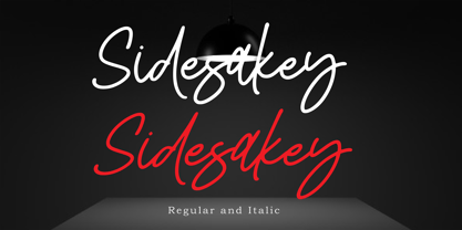 Sidesakey simplifies elegance into one truly stunning handwritten font. With its relaxed feel, Sidesakey is incredibly versatile, suitable to each of the design projects you may have in mind! Use it to create beautiful greeting cards, wedding invitations, logos, website titles and much more! Comes in Regular and Italic styles. Thank you for your purchase! Hope you enjoy with our font
 - Sepulcra - Personal use only

- Stilla by Linotype,
$29.99 François Boltana was a French prolific lettering artist during the late 20th Century. He created the Stilla typeface in 1973. Stilla is a cursive “Fat Face”-style design, reminiscent of the first large advertising and display types produced in the wake of the successful Bodoni, Didot, and Walbaum text faces. Because of this pedigree, Stilla is the perfect headline choice for applications that look back to the 19th century. Stilla could also be used for very short headlines or big logos.
 - Octavia Signature by Pixesia Studio,
$23.00 Introducing Octavia Signature - Script Business Font Octavia Signature is a monoline script font that effortlessly blends simplicity with style. With its clean lines and graceful curves, Octavia Signature exudes a warm and welcoming vibe, making it the ideal choice for your creative projects. Octavia Signature is perfectly suited for branding projects, logo, wedding designs, social media posts, advertisements, product packaging, product designs, label, photography, watermark, invitation, stationery and any projects seeking handwritten taste. FEATURES - Stylistic Alternates - Ligatures - Uppercase and Lowercase letters - Numbering and Punctuations - Works on PC or Mac - Simple Installation - PUA Encoded Characters - Easily accessible without additional design software. - Support Adobe Illustrator, Adobe Photoshop, Adobe InDesign, also works on Microsoft Word - Multilingual Support for 84 languages including Afrikaans, Albanian, Basque, Bosnian, Catalan, Croatian, Czech, Danish, Dutch, English, Estonian, Filipino, Finnish, French, Galician, German, Hungarian, Indonesian, Irish, Italian, Lithuanian, Malay, Norwegian Bokmål, Polish, Portuguese, Slovak, Slovenian, Spanish, Swahili, Swedish, Turkish, Zulu Hope you Like it. Thanks.
 - San Giuseppe by Mans Greback,
$59.00 San Giuseppe is a serif font with finesse and unique charm. Inspired by the romantic, ornate style of the Victorian era and the bold, captivating geometry of Art Deco, San Giuseppe is the perfect blend of neo-classic and vintage aesthetics. This serif font family is designed to infuse your work with an air of grace and refinement that is sure to leave a lasting impression. Ideal for wine labels, luxury branding and high-end packaging, San Giuseppe is an all-capitals font, featuring a stunning array of alternate characters that allow you to create a truly bespoke typographical experience. With its fine, intricate serifs and delicate, artistic letterforms, this font is a testament to the beauty and craftsmanship of yesteryear, created for a modern setting. The San Giuseppe font family consists of six high-quality styles: In addition to the Regular font, it is provided in both Bold and Light, and each of the weights as Italic. The font is built with advanced OpenType functionality and has a guaranteed top-notch quality, containing stylistic and contextual alternates, ligatures and more features; all to give you full control and customizability. It has extensive lingual support, covering all Latin-based languages, from Northern Europe to South Africa, from America to South-East Asia. It contains all characters and symbols you'll ever need, including all punctuation and numbers.
 - Romatine Signature by Aminmario Studio,
$20.00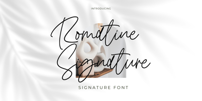 Romatine Signature Font Romatine Signature is a stylish signature font. Its modern charm makes it appear wonderfully, readable, and, ultimately, incredibly versatile. This font will look outstanding in any context, whether it’s being used on busy backgrounds or as a standalone headline! Thank you for the purchase. Happy creating design :)
 - Talaga Lakes by Aminmario Studio,
$20.00 Talaga Lakes Font Talaga Lakes is a casual script font. Its modern charm makes it appear wonderfully, readable, and, ultimately, incredibly versatile. This font will look outstanding in any context, whether it’s being used on busy backgrounds or as a standalone headline! Thank you for the purchase. Happy creating design :)
 - Ps Willy by Fontopia,
$13.99 Willy is a typeface with a wink. This display font is based on existing piquant form from the immediate vicinity. It is sexy, if you have an eye for. But it also should not be taken too seriously, especially because it has a humorous slant. The font has its origins in an art project. It is now made available for design around festifals, parties, invitations, etc.
 - Desmo by Craft Supply Co,
$20.00 Introducing Desmo Reversed Contrast Slab Serif Font Unique Design Meet Desmo Reversed Contrast Slab Serif Font. Its reversed contrast sets it apart. Thick horizontal lines and thin verticals create a striking look. This design choice grabs attention, perfect for impactful displays Versatile Display Font Desmo shines in display settings. Whether for headlines, posters, or advertising, it stands out. Its bold features ensure readability from a distance. Moreover, its unique style makes every design engaging. Engaging Typography Desmo’s typography is designed to captivate. Its slab serifs add a touch of elegance. The font’s balanced spacing ensures clarity in every word. Therefore, it’s ideal for brands aiming to make a statement. Accessibility and Ease of Use This font is accessible to a wide range of users. Its simplicity avoids complex vocabulary. Easy to install and use, Desmo suits various design projects. Additionally, its compatibility with multiple software enhances its versatility.
 - Egoism by WTFont,
$10.00 Presenting a proud and tall font! The ability to express emotion through typography is one that is very much needed. Thus, the idea of emotional typography to communicate feelings was born. The emotion of Egoism is primarily one that is self serving and personal. While appearing to be deceptively simple, it is designed to have a handmade effect. The center point of the letters has been raised, giving the letters and glyphs a taller appearance. This reflects the feeling of having an inflated Ego. The handmade aspect of this font is what makes it great for giving any design a personal touch. Pair it with a bold Sans Serif font which also has a hand made appearance. Create designs with this Egoism font that enhances your hand made looking pieces!
 - 8th Avenue by Our House Graphics,
$16.00 Inspired by the strange, blocky lettering on the sides of a set of a set of plastic kitchen containers in my childhood home, 8th Avenue is a sophisticated, somewhat syncopated font with a retro look and feel that at the same time brings a very modern attitude to your design. 8th Avenue works well as display font for packaging, headlines and logos. Those pastel turquoise plastic boxes from the early 1950s, with white screen printed letters reading FLOUR, SUGAR, COFFEE etc. on one side were a simple quiet presence in our home back then and for decades after. Seeing them, even that soft blue-green colour felt like home. SUGAR, the soul survivor of that set has become one of those mundane items of daily life that somehow become simple icons of another time, ripe with memories. Obviously I had to make a font. September 2014
 - Ctoxina by FSdesign-Salmina,
$39.00 The Ctoxina family is growing. Due to the success the author decided to add an outline version of the font. The typeface is now available in 6 different styles: light, light italic, regular, italic, bold and bold italic. The Atoxina family is designed especially for the burgeoning market of starships and other space cruisers. The fonts are ideal for internal and external use (including zero-g and occasional bursts of cosmic rays), and with their simplified forms are expected to survive well in non-linear galaxies. With their unusual diagonal half-pixels the fonts are striking as abstract designs at astronomical sizes, where small text may be placed within the black holes formed inside the letters.
 - AW Conqueror Std Inline by Typofonderie,
$59.00 30s inspired geometric inline display typeface Several titling typefaces made their appearance at the start of the 20th century, notably Acier and Bifur, both created by French poster artist Cassandre. Later, in the Netherlands, S.H. de Roos designed a version of Inline for its Nobel family called, naturally, Nobel Inline. AW Conqueror Inline pays homage to this beautiful version. AW Conqueror superfamily AW Conqueror Didot is part of a larger family, who include 4 others subfamilies with great potential: They’re but based on same structure, with some connection between them (width for example), to offer a great & easy titling toolbox to any designers, from skillful to beginner. Each of the members try their best to be different from the others because of their features. They should work harmoniously in contrast. Club des directeurs artistiques Prix 2010 European Design Awards 2011
 - Pirate Bay by Vozzy,
$5.00 A vintage look label font named "Pirate Bay".Typeface includes five styles plus aged version, for sample look at 4th preview. This font will good viewed on any retro design like poster, t-shirt, label, logo etc. For using effects layers: - Type your text in Regular. - Copy that and paste at the same position. - Change the style to Effects, Shadow or Texture.
 - Lighthouse Treasure by Letterhanna Studio,
$19.00 "Lighthouse Treasure" is an enchanting handwritten sans-serif font designed with a playful and informal touch, making it an ideal choice for projects with a kids' theme. This font combines the relaxed charm of informal handwriting with a touch of whimsy, perfect for capturing the imagination of young audiences. Whether you're working on children's book covers, playful posters, or vibrant educational materials
 - Neuro X by Sawdust,
$35.00 Neuro X is a narrow sans serif typeface consisting of three weights with additional rounded versions and matching italics. It was first drawn as an exploration for a headline font and later expanded on to become a full typeface family. Neuro X explores the extremities of narrow proportions whilst also allowing for eccentric cuts. The typeface has been tightly monospaced and intended for use at larger sizes as a display but can also work at smaller scales for the more courageous among us. This 339 glyph font has language support for 26 languages: Afrikaans, Albanian, Catalan, Croatian, Czech, Danish, Dutch, English, Estonian, Finnish, French, German, Hungarian, Icelandic, Italian, Lithuanian, Maltese, Norwegian, Polish, Portuguese, Slovak, Slovenian, Spanish, Swedish, Turkish, Zulu.
 - Pinel Pro by URW Type Foundry,
$39.99 The characteristic ‘French face’ was originally made in 1899 under the supervision of Joseph Pinel. Thus, what was originally French 10 pt. Nº 2, got its present name. The Frenchman Joseph Pinel called himself a "typographical engineer", but was at the time employed as a type draughtsman at the Linotype Works in Altrincham. It appears that this and some other faces that he supervised, were, except for use on the Linotype, also meant for manufacturing matrices for the Dyotype. This composing machine was an invention of Pinel. The Dyotype was a rather complicated machine and consisted, like the Monotype, of two separate contraptions, a keyboard which produced a perforated paper ribbon and a casting machine which produced justified lines of movable type. Unlike the Monotype which has a square matrix carrier, the Dyotype had the matrices on a drum (in fact two drums, hence the name of the machine). A Pinel Diotype company was founded in Paris and a machine was built with the help of the printing press manufacturer Jules Derriey. As is often the case, a lack of sufficient capital prevented the commercializing of this ingenious composing machine. Coen Hofmann digitized the font from a batch of very incomplete, damaged and musty drawings, which he dug up in Altrincham. He redrew all characters, bringing up the hairstrokes somewhat in the process. The result is a roman and italic, while the roman font also includes Small Caps
 - Flintlock by CozyFonts,
$25.00 The Flintlock Font Family has a Bold personality. The 'Rough' version of the Flintlock Font has a hand-carved or hand-etched edge, carefully crafted for each of over 300 glyphs. Caps, lower case, all numbers, fractions, accents and European characters that work in over 70 languages. 'Classically Built with a Vintage Flair'. Vintage in the American West Tradition that might have been forged and implemented from the 1860s through the 1930s and consequently fresh again. Flintlock Rough can be envisioned on many things dated from 1860 to present day. The font is available in 3 basic weights as of this release date. There are other versions on the drawing board... Flintlock Rough works extremely well with Posters, Branding, Movie Titles, Invites, Stationary, Signage, Embroidery, Letterpress, Ads, Logos and anything that feels Industrial or Hand-Crafted, eg. Coffee, Breweries, Antiques, Woodcuts, Western Styles, Sports Styles, Holidays, Menus, and more. Flintlock Flat & Flintlock Flat Italic are the siblings to Flintlock Rough without the hand-carved edge but rather clean with slightly rounded corners and edges. Extremely Legible, Bold and best used in all the same application descriptions mentioned above and more, specifically contemporary uses and settings, eg. Sports, Titles, Branding, Headlines, Logos and more. Curiously the Flat & Italic versions of Flintlock work extremely well in 1960s and 1970s settings.
 - Metalsmith by Burntilldead,
$13.00 Say hi to “Metalsmith” font family, a stylish custom culture typeface. Started from the enthusiasm of custom motorcycles, artsy looks of hand made typefaces & illustrations, along with the freedom vibes that came with it, become the first motivation in making this Metalsmith typeface. Packed up with three styles font; regular Clean, Ink Paint & Vintage textured. Italic version on each styles are included. There are 655 glyphs on each styles font including Stylistic sets, Discretionary Ligatures, Standard Ligatures, Contextual Alternates etc. Powered with OpenType features that allows you to mix and match pairs of letters to fit into your design.
 - Skulderklap by Bogstav,
$17.00 Skulderklap is reckognition - you know, that cheerful pad on the shoulder and the compliments that makes your day! This font wants to compliment your designs - that being posters, postcards, flyers or whatever needs a chunky and legible font. Use the ligatures for both UPPER- and lowercase letters to make your text look even more like genuine handwriting!
 - Piano Keybuild by Type Minds,
$5.00 Piano Keybuild is a small font designed for creating piano keyboard layouts. It was inspired by my Yamaha CLP-840, a wonderful digital piano. The face consists entirely of keyboard keys that can be combined to form realistic keyboards. These keys come in four styles: basic outlined keys, filler keys (for adding a second color inside the outlines), keys with note names, and pre-made sets of keys. Keys of a given kind will kern with one another, but only in the order that they would naturally occur on a keyboard. (This makes it easier to spot incorrect key sequences.) It also includes digits 0 through 9 inspired by numerals used in traditional music notation. The user guide (PDF under Gallery tab) demonstrates the locations of all the glyphs as well as how to use them together effectively.
 - 2030 by Noir Typo,
$26.00 2030 font is inspired by the typography of the early 20th century, the Futura of Paul Reener, Cassandre and Charles Loupot’s works and, on a broader level by modernism and art déco mouvements. Geometric, with classicals proportions, this typefaces is a re-interpretation, in a actual form, of the alphabets from this period. The lines are straight, but the letters are easy to read and nice to watch thanks to optical corrections. Build with 9 weights of 700 glyphs, italics and small caps.
 - Straight Line by K-Type,
$20.00 Straight Line is essentially an outline Modern, but drawn without any curves whatsoever. Thin horizontals and thick verticals provide the classic look of a Didone, updated and enhanced by clean, minimalist geometry. In addition to the Straight Line font itself, the package includes Straight Line Solid with matching spacing and kerning. The Solid font can be used solo, or layered with the outline font to provide a colour background. Straight Line is an excellent display face for contemporary, eye-catching headings and sub-headings, and the fonts contain a full complement of Latin Extended-A characters. The typeface was inspired by a 1930s experimental alphabet by the British artist, Percy J Smith.
 - Bewick Roman NF by Nick's Fonts,
$10.00 In 1905, artist and illustrator Will Bradley devised the pattern for this charming face. A little bit quirky and a whole lot of fun. Both versions support the Latin 1252, Central European 1250, Turkish 1254 and Baltic 1257 codepages.
 - Raligur by Hishand Studio,
$15.00 Raligur is a harmonious blend of timeless aesthetics and modern versatility, making it a perfect choice for designers seeking a balance between tradition and innovation. Featuring exquisite details and a sense of timeless appeal, Raligur, the newly unveiled serif font, sets the stage for elegant typography that leaves a lasting impression on any audience. Complete with ligatures alternates regular italic icon kerning multilingual support
 - Light Metro by Nathatype,
$29.00 Ready to make your branding spark? If you need to create a big, bold logo for your business, work on a poster for an event, or whatever your project may be-then this is the perfect font for you. Light Metro-A Script Font Light Metro is a captive font designed with strong outlines and fat strokes to bring your branding to life and add a touch of vintage, fun, but still stylish. Inspired from pop 1960-1970s. This font features thick and angular letters that easy on the eyes and nice to look while it’s also easy to read. Light Metro becomes more special with extruding version option. Perfect to create amazing headings, logos, menus, social media graphics, and many more. Our font always includes Multilingual Support to make your branding reach a global audience. Features: Ligatures Stylistic Sets Swashes PUA Encoded Numerals and Punctuation Thank you for downloading premium fonts from Natha Studio
 - Sabon Paneuropean by Linotype,
$45.99Jan Tschichold designed Sabon in 1964, and it was produced jointly by three foundries: D. Stempel AG, Linotype and Monotype. This was in response to a request from German master printers to make a font family that was the same design for the three metal type technologies of the time: foundry type for hand composition, linecasting, and single-type machine composition. Tschichold turned to the sixteenth century for inspiration, and the story has a complicated family thread that connects his Sabon design to the Garamond lineage. Jakob Sabon, who the type is named for, was a student of the great French punchcutter Claude Garamond. He completed a set of his teacher's punches after Garamond's death in 1561. Sabon became owner of a German foundry when he married the granddaughter of the Frankfurt printer, Christian Egenolff. Sabon died in 1580, and his widow married Konrad Berner, who took over the foundry. Tschichold loosely based his design on types from the 1592 specimen sheet issued by the Egenolff-Berner foundry: a 14-point roman attributed to Claude Garamond, and an italic attributed to Robert Granjon. Sabon was the typeface name chosen for this twentieth century revival and joint venture in production; this name avoided confusion with other fonts connected with the names of Garamond and Granjon. Classic, elegant, and extremely legible, Sabon is one of the most beautiful Garamond variations. Always a good choice for book typography, the Sabon family is also particularly good for text and headlines in magazines, advertisements, documentation, business reports, corporate design, multimedia, and correspondence. Sabon combines well with: Sans serif fonts such as Frutiger, Syntax. Slab serif fonts such as PMN Caecilia, Clairvaux. Fun fonts such as Grafilone, Animalia, Araby Rafique. See also the new revised version Sabon Next from the Platinum Collection." - Narnia BLL - Unknown license

- Rosemont by Scriptorium,
$24.00Rosemont is a playful new font which hovers on the bordeline between Arts and Crafts style and Art Nouveau style. It has the narrowness of Art Nouveau fonts like Adresack, Spoonbill and Coloma, with the curls and unique character forms of Art Nouveau fonts like Beauvoir or Acadian. The result is an interesting looking font which could be at home in either design environment. Rosemont features two sets of upper case characters, one with more decoration and one which is more plain. - Specialist by Trim Studio,
$12.00 The Specialist is a beautiful signature script. It has a great readability and is perfect for adding a striking, yet elegant look to your designs. The two included styles are perfect for signatures, branding, wedding invites, business cards, quotes, travel designs, playful events and more! Its perfectly suited for crafter and graphic artist to complete their design such as invitation, advertisement, poster, logo, birthday, product sign, and many more! The Specialist Font is also Lightweight and contains All Standard glyphs and punctuations and can be used beside any font.
 - Fordor Incised NF by Nick's Fonts,
$10.00Based on a old standard, Tudor Black, this version offers a dramatic inline treatment that adds sparkle and grace. The typeface takes its name from Ford Motor Company's old designation for a sedan. Both versions of the font include 1252 Latin and 1250 CE (with localization for Romanian and Moldovan) character sets.

