10,000 search results (0.05 seconds)
  1. Landscape-Trees by Scriptorium, $12.00
  2. Subikto Tree by Subtitude, $27.00
    Subikto Tree is an ode to Mother Nature. This summer enjoy so many variety of trees in your design, be green and forget the blues.
  3. Big Trees by A New Machine, $19.00
    Inspired by a trip to Sequoia National Park, this bold, all cap font is reminiscent of the great west and wide open spaces. Upper case letters are solid while lower case letters feature shadow lines. Great for titles, branding and logo work.
  4. Tree Assortment by Gerald Gallo, $20.00
    An assortment of all types of trees from simple to complex.
  5. Tonys Trees by Komet & Flicker, $10.00
    Tony’s Trees was inspired by the handmade signs down at the local Christmas tree lot. A fun-forest of typographic possibilities!
  6. DB Trees by Illustration Ink, $3.00
    DB Trees includes several familiar and not so familiar tree designs with plenty of room for creativity to grow. Makes fun additions to your creative projects.
  7. XXII DONT-MESS-WITH-VIKINGS - Unknown license
  8. 101! Your FontZ Are Served - Unknown license
  9. XXII DONT MESS WITH VIKINGS by Doubletwo Studios, $-
  10. KG Primary Penmanship 2 - Personal use only
  11. Janda Closer To Free - Personal use only
  12. SPARKS Free for All - Unknown license
  13. Free Form Retro JNL by Jeff Levine, $29.00
    The titles and credits from the 1960 French film “Le Passage Du Rhin” (English release title: “Tomorrow is My Turn”)” are hand made in a free form bold alphabet resembling both cut paper and quickly sketched lettering. This avant garde style inspired the digital type revival, which is available in both regular and oblique versions.
  14. Free Form Showcard JNL by Jeff Levine, $29.00
    One of the examples in the 1916 publication “Baker’s Showcard Book” [an early 20th Century instructional book on sign lettering] was simply called “Plain Poster”. Somewhat Art Nouveau in style, but with many ‘nonconforming’ character shapes and widths, this novelty design is available digitally as Free Form Showcard JNL in both regular and oblique versions.
  15. Janda Closer To Free by Kimberly Geswein, $5.00
    This chunky serif handwriting is fun but still completely legible for children.
  16. Bodoni Classic Free Style by Wiescher Design, $39.50
    Bodoni Classic Free Style is my really fat, high contrast free flowing, liberated designed, script-like non-script extension to my ever expanding Bodoni Classic family.
  17. GF Ordner Inverted - Unknown license
  18. American Advertise 012 by Intellecta Design, $19.90
  19. American Advertise 014 by Intellecta Design, $18.95
    from the wood type heritage of America
  20. American Advertise 008 by Intellecta Design, $22.90
    a decorative caps font digitized in the american type heritage
  21. American Advertise 003 by Intellecta Design, $11.90
    wood type heritage
  22. FS Albert Arabic by Fontsmith, $150.00
    Brother To create a truly global font family, FS Albert needed an Arabic script sibling. Emanuela Conidi set about the delicate task of creating an alphabet to harmonise visually with its Latin sans serif counterpart so that the two could be used side-by-side in bilingual publications. Working with the Kufic style of script, with its simpler, geometric forms, Emanuela sculpted letters with the a similar optical size, weight and rhythm as FS Albert, with open counters and monolinear strokes. It never hurts to Naskh But there’s more to FS Albert than a simple, geometric structure. To match Albert’s cheery, charming character, FS Albert Arabic needed an injection of warmth and informality. Emanuela incorporated some of the more expressive, calligraphic shapes of the Naskh script style, which lent the letterforms a looser, softer, more handwritten quality, while remaining functional and structured. The Naskh influence is most noticeable in the bowl of characters such as Jim, Qaf and Nun, in the curved tail of Waw and Reh, and the deep joining of Tah. Follow the script The end result is an Arabic script that’s the perfect partner to FS Albert: open counters, monolinear strokes and a friendly, rounded appearance. FS Albert Arabic is available in Opentype format, in five weights from Thin to ExtraBold. It supports Persian and Urdu, with proportional and tabular numerals for both, plus full vocalisation and the Hijra feature.
  23. American Advertise 016 by Intellecta Design, $15.95
    a classic decorative caps font digitized from the wood type classics heritage from America's
  24. Fat Albert BT by Bitstream, $50.99
    Ray Cruz releases another typeface family, this time inspired by 1970's pop culture. Fat Albert Regular, Outline and Shadow are bold poster types that evoke the fun and funk of an era gone by. Go on bro, get Fat Albert and get down.
  25. American Advertise 007 by Intellecta Design, $18.90
  26. American Advertise 006 by Intellecta Design, $14.90
    decorative caps from america heritage typography
  27. American Advertise 019 by Intellecta Design, $17.90
    See also some related font families: American Advertise 013 , American Advertise 014 , American Advertise 015 , American Advertise 016 , American Advertise 017 , and American Advertise Square Series .
  28. American Advertise 011 by Intellecta Design, $19.90
  29. LHF Advertisers Square by Letterhead Fonts, $33.00
    This easy to read, versatile letterstyle was inspired by Al Imelli's "Advertiser's Square" (circa 1920's). Modifications were made and alternates added.
  30. American Advertise 015 by Intellecta Design, $14.95
    digitization of a classic font from America heritage
  31. American Advertise 005 by Intellecta Design, $15.90
    a classic from american heritage
  32. American Advertise 009 by Intellecta Design, $26.90
    from american wood type heritage
  33. American Advertise 018 by Intellecta Design, $26.90
  34. American Advertise 013 by Intellecta Design, $9.00
    inspired in classic wood type heritage fonts from old America's foundryes
  35. American Advertise 017 by Intellecta Design, $17.90
  36. American Advertise 010 by Intellecta Design, $13.90
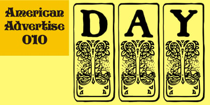
  37. FS Albert Paneuropean by Fontsmith, $90.00
    The x factor How do you make a font like FS Albert unique, distinctive? “When designing a font I try to question every letter,” says Jason Smith, “but all you need is a few that have an x factor. With FS Albert, they’re the lowercase ‘a’ and ‘g’ and the uppercase ‘I’ and ‘J’. “I remember a friend saying, ‘Why on earth have you designed the ‘a’ like that? Isn’t it too friendly for this kind of font?’ And, in a way, that’s what I wanted – honesty and warmth, because a lot of big brands at the time really needed to show a more human side.” Range of weights and styles FS Albert is a charismatic type: a warm, friendly sans serif face with a big personality. Open, strong and amenable, and available in a wide range of weights and styles, FS Albert suits almost every task you put it to. Fontsmith has crafted five finely-tuned upright Roman weights and four italic weights, as well as a special Narrow version to provide the best coverage and give headlines and text an easy-going character. The chunky kid “FS Albert was inspired by – and named after – my son, who was a bit of a chunky kid,” says Jason Smith. “I designed an extra bold weight because I always felt that the really big font heavy weights had the most personality. “I recently told Albert this story. He laughed, and forgave me for thinking he was a fat baby. He liked the big personality bit, though.” 1000s of glyphs Not content with a character set that covered Europe and the whole of the Western world, the studio decided to go further afield. There are now FS Albert character sets that cover western and eastern European languages, including those of Russia, as well as Cyrillic, Arabic and Greek scripts. In fact, the font now covers more than 100 languages, making it ideal for bringing a consistent typographic style to the communications of global brands.
  38. Advertising Stencil JNL by Jeff Levine, $29.00
    An ad spotted in a 1964 issue of Billboard magazine with the words “STAND BACK…” introduced the first record album from then-new stand-up comedian Bill Cosby. The lettering of those two words was in a stencil sans serif design that was a perfect candidate for developing into a digital font. The end result is Advertising Stencil JNL, which is available in both regular and oblique versions.
Looking for more fonts? Check out our New, Sans, Script, Handwriting fonts or Categories
abstract fontscontact usprivacy policyweb font generator
Processing