10,000 search results
(0.144 seconds)
- 1479 Caxton by GLC,
$38.00
- Carbon Tax by Phat Phonts,
$25.00 - Carbon Neutral by Okaycat,
$29.95
- FF Karton by FontFont,
$62.99
- Ye Carbon by Yinon Ezra,
$30.00
- Caltons Typeface by Tacikworks,
$16.00
- Calton Hosvesk by UICreative,
$23.00
- Caxton SH by Scangraphic Digital Type Collection,
$26.00 - Maroon Vibes by ErlosDesign,
$19.00
- Orange Baroon by Attype Studio,
$14.00
- NOh Carbone by OhType!,
$32.00
- Shardee - Unknown license

- Fong Shay Noon JNL by Jeff Levine,
$29.00
- Monte Carlo Script NF by Nick's Fonts,
$10.00 - Put My Foot Down by Ingrimayne Type,
$14.95
- Dont Bug Me JNL by Jeff Levine,
$29.00 - SF Comic Script - Unknown license

- Bionic Comic Condensed - Unknown license

- SF Wonder Comic - Unknown license

- Bionic Comic Italic - Unknown license

- Comic Strip MN - Unknown license

- Casper Comics Solid - Unknown license

- SF Comic Script - Unknown license

- FortuneCity Comic Outline - Unknown license

- SF Slapstick Comic - Unknown license

- Comic Book Commando - Personal use only

- Bionic Comic Expanded - Personal use only

- SF Wonder Comic - Unknown license

- SF Wonder Comic - Unknown license

- SF Wonder Comic - Unknown license

- HVD Comic Serif - Unknown license

- SF Slapstick Comic - Unknown license

- SF Slapstick Comic - Unknown license

- SF Slapstick Comic - Unknown license

- Classic Comics JNL by Jeff Levine,
$29.00
- FF Comic Jens by FontFont,
$41.99 - Breaking The Comic by Gassstype,
$23.00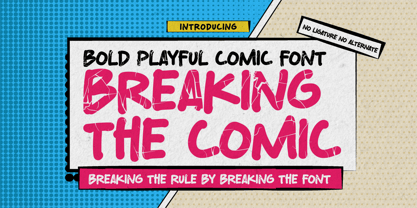
- Sweet Cane Comic by Mvmet,
$15.00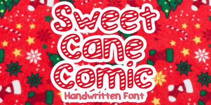
- Comic Pro JY by JY&A,
$39.00 - Comic Opera JNL by Jeff Levine,
$29.00


