10,000 search results
(0.107 seconds)
- Reina Neue by Lián Types,
$29.00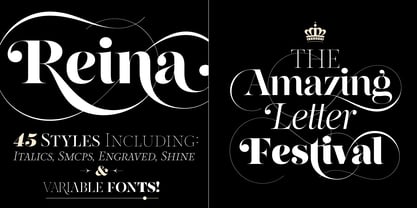 Hey! See Reina Neue in action here! INTRODUCTION When I designed the first Reina¹ circa 2010, I was at the dawn of my career as a type designer. The S{o}TA, short for the Society of Typographic Aficionados, described it as complex display typeface incorporating hairline flourishes to a nicely heavy romantic letterform². And it was like that; that’s what I was pursuing at that time since I was very passionate about ornaments and accolades of Calligraphy. Why? I felt that Typography, in general, needed more of them. These subtle flourishes could breathe life into letters. Maybe, I thought it was the only way I could propose something new into the field of type. However, after some years, I came across a very interesting quote: –Beautiful things don’t ask for attention– Wow! What did this mean? How could something be attractive if it’s not actually showing it. Could this be applied to my work? Sure. I think every type-designer goes through this process (aka crisis) regarding his or her career. At the beginning we love everything. We are kind of blind, we only see the big picture of a project. And that’s not because we are lazy. We actually can’t see the small mistakes nor the subtleties that make something simpler beautiful. We are not able. But, the small subtleties… They are actually everything: With experience, one puts more attention into the details and learns that every single decision in type has to be first meticulously planned. Here I am now, introducing a new Reina, because I felt there was a lot of it that could be improved, also the novelty of Variable Fonts caught my attention and I had to take that to my type library. THE FONT A thing of beauty is a joy forever Now, a decade later, I’m presenting Reina Neue. This font is not just an update of its predecessor: –A thing of beauty is a joy forever– is the first line of the poem ‘Endymion’ by John Keats, and despite the meaning of “beauty” may vary from person to person, and even from time to time (as read in the last paragraph), with Reina I always wanted to bring joy to the eye. In 2010, and now, in 2020. I believe the font is today much better in every aspect. It was entirely re-designed: Its shapes and morphology in general are much more clean and pure. The range of uses for it is now wider: While the old Reina consisted in just one weight, Reina Neue was converted into a big family of many weights, even with italics, smallcaps and layered styles. The idea behind the font, this kind of enveloping atmosphere made out of flourishes, is still here in the new Reina. This time easier to get amazing results due to the big amount of available alternates per glyph and also more loyal from a systemic point of view. However, and as read in the introduction -Beautiful things don’t ask for attention-, if none of the flourishes are activated the font will look very attractive anyway. Reina Neue is ready to be used in book covers, magazines, wedding cards, dazzling posters, storefronts, clothing, perfumes, wine labels and logos of all kind. Like it happened with the previous Reina, I hope this new font satisfies every design project around the world if used, and can be a joy forever. SOME INSTRUCTIONS Before choosing the right style for your project, hear my advice: -Reina Neue Display was meant to be used at big sizes. If you plan to print the font smaller than 72pt, I suggest using Reina Neue, not Display. Otherwise, if the font will be BIG or used on a digital platform, Reina Neue Display should be your choice. For even smaller sizes, use Reina Neue Small. This style was tested and printed in 12pt with nice results. (Note for variable fonts: Print them in outlines) -Reina Italic is not a slanted version of the roman, and this means some flourishes are different between each other. The Italic version has other kind of swirls. More conservative, in general. -All the styles of Reina Capitals have Small Capitals inside. -Reina Capitals Shine should be used/paired ONLY with Reina Capitals Black. The engraved feeling can be achieved if Reina Capitals Black and Reina Capitals Shine are used as layers, with the same word. Variable fonts instructions: -For more playful versions, choose Reina Neue VF, Reina Neue Italic VF or Reina Neue Capitals VF: With them you can adjust between 3 axes: Weight (will change the weight of the font) – Optic Size (will thicken/lighten the thin strokes and open/close the tracking) – Accolades (will modify the weight of the active flourishes). SOME VIDEOS OF REINA NEUE VF https://youtu.be/8cImmT5bpQM https://youtu.be/1icWfPmKAkg https://youtu.be/YC9GkJDL1a8 NOTES 1. The original Reina, from a decade ago: https://www.myfonts.com/fonts/argentina-lian-types/reina/ 2. In 2011, Reina received an honourable mention by S{o}TA. “Great skill is shown in the detailing, and an excellent feel for the correct flow of curves and displacement of stroke weight.” https://www.typesociety.org/catalyst/2011/ Reina was featured in the “Most Popular Fonts of the year” in MyFonts in 2011 https://www.myfonts.com/newsletters/sp/201201.html In 2012, the font was also selected in Tipos Latinos, the most prestigious competition of type in Latinoamerica. https://www.tiposlatinos.com/bienales/quinta-bienal-tl2012/resultados Also, chose as a “Favorite font of the year” in Typographica. https://typographica.org/typeface-reviews/reina/
 - Equines by Attractype,
$12.00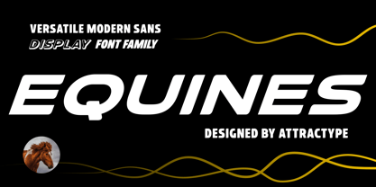 Equines Display is a versatile font family designed specifically for display purposes. Its modern, thick and strong appearance is perfect for branding, logos, banners and any lettering that requires bold and clear letters. To add an artistic image rather than just the thickness of the shape, Equines Display adds a rounding feature to the corners of the letters with a cross system, which makes the word display dynamic, strong and elegant. Until this description was published, Equines Display had 14 styles including condesed, expanded, outline and shaded in hopes of meeting the display font needs of designers and everyone at large. Enjoy working with the Equines Display font family. Best regards, Saefulloh - Attractype Foundry.
 - Quadon by René Bieder,
$25.00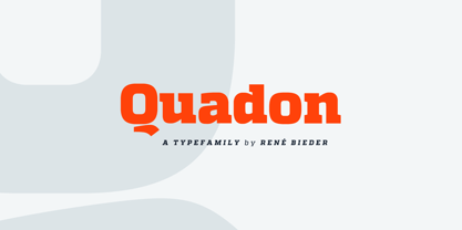 Quadon was designed to fill the gap between traditional serifs and the lasting trend of using sans serif fonts for contemporary design. The result is a modern, clear and infinitely flexible interpretation of slab serif fonts. The open shapes and a large x-height keep the font legible in small sizes while the short descender supports the compact heart and strength of a slab serif. Quadon has a wide range of typographic features and alternative glyphs to create your own and unique version of it. It comes in nine different weights with matching italics. From the sensitive but sharp thinner weights to the punchy and powerful heavy weights, Quadon is well-suited for a wide range of versatile tasks.
 - Cornucurlia by Calligraplay,
$13.00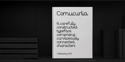 Cornucurlia is a carefully constructed typeface comprising curvaceously connected characters. Designed as a display font, use it for posters, signage, branding and any type-based artwork that needs stylish, standout lettering. Multi-lingual and with a range of symbols, the font includes 368 glyphs that link together with geometric curves.
 - Rosalinda Script by My Creative Land,
$18.00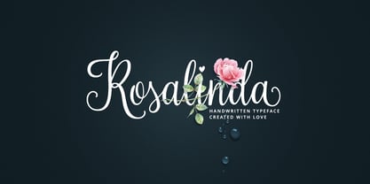 Rosalinda is a new handwritten typeface designed with wedding invitations in mind but can be used for various purposes like t-shirt design, logos, quotes design etc. The font contains 900+ characters and is best used in an Opentype-aware application such as Adobe Illustrator, Adobe InDesign, MSWord, Adobe Photoshop etc.
 - Spontial by Lemonthe,
$12.00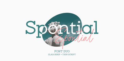 Spontial consists of two fonts, Script and Slab serif, designed to complement each other perfectly. Whether together or separate, these fonts will add an elegant and classy touch to your design. It is perfect for many different projects such as logos & branding, invitation, stationery, wedding designs, signature, product designs, labels, photography, and much more!
 - Lumend by Craft Supply Co,
$20.00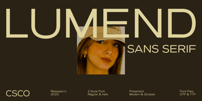 Lumend Modern Sans Serif Font Sleek and Contemporary Design Introducing Lumend, a modern sans serif font with a unique grotesque twist. Its minimalist aesthetic is defined by clean lines and unadorned forms, offering a fresh, contemporary look. Versatility in Application Remarkably versatile, Lumend Modern Sans Serif Font is adept in both text and title settings. Its legibility in lengthy paragraphs is impressive, while its boldness in headlines commands attention, making it ideal for a variety of design projects. Optimized for All Mediums Crafted for both digital and print use, Lumend’s clarity excels on screens and maintains crispness in print. This adaptability makes it suitable for web design, printed materials, and everything in between.
 - Pink Chicken by Scratch Design,
$9.00Pink Chicken is a cute handwritten font, this font is complete all punctuations and multi-languages support. Pink chicken has an authentic casual shape so this design will applicable on any occasion design. Enjoy this font, its also support for mac and windows. - Butter Swany by FHFont,
$17.00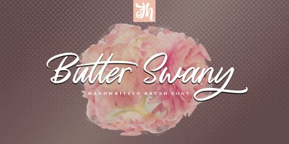 Butter Swany is a Hand lettering Brush font with opentype features.. Suitable for design, element design, wedding, event, t-shirt, logo, badges, sticker, and awesome work.
 - Dragtime by FHFont,
$17.00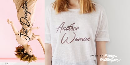 Dragtime is handwritten script font with signature style. Suitable for design, element design, wedding, event, t-shirt, logo, badges, sticker, and awesome work, and many more.
 - Pinkalova by FHFont,
$15.00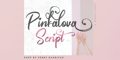 Pinkalova is handwritten script font with love and unique style. Suitable for design, element design, wedding, event, t-shirt, logo, badges, sticker, and awesome work, etc...
 - Bella Sweety by Almarkha Type,
$29.00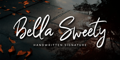 Bella Sweety- Its a handwritten script font with a Signature Style and classy style, this font is great for your creative projects such as watermark on photography, and perfect for logos & branding, photography, invitation, watermark, advertisements, product designs, stationery, wedding designs, label ,product packaging, special events or anything that need handwriting Accessible in the Adobe Illustrator, Adobe Photoshop, Adobe InDesign, even work on Microsoft Word. PUA Encoded Characters – Fully accessible without additional design software. Fonts include multilingual support Image used : All photographs/pictures/vector used in the preview are not included, they are intended for illustration purpose only. Cheers! Thank You
 - PR Swirlies 01 Frames by PR Fonts,
$10.15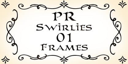 This font is a collection of simple calligraphic ornaments suitable for invitations, gift tags, and anything that can benifit from a "spoonful of sugar" visually. The frames font uses the same calligraphic elements as PR-Swirlies-01, but has them combines in ways which form an elliptical cartouche. Many of the elements can be used in a modular way to create frames of varying length.
 - Taranum by Jorsecreative,
$19.00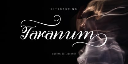 Taranum is a beautiful, high-quality modern-style calligraphy font, perfect for branding, web titles, Application, wedding invitation cards, and maybe for Drink Labels, etc. Taranum is made with the Glyph OpenTypo Latpro option, so there are no worries about the completeness, numbers, symbols and various punctuation marks. All lowercase letters including initial and final swash provide a realistic calligraphy style. OpenType features can be accessed using smart OpenType programs such as Adobe Photo Shop, Adobe Illustrator, Adobe Indesign, Corel Draw and Microsoft Office. Thank you and have a nice day. Symon Adam
 - Magnesia SF by S6 Foundry,
$24.00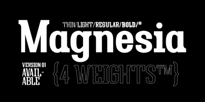 Magnesia Sf is a modern, one-of-a-kind font that will make your designs stand out against the competition. This stylistic semi-block serif comes in 4 styles and has Multi-languages support and the display typeface has what you need for all sorts of projects! Perfectly suited for headlines, large-format prints, brand identities, social media, advertising, editorial design, posters, magazines, logos, headings, digital and more.
 - R-Flex by VType,
$25.00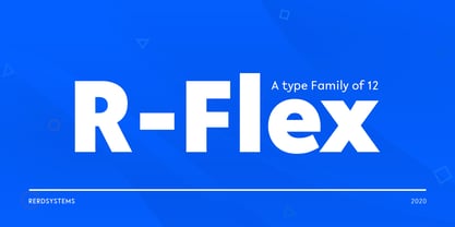 A modern sans serif font with a geometric and a bit of a grotesque touch. It comes in 12 weights, 6 straights and matching italics. Each weight includes extended language support (+ Cyrillic), fractions, tabular figures, ligatures and more. It has been designed with powerful OpenType features in mind. Perfectly suited for graphic design and display use. It could work seamlessly for web, signage, corporate and editorial design.
 - Solar Vesta by Anthony James,
$15.00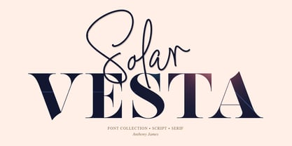 Solar Vesta Collection houses both Script & Serif fonts that compliment each other perfectly. Solar Vesta Script includes 127 ligatures, along with a full set of Alternates/Contextuals for a completely versatile and natural aesthetic. Solar Vesta Serif is a sharp robust fashion-based typeface, incorporating that beautiful contrast between thick and thin. To access the built-in Opentype features within the script font, make sure to turn on Standard Ligatures and Contextual Alternates in your Softwares Opentype Panel. This activates all neccessary features and enables optimum accessibility, to allow for natural handwriting. Solar Vesta Script also includes swashes, these are easily accessible as Stylistic Alternates, when typing in basic Numerals...123 etc.
 - Boogie by Linotype,
$40.99German graphic designer Ralf Weissmantel created Boogie in 2003. Boogie is an ironic reference to pop art, and to disco lettering from the 1960s and 70s. Its round forms and outlines evoke the flashing, pulsating lights and music of that era. Shipping with five different, width-compatible fonts, the Boogie typeface has four different components: an outlined letterform is the base element, and forms the first font. Three additional fonts may be layered over top of this base, surrounding the first font with up to three bubble-outlines. In graphics applications like Adobe PhotoShop or Illustrator, these elements can each be assigned different colors. There is also a fifth font, which contains the base outlined letterform pre-surrounded by three additional outlines of the same color. Boogie works best in large headline, display and signage applications, where its forms can be clearly seen and enjoyed. When different colored layers are applied, text set in Boogie will gyrate and jive across the page! Weissmantel has worked as an art director for various international advertising agencies, and has led Corporate Design projects for firms such as Grey and MetaDesign. His design work, honored internationally, has been included in the typography collection of the Museum for Art and Trade in Hamburg. He is currently teaching graphic design at the Düsseldorf University of Applied Sciences. Weissmantel has been an associate of the United Designers Network since August 2002. Boogie received an Honorable Mention in the 2003 International Type Design Contest, sponsored by Linotype GmbH. - P22 Barabajagal by IHOF,
$29.95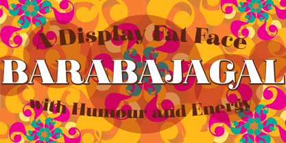 P22 Barabajagal is a unique take on the display fat face by way of doodling fun. Somewhat informed by the shapes of an early 1970s film type called Kap Antiqua Bold, this font’s aesthetic is the stuff of boundless energy and light humour, where an uncommon “peak” angle drawing perspective results in sturdy trunks, fat bottom curls, and active ascenders eager for mobility in space. This is the kind of font that makes you wonder whether it was drawn with rulers, protractors and compasses, or just by a mad doodler’s crazy-good free hand. Regardless, Barabajagal easily turns the geometry of modern forms into an exercise in sugar-loaded fun. It’s a very good tool to use in design geared at kids and young adults, such as food and toy packaging, books, animation, cartoons and games. Barabajagal comes with over 550 glyphs, lots of alternates, and a few ligatures and swash caps. It also contains extended support for Latin languages.
 - Joomplank by ZetDesign,
$15.00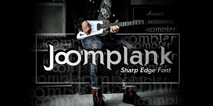 Joomplank is a decorative font with a pointed shape at the end of each letter. The pointed tip gives a firm impression on the appearance of your design. This font has four families that allow designs to choose according to their needs, plus an opentype feature that helps designers produce the best work. This font is very suitable for use in posters, screen printing, logos, and more.
 - Lenolove by Balevgraph Studio,
$10.00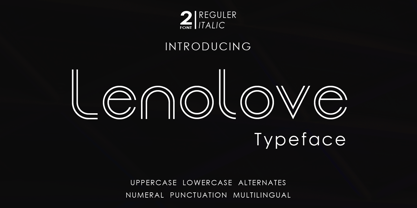 Lenolove is a cool and classy display font. Add this minimalistic and techno-style font to any web design, logo, Title, or anything else that needs a smart, cool touch. What's Included? Uppercase & Lowercase Numbers & Punctuation Multilingual Support Regular & Italic PUA Encoded
 - Quercus 10 by Storm Type Foundry,
$69.00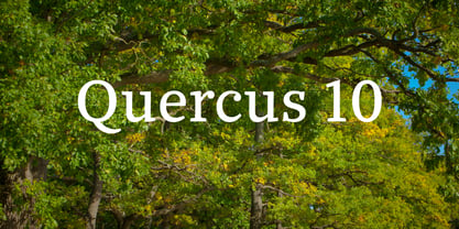 Quercus is characterised by open, yet a little bit condensed drawing with sufficient spacing so that the neighbouring letters never touch. It has eight interpolated weights with respective italics. Their fine gradation allows to find an exact valeur for any kind of design, especially on the web. Quercus serif styles took inspiration from classicistic typefaces with vertical shadows, ball terminals and thin serifs. The italics have the same width proportion as upright styles. This “modern” attitude is applied to both families and calls for use on the same page, e g in dictionaries and cultural programmes. Serif styles marked by “10” are dedicated to textual point sizes and long reading. The sans-serif principle is rather minimalistic, with subtle shadows and thinned joints between curved shapes and stems. Quercus family comprises of the usual functionality such as Small Caps, Cyrillics, diacritics, ligatures, scientific and aesthetic variants, swashes, and other bells & whistles. It excels in informational and magazine design, corporate identity and branding, but it’s very well suited for book covers, catalogues and posters as well. When choosing a name for this typeface I've been staring out from my studio window, thinking helplessly without any idea in sight. Suddenly I realised that all I can see is a spectacular alley of oaks (Quercus in Latin) surrounding my house. These oaks were planted by the builders of local ponds under the leadership of Jakub Krčín in the fifteenth century.
 - Quercus Whiteline by Storm Type Foundry,
$69.00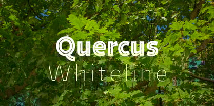 Quercus is characterised by open, yet a little bit condensed drawing with sufficient spacing so that the neighbouring letters never touch. It has eight interpolated weights with respective italics. Their fine gradation allows to find an exact valeur for any kind of design, especially on the web. Quercus serif styles took inspiration from classicistic typefaces with vertical shadows, ball terminals and thin serifs. The italics have the same width proportion as upright styles. This “modern” attitude is applied to both families and calls for use on the same page, e g in dictionaries and cultural programmes. Serif styles marked by “10” are dedicated to textual point sizes and long reading. The sans-serif principle is rather minimalistic, with subtle shadows and thinned joints between curved shapes and stems. Quercus family comprises of the usual functionality such as Small Caps, Cyrillics, diacritics, ligatures, scientific and aesthetic variants, swashes, and other bells & whistles. It excels in informational and magazine design, corporate identity and branding, but it’s very well suited for book covers, catalogues and posters as well. When choosing a name for this typeface I've been staring out from my studio window, thinking helplessly without any idea in sight. Suddenly I realised that all I can see is a spectacular alley of oaks (Quercus in Latin) surrounding my house. These oaks were planted by the builders of local ponds under the leadership of Jakub Krčín in the fifteenth century.
 - Quercus Serif by Storm Type Foundry,
$69.00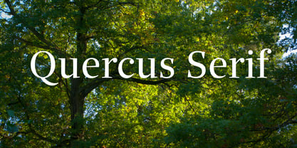 Quercus is characterised by open, yet a little bit condensed drawing with sufficient spacing so that the neighbouring letters never touch. It has eight interpolated weights with respective italics. Their fine gradation allows to find an exact valeur for any kind of design, especially on the web. Quercus serif styles took inspiration from classicistic typefaces with vertical shadows, ball terminals and thin serifs. The italics have the same width proportion as upright styles. This “modern” attitude is applied to both families and calls for use on the same page, e g in dictionaries and cultural programmes. Serif styles marked by “10” are dedicated to textual point sizes and long reading. The sans-serif principle is rather minimalistic, with subtle shadows and thinned joints between curved shapes and stems. Quercus family comprises of the usual functionality such as Small Caps, Cyrillics, diacritics, ligatures, scientific and aesthetic variants, swashes, and other bells & whistles. It excels in informational and magazine design, corporate identity and branding, but it’s very well suited for book covers, catalogues and posters as well. When choosing a name for this typeface I've been staring out from my studio window, thinking helplessly without any idea in sight. Suddenly I realised that all I can see is a spectacular alley of oaks (Quercus in Latin) surrounding my house. These oaks were planted by the builders of local ponds under the leadership of Jakub Krčín in the fifteenth century.
 - Quercus Sans by Storm Type Foundry,
$69.00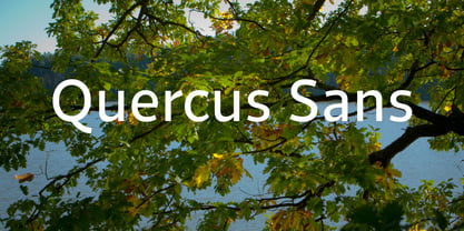 “Quercus” is characterised by open, yet a little bit condensed drawing with sufficient spacing so that the neighbouring letters never touch. It has eight interpolated weights with respective italics. Their fine gradation allows to find an exact valeur for any kind of design, especially on the web. Quercus serif styles took inspiration from classicistic typefaces with vertical shadows, ball terminals and thin serifs. The italics have the same width proportion as upright styles. This “modern” attitude is applied to both families and calls for use on the same page, e g in dictionaries and cultural programmes. Serif styles marked by “10” are dedicated to textual point sizes and long reading. The sans-serif principle is rather minimalistic, with subtle shadows and thinned joints between curved shapes and stems. Quercus family comprises of the usual functionality such as Small Caps, Cyrillics, diacritics, ligatures, scientific and aesthetic variants, swashes, and other bells & whistles. It excels in informational and magazine design, corporate identity and branding, but it’s very well suited for book covers, catalogues and posters as well. When choosing a name for this typeface I've been staring out from my studio window, thinking helplessly without any idea in sight. Suddenly I realised that all I can see is a spectacular alley of oaks (Quercus in Latin) surrounding my house. These oaks were planted by the builders of local ponds under the leadership of Jakub Krčín in the fifteenth century.
 - Potato Sans by 4RM Font,
$9.00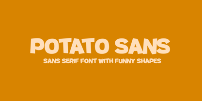 Made with a cute shape, making this font suitable for use in graphic designs related to unique things. This font is available in 2 styles namely bold and black.
 - Belinda New by Melvastype,
$29.00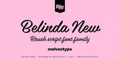 Belinda New is an updated version of the original Belinda which I designed in 2011. Belinda New is a smooth and lining brush script font with a vintage and retro feel. It has two sets of uppercase and many alternates for lowercase letters. It is a good choice to use in logos, headlines and packages. You can also match it with a serif or sans serif fonts and use it as a secondary font in web design, magazines and branding.
 - Lumina by BXS Type,
$10.00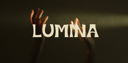 Lumina is a font that exudes sophistication and style. Combining modern and classic elements, it boasts a unique and distinctive look that sets it apart. This versatile font shines brightly in larger contexts, making it ideal for various design applications. Whether you're working on a logo, web font, or looking to add a touch of elegance to your project, Lumina is the perfect choice. With its radiant presence, Lumina effortlessly elevates any design, adding a dose of charm to your visual creations. **Uppercase
 - Dreamcolor - Unknown license

- DreamerOne - Unknown license

- Core Sans N SC by S-Core,
$15.00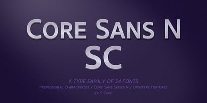 Core Sans N SC is the Small Caps version of the Core Sans N that is a part of the Core Sans Series (Core Sans N SC, Core Sans N Rounded, Core Sans M, and Core Sans G). Letters in the Core Sans N SC Family are designed with genuine neo-grotesque and neutral shapes without any decorative distractions. The spaces between individual letter forms are precisely adjusted to create the perfect typesetting. The Core Sans N SC Family consists of 3 widths (Condensed, Normal, Extended), 9 weights (Thin, ExtraLight, Light, Regular, Medium, Bold, ExtraBold, Heavy, Black), and Italics for each format. It also supports WGL4, which provides a wide range of character sets (CE, Greek, Cyrillic and Eastern European characters). Each font includes support for Tabular numbers, Arrows, Box drawings, Geometric shapes, Block elements, Mathematical operators, Miscellaneous symbols and Opentype Features such as Proportional Figures, Numerators, Denominators, Superscript, Scientific Inferiors, Subscript, Fractions and Standard Ligatures. The Core Sans N SC Family provides both OpenType (.OTF) and TrueType (.TTF) versions in the same package. We highly recommend it for use in books, web pages, screen displays, and so on.
 - Core Sans WHH Sub NR by S-Core,
$15.00The Core Sans NR Family is a part of the Core Sans Series, such as Core Sans N, Core Sans N SC, Core Sans M, and Core Sans G. This family is the rounded version of Core Sans N family. Letters in the Core Sans NR Family are designed with genuine neo-grotesque and neutral shapes without any decorative distractions. The spaces between individual letter forms are precisely adjusted to create the perfect typesetting. The Core Sans NR Family consists of 3 widths (Condensed, Normal, Extended), 9 weights (Thin, ExtraLight, Light, Regular, Medium, Bold, ExtraBold, Heavy, Black), and Italics for each format. It also supports WGL4, which provides a wide range of character sets (CE, Greek, Cyrillic and Eastern European characters). Each font includes support for Tabular numbers, Arrows, Box drawings, Geometric shapes, Block elements, Mathematical operators, Miscellaneous symbols and Opentype Features such as Proportional Figures, Numerators, Denominators, Superscript, Scientific Inferiors, Subscript, Fractions and Standard Ligatures. The Core Sans NR Family provides both OpenType (.OTF) and TrueType (.TTF) versions in the same package. We highly recommend it for use in books, web pages, screen displays, and so on. - Core Sans NR by S-Core,
$15.00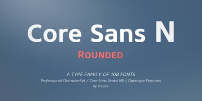 The Core Sans NR Family is a part of the Core Sans Series, such as Core Sans N, Core Sans N SC, Core Sans M, and Core Sans G. This family is the rounded version of Core Sans N family. Letters in the Core Sans NR Family are designed with genuine neo-grotesque and neutral shapes without any decorative distractions. The spaces between individual letter forms are precisely adjusted to create the perfect typesetting. The Core Sans NR Family consists of 3 widths (Condensed, Normal, Extended), 9 weights (Thin, ExtraLight, Light, Regular, Medium, Bold, ExtraBold, Heavy, Black), and Italics for each format. It also supports WGL4, which provides a wide range of character sets (CE, Greek, Cyrillic and Eastern European characters). Each font includes support for Tabular numbers, Arrows, Box drawings, Geometric shapes, Block elements, Mathematical operators, Miscellaneous symbols and Opentype Features such as Proportional Figures, Numerators, Denominators, Superscript, Scientific Inferiors, Subscript, Fractions and Standard Ligatures. The Core Sans NR Family provides both OpenType (.OTF) and TrueType (.TTF) versions in the same package. We highly recommend it for use in books, web pages, screen displays, and so on.
 - Core Sans WHH Head NR by S-Core,
$15.00The Core Sans NR Family is a part of the Core Sans Series, such as Core Sans N, Core Sans N SC, Core Sans M, and Core Sans G. This family is the rounded version of Core Sans N family. Letters in the Core Sans NR Family are designed with genuine neo-grotesque and neutral shapes without any decorative distractions. The spaces between individual letter forms are precisely adjusted to create the perfect typesetting. The Core Sans NR Family consists of 3 widths (Condensed, Normal, Extended), 9 weights (Thin, ExtraLight, Light, Regular, Medium, Bold, ExtraBold, Heavy, Black), and Italics for each format. It also supports WGL4, which provides a wide range of character sets (CE, Greek, Cyrillic and Eastern European characters). Each font includes support for Tabular numbers, Arrows, Box drawings, Geometric shapes, Block elements, Mathematical operators, Miscellaneous symbols and Opentype Features such as Proportional Figures, Numerators, Denominators, Superscript, Scientific Inferiors, Subscript, Fractions and Standard Ligatures. The Core Sans NR Family provides both OpenType (.OTF) and TrueType (.TTF) versions in the same package. We highly recommend it for use in books, web pages, screen displays, and so on. - Easy Headline by Dumadi,
$25.00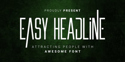 Hello Designers! Are you ready to make your Designs rock the world? If so, we know the right solution. Now comes the Easy Headline font ready to use for your best projects. Easy Headline is equipped with Uppercase Letters, Lowercase Letters made with unique and cool shapes, Numbers, and Multilingual Support. This font is made for any professional branding project, Great for creating titles, Movie titles, Event titles, Social media titles, Book cover titles, Poster titles, branding, posters, Each letter has a unique and beautiful touch. You can see the sample preview above for comparison, stay the center of attention and classy!
 - Rosiana by Arterfak Project,
$24.00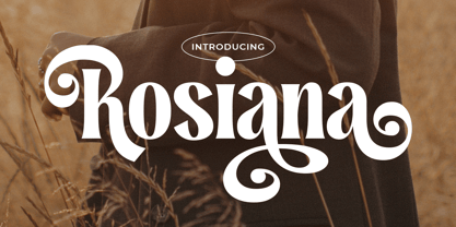 Rosiana is a modern decorative serif font. Inspired by the classic typography which visualizes a bright shade that feels good to apply to your design, such as magazines, cards, invitations, labels, logo, logotypes, books, packaging, and more! Designed with high contrast and soft-sharp serif that looks strong and confident as a display. Equipped with 200+ special characters and ligatures to beautify your typographic design. Font featured: Uppercase Lowercase Numbers Symbol Accented characters ÞþßÀÁÂÃÄÅÆÇÐĐÈÉÊËÌÍÎÏŁÑÒÓÔÕÖØŒŠÙÚÛÜŸÝŽàáâãäåæçđèéêëìíîïłñòóôõöøœšùúûüýÿž ĀāĆćĈĉČčĎďĒēĚěĜĝĤĥĨĩĪīĴĵŃńŇňŌōŔŕŘřŚśŜŝŞşŢţŤťŨũŪūŮůŴŵŶŷŹźẀẁẂẃẄẅĹ徼 Stylistic alternates Stylistic set 01-11 Ligatures
 - Maracay by John Moore Type Foundry,
$39.95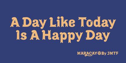 Maracay is a tropical typeface that works for texts or headlines, mainly as a display font and designed to work in layers of overlapping texts. Maracay is a unique design with nine fonts based creating a particular style of design and the combination of a couple different looks can be obtained eighteen. Thanks to the versatility of coloring matter, together form a coherent and attractive ideal for a variety of different projects such as invitations, menus, magazines, brochures, packaging, design, etc. Maracay provides alternate characters, swash, ligatures, icons, ordinals and fractions. Maracay has 4 shape styles : Regular Maracay base as essential as Tooled variations of brightness or wood with the appearance of a WoodType vintage wooden texture . Inner font as serves as Light or inner contour of the foregoing. Follow three fonts contouring as Outline, Shape and Umbra as a 3D projection. For decorative purposes Shape that there is a textured lines or Half as a split in the top half letter. Maracay has been carefully studied to provide the best combinations of the most of pairs and trios of glyphos avoiding undesirable extensions between ornate characters through its Opentype programming.
 - Tropical Nature by Skinny Type,
$15.00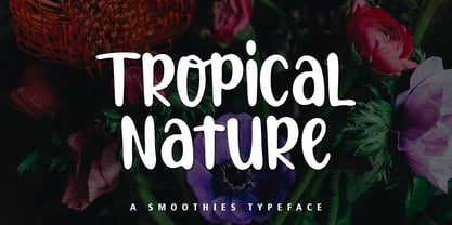 Tropical Nature is a smoothie handwritten font perfect for your boho and farmhouse designs! This font is perfect for signs, shirts, wedding, home decor, branding, blogs, logos, invitations and more! Thank you!
 - Adimlara by Queenop Studio,
$12.00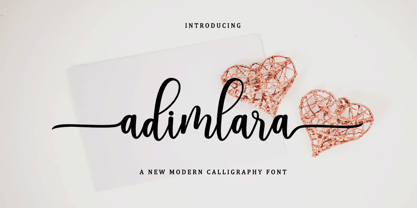 Adimlara is attractive because it is sleek, clean, feminine, sensual, glamorous, simple and very easy to read, thanks to its many luxurious letter joints. I also offer a number of viable alternative styles for all letters. Classic style is very suitable to be applied in various formal forms such as invitations, labels, restaurant menus, logos, fashion, make up, stationery, novels, magazines, books, greeting cards/weddings, packaging, labels or all kinds of advertisements. for your purposes.
 - Behrensschrift iF Plus by Ingo,
$29.00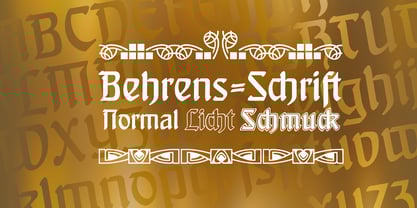 Peter Behrens’ renowned art nouveau type from 1902 – with ornaments. Newly revised and neatly digitalized by Ingo Zimmermann In 1902, Peter Behrens (1869–1940), architect, designer and typographer, created a new ”German“ type which became very successful very quickly for the Rudhard’sche Gießerei (foundry which later became Gebr. Klingspor AG) in Offenbach am Main. It served, for example, as the official German type for the world expositions in 1904 and 1910. Behrens himself writes about the development of this type ”...For the actual form of my type, I took the technical principle of the Gothic script, the stroke of the quill feather. The proportions of height and width and the boldness of the strokes of the Gothic letters were also decisive for me in producing a German character. A cohesive character could be hoped for by avoiding all non-necessities and by strictly carrying out the design principle of holding the quill at an angle…“ By the way, when “long s” is activated, the typographically correct “round s” is automatically placed at the end of the word so that you need only pay attention to the correct s on syllable endings within words. When using “long s,” you must ensure the correct use of the rules for the Fraktur font: “round s” is always at the end of the word, also in compound words. For those of you who want to be even more correct, read the corresponding article in >> Wikipedia. Peter Behrens also drew matching ornaments for his typeface – we have likewise carefully revised these decorative touches and arranged them into a font. The "Behrens-Schrift" fits best on all topics that have something to do with art history or the time around 1900.

