10,000 search results
(0.045 seconds)
- Lontare by RGB Studio,
$17.00 Lontare script typeface works really well for Logos and Apparel Design. It's also great for creating Prints or Merchandise, as you can use the illustrative qualities of the shapes to create an art piece. Lontare script typeface includes many different alternates for each lowercase letter. It's extremely fun to use as each word can be transformed to your liking. Files Include : Basic Latin A-Z and a-z Numbers Symbols PUA Encode Multilanguage Support Thanks and have a wonderful day, If you have any questions, please get in touch with us Don't forget to check out our other products.
 - Aravis by AravisFonts.com,
$39.89 Amazingly easy on the eye; it draws the reader in with minimal brain bandwidth use. Designed to enable more focus on the content. Good for web pages. Very Dyslexia friendly. Our mission has been to create a font that scientifically designed to be dyslexia friendly while also being attractive and useful. Dyslexia features: Each letter is unique even if reversed or flipped. The spacing is carefully designed using scientific evidence to help all readers from those who read via word shapes to those who read using phonemes and syllables. The visual stress caused by contrast pattern glare is minimised and has fared well when measured by professionals against other common fonts. Usefully mid-sized to make it easy to transfer artwork from common fonts to Aravis. This is very helpful when providing reasonable adjustments for people with Dyslexia. Based on algorithms found in nature. Range of use: Ø 72 Latin based languages Ø Greek and Coptic Ø IPA extensions Ø Good Maths symbols provision with OT support for vulgar fractions Ø Innovative OT support for creating boxes for forms Ø Small Capitals with some accents also supported (Czech) Ø Subscripts and sups: Complete alphabet upper and lower case and numbers Ø Customers can request additional symbols and characters within reason, or add an accent /shape unique to their country if it fits with the overall mission of the font.
 - Raw Street Wall by Volcano Type,
$25.00 The typeface Raw Street Wall is designed for the Typo Graphic Design font foundry from 2011–2017 by Manuel Viergutz. A playful display type for headlines with a street-art graffiti-style by hand. Rough-look plus state-of-the-art automatic generated OpenType-features (like contextual alternates (calt)). 567 glyphs with extras like emoticons/icons, arrows, dingbats, symbols, geomatric shapes, catchwords and many alternative letters. Multilingual support with 27 languages. Have fun with this font & try the DEMO-FONT (with reduced glyph-set) FOR FREE! Example of use It’s your turn … for example everywhere where it makes sense. Maybe for use in magazines, posters, headlines and advertisement, plus as webfont for decorative headlines. Technical Specifications ■ Font Name: Raw Street Wall ■ Font Weights: Regular + DEMO (with reduced glyph-set) ■ Font Category: Display for headline size ■ Font Format: .otf (OpenType Font for Mac + Win) + .ttf (TrueType Font) ■ Glyph Set: 567 glyphs ■ Language Support: 27: Afrikaans, Albanian, Catalan, Croatian, Czech, Danish, Dutch, English, Estonian, Finnish, French, German, Hungarian, Italian, Latvian, Lithuanian, Maltese, Norwegian, Polish, Portugese, Romanian, Slovak, Slovenian, Spanisch, Swedish, Turkish, Zulu ■ Specials: Extras like emoticons/icons, arrows, dingbats, symbols, geomatric shapes, catchwords and many alternative letters plus OpenType-Features. ■ Design Date: 2011–2017 ■ Type Designer: Manuel Viergutz ■ License: Desktop license, Web license, App license, eBook license, Server license
 - Mono Rose by Yumna Type,
$25.00 Mono Rose is a visually prominent display font having unique, attractive letter designs along with rose ornaments to leave lovely, romantic impressions. All of the font letters are designed in special details and have peculiarly unique characteristics to reflect the beauty of a rose making it suitable to apply for any products expressing rose beauty and charm. Furthermore, the blunt and round font letter shapes leave soft and friendly impressions. In fact, Mono Rose is able to produce beautiful, elegant displays to its advantage and able to make your designs look more attractive, and elegant for increasing the product’s attractiveness. You can use this font for big text sizes due to its unique shapes to ease you to read it. Mono Rose provides a clipart in accordance with the font theme as a bonus and features you can enjoy. Features: Multilingual Supports PUA Encoded Numerals and Punctuations Mono Rose fits best for various design projects, such as brandings, headings, magazine covers, quotes, printed products, merchandise, social media, etc. Find out more ways to use this font by taking a look at the font preview. Thanks for purchasing our fonts. Hopefully, you have a great time using our font. Feel free to contact us anytime for further information or when you have trouble with the font. Thanks a lot and happy designing.
 - Halfroy by Heypentype,
$20.00 Halfroy is our answer to generic geometric sans trends exploding nowadays who creates sameness. Halfroy brings new sans perspectives by combining rounded and sharp edges to create delicate sans fonts. See the difference by looking at counter-shapes compared to outline, insides counter shapes you will sees a sharp edges while round but not geometrical on outlines. Halfroy gives your project unique visual impact whatever your design project is, but we recommend using thin, semibold to Fat as display then light and regular. Halfroy taken inspirations not from looking at other sans typeface, but its design inspirations comes from observing a land contour and geographical statistics in our city, Kota Batu. We found that our city geographic consist of steep slope like waves with sharp peaks and surrounded by small and third highest mountains peak on our country. From then on we begin visualize and applied on few letters. Take a look on our 'O', 'f', 's' letters, its like a stone carved letters. Its hard edges and soft edges outline clearly draws from our inspiration source. Even Halfroy looks stony, hard as individual letters, we treat this type with humanist approach in mind. Therefore you can sense a friendly yet casuals of typical sans serif fonts when it grouped together to form a words or sentences. We hope Halfroy will gives your design project a unique on its own.
 - Raqib by Twinletter,
$18.00 Introducing Raqib, a distinctive and eye-catching font that gives any project a robotic, sci-fi edge. Raqib is ideal for creating futuristic and intriguing designs due to its bold font shape and distinctive robot style. Raqib is the ideal option if you’re working on a project with a sci-fi theme or want to incorporate robotics into your branding. Because of its bold design, it’s perfect for headlines, posters, and social media graphics, and its distinctive font shapes give your text a standout, memorable appearance. For those looking to stand out in the modern era and add a touch of innovation and futurism to their designs, the Raqib font is ideal. This font is a must-have for anyone looking to create designs that really stand out. Don’t miss this limited-time offer, get the unique and versatile Raqib font today and start creating designs that will be remembered. With Raqib, you can create stylish and professional designs, with a futuristic robotic look that’s sure to stand out. What’s Included : - File font - All glyphs Iso Latin 1 - Alternate - Simple installations - We highly recommend using a program that supports OpenType features and Glyphs panels like many Adobe apps and Corel Draw so that you can see and access all Glyph variations. - PUA Encoded Characters – Fully accessible without additional design software. - Fonts include Multilingual support
 - CemeteryWalk by Ingrimayne Type,
$5.00 I created CemeteryWalk in 2018 to illustrate a program for a local cemetery walk. CemeteryWalk places letters on pictures of gravestones. In 2022 I expanded the family by placing three different sets of letters on the gravestones. Each of the four different sets of letters on gravestones has two styles, one with black letters on white gravestones and the other with white letters on black markers (the bold style). The bold style can be placed beneath the plain style to add color or texture. All eight styles are caps only, with the lower-case letters having different shapes for the tombstones but the same letters as in the upper case. There is only one set of accented characters and it is where the upper-case letters are found. Each also has an alternate set of characters that are somewhat similar in appearance and it can be accessed using the OpenType feature of stylistic sets. A final typeface in the family is a picture font of items that may be found on old tombstones.
 - Guinevere Pro by Canada Type,
$29.95 Guinevere Pro is a typeface designed by Icelandic art director Sigurdur Armannsson. It started in 2001 as simple hand-drawn sketches of a few letters built from modules, then became an experiment with four goals: - Construct an original alphabet from a specific set of predetermined modules. - See how certain letter forms built without said modules would behave within the totality of the module-constructed alphabet. - See if certain letters would actually enforce their own shapes to be drawn a certain way within the totality of the typeface. Likewise, see if the totality of the alphabet demands that individual letters be drawn in a specific way, and if so, how much room for variation would there be? - See how all of the above reacts/changes to implementing the alphabet across different weights. The experiment was finessed and re-worked over many years of technology changes, and Guinevere Pro is the final outcome, ten years later. The Guinevere Pro set is four cross-platform Open Type fonts, with built-in small caps, alternates, ligatures, and support for a wide range of Latin-based languages.
 - Yalta Sans by Linotype,
$29.00 Yalta Sans combines the warmth of a traditional humanist design, the clarity of a grotesque and the modernity of a square sans. Several design traits contribute to this melding of diverse typographic concepts. Characters find their foundation in stroke-based shapes rather than constructed forms. Curve stokes are also slightly squared and counters are open. Curved strokes join verticals at nearly right angles to create a strong horizontal stress, aiding the reading process. The resulting design is exceptionally legible while still inviting. Although Yalta Sans is clearly differentiated from its calligraphic ancestors, many details of the design emulate the distinctive characteristics of typefaces from the Renaissance. Tapering horizontal stokes also give Yalta Sans a dynamic relationship with linear grotesque while its angled stroke terminals echo the work of a calligraphic brush Yalta Sans italics are cursive designs that are in keeping with humanistic letterforms and are markedly narrower than the Roman characters. Lining and old style figures, small caps and a suite of ligatures also make for a remarkably versatile typeface family.
 - Moho Condensed by John Moore Type Foundry,
$40.00 Moho is inspired by the Victorian sans shapes, movements and expressions of modernism art deco and constructivism, conceiving a decorative and elegant font, modern and readable display. This provides a retro look style of elegance of the 30s. Moho Condensed font family is straight, vertical, with joints and links or curvilinear or angular. Moho provides an innovation in the form of letters, to replace traditional forms of curves by straight or vice versa. Condensed Moho is a category of square letter, has an efficient OpenType programming for Moho OT Condensed, and basic for Moho Std families to compose texts in European languages of East and West, having wide set of over 610 glyphs. Designed to hold and typesetting over 14 pts or less increasing readability depending on the tracking. Moho Condensed is ideal for publishing newspaper and magazine design, convenient for the design covers and labels due to its space saving. Moho Condensed typefaces are closely related to the arts and fashion are very useful in creating logos and brands.
 - Serway by Hazztype,
$20.00 Serway is a captivating typeface that seamlessly blends elegance with a touch of playfulness. This font's defining characteristic is its wavy stems, which give each character a dynamic and fluid appearance. The wavy stems gracefully meander, creating a harmonious rhythm that adds a unique visual appeal to any design. The wavy stems in Serway mimic the graceful movement of gentle waves, the bending of tall grasses in the wind, or the meandering path of a flowing river. These organic shapes infuse each character with a sense of fluidity and harmony. The sans serif structure of Serway maintains a contemporary and modern aesthetic. The clean lines and smooth curves of the letterforms offer a sense of simplicity and sophistication, perfectly complementing the nature-inspired wavy stems. Serway is an ideal choice for various design projects, including editorial design, packaging, headlines, web design, logo creation, and branding. Its wavy stems add a distinct touch that sets it apart from traditional sans serif fonts, making it perfect for designs that seek to capture attention and create a memorable visual impact.
 - Battista by preussTYPE,
$29.00 The BATTISTA typeface stands in the long tradition of the designs developed by Giambattista Bodoni, who made his famous typefaces in the end of the eighteenth century. Similar designs can be found on various specimen books e.g. Alexander Wilson, John Bell, Edmund Fry and Alexander Thibaudeau. One of the best italics was available by Stephenson Blake & Co. foundry form Sheffield, England. In the end of the nineteenth century an unknown punch cutter at the German type foundry Schelter & Giesecke made an very bold cut of this Bodoni design. He brought both designs, the regular and the italic to an new level of harmony. Compared to the original Bodoni designs the new typeface was a lot bolder, which was well taken by the audience in this time. The BATTISTA typeface is an remarkable design, assembled of ultra bold and very fine shapes, but in all, the spirit of Bodonis design was well preserved. BATTISTA is a classic display design. The fine details are best shown on larger text sizes.
 - Morro by Great Scott,
$16.00 Morro is based on simple geometric shapes – circles, triangles and rectangles. Imagine cutting circles, triangels and rectangles from paper and arranging them into letters where the outer edges form a filled figure. Arranging figures like this to form letters is nothing unique. You can find several beautiful examples of alphabets that inspired the creation of Morro. Everywhere from a 1936 booklet by Draughtsman called ”Modern lettering for all branches of commercial arts” to obvious examples is from the paragon of the design industry - Milton Glaser - with his typeface Baby Teeth. What sets Morro apart from other digitized versions of Glasers' ”Baby teeth”, or other similar designed fonts, is that Morro is expanded into lower case and also supports Basic latin, Western European, Central European, south Eastern European and Pinyin. There are also stylistic alternatives to some of the glyphs. Morro Regular works like a stencil and is accompanied by a block shadow style and an outline. The Morro family of fonts are layered and can be superimposed on each other to create several types of text effects.
 - Habana Deco ML by HiH,
$12.00 Habana Deco ML was inspired by a hand-lettered sign on the stucco exterior of a small pharmacy in modern-day city of Havana, Cuba. It, in turn, was based on the fat-faced Art Deco lettering of the late 20s and early 30s, especially the Futurismo posters out of Italy, as well as alphabets designed in The Netherlands, France, USA and even the Soviet Union. There are 24 stylistic alternate glyphs (SALT), many inspired by a variety of these sources, including a couple from the sign in the front of the Congress Hotel in South Beach, Miami. The others features of the Habana Deco include 363 glyphs, 184 kerning pairs (KERN), 14 ornaments and shapes (ORNM) and 15 discretionary ligatures (DLIG). This is a font with which you can have fun. The zip package includes two versions of the font at no extra charge. There is an OTF version which is in Open PS (Post Script Type 1) format and a TTF version which is in Open TT (True Type)format. Use whichever works best for your applications.
 - View Roman Black - Personal use only

- Poliphili by Flanker,
$19.99 Hypnerotomachia Poliphili, which can be translated in English as “Dreaming Love Fighting of Poliphilus”, is a romance about a mysterious arcane allegory in which the main protagonist, Poliphilo, pursues his love, Polia, through a dreamlike landscape. In the end, he is reconciled with her by the “Fountain of Venus”. The author of the book is anonymous, however, an acrostic formed by the first, elaborately decorated letter in each chapter in the original Italian reads “POLIAM FRATER FRANCISCVS COLVMNA PERAMAVIT”, which means “Brother Francesco Colonna has dearly loved Polia”. Despite this clue, the book has also been attributed to many other authors. The identity of the illustrator is less certain than that of the author. It was first published in Venice, in December 1499, by Aldo Manutio. This first edition presents an elegant and unique page layout, with refined woodcut illustrations in an Early Renaissance style and a refined Roman font, cut by Francesco da Bologna, which is a revised version of the type used in 1496 for the De Aetna of Pietro Bembo. The print quality is very high for the time, but nevertheless it presents many inconsistencies and imperfections due to the non-ideal inking and adherence of the matrix to the paper. For that reason numerous samples of the original have been used to create every single glyph which will result in an appropriate reconstruction and not a mere and humble reproduction. Some letters like \J, \U and \W were extrapolated, because they are not part of the original alphabet of the period. Some letters like \Q, \X, \Y, \Z and \h have been updated to more modern variants, but the original shape is accessible by Stylistic Alternates Opentype Feature, which also changes the shape of the \V and the \v. The original numerals \zero, \one, \tree, \four and \six have been accompanied by reconstructions of the missing numbers and extended by modern figures. Finally, swashed lower cases and original scribal abbreviations were also included. The font has joined by a matching Italic variant, closely inspired from Aldo Manuzio's 1501 "Vergilius", the first book printed entirely in Italic type by Francesco da Bologna.
 - Seventies by Lián Types,
$37.00 'Meeeeoooow'! Seventies is another of my 'funkadelic' attempts (1) to fill the existing gap of seventyish looking fonts. In my opinion, that decade has a hidden treasure regarding type that remains unexplored: Only very few fonts rescue its 'groovy' essence, its ‘colourful’ qualities. But, don't have a cow man , and keep on truckin! With Seventies, my new foxy mama , your projects will stand out among the rest. Since there’s not much information available about this kind of lettering I had to get ideas from other styles: Nowadays it’s easy to find all kind of books or guides to understand and practice how different styles of calligraphy and lettering should be done. However, for some reason, 60s and 70s letters seemed to ignore/be free of rules... Was this suggesting the birth of postmodernism? I incorporated some ideas of the copperplate style of calligraphy: The ductus of its forms may be compared to the way letters are made in snell/engrosser’s script. Obviously, this is just the idea behind; the delicacy of thins is replaced here with the graceful imprint of really thick thicks with a brushy look and tons of good vibe . Seventies will work awesome in posters, brands, magazines, book-covers of any kind, due to its modern look adapted to our century. Well, catch you on the flip~side ! STYLES To make you more psyched , Seventies is a layered font! See examples in the posters using Seventies Shade, Seventies Shine and Seventies Printed. NOTES (1) My first one was with Beatle in 2014.
 - Blindshot by Crumphand,
$25.00 Introducing the Wild Brush Style Fonts, Blindshot. Blindshot inspired by vaporwave, graffity. This font have a good shape and texture. Good for your brand, clothing line, company and etc. What's Included Inside The Fonts ? Uppercase Lowercase Symbols Numerals Stylistic Set 1 Stylistic Set 2 Stylistic Set 3 Stylistic Set 4 European Multilingual Thank You, Regards!
 - COS Elfish by Cosmope Type,
$17.00 COS Elfish is a typeface with stroke contrast and has a unique shape. It has a structure that is well suited for display purposes. It has small serifs throughout and features curvilinear elements in some letters. It is suitable for use in various media such as unique and individual graphic design or web design.
 - Wiggly Wavy by Mvmet,
$14.00 Wiggly Wavy is a whimsical display font that took inspiration from french fries shapes. You can use it for anything ranging from t-shirts, kids’ book designs, restaurant menu, greeting cards, stickers, and posters, or anything that needs a casual touch. Try it to create lovely designs and feel the good vibes with it!
 - Sunyshine by RagamKata,
$14.00 Sunyshine, an elegant and stylish font that will light up your project. A graceful typeface, with a perfect shape and ligatures will make your design look graceful. This typeface is a perfect for a luxury logo, classy editorial designs, fashion brand and promotion, and much more. Get sunyshine to make your design fine as wine.
 - Umbra LT by Linotype,
$29.99Umbra was designed by R. Hunter Middleton for the Ludlow Corporation in 1935. This is a three-dimensional typeface, unique in that the main character shape is defined only by its shadow. It was originally designed to be a second-color drop-shadow for the typeface Tempo, but stands alone as an unusual display face. - Sans Culottes by K-Type,
$20.00 A misprinted sans serif loosely based on Phillip Cavette’s 1999 font 4990810, but with re-drawn outlines, more distress marks, a neater vertical aspect and no baseline irregularity. Unlike its inspiration, Sans Culottes is a complete font which includes a lower case, accented characters and as many dingbats as you can shake a stick at.
 - Scaffold by Lafontype,
$12.00 Scaffold is the sans serif family created for people who love well balanced kerning and weight. With a rectangular shaped structure and solid weight that makes it look strong and elegant. From hairline to heavy Scaffold comes with multiple languages and OpenType features such as ligatures, localized forms, fraction, ordinal, superscript, numerator, dnominator and subscript.
 - Oregon Highlights by Supfonts,
$19.00 Oregon Highlights is a bold and nostalgic display with clear lines, which makes it awesome in the headlinesFont is an open type with clean shapes and precise kerning. It includes ligatures encoded by the PUA. Language support: All European languages Don't forget to subscribe so you don't miss out on the new awesome fonts Dima
 - Contourism by Artyway,
$14.00 The Contour font is a futuristic letter set, inspired by architecture and future style. Suitable for amazing projects: hud, web, movie or music, and especially logo and headline. The Contour is an amazing futuristic font with linear space and color spot shapes. Your download will include Uppercase and lowercase letters Punctuation Numbers Multilingual coverage
 - Bellino by Mans Greback,
$59.00 Bellino is a well-crafted script typeface. Drawn by Måns Grebäck during 2018, this high-quality font has beautiful letter shapes and swashy capitals. Use one or more underscores after any word to underline. Example: Bellino___ The font contains stylistic, initial and final alternates, as well as ligatures. It also has extensive language support.
 - Candy Paint by Crumphand,
$20.00 Introducing, Candy Paint fonts. Candy Paint have a unique shape, rounded and fun. Comes with 4 style Regular, Outline and Extrude, then can mix and match with Stylistic Set. What's Included Inside The Fonts ? Uppercase Lowercase Symbols Numerals Stylistic Set 1 Stylistic Set 2 Stylistic Set 3 Stylistic Set 4 European Multilingual Thank you, Regards!
 - HT Cartoleria by Dharma Type,
$19.99 This font has a lovely roundish shape and gives us cute and relax impression. But because it is upright, it has a well-ordered atmosphere. Holiday Type Project offers retro hand drawing scripts. Inspired by retro script on shopfront lettering, wall paint advertisements in Italy around 1950s. Check out the script fonts from Holiday Type!
 - Neon Planet by Din Studio,
$25.00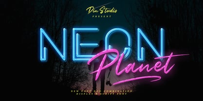 Neon Planet is a modern and futuristic font duo. Combining the neon shape design and the brush textured handwriting will make your design project more powerful. The font is suitable for any project that needs Retro, Modern, and Casual Vibes. Enjoy the Font! Features: Accents (Multilingual characters) PUA encoded Numerals and Punctuation (OpenType Standard)
 - Agane by Trim Studio,
$20.00 Agane is a Basic modern Sans Serif font. Design with oval as main shape, It's combine the basic sans type with smooth curve in the end, perfectly suited for graphic artists to complete their design such as web design, advertisements, posters, logos, product signs, and many more. Agane contains all standard glyphs and punctuations.
 - Tithua by Muykyta,
$20.00 Tithua is a modern font with strokes clear and well marked, easy to read and simple design. The curved shape on the slab terminations give a harmonious and pleasant smoothing which removes stiffness and enriches the design. For now comes in five different widths and includes Latin extended-A characters and some OpenType features.
 - Glamure by Fauzistudio,
$10.00 Glamure was inspired by the Myriad font which has been frequently used by technology companies and governments since the 1990s. Glamure is a clean, sleek and versatile font, by applying geomattric shapes to create a fantastic, modern and humanistic font. Glamure can function as a title, logo, body copy, subtitle, headline and so on.
 - Umbra by Linotype,
$29.99Umbra was designed by R. Hunter Middleton for the Ludlow Corporation in 1935. This is a three-dimensional typeface, unique in that the main character shape is defined only by its shadow. It was originally designed to be a second-color drop-shadow for the typeface Tempo, but stands alone as an unusual display face. - RANNEX by Gatype,
$14.00 Bannex is a versatile font with a clean, sleek shape. The overall typeface is strong to bring order and harmony between letters. Best used as Instagram, poster, web design, magazine, logo or product. -Letters, Numbers, Puntuations, Accens Ligatures, Swashes, Alternates If you've got any questions don't hesitate to drop me a message thank you
 - Jesaya by Typodermic,
$11.95 Introducing Jesaya: the typeface that will elevate your design game. With its unique geometric design, Jesaya will bring a new level of sophistication and style to your creative projects. Its clean shapes and sharp angles give your message a distinctive voice, projecting a sense of precision and attention to detail. And with seven weights and italics, you have the flexibility to experiment with different styles and layouts, ensuring your design stands out from the crowd. But that’s not all—Jesaya is designed with your comfort in mind. Its shaved sharps prevent typographic injury, ensuring a smooth and seamless design process. So whether you’re crafting a bold logo, designing a sleek website, or creating eye-catching marketing materials, Jesaya’s contemporary style and unique geometry will help you express your vision with clarity and impact. Try it today and see the difference for yourself. Most Latin-based European writing systems are supported, including the following languages. Afaan Oromo, Afar, Afrikaans, Albanian, Alsatian, Aromanian, Aymara, Bashkir (Latin), Basque, Belarusian (Latin), Bemba, Bikol, Bosnian, Breton, Cape Verdean, Creole, Catalan, Cebuano, Chamorro, Chavacano, Chichewa, Crimean Tatar (Latin), Croatian, Czech, Danish, Dawan, Dholuo, Dutch, English, Estonian, Faroese, Fijian, Filipino, Finnish, French, Frisian, Friulian, Gagauz (Latin), Galician, Ganda, Genoese, German, Greenlandic, Guadeloupean Creole, Haitian Creole, Hawaiian, Hiligaynon, Hungarian, Icelandic, Ilocano, Indonesian, Irish, Italian, Jamaican, Kaqchikel, Karakalpak (Latin), Kashubian, Kikongo, Kinyarwanda, Kirundi, Kurdish (Latin), Latvian, Lithuanian, Lombard, Low Saxon, Luxembourgish, Maasai, Makhuwa, Malay, Maltese, Māori, Moldovan, Montenegrin, Ndebele, Neapolitan, Norwegian, Novial, Occitan, Ossetian (Latin), Papiamento, Piedmontese, Polish, Portuguese, Quechua, Rarotongan, Romanian, Romansh, Sami, Sango, Saramaccan, Sardinian, Scottish Gaelic, Serbian (Latin), Shona, Sicilian, Silesian, Slovak, Slovenian, Somali, Sorbian, Sotho, Spanish, Swahili, Swazi, Swedish, Tagalog, Tahitian, Tetum, Tongan, Tshiluba, Tsonga, Tswana, Tumbuka, Turkish, Turkmen (Latin), Tuvaluan, Uzbek (Latin), Venetian, Vepsian, Võro, Walloon, Waray-Waray, Wayuu, Welsh, Wolof, Xhosa, Yapese, Zapotec Zulu and Zuni.
 - Mamute by PintassilgoPrints,
$18.00 Mamute is a block rockin' family with a cool letterpress look. Its upper- and lower-case slots hold glyphs with slightly different textures for a natural look. Numbers and punctuation marks also have alternate versions. Just trigger the Contextual Alternates feature to easily cycle the alternate glyphs, preventing double letters from displaying the same texture. Mamute is a highly decorative typeface available in 2 widths, regular and condensed, each also offered as a layered font, a handy and playful way for adding shades to your composition. There’s also a generous ornaments font and a catchwords one to spice up your designs. Mamute is based on Aldine wood type spirit (as there were many incarnations of it!), from circa 1870. Please note that this family has a limited character set and doesn't bring diacritics nor accented characters. But yet it does rock, you bet!
 - P22 Schneeberger by IHOF,
$29.95 In this font from graphic arts veteran Tracy Sabin, his trademark whimsy and playfulness are exhibited in spades. Sabin takes a multitude of influences, from mid-century art nouveau to today’s pleasant dream-pop doodles, and mixes them up into a sweet and animated alphabet that oozes energy, enthusiasm and honest innocence. Alongside the chromatic and colour-play possibilities that come with two layerable fonts, the jumpy, rough and curly elements that make up Schneeberger’s construct make this face a unique and essential tool for display and packaging aimed at catching the eyes of kids and teens. Use it for fantasy flicks, sugar-fix wrapping, and the elaborate backyard birthday party invite where the program is just as appealing for the adults as it is for the children. P22 Schneeberger comes in solid (Black) and outline (Regular) variants, each of which containing more than 400 characters, some very cool built-in stylistic alternates, a bunch of ligatures, and support for the majority of Latin languages.
 - Brawner by IKIIKOWRK,
$25.00 Proudly present Brawner - Y2K Liquid Font, created by ikiiko. Brawner is the ultimate Y2K font with a liquid edge, developed for the fashion-forward and streetwear trendsetters. Brawner's flowing shapes encourage movement and vitality, resulting in a visual experience as bold and edgy as the streetwear culture it embodies. The font's liquid features offer a touch of avant-garde flair, making it an ideal match for firms looking to radiate cutting-edge style and stay ahead of the fashion curve. Brawner, the Y2K font that embodies the essence of hypebeast style and current streetwear, ushers you into the future of fashion. Elevate your brand's visual identity with a typeface that speaks the language of the fashionable, pushing limits and establishing trends with each letter. This font is very suitable for making a streetwear brand, poster, magazine layout, fashion design, quotes, or simply as a stylish text overlay to any background image. What's Included? Uppercase & Lowercase Numbers & Punctuation Alternates Ligatures Multilingual Support Works on PC & Mac
 - Dufour by Scholtz Fonts,
$19.00 Dufour was named in honor of an art deco font called "Independent" designed in the 1930s by Collette and Dufour. "Dufour" is influenced by the original font, however, there are substantial differences: instead of small caps, a true lower case was created, the upper case character proportions and shapes have been greatly modified, and all missing characters have been created to make a truly modern font which nevertheless has all of the panache of the original. A related font is Collette, designed by Anton Scholtz, however, Dufour has a softer feel that is more true to the original art deco period. Dufour comes in four styles: Dufour Regular, Dufour Regular Outline, Dufour Condensed, and Dufour Condensed Outline. The font has been carefully kerned and best results are obtained if kerning is switched on. (All-caps passages work well.) It is best used to create a retro feel and in headings, subheads and in short passages of text. Very effective in marketing for products for children.
