10,000 search results
(0.301 seconds)
- Rainmoney by Alit Design,
$18.00 “Rain Money” is a unique font designed with a concept of dark beauty and modern style. The font combines elements of both modern serif and blackletter styles, creating a striking and distinctive appearance. With a total of 717 glyph characters, including rare ligatures and swashes, this font is perfect for creating bold and impactful designs. The font also supports PUA unicode and multilingual characters, making it suitable for use in a variety of languages and settings. Whether you’re designing logos, posters, or other graphics, “Rain Money” is sure to make a lasting impression. Language Support : Latin, Basic, Western European, Central European, South European,Vietnamese. In order to use the beautiful swashes, you need a program that supports OpenType features such as Adobe Illustrator CS, Adobe Photoshop CC, Adobe Indesign and Corel Draw. but if your software doesn’t have Glyphs panel, you can install additional swashes font files.
 - Zagore by NoCommenType,
$30.00 Zagore (zɑːgɔːrɛ) is the name of a beautiful place in Bulgaria. There is no contrast between horizontal and vertical stems, typical for geometric fonts. The typeface is built under strict rules and logic, by using the stroke as skeleton for each glyph. Although the structure of the font remains the same, there is a noticeable visual diversity throughout different styles. Middle weights suggest paragraph use, while the ones at the extremes are more suited for display text. The typeface offers support for Basic Latin, Latin-1 Supplement, Latin Extended-A, Greek and Coptic, Cyrillic, and Cyrillic Supplement Unicode ranges. Included OpenType features are localized forms, to suit multi-language designs, tabular and proportional lining, basic ligatures, and extra symbols.
 - Stroom Script by wearecolt,
$12.00 Your new favourite handwritten script font. A great display font with a natural flow. All hand-drawn glyphs with custom linked letters for a unique marker pen look. Perfect for magazine titling, logo marks, signatures. Features: • Regular and bold weights • Alternative glyphs • Ligature sets
 - Sabor by Intellecta Design,
$59.90 Sabor is a voluptuous upright connected display font with mixed taste of script fonts. There were many inspirations for Sabor, but all started with a book from the 1950s about the battles of World War II. To that first sketches of a naive dense display typeface we, day by day, start to create a mixed style evolving some lettering concepts from 1950s, some calligraphy notions and the first display ideas. The feeling of this font is good to be used in many artworks, like logos, packaging, party invitations, layouts for t-shirts, magazine headings, and much more, since websites to and all kind of printed jobs. That font is not really a script, but, like the scripts we strongly recommends to use the caps only in the beginning of words and sentences, to contrast with the lower cases : it’s not designed for all-caps settings, so avoid that kind of use. This font has almost 700 glyphs and supports the most important Latin-based languages. We works hard in a tour-de-force kerning: over 12.000 kerning pairs soft adjusted handily. Its OpenType features include final forms, initial forms, special sets (upper and lowercase's), hundreds of contextual alternates ligatures providing letter-form variations and connections that make your designs really special, and ornaments (tails). Because of its high number of alternate letters and combination's, we suggest the use of the glyph palette to find ideal solutions to specific designs. The sample illustrations will give you an idea of the possibilities. You have full access to this amazing stuff using InDesign, Illustrator, QuarkXpress and similar software. However, we still recommend exploring what this font has to offer using the glyphs palette: principally to get all the power of the Contextual Alternates feature. You can get an idea of the power of this font looking at the “Sabor User Guide”, a pdf brochure in the Gallery section. Also available two sister fonts easy to use : SaborWords and SaborRasgosEscritura Sabor has original letters designed by Iza W and overall creative direction plus core programming by Paulo W.
 - ETIAW v3 - 100% free

- Cathzulu Extraz - Unknown license

- Akademie Alte - 100% free

- Dramaturg by GRIN3 (Nowak),
$26.00 Dramaturg is a handwritten, brush, fully connected script with ligatures and contextual alternates to help with flow and readability. Dramaturg is the most complete style, it contains over 600 glyphs, 7 stylistic sets, contextual alternates and ligatures. Every lowercase letter has six variations (uppercase letter has four). When the font is used in OpenType-savvy applications, the 3 variants of glyphs are automatically alternated to achieve a random-like effect. Dramaturg A and Dramaturg B have less glyphs than the Regular one (no stylistic sets), they only contain some selected alternates and ligatures. Language support includes Western, Central and Eastern European character sets, as well as Baltic and Turkish languages.
 - Tiamaria by Galapagos,
$39.00In the 70's I went out with a girl whose father was a card-carrying member of 3 of the biggest unions in the printing arts. He gave me 2 things, a pre-war Linotype specimen book and an ancient 'how to' lettering book that contained 30 or 40 script specimens from lettering artists of the time. Tiamaria is the developed glyphs of one of these specimens. Tiamaria is the name of one of the islands in the Galapagos chain. - 1499 Alde Manuce Pro by GLC,
$42.00 This family was inspired by the beautiful roman font used by Aldus Manutius in Venice (1499) to print for the first time Hypnerotomachia Poliphili..., the well known book attributed to Francesco Colonna. Francesco Griffo was the punchcutter. The present font contains all of the specific latin abbreviations and other ligatures used in the original. The Italic style, carved by Francesco Colonna, the so called "Aldine" style, was inspired from various documents, all printed with this first Italic font. We offer the complete set of ligatures (about 60) we have been able to find, contained in the original font. In the two styles, we have made differences between I and J, V and U, to make easier a modern use. Added are the accented characters and a few others not in use in this early period of printing. The Italic style may be used as a complement to our 1470 Jenson Latin. The font contains all characters for West European (including Celtic), Baltic, East and Central European and Turkish language.
 - Postillon by RMU,
$30.00 Herbert Post’s (1903-1978) blackletter fonts redesigned for nowadays’ use. Both font styles contain adorning swash caps. Typing N, o, and period, and activating the OT feature Ordinals produces an oldstyle number sign.
 - Palatino Linotype by Linotype,
$197.99The Palatino™ typeface was first designed over 50 years ago by Hermann Zapf, and is probably the most universally admired and used of his type designs. In 1950, it was punchcut in metal by August Rosenberger at D. Stempel AG typefoundry in Frankfurt am Main, and then adapted for Linotype machine composition. Zapf optimized Palatino's design for legibility by giving it open counters and carefully weighted strokes, producing a typeface that was legible even on the inferior paper of the post-World War II period. The font was named after Giambattista Palatino, a master of calligraphy from the time of Leonardo da Vinci. Palatino is a typeface based on classical Italian Renaissance forms. It has become a modern classic in itself, and is popular among professional graphic designers and amateurs alike. Palatino works well for both text and display typography. The new Palatino™ Linotype typefaces are OpenType format fonts, which include many newly designed characters in four large character sets; including extensive support for the Latin, Greek, and Cyrillic alphabets, as well as for Central European and many other languages. The Palatino Linotype OpenType fonts contains the following Microsoft code pages: 1252 Latin 1, 1250 Latin 2 Eastern, 1251 Cyrillic, 1253 Greek with polytonic Greek, 1254 Turk, 1257 Windows Baltic, and 1258 Windows Vietnamese. The fonts also include many ligature glyphs, including some historical long s-ligatures, as well as sets of Small Caps, Old style Figures, and vertical & diagonal fractions. Each font contains 1325 different glyphs. - Silver Sale by Azetype,
$12.00 Presenting Silver Sale! A SIgn Painting Font with a set of alternate and 28 swashes. This font is made with the perfect combination of each character. You can type by Mix & Match with an alternate version to get a unique combination. It looks original and can be used for all your project needs. Each glyph has its own uniqueness and when meeting with others will provide dynamic and pleasing proximity. This font can be used at any time and on any project. You can see in the presentation picture above, Silver Sale looks casual and clean on design projects. So, Silver Sale can't wait to give its touch to all your design projects such as sign painting, quotes, poster design, personal branding, promotional materials, website, logotype, product packaging, etc. WHAT'S INCLUDED? 1. Silver Sale Basic • The first version comes with uppercase, lowercase, numeral, punctuation, symbols, and Standard Latin Multilingual Support (Afrikaans, Albanian, Catalan, Danish, Dutch, English, French, German, Icelandic, Indonesian, Italian, Malay, Norwegian, Portuguese, Spanisch, Swedish, Zulu, and More). You can also access alternate and swash by Opentype Features or typing c_1 until c_28 to feature swash. 2. Silver Sale Alternate • The second version comes with uppercase, lowercase, numeral, punctuation, symbols, and Standard Latin Multilingual Support (Afrikaans, Albanian, Catalan, Danish, Dutch, English, French, German, Icelandic, Indonesian, Italian, Malay, Norwegian, Portuguese, Spanisch, Swedish, Zulu, and More). You can also access swash by Opentype Features or typing c_1 until c_28 to feature swash. 3. Silver Sale Swash • The first version comes with 28 swashes. Simply access just type all alphabet, period (.) and comma (,). Thank You Azetype Studio www.azetypestudios.com
 - REGISTRATION PLATE UK - Personal use only

- ThunderCats-Ho! - Personal use only

- Spark Sans by Primitive Spark,
$5.00 Spark a revolution for a better future with Spark Sans. Super clean and geometric, this display typeface is ideal for tech, transportation, electronic music, revolutionary products or other disruptive ideas that move us beyond the present. Spark Sans has a relatively high x-height and squared off curves that give it a distinctive look while still maintaining a minimalist aesthetic. The design originated with custom lettering for the Primitive Spark identity, which became the foundation for the bold style. With 260 glyphs, Spark Sans is a great choice for many languages with Latin characters.
 - Smena by ParaType,
$30.00 Smena was based on the lettering of the so called 'calligraphic style' that was very popular during the period 1940-1970. The style was used in logos, book and magazine headlines, posters, signage etc. For use in advertising and display typography. Licensed by ParaType in 2006.
 - Candlebright by Ana's Fonts,
$16.00 Candlebright is a gothic calligraphy font with 345 glyphs, including stylistic alternates, swashes, ligatures, and a set of matching ornaments. Candlebright's smooth lines and round corners make it warmer than the average blackletter font, and it can be used for both vintage-inspired and modern designs. Candlebright works particularly well in logotype designs, or as a display font in editorial or website designs. The set of matching ornaments is perfect to add a touch of elegance to any design, and you can use it to achieve eye-catching social media and promotional designs.
 - Stefian Script by Mightype,
$17.00 Stefian Script is a modern calligraphy font with the current handwriting style. This font is perfect for branding, wedding invites, magazines, mugs, business cards, quotes, posters, and more, you can try it first if you want to buy this font. Stefian Script is equipped with 526 glyphs and has 97 ligatures. By having so many glyphs you will be able to choose the letters according to your tast and needs. With lots of variations and options for each letter, you can customize on your design needs. You need a program that supports OpenType features such as Adobe Photoshop Cs / Adobe Photoshop CC, Adobe Illustrator CS / Adobe Illustrator CC, Adobe Indesign and Corel Draw and many more programs that support OpenType. If you don't have a program that supports OpenType, you can access all the alternate glyphs using Font Book (Mac) or Character Map (Windows) If you have any question, do not hesitate to contact me by email mightype89@gmail.com Thanks and happy designing :-)
 - 1790 Royal Printing by GLC,
$38.00 From 1702 to 1811 the French "Royal", then "Imperial", Printers, neglected Garamond and Fournier's designs and used only the font called "Romain du Roy", carved (1693 to 1723) by Philippe Grandjean by order of the king Louis XIV. 1790 Royal Printing was inspired by various variants of Romain du Roy that were in use during this period. Our sources were mainly official and legal documents printed in the late royal period, and in the beginning of the French revolution. There was no bold style. The 1790 Royal Printing Caps fonts contain small caps, plus titling caps for headlines as 1790 Royal Printing capitals are intended to be used preferably for text.
 - Sunday Chillin by Hoperative Design,
$15.00 Sunday Chillin is a gorgeous and retro-styled script font crafted to add tons of stylish character to your designs. This font is PUA encoded, which means you can access all of the glyphs and swashes with ease! This font can be used for logos, branding, invitations, stationery, wedding designs, social media posts, and much more! Sunday Chillin Features : Ligature Kerning Uppercase and Lowercase Number and Punctuation Stylistic Alternates Stylistic set 01 Stylistic set 02 Stylistic set 03 Swash PUA encoded which means you can access all glyphs Multilingual Support Thanks, Hoperative Design
 - Jeullyta by Tigade Std,
$10.00 The name Jeullyta is taken from the Indonesian language but with modified pronunciation. The correct one is Jelita which means "Gorgeous". I named this font Jeullyta because it is gorgeous, from the initial process until the end product. It is a strong yet nice looking script font and can be considered a brush font too with the shadow on the body of each glyph. This font is suitable to be used for: Posters Advertisement Book Cover and much more It comes with hundreds of stylistic alternate glyphs to enhance the feel of your design. Enjoy!!
 - Special Charisma by Say Studio,
$17.00 Special Charisma is a stylish vintage font inspired by 70’s groovy vibe with a touch of modernity. It looks amazing at display sizes and is easily readable in text size. Olive Village comes with access to your OpenType features, large selection of alternate glyphs and ligatures. There are three versions of this font : REGULAR, ITALIC, and OUTLINE. WHAT'S INCLUDED : Multilingual Support For access to Stylistic Alternates is required software with glyphs panel like Photoshop and lllustrator. No special software is required to use Ligatures. Have a wonderful day, Saystudio
 - Alaysa by Axara Creative,
$10.00 Alaysa Script is retro signage font, bold and clean. There are so many variations on each character. Include OpenType stylistic alternates. You are able to create so many different typographical layouts easily and quickly. Make sure you use OpenType savvy program and simply open Glyph Palette to access all of the glyphs. This font is suitable for t-shirts, signage, logos, headlines, branding, packaging, etc. Accessible in the Adobe Illustrator, Adobe Photoshop, Adobe InDesign, even work on Microsoft Word. PUA Encoded Characters – Fully accessible without additional design software.
 - Blissful Beauty by Letterhend,
$17.00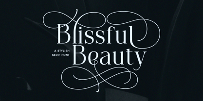 Blissful Beauty is a serif font that radiates elegance and sophistication. Its stylish alternates and delicate swashes make it the perfect choice for creating designs that demand a refined and chic look. From high-end branding to elegant wedding invitations, this font will captivate with its luxurious appeal. Features : Uppercase & lowercase Numbers and punctuation Alternates & Ligatures Multilingual PUA encoded We highly recommend using a program that supports OpenType features and Glyphs panels like many of Adobe apps and Corel Draw, so you can see and access all Glyph variations.
 - Blastvader by Invasi Studio,
$19.00 Introducing a new collection of retro display fonts. Blastvader is a reverse contrast retro display font. The glyphs have a fat rounded shape. It's ideal for headlines, flyers, posters, greeting cards, product packaging, book covers, logotypes, and album covers, among other things. Ensuring carefully crafted styles result from the use of this font. The alternates in this font can add more fun to your projects. Its imperfections keep it casual while still providing legibility. Features: Total 209 Glyph Uppercase Numerals & Punctuation Alternates Multilanguage Supports 60+ Latin based languages
 - Chula by Colmena,
$2.00 Colmena studio presents Chula, a geometric typeface 100% original, traced in the beginning by hand, chula is not based in any other typeface, each glyph was drawn in base of circles and rectangles, the tail of certain glyphs gives to the typeface and designs fluency and movement. Chula is fresh and modern but with a little touch of vintage, ideal for big texts and formats, but also legible in small size. You can use it in 3 versions, regular, medium full and full. It works perfectly in logos, monograms and patterns.
 - Textus Receptus by Lascaris,
$60.00 Textus Receptus is a historical revival based on the Roman and Greek types used by Johann Bebel (and later also Michael Isengrin) in Basel in the 1520s. The Roman is a low-contrast medium-to-heavy Venetian reminiscent of Jenson or Golden Type. The unusual polytonic Greek, not previously digitized, is lighter in weight and supplied with all the ligatures and variants of the original. Yet when used without historial forms the Greek has a surprisingly contemporary feel: it’s quirky and playful as a display face, but still easily legible in running text. Bebel’s Greek extended and refined the one used for the first printed Greek New Testament, Desiderius Erasmus’ Novum Instrumentum Omne, published in Basel in 1516 by Johann Froben. The name of the font was chosen in honor of this edition, which was so influential that it was later called the Textus Receptus (the “received text”), serving as the basis for Luther’s German Bible in 1522 and much subsequent scholarship for over 300 years. Following 16th century practice, Textus Receptus contains 130 ligatures and stylistic alternates for Greek, accessible either with OpenType features or with five stylistic sets. The Greek capitals, often printed bare in early editions, have been equipped with accents and breathings for proper polytonic or monotonic typesetting. The Roman includes both standard and historical ligatures along with the abbreviations and diacritics typically employed in early printed Latin. For expanded language coverage it has the entire unicode Latin Extended‑A range and part of Latin Extended-B. The capital A is surmounted by a horizontal stroke, as in some 16th century Italian designs, and the hyphen and question mark have both modern and historical form variants. Mark-to-base positioning correctly renders fifty combining diacritics, and with mark-to-mark positioning the most common diacritics may be stacked, permitting, for example, accents and breathings on top of length-marked vowels. Numerals include old-style, proportional lining and tabular lining. For further details, please download the 31-page Textus Receptus User Guide.
 - Fontryl by Nantia.co,
$7.00 The Retro Handwritten Font Fontryl is a 100% handwritten font with which you can achieve a retro handwritten-type lettering feeling. This typeface is a multilingual retro lettering font with Greek (of course), Latin characters and diacritics. Inspired by handwritten Greek 50s ads, this font is perfect for your vintage graphic design needs. This font has a really nice flow so you use it in a large text if you want to give them a touch of personality. In addition, this typeface is the perfect font candidate for all social media content, for branding or packaging.
 - JWX Memo by Janworx,
$15.00 Memo, designed by Janet Valdez of Janworx, is a digital version of her own personal penmanship, currently displayed in abundance on sticky notes all over her desk and monitor. Although its basis is in actual handwriting, it's perfectly legible, offering a casual alternative typeface for everyday correspondence or simple things, ranging from event flyers to children's birthday party invitations. Memo performs well at regularly used correspondence sizes, but at a larger size can also be manipulated in graphics software for interesting effects. The letters can be moved randomly from the baseline, overlapped, and then contoured with good results for a casual look.
 - Migelia by Romie Creative,
$12.00 Migelia is a beautiful script font with perfect alternatives. This font will add a romantic and elegant feeling to your design. Migelia can be used for various applications, such as wedding designs, logos, invitations, posters, social media posts, and others. Additional characters are coded by PUA with a love accent Can be used in any software, such as Adobe Photoshop, Illustrator, Microsoft Word, PowerPoint, and others. Multilingual glyphs.
 - Monisha by Rotterlab Studio,
$12.00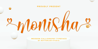 Monisha is a beautiful script font with perfectly perfect alternates. This font will exude a romantic and elegant feeling of your design. Monisha can be used for various applications, such as wedding designs, logos, invitations, posters, social media posts, and others. Features: - Additional characters encoded by PUA with a love accent - Can be used in any software, such as Adobe Photoshop, Illustrator, even Microsoft Word, PowerPoint, and others. - multilingual glyphs
 - Qanelas by Radomir Tinkov,
$29.00 Qanelas is a modern sans serif with a geometric touch. It comes in 20 weights, 10 uprights and its matching italics. Designed with powerful opentype features in mind. Each weight includes alternate characters, fractions, extended language support (+ Cyrillic), arrows, ligatures and more. Perfectly suited for graphic design and any display use. It could easily work for web, signage, corporate as well as for editorial design.
 - Chord Brights by Letterhend,
$16.00 Introducing, Chord Brights, a one of a kind layered typeface with 4 styles (Regular, Extrude, Outline, Inline). This typeface has a nostalgic feel because of its style, so the font is really a match for your project with a retro/vintage theme. Chord Brights is perfectly made to be applied especially in logos, invitations, labels, logos, magazines, books, greeting/wedding cards, packaging, fashion, make up, stationery, novels, labels or any type of advertising purpose. Features : uppercase & lowercase numbers and punctuation multilingual ligatures alternates swashes PUA encoded contextual alternate We highly recommend using a program that supports OpenType features and Glyphs panels like many of Adobe apps and Corel Draw, so you can see and access all Glyph variations. Email us to letterhend@gmail.com if you need something! Happy Designing!
 - Kibrya by Keristyper Studio,
$14.00 Introducing Kibriya font! A playful blend of Serif and Sans-Serif, perfect for adding a touch of fun to your designs. This font is versatile and can be used in a variety of projects, from logos to posters to social media graphics. Its unique combination of classic and modern styles creates a fun and fresh look that will make your designs stand out. Get Kibriya font today and add some playful charm to your next project! Featured: Standard, Uppercase & Lowercase Numeral & Punctuation Multilingual : ä ö ü Ä Ö Ü ß ¿ ¡ Alternate & Ligature PUA encoded We recommend programs that support the OpenType feature and the Glyphs panel such as Adobe applications or Corel Draw, so you can use all the variations of the glyphs. Hope you enjoy our fonts!
 - Balistine by Owl king project,
$39.00 The Balistine font, a combination of modern and slightly taking elements of 80s era in some lowercase curves such as "a b d q w and there are several alternative letters found in Balistine. By carrying a weight of 20 Balistine can easily be used for wider exploration. Let's start design.
 - Castle Rocks by Java Pep,
$17.00 Introducing ligature serif font called CASTLE ROCKS duo fonts, these fonts have more than 50 ligatures include full set in uppercase and lowercase. This package consists of CASTLE ROCKS is the ligature font and CASTLE ROCKS DUO is the regular font so you can combine it to mix and match with switch on ligature font (CASTLE ROCKS) or regular font (Castle Rock). CASTLE ROCKS duo fonts are pretty and elegant fonts that perfect for title, headline, logotype, personal branding, branding invitations, quote, magazine, text font, etc. The package including CASTLE ROCKS (Ligature Font), this full set ligature font in uppercase and lowercase and have 4 weight style regular, italic, bold, and bold italic. CASTLE ROCKS DUO (Regular Font), this regular font without ligature feature so you can mix and match with CASTLE ROCKS or use to text font, this has 4 weight style regular, italic, bold, and bold italic. Multilingual, support more than 30 languages PUA Encoded If you have any questions, please let me know. Thanks and have a wonderful day.
 - Tristyn by Arendxstudio,
$12.00 Tristyn is a signature handwritten font package with a personal charm. With a style that I feel is the first time being blended with a different brush so it has a natural hand Tristyn Regular contains upper and lower case letters, numbers and various complete signs. Tristyn Alt includes alternative characters, with capital letters and small that is completely new. Ligatures are available for some lowercase letters (more natural double letters). This can only be accessed through software with different devices or glyph panels, e.g. Photoshop / Illustrator. There it is! I really hope you enjoy it - comments & likes are always welcome and accepted. More importantly, don't hesitate to send a message if you have a problem or question. Now just read this, go there and make it happen :)
 - M Computer PRC by Monotype HK,
$523.99 PRC series fonts are in Unicode encoding and consists covers GB 2312 character set. It conforms to GB12345 standard. The character glyphs are based on the regular simplified Simplified Chinese writing form and style. It is generally used in China Mainland PRC and Singapore.
 - Cherishline Font by sizimon,
$20.00 Cherishline Script is a thin lettered and graceful script font. Fall for its ravishing style and use it to create gorgeous wedding invitations, beautiful stationary art, eye-catching social media posts, and much more! Cherishline Script is PUA encoded which means you can access all glyphs and swashes with ease! What's Include : PUA encode & Opentype ( It is full of Tails and glyphs ) Multilingual support Use the fonts for: logos, branding materials, wedding sign, wedding website card, farmhouse signs, sign bridal, shirts, pantry labels, sign bridal shower, business cards, greeting cards, wall decor, social media, planner prints and websites. • This font works with any application Microsoft Word, Adobe Photoshop, Microsoft Paint, Corel, Adobe Illustrator, Cricut Design Space, and many others! If you have any question please do not hesitate to contact me. Thank You!


