3,878 search results
(0.022 seconds)
- Bimbo by Zetafonts,
$39.00 Bimbo is a monoline script font family created in 2018 by Francesco Canovaro for Zetafonts as an extension & redesign of the original Arsenale White typeface created with italian illustrator Jonathan Calugi. Bimbo expands the original design with six new weights and over 300 new characters to cover over 70 languages using the latin, greek and cyrillic alphabets, while keeping the handmade aesthetic that made successful the original font. Bimbo is essentially a display font, born for minimal lettering and logos, with a handwritten sensibility enhanced by the built-in letter swapping open type feature that makes sure double letters are always different one from another. Open counters and a monoline design allow for great readability at small sizes, making Bimbo the ideal font for creating fake handwritten notes and meta-textual jokes.
 - Barthley Script by ijemrockart,
$7.00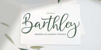 Barthley Script with a handmade calligraphy style, decorative characters and a dancing baseline! So beautiful on invitation like greeting cards, branding materials, business cards, quotes, posters, and more!! Barthley Script come with 300+ glyphs. The alternative characters were divided into several Open Type features such as Swash, Stylistic Sets, Stylistic Alternates, and Ligature. The Open Type features can be accessed by using Open Type savvy programs such as Adobe Illustrator, Adobe InDesign, Adobe Photoshop Corel Draw X version, And Microsoft Word. And this Font has given PUA unicode (specially coded fonts). so that all the alternate characters can easily be accessed in full by a craftsman or designer. Barthley Script Features : Uppercase & Lowercase International Languange & Symbols Support Punctuation & Number PUA Unicode Range Standard Ligatures Discretionary Ligatures Stylistic Alternates Stylistic Set.
 - Chaotic Neutral by Missy Meyer,
$12.00 I'm letting my inner nerd show through on this one: "Chaotic Neutral" is a Dungeons & Dragons thing. But the name applies to this font, too! Chaotic: This font has all sorts of built-in irregularities. Some variation in letter heights and letter widths, and the stroke widths are all over the place. It's all about the hand-written messiness. Neutral: And yet! I've smoothed the strokes a bit, and gone for as few nodes on each letter as I can (while still keeping a bit of roughness), so this font can be used for any kind of purpose -- not just print, but cutting out as well! Chaotic Neutral also comes with over 300 extended Latin characters for language support, and is fully PUA-encoded for easy access no matter what program you're using.
 - Thinpaw by upirTYPO,
$4.00 Thinpaw is a serif handwritten font perfect for usage in a really big sizes (50 pt+). The stem width is about 0.5 mm (0.019") in 100 pt size. The font comes with central european character set and a set of various glyphs and icons (see preview images). Opentype features: - Standard ligatures - fi, fl, ff - Discretionary Ligatures - ft, fb, fh, fk, fj - Contextual Alternates - a, e, f, g - Stylistic set 01: A Stylistic set 01 changes every dot into the heart shape symbol. It turns every writing into a nice looking love letter! Thinpaw is perfect for wedding proposals, wedding invitations, happy birthday cards or anything personal. For usage on the computer screen, the stem width is about 1 pixel for 50 pt size, and 2 pixel for 100 pt size.
 - Benedictus Brush by Ben Hodosi,
$29.00 Benedictus Brush is a stylish, fresh new layered brush script font family. With lots of alternate characters (415+) and more than 340 realistically created standard ligatures. The letters are made with brush pen and scanned thereafter carefully drawn into vector format. Benedict Brush is a versatile multilungual font family and comes with several of OpenType features: - 340+ Standard Ligatures - Stylistic Set - Character Variant - Terminal Forms - Proportional Figures - Tabular Figures - More than 1140 Glyphs - Multilingual To make you more better eye-catching and colorful designs, Benedictus Brush is a layered font! There are 7 variants of Benedictus Brush, to add even more flexibility to your designs: Solid Base, Shine Solo, Shadow Solo, Combo One, Combo Two, Combo Three and Complex. These are features that offers virtually endless variation. Enjoy!
 - Remeslo - Unknown license

- Madison Ave. by Funk King,
$10.00 The Madison Ave. family started from Madison Ave. at Fontstruct.com. As my most downloaded font, this was an easy, although not necessarily logical choice to make – regarding taking an existing free font and attempting to offer it for purchase. The font is very basic and simple in its layout, but has achieved popularity over at Dafont with almost 80,000 downloads with its cool, understated nature and inherent sophistication. The original Madison Ave. is now 95 Madison Ave. A couple of glyphs have changed from the original, but mostly the set is the same. The big news here is the availability of multiple variations on the original. Ninety-five refers to the filter settings used to achieve the faint cross lines in the font. The sequence 95-100 provides a gradual fade to solid effect when used together. The other versions use variations on the filter settings that allow each its own distinctive flavor, while at the same time maintaining inherent characteristics of the original. Ninety-five is now joined by 55, 75, 97, 99, 100, 102, 105, 155, 175, 201, 202, and 275. 100 is the solid version which doesn’t contain the trademark lines found in 95. In 95-99, the line width varies to achieve subtle effects. 50 and 85 are distorted by reducing the filter settings in a somewhat minimizing fashion. In 102-205, these are distorted by increasing the filter settings above the normal which is what 100 represents. While some of the effects are extreme and challenge the legibility of text, these can be fun or edgy. They offer a cohesion that can be used to advantage for different projects that require the use of a modern font family.
 - Font - Unknown license

- Caracura - Unknown license

- Orgy - Unknown license

- Armor Piercing - Personal use only

- No Reklamo - Unknown license

- Seperated - Unknown license

- Shift - Unknown license

- Bionique - Unknown license

- Bubbleboy - Unknown license

- Cubicle - Unknown license

- Wicked Queen BB - Personal use only

- Pythia - Personal use only

- Doctor - Unknown license

- Gorilla Milkshake - Personal use only

- Orange Fizz - Personal use only

- Jamiro - Unknown license

- Teacher - Unknown license

- Rainbow - Unknown license

- Geriatric - Unknown license

- Thundershower - Unknown license

- 1920 - Unknown license

- Tequila - Unknown license

- Powerpuff - Unknown license

- FStein - Unknown license

- Origin - Unknown license

- Assimilate - Unknown license

- Beam - Unknown license

- XSchnee Flaken by Ingrimayne Type,
$12.95 Two typefaces of snowflake designs; the alternative has the same designs but rotated 30 degrees.
 - Deutsche Poster Steinschrift by Intellecta Design,
$19.90inspired in plakat stijl, a german style of lettering used in 30's advertise lettering - Futura PT by ParaType,
$30.00 Futura is a classic geometric sans serif, one of the crucial typefaces of the 20th century. It remains relevant today and is widely used in logos, headings, web and print. Futura was designed by Paul Renner for Bauersche Gießerei (Bauer) in 1927. The typeface is based on simple geometric forms and is close in the aesthetics to 1920s-30s constructivism and the Bauhaus. Futura PT is the most complete Cyrillic version of Futura. It’s a type system of 25 styles: 16 regular and 9 narrow, from Thin to Extrabold. Futura PT has linear and old style figures, subscripts and fractions. The typeface supports more than 100 languages: Western and Central European Latin and the Cyrillic-extended. The Cyrillic version of Futura was designed by Vladimir Yefimov in 1991–1995. He partially redesigned the typeface in 2007, making it a wholesome consistent system, and Isabella Chaeva added new styles. The typeface was released under the name Futura PT. Isabella Chaeva returned to work on Futura in 2022. The typeface has three new styles, old style figures and extended Cyrillic support.
 - User Stencil by DSType,
$30.00 User is a monospaced type family with 30 styles, from Hairline to Bold, divided in Regular, Upright and Stencil, with five weights (Hairline, ExtraLight, Light, Medium and Bold) all with Cameo versions. Complexity and versatility are the keywords for this type family. Despite being a monospaced font, which means there's no kerning, all the glyphs were designed in order to sit comfortably in the 600 points width, a hard task because some glyphs are too narrow ('i' and 'l'), while others are too wide ('m' and 'w'), but they must fit the same width. The desire for keeping a comfortable readability in User was one of the key elements, therefore we designed several ligatures that fit both single and double space width, allowing to maintain a certain idea of proportional design. In this digital booklet you will find a detailed vision of the anatomy of the typefaces, the amount of characters available, the styles and weights, along with a series of features, specially designed to make User a very versatile and usable type system.
 - User Upright by DSType,
$30.00 User is a monospaced type family with 30 styles, from Hairline to Bold, divided in Regular, Upright and Stencil, with five weights (Hairline, ExtraLight, Light, Medium and Bold) all with Cameo versions. Complexity and versatility are the keywords for this type family. Despite being a monospaced font, which means there's no kerning, all the glyphs were designed in order to sit comfortably in the 600 points width, a hard task because some glyphs are too narrow ('i' and 'l'), while others are too wide ('m' and 'w'), but they must fit the same width. The desire for keeping a comfortable readability in User was one of the key elements, therefore we designed several ligatures that fit both single and double space width, allowing to maintain a certain idea of proportional design. In this digital booklet you will find a detailed vision of the anatomy of the typefaces, the amount of characters available, the styles and weights, along with a series of features, specially designed to make User a very versatile and usable type system.
 - User by DSType,
$30.00 User is a monospaced type family with 30 styles, from Hairline to Bold, divided in Regular, Upright and Stencil, with five weights (Hairline, ExtraLight, Light, Medium and Bold) all with Cameo versions. Complexity and versatility are the keywords for this type family. Despite being a monospaced font, which means there's no kerning, all the glyphs were designed in order to sit comfortably in the 600 points width, a hard task because some glyphs are too narrow ('i' and 'l'), while others are too wide ('m' and 'w'), but they must fit the same width. The desire for keeping a comfortable readability in User was one of the key elements, therefore we designed several ligatures that fit both single and double space width, allowing to maintain a certain idea of proportional design. In this digital booklet you will find a detailed vision of the anatomy of the typefaces, the amount of characters available, the styles and weights, along with a series of features, specially designed to make User a very versatile and usable type system.