10,000 search results
(0.025 seconds)
- Achosmon by Mchcrafter,
$15.00 Achosmon font is a Modern Stylistic Serif typeface A new serif that we created specially for branding needs, with extra ligatures and alternates in a unique shape just to add value to your brand. It so nice to leverage designer or product owner that need solutions to make their design look more stylish and modern. And specially for Achosmon font, We prepared all the ligatures, and the alternates characters to help you create unlimited variations for your creative needs. Lovely Bastilla font includes: All uppercase & lowercase letters All numbers 0-9 & Punctuation
 - Interzone by MYSTERIAN,
$9.00 This type crept up the sense that it was made in Eastern Europe by poorly trained urbanites from a crippled nation, or that it is the remains of a contemporary gothic (like Eckmann) stencil. The choice of what this type signifies is up to the public. Lately I like the idea of 'putting on' (in McLuhan's sense) a genre of idea that is somewhat different from my tradition's beliefs, and fitting a core category of that toward a teleological/eschatological advantage. Therefore postmodernist/apocalyptic carelessness (which I may 'put on' by using this type) is how I abstain from the cravings of immortality, or more so that wanting it is pointless. It’s stands as memento morí; that I will have to die someday. I have to become less, He must become more. Of course, Interzone may signify a classic Joy Division track from Unknown Pleasures as well as the Cold Warish ongoings of conflicted eastern European life. I considered naming this Lunik 9.
 - Arise by Monotype,
$30.00 Arise is a humanist typeface designed for both text and display purposes. Its an understated type family with enough subtle nuances and personality to add distinction to your own typographic compositions. As can be seen in the /a/c/f/g/r/y/ glyphs, hooked terminals are a key feature of this typeface. These terminals are blade-like in appearance, defining a distinctive character that is unusual, yet balanced and refined. Practical features include 38 capital swash alternates for intial and final forms that can be particularly effective when used in titling and branding situations. Small caps are also included (along with matching diacritics) – these are designed to harmonise with regular lowercase forms so that you may easily achieve unicase-style typography. There are 18 fonts altogether, with 9 weights from ExtraLight to Ultra in both roman and italic. Arise has an extensive character set that covers all Latin European languages. Key features: 9 Weights Roman & Italic Small Caps 38 Alternates Old Style Figures European Language Support (Latin) 700+ Glyphs per font.
 - Bendita by Rhythm 'n type,
$25.00 Bendita could evoke the didones of the 19th century. It has an extreme contrast that makes it only suitable as a display typeface, with its characteristic shapes. The fatty type par excellence.
 - Just Flower Pots by Outside the Line,
$19.00 Pots of flowers, pots of leaves. 30 topiaries, daffodils, hearts, daisies, lily, a snail, a butterfly, a ladybug, a shovel, a bell jar and watering can too. Just in time for Spring.
 - Chubbet Distended by Emboss,
$25.00 Chubbét (pr. Chub-bay) Distended is the extended version of Chubbét. The regular weight starts off plumper than plump, then it expands inward until there is a minimal amount of positive space.
 - Andaluz by Storm Type Foundry,
$38.00 The land of beauteous angels, Andalucia, connects different cultures with a curved arch. Almond trees bloom there in February, and orange trees grow in the heavenly courtyards of Gothic churches. A Catholic cathedral stands in a mosque, Moorish fountains gush with water, and ornate arcades are reflected in the mirrors of the Alhambra pools. Fishing villages have long been busy with tourism, but there are remote pubs where only locals go for fresh fish. Beer is served in wine glasses, and with each one you get a piece of cheese, shrimp, or a few slices of specially smoked ham, sitting on the bar counter. Here, in the off-season, it is possible to gaze into the distance towards the African shores and sketch watercolors for the diary completely undisturbed.
 - AT Move Billiard by André Toet Design,
$39.95 BILLIARD was born from the numerous sketches André Toet did for the design of a series of postage stamps in 2011. It’s a capital monospaced and ‘fun’ alphabet, based on the classic billiard play with two white and one red ball. Actually snooker and pool were derived from this rather old sport! In Europe it used to be a sport played by elderly people, practiced in traditional bars, including the smell of beer and the at that time prevalent smell of cigarettes and cigars. These days billiard, snooker and pool are quite popular once again with young people. Hopefully our new font will get the same attention the ‘old sport’ deserves and who knows it might even be used in a sportive way. Concept/Art Direction/Design: André Toet © 2017
 - Guess What by Resistenza,
$39.00 Guess What? A new hand-drawn font family has arrived! 5 different sets of letters were sketched using a felt tip marker on paper to get a realistic handmade feeling. The magic comes activating the Opentype features, the letters will randomly combined by an advance code creating a more human feeling. More than 1500 glyphs available to customize your text. Guess what is also a font system, composed by four styles; Regular, Inline, Shadow and Papercut. All styles can be easily overlapped. Works perfectly for many purposes adding a casual natural mood to the text. Try it on a book cover, digital ads, kids stuff, comics, branding, advertising, packaging...
 - Plectrum CP by CounterPoint Type Studio,
$29.95 As the first multi-font family designed for the CounterPoint font library, Plectrum offers designers and font lovers an alternative to the usual display style fonts of CounterPoint with a low key yet elegant sans serif family that can serve a variety of functions. Designed as a humanist style sans serif, the letters have variation in stroke weight. The italic faces have some variation in the letter design making them more of a true italic rather than simple oblique faces. The complete family consist of four weights: Regular, Italic, Bold and Bold Italic which can be purchased separately or as a complete package. The typeface has some unique features which add warmth to the design such as a slanted cross bar on the lowercase e and a large x-height. This is a solid, versatile family. Available in OpenType and contains support for Latin based and Eastern European languages.
 - Cralter by Edignwn Type,
$18.00 The Cralter Font is inspired by authentic typefaces in old posters. These font collections contain serif and sans serif fonts. Every font comes with 4 style typefaces (regular, rounded, rough and stamp). Cralter gives more extras 1 pack illustrations. The Cralter matches apply in some designs such as the logo, poster, label, badge, packaging, t-shirt, branding, quotes and more custom design. Cralter features : 4 style typefaces (regular, rounded, rough and stamp) All-caps, numeral, symbol and punctuation Multilingual PUA Encoded Cralter includes : 9 fonts (serif, sans serif and dingbat) 13 hand-drawn illustrations in dingbat
 - Human Sans by Ian Farnam,
$20.00 Human Sans is a humanist sans serif font created as an experiment. The goal, how much a simple substitution of a small set of characters could change a font's nature. In its base form, Human Sans is a humanist sans serif geared toward text. However, through stylistic sets, it can adopt a myriad of different visual styles. This includes geometric alternates, uncials alternates, contextual swash caps, and the high and low midlines, typically seen in Art Deco lettering. These features are combinable for whatever look you may need. Human Sans comes with a full set of diacritics, in 9 weights and corresponding Italics.
 - OTC New York by OTC,
$39.00 OTC New York is a geometric sans serif font family with support for Latin, Cyrillic and Greek. The display font comes in 18 styles, 9 weights (including italics) and as a variable font which supports two axis variability: weight and italic. It’s ideal for branding, logos, headlines, editorial design, packaging, web and television use. The font family is inspired by the Bauhaus school with its simplified geometric form, balanced layout, harmonious geometric shapes that are simple but strong. OpenType features contain stylistic alternates (for A, a, e & g); old style figures; fraction figures; subscript, superscript, numerator and denominator figure position and tabular figures.
 - Journey Signature by Azetype,
$19.00 Presenting Journey Signature! An Authentic Script Font crafted carefully. Based on original signature hand scratches that look Classy and Vintage style. This font can be used at any time and in any project. You can see in the presentation picture above, how it's working! So, this font can give a different touch to all your design projects e.g. watermark, quotes, logotype, poster design, personal branding, lettering, photography needs, blog header, wedding, letter, invitation, stationery, etc. WHAT'S INCLUDED? 1. Journey Signature • This one comes with Standard Characters and 3 Stylistic Alternates (uppercase, lowercase) numeral, punctuation, symbols, and huge multilanguage support e.g. Afrikaans, Albanian, Catalan, Czech, Danish, Dutch, English, Estonian, Finnish, French, German, Hungarian, Icelandic, Indonesian, Italian, Latvian, Lithuanian, Maltese, Malay, Norwegian, Polish, Portuguese, Spanisch, Slovak, Slovenian, Swedish, Zulu, and Many More). • Multilingaul Glyphs: ÀÁÂÃÅÄĀĂǺĄÆǼǢÇĆČĈĊĎÐÈÉÊËĘĒĖĚĔĞĢĠĜÌÍÎǏÏĪĮĬĨļĶĿĽĻĹŁÑŃŇŅŊÒÓÔÕÖŌŐŎØŒÞŔŘŖŚŠŞŜ ŦŤŢÙÚÛÜŪŮŰŲŨŬŴÝŸŶŻŹŽàáâãåäāăǻąæǣçćčċĉďđðèéêëęěēėĕğģġĝĥħıìíîǐïīįĭĩķłŀĺñńňŋʼnņòóôõöőŏøœ þŕřŗśšşşŝßŧťţùúûüūůűųŭŵýÿŷżźž 2. Journey Signature Swash • This One comes with an underline swash that makes your design project looks standout and classy. For feature, you just type A-Z or a-z, choose the Swash version, and than ready to use. Thank You Azetype Std.
 - Mercado by MADType,
$24.00 Mercado is a versatile stencil font family with 3 styles and 3 weights of each style. I was inspired by local boutique supermarkets to create a stencil font family with both upper and lowercase as well as a large international characterset. Mercado Regular can be used at small point sizes without the stencil gaps filling in. It also makes a bold statement when used large. Mercado Display with it's precision slices is best used large, or in any design solution where the tight gaps will not become filled in. Mercado Sans is a quirky and strong sans serif based on the bones of the stencil version.
 - West Byanetta Cyrillic by Ira Dvilyuk,
$20.00 I'm happy to present to you luxurious handwritten script font West Byanetta Cyrillic. It's the best option for your branding, logo designs, invitation designs wedding stationery, social media, product packaging and other projects that require an elegant touch. West Byanetta Cyrillic is an elegant, graceful handwritten script font, as well as a West Byanetta Symbols font with 36 lovely hand-drawn flourishes and illustrations. West Byanetta script font contains the Cyrillic glyphs too. West Byanetta script Latin part contains a full set of uppercase letters and 3 full sets of lowercase letters, (standard, initial and final forms). To make a needed form just type a letter with a number such as a1, b1, c1...after that selecting the word and apply the Open Type Features in programmes such as Adobe Illustrator, Photoshop, and others) And 40 ligatures - which can be used to create a handwritten look. The Cyrillic part of the font contains the uppercase letters and 3 full sets of lowercase letters, (standard, initial and final form. To make a needed form just type a letter with a number such as a1, б1 в1... After that select the word and apply the Open Type Features in programmes such as Adobe Illustrator, Photoshop, and others) Also Cyrillic part of the font contains 31 handwritten Cyrillic ligatures. West Byanetta Symbols is a font with over 36 hand-drawn elements, floral illustrations, and swashes and can help to make your design unique and matchless. Combine and merge swashes and illustrations to create your own designs and make borders, frames, dividers, logos, and more (just use A-Z or a-z and 0-9 keys in the included West Byanetta Symbols font). A different symbol is assigned to each uppercase or lowercase standard character, so you do not need graphics software, just type the letter you need. Language Support for 32 languages: Latin glyphs for Afrikaans, Albanian, Basque, Bosnian, Catalan, Danish, Dutch, English, Estonian, Faroese, Filipino, Finnish, French, Galician, Indonesian, Irish, Italian, Malay, Norwegian Bokmål, Portuguese, Slovenian, Spanish, Swahili, Swedish, Turkish, Welsh, Zulu. And Cyrillic glyphs support for Russian, Belorussian, Bulgarian, Ukrainian and Kazakh languages. Works perfectly on the Canva platform. For Cricut & Silhouette recommended.
 - Oliver Serif by Lebbad Design,
$29.95 Oliver Serif, clean, contemporary and sophisticated. It is available in 3 distinctive weights-Regular, Bold and Ultra with matching italics. Oliver Serif is a fine choice for a variety of uses ranging from body text to bold dynamic headlines and branding applications. A perfect choice for both digital and print.
 - Plz Print by Outside the Line,
$19.00 A happy, friendly hand printed font for many uses. Works as a display or body copy font. Great for that letter home to Mom or when you need a casual look. It can also be found in the book "Indie Fonts 3, a Compendium of Digital Type from Independent Foundries".
 - Shifttype by Ali Güzel,
$18.00 An experimental typeface with at least 3 characters each, uppercase, lowercase, numbers, and punctuation marks. It would be great for experimenting with different typefaces to decide what's the general taste of your logo or designing a poster, music cover, etc. Or just use the typeface with exploring its alternate glyphs, enjoy!
 - Toppo by Typoforge Studio,
$30.00 To design the font Toppo I was inspired by a You And Me Monthly published by National Magazines Publisher RSW Prasa that appeared from Mai 1960 till December 1973 in Poland. This family contains 6 different styles. In the Toppo family, every variety contains 3 alternative characters with automatic replacement.
 - Kianda Pro by QubaType,
$19.00 Kianda typeface was created as a non-classic, sport logo typeface. Now it has two fonts with multilingual uppercase, numerals and punctuation. Almost every letter have 3-4 alternates, which allows you to feature stylish text for your logo. Also this typeface works good with short slogans, packaging and more.
 - Black Bison by Linecreative,
$16.00 Black Bison is display font featuring a unique, strong and versatile style with alternates and Ligatures to create a more stunning display. Black Bison includes: 1. Upper and Lowercase characters (All Caps) 2. Ligatures (39 characters) and Stylistic Set (52 Characters) 3. Multilingual Support (Latin Western Europe), Numbers and Punctuation
 - Aira by Jafar07,
$19.00 Aira is a serif font with a modern style that is designed very neatly and boldly, especially for designers and clients who want to have a classic yet trendy design concept, with 35 alternative lowercase letters and 9 ligatures, as an option for those of you who want to add a unique touch to your design. This font is perfect for a sturdy and discreet company logo and is also perfect for magazine layout designs, articles, quotes, and even posters.
 - 2030 by Noir Typo,
$26.00 2030 font is inspired by the typography of the early 20th century, the Futura of Paul Reener, Cassandre and Charles Loupot’s works and, on a broader level by modernism and art déco mouvements. Geometric, with classicals proportions, this typefaces is a re-interpretation, in a actual form, of the alphabets from this period. The lines are straight, but the letters are easy to read and nice to watch thanks to optical corrections. Build with 9 weights of 700 glyphs, italics and small caps.
 - Lorsche Display by FoxType,
$10.00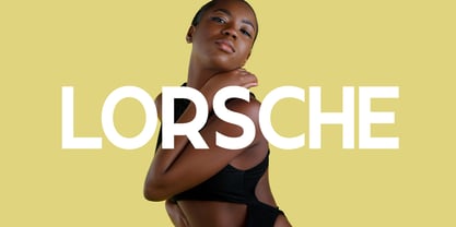 Lorsche Display is a Unique Modern Elegant Typeface with Web-fonts. It's a very versatile font that works great in large and small sizes. Lorsche Font would perfect for branding, logos, headlines, Captions. or simply as a stylish text overlay to any background image. Strong capitals and a smooth, open lowercase are effective in a variety of applications. It's shown a clean, minimalist, warmth, quirky, yet still purposed to be versatile and easy to read. 9 Weights Included. Free updates and feature additions.
 - Iki Mono by CAST,
$45.00 Iki Mono is a multifaceted monospaced typeface designed for publishing and coding. Its sans serif structure displays some letterforms (as well as a degree of contrast) that are reminiscent of 19th-century grotesques, while in the non-oblique versions the letters have been very slightly slanted leftwards. Like typewriter typefaces Iki Mono has to cope with the limitations of a width system that forces shapes into a specific space. This extensive type family of forty weights and styles – from Compressed Thin to ExtraExpanded Bold, including their slanted versions – takes its name ‘Iki’ from the Japanese word for breath.
 - Mule Cargo by Menagerie Type,
$20.00 The Mule is a very special mix – it has a donkey father and horse mother, and they often inherit the best qualities of both. "The mule is an example of hybrid vigor, Charles Darwin wrote: The mule always appears to me a most surprising animal. That a hybrid should possess more reason, memory, obstinacy, social affection, powers of muscular endurance, and length of life, than either of its parents, seems to indicate that art has here outdone nature." They are typically very strong for their size compared to horses and are able to cope with bad weather better than donkeys. Mules rarely become ill and their behavior is Intelligent and sensitive. In the right home, they can make great companions for other equines, and wonderful pets. However, if they are unhandled or not correctly trained, mules have the potential to be dangerous. The inner shapes of Mule Cargo are almost identical between the Regular and the Heavy weight. This shared genom make them very powerful pair and a useful design tool for display purposes.
 - Scion by Type Innovations,
$39.00 ‘Scion’ is an original design by Alex Kaczun. The inspiration for the typeface came from the Toyota SCION logo, which bears its name. In Alex’s own words, "I loved the simplicity, proportions and hi-tech look of the logo and decided to create an entire new design series based on its unique look". The fonts come in five flavors: thin, light, regular, bold and black. All the font weights were designed systematically on tabular widths so that the user can make adjustments to overall type color without changing the line length. In addition, Alex Kaczun has provided us with several alternate glyph substitions to further enhance the overall appeal of this contemporary new design. The large Pro font character set, which supports most Central European and many Eastern European languages, makes this typeface series ideally suited for display copy as well as text composition. In the near future, Alex plans to include a narrow, compressed and ultra expanded, along with true-drawn italic variations to further expand the possibilities of this great new display series.
 - ICONOS SKATE - Personal use only

- OldStyle 1 - Unknown license

- El&Font - Unknown license

- Pyramidhead - Personal use only

- KR Silly Art Holiday - Unknown license

- KR Silly Art People - Unknown license

- KR Silly Art Dings - Unknown license

- Cross Stitch Monogram by Gerald Gallo,
$20.00 Cross Stitch Monogram is based on upper case characters 15 stitches tall and contains the upper case characters A-Z, numbers 0-9, ampersand, and a selection of various simple ornaments.
 - Black Butcher by IKIIKOWRK,
$19.00 Introducing Black Butcher - Oldtype Series, created by ikiiko. Black Butcher is inspired by logo/ typography of classic american muscle car. The letters are bold script fonts with a flexible and straight line. This font have a unique waveform and has a large selection of stylistic sets. You can play with many style choices! This typeface is perfect for an vintage car logo, magazine cover, poster & flyer design for automotive event, and also good for vintage product, or simply as a stylish text overlay to any background image. What's included? 2 Weights : Regular & Italic Uppercase & Lowercase Number & Punctuation Alternates & Stylistic Multilingual Support Get also a good offer & FREEBIE at our site : www.ikiiko.com Enjoy our font and if you have any questions, you can contact us by email : ikiikowrk@gmail.com
 - Burnaby Stencil by Typodermic,
$11.95 Listen up! Got a font that’s gonna give your text that raw, tough edge you’re lookin’ for. Burnaby Stencil, baby. This typeface is all about the spray-painted stencil vibe, with bold headlines that’ll grab attention like a bear trap. But don’t think it’s all bark and no bite. Burnaby Stencil packs a punch with a gritty tone that’ll make your message feel like it’s coming straight from the streets. And if you’re worried about it looking too cookie-cutter, no need to fret. This font switches up custom letter pairs in OpenType savvy apps, giving your text a natural, hand-painted feel. So if you’re ready to unleash the rugged, urban vibes in your designs, Burnaby Stencil is your new best friend. Let your words speak loud and proud with this font that’ll make ’em stand up and take notice. Most Latin-based European writing systems are supported, including the following languages. Afaan Oromo, Afar, Afrikaans, Albanian, Alsatian, Aromanian, Aymara, Bashkir (Latin), Basque, Belarusian (Latin), Bemba, Bikol, Bosnian, Breton, Cape Verdean, Creole, Catalan, Cebuano, Chamorro, Chavacano, Chichewa, Crimean Tatar (Latin), Croatian, Czech, Danish, Dawan, Dholuo, Dutch, English, Estonian, Faroese, Fijian, Filipino, Finnish, French, Frisian, Friulian, Gagauz (Latin), Galician, Ganda, Genoese, German, Greenlandic, Guadeloupean Creole, Haitian Creole, Hawaiian, Hiligaynon, Hungarian, Icelandic, Ilocano, Indonesian, Irish, Italian, Jamaican, Kaqchikel, Karakalpak (Latin), Kashubian, Kikongo, Kinyarwanda, Kirundi, Kurdish (Latin), Latvian, Lithuanian, Lombard, Low Saxon, Luxembourgish, Maasai, Makhuwa, Malay, Maltese, Māori, Moldovan, Montenegrin, Ndebele, Neapolitan, Norwegian, Novial, Occitan, Ossetian (Latin), Papiamento, Piedmontese, Polish, Portuguese, Quechua, Rarotongan, Romanian, Romansh, Sami, Sango, Saramaccan, Sardinian, Scottish Gaelic, Serbian (Latin), Shona, Sicilian, Silesian, Slovak, Slovenian, Somali, Sorbian, Sotho, Spanish, Swahili, Swazi, Swedish, Tagalog, Tahitian, Tetum, Tongan, Tshiluba, Tsonga, Tswana, Tumbuka, Turkish, Turkmen (Latin), Tuvaluan, Uzbek (Latin), Venetian, Vepsian, Võro, Walloon, Waray-Waray, Wayuu, Welsh, Wolof, Xhosa, Yapese, Zapotec Zulu and Zuni.
 - FS Split Sans by Fontsmith,
$80.00 Quirky and irregular FS Split is no ordinary typeface. Its irregular proportions make it unique, with round letters appearing wide, and straight letters narrow. Other quirks include its eclectic crossbars – the uppercase ‘A’ has an unusually low bar, while the bar on ‘G’ is particularly long. The uppercase has many interesting features in fact, including large counters, closed terminals on certain letters like ‘J’, and a cap-height that lines up with ascenders. The lowercase also holds surprises – the dots on ‘i’ and ‘j’ are unusually large, and some characters, such as ‘g’, feature double-storey counters. An extreme but stylish italic The italic versions of FS Split Sans and Serif are particularly striking. While similar in style to their upright, Roman versions, they take on a larger-than-usual 18-degree angle, making the forward-slant more dramatic. Although the main purpose of any italic is to help words and phrases stand out, this unique execution helps to make the italic variants of FS Split stylish fonts in their own right – they would work brilliantly on magazine covers, in titles and headlines, pull quotes, and even used commercially in logos and corporate branding. Serif and sans: a split personality FS Split Sans and Serif have their differences but also their similarities, contrasting and complementing each other perfectly. This ‘love hate’ relationship inspired the name of the typeface family, and means the two variants provide a versatile, typographic palette for use in graphics and branding. While its proportions are similar to the sans, the serif has a bigger contrast between its weights of bold, regular and light, bracketed serifs, and different styles of terminals, some being straight and others ball-shaped. FS Split Sans has more subtlety and simplicity, with a smaller weight contrast, less flamboyant terminals, and more consistent counter sizes. The two variants are distinct yet alike, so can be used successfully either in isolation or together.
 - FS Split Serif by Fontsmith,
$80.00 Quirky and irregular FS Split is no ordinary typeface. Its irregular proportions make it unique, with round letters appearing wide, and straight letters narrow. Other quirks include its eclectic crossbars – the uppercase ‘A’ has an unusually low bar, while the bar on ‘G’ is particularly long. The uppercase has many interesting features in fact, including large counters, closed terminals on certain letters like ‘J’, and a cap-height that lines up with ascenders. The lowercase also holds surprises – the dots on ‘i’ and ‘j’ are unusually large, and some characters, such as ‘g’, feature double-storey counters. An extreme but stylish italic The italic versions of FS Split Sans and Serif are particularly striking. While similar in style to their upright, Roman versions, they take on a larger-than-usual 18-degree angle, making the forward-slant more dramatic. Although the main purpose of any italic is to help words and phrases stand out, this unique execution helps to make the italic variants of FS Split stylish fonts in their own right – they would work brilliantly on magazine covers, in titles and headlines, pull quotes, and even used commercially in logos and corporate branding. Serif and sans: a split personality FS Split Sans and Serif have their differences but also their similarities, contrasting and complementing each other perfectly. This ‘love hate’ relationship inspired the name of the typeface family, and means the two variants provide a versatile, typographic palette for use in graphics and branding. While its proportions are similar to the sans, the serif has a bigger contrast between its weights of bold, regular and light, bracketed serifs, and different styles of terminals, some being straight and others ball-shaped. FS Split Sans has more subtlety and simplicity, with a smaller weight contrast, less flamboyant terminals, and more consistent counter sizes. The two variants are distinct yet alike, so can be used successfully either in isolation or together.


