583 search results
(0.006 seconds)
- Los Lana Niu by Latinotype,
$45.00 Los Lana Niu was designed by Bruno Jara and Luciano Vergara. The typeface is based on Los Lana (2007). Along with the redesign, the font has increased from 1 to 24 different styles. This new version preserves the rustic aesthetics of the original typeface, but it lacks of curves and it visually looks as if it was a nirregular font. Los Lana Niu comes with a wide range of ligatures included in every weight: from Thin to Black. In order to offer a wide array of uses, the typeface has been structured by adding acomplete family of small caps, which makes this font well-suited for headlines, posters, branding and publishing design. Los Lana Niu comprises 3 subfamilies: Los Lana Niu Essential (392 glyphs) – including both regular and alt versions, Los Lana Niu Small Caps (392 glyphs) and Los Lana Niu (820 glyphs), which includes a variety of OpenType features such as stylistic ligatures, contextual alternates and small caps.
 - HWT Unit Gothic by Hamilton Wood Type Collection,
$39.95 The Unit Gothic series was released by Hamilton Manufacturing Co. in 1907. This sans serif family features one of the first multi width/weight type 'systems' anticipating the Univers font system by 50 years. This set of 7 fonts was designed to aid in press room efficiency and with its incremental variation in widths gave poster printers unprecedented flexibility in fitting copy while using consistently harmonious fonts. This HWT release is the first ever digital version of these fonts. Each font contains 600 glyphs including Greek and Cyrillic character sets as well as alternate characters which are based on the actual special character production patterns from the Hamilton Wood Type Museum collection. HWT Unit Gothic system features: •HWT Unit Gothic 716 - 50% wider •HWT Unit Gothic 717 - 25% wider •HWT Unit Gothic 718 - (Standard width which others are based on) •HWT Unit Gothic 719 - 25% narrower •HWT Unit Gothic 720 - 50% narrower •HWT Unit Gothic 721 - 62.5% narrower •HWT Unit Gothic 722 - 75% narrower
 - Kidwriting Pro by Corradine Fonts,
$20.00 Kidwriting is a hand-drawn font, originally released in 2007. Now, we are proud to present a totally redrawn and improved font: Kidwriting Pro, which include not just a softer appearance but also an extended set of characters and new typographic features that makes it a professional tool. The childlike appearance of Kidwriting Pro allows to apply it to any child related project like teaching material or games. It effectively recreate the charming and somehow bumbling qualities of a child’s handwriting, but is balanced enough for comfortable reading. Kidwriting Pro has many Open Type features such as Old Style figures, discretionary ligatures, ordinals and fractions. Composed of more than 500 glyphs, Kidwriting Pro supports Western European, Central/Eastern European, Baltic, Turkish and Romanian Languages. Kidwriting Pro is complemented with a set of 62 selected dingbats which evoque the children world. And the best: it comes also in the same five weights to match completely with each one of the fonts.
 - Isidora by Latinotype,
$26.00 Designed by Enrique Hernández V. Isidora is a modern geometric design based on the classic typefaces of the early 20th Century with a contemporary and functional touch. In spite of its strong and rational structure, the font also looks friendly and expressive, thanks to its rounded terminals. In addition, its diagonal terminal cuts give it a softer and more rounded appearance. Isidora consists of two 7-weight subfamilies: one (more classic) Regular and one Alternative (more contemporary and for display use). Both subfamilies come in italic version, giving a total of 28 fonts. Isidora is the perfect font for headlines, logotypes, branding, packaging, publishing and web use. The family contains a set of 438 characters—supporting 207 different languages—and also includes an alternative character set, which allows for more versatility when composing text.
 - Jano Round by Craceltype,
$37.00 Jano Round™ is a sans serif type family with a friendly and synergetic profile. Designed with rounded forms, low contrast and a somewhat techie feel, Jano Round™ is a highly legible typeface suited for any text application and typographic reproduction. Jano Round™ has 18 styles and its a workhorse type system. It covers 290+ languages, including extended latin, cyrillic and greek writing systems. With over 1800 glyphs per style, its Opentype features include alternative shapes, small caps, standard and discretionary ligatures, localized forms in latin and cyrillic, case sensitive forms, numerators and denominators, proportional and tabular figures, slashed zero, fractions and more. The engaging personality and the huge set of features and glyphs makes Jano Round™ an excellent choice for branding, editorial, web and broadcast.
 - Abula by Typesketchbook,
$30.00 Structurally inspired by Modern font, Abula is distinctive for its two options: Original Slab Serif and Organic Slab Serif. The Latter is special for it illustrates the designer’s attempt to genetically modify the font. Beginning with the original structure, a humanist twist is incorporated into the serif adding the presence of curvy lines that shatter the solidity of the geometric form of the font. Another distinctive feature of Abula is the Ball Terminal at the upper curve of the letters such as ‘a, c, r and s.’ The results of Typesketchbook’s investigation give birth to a unique pair of the fonts, Original Slab Serif and Organic Slab Serif, that while stemming from the same structure, offer a different visual vibe and feel. Articles : Art4d Magazine(Thailand) Issue 207
 - Telemark by Juri Zaech,
$20.00 Telemark is a monolinear slab serif influenced by the wide serif typefaces of the 19th century. The name refers to the vintage form of skiing which was introduced in Norway at the same period of time and allowed more fluid turns. After the Telemark style was replaced by newer techniques in the Alpine countries it has experienced a rise in popularity in recent years. The Telemark type family features the three weights in an additional label style which allows an uncomplicated creation of editable pointers, banners and cartouches. Different combinations of end pieces result in a great variety of designs. Telemark is suitable for headlines and logotypes and complements script typefaces as well as any neutral grotesque. Details include 207 characters in three weights, a total of six styles and manually edited kerning.
 - Bernat by Designova,
$15.00 BERNAT is a unique display typeface perfect for headlines, big text, brandings, logotypes & graphic design purposes such as posters, flyers, and advertisements. This all-caps font can be an excellent choice for creating outstanding logos, promotional content, and marketing presentations that bring uniqueness and freshness. The font is very flexible in terms of your creativity, you can adjust the letterspacing to design unique textual presentations, especially for creating amazing logotypes and branding designs. Please see the examples shown above to get an idea of the capability of this typeface. Extra Features: BERNAT features a Stylistic Alternatives Set of 22 glyphs covering major glyphs which will give you more possibilities to create unique design combinations. The font comes with extended language support including Western European, Central European, and South-Eastern European character sets (a total of 290 glyphs).
 - Nudista by Suitcase Type Foundry,
$39.00 Nudista is a monolinear, geometric sans-serif based on the proportions of the Purista typeface, released in 2007. The forms are not based strictly on square shape, but rather on a pleasant oval, round shape. The letter outlines are smooth, even technicist, the geometric precision is however compensated in places where it would get in the way of legibility and compromise the desired visual impact. Nudista was originally conceived as a display type, but it is sufficiently legible even in text sizes. Thus, it suits short texts in corporate prints. Carefully chiselled letter curves are sturdy and well suited for the harsh conditions of low-resolution printing devices, they work well on computer screens and mobile phone displays. However, Nudista works best in corporate systems, navigation and orientation systems, where it may be, also thanks to the sufficient range of weights, a good alternative to the well-known and thus a little overused DIN. Naked typeface with no needless decorations humbly serves in all places where too expressive types could be disturbing.
 - Adriane Text by Typefolio,
$49.00 Adriane Text was designed between 2006 and 2007 with additional production completed by Silas Dilworth for this 2008 release [v1.002]. Focusing on text composition and unique typographic characteristics, details within the characters provide both personality and excellent legibility at small sizes. With a medium contrast, a predominantly vertical axis, and a generous x-height, it can be classified as a transitional typeface. This package of advanced OpenType fonts consists of the style-linked quartet of Regular and Bold weights accompanied by corresponding Italics, each of which include small caps and full support for Extended Latin character sets - now including Central European diacritics. Old style and lining figures are provided in both proportional and tabular spacing, and an extensive set of ligatures, ornaments, dingbats, and alternate ampersands are available across the family. The Italics possess a fluidity that contrasts with the staid posture of the Roman styles. The degree of inclination for the uppercase and lowercase characters are slightly different, offering an enhanced visual rhythm in the text settings.
 - Futura PT by ParaType,
$30.00 Futura is a classic geometric sans serif, one of the crucial typefaces of the 20th century. It remains relevant today and is widely used in logos, headings, web and print. Futura was designed by Paul Renner for Bauersche Gießerei (Bauer) in 1927. The typeface is based on simple geometric forms and is close in the aesthetics to 1920s-30s constructivism and the Bauhaus. Futura PT is the most complete Cyrillic version of Futura. It’s a type system of 25 styles: 16 regular and 9 narrow, from Thin to Extrabold. Futura PT has linear and old style figures, subscripts and fractions. The typeface supports more than 100 languages: Western and Central European Latin and the Cyrillic-extended. The Cyrillic version of Futura was designed by Vladimir Yefimov in 1991–1995. He partially redesigned the typeface in 2007, making it a wholesome consistent system, and Isabella Chaeva added new styles. The typeface was released under the name Futura PT. Isabella Chaeva returned to work on Futura in 2022. The typeface has three new styles, old style figures and extended Cyrillic support.
 - Parisine Plus Std by Typofonderie,
$59.00 A playfull fancy sanserif typeface in 16 fonts Parisine Plus was designed in 1999 as an informal version of Parisine. A reaction to the subjective functionalism of Parisine. In fact, when Parisine try to express neutrality (a typeface is never neutral), Parisine Plus has fun with contrasts and not-so-obvious additions for a sans family. Parisine Plus is a precursor in the way it offers many ligatures and strange forms we generally find more in serif typefaces families that express historical connotations. The various Parisine Plus typeface subfamilies Parisine Plus is organised in various weight subsets, from the original family Parisine Plus (4 compatible fonts), Parisine Plus Gris featuring lighter versions of the usual Regular and Bold (4 compatible fonts), Parisine Plus Claire featuring extra light weights (4 compatible fonts), to Parisine Plus Sombre with his darker and extremly black weights as we can seen in Frutiger Black or Antique Olive Nord (4 compatible fonts). About Parisine Parisine helps Parisians catch the right bus Parisine Plus and its fancy type effects Observateur du design star of 2007
 - Limon by Typesenses,
$49.00 Limon was entirely hand drawn and carefully digitised to get accurate curves but keeping the handmade look. The script fonts are smart scripts, plenty of alternates designed to preserve the calligraphic rhythm. Limon is a beautiful option for menus, magazine covers, wedding invitations, cards and all kind of stationery, packaging and labels. Default positional forms appear while you are writing when Standard Ligatures and Contextual Alternates features are on. Just keep them activated and let Limon Script do the rest. It warrants that all the connections will look good. Also, you can activate stylistic alternates, swash, titling and stylistic sets to have options for capitals, initials and terminals. Each Script Font reaches a total of more than 2900 glyphs (languages for every alternate included). Use professional software that widely support Open Type features. Otherwise, you may not have access to some glyphs. For further information about features and alternates, see the User Guide. Limon has extensive Western, Central and Eastern European language support. Limon Script matches very well with Dress and Chonky When life gives you Limon, make a beautiful design!
 - Love Story by Latinotype,
$29.00 Love story is a display hairline typeface for use in big sizes and short texts. It’s inspired by different kinds of love and specially designed for Valentine’s day. Its soft curves and sweet style give it a lovely personality. Designed by Luciano Vergara and his wife Guisela Mendoza who has been studying ornaments since 2007 and has done her best for each project. You can see in her dingbats specially Printa and Abel designed for generate patterns. Now she integrated her passion to the ornament in a clean set which includes dingbats, ornaments and patterns. Luciano Vergara has designed very strong fonts with a particular work in the lines study and close to the geometry since 2005, getting a structure style, you can see in his fonts specially Regia and Kahlo. Now he integrated his study of lines, in a hairline font delicate, continuous and beautiful. In this story both designers have been merged their worlds creating a gorgeous product. This is a romantic type story, a love story.
 - Morgenwalsh by LetterStock,
$20.00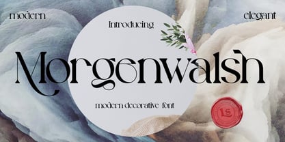 **Morgenwalsh Font** This pair was inspired by the elegance vintage poster design that i saw on some coffee shop, It was crafted by hand specially to add natural handmade feeling in its brand identity than i make it clean with pentool. **Opentype features** Morgenwalsh font has 207 character set included Morgenwalsh Font is very good looking in logo, labels, product packaging, invitations, advertising and others. This fonts works with folowing languages: Afrikaans, Albanian, Asu, Basque, Bemba, Bena, Chiga, Cornish, Danish, English, Estonian, Filipino, Finnish, French, Friulian, Galician, German, Gusii, Indonesian, Irish, Italian, Kabuverdianu, Kalenjin, Kinyarwanda, Low German, Luo, Luxembourgish, Luyia, Machame, Makhuwa-Meetto, Makonde, Malagasy, Malay, Manx, Morisyen, North Ndebele, Norwegian Bokmål, Norwegian Nynorsk, Nyankole, Oromo, Portuguese, Romansh, Rombo, Rundi, Rwa, Samburu, Sango, Sangu, Scottish Gaelic, Sena, Shambala, Shona, Soga, Somali, Spanish, Swahili, Swedish, Swiss German, Taita, Teso, Vunjo, Zulu Thank you for using this font. LS
 - Sinofluck by LetterStock,
$23.00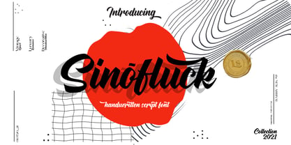 **Sinofluck Font** This pair was inspired by the samurai poster design that i saw on some coffee shop, It was crafted by hand specially to add natural handmade feeling in its brand identity than i make it clean with pentool. **Opentype features** Sinofluck font has 207 character set included Sinofluck Font is very good looking in logo, labels, product packaging, invitations, advertising and others. This fonts works with folowing languages: Afrikaans, Albanian, Asu, Basque, Bemba, Bena, Chiga, Cornish, Danish, English, Estonian, Filipino, Finnish, French, Friulian, Galician, German, Gusii, Indonesian, Irish, Italian, Kabuverdianu, Kalenjin, Kinyarwanda, Low German, Luo, Luxembourgish, Luyia, Machame, Makhuwa-Meetto, Makonde, Malagasy, Malay, Manx, Morisyen, North Ndebele, Norwegian Bokmål, Norwegian Nynorsk, Nyankole, Oromo, Portuguese, Romansh, Rombo, Rundi, Rwa, Samburu, Sango, Sangu, Scottish Gaelic, Sena, Shambala, Shona, Soga, Somali, Spanish, Swahili, Swedish, Swiss German, Taita, Teso, Vunjo, Zulu Thank you for using this font. LS
 - Informative by Latinotype,
$39.00 Informative is a typeface consisting of a whole family of sans fonts and a collection of thematic pictograms. This combination of two different types of communication reflects the current need for using text and images as means of conveying information in a complementary way. The family comes with a text version of 7 weights (with matching italics)—Thin, Light, Regular, Medium, SemiBold, Bold and Black, and includes 7 thematic icons sets which allude to elements related to alimentation, city, energy, people, politics, sports and work. Each set contains 88 glyphs and includes both outline and black versions. The text font contains a set of 423 glyphs that support 207 different languages. Informative is a clean, simple and versatile typeface well-suited for a wide range of graphic design and visual communication projects. This font has especially been designed for infographics, maps and digital applications.
 - Fondue by Latinotype,
$29.00 Fondue: an eclectic-flavoured contemporary typeface. Designed by Jorge Alberto Martínez and Latinotype Team. Fondue is a type family of eclectic shapes, inspired by Art Deco designs, in particular, the lettering used by the Mexican cartoonist Ernesto “El Chango” Cabral on almost the entire publication Revista de Revistas ("Magazine of Magazines"). Far from being a copy, Fondue expects to be an adaptation of the thinking of that time to be used in contemporary context. Fondue has a cursive ductus, wide horizontal proportion and large x-height. Its friendly consistent rhythm makes it ideal for medium-sized text, headlines, branding, and so on. The family comes in 6 weights, from Thin, which reminds of the cartoonist’s loose strokes, to Ultra Bold, the version with powerful and unique voice. Fondue has a set of 496 characters that support 207 different languages.. OpenType features include standard and discretionary ligatures as well as stylistic alternates.
 - Moksha - 100% free

- Jano Sans Pro by Craceltype,
$39.00 Jano Sans™ Pro is a neo humanist sans serif that was initially created to be used as a text and display typeface in brand communication. The result is a type family with a relatable character and a collaborative profile. Designed with elegant forms, low contrast and a geometric feel, Jano Sans™ Pro is a highly legible typeface suited for any text application and typographic reproduction. Jano Sans™ Pro has 18 styles and its a workhorse type system. It covers 290+ languages, including Extended Latin, Cyrillic and Greek writing systems. With over 1800 glyphs per style, its Opentype features include alternative shapes, small caps, standard and discretionary ligatures, localized forms in Latin and Cyrillic, case sensitive forms, numerators and denominators, proportional and tabular figures, slashed zero, fractions and more. The techie personality and the huge set of features and glyphs makes Jano Sans™ Pro an excellent choice for a wide range of applications, such as branding, editorial, web and broadcast.
 - Social Gothic by Canada Type,
$29.95When Social Gothic first launched in 2007 as a basic single font, it became an instant branding and advertising favourite. It was used widely by a few major fashion outlets and department stores, then soared to new heights of exposure when it became the billboard-cause standard face for a few charity outfits and political organizations throughout Canada’s major urban centres. Social Gothic is a unicase font that combines standard sans serif elements with some distinct “wooden” shapes and oval lowercase components, to make for a totality that achieves a handmade look while maintaining a clean, legible, understated and easy message delivery. It is a gothic with quite a few humanist leanings, something seldom found in the sans serif genre. This retail Social Gothic family is the re-conceptualized, refined and optimized redux of the many bespoke versions that were commissioned and customized for various proprietary brands and projects over the years. The remastered set consists of four multi-script weights, rough and soft variations, and a very unique stencil treatment. Each of the Social Gothic fonts contains over 550 glyphs and support for Latin, Greek and Cyrillic languages. - Love Wins by Resistenza,
$19.00 In 2007 we shared our first pride together. More than 1 million people took the streets of Madrid for this huge celebration … seeing the diversity of people supporting love was incredibly touching. Gay Pride is a celebration of freedom, human rights and the right to love whoever we want. It’s a memorial for the battles, the lives lost and the pain suffered while fighting for a growing list of equal rights. But let’s not forget there are still places where LGTBQ community is repressed and persecuted. As Letter crafters we love seeing the signs people design for their different pride parades, and we wondered… Why don’t we create a collection of handcrafted lettering to share some love and to add a typographic realness to the party? Love Wins Font is a series of 60 phrases handwritten with expertise and love specially designed to celebrate diversity. The lettering was crafted with different calligraphic tools creating diverse aesthetics. You can use them to create your signs, t-shirts, stickers, poster, banners.. all you need is to spread love during your Pride Celebrations (or day-to-day life!).
 - Aviano Sans by insigne,
$24.99 insigne returns to Aviano’s classically inspired forms with this sans serif variant. Wide and geometric, Aviano Sans is perfect for any job that calls for a chic and dignified sans serif as seen in this demonstration video. Aviano Sans has consistently topped insigne’s best-seller chart for more than seven years, earning its stripes as an expressive and versatile typeface that belongs in any designer’s tool chest. Aviano Sans' five weights of Regular, Thin, Light, Bold, and Black include 42 Art Deco-inspired alternate characters that can turn you and your project into a force to be reckoned with. The typeface family also includes 40 unique ligatures that add a bit of swagger to this serious sans. insigne released the first Aviano in early 2007. Its beautifully drawn extended letterforms were a hit with designers, and Aviano quickly became one of insigne’s most popular offerings. The simplified variant of Aviano Sans followed soon after, paring down the structure around the core concept. The Aviano series continues to develop further today with new variants on this classic form. Be sure to check out the rest of the Aviano series, including Aviano, Aviano Serif, Aviano Flare, and Aviano Contrast.
 - Maxima Now Pro by Elsner+Flake,
$59.00 The sans serif linear antiqua Maxima which was created in the beginning of the sixties by Prof. Gert Wunderlich for Typoart Dresden, was newly actualized in 2007 after more than 45 years. Many hands and heads were involved in the successful re-design of Maxima Now over a period of two years to assist the designers of the Elsner+Flake Design Studios in Hamburg, and the typeface family is now available. The re-design happened in close cooperation with Wunderlich who has given support to numerous projects in Elsner+Flake’s studio in Hamburg. A great deal of care was given to the necessary preliminary tasks such as the viewing of the original designs and print tests, the analysis of the digital Typoart data which had been in the possession of Elsner+Flake since 1985 and 1989, and a design conceptualization based on detail correlations, as well as the extension of the character complement. It had been Elsner+Flake’s goal to include as many of the existing Maxima cuts into the re-design program as possible. The result is an extended font family with 25 weights in EuropaPlus layout.
 - Czykago Rough by TypoGraphicDesign,
$19.00 From 2019 back to the 90s … The typeface “Czykago Rough” by Alexander Branczyk and Manuel Viergutz is a re-issue of the font “Czykago” published in 1995 by the font label “Face2Face”. Designed as a re-release for the Font Foundry “Typo Graphic Design” in 2019. The rough sans serif display font is inspired by the 80s and 90s. Glyhph-Set: Latin Extended (Adobe Latin 3). 907 glyphs with 3× A–Z & a–z and 350+ decorative extras like icons, arrows, dingbats, emojis, symbols, sign of the zodiac, geometric shapes, catchwords, decorative ligatures (type the word #LOVE for ❤ or #SMILE for ☺ as OpenType-Feature dlig) and stylistic alternates (4× stylistic sets). For use in logos, magazines, posters, advertisement plus as webfont for decorative headlines. The font works best for display size. Have fun with this font & use the DEMO-FONT (with reduced glyph-set) FOR FREE! ■ Font Name: Czykago Rough ■ Font Weights: Cond + Stretch + Mix + CondBG + Icons + DEMO (with reduced glyph-set) ■ Font Category: Display for headline size ■ Font Format: .otf (OpenType Font for Mac + Win) + .ttf (TrueType Font) ■ Glyph Set: 907 glyphs with 350+ decorative extras like icons ■ Language Support: 80+ for Latin Extended (Adobe Latin 3). Afrikaans, Albanisch, Baskisch, Bemba, Bena, Bosnisch, Dänisch, Deutsch, Englisch, Estnisch, Färöisch, Filipino, Finnisch, Französisch, Friulisch, Galizisch, Gusii, Indonesisch, Irisch, Isländisch, Italienisch, Kabuverdianu, Kalenjin, Katalanisch, Kinyarwanda, Kölsch, Kornisch, Kroatisch, Lettisch, Litauisch, Luhya, Luo-Sprache, Luxemburgisch, Machame, Madagassisch, Makhuwa-Meetto, Makonde, Malaiisch, Manx, Morisyen, Niederländisch, Niedersorbisch, Nord-Ndebele, Norwegisch Bokmål, Norwegisch Nynorsk, Nyankole, Obersorbisch, Oromo, Pare, Polnisch, Portugiesisch, Rätoromanisch, Rombo, Rukiga, Rumänisch, Rundi, Rwa, Samburu, Sango, Sangu, Schottisches Gälisch, Schwedisch, Schweizerdeutsch, Sena, Shambala, Shona, Slowakisch, Slowenisch, Soga, Somali, Spanisch, Suaheli, Taita, Teso, Tschechisch, Türkisch, Turkmenisch, Ungarisch, Vunjo, Zulu ■ Specials: Alternative letters, stylistic sets, automatic contextual alternates via OpenType Feature (3× different versions of A–Z & 0–9 + a–z), Euro, kerning pairs, standard & decorative ligatures, Versal Eszett (German Capital Sharp S), 350+ extras like Dingbats & Symbols, arrows, hearts, emojis/smileys, stars, further numbers, lines & geometric shapes ■ Design Date: 1995–2019 ■ Type Designer: Alexander Branczyk and Manuel Viergutz
 - Vox Round by Canada Type,
$39.95 Vox Round is the softer version of the Vox family. The original brief for Vox was a extensive monoline typeface that can be both precise and friendly, yet contain enough choice of seamlessly interchangeable variants for the user to be able to completely transform the personality of the typeface depending on the application. Basically, a sans serif with applications that range from clean and transparent information relay to sleek and angular branding. When the first version of Vox was released in 2007, it became an instant hit with interface designers, product packagers, sports channels, transport engineers and electronics manufacturers. This new version (2013) is the expanded treatment, which is even more dedicated to the original idea of abundant application flexibility. The family was expanded to five weights and two widths, with corresponding italics, for a total of 20 fonts. Each font contains 1240 glyphs. Localization includes Cyrillic and Greek, as well as extended Latin language support. Built-in OpenType features include small caps, caps to small caps, four completely interchangeable sytlistic alternates sets, automatic fractions, six types of figures, ordinals, and meticulous class-based kerning. This kind of typeface malleability is not an easy thing to come by these days.
 - Karmina by TypeTogether,
$49.00 Karmina is a text typeface developed mainly for pocket books and budget editions. It was built to withstand the worst printing conditions: low quality papers, high printing speed with web presses and variations in the ink level of the printing press. Some of Karmina's most representative features are the rather large serifs, intended to work perfectly in small reproduction sizes, the sharpness of the shapes, including some calligraphic reminiscences, and the large and yet graceful ink traps in the acute connections. Structurally, Karmina combines a significantly large x-height with relatively compressed letterforms. The result of these features grants Karmina outstanding legibility and economy. Karmina features four weights and 800 characters per weight, including small caps, discretionary ligatures, fractions and a complete range of numerals for every use. It also supports over 40 languages that use the latin extended alphabet. Karmina was selected in the text typography category at the Letras Latinas exhibition 2006 and won a merit in the European-wide ED-Awards competition 2007. Karmina Basic is a reduced version of Karmina. It is still an OT-font but without any particular features except of a set of ligatures, class-kerning and language support including CE and Baltic.
 - APF Lagoon Regular by Pomegranate,
$30.00 In 2007-8, Carolyn Puzzovio developed this OpenType typeface: Lagoon which is based on an Armenian model from the Mechitarist monastery, Venice, 1810. This project was supported by a grant from the AHRC (Arts & Humanities Research Council, UK) and won a first prize in the Granshan 08 type design competition. Oſten, Armenian digital types are designed to match the forms of Latin type characters and ‘Latinized’, by uprighting the forms; truncating ascenders and descenders and raising the x-height – but in this case the Latin characters in the OpenType font have been designed to blend in with the traditional Armenian proportions which are based on cursive forms – also incorporating some of the quirky shapes from the original model. Faithfully following the original created difficulties of ‘clashing’ characters, particularly those with long descenders, so the font contains over 100 alternative characters in the Armenian part, which will normally substitute automatically where necessary. The sloping lower case characters and upright capitals are traditional in Armenian – capitals are used less in the Armenian language. Three new characters for the Armenian unicode range are included: the Armenian dram (currency) symbol; the eternity symbol; and the index number symbol. This font which will be one of the first OpenType fonts to incorporate these newly unicoded characters.
 - Rougon by VanderKeur,
$30.00 The reason for Nicolien van der Keur to design the Rougon font was the translation of twenty novels written by Emile Zola, a French writer, and translated by Martine Delfos. It follows the lives of the members of the two titular branches of a fictional family living during the Second French Empire (1852–1870) and is one of the most prominent works of the French naturalism literary movement. This series deserved a font with French roots and corresponded to the period in which Zola’s books were written and published, the period between 1870 and 1893, the end of the nineteenth century. Extensive research into French historical typefaces has led to a type specimen from the French type foundry Deberny et Cie in Paris around 1907. It turned out to be good and helpful source as it contained a sample of a typeface that reflected the content and style of the novels, but also represented the period in which the books were written in France. A large part of the novels are about the generations of Rougon, so it seemed a natural choice to give the font that name. It is available in one weight and contains stylized portraits of Emile Zola and the French Marianne. This font also contains various ornaments.
 - Wedge Gothic by HiH,
$12.00 Bold, muscular, vaguely oriental, Wedge Gothic ML is the original name of this font released by Barnhart Bros. and Spindler of Chicago in 1893. The straight-forward, no-nonsense name tells us exactly what to expect: sans-serif letterforms based on wedge-shaped vertical strokes. The typeface was dropped for awhile -- it does not appear in the 1907 catalog for example -- but reappeared in 1925 as Japanette. What is the opposite of "straight-forward" anyway? According to McGrew, Wedge Gothic was originally created for the Chicago Herald newspaper. The designer is unknown. A distinctive display face, useful when a strong and unusual statement is desired. Wedge Gothic ML features: 1. Glyphs for the 1250 Central Europe, the 1252 Western Europe, the 1254 Turkish and the 1257 Baltic Code Pages. Total of 335 glyphs. 2. OpenType GSUB layout features: pnum, ornm, hist & salt. 3. 66 kerning pairs. 4. Both tabular & proportional numbers. 5. Alternate bullets. The zip package includes two versions of the font at no extra charge. There is an OTF version which is in Open PS (Post Script Type 1) format and a TTF version which is in Open TT (True Type)format. Use whichever works best for your applications.
 - Vox by Canada Type,
$39.95 The original brief for Vox was a extensive monoline typeface that can be both precise and friendly, yet contain enough choice of seamlessly interchangeable variants for the user to be able to completely transform the personality of the typeface depending on the application. Basically, a sans serif with applications that range from clean and transparent information relay to sleek and angular branding. When the first version of Vox was released in 2007, it became an instant hit with interface designers, product packagers, sports channels, transport engineers and electronics manufacturers. This new version (2013) is the expanded treatment, which is even more dedicated to the original idea of abundant application flexibility. The family was expanded to five weights and two widths, with corresponding italics, for a total of 20 fonts. Each font contains 1240 glyphs. Localization includes Cyrillic and Greek, as well as extended Latin language support. Built-in OpenType features include small caps, caps to small caps, four completely interchangeable sytlistic alternates sets, automatic fractions, six types of figures, ordinals, and meticulous class-based kerning. This kind of typeface malleability is not an easy thing to come by these days. For additional versatility, take a look at Vox Round, the softer, but just as extensive, counterpart to this family.
 - Art Gothic HiH by HiH,
$10.00 Art Gothic was attributed to the Central Type Foundry of St. Louis, Missouri, USA by Henry Lewis Bullen, writing in INLAND PRINTER in 1907, with a reproduction shown in Kelly’s American Wood Type. The typeface appears on the cover of an issue of “The Superior Printer” pictured in Typology by Heller and Fili dated in the 1870s. Art Gothic was designed in 1884 by Gustav Schroeder and proved to be one of the more popular and enduring of the American-designed Victorian display faces of the period, appearing frequently in ads in various publications. The Hamilton Mfg. Co showed a very similar wood type, No. 232, with a modified and rather heavy-handed upper case in 1892. As late as 1897, it may be found in the advertising section of The Ivy of Trinity College of Hartford, Connecticut and was included in the Norwood Press 1902 Specimen Book. Our font includes a complement of five upper case and four lower case alternatives as follows: 123=C, 125=E, 135=H, 137=S, 172=c, 175=e, 215=m and 247=s. Great for period pieces. ART GOTHIC HIH is clean, readable, and surprisingly modern-looking; unlike so many overly complex Victorian display fonts, it can be used in text sizes.
 - Koufiya by Linotype,
$187.99 Koufiya is designed by Nadine Chahine in 2003 as part of her MA project at the University of Reading, UK and later released by Linotype in 2007. It is the first typeface to include a matching Arabic and Latin designed by the same designer at the same time with the intention of creating a harmonious balance between the two scripts. The Arabic part is based on the Early Kufi style popular in the 7th to 10th century AD. It is characterized by a strong horizontal baseline, horizontal stacking order, clear and open counters, and a general open feeling. Though based on the earliest styles on Arabic manuscript, the design paradoxically appears quite modern and fresh. The Latin part of Koufiya recalls a Dutch influence in its shallow top arches and rather squarish proportions. Both Arabic and Latin parts have been carefully designed to maintain the same optical size, weight, and rhythm. However, no sacrifices were made to make them appear closer to each other. They are designed so that they work well together on the printed page, and to make sure that the two scripts are harmonious when they are mixed together even if within the same paragraph. The font includes support for Arabic, Persian, and Urdu. It also includes proportional and tabular numerals for the supported languages.
 - Akagi by Positype,
$25.00 Akagi started as a rough sketch while on a really long plane ride to Tokyo in 2007. I wanted to develop a sans that was a complete departure from my successful Aaux Pro (now Aaux Next) sans serif family. Whereas Aaux and its siblings are rather unforgiving and stark in their presentation, I wanted this new sans serif to "smile" at you when it's on the page. When the plane landed and I realized I did not sleep through the 15 hour trip, my brain shut off, the laptop closed and I hopped in the car to the hotel—forgetting the "new sans" folder on my desktop. Fast forward a few months and I found myself seeing a lot of crisp, rigid, robot-like sans serif typefaces everywhere... I enjoy these new crop of faces but wanted to see something "friendlier" and remembered my earlier sketch work. The groundwork was there screaming at me to complete and Akagi arose from the ashes. To be truly satisfied with it personally, a great deal of time was spent trying to create a harmony between line and curve in an attempt to show that you can be crisp, clean and legible and still keep some personality. The Light and Fat weights (regular and italic) are my favorites and I hope to see them as the workhorses of the typeface.
 - Eveningnews by Wiescher Design,
$39.50 Since many years I live in Munich and read the daily newspaper Abendzeitung. One morning they had redesigned the paper, using Eric Gill's Joanna for the body copy and a tweaked version of Franklin Gothic for the headlines. Since both typefaces are my all-time favorites, I was very pleased. The old hand-lettered title lettering designed by in-house designer Ernst Friedrich Adler around 1947 or 48 was untouched as it always was. Adler had worked for the newspaper an incredible 47 years! Ernst Friedrich Adler celebrated his 100th birthday in the summer of 2007 looking very healthy. But someone had adapted his title lettering for use in the chapter headings, and I did not like the way that was done. Every morning I saw those letters and thought "one day I have to clean that up". About 15 years later I finally did it! Being at it, I designed the whole typeface and added a second fancy cut. And, what do you know, the people at the Abendzeitung called me up and said they liked what I did and started using it. So since that day in 2005 I can read my morning paper without having to wonder about the chapter headings. Well maybe one day they will do another redesign and maybe they will use another one of my fonts. Your editorial typeface designer, Gert
 - Akagi Pro by Positype,
$29.00 Akagi Pro is a complete rebuild and expansion of my popular Akagi typeface. Contemporary, clean, simple and friendly continue to serve as the adjectives for an expansion that includes 250+ additional characters per weight, many new ligature options, expanded stylistic alternates, 4 sets of figures, new symbols, case-sensitive punctuation, superscripts, subscripts, ordinals, expanded language support and two new styles that provide even more flexibility within the lighter weights of the family. When I designed Akagi in 2007, I wanted this new sans serif to "smile" at you — with this new expansion, I hope you smile back. Akagi Pro is economical while keeping a distinctive, expressive personality on the page that distinguishes it from among many of the mechanical/rigid/emotionless sans out there without becoming cliché. Perfect for the page and the screen, the flexible weights available allow for pinpoint selection at whatever size. Each style of Akagi Pro has a robust character set made even more functional with expansive OpenType features. A typesetter's dream — case-sensitive punctuation, tabular and proportional variants of lining and oldstyle numerals, true italics, small caps, expansive language support, an alternate 'g' and 'y', highlight a wealth of features of the typeface. This versatility infused within Akagi Pro will allow it to assume both roles of the utilitarian workhorse and light-hearted go-to typeface — and make the user happy.
 - Ciseaux Matisse by Harald Geisler,
$65.74 Ciseaux Matisse was inspired by the exhibition Drawing With Scissors, which I visited at the Kunsthalle Schirn in my hometown of Frankfurt am Main in 2003 and the book Jazz published in 1947 by Henri Matisse. Admittedly, before that time I wasn’t a fan of Matisse’s work, neither his late nor the early work. That definitely changed after the exhibition. While his motifs have been overused on postcards and mouspads, in front of the originals you forget those tiny pictures. Some of the works were massive—larger than 24ft. By cutting directly into the color Matisse created shapes with strong dynamics. Years later, in 2007, I used that inspiration to cut an exclusive font for a newspaper that I designed at that time (see Gallery Pictures). Later I developed that font into the four styles featured here. The cut-out style is a paper cutout; boxed is the paper background. Both linear and boxed linear have no curved outlines, so they are more aggressive. As drawing with scissors implies, all characters are cut by hand. With only uppercase letters, this font is designed for editorial use: headlines, slogans in ads, or musical usage in posters and flyers that need the little touch of the jazz scissors. In special cases the lowercase letters contain alternate shapes to the uppercase forms.
 - Ingy Ding MCD by Ingrimayne Type,
$21.00 This font began as an attempt of draw alternatives to the images of Microsoft’s Wingdings, but then grew beyond that. This new version from late 2010 has over 1400 characters, including almost all of the geometric shapes in unicode 2500 and 2B00 ranges, almost all of the arrows in the unicode 2100, 2700, 2900, and 2B00 ranges, almost all of the dingbats and symbols in the unicode 2600 and 2700 ranges, many of the pictures, symbols, and emoticons in the 1F300 to 1F600 ranges, and a few of the miscellaneous technical items in the 2300 range. There are also pictures on the standard open type letters, most of which can be accessed from the keyboard. However, most of the characters in this typeface have to be accessed using their unicode designation. In Windows this is done with the alt key and the unicode hex number. On the Macintosh the easiest way (and for the five digit unicode characters, perhaps the only way) is to use the “Special Characters” window under the Edit Menu in the Finder. A unicode index of the font is provided in a pdf file that was generated using FontLab. However, it only has four of the unicode digits for the five-digit elements. Almost all of the unicode numbers starting with F should have a 1 in front of the F.
 - Reiner Hand by Canada Type,
$24.95One of the earliest fonts published by Canada Type was Almanac, Phil Rutter's digitization of Imre Reiner's 1957 calligraphic typeface, London Script. In 2007, when the font was revisited for an update, it was shown that it too light for applications under 24 pt, and too irregular for applications over 64 pt. So the face was redigitized from scratch, using larger originals. This new digitization maintains a soft contour and, slightly darker and steadier stroke, and much better outlines for use at both extremes of scaling. Language support was also greatly expanded, and many alternates and ligatures were added to the redigitized character set. The name was also changed to Reiner Hand, to better reflect the origins of the design. Reiner Hand is soft and irregular jolts from a calligraphy master's hand. In a very Reineresque fashion, most characters include the one finishing stroke that makes professional calligraphers pause and ponder this additional touch to a letter's personality. Reiner Hand comes in all popular formats. The TrueType and PostScript versions come with 2 fonts, one of them loaded with alternates and ligatures. The OpenType version combines both fonts into one, and includes features for intelligent substitution in software that supports advanced typography. Language support includes Western, Central and Eastern European character sets, as well as Baltic, Esperanto, Maltese, Turkish, and Celtic/Welsh languages. - Goldenwick by LetterStock,
$25.00 Goldenwick This pair was inspired by lettering at invitation design that i got few weeks ago, it was crafted by hand specially to add natural handmade feeling in its brand identity than i make it clean with pentool. Opentype features Goldenwick font has 207 character set included. This font is very good for design logo, labels, packaging product, invitations, advertising and others, this font will make your design authentic and good looking with modern calligraphy style. If you’re looking for original calligraphy script font for your greeting card and make your design authentic, this item is a great choice to make your design looks great and unique. This fonts works with following languages: Afrikaans, Albanian, Asu, Basque, Bemba, Bena, Chiga, Cornish, Danish, English, Estonian, Filipino, Finnish, French, Friulian, Galician, German, Gusii, Indonesian, Irish, Italian, Kabuverdianu, Kalenjin, Kinyarwanda, Low German, Luo, Luxembourgish, Luyia, Machame, Makhuwa-Meetto, Makonde, Malagasy, Malay, Manx, Morisyen, North Ndebele, Norwegian Bokmål, Norwegian Nynorsk, Nyankole, Oromo, Portuguese, Romansh, Rombo, Rundi, Rwa, Samburu, Sango, Sangu, Scottish Gaelic, Sena, Shambala, Shona, Soga, Somali, Spanish, Swahili, Swedish, Swiss German, Taita, Teso, Vunjo, Zulu Thank you for using this font. LS
