10,000 search results (0.043 seconds)
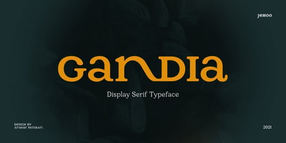
  1. Gandia by Jehoo Creative, $25.00
    Gandia is a true form of elegance and refinement. Curved corners give a soft yet bold impression. Inspired by the fast-growing vintage culture, this typeface can easily blend with modern retro design needs. With low contrast including the Cyrillic alphabet, it is very flexible to pair with other fonts. Gandia is perfect for various design needs such as magazines, posters, branding, clothes, quotes, web ui, social media posts, cover designs, Logo and many more. Comes with 8 Weights: Thin, Extralight, Light, Regular, Medium, Semibold, Bold, Extrabold. Equipped with attractive Opentype features Smallcaps, Discretionary Ligature vertical on Uppercase and Ss01, Ss02, Ligature on Lowercase and each font has more than 1300 glyph.
  2. Nike Combat Stencil - Unknown license
  3. MB-Back for Death - Personal use only
  4. Pea Kim - Unknown license
  5. Pea Martha - Personal use only
  6. Pea Martha - Unknown license
  7. Pea Glo-Girl Script - Personal use only
  8. Q-bo - Personal use only
  9. Pea Jamie*B* Wake Up Fishy! - Unknown license
  10. Pea Mandy - Unknown license
  11. HelenaDEMOVERSION - Personal use only
  12. Linotype Scrap by Linotype, $29.00
    Linotype Scrap is part of the Take Type Library, chosen from the entries of the Linotype-sponsored International Digital Type Design Contests of 1994 and 1997. The font is available in two weights and was designed by German artist Ingo Preuss. It is as though the forms of the basic weight were cut with scissors out of pieces of paper. There are no inner contours, only the outer silhouettes. The capital letters which make up Scrap Bonus are set on black rectangular backgrounds and are white and framed with a white contour. This weight includes a number of different pictograms which were also not spared the scissors. The decorative Linotype Scrap embodies the comic style of the 1990s and is meant exclusively for headlines of points sizes 18 and larger.
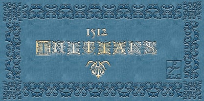
  13. 1512 Initials by GLC, $20.00
    This set of initial decorated letters is an entirely original creation, drawn inspired by Italian renaissance patterns. It contains two roman alphabets : one drawn in white on black background and the other in black on white. We have included a few fleurons and decorative elements. It can be used as variously as web-site titles, posters and flyers design, publishing texts looking like ancient ones, or greeting cards, all various sorts of presentations, as a very decorative, elegant and luxurious additional font... This font supports strong enlargements remaining very smart and fine. It's prefered height is about one inch equivalent to about four lines of characters. This font may be used with all blackletter fonts, but works especially well with 1543 Humane Jenson, 1557 Italique and 1742 Civilite, without any anachronism.
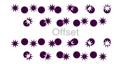
  14. Heavenly Bodies by Aah Yes, $0.25
    All 6 fonts use the characters A - K and a - k to show two planets/stars/moons moving across each other. Nice and simple. There's a different number of points on the stars, or they're different sizes, and some appear to pass left-to-right, and some appear to pass the other way. Just type in ABCDEFGHIJK or abcdefghijk and you'll see. Two fonts have all the characters on the same level, (All-Black and Black+White). The Offset font has the 'sun/moon' with one slightly above the other and in black and white, and Half has them all-black. Partial has them even further separated in 2-tone. NearMiss is a very close shave. Comma, hyphen, and full stop/period give just a single symbol; there's a Space, and that's it.
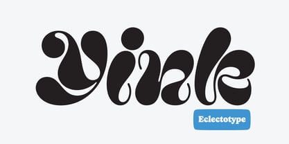
  15. Yink by Eclectotype, $40.00
    Yink takes big, bulbous, ball terminals up a notch, by repeating the shapes not only in the black but in the white space too. This interplay between black and white shapes is reminiscent of the yinyang symbol in places, which is where the name Yink originates. It's a shamelessly over-the-top font, and should be set large. There's a handful of OpenType features, including ligatures and alternates: Ligatures for ff, fft, ft, tt, gj Alternates are grouped into stylistic sets: 1. An alternate u, possibly more legible, but definitely not as much fun! 2. Again, a more boring version of m, just in case the default is ambiguous. 3. A more exuberant L 4. A blackletter informed T 5. Alternate P and R 6. An alternate 1 (one)
  16. Stack Braille by Echopraxium, $5.00
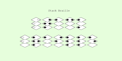
    This is a monospace font for the Braille alphabet. The idea came while exploring new ways to display the regular braille glyph ( 3 rows of 2 dots ). The glyph design is inspired by "stackable multiple board" games like the famous Vulcan chess (from Star Trek series) and the Qubic (3D tic-tac-toe). The stack is made from 3 levels, each level is a 3x3 grid with 2 "playable" cells (South-West and North-East). Each cell can be either empty, filled by a white square token or a black square token. The 3D effect is obtained by means of the classic isometric perspective. Lowercase letters use black tokens, while uppercase letters use white tokens. Most special characters (e.g. digits, *$#@, []{}() etc.. ) are also provided for special usages like program source code (see poster 5).
  17. FacetsNF - 100% free
  18. JunebugStompNF - 100% free
  19. UppenArmsNF - 100% free
  20. Grafista by Scannerlicker, $44.00
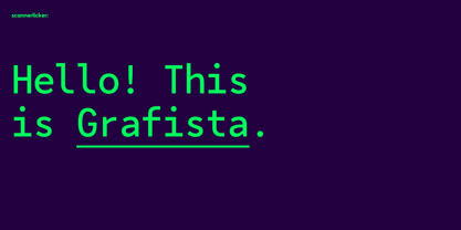
    Grafista is an extrapolation on what fonts are used for: in spite of the possibility to use it for setting text, Grafista strives when used as a texture library, the same way that one would set up tiles. Thus, Grafista was built as two different things compiled in the same font: the letterforms (for setting text) and the texture library. Both of the sets are monospaced (with every glyph having the same width), but the letterforms are half of the texture tiles' width. On the tech side, the letterforms are 500/1000 UPMs, while the tiles are 1000/1000 UPMs.
  21. Arkham77 by Jvne77 Studio, $20.00
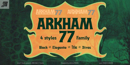
    Inspired by the works of Howard Philips Lovecraft (1890-1936), and the city of Arkham lying abroad the Miskatonic River... witth all those witchcrafts secrecy and the infamous Necronomicon. The Elder Ones and the mighty Cthulhu, who lies and not dies within the dephts of the ocean in R'lyeh he's awaiting... arf, anyway this font will well set for posters, detective stories or horror books, pulps and others... *Full western latin language with most diacritics and numbers* Included in this set: - ARKHAM77 Black (More formal display) 560 glyphes - ARKHAM77 Elegante (for a creepiest rendition) 590 glyphes - ARKHAM77 Titles (as its name do not tells, for credits, or simple text) 560 glyphes - ARKHAM77 Extras (Embellish your work with this cool collection of frames and ornaments) +100 glyphes
  22. Istoria by Hooper Type, $12.00
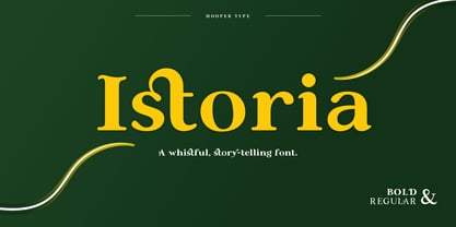
    New foundry on the block, Hooper Type, kicks off it's catalogue with a versatile, story-telling serif font. With a love of the magical and a yearning for adventure, Istoria pushes away from the static, drawing in whisps and whirls that entice and excite, without distracting. Unassuming in it's long form, with delicate strokes that draw the eye, it commands attention when used in short punchy titles, or set in caps. Istoria (meaing both history and story in Greek) delights in having unusual curves, curvy straights and twisty feet which emulate those adventures and myths from days gone by. Type shouldn't interfere with the content, but it absolutely can enhance it. Hope you enjoy it!
  23. GauFontExpositionR - Unknown license
  24. Corners 2 - Unknown license
  25. Copyright Violations Nudged - Personal use only
  26. GauFontExpositionW - Unknown license
  27. Candy Cane Match - Unknown license
  28. NewStyle - Unknown license
  29. Mississauga - Unknown license
  30. Alianna - Unknown license
  31. Chellovek - Unknown license
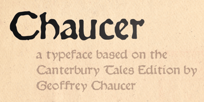
  32. Chaucer by Volcano Type, $19.00
    Geoffrey Chaucer (1340-1400) was a English poet, one of the most important figures in English literature.
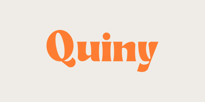
  33. Quiny by Nestype, $17.00
    Quiny is built with bold and curvy characters, Perfect if you need fun for your projects.
  34. Wood Sans Narrow JNL by Jeff Levine, $29.00
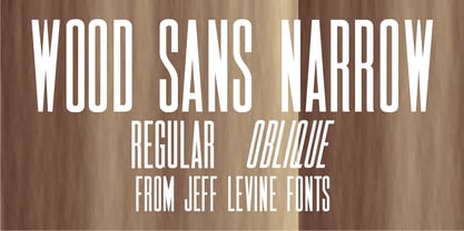
    Wood Sans Narrow JNL is based on examples of an extra condensed Hamilton Wood Type. The design was cleaned up a bit to provide more uniform stroke widths, but still retains the nostalgic feel of a tall, narrow type face found on broadsides and posters of the late 1800s. It is available in both regular and oblique versions.
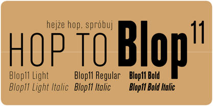
  35. Blop11 by osialus, $15.00
    Blop11 is a geometric sans-serif type family, consisting of 3 weights. Blop11 Bold is inspired by 1800s-style wood, poster typeface. Owing to its rounded terminals, Blop preserves natural organic quality of wood typeface. The Regular and Light versions are contemporary original projects. Blop11 is well-suited to headlines and short text. See also Blop77
  36. Nanki Poo NF by Nick's Fonts, $10.00
    This little gem is based on a typeface discovered in a Boston Type Foundry catalog from the late 1800s, originally called "Mikado". This font gets its name from one of the more memorable characters in Gilbert and Sullivan’s operetta. Both versions of this font include the complete Unicode Latin 1252 and Central European 1250 character sets.
  37. Eckhardt Freehand JNL by Jeff Levine, $29.00
    Eckhardt Freehand JNL is the fourth font based on the lettering of sign painters and show card writers. Jeff Levine has chosen to name this “mini series” of fonts in honor of his friend Albert Eckhardt, Jr., a talented sign man who ran Allied Signs [in Miami, Florida] from 1959 until his passing in 2005.
  38. Iamblock by wearecolt, $-
    Free Font Iamblock is a super heavy display font that makes a statement. In the family, you get a monospace and a naturally spaced version of Iamblock. Iamblock was developed with the rave and party scene in mind, with lots of bright, bold colors mixed with blacks and whites... it's about the heavy contrast.
  39. Betula by Hanoded, $10.00
    Betula is the scientific name for Birch - I probably don’t have to explain that birches are my favourite trees! They always look like the ghosts of the forest with their papery white bark and dark blotches. Betula is a rough, crayon-like font. Very legible with a childlike appearance. Comes with a forest of diacritics.
Looking for more fonts? Check out our New, Sans, Script, Handwriting fonts or Categories
abstract fontscontact usprivacy policyweb font generator
Processing