4,473 search results
(0.033 seconds)
- Cyrillic Old Face - Unknown license

- Action Is, Shaded JL - Unknown license

- Denso Serif by DSType,
$40.00 An eye-catching and practical type family that doesn't intend to be retro or evoke any geometrical cliché. Ranging from a low contrasted thin to a vigorous black, Denso is available in both low and high contrast versions. All consistently developed across two styles, Serif and Sans. Marked by the vertical rhythm, enhanced by the enormous x-height, Denso has the typographic qualities that will allow the design to be highly readable, with a strong stylish statement.
 - Olympia by Linotype,
$29.99The typewriter font Olympia was developed by Hell Design Studio and is available in one weight. A typical characteristic of a typewriter face is that it is monospaced, meaning all characters take up the same amount of space, whether a relatively wide m or a relatively narrow i. Typewriters have all but disappeared from the workplace and such faces have lost their original, practical use, but their style and effect has kept them alive and well, especially in advertisements. - Arbour Soft by TypeUnion,
$35.00 Arbour Soft is the cheeky version of it's big brother, Arbour. The soft version creates a smooth finish that flows perfectly across screens and print. Arbour Soft comes in 7 weights, from a delicate extra-light to a soft, strong black, with matching soft italics for each upright. The soft black weights are perfect for your new brand or article headlines, and the light weights are great for calling out text. The mid weights are perfect for longer texts.
 - Ongunkan Rhaetian Script by Runic World Tamgacı,
$60.00 Rhaetic or Raetic (/ˈriːtɪk/), also known as Rhaetian, was a Tyrsenian language spoken in the ancient region of Rhaetia in the eastern Alps in pre-Roman and Roman times. It is documented by around 280 texts dated from the 5th up until the 1st century BC, which were found through northern Italy, southern Germany, eastern Switzerland, Slovenia and western Austria, in two variants of the Old Italic scripts. Rhaetic is largely accepted as being closely related to Etruscan.
 - Denso Serif High by DSType,
$40.00 An eye-catching and practical type family that doesn't intend to be retro or evoke any geometrical cliché. Ranging from a low contrasted thin to a vigorous black, Denso is available in both low and high contrast versions. All consistently developed across two styles, Serif and Sans. Marked by the vertical rhythm, enhanced by the enormous x-height, Denso has the typographic qualities that will allow the design to be highly readable, with a strong stylish statement.
 - Sightseeing Tour JNL by Jeff Levine,
$29.00 Samuel Welo was a sign painter who had published in the 1920s and again in 1960 his “Studio Handbook – Letter and Design for Artists and Advertisers”, prolifically hand lettering all of the type style examples within the pages of the publication. In 1930 Welo also published “Lettering - Practical and Foreign”. From this book comes a thick-and-thin hand lettered Art Deco alphabet – now available digitally as Sightseeing Tour JNL in both regular and oblique versions.
 - Merciful Heart by Sronstudio,
$16.00 Merciful Heart - A lovely Calligraphy Font with lovely alternate swashes and doodle heart bonus. I made this font especially for you craft designer, this font will perfect for adding a lovely touch to your design and with a pretty good thickness, this font will be great for those of you who use Cricut or Silhouette. How To Access Alternate Swashes? You can read this article: https://helpx.adobe.com/illustrator/using/special-characters.html Follow Instagram: @sronstudio Thank You!
 - Denso Sans High by DSType,
$40.00 An eye-catching and practical type family that doesn't intend to be retro or evoke any geometrical cliché. Ranging from a low contrasted thin to a vigorous black, Denso is available in both low and high contrast versions. All consistently developed across two styles, Serif and Sans. Marked by the vertical rhythm, enhanced by the enormous x-height, Denso has the typographic qualities that will allow the design to be highly readable, with a strong stylish statement.
 - Denso Sans by DSType,
$40.00 An eye-catching and practical type family that doesn't intend to be retro or evoke any geometrical cliché. Ranging from a low contrasted thin to a vigorous black, Denso is available in both low and high contrast versions. All consistently developed across two styles, Serif and Sans. Marked by the vertical rhythm, enhanced by the enormous x-height, Denso has the typographic qualities that will allow the design to be highly readable, with a strong stylish statement.
 - Manufactory JNL by Jeff Levine,
$29.00 Manufactory JNL and its oblique counterpart were re-drawn from examples of a now-antique typeface used within many advertisements found throughout the pages of The American Stationer magazine, circa 1879. The term ‘manufactory’ was popular during this era; the word being a more archaic form of ‘factory’. There is a bit of Western flavor to this type design, as the spurred serifs and the top and bottom strokes are heavier than the vertical and mid-point stroke weights.
 - Sarabande by Three Islands Press,
$24.00Sarabande is a painstaking reproduction of Jean Jannon's famous "Garamond" of 1621 -- also known as "Caracteres de l'universite." Whereas the original was intended for setting French and Latin text only, Sarabande has all standard international characters and diacritics, along with a Euro symbol. (There are however no characters for higher mathematics or logic, and the number of other unhistorical characters has also been kept to a practical minimum.) Sarabande comes with two styles: a roman and a true italic. - Beaverist by Popskraft,
$18.00 The Beaverist belongs to the group of handwritten fonts and is inspired by the culture of small and cute villages located far from big cities, almost as a part of nature. Beaverist does not have the pompousness of calligraphic fonts, but it has the warmth and softness of natural forms that we rarely meet in our hectic life. So if you want a simple and easy-to-read handwritten font, don't hesitate, the Beaverist font is your choice.
 - Sailor Gothic by Design is Culture,
$39.00A font by Christian Acker (2003), based upon the practice of the Americana folk art tradition of tattoo design. Throughout the late 19th and 20th Centuries sailors would popularize and spread motifs, designs and styles by carrying this art around the world on their sleeves. A family of four fonts representing traditional styles is now available as a digital font. An accompanying collection of over 60 eps illustrations of tattoo "flash" are also available at cubanica.com. - Beth Ellen - 100% free

- Mostly Ghostly - 100% free

- October Crow - 100% free

- Elfabet - Unknown license

- Futurex Bitmax - Unknown license

- VTCKomixationHand - Unknown license

- DS Rabbit - Unknown license

- French Stencil Moderne JNL by Jeff Levine,
$29.00 French Stencil Moderne JNL is modeled from an alphabet found in the 1930s publication "100 Alphabets Publicitaires" by M. Moullet, and is available in both regular and oblique versions. Strongly resembling the stencil motif of Futura Black, this French stencil alphabet has enough variations to give it a unique design flavor all its own.
 - Jackerton by noggindoodle,
$15.00 Jackerton is a playful, hand-drawn typeface inspired by the doodles of the designer's father. Every word is a puzzle with pieces changing and shifting as you type. Over 50,000 words in more than 100 latin-based languages have been scrutinized to make sure each combination of letters fits together precisely from the 2,000+ ligatures.
 - FHA Nicholson French by The Fontry,
$25.00 An Art Nouveau alphabet that has stood the test of time, Nicholson French, by legendary sign-painter Frank H. Atkinson, is over 100 years old and going strong. In modern typographic trim, it comes with OpenType feature replacement options and multi-language support, from standard Latin-1 to Latin Extended-A, Greek and Cyrillic.
 - White Glory by Yumna Type,
$16.00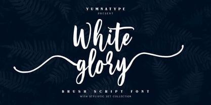 White Glory is a beautiful brush font. The texture from this natural brush font will make your design more beautiful and powerful. This font is suitable for any design like branding, quotes, t-shirt printing and more. Features: Accents (Multilingual Characters) 104 beautiful stylistic alternates PUA encoded Numerals and punctuations (OpenType standard) Design by yumnatype
 - Lazy Boutique by Bogstav,
$17.00 Lazy Boutique is and exciting and beautiful piece of work. It's 100% handmade and slightly irregular in an organic way. I've added X different versions: Regular, Line, Fill and Curl - mix and match to find your favourite kind of look . Use Lazy Boutique for your products that needs a handmade, organic and exciting look!
 - Nazgul by Hikhcreative,
$20.00 Nazgul is a modern dynamic sans serif font with subtle vintage characteristics. It works perfectly for film posters, headlines, block letters, subheadings, logo designs, big banners, classic and decorative typography, web designs, packaging and more. The two styles, Regular and Outline, include more than 100 ligatures and alternate characters allowing for versatility in design.
 - Grimalda by Hikhcreative,
$20.00 Grimalda is an elegant serif typeface with taste of modern and simplicity. It is perfectly for magazine cover, headline, wedding invitations, logo, brand, and many more. Grimalda have more than 100 characters of ligatures and alternates. You can create any imagination with this serif font. What's included? - Uppercase & Lowercase Characters - Multilingual support - Ligatures & Alternates Characters
 - RM Sans by Ray Meadows,
$19.00 RM Sans has been designed to offer an useful but inexpensive family of 5 regular weights; 3 condensed weights; 5 outline weights and an 'eco' alternative. Due to the modular nature of this design there may be a slight lack of smoothness to the curves at very large point sizes (around 100 pt and above).
 - Lippy by Thinkdust,
$10.00 Lippy is designed to give a 100% lipstick feel. The reason the lipstick feel is so authentic is because the original sketches were actually drawn in lipstick, taken into illustrator, retraced and then edited carefully in Fontlab. If you're after a lipstick typeface with an authentic feel, then lippy is the one for you.
 - Goethe Fraktur by RMU,
$25.00 First released by the Woellmer Foundry, Berlin, in 1910, Goethe Fraktur is a strong and legible blackletter font which has been now revived and carefully extended for modern use. To get access to all ligatures, it is recommended to activate both standard and discretionary ligatures. You will find the longs by typing option + b or by using the OT feature historical forms.
 - Good Sport JNL by Jeff Levine,
$29.00 Good Sport JNL has nothing to do with any of the major sports activities such as baseball, football, basketball or soccer. Instead, the typeface gets its name from the sport of camping, as the lettering was spotted on an image of an old ad for the Colonial Forest-Master boy’s pocket knife. Good Sport JNL is available in both regular and oblique versions.
 - Sleepless by Gassstype,
$27.00 Introducing of our new product Sleepless is a hand drawn Horror Brush font and dramatic movement. This font is great for your next creative project such as logos, printed quotes, invitations, cards, product packaging, headers, Logotype, Letterhead, Poster, Label, and etc. Best for project that need horror vibes , horror poster, childrenbook, cartoon, comic . You can activate Ligature OpenType panel design more interesting.
 - Shine of Love by Namara Creative Studio,
$9.00 Cute and Playful display fonts crafted with heart, especially for you. It is perfect for children-themed designs, Such as t-shirt designs, story books, packaging, children’s activity or school projects, posters, greeting cards, valentine’s crafts, and more! Come in 03 variants : Regular, Shadow and Fun. So add it to your creative ideas and notice how it makes them stand out!
 - Flowess by Gassstype,
$29.00 Hello Everyone, introduce our new product Font Flowess This Is Brush Font.This is a Textured Natural Style and classy style with a clear style and dramatic movement. This font Flowess is great for your next creative project such as logos, printed quotes, invitations, cards, product packaging, headers, Logotype, Letterhead, Poster. You can activate 23 Ligatures and 34 Alternate glyphs OpenType panel.
 - Emilia Fraktur by RMU,
$35.00 Based upon Emil Rudolf Weiss’ Fraktur, first released in 1913, Emilia Fraktur was redrawn and extended not only with its engraved initial caps but also with various ornaments and border elements. To get access to all ligatures, it is recommended to activate both Standard and Discretionary Ligatures. The quickest way to the long s is by typing the integral sign.
 - Christolas Gift by Ake,
$12.00 Christolas Gift is a delightful display font that uses the magic of the winter holidays to bring joy to the ones who use it. Its playful style makes it a perfect choice for a variety of products. You can use it with confidence on greeting and holiday cards, quotes. children’s books and activities, logos, mugs, gift bags, and many more.
 - Chewing Gum by Gleb Guralnyk,
$14.00 Hello! Introducing a decorative font named Chewing Gum. It's an abstract shape smooth typeface with curly elements. For the English alphabet, there are alternative characters included. It basically simplified letters that are more readable in small sizes (You can access these letters by activating a "Stylistic Alternates" on your OpenType panel). Twelve fancy ligatures will make your lettering more organic and natural.
 - Student Council JNL by Jeff Levine,
$29.00 While Student Council JNL was not influenced by any school activities, the design is based on a lithographed cardboard sign (circa 1930s) for Spizz Sparkling Water, a bottled seltzer from the Dr. Pepper Bottling Company of Lexington, Kentucky. A squared letterform with angled semi-serifs, this Art Deco typeface grabs attention. Student Council JNL is available in both regular and oblique versions.


