10,000 search results
(0.013 seconds)
- Partager Caps NF by Nick's Fonts,
$10.00This typeface takes its inspiration from Will Bradley's Ultra Modern Initials, released by American Type Founders in 1934. Unlike the caps-only original version, both versions of this font contain complete Unicode 1252 (Latin) and Unicode 1250 (Central European) character sets, with localization for Romanian and Moldovan, and the Macintosh Roman character set, as well. - Zar Brush Gothic by SzarDesign,
$19.95 ZarBrush Gothic is a "speedball" font inspired by showcard lettering done with a loaded red sable brush. Perfect for text and headlines.
 - Intellecta Monogram Caps by Intellecta Design,
$28.90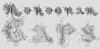
- Newsreel Caps JNL by Jeff Levine,
$29.00 Newsreel Caps JNL is a novelty caps-only outline letter with cast shadow set inside film frames. Although the design idea itself is not new, this version is based on lettering from a vintage piece of sheet music for a song featured in the movie "Fox Movietone Follies". The font is a wink and nod to Fox's long-running newsreel series called "Fox Movietone News". The upper case keys have black letters on a white frame, while the lower case keys have white letters on a black frame. A blank white frame is on the period key; a blank black frame is on the comma key. Use this font for individual initials, set the characters loose for effect or set them tight (as provided) for a continuous film strip.
 - AF Generation ZaZ by ACME Collection,
$44.00 - ITC Zapf International by ITC,
$39.00 Zapf International font is the work of German designer Hermann Zapf, formal enough for widespread use yet tempered with calligraphic warmth. Vigor in the italics is achieved more from design than from slant. One of the distinguishing characteristics of Zapf International is its graduation of weights. Light and medium are relatively close and equally eloquent for text. Demi is a full two steps heavier than medium and heavy several steps beyond demi.
 - Isometric Initial Caps by Gerald Gallo,
$20.00 Contains characters A-z, 0-9, and ampersand in two variations totaling 74 characters.
 - Kudos Kaps NF by Nick's Fonts,
$10.00Introducing a series of decorative initials with a twist: each font contains two complete alphabets, A-Z, and numerous border elements in the numeral and shift-numeral positions. Classic, ornate, quaint and exotic, these fonts are essential tools for adding style and charm to your next project. Kudos Kaps Five features Jakob Erbar’s eponymous Initials in the uppercase slots, and Aldo Novarese’s Fontasi in the lowercase AND numeral slots. The font also includes three complete eight-piece borders, a two-piece accent set, two single border elements and an elegant penman dingbat. - AF Zip Code by ACME Collection,
$44.00 - Mr Richmond Caps by Intellecta Design,
$11.90 a classic decoative caps from wood types era
 - Zapf Humanist 601 by Bitstream,
$29.99
- Berengard Caps Two by Intellecta Design,
$12.00 a classical wood type era box ornament using blackletter... a beautiful arrangement for publishing edition and other jobs
 - ITC Zapf Chancery by ITC,
$29.99 Zapf Chancery font is a work of German designer Hermann Zapf. It was named after a typeface used in Anglo-Saxon lands during the Renaissance as well as inspired by such scripts. This font makes it possible to give printed items an individual character. The handwriting of the designer can be seen in the forms of this classic, elegant font.
 - Flowery Drop Caps by Celebrity Fontz,
$15.99The Flowery Drop Caps font is a set of highly ornate block letters with rich embedded flowery designs, perfect for Spring and holiday themes and publications or any text where you want to add some texture, pizzazz, and depth to make your message stand out. This one-of-a-kind font has the feel of a homemade embroidered or quilted design and comes with both upper and lower case letters to give you more design flexibility. (Numbers, special characters, and punctuation are a neutral sans serif typeface and are included for convenience only.) - Speedball Metropolitan Caps by Intellecta Design,
$6.00 a decorative caps font based in designs of old Speedball booklets
 - Tap Water JNL by Jeff Levine,
$29.00 A WPA (Works Progress Administration) poster for the Rural Electrification Administration’s promoting of running water for rural areas is the basis for Tap Water JNL. A condensed slab serif, it is available in both regular and oblique versions.
 - 1676 Morden Map by GLC,
$42.00 This family was created -- inspired from the engraved typeface (Two styles : Normal & Italic) used in the pack of 52 playing cards who was describing the 52 counties forming a small Atlas of England and Wales and depicting English roads for the first time, published by Sir Robert Morden in 1676. Our OTF and TTF versions are covering Western, Eastern and Central European languages (including Celtic), Baltic and Turkish, containing historical and standard ligatures plus specific Old English abbreviations. The MacTT Classic version is containing the basic standard 256 glyphs including some extra ligatures.
 - Renaissance Caps BA by Bannigan Artworks,
$19.95This is a revival font of a sixteenth century typeface. I kept this font as close as possible to the original letters, including the imperfections and irregularities, to preserve the look of antiquity. Some of the letters of the original sample were missing and had to be created from the available letters. - ITC Zapf Book by ITC,
$29.99 Zapf Book font is the work of German designer Hermann Zapf, a blend of the characteristics of Walbaum, Melior and the contrasting weights of Bodoni. It is a typical Zapf font, distinction without eccentricity and superb sensitivity and letterfit, and clearly demonstrates his concern that an alphabet work not just as a collection of single letters, but also have a sense of unity in itself.
 - LTC Circled Caps by Lanston Type Co.,
$24.95 This handy font allows designers of commercial products to add basic circled letters that are uniform in appearance. For example, on music CDs, the Copyright and Publish (AKA Phonogram) symbols often do not match. While most fonts include a circled 'c' for Copyright, they seldom contain a circle 'p' for Publish (note that all P22 fonts include the circle 'p' and 'c'). The circle 'U' and 'K' for Kosher foods are rarely included in fonts and have to be made as needed. This single font contains both a serif and sans serif style caps A-Z as well as figures assigned to regular keys and also mapped to standard Unicode for "Enclosed Alphanumerics".
 - P22 Durer Caps by IHOF,
$24.95 Durer Caps is three fonts in one. Based on master artist Albrecht Dürer’s 1525 geometric construction of Roman capitals, this font features A to Z as caps only. But there are three variations included: filled construction, unfilled construction, and the solid fill letters by themselves.The user can layer the unfilled and the solid fill letters to do two-color overlay effects.
 - Medieval Caps BA by Bannigan Artworks,
$19.95This is a revival font from an Image of a plate made from Eleventh Century initial letters. The "numerals" are Roman numbers done as ligatures. - Albeit Grotesk Caps by Cloud9 Type Dept,
$40.00 Albeit Grotesk Caps is a graphic geometric all caps display font family of four weights (Light, Regular, Medium and Bold) with slightly exaggarated diacritics for better readability making it ideal for headlines.
 - Zapf Renaissance Antiqua by Linotype,
$29.99The Zapf Renaissance Antiqua type family was designed by Hermann Zapf for the German Scangraphic Dr. Böger GmbH in Hamburg, from 1984–1986. The typefaces were engineered for use in digital CRT phototypesetting. This version was based on Scangraphic SH version (For Display use) and not on the SB version (for text use). - Snowflake Drop Caps by Celebrity Fontz,
$15.99The Snowflake Drop Caps font is a set of highly ornate block letters with rich embedded snowflake designs, perfect for winter and holiday themes and publications or any text where you want to add some texture, pizzazz, and depth to make your message stand out. This one-of-a-kind font has the feel of a homemade embroidered or quilted design and comes with both upper and lower case letters to give you more design flexibility. (Numbers, special characters, and punctuation are a neutral sans serif typeface and are included for convenience only.) - 1805 Jaeck Map by GLC,
$42.00 This font is mainly inspired from the engraved characters of a German Map depicting Germany's roads and parts of surrounding lands, edited in Berlin probably in the end of 1700's. The engraver was Carl Jaeck or Jaek (1763-1808). The Map was bought by the French napoleonic general Louis Pierre Delosme (1768-1828) probably during the Napolenic campaign against Germany, circa 1805 or at least 1806, his sole staying in Germany. The font (with two styles, Normal and Italic)is containing standard ligatures and a few alternative characters. It is a "small eye" or "Small x-eight" font, as the Maps' characters are most often very small (some Italic lower cases of the map are 1mm hight, upper cases 2mm) The standard English characters set is completed with accented or specific characters for Western (Including Celtic) and Central European, Baltic, Eastern Europe and Turkish languages.
 - PL Davison Zip by Monotype,
$29.99PL Davidson Americana is an all-capital typeface based on woodcut designs from the nineteenth century. The PL Davidson Americana font was designed by M. Davison in 1965, during the revival of American headline faces. - LP Horizont Caps by URW Type Foundry,
$19.99 LP Horizont Caps is another new font creation from German designer Peter Langpeter (lp-design.de). LP has been running his own design studio since 1995, working as a typeface and logo designer, as a calligrapher, cartographer and illustrator. During this time LP created a large number of excellent new typeface designs. LP Horizont Caps is a very futuristic looking, sharp and elegant sans serif.
 - Apothem Caps Med - Personal use only

- Axial Caps Med - Personal use only

- Tighten Caps Light - Personal use only

- Octavus Caps Black - Personal use only

- Dawning of a New Day - Personal use only

- Brave New Era (outline) G98 - Unknown license

- KR Happy New Year 2002 - Unknown license

- Brave New Era (narrow) G98 - Personal use only

- Brave New Era (flat) G98 - Unknown license

- Times New Roman PS Cyrillic by Monotype,
$67.99In 1931, The Times of London commissioned a new text type design from Stanley Morison and the Monotype Corporation, after Morison had written an article criticizing The Times for being badly printed and typographically behind the times. The new design was supervised by Stanley Morison and drawn by Victor Lardent, an artist from the advertising department of The Times. Morison used an older typeface, Plantin, as the basis for his design, but made revisions for legibility and economy of space (always important concerns for newspapers). As the old type used by the newspaper had been called Times Old Roman," Morison's revision became "Times New Roman." The Times of London debuted the new typeface in October 1932, and after one year the design was released for commercial sale. The Linotype version, called simply "Times," was optimized for line-casting technology, though the differences in the basic design are subtle. The typeface was very successful for the Times of London, which used a higher grade of newsprint than most newspapers. The better, whiter paper enhanced the new typeface's high degree of contrast and sharp serifs, and created a sparkling, modern look. In 1972, Walter Tracy designed Times Europa for The Times of London. This was a sturdier version, and it was needed to hold up to the newest demands of newspaper printing: faster presses and cheaper paper. In the United States, the Times font family has enjoyed popularity as a magazine and book type since the 1940s. Times continues to be very popular around the world because of its versatility and readability. And because it is a standard font on most computers and digital printers, it has become universally familiar as the office workhorse. Times?, Times? Europa, and Times New Roman? are sure bets for proposals, annual reports, office correspondence, magazines, and newspapers. Linotype offers many versions of this font: Times? is the universal version of Times, used formerly as the matrices for the Linotype hot metal line-casting machines. The basic four weights of roman, italic, bold and bold italic are standard fonts on most printers. There are also small caps, Old style Figures, phonetic characters, and Central European characters. Times? Ten is the version specially designed for smaller text (12 point and below); its characters are wider and the hairlines are a little stronger. Times Ten has many weights for Latin typography, as well as several weights for Central European, Cyrillic, and Greek typesetting. Times? Eighteen is the headline version, ideal for point sizes of 18 and larger. The characters are subtly condensed and the hairlines are finer." - Iwata News Mincho NK Pro by IWATA,
$309.00 数多くの新聞社で使われてきた伝統ある「岩田新聞明朝体」を再現した「イワタ新聞明朝体」と、かなを現代風にアレンジした「イワタ新聞明朝体新がな」があります。
 - Iwata News Gothic NK Pro by IWATA,
$309.00 数多くの新聞社で使われてきた伝統ある「岩田新聞呉竹体」を再現した「イワタ新聞ゴシック体」と、かなを現代風にアレンジした「イワタ新聞ゴシック体新がな」があります。


