10,000 search results
(0.027 seconds)
- OMORIKA by Posterizer KG,
$19.00 OMORIKA font is very unique, with rough, rustic and raw handwritten serif typefaces with unformal look. It makes a perfect font to create the hand-made character look, or to supplement illustrations with typography. Technicaly this is a Condensed, Headline, Grunge Serif, Sketch, Hand Display Font. There are plenty of Standard and Discretionary Ligatures to avoid frequent repetition of letters. If you find a single repeating glyphs, you can change that by toggling between Stylistic Alternates. It contains ligatures created for Cyrillic... more then 100 languages supports, and more then 100 dingbats. OMORIKA would look good in headlines, magazines or websites, party flyers, movie posters, music posters, music covers or web banners... all natural and authentically beautiful things.
 - Veneto Handwriting Pro by SoftMaker,
$15.99 Digitized handwriting fonts are a perfect way to give documents the “very special touch”. Invitations look simply better when handwritten than when printed in bland Arial or Times New Roman. Short handwritten notes look authentic and appealing. There are numerous occasions where handwritten text makes a better impression. Veneto Handwriting Pro is a beautiful typeface that mimics true handwriting closely. Use Veneto Handwriting Pro to create stunningly beautiful designs easily. This typeface comes with many pre-made ligatures and alternative characters for sophisticated typography – all easily accessible as OpenType features. A “random” feature even allows for automated random switching between variations of the same character, resulting in type that looks authentically handwritten.
 - Mix Label by Mix Fonts,
$13.00 Get the handwritten, labeled look you love with MIX LABEL – the perfect font for creating clean, thick designs. Inspired by the look of school supplies labeled with a Sharpie marker, this font is ideal for replicating the handwritten style of labels and addresses on mailers. Whether you’re looking to add a personal touch to your branding or simply want a unique font, MIX LABEL has got you covered. Don’t settle for boring, generic fonts – label your designs with MIX LABEL and stand out from the crowd. Includes the following characters: ABCDEFGHIJKLMNOPQRSTUVWXYZ abcdefghijklmnopqrstuvwxyz 0123456789 !@$#%^&*()`~♥❤✿•· ÷×+−±≈=≠≥≤[]‹›:;'",.|/?{}“”‘’-–—_ …©®™«»°¹²³ªº¡¿x₱¢€£¥§№† ÁÀÂÄÃÅĂĀĄÆĆĈČÇÐĐÉÈÊËĖĒĘĜĤIÍÌÎÏĪĮĴŁŃÑŇ ÓÒÔÖÕØŌŐŒŔŘŚŜŠȘŤȚÚÙÛÜŮŰŪŲẂẀŴÝŶŸŹẐŽŻÞ áàâäãåăāąæćĉčçðđéèêëėēęĝĥıíìîïīįĵłńñň óòôöõøōőœŕřśŝšșťțúùûüůűūųẃẁŵýŷÿźẑžżþß Discretionary Ligatures: bb dd ee gg kk ll mm nn oo pp tt
 - Da Bronx Sans by Good Gravy Type Co,
$9.00 DaBronx is an downright nifty condensed grotesque font family. It comes with 12 righteous weights. DaBronx is ready for a wide range of uses. It would look great scrolling across a screen and would give extra presence to titles and headlines in a number of different applications. DaBronx is like a finely tailored suit for your content, upright, spiffy and slick. It has been painstakingly tweaked to perfection in the Good Gravy lab to make it so easy on the eyes. It looks stellar in an ad campaign, logo design, apparel, or anything else that requires a sleek modern look. DaBronx would pair well with Koozie Script, another one-of-a-kind Good Gravy font!
 - Ribera by URW Type Foundry,
$39.99 Ribera is a contemporary sans serif typeface including three styles. The Ribera characters have smooth curved spins and little contrast combined with a big x-height and big counters. These characteristics make Ribera ideal for almost any type of graphic design. Its unique look is well suited for corporate identity, its precise drawing for branding and poster design, the fresh look for advertising and the clear appearance for sign posting. But also editorial design benefits from Ribera. It expresses a modern look in headlines and stays highly legible in small sizes. As part of the URW++ SelecType collection, Ribera meets very high quality standards. The character set includes various OpenType features and a broad language support.
 - Karl Geoff by Mas Anis Studio,
$16.00 Karl Geoff is a unique and cool looking handwritten script, ideal for use in projects that need an organic and natural style. This font is great for logotype, signatures, labels, and can add an elegant and classy look to your work. We keep Karl Geoff looks elegant, classy, readable, stylish, eye catching and easy to use. With Modern and Classy style, make this font perfect for project like watermark for photo, wedding, event, invitation, escort card, table number, header menus, editorial, display, logos, slider blog, social media, custom address, stamps, packaging, greeting card, etc. You can easily pair them with sans or serif font from all over the world to make your work more interesting!
 - Videomax by PizzaDude.dk,
$16.00 Videomax looks like something from the future - perhaps even something from a future where the world lies in ruins and is about to be taken over by hostile aliens. The worn letters represent the decades of war against the computers...or the aliens...or maybe the letters comes from a sign of a computer company from the eighties, which was recently found in an abandoned place. The speculations are many, but one thing is definitely true: Videomax got that grungy / computer / worldwar feeling! Write your text, and watch how the randomness of letters make your text look really good. I've put it 4 different versions of each letter, which makes it look really nice and worn!
 - Schneid Handwriting Pro by SoftMaker,
$15.99 Digitized handwriting fonts are a perfect way to give documents the “very special touch”. Invitations look simply better when handwritten than when printed in bland Arial or Times New Roman. Short handwritten notes look authentic and appealing. There are numerous occasions where handwritten text makes a better impression. Schneid Handwriting Pro is a beautiful typeface that mimics true handwriting closely. Use Schneid Handwriting Pro to create stunningly beautiful designs easily. This typeface comes with many pre-made ligatures and alternative characters for sophisticated typography – all easily accessible as OpenType features. A “random” feature even allows for automated random switching between variations of the same character, resulting in type that looks authentically handwritten.
 - 1536 Civilite Manual by GLC,
$42.00 This font was created inspired from a handwritten copy of the "Brief story of the second journey in Canada" (1535) by French explorer Jacques Cartier. It is an early "Civilité" manual style, closely looking like the "Civilité" script font carved by Robert Granjon a few years later and still strongly influenced by blackletters forms, clearly visible in the capitals or long s, d, e, f or t forms. (Look at our "1557 Civilite Granjon Pro" and the latest "1638 Civilite Manual"). It is containing Western (including Celtic) and Northern European, Icelandic, Baltic, Eastern, Central European and Turquish diacritics. Historical forms, titling alternates and the numerous lower alternates or ligatures made the font looking like a real various hand.
 - Novecento Sans by Synthview,
$- This is of Novecento Sans, a font family inspired by European typographic trends between the second half of 19th century and first half of the 20th. It looks rational and geometric. However, it is optically corrected and balanced. NEWS: you can add a layered effect with Novecento Carved as top layer. This font face is designed to be used mostly for headlines, visual identities or short sentences, both in big and small sizes. Lighter faces provide a more contemporary and design look and feel, while the bolder ones definitely look retro. Novecento Sans family comes in 32 styles, speaks 76 latin based languages, has 590 glyphs and 16 stylistic opentype features for advanced typography.
 - Fatimurgeno by Greentrik6789,
$21.00 Sans serif fonts, hundreds, or maybe thousands. There have been a lot of sans serif fonts that have been created and circulated on the internet. This font is here to increase the number of sans serif fonts circulating on the internet to be even more. Fatimurgeno comes with variable font. You can adjust the size of the weight which is suitable for the needs you want. Fatimurgeno is a various sized, clean and modern looking sans serif font. Whether you’re using it for crafting, digital designing, presentations or greeting cards making, it’s perfect! The Thick version will be perfect for a clean and strong look, and the slim version will be perfect for a soft and seductive look.
 - Delauney by Arterfak Project,
$17.00 Delauney is a display font, inspired by the Art Deco style from the 1920s. Delauney visualizes luxurious looks, elegance, and wealth. This font is an all-caps font designed with geometric shapes and firm strokes that gives a clear look and minimalist. Delauney also has some OpenType features and accented characters to give you many alternatives in your creative process. A great choice for your headline, title, label, editorial, logotype, quotes, typography, and more! Delauney provides three styles : Regular: The main style for display or headline Shadow: Secondary style that you can use to beautify the Regular one. Catchwords: Available in three languages; English, Spain & Bahasa. Complete your words to look more decorative. Thank you for visiting Happy designing!
 - Mundbind DK by PizzaDude.dk,
$15.00 A few days ago, my good friend David from Hanoded.com visited me for a few days. We drank a lot of coffee and walked the streets of Copenhagen - we even took a trip up in Rundetårn! :) Well, on one of our walk (of course looking for inspiration for new fonts) we spotted this handmade sign. We agreed to make a font of the 7 letters available, using our own imagination and style! I called my font Mundbind DK and David named his Mundbind NL - of course it is the landcodes of Denmark and Holland. As you can tell, the font is uneven and somewhat unpredictable - following only the "rules" of the person who handprinted that sign ... and not many of the rules of the good old and respected painter who make beautiful signs ... however, this sign had it's beauty in a natural and innocent way.
 - Agile Jewelry by Nathatype,
$29.00 Agile Jewelry a stylish, modern display serif font to give you informal, modern impressions. The characteristics of this font are the extra hooks on the letters’ edges and some of the letters have curvy ending wipes. The thick and thin lines on every letter are clearly visible. For a legibility reason, apply this font for big-sized texts instead of the body texts. Features: Stylistic Sets Ligatures Multilingual Supports PUA Encoded Numerals and Punctuations Agile Jewelry fits for various design projects, such as posters, banners, logos, magazine covers, quotes, headings, printed products, merchandise, social media, etc. Find out more ways to use this font by taking a look at the font preview. Thanks for purchasing our fonts. Hopefully, you have a great experience using our font. Feel free to contact us if you require more information when you are dealing with a problem. Thank you. Happy designing.
 - Gineso Titling by insigne,
$19.00 Before the Great War, there were great posters. Posters of elegance and grandeur. Posters calling people to the pleasures of sunny southern France and to the perfections of northern Italy’s dolce vita. Le Havre, based on a poster by AM Cassandre, was one of my first typefaces that took inspiration from this genre. Now, the golden memories of years past are the inspiration for insigne design’s new Gineso Titling as well. Gineso revives the retro forms of past poster design with its newly crafted sense of humanity, which is amplified by a great variety of texture options. While the new forms are perfect for posters, this titling font is also ideal for bringing the charm of pre-war Southern Europe to a new bottle of wine, to fine foods and beverages, and to high-end logotypes. For the grandeur and elegance you need in your titling, look to Gineso Titling.
 - Yorkten by insigne,
$- Clean and welcoming, the distinct look of Yorkten is remarkably satisfying to the eye. Straight to the point, Yorkton features a fashionable, geometric composition with angled main stems. There are no fewer than fifty-four fonts in the family, all of which are characterized by one of three widths – extended, normal or condensed. Each individual subfamily is equipped with eight weights from Thin to Black with respective Italics, giving Yorkten a breathtaking range of fonts to boast. The greater value for you, though, is its members’ ability to work well together. With a deep toolbox of weights and widths to choose from, this family provides you with significant value and a broad number of design solutions, making sure you have the tools you need for each challenge. So where should you use the font? Jeremy Dooley designed Yorkten’s underpinning structure to be compact. Combined with its superior features and terrific legibility, this versatile font can be used effectively for many jobs, whether in print or on screen. Use it freely for e-books and apps. Yorkten is particularly great for headlines, banners, posters, and websites. As with all insigne fonts, fonts that are well received by the market are expanded into future variants such as rounded or slab serif types. Yorkten’s later expansions will increase the versatility and functionality of the family. There’s no need to wait for these future releases, though. This new face already complements a number of other insigne faces, such as Grayfel, Look, or the Cabrito Superfamily. So what are you waiting for? Get Yorkten today and bask in the rich potential it offers! Get Yorkten and luxuriate in its straightforward multifunctionality!
 - PharmaCare - Unknown license

- Carlton by ITC,
$29.99Carlton is based on a typeface designed by Prof. F. H. Ehmcke. In 1908, Ehmcke released his Ehmcke-Antiqua design through the Flinsch typefoundry in Germany. Ehmcke-Antiqua was later distributed by the Bauer typefoundry in Frankfurt am Main. The Caslon Letter Foundry in England discovered the design and released their own typeface based upon the model, which they named Carlton. Carlton entered the Stephenson Blake program after they acquired the Caslon Letter Foundry in the late 1930s. As hot and cold metal typesetting became outdated technologies, Carlton and Ehmcke-Antiqua fell out of general use. In the 1990s, Letraset revived this classic design, distributing it under its English name, Carlton. Carlton's clean and generous capitals, as well as its understated yet detailed lower case, have found popularity again in recent years. The elegance of Carlton is best used for displays with large letter and word spacing. Carlton shows all of the hallmarks of a delicate serif typeface design; its forms capture a distinct moment that was common within Central European type design during the first third of the 20th Century. Carlton is similar to several other expressive typefaces from the early 1900s, including Bernhard Modern, Koch Antiqua, Locarno, and Nicolas Cochin." - Artisinal by Stiggy & Sands,
$24.00 Artisinal, not to be confused with the term artisanal, is our revival of the Art Deco typeface known as Cubist Bold, by John W. Zimmerman for Barnhardt Bros. & Spindler in 1929, breathes new life into a classic. The original metal cast typeface was designed without a lowercase, as well as some wedge serif capitals made for not always perfect pairings. We've created a lowercase that blends well with the original design to give the typeface more usability. We've also created a fully sans version of the capitals as the default set, and moved the original wedge serif capital styles to a contextual alternates feature. And we created a few stylistic alternates for lowercase characters like the u and y and their accented styles. See the 5th graphic for a comprehensive character map preview. Opentype features include: - Full set of Inferiors and Superiors for limitless fractions. - A Standard lining figure set. - A collection of basic f Ligatures. - Stylistic Alternates for variations of several characters such as u and y. - Contextual Alternates for the original wedge variations of capitals that will mix in where appropriate. Approx. 450 Character Glyph Set: Artisinal comes with a glyph set that includes standard & punctuation, international language support, and additional features
 - Hydrargyrum by Type Minds,
$15.00 Hydrargyrum is the Latin form of a Greek word meaning "liquid silver" - mercury. The Hydrargyrum typefaces are designed with characteristics both of a metal and a liquid. The basic shapes of the letters are generally rigid and rectangular (particularly in style C), but the forms are enhanced by fluid curves and gently rounded corners. Hydrargyrum is not recommended for use at small sizes or in lengthy passages of text. It performs best in display-sized settings. Hydrargyrum consists of three styles, each in medium and semibold weights with matching obliques. The A style features solid, standard letterforms including the two-story a and g. Style B substitutes the a, g, M, and N (and related glyphs including numero and trademark symbols) for alternate shapes. The third subfamily takes the rectangular theme to an extreme, eliminating as many slanted strokes as possible from the letterforms. This makes some C-style letters ambiguous with one another, such as the U's and V's. As such, the C style is best used carefully even at larger sizes. The Hydrargyrum fonts are style linked within each style subfamily with, for example, Hydrargyrum A Medium as the regular style, Hydrargyrum A Medium Oblique as the italic, Hydrargyrum A SemiBold as the bold option, etc.
 - Ongunkan Phrygian by Runic World Tamgacı,
$50.00 Phrygia is the Greek name of an ancient state in western-central Anatolia (modern Turkey), extending from the Eskişehir area east to (perhaps) Boğazköy and Alishar Hüyük within the Halys River bend. The Assyrians, a powerful state in northern Mesopotamia to the south, called the state Mushki; what its own people called it is unknown. We know from their inscriptions that the Phrygians spoke an Indo-European language. Judging from historical records supported by ceramic evidence, settlers migrating from the Balkans in Europe first settled here a hundred or more years following the destruction of the Hittite empire (ca. 1200 B.C.). Most of what is known about Phrygian archaeology and its language derives from excavations at the capital city Gordion, located about 60 miles southwest of the modern Turkish capital of Ankara (also a Phrygian site). Gustav and Alfred Körte first excavated Gordion in 1900. The excavators did not reach Phrygian levels, but they did reveal burials dated to the late eighth century B.C. with Phrygian ceramic, metal, and wooden artifacts. From 1950 to 1973, Rodney S. Young of the University of Pennsylvania led excavations at Gordion. Archaeological work at the site resumed in 1988 and continues to the present.
 - Frutiger Serif by Linotype,
$42.99 Frutiger® Serif is a re-envisioning of Meridien,a typeface first released by Deberny & Peignot during the 1950s. Working closely with Adrian Frutiger, Linotype's Type Director Akira Kobayashi expanded the original metal type version of Meridien into a new digital family of 20 variants. Renamed Frutiger Serif, this up-to-date Meridien has new weights, widths, and styles that correspond better with several other of Frutiger's designs. Just as Meridien has always been a fine choice for text settings, Frutiger Serif works brilliantly for large amounts of text & also at small point sizes. With its many weights and styles, this family is strong enough for most typographic projects. However, its added versatility is revealed when used in combination with other fonts. Frutiger Serif works well with the original Frutiger, Frutiger Next, and Univers - just to name a few. Paring these serif and sans serif families together is perfect for creating complex hierarchies and clear information design. Working with complicated typographic systems - involving elements such as headlines, captions, pull quotes, multilingual text, etc - is made easy by selecting Frutiger Serif and another of Frutiger's sans serif families. The designer needs simply to mix and match different weights and styles for the various textual elements to create smart and innovative layouts.
 - Grapple BRK Pro by CheapProFonts,
$10.00 Another very squarish and futuristic font from Brian Kent. This time I've kept the very thin style of the diacritics, but I have redesigned the A and H (and a couple of other letters and glyphs ;) - mostly to give them a little more "meat". And then added the usual plethora of accented letters for our unique language support, of course. Result! ALL fonts from CheapProFonts have very extensive language support: They contain some unusual diacritic letters (some of which are contained in the Latin Extended-B Unicode block) supporting: Cornish, Filipino (Tagalog), Guarani, Luxembourgian, Malagasy, Romanian, Ulithian and Welsh. They also contain all glyphs in the Latin Extended-A Unicode block (which among others cover the Central European and Baltic areas) supporting: Afrikaans, Belarusian (Lacinka), Bosnian, Catalan, Chichewa, Croatian, Czech, Dutch, Esperanto, Greenlandic, Hungarian, Kashubian, Kurdish (Kurmanji), Latvian, Lithuanian, Maltese, Maori, Polish, Saami (Inari), Saami (North), Serbian (latin), Slovak(ian), Slovene, Sorbian (Lower), Sorbian (Upper), Turkish and Turkmen. And they of course contain all the usual "western" glyphs supporting: Albanian, Basque, Breton, Chamorro, Danish, Estonian, Faroese, Finnish, French, Frisian, Galican, German, Icelandic, Indonesian, Irish (Gaelic), Italian, Northern Sotho, Norwegian, Occitan, Portuguese, Rhaeto-Romance, Sami (Lule), Sami (South), Scots (Gaelic), Spanish, Swedish, Tswana, Walloon and Yapese.
 - Plate Gothic by Monotype,
$29.00Around the turn of the twentieth-century, Steel and copper plate engraving was the most sophisticated and expensive method for producing business cards, stationery, and formal announcements. In engraved printing, the image is incised, or engraved into a hard, flat plate. Ink is applied to the plate, and then wiped off; leaving only the ink that is trapped below the surface in the incised areas. When the paper is pressed against the flat plate, the ink is drawn out of these areas and transferred to the paper. The results are twofold: printing which sits above the surface of the paper, and the reproduction very delicate lines and shapes. For business and formal printing, engraved printing was, and is, considered the best. The problem is that not everybody can afford the best. Type foundries, in the early 1900s, figured that if they could produce a typeface for traditional printing, which had appearance of engraving, they would be able to satisfy the needs of those forced to live with modest printing budgets. Engravers faces were born. Fredric Goudy’s Copperplate Gothic was one of the most popular. Plate Gothic is a version of this style updated for digital technology. It has all the charm and charisma as the metal type and yet is perfect for today's needs. - Press Gothic by Canada Type,
$24.95 Press Gothic is a revival of Aldo Novarese's Metropol typeface, released by Nebiolo in 1967 as a competitor to Stephenson Blake's Impact (designed by Goeffrey Lee). Though Metropol enjoyed a few short months of popularity and use in Italy, Germany and France, Impact won the technological outlasting battle by moving on to film type then to computer outlines bundled with mainstream software, while Metropol never made it past the metal state until now. Too bad really, since this is one of the few faces that could have played well with all the horrendous stretch'n'squeezing of the 1970s. Just like its inspiration, Press Gothic aims to be a fresh alternative to big economical poster fonts with clear sans serif forms and an urgent, strong, yet elegant design appeal. In the summer of 2008, Press Gothic underwent a major linguistic and aesthetic reworking for an international publishing company. The result of this on the retail side are new small capitals and biform/unicase additions to the main font, as well as expanded language support that includes Cyrillic, Greek, Turkish, Baltic, Central and Eastern European, Maltese, and Esperanto. Press Gothic Pro, the OpenType version, combines all three fonts into one, taking advantage of the small caps feature, and the stylistic alternate feature for the biform shapes.
 - Flanker Tanagra by Flanker,
$12.00 In order to give new imput to the art of typeface design in Italy, Nebiolo Company held, in March 1910, an artistic competition for a new alphabet conception, so the best-ranked design would be transformed into a real new typeface. 42 competitors participated and, although the first prize was not technically awarded, "Ancora" resulted as the best typeface, created by the designer-typographer Natale Varetti of Turin. Nonetheless, the new alphabet was transformed into a full-fledged metal typeface in 1924, renamed "Tanagra" in honor of the Greek city in the center of Boeotia. The new font, although not significantly detached from the classical Roman form, introduced decorative elements that allowed its use in both rational and artistic compositions. This font appears very clear and easy to read, with very high ascenders and some decorations that make it distinctly retrò. Finally, after almost 100 years, this peculiar character has been digitized taking it as a model the shapes of the 16 points size (other dimensions have significantly different contrasts and proportions). To adapt it to modern use, some glyphs have been modified, but all the originals are available as Stylistic Alternate OTF, as well as all the swashed variants while the missing ones were added.
 - Feliks Handwriting by SoftMaker,
$7.99 Digitized handwriting fonts are a perfect way to give documents the “very special touch”. Invitations look simply better when handwritten than when printed in bland Arial or Times New Roman. Short handwritten notes look authentic and appealing. There are numerous occasions where handwritten text makes a better impression. Feliks Handwriting is a beautiful typeface that mimics true handwriting closely. Use Feliks Handwriting to create stunningly beautiful designs easily.
 - Nagaiya by Identitype Co,
$25.00 Designed by Aulia Rahman and Hendra Maulia, Nagaiya is a versatile companion, perfectly usable for a variety of applications. But especially the areas of branding and editorial design. There in particular, the typeface impresses with its look and feel, making the design pleasant and smooth. Take a look at the wonderful lowercase letter /a, or the spiky spurs of the other lowercase letters. That's where the fun begins.
 - Gritalina Script by Soft Creative,
$18.00 Gritalina Modern Calligraphy is a new modern script font with an irregular baseline. Trendy and feminine style. Gritalina looks lovely on wedding invitations, thank you cards, quotes, greeting cards, logos, business cards and more. Perfect for using in ink or watercolour. Including initial and terminal letters, alternates and multiple language support. This font is available in several modern swirls that can make your work look elegant, sweet and perfect.
 - Jay Handwriting Pro by SoftMaker,
$15.99 Digitized handwriting fonts are a perfect way to give documents the “very special touch”. Invitations look simply better when handwritten than when printed in bland Arial or Times New Roman. Short handwritten notes look authentic and appealing. There are numerous occasions where handwritten text makes a better impression. “Jay Handwriting Pro” is a beautiful typeface that mimics true handwriting closely. Use Jay Handwriting Pro to create stunningly beautiful designs easily.
 - Pascal Handwriting by SoftMaker,
$15.99 Digitized handwriting fonts are a perfect way to give documents the “very special touch”. Invitations look simply better when handwritten than when printed in bland Arial or Times New Roman. Short handwritten notes look authentic and appealing. There are numerous occasions where handwritten text makes a better impression. “Pascal Handwriting” is a beautiful typeface that mimics true handwriting closely. Use Pascal Handwriting to create stunningly beautiful designs easily.
 - Brian Handwriting by SoftMaker,
$7.99 Digitized handwriting fonts are a perfect way to give documents the “very special touch”. Invitations look simply better when handwritten than when printed in bland Arial or Times New Roman. Short handwritten notes look authentic and appealing. There are numerous occasions where handwritten text makes a better impression. Brian Handwriting is a beautiful typeface that mimics true handwriting closely. Use Brian Handwriting to create stunningly beautiful designs easily.
 - Thery Handwriting by SoftMaker,
$15.99 Digitized handwriting fonts are a perfect way to give documents the “very special touch”. Invitations look simply better when handwritten than when printed in bland Arial or Times New Roman. Short handwritten notes look authentic and appealing. There are numerous occasions where handwritten text makes a better impression. Thery Handwriting is a beautiful typeface that mimics true handwriting closely. Use Thery Handwriting to create stunningly beautiful designs easily.
 - Larissa Handwriting by SoftMaker,
$15.99 Digitized handwriting fonts are a perfect way to give documents the “very special touch”. Invitations look simply better when handwritten than when printed in bland Arial or Times New Roman. Short handwritten notes look authentic and appealing. There are numerous occasions where handwritten text makes a better impression. Larissa Handwriting is a beautiful typeface that mimics true handwriting closely. Use Larissa Handwriting to create stunningly beautiful designs easily.
 - BLT Norfolk by Black Lab Type,
$12.00 Norfolk is a vintage-inspired font based on the styles found on packaging from the early 1900's. It evokes a genuine and timelessly crafted look from this period. Three styles are included in this family: Fill, Inline and Outline. The styles can be used together or layered to create a variety of vintage looks for any project. Norfolk works well as a header or title for branding, packaging or publications.
 - Kuno Handwriting by SoftMaker,
$15.99 Digitized handwriting fonts are a perfect way to give documents the “very special touch”. Invitations look simply better when handwritten than when printed in bland Arial or Times New Roman. Short handwritten notes look authentic and appealing. There are numerous occasions where handwritten text makes a better impression. Kuno Handwriting is a beautiful typeface that mimics true handwriting closely. Use Kuno Handwriting to create stunningly beautiful designs easily.
 - Tommi Handwriting by SoftMaker,
$15.99 Digitized handwriting fonts are a perfect way to give documents the “very special touch”. Invitations look simply better when handwritten than when printed in bland Arial or Times New Roman. Short handwritten notes look authentic and appealing. There are numerous occasions where handwritten text makes a better impression. Tommi Handwriting is a beautiful typeface that mimics true handwriting closely. Use Tommi Handwriting to create stunningly beautiful designs easily.
 - Valerian Handwriting by SoftMaker,
$15.99 Digitized handwriting fonts are a perfect way to give documents the “very special touch”. Invitations look simply better when handwritten than when printed in bland Arial or Times New Roman. Short handwritten notes look authentic and appealing. There are numerous occasions where handwritten text makes a better impression. “Valerian Handwriting” is a beautiful typeface that mimics true handwriting closely. Use Valerian Handwriting to create stunningly beautiful designs easily.
 - Turandot Handwriting by SoftMaker,
$7.99 Digitized handwriting fonts are a perfect way to give documents the “very special touch”. Invitations look simply better when handwritten than when printed in bland Arial or Times New Roman. Short handwritten notes look authentic and appealing. There are numerous occasions where handwritten text makes a better impression. Turandot Handwriting is a beautiful typeface that mimics true handwriting closely. Use Turandot Handwriting to create stunningly beautiful designs easily.
 - William Dhatos by Kotak Kuning Studio,
$18.00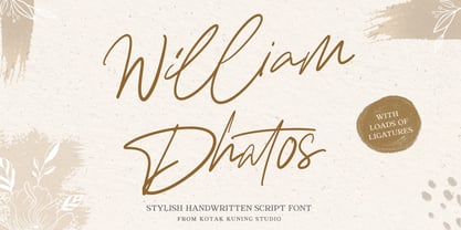 William Dhatos is a handwritten signature script with a natural and stylish flow. This font has a multitude of natural looking ligatures in its OpenType features - making the font look as close to natural handwriting as possible. William Dhatos is perfect for many different projects such as logos and branding, invitation, stationery, wedding designs, social media posts, advertisements, product packaging, product designs, label, photography, watermark, special events and more.
