10,000 search results
(0.061 seconds)
- Jukebox Hero by Grype,
$19.00 As one of the most popular rock bands of the world, Foreigner has rocked the charts with 10 multi-platinum albums and sixteen top 30 hits in the last 40 years. But one might ask what a band this successful has been missing all these years? No head games here...a consistent typeface based on their logo is the answer. As fans of Foreigner, we've taken the essence of their iconic logotype and expanded it out into a full typeface in regular and bold weights to celebrate their 40th anniversary tour. The Jukebox Hero Family celebrates the typographic stylings of Foreigner, with the soft rounded terminals and an open geometric feel, including the unique stencil flavor of the original logo. It inherited the friendly stylings of the all Capitals logo that inspired it, and goes on to include a full standard character set with expansive international support of latin based languages, and two weights jumping from regular to a beefy bold. This family is ready to rock the charts for your designs towards that of a modern, comfortable appeal. Here's what's included with Jukebox Hero Family bundle: 413 glyphs - including Capitals, Lowercase, Numerals, Punctuation and an extensive character set that covers multilingual support of latin based languages. (see the 3rd graphic for a preview of the characters included) 2 weights: Regular & Bold. Fonts are provided in TTF & OTF formats. The TTF format is the standard go to for most users, although the OTF and TTF function exactly the same. Here's why Jukebox Hero Family bundle is for you: You're a die-hard Foreigner fan, and have a case of "Double Vision" and need both font weights. You're looking for a stylish and sophisticated soft sans-serif stencil typeface family. You've been waiting for fonts like these. You're looking for a Sci-fi vibe typeface that has a look that feels familiar. You just like to collect quality fonts to add to your design arsenal
 - DF Zzzz by Dutchfonts,
$33.00 This typeface, in fact a bitmap font 'avant la lettre' is an interpretation of the Old Face condensed type. It is being used where space is scarce. Its skeleton is projected on the chain structure of a fly screen. Eventually your text lines fill the space as wide as hypothetical doors can be. In small sizes the text appears to be drawn with a pencil.
 - KAPITAL by Superfried,
$32.00 KAPITAL is an elegant, geometric uppercase sans. It is available in standard and stencil style across four weights – light | regular | medium | demi – covering 346 glyphs. It is based on the capital character set from a previous release – Basik. Continuing the clean, geometric aesthetics, KAPITAL was refined further to create a more minimal style. This enabled the characters to discreetly perform their role – to simply convey the message of the writer without distraction. To achieve this, special attention was applied to the form consistency of the glyphs across the weights and negative space throughout. In many typefaces as the weight is increased the form and style can deviate significantly from the original design. With regards to negative space – although inevitable – wherever possible key letterforms were adjusted to alleviate this.
 - Evereast by Nocturnal Workspace,
$9.00 Evereast Collection Display Font The beta version of the Evereast font has been published since 2020, and can be downloaded for free on the dafont website. At first this font was just a learning project from the 2nd type of font and because we saw the enthusiasm of the downloader, we developed it into 4 versions and 31 types of font files. WHAT YOU GET 4 versions. Evereast with style slab serif, western slab, soft edge, western edge 31 types of font files include Regular, Bold, Light, Hollows/Outlines, Rough, Italic, Stencil PUA Encode Characters, fully accessible without additional design software. Includes a range of multilingual characters. Evereast is suitable typeface for various purposes like logotype, signage, label, poster, dropcap, titles, letterhead, book cover and etc. Thank you!
 - Brush Crush by Hanoded,
$20.00 I bought a few new pencils and I tried them out using Chinese ink and quality French watercolor paper. The result is Brush Crush - a very nice brush font. Brush Crush would look perfect on packaging, book covers, posters and headlines and comes with alternates for all lower case letters. Needless to say, Brush Crush speaks most Latin-based languages.
 - Leuk by Wilton Foundry,
$29.00 The Dutch word “leuk" translates loosely to English as pleasant, jolly, funny, witty, clever, nice, sweet, kind, nice, amusing, entertaining, and funny. Leuk, the font, is a small, highly legible font with a witty, sociable personality that engages it’s readers. My challenge in designing Leuk was to find a unique feature to set apart the font without losing the fundamentals of type design. In the process of doing so, I created a virtual font “smile and wink” in the “o” upper and lowercase with integrated stencil-connecting strokes within the “a,e, k, z, o, ß” to reveal Leuk’s calligraphic roots. Legible and friendly, Leuk is designed for use in advertising, brochures, promotion, book cover design, packaging, and the like. The Leuk family consists of Leuk Light, Leuk Light Italic, Leuk Regular, Leuk Italic, Leuk Bold, Leuk Bold Italic, Leuk Black, Leuk Black Italic in Opentype format.
 - HS Alhuda by Hiba Studio,
$50.00 HS Alhuda is a display typeface. It can be used for titles and graphic projects, which support Arabic, Persian Urdu and Kurdish. It has been created based on modern kufi style. It enjoys flexibility between sharp and curved lines in the structure of characters. This supports with a beautiful appearance and wonderful geometric structure. The sharp endings in the bottom of character also give an aesthetic addition to the character. (8) Weights has been created for this typeface between the heariline weight and heavy weight. Besides, those six additional weights which can be used in headline, has baseline parts are more thicker than the vertical parts. One has a regular form and the others has a stencil form in the middle using various styles. This typeface with its diversity of (14) weights is intended to be an attempt for a good addition to Arabic typography.
 - DIN Next Decorative by Monotype,
$40.99 This four-piece family is the DIN design, but not as you know it. The famously, crisp, clean and precise typeface has been given a textured update that's reminiscent of rusted metal, or rubber stamps. Underneath this lies the same sturdy, geometric shapes that have allowed DIN to stand the test of time, but with a new sense of tangibility. “This kind of treatment is more about creating a feeling or a mood that goes beyond the communication of the words themselves,” explains Monotype Studio director Tom Rickner. “I think it expands the repertoire of what DIN Next can express.” Designed for display, these four typefaces – DIN Next Rust, DIN Next Shadow, DIN Next Slab Rust and DIN Next Stencil Rust – show a new side of DIN Next's personality, as if the surface of each letterform has been gradually worn away over the years.
 - Defense by Reserves,
$49.00 Defense is an unyielding rectangular slab-serif stencil face designed with consistently balanced letterforms and a refined finish. It’s extremely angular geometric form commands attention in display settings, yet is also legible in short text blocks. The stencil mark width varies accordingly with each weight, helping to further define each style. Numerous alternate character sets allow room for customization, while the expanded ligatures push letter combinations to the limit. Stylistically, Defense’s almost crude, sharp-cornered construction is balanced by it’s sophisticated finish and attention to detail, often unrealized in similar faces of this genre. The upright weights are complimented by pairings of true italics, completely rebuilt, slightly narrower in width with modified letterforms, increasing their contrast and flow. Features include: Precision kerning Standard Ligatures set including 'f' ligatures (fi, fl, ff, fh, fj, ffl, ffi, ffj) Discretionary Ligatures set including (ft, rt, ae, oe, st, ft, ct, oc, oo, ry, AE, OE, AL, TH, HE, AK, AN, TT, HD, AM, AP, AR, NF, NE, NH, NL, NB, FL, ND, FE, AB, OB, OD, OF, OG, OH, OK, OL, OM, ON, OO, OP, OQ, OR, OU, AH, UE, UF, UB, UD, UH, UK, UL, UM, UN, UP, UR, UU, MP, XY, YX, KY, WY, VY, AF, FF, FI) Alternate characters (O, o, S, s, a, h circumflex, @, ®, ™, ¶, $, &, _, and various ligature alternates) Case forms (shifts various punctuation marks up to a position that works better with all-capital sequences) Capital Spacing (globally adjusts inter-glyph spacing for all-capital text) Slashed zero Full set of numerators/denominators Automatic fraction feature (supports any fraction combination) Extended language support (Latin-1 and Latin Extended-A) *Requires an application with OpenType and/or Unicode support.
 - Linotype Sjablony by Linotype,
$29.99Linotype Sjablony is part of the Take Type Library, chosen from the entries of the Linotype-sponsored International Digital Type Design Contests of 1994 and 1997. Designed by Dutch artist Mark van Wageningen, the typeface with its interrupted strokes has the characteristics of the stencils seen on crates and barrels. The difference lies in the raw contours of this font, which make the characters look as though they were slowly eroded away by water and wind. Linotype Sjablony is composed exclusively of heavy capital letters and is particular suitable for initials and headlines with point sizes of 18 and larger. - Skarpa by Aga Silva,
$23.99 This is long awaited thorough revision to Skarpa family. The revision has inculded both another look at letter shapes as well as kerning and metrics of the files. The shapes encapsulated in this font stem from old time architectural drawings hand executed at drawing board with tracing paper and rapidographs. Think of lettering stencils sliding across the tracing paper and craftily exectuted drawing descriptions. The font is based on geometric forms devoid of excessive flourishing. Would suit modern designs either in fashion, technology or laboratory setting. Would look good on door plaques in pharmacy or simple drawer plaques - especially Medium or Bold specimen.
 - Clarendon Wide by Canada Type,
$24.95 By overwhelming popular demand, this is the wide display companion to Canada Type's Clarendon Text family. It comes in ten styles: regular, medium, bold, with small caps and oldstyle Figures counterparts, as well as stencil and sketch versions of the regular and the bold. All the fonts come equipped with superscripts/numerators, denominators, and scientific inferiors. The OpenType fonts also contain automatic fractions and class-based kerning. The Clarendon Wide fonts are available in all popular formats. Language support includes Western, Central and Eastern European character sets, as well as Baltic, Esperanto, Maltese, Turkish, and Celtic/Welsh languages.
 - Gridiot by Peter Bain,
$10.00 Gridiot is a constructed, semi-serif, two-weight stencil family that expands an approach taken by Josef Albers. Intended for display or headline setting, it features chamfered or bevel-cut corners, used instead of curves. The individual letter components sometimes vary in depth, avoiding a strictly modular approach, while the widths are kept consistent. The lining figures provide a standard set of numbers, and the oldstyle figures align with the lowercase, encouraging lowercase-only setting. Currency and other useful numerical symbols are provided in both versions. The zero is intentionally lighter, following early Renaissance types; there are filled versions as stylistic alternates. While horizontal scaling distorts the relationship between verticals and horizontals in a typeface, since every chamfer in Gridiot is at 45°, changing the horizontal scaling of the type will affect all diagonals equally. When used at a large size, or for a just few words, Gridiot can be very tightly spaced. Remember, any idiot can design a typeface on a grid: Gridiot.
 - Trepa by Tipo Pèpel,
$22.00 From time to time at Tipo Pèpel we like to play like children and get our hands dirty with whatever implement that can be used to mark or draw on the walls, even if the grown-ups don’t like it. And this is more or less what happened with “Trepa” (catalan for “stencil”), a typeface with a fresh and uninhibited appearance, inspired by commercial signs and the 1950’s French art movement “Graphie Latine”. Far removed from the straight lines of vector art, “Trepa” has the necessary roughness to make this class of font stand out and what’s more it has an extensive range of latin characters covering more than 200 languages, and a pair of complementary texture fonts which further multiply its creative possibilities. If you want to protest with elegance, “Trepa” is your best choice.
 - FP København by Fontpartners,
$35.00 Copenhagen has been in need of a typeface that unites the city’s many visual expressions. The three designers Morten Rostgaard Olsen, Henrik Birkvig and Ole Søndergaard have designed and developed the typeface FP København. Now available from MyFonts in 20 styles: Uprights & Italics, small caps, pictos-characters, stencils, sprayed style, OT-features, ligatures, contextual alternates etc. The shapes of the letters are inspired by the city’s culture and the visual environment and design in Denmark in the 20th century. It is relatively low and wide as the city itself and with rounded corners that give it a warm visual mood. “You can find examples of the use of a typeface with the same purpose in other parts of the world, for example, to identify local areas or urban tourism materials. FP København is our take on that kind of typeface” the designers add.
 - Blackletter Moderne JNL by Jeff Levine,
$29.00 Blackletter Moderne JNL was inspired by the original 1935 pencil drafts for “Deutsche Schrift” (German script); designed for the country’s railway system – and is available in both regular and oblique versions.
 - Walken by Typodermic,
$11.95 You want a typeface that’s gonna command attention? You want a typeface that’s gonna make your message scream out, “Hey, look at me!”? Then you need Walken. This slab serif is built like a brick house, with sturdy letterforms and robust serifs that mean business. And don’t think you’re gonna get some plain vanilla lettering here. Oh no. Walken’s got some tricks up its sleeve. We’re talking custom letter pairs, baby. OpenType ligatures that’ll swap out some letter combinations and create a unique, unpredictable look. You’ll get a mix of stencil and non-stencil characters that’s gonna give your message a personality all its own. Now, if you’re not satisfied with just one tough look, Walken’s got you covered. We’ve got three, count ’em, three forceful options: Clean, Crisp, and Hard. So whether you’re aiming for a sleek, professional image or a rough-and-tumble vibe, we’ve got you covered. So what are you waiting for? You want a typeface that’s gonna make you stand out from the crowd? You want Walken. But be warned: this typeface means business. Most Latin-based European writing systems are supported, including the following languages. Afaan Oromo, Afar, Afrikaans, Albanian, Alsatian, Aromanian, Aymara, Bashkir (Latin), Basque, Belarusian (Latin), Bemba, Bikol, Bosnian, Breton, Cape Verdean, Creole, Catalan, Cebuano, Chamorro, Chavacano, Chichewa, Crimean Tatar (Latin), Croatian, Czech, Danish, Dawan, Dholuo, Dutch, English, Estonian, Faroese, Fijian, Filipino, Finnish, French, Frisian, Friulian, Gagauz (Latin), Galician, Ganda, Genoese, German, Greenlandic, Guadeloupean Creole, Haitian Creole, Hawaiian, Hiligaynon, Hungarian, Icelandic, Ilocano, Indonesian, Irish, Italian, Jamaican, Kaqchikel, Karakalpak (Latin), Kashubian, Kikongo, Kinyarwanda, Kirundi, Kurdish (Latin), Latvian, Lithuanian, Lombard, Low Saxon, Luxembourgish, Maasai, Makhuwa, Malay, Maltese, Māori, Moldovan, Montenegrin, Ndebele, Neapolitan, Norwegian, Novial, Occitan, Ossetian (Latin), Papiamento, Piedmontese, Polish, Portuguese, Quechua, Rarotongan, Romanian, Romansh, Sami, Sango, Saramaccan, Sardinian, Scottish Gaelic, Serbian (Latin), Shona, Sicilian, Silesian, Slovak, Slovenian, Somali, Sorbian, Sotho, Spanish, Swahili, Swazi, Swedish, Tagalog, Tahitian, Tetum, Tongan, Tshiluba, Tsonga, Tswana, Tumbuka, Turkish, Turkmen (Latin), Tuvaluan, Uzbek (Latin), Venetian, Vepsian, Võro, Walloon, Waray-Waray, Wayuu, Welsh, Wolof, Xhosa, Yapese, Zapotec Zulu and Zuni.
 - Aviano Silk by insigne,
$22.00 A premier product from insigne, the powerful Aviano redefines its classic lines for the contemporary elegance of Aviano Silk. This modern development of a timeless font, part of insigne's annual tradition in adding to the Aviano family, was elected the clear leader in a poll of insigne design's social media followers. Aviano Silk refers to the smooth flowing feel that the negative space gives the font. This particular example is sort of a hybrid between the stencil and a centerline. It has a certain amount of velocity to it. Extended characters lend formality and a sense of wealth and power. Due to the modifications required for the new look, the Silk family cannot work as an overlay for Aviano, though it pairs nicely with it. There are also 12 Aviano families that work well with Silk. Aviano Silk is particularly suited to high-end luxury applications and especially branding projects. Use Aviano Silk to lend refinement and luxurious elegance to your design.
 - Sunkist Agness by Alit Design,
$15.00 Introducing Sunkist Agness Typeface The Sunkist Agness inspired by chill and playful street font combined with stencil font style. this font have rough and distorted shape which is become its own characteristic and uniqueness. Designed with 3 characters: Slab Serif, Sans Serif, and Serif, Sunkist Agness font is suitable to be combined into a playful and interesting combinations, not to mention the alternates from each characters that will add more uniqueness to your design! The "Sunkist Agness" are very easy to apply to any design, especially those with an retro and classic, army, playful and retro concept, besides that this font is very easy to use both in design and non-design programs because everything changes and glyphs are supported by Unicode (PUA).
 - Pluckypot by Maulana Creative,
$12.00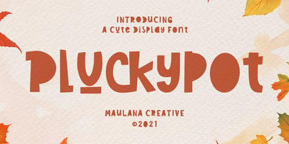 Pluckypot is a decorative handwritten display font. With pencil effect stroke, fun character with a bit of ligatures. To give you an extra creative work. Pluckypot font support multilingual more than 100+ language. This font is good for logo design, Social media, Movie Titles, Books Titles, a short text even a long text letter and good for your secondary text font with Script or Handwrittens. Make a stunning work with Pluckypot font. Cheers, MaulanaCreative
 - Cooper Black Pro by SoftMaker,
$15.99 SoftMaker’s Cooper Black Pro is a friendly, chubby typefaces with rounded serifs and tilted back ovals. It is perfect whenever an informal, friendly character is desired in your designs. Oswald Cooper designed Cooper Black in 1919 for Barnhart Brothers & Spindler; later it was popularized by ATF. This release adds variations not present in the original design: In addition to a true italic and a condensed version, you can also experiment with a “poster” variant (tighter spacing, integral umlauts and accents) and a “stencil” variant. SoftMaker’s Cooper Black Pro typeface family contains OpenType layout tables for sophisticated typography. It also comes with a huge character set that covers not only Western European languages, but also includes Central European, Baltic, Croatian, Slovene, Romanian, and Turkish characters. Case-sensitive punctuation signs for all-caps titles are included as well as many fractions, an extensive set of ligatures, and separate sets of tabular and proportional digits.
 - Interzone by MYSTERIAN,
$9.00 This type crept up the sense that it was made in Eastern Europe by poorly trained urbanites from a crippled nation, or that it is the remains of a contemporary gothic (like Eckmann) stencil. The choice of what this type signifies is up to the public. Lately I like the idea of 'putting on' (in McLuhan's sense) a genre of idea that is somewhat different from my tradition's beliefs, and fitting a core category of that toward a teleological/eschatological advantage. Therefore postmodernist/apocalyptic carelessness (which I may 'put on' by using this type) is how I abstain from the cravings of immortality, or more so that wanting it is pointless. It’s stands as memento morí; that I will have to die someday. I have to become less, He must become more. Of course, Interzone may signify a classic Joy Division track from Unknown Pleasures as well as the Cold Warish ongoings of conflicted eastern European life. I considered naming this Lunik 9.
 - Bomber TV by Kustomtype,
$25.00 I was asked by a good friend of mine to design his tattoo lettering. This fellow prefered an easy stencil with no ornament, such as swirls or loops. After some preliminary design I finally accepted the challenge and while completing the whole alphabet, the idea of creating a cool font of it occured to me. Only a few months later this new font family already contained 4 weights, every weight has a companion Italic style, punctuation, numerals and mathematical operators, as well as all accented characters. Bomber TV is a brand-new font and all glyphs have been contemplated very carefully so that all characters match in a well-balanced and streaming way. In both shaped weights, the font suits extraordinary well for headings, slogans etc. The cleanly cut and powerful Bomber TV font can easily be used for logotype, games, prints, magazines, web, apps, packaging, posters, T-shirts, signage & design projects. The font is original and custom made by Kustomtype.
 - Covent BT by Bitstream,
$50.99Designed by Jochen Hasinger of Frankfurt, Germany, Covent BT is an unconventional geometric sans serif typeface, featuring rounded terminal ends and a stencil-like break of the contour in some glyphs. At first glance you might think of it as a display typeface, but the generous x-height and openness of the lowercase makes Covent BT very legible at text sizes. Central Europe and Cyrillic is supported in the extended glyph set. Each weight contains 485 glyphs and includes some alternate figures, some upper and lowercase alternates, as well as others, all accessible via OpenType features. Covent BT Symbols is a stylized geometric symbol font, intended to stand alone or used as a companion to the Covent BT typefaces. The array of glyphs covers many of the more popular icons of the day including symbols for web use, numbers, sports, travel and astrology, to name a few, each with its own unique stylized interpretation. - Hand Printing Press by Fontscafe,
$39.00 Hand printing typography revolutionized the way books were published. The earliest printing presses made it possible for newspapers to reach the doorstep every morning, for information to freely be shared among the masses for the first time on a large scale…and the fonts that were used in those classic times are forever embedded within the collective memories of societies across the planet. It is to this collective memory that we give a visual form with our new Hand Printing Press Pack. Up for grabs are a set of 10 Hand Printing fonts plus one "Stamps" elements font. The fonts are: the Normal, the Stencil, the Eroded, the Meshed and the Scraped in REGULAR and BOLD versions; each of them displaying a simplistic yet classic printing style and as often happens lately, we are also offering you an "elements" pack, the "Stamps" font, to go with these to create your customized stamp giving to your creations a touch of "official documentation".
 - Heimat Sans by Atlas Font Foundry,
$50.00 Heimat Sans is the grotesque typeface family within the Heimat Collection, also containing Heimat Didone, Heimat Display, Heimat Mono and Heimat Stencil. Heimat Sans is a legible typeface family designed for contemporary typography, especially for use in headlines and on posters, but also for reading purposes. It combines an idiosyncratic appearance with the feeling of a grid-based letter construction of the late 20s. Since the design might be too extreme for some applications, Heimat Sans character set provides two alphabets, the regular one plus an alternate design that comes across as less suspenseful. Heimat Sans [732 glyphs] comes in six weights and contains an extra set of alternate glyphs, many ligatures, lining [proportionally spaced and monospaced], hanging [proportionally spaced and monospaced], positive and negative circled for upper and lower case, superior and inferior, fractions, extensive language support and many more OpenType features.
 - Gothica by Type Innovations,
$39.00 Say hello to Gothica. It’s a display geometric sans designed with Stencil-like elements and letter cutouts specifically created for visual impact—ideal for logo, branding and advertising purposes. The font includes capitals and capital alternatives in the lower case keystroke positions—it’s like having 2 display fonts in one. In addition, Gothica includes various opentype features that allow graphic designers to tailor the type for custom needs. The development of Gothica started in 1997, inspired by Alex Kaczun’s best selling grotesque font family called Contax Pro. An experimental design, Gothica is specifically introduced as a bold weight, but Alex plans to expand the design to include many weights, styles and alternative design treatments. Stay tuned! If you like Gothica—check out similar gothic alternates like Decrypt 01, Decrypt 02, Decrypt H1 and all of Type Innovations fonts from Alex Kaczun.
 - Heimat Mono by Atlas Font Foundry,
$50.00 Heimat Mono is the monospaced typeface family within the Heimat Collection, also containing Heimat Didone, Heimat Display, Heimat Sans and Heimat Stencil. Heimat Mono is a legible typeface family designed for contemporary typography, especially for use in headlines and on posters, but also for reading purposes. It combines an idiosyncratic appearance with the feeling of a grid-based letter construction of the late 20s. Since the design might be too extreme for some applications, Heimat Mono’s character set provides two alphabets, the regular one plus an alternate design that comes across as less suspenseful. Heimat Mono [684 glyphs] comes in six weights and contains an extra set of alternate glyphs, many ligatures, lining [proportionally spaced and monospaced], hanging [proportionally spaced and monospaced], positive and negative circled for upper and lower case, superior and inferior, fractions, extensive language support and many more OpenType features.
 - Pixel Grid by Caron twice,
$39.00 Pixel Grid is a font that lets us know that we have entered the digital age. We know about grid systems from the very first computers and electronic LED boards. Pixel Grid offers three types of grid resolution as well as many incarnations of individual segments. It is an electronic game: characters can be animated, overlapped, and played with in different ways. If you need a font that is strictly technical in nature, you can use tried-and-true square and round points. You can save ink by using them on receipts, for example, so the font can be used sustainably. Pixel Grid is suitable for engraving, or it can be used as a stencil. This complete font family aims to gain an extensive selection covering the early digital font style, facilitating the use of the style in professional applications today. Specimen: http://carontwice.com/files/specimen_Pixel_Grid.pdf
 - Quizles by Struvictory.art,
$15.00 Quizles is an elegant stencil serif with contrast. The font has classic proportions with bold serifs and fading thin lines. Quizles is easy to use in various design programs or without any program. The font is suitable for modern and vintage typographic compositions, design of books and fashion magazines, branding, packaging and social media design. Also use individual letters to create logos and monograms. The font has extensive language support, it includes English, French, German, Italian, Spanish, Portuguese, Danish, Norwegian, Swedish, Finnish, Estonian, Turkish. Quizles serif includes stylistic alternates for symbols: K, k, O, R. There are also ligatures: tt, ff, fi, gi, oo, ll, ra, ga, ca.
 - Chelleh by Si47ash Fonts,
$23.00 Nostalgic, typographic, stencil and old-style! Chelleh is the Persian Northern Hemisphere's winter solstice festival celebrated on the "longest and darkest night of the year, and I also an Arabic/Persian typeface too! Well, of course supporting basic Latin as well. Due to its special design, Chelleh doesn't support Arabic diacritics. Shahab Siavash, the designer has done more than 30 fonts and got featured on Behance, Microsoft, McGill University research website, Hackernoon, Fontself, FontsInUse,... Chelleh heavy and headline font which is one of his latest designs, already got professional typographers, lay-out and book designers' attention as well as some of the most recognizable publications in Arabic/Persian communities.
 - Steel Grrrder Script by ULGA Type,
$9.00 Steel Grrrder is an industrial-style joining script with a stencil effect, available in six weights ranging from Light to Black. Great for all kinds of display purposes including posters, film titles, book covers, magazines, advertising, signage, packaging, logos and tanks, this is a script with a sharp personality and a steely presence. However, if you’re searching for a “nice” script - sorry, bud - you’re looking in the wrong place. Steel Grrrder Script doesn’t entice the reader with voluptuous curves, flowing swashes or frisky letterforms, instead its sharp chiselled features compel the reader to pay attention. Characters muscle their way along like robotic bulldogs in steel-toe cap boots. Steel Grrrder Script is a veritable slab fest, best categorised as a constructivist joining script. Forged from carbon steel and wrapped in a layer of Graphene, this is a robust display typeface family able to withstand even the most demanding typographical situations. The Steel Grrrrder extended family also includes a six-weight sans-serif with corresponding italics and two display fonts, Groove & Nutjob - all designed to work with each other.
 - Austin Pen by Three Islands Press,
$29.00 Empresario Stephen F. Austin (1793-1836) is considered by many the “Father of Texas” for leading the first Anglo-American colony into the then-Mexican territory back in the 1820s. A few years later, while on a diplomatic mission to Mexico City, Austin was arrested on suspicion of plotting Texas independence and imprisoned for virtually all of 1834. During this time he kept a secret diary of his thoughts and musings—much of it written in Spanish. Austin Pen is my interpretation of Austin’s scribblings in this miniature prison journal (now in the collection of the wonderful Dolph Briscoe Center for American History, in the Texas city that bears his name). The little leather-bound book is filled with notes in ink and pencil—some of the faded penciled pages traced in ink years later by Austin’s nephew Moses Bryan. A genuine replication of 19th century cursive, Austin Pen has two styles: a fine regular weight, along with a bold style that replicates passages written with an over-inked pen. Each is legible and evocative of commonplace American penmanship of two centuries ago.
 - ITC Japanese Garden Ornaments by ITC,
$29.99ITC Japanese Garden Ornaments is a symbol font designed by Akira Kobayashi (before Kobayashi became Linotype's Type Director in 2001, he worked as an independent typeface designer in Tokyo). The images in Japanese Garden are, as the name suggests, mostly floral or herbaceous, derived from designs used in Japanese indigo stencil dyeing. In Japanese Garden," Kobayashi says, "I tried to create a set of type fleurons that are very familiar to a Japanese eye, but not too exotic to people in other countries." Several of the designs fit together seamlessly in repeating patterns; others work either together or as isolated ornaments, a flexibility that also characterizes traditional Western type fleurons. "The original illustrations," notes Kobayashi, "were mostly cut from white paper squares, about two by two inches in size, and were simply scanned and traced. That is why there are few smooth curves and perfectly straight lines in the illustrations. I simply liked the ragged textures of them."" - Soviet - Unknown license

- Gabriela by Latinotype Mexico,
$29.00 The Gabriela project is of great importance to us since it is the first font published by Latinotype México which is our brand-new sister foundry in Mexico. Gabriela, yet more versatile, shares all of its DNA with Gabriela Stencil. The font is an excellent choice for short and medium-length text. Gabriela is a Didone typeface well-suited to classy branding and editorial designs. Its alternate version includes swashes and more than 300 glyphs and 75 ligatures, allowing for more stylized designs. It may look different from its "regular" counterpart, but the essence of both is the same. Gabriela comes in 9 styles, ranging from Thin to Black, and includes matching true italics. Each font weight has an average of 750 characters which support more than 200 Latin-based languages.
 - Just Fall Holidays by Outside the Line,
$19.00 Lots of Fall fun, many Halloween icons... black cat, haunted house, witch hat, ghost, scary masks, pumpkins, bat, BOO! and more. Plus back to school icons... bus, pencil, flashcards, paste, leaves and an apple for the teacher.
 - FebDrei by Ingrimayne Type,
$9.95 FebDei is neat, meticulous hand printing in two weights, plain and bold, each with italics. It has little contrast and appears as if it was written with a pencil or ball-point pen. Unlike many other hand-printing fonts, it has tiny serifs. FebDrei was created in the process of making the fonts AllSmiles and BringInTheFrowns and can be used with them.
 - Letter Sketch by Motokiwo,
$15.00 This fun typeface is great for quote, tagline, or headline. Letter Sketch is all caps hand drawn font with two style, rough sketch and filled version. It's have natural drawing feels in each characters and give personal touch to your projects. Letter Sketch Regular : a funky rough pencil sketch font Letter Sketch Bold : the filled version of Letter Sketch Regular
 - FS Sammy by Fontsmith,
$80.00 Chalky Spritely and full of personality, FS Sammy is a hand-drawn font with a chalky texture, available in one weight only. Give Sammy a run in branding, packaging or billboard advertising for a fresh, informal, honest personality. Calligraphic Too many script fonts have a rushed and thrown-together feel about them. It’s a deceptively complex feat to achieve forms that hold together neatly in text yet still have the breezy, natural air of real handwriting. That’s FS Sammy: considered and crafted. Pencil FS Sammy was originally drawn for a drinks manufacturer by Fontsmith’s calligrapher, Sehmi Satwinder, who made handwritten impressions with a large soft pencil on textured watercolour paper. The digital interpretation of Sehmi’s letters was pushed to its limits and, after a lot of experimentation, a balanced alphabet was achieved. Texture and spirit FS Sammy’s success and uniqueness within the script font category is down to its versatility. In the large text of billboard advertising or headlines, all of its texture comes to life, and small, on menus or booklets, it conveys all of the spirit and personality of a considered piece of handwriting.
