10,000 search results
(0.076 seconds)
- Good Vibrations by TypeSETit,
$24.95 A beautifully flowing script with casual uppercase forms combined with more formal lowercase letters. Good Vibrations Pro is an extension of this popular font. Over 400 glyphs, with character sets for European languages. OpenType features include smooth connecting ligatures and alternate characters.
 - Narziss by Hubert Jocham Type,
$39.00 Since Mommie I gradually got more into swirly ornaments. The massive contrast in the neoclassic style is perfect for thin swirly extensions to the characters. Even in an upright typeface. Narziss is very elegant in big headline sizes. Use it only very big.
 - Kunze by Kitchen Table Type Foundry,
$15.00 Kunze font was inspired by the work of German graphic artist Carl Kunze (Minden, 1884). Kunze is a fat display font; a little rough around the edges, a little wonky in places, but very distinguishable and useful. Comes with extensive language support.
 - Arzachel by CAST,
$45.00 Arzachel is a humanistic sanserif with a big x-height and a specific organic look. Its design is scientifically sharp and efficient in small type sizes as well as rugged and dramatic in headlines. Arzachel’s essential feeling comes from several features: all the letters are slightly sloped, stem terminations are flared at the top, and the terminals in letters a, c, e, f… are widening with the inside parts completely flat. The stroke contrast is low in the regular weight while it increases in the black; finally the capitals have an inscriptional flavor. Despite being a sanserif (thus a product of recent typography) Arzachel’s roots stretch back to the Renaissance tradition: Olocco took inspiration from some of the early and rather weird types cut in Venice in the 15th century. Arzachel was conceived during Olocco’s MA in Reading to provide a companion for his Zenon for use in small type sizes. But instead of expanding the Zenon family with optical sizes, the designer decided on a sans with its own personality rather than a sanserif version of Zenon with chopped-off serifs.
 - Rawhide by Canada Type,
$29.95 Rawhide is a fresh digitization and expansion of a very popular (yet uncredited) early 1970s film type called Yippie, which was commonly used in wild west cartoons and comics. Publishers of Lucky Luke, the famous Belgian comic by Morris, used these bouncy letters for the titling on a few of their soft cover editions, and different variations of it were used throughout the 1970s and 1980s by cartoon classic Looney Tunes and a variety of wild west animations and comics. It slowly disappeared without fanfare when desktop publishing became the norm. Here it is again now for the computer age, available as a high quality font with a complete character set that accommodates more than 20 Latin-based languages. In short, Rawhide comes with an impressive track record, and is a must for any funny cowboy design or off the wall wild west layout. This set of fonts contains a very expanded character set that includes full support for Central, Eastern and Western European languages, as well as Baltic, Turkish, Esperanto, Greek, Cyrillic and Vietnamese.
 - Diad by Andinistas,
$29.95 Diad was born on 2000 in order to design posters about second World War. The original idea was obtained by breaking, burning and getting wet a bunch of written copies with an old writing machine. Today, Diad is a small typographic system useful for bringing relevance to any content with a grunge look. Each and every detail passed through a strict experimentation process. Its outrageous and unconventional spirit travels from high leveled corrosion, up to a delicate visual neglect. Diad 2 and 3 work for designing words. Diad 1 is ideal for long phrases and titles. Diad dingbats includes 26 illustrations about motocross. In total, adding Diad 1,2 and 3, it has around 260 glyphs. Diad will make your design shine providing different graphic atmospheres, optimizing time and work to its users. Diad is perfect for graphic design on contexts such as death metal, drum and bass, films, war and horror video games. It could work also for logos, words, titles and short texts in covers, tags, clothes, wraps, cards, stickers, toys, bicycles, surf boards, etc.
 - Cora by TypeTogether,
$49.00 Cora is a sans serif with an experimental bent, offering a large x-height, some contrast of stroke weight, and capitals inspired by classical lettering. The large x-height gives it a voice with a little more volume so that those in the back of the room have no trouble hearing. Because the letters seem slightly large, Cora remains clear at smaller point sizes. It is a typeface intended to perform well on screen without losing its attraction in print and the nature of its shapes allows for condensation or expansion without becoming severely distorted. The uppercase exhibits classical proportions found in ancient Roman inscriptions, which provides opportunities for setting titles in all caps. Cora Opentype Pro has a full range of numerals for every use, small caps, the most common open type features and supports many languages that use the latin extended alphabet. It is available in a range of three weights plus Italics. CoraBasic is a reduced version of Cora. It is still an OT-font but without any particular features except of a set of ligatures, class-kerning and language support including CE and Baltic.
 - Le Monde Journal Std by Typofonderie,
$59.00 A highly legible typeface in 4 series Le Monde Journal by definition is intended for newspaper use & at small sizes. It’s an economical and workshorse typeface adapted to any extrem condition of uses. Even though it has the same colour as Times, it appears more open. The reading flow has been made more fluent & less abrupt. The glyphs counters are bigger, as if they were “alluminating the interior.” The form, characterized by its serifs, remains embedded in our visual memory. Intermediate weights like Book can be considered as a grade supplement of the Regular. Italics accompany Le Monde Journal. With a more delicate design & a distinctive rhythm, they remain noticeable when used with the romans. Its companion, Le Monde Sans can extend your typographic palette. For beautiful page layout, use it in conjunction with Le Monde Livre for titling sizes. The verticals metrics and proportions of Le Monde Journal are calibrated to match perfectly others Typofonderie families. This family was designed in 1994 as bespoke typeface family for the French newspaper Le Monde. The family is not used any more by this newspaper from November 2005. Bukva:raz 2001 Type Directors Club .44 1998 European Design Awards 1998
 - Travel Kit SG by Spiece Graphics,
$39.00 Here’s an intriguing mixture of 1930s deco and modern tech fashion. Travel Kit Medium is a sturdy semi-serif hybrid with one foot in the past and another in the present. It is slightly low-waisted with extended crossbars on the capital A, E, F, H, K, and P. But the capital B, M, R and X are distinctively contemporary with the E and M repeated as unicase letters in the lowercase. Optional retro characters (notably the unicase e and m) have been provided if you prefer a more traditional overall look - and your software allows access to these characters. Simply find and replace the more modern letters with the older ones. In addition, small caps with even more alternate characters have been included for greater flexibility and convenience. Travel Kit Medium with Alternates is now available in the OpenType format. In addition to small caps, lining figures, oldstyle figures, and petite figures, this expanded OpenType version contains additional stylistic alternates and historical forms. These advanced features work in current versions of Adobe Creative Suite InDesign, Creative Suite Illustrator, and Quark XPress. Check for OpenType advanced feature support in other applications as it gradually becomes available with upgrades.
 - Vtg Stencil France No1 by astype,
$40.00 The Vtg Stencil fonts from astype are based on real world stencils from several countries. In the case of French stencils the challenge was special, because of the varieties of different widths and weights between the stencil sets – so I made France No. 1, No. 3 and No. 5. The most unique and eye-catching elements of typical French stencils are the figures 1, 2, 3, 7 and a specially 5. The figure 5 changes in style on smaller stencil sizes, its bobble getting replaced by something like a “breve”. The letters J and Q can differ in style too. While the local stencil lettering styles are gradually disappearing in other countries, there are regions in France, such as Normandy and Brittany, where these stencils are still in use today. They are used for technical lettering, which is what stencils were originally intended for, but also for ads and information signs in a more artistic or patriotic context. Over the time, these stencil letters became a globally recognized landmark of French design and French taste. All styles offering an extended Latin character set. » pdf specimen «
 - PT Sans Pro by ParaType,
$50.00PT Sans Pro is a comprehensive type family intended for a wide range of applications. It consists of 32 styles: 6 weights (from light to black) with corresponding italics of normal proportions; 6 narrow styles; 6 condensed styles; 6 extra condensed styles and 2 caption styles (regular and bold). The design combines traditional conservative appearance with modern trends of humanistic sans serif and possess enhanced legibility especially in caption styles. These features, besides conventional use in business applications and printed materials, make the fonts usable for direction and guide signs, schemes, screens of information kiosks, and other objects of urban visual communications. The fonts have extended Latin and Cyrillic character sets serving alphabets of all title languages of the national republics of Russian Federation and supporting the most of the languages of neighboring countries. Each font contains about 1400 characters including small caps for all alphabetic characters, 4 sets of figures with lining and old style variations, stressed Cyrillic vowels, indices, fractions and so on. Design -- Alexandra Korolkova with assistance of Olga Umpeleva and supervision of Vladimir Yefimov. The fonts released by ParaType in 2010. - Codec Pro by Zetafonts,
$39.00 Codec Pro is the newest incarnation of the Codec family, developed in 2017 by Francesco Canovaro, Cosimo Lorenzo Pancini and Andrea Tartarelli as a research on the subtleties and the variations on the theme of the geometric sans-serif design. The original typeface has been completely redesigned and expanded to feature a wide range of eleven weights, from the hairline thin to the bulky fat, while the character set has been extended to include not only latin, cyrillic and greek but also arabic, farsi and urdu scripts. A veritable swiss-knife for the designer, Codec Pro also includes a wide range of alternates and stylistic sets that cover all the subfamilies and the moods of the original type system. So while the standard set (Codec Cold) has terminals cut parallel or perpendicular to the baseline, emphasizing geometry for a more constructed look, stylistic set 4 (Codec Warm) uses open diagonal cuts and humanist shapes to give the typeface a gentler, warmer feeling. Set 3 (Codec Cold Logo) comes alive with funky ligatures, while Set 5 (Codec Warm Logo) stretches uppercase characters horizontally for a dynamic, unexpected effect
 - Edita by TypeTogether,
$49.00 Edita is a gentle typeface, humanistic in concept yet with a contemporary feel, where softness and fluidity play a very important role. This can be seen especially in its italics, which are loosely based on handwriting. This book typeface family is intended to be used in books where text is set together with photographs and other graphic elements. However, Edita is a general book typeface, versatile enough to be used in many other contexts, from novels to promotion material. Edita’s large character set, covering most languages which use Latin script, and styles give the designer the possibility to work with a big typographic palette, allowing complex typesetting with several levels of information. This is further enhanced by the two optically corrected weights Edita Small and Small Italic. They have been particularly designed for their use in very small type sizes, such as in captions and notes. They differ in having a slightly bigger x-height, heavier stems, reduced contrast, and carefully drawn ink-traps to ensure legibility at sizes as small as 5 pt. Additionally, their extenders are shorter to save space which allows text to be set with tighter leading.
 - Billund by Elster Fonts,
$24.00 Have you ever played with Lego™ and built letters? With Billund Side and Billund Top you can do it again and create colourful headlines on your Mac or PC. Billund is a font-system consisting of the two base-fonts Billund Side Outline and Billund Top Outline, extended by layer-fonts for one or five colours. Use the Outline-fonts alone to get »transparent« letters in one colour, use it with the Fill-fonts to fill the whole letter with one colour, or use the five Colour-fonts to get colourful letters in every colour you want. Billund contains cyrillic and greek glyphs and can be used for nearly a hundred languages. To expand the typographic possibilities, small caps, old style figures, numerals for small caps (c2sc), three stylistic sets, different symbols, forms, standard- and discretionary ligatures have been added, furthermore contextual alternates to avoid colliding letters. Each Billund-font contains 870 glyphs and more than 1600 kerning-pairs. Billund is named after the city of Billund (Denmark), where Lego™ was invented, the Lego™-headquarter still resides and the first Legoland™ theme park was opened in 1968 and still exists today.
 - Salome by Canada Type,
$24.95 Salome is a revival, normalization and elaborate expansion of a 1972 film face called Cantini. The original film type, released by a tiny independent outfit called Letter Graphics, looked like it was hand drawn with little consideration for consistency in essential lettering flow measurements, like angles, stroke widths, and vertical metrics. All these issues have been resolved in this digital version, and the original character set, including the whole lot of alternates, was entirely redrawn and expanded to include even more alternates and many useful ligatures, as well as extended support for Latin-based languages. Combining elements of early 20th century art nouveau with common 1960s and 1970s signage and poster lettering flair, Salome uses curls and curves to wave its fantastic shapes in a most hypnotic dance. Salome simply cannot be unseen. Just like its namesake, the female seduction icon, it does not hesitate to put all of its natural beauty and energy on display in order to get what it wants. Salome comes in all popular font formats. The OpenType version, Salome Pro, combines the main font with the alternates one, and contains convenient features for push-button alternation and ligature substitution in supporting software programs.
 - Movida by ROHH,
$39.00 Movida™ is a 101-font mega family - modern, spurless, with geometric flat-sided nature. Its versatile character and huge choice of styles let it serve as a charismatic display typeface as well as clean contemporary tool for setting paragraph text. Its dynamic personality fits perfectly to such industries as sports, gaming, technology, streetwear, automotive. Movida works great for logo design & branding, magazine editorial use, web design, user interfaces and mobile applications. Movida features a super-flexible 3-axis variable font allowing fluent adjustments to width, weight and italic angle. This single font contains all the styles and features of the whole mega family. Main features: 5 widths (Narrow, Condensed, Normal, Expanded, Wide) 10 weights for each width (from Hairline to Black) + 10 corresponding italic styles 1 variable font (3 axes: weight, width, italic angle) modern, slick & sharp spurless design large x-height improving legibility in small sizes flattened oval shapes, adding vertical rhythm and elegance to narrow styles extended latin language support OpenType features (case sensitive forms, standard and discretionary ligatures, stylistic sets, contextual alternates, lining, oldstyle and tabular figures, slashed zero, fractions, superscript and subscript, ordinals, currencies and symbols)
 - Beni by Nois,
$18.00 Beni is a bold & strong sans serif font family beautifully crafted to perform in short headlines in posters or contemporary interface design. Each character has been optically adjusted for maximum effect in the space between; as such, this is a strong contender for movie posters, titling, album artwork, and any design project that needs a clean sans serif that makes an impact wherever it is applied. This type family is available in four unique weights that stand well apart from one another in visual style. Beni Light is the runway model of the family, standing with a narrow posture and towering height. It’s a fantastic choice for conveying a message in a limited horizontal space. Beni Regular and Beni Bold are shorter in stature but both pack a punch, carrying bold strokes that speak with confidence and offer great legibility. The heaviest of the heavy, Beni Black is the super-bold, go-to type design for projects that need an impossibly strong type design at the helm. Beni extends multilingual support to Basic Latin, Western European, Euro, Catalan, Baltic, Turkish, Central European, Pan African Latin, Igbo Onwu, and Basic Greek for design projects intended for an international audience.
 - Mousse Script by Sudtipos,
$79.00 Mousse Script is based on Glenmoy, a 1932 Stephenson Blake typeface. Glenmoy a prime example of what display typography was in pre-WWII American ad art. It graced the pages of magazines, sold numerous products and services, then simply died out when the typographic trends shifted towards the more personalized, stylized and handwritten types of calligraphy. The current trend in typography is a revivalism that brings all of the distinctive display typography of the 20th century, without chronological discrimination, back in the name of ‘retro’. Who are we to deny the masses what they want? Mousse Script doesn’t just bring Glenmoy back from the ashes of the 20th century. It expands upon the limited metal character set nearly twice over and takes advantage of the latest type technologies. This makes Mousse Script a striking typeface, both functionally and visually. A simple, attractive display font on the surface, Mousse Script is unique in its bold upright calligraphy, something rarely found these days. The OpenType version of Mousse Script combines both the regular and alternate character sets into a single, cross-platform package that takes advantage of the extended typographic features of the OpenType format.
 - Source Code Pro - 100% free

- Cultura New by DSType,
$40.00 Cultura New is a reviewed, expanded and improved version of the previous released Cultura.
 - ITC Franklin by ITC,
$40.99 The ITC Franklin™ typeface design marks the next phase in the evolution of one of the most important American gothic typefaces. Morris Fuller Benton drew the original design in 1902 for American Type Founders (ATF); it was the first significant modernization of a nineteenth-century grotesque. Named in honor of Benjamin Franklin, the design not only became a best seller, it also served as a model for several other sans serif typefaces that followed it. Originally issued in just one weight, the ATF Franklin Gothic family was expanded over several years to include an italic, a condensed, a condensed shaded, an extra condensed and, finally, a wide. No light or intermediate weights were ever created for the metal type family. In 1980, under license from American Type Founders, ITC commissioned Victor Caruso to create four new weights in roman and italic - book, medium, demi and heavy - while preserving the characteristics of the original ATF design. This series was followed in 1991 by a suite of twelve condensed and compressed designs drawn by David Berlow. ITC Franklin Gothic was originally released as two designs: one for display type and one for text. However, in early digital interpretations, a combined text and display solution meant the same fonts were used to set type in any size, from tiny six-point text to billboard-size letters. The problem was that the typeface design was almost always compromised and this hampered its performance at any size. David Berlow, president of Font Bureau, approached ITC with a proposal to solve this problem that would be mutually beneficial. Font Bureau would rework the ITC Franklin Gothic family, enlarge and separate it into distinct text and display designs, then offer it as part of its library as well. ITC saw the obvious value in the collaboration, and work began in early 2004. The project was supposed to end with the release of new text and display designs the following year. But, like so many design projects, the ITC Franklin venture became more extensive, more complicated and more time consuming than originally intended. The 22-font ITC Franklin Gothic family has now grown to 48 designs and is called simply ITC Franklin. The new designs range from the very willowy Thin to the robust Ultra -- with Light, Medium, Bold and Black weights in between. Each weight is also available in Narrow, Condensed and Compressed variants, and each design has a complementary Italic. In addition to a suite of new biform characters (lowercase characters drawn with the height and weight of capitals), the new ITC Franklin Pro fonts also offer an extended character set that supports most Central European and many Eastern European languages. ITC Franklin Text is currently under development.
 - Vtc-NueTattooScript - Personal use only

- Neo Contact by Linotype,
$40.99Neo Contact is the typeface used on the packaging of Marlboro cigarettes (Marlboro “Reds,” the main line of the brand). The typeface is bold and condensed, designed in the Egyptienne style. Egyptienne types were first designed in the 1800s, as type founders - especially in the westward-expanding United States - began to dream up newer, bolder styles of letters for advertising usage. During the 1800s, it became increasingly important for businesses to set themselves, and their products, apart from competitors. This desire has remained with corporations, as well as with advertisers and designers, into the 21st century. In addition to cigarette packaging, Neo Contact (as part of Marlboro’s branding efforts) can be seen on numerous items, including Ferrari’s F1 racers, and at Formula 1 race tracks. The letters in Neo Contact are filled with personality. Their forms display two distinct weights of line, and the serifs are made up of tiny, strict slabs. Ball terminals round out the design. Neo Contact is a complete font, with a complete western character set. Typefaces in the Egyptienne style preceded the development and distribution of larger, crazier wood typefaces, but also share many similarities with these descendents. More traditional, text faces in the Egyptienne manner are also available from Linotype GmbH (e.g., Adrian Frutiger’s Egyptienne F). On the opposite end of the spectrum, we offer interesting, personality-filled wood display types, like Ponderosa as well. - Dokument Pro by Canada Type,
$29.95 Jim Rimmer aptly described his Dokument family as a sans serif in the vein of News Gothic that takes nothing from News Gothic. Building on that internal analysis, Dokument Pro is the thoroughly reworked and expanded of the original main set released in 2005, with different widths still in the pipeline. This new version updates Jim’s work to six Pro weights and their italic counterparts, each of which takes advantage of OpenType stylistic sets to introduce different degrees of graduation from gothic to humanist. Dokument Pro is now a unique text sans family, with an adaptable personality suitable for the kind of edgy, uncompromising corporate and media typography that just tells it like it is, instead of having to resort to the common contemporary luring and baiting tactics. Dokument Pro’s range of weights, styles and features (over 775 glyphs per font, built-in small caps, alternates galore, and support for over 45 Latin languages) allows for multi-application versatility and clear, precise emotional delivery. This is the kind of straight-shooter sans that should be in every designer’s toolbelt. For more details on the fonts' features, text and display specimens and print tests, consult the Dokument Pro PDF availabe in the Gallery section of this page. 20% of Dokument Pro’s revenues will be donated to the Canada Type Scholarship Fund, supporting higher typography education in Canada.
 - Al Seg33 by Nihar Mazumdar,
$1.00 Al Seg 33 is a moderately dense alphanumeric display. The 33 segments are made up of eight outer segments, and twenty-four inside segments, and a center dot. It has five diagonals in each corner.
 - Mustkill by Invasi Studio,
$19.00 Taking inspiration from horror movie posters. Mustkill Font comes in rough detail and uppercase style. This font comes with angry and nightmare feelings. It's perfect for a poster, branding, logo, book cover, or Halloween promo.
 - Infection by Ronin Design,
$15.00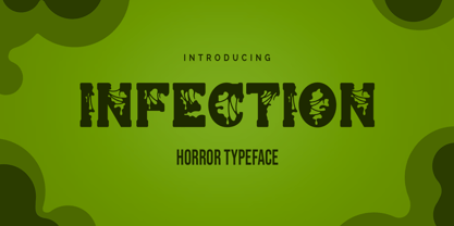 Infection is a horror and halloween font. Designed with a zombie virus touch will give a creepy impression, This font is ideal for labels, posters, or pretty much anything else that requires a creepy touch.
 - Ancherr by Tama Putra,
$12.00 Ancherr is a horror brush typeface. It is suitable for any design needs, branding, art quote, cover title, t-shirts, posters and more. The Ancherr typeface includes multi-lingual and currency support, numerals, and punctuations.
 - Agio by Gaslight,
$15.00 Agio - a heavy contrast style font with cuts on the top of the some glyphs and spurs on top left corner of every glyphs. Also Agio has some decorative styles for glyphs and decorative elements.
 - Celsius by Wilton Foundry,
$29.00Celsius was handwritten with a scratchy nylon marker creating a rougher than normal effect - almost like trying to write in the cold with a pen that doesn't cooperate very well. Dedicated to all snowboarders everywhere! - Silent Comedy JNL by Jeff Levine,
$29.00 A poster for the 1917 Charlie Chaplin comedy “Easy Street” had Chaplin’s name hand lettered in thick, round cornered block characters. This inspired Silent Comedy JNL, which is available in both regular and oblique versions.
 - Tasci Kufi by Abdullah Tasci,
$50.00Tasci Kufi is the today’s commentary of the minimalist comprehension of the geometric balance in the epigraphs of the Seljuk period. The typeface offers innumerable alternatives for the balance component needed for headlines and logotypes. - Theatrics JNL by Jeff Levine,
$29.00Theatrics JNL gives a rounded corner treatment to Prismatiq JNL; which in turn was modeled from lettering found in an early 1900s French lettering book displayed at an online image sharing site. Limited character set. - Droid Sans Mono by Ascender,
$92.99 Droid Sans Pro Mono is a humanist sans serif typeface designed by Steve Matteson, Type Director of Ascender Corp. Droid Sans Mono features a fixed width (non-proportional) which is useful for developers to see code in a tabular setting and for viewing emails and other screens. Droid Sans is an approachable, friendly set of typefaces optimized for display on screen. Droid Sans Mono was designed to provide optimal quality and legibility. It features upright stress, open forms and a neutral appearance. Droid Sans Mono was optimized for user interfaces and to be comfortable for reading on a mobile handset in menus, web browser and other screen text. The Droid Sans Pro Mono Regular font contains Old Style Figures (requires an application that support advanced OpenType typographic features) and extensive character set coverage including Western Europe, Eastern/Central Europe, Baltic, Cyrillic, Greek and Turkish support.
 - Doris PP - 100% free

- Daylosta by Authentype,
$20.00 Daylosta Authentic Handwritten Font created by AuthenType. This font features a classic and elegant style, perfect for: The concept of font design for the food, drink and cake industry leads to an energetic and creative youth market processing the taste and color of food. Features Standard glyphs uppercase and lowercase letters Numerals, a large range of punctuation and ligatures. Lowercase letters include ending swashes. Works on PC & Mac. Simple installations, accessible in the Adobe Illustrator, Adobe Photoshop, Adobe InDesign, even work on Microsoft Word. PUA Encoded Characters – Fully accessible without additional design software. Fonts include multilingual support for; ä ö ü Ä Ö Ü ß ¿ ¡ ________________________________________________________________________________________________________________________________________________ Image used : All photographs/pictures/logo/vector used in the preview are not included, they are intended for illustration purpose only. Thank you for your purchase! Hope you enjoy with our font! Designers: Ekayasa.
 - Scrittura by Scholtz Fonts,
$12.50 Scrittura was inspired by Anton Scholtz’s font, Honeybird, and developed into a contemporary variation with three styles. Scrittura Moderna: sleek and calligraphic. A dramatic, vigorous yet elegant font, whose upright letter shapes flow into each other like molten gold. Use Moderna for marketing cosmetics and clothing, for book covers, greeting cards, wedding stationery. Scrittura Antiqua: weathered, almost grungy. A new font with an “antique” look , reminiscent of ancient parchment manuscripts. Use Antiqua for certificates, medieval banquet or wedding stationery, theatre posters and programs, and book covers. Scrittura Fantasia: magical and ghostly. A slightly distorted, evoking Halloween, the Day of the Dead, and your favorite horror movie. Use Fantasia for horror comic covers & posters, horror movie posters, CD covers, Halloween material. The font contains over 272 characters - (upper and lower case characters, punctuation, numerals, symbols and accented characters are present). It also includes "open-type"characters to enhance the flow of the text. It has all the accented characters used in the major European languages.
 - Ceciliany by Brenners Template,
$19.00 Ceciliany is a classy font family that adds calligraphic touches to the basic structure of the display serif. Italic styles share a language set and OpenType Features compared to static styles, but have a completely different metrics In addition, an elaborate and detailed kerning system is also operated separately. 9 weights and 18 unique styles offer designers the amazing creativity of the serif font family. It offers a variety of options for editorial design as well as typography work for various channels. Features 9weights, 18styles Optimized Kernings Stylistic Set Fractions Oldstyle Figures Discretionary Ligatures : AM, AR, BA, BR, CA, CH, CR, DE, EA, El, FR, GA, GH, HR, IL, IM, JA, KA, KR, Ki, LA, LE, LO, MA, Ma, Me, NA, NE, NT, Nu, PS, RA, RE, RO, Ro, SA, ST, TH, UB, Ze, Zo, ft, li. Standard Ligatures : ff, fi, fl. * In particular, ligatures displayed in preview images can be easily applied to Adobe apps. Check out the ligature features of the software you are using.
 - Patron - Personal Use - Personal use only

- Fogthree by Glukfonts,
$7.00 Decorative, semi-serif fonts with high contrast: - Fogthree-ACL (AllCaps & Ligatures) with lots of unique (92 basic and 144 diacritic) Ligatures. - Fogthree as an accompanying, classic font with delicate feel, ideal for headlines, short text, logos, packaging and advertising. Ligatures gives text a unique, elegant and romantic feel. These Ligatures are PUA encoded and can also be accessed from Glyph Palette or Character Map. It comes in OpenType format with extended language support.


